0%

Book Description

Make the most of your data using the power of Excel

When you think of data, do you think of endless rows and columns in spreadsheets? Excel Dashboards and Reports For Dummies, 3rd Edition shows you how to make the most of your data—and puts an end to mind-numbing spreadsheets by exploring new ways to conceptualize and present key information. There's often a gap between handling data and synthesizing it into meaningful reports, and this approachable text bridges this gap with quick and accessible information that answers key questions, like how to meaningfully capture data trends, how to show relationships in data, and when it's better to show variances than actual data values.

As a leading spreadsheet application, Microsoft Excel is the go-to data software. This tool allows you to use dashboard reports that leverage gauges, maps, charts, sliders, and other visual elements to present complex data in a manner that's easy to understand. Using Excel dashboards effectively can improve your professional capabilities by leaps and bounds.

  • Analyze and report on large amounts of data in a meaningful way
  • Look at data from different perspectives, and better visualize the information you're presenting by quickly slicing data on the fly
  • Automate redundant reporting and analysis functions, making your data analysis and reporting routine more efficient
  • Create visualizations, dashboards, and what-if analyses that are as visually appealing as they are substantial

Excel Dashboards and Reports For Dummies, 3rd Edition is a fantastic resource if you're looking to spice up your reporting!
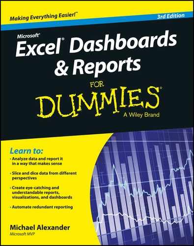
Table of Contents

  1. Cover
    1. Cover
    2. Introduction
      1. About This Book
      2. Foolish Assumptions
      3. How This Book Is Organized
      4. Icons Used In This Book
      5. Beyond the Book
      6. Where to Go from Here
    3. Part I: Getting Started with Excel Dashboards & Reports
      1. Chapter 1: Getting In the Dashboard State of Mind
        1. Defining Dashboards and Reports
        2. Preparing for Greatness
        3. A Quick Look at Dashboard Design Principles
        4. Key Questions to Ask Before Distributing Your Dashboard
      2. Chapter 2: Building a Super Model
        1. Data Modeling Best Practices
        2. Excel Functions That Really Deliver
        3. Using Smart Tables That Expand with Data
    4. Part II: Building Basic Dashboard Components
      1. Chapter 3: Dressing Up Your Data Tables
        1. Table Design Principles
        2. Getting Fancy with Custom Number Formatting
      2. Chapter 4: Sparking Inspiration with Sparklines
        1. Introducing Sparklines
        2. Understanding Sparklines
        3. Customizing Sparklines
      3. Chapter 5: Formatting Your Way to Visualizations
        1. Enhancing Reports with Conditional Formatting
        2. Using Symbols to Enhance Reporting
        3. Wielding the Magical Camera Tool
        4. Making Waffles with Conditional Formatting and the Camera Tool
      4. Chapter 6: The Pivotal Pivot Table
        1. An Introduction to the Pivot Table
        2. The Four Areas of a Pivot Table
        3. Creating Your First Pivot Table
        4. Customizing Pivot Table Reports
        5. Creating Useful Pivot-Driven Views
    5. Part III: Building Advanced Dashboard Components
      1. Chapter 7: Charts That Show Trending
        1. Trending Dos and Don’ts
        2. Comparative Trending
        3. Emphasizing Periods of Time
        4. Other Trending Techniques
      2. Chapter 8: Grouping and Bucketing Data
        1. Creating Top and Bottom Displays
        2. Top Values in Charts
        3. Using Histograms to Track Relationships and Frequency
      3. Chapter 9: Displaying Performance against a Target
        1. Showing Performance with Variances
        2. Showing Performance against Organizational Trends
        3. Using a Thermometer-Style Chart
        4. Using a Bullet Graph
        5. Showing Performance against a Target Range
    6. Part IV: Advanced Reporting Techniques
      1. Chapter 10: Macro-Charged Dashboarding
        1. Why Use a Macro?
        2. Recording Your First Macro
        3. Running Your Macros
        4. Enabling and Trusting Macros
        5. Examining Some Macro Examples
      2. Chapter 11: Giving Users an Interactive Interface
        1. Getting Started with Form Controls
        2. Using the Button Control
        3. Using the Check Box Control
        4. Toggling a Chart Series On and Off
        5. Using the Option Button Control
        6. Showing Many Views through One Chart
        7. Using the Combo Box Control
        8. Changing Chart Data with a Drop-Down Selector
        9. Using the List Box Control
        10. Controlling Multiple Charts with One Selector
      3. Chapter 12: Adding Interactivity with Pivot Slicers
        1. Understanding Slicers
        2. Creating a Standard Slicer
        3. Getting Fancy with Slicer Customizations
        4. Controlling Multiple Pivot Tables with One Slicer
        5. Creating a Timeline Slicer
        6. Using Slicers as Form Controls
    7. Part V: Working with the Outside World
      1. Chapter 13: Using External Data for Your Dashboards and Reports
        1. Importing Data from Microsoft Access
        2. Importing Data from SQL Server
        3. Leveraging Power Query to Extract and Transform Data
      2. Chapter 14: Sharing Your Workbook with the Outside World
        1. Protecting Your Dashboards and Reports
        2. Linking Your Excel Dashboards to PowerPoint
        3. Distributing Your Dashboards via a PDF
        4. Distributing Your Dashboards to OneDrive
        5. Limitations When Publishing to the Web
    8. Part VI: The Part of Tens
      1. Chapter 15: Ten Chart Design Principles
        1. Avoid Fancy Formatting
        2. Skip the Unnecessary Chart Junk
        3. Format Large Numbers Where Possible
        4. Use Data Tables Instead of Data Labels
        5. Make Effective Use of Chart Titles
        6. Sort Your Data before Charting
        7. Limit the Use of Pie Charts
        8. Don’t Be Afraid to Parse Data into Separate Charts
        9. Maintain Appropriate Aspect Ratios
        10. Don’t Be Afraid to Use Something Other Than a Chart
      2. Chapter 16: Ten Excel Chart Types and When to Use Them
        1. Line Chart
        2. Column Chart
        3. Clustered Column Chart
        4. Stacked Column Chart
        5. Pie Chart
        6. Bar Chart
        7. Area Chart
        8. Combination Chart
        9. XY Scatter Plot Chart
        10. Bubble Chart
    9. About the Author
    10. Cheat Sheet
    11. Advertisement Page
    12. Connect with Dummies
    13. End User License Agreement
3.146.34.218