
Art is born of the observation and investigation of nature.
—Cicero
Roman author, orator, and politician, 106 BC–43 BC
Creating art for computer games requires both artistic and technical skills. We will look at both but first we will look at the very basics of art. The goal of this chapter isn’t to turn you into an artist, but it will help you create better textures to understand these fundamentals. If you have any art training, this may be material you will want to skim over. If you don’t, hopefully it will help point you in the right direction to learn what you need to in order to become a great game artist.
There are a few basic aspects of visual art that are simple to understand but can take years to master. And even though teaching you traditional fine art skills is beyond the scope of this book, it is critical that you have an understanding of these basic aspects of visual art so that you can create game textures. Fortunately, these basic aspects of art are easy to present in book form and you can learn the vocabulary of an artist without difficulty. By studying these basics of art, you will learn to see the world as an artist does and to understand what you see and then be better able to create a texture set for a game world.
The basic aspects of visual art that we will focus on are as follows:
• Shape and form
• Light and shadow
• Texture
• Color
• Perspective
Learning to observe the world around you, understand what you are seeing, and then explain it verbally is what an artist does. Communicating with other artists and team members is critical in the development process. Just being able to make a decent texture isn’t enough; you need to be able to create the texture that is needed and that need will be communicated to you through the nomenclature of the artist.
Technology is, of course, critical to the larger picture of game textures, but the actual basics of art are where great textures begin. It is way too common for a book or class to start with a tutorial on tiling in Photoshop or even game engine technology and that is skipping what the game artist really needs, a fundamental understanding of the visual world. It is very common for people to know this stuff, but it is equally as common for a person to have absolutely no understanding of any of it.
The skills that are the most important for the creation of game textures are the ability to understand what you are seeing in the real world and the ability to recreate it in the computer. Often a texture artist is required to break a scene down to its core materials and build a texture set based on those materials, so learning this skill is essential. Although you don’t need to have an advanced degree in art to create great textures, let’s face it: Almost anyone can learn what buttons to click in Photoshop, but the person who understands and skillfully applies the basics of art can make a texture that stands out above the rest.
There are many types of art and aspects of visual art that you should further explore to develop as a game artist. The following are some of the things you can study and/or practice:
• Figure drawing
• Still life
• Calligraphy
• Photography
• Painting (oil, water color, etc.)
• Lighting (for film, still photography, the stage, or computer graphics)
• Color theory and application
• Sculpture
• Drafting and architectural rendering
• Anatomy, which usually starts with stick figures and adds the skeleton, muscles, and then skin
• Set design
• Technical illustration
It is even worth the time to study other areas of interest beyond art, such as the sciences, particularly the behavior of the physical world. Almost all commercial game engines process light in real time and don’t rely on painting it into the texture. There are still many situations where that skill is needed so we will look at working with textures for both methods. The more you understand and are able to reproduce effects such as reflection, refraction, blowing smoke, and so on, the more success you will find as a game artist. We now have technologies that reproduce the real world to a much greater extent than ever before, but it still takes an artist to create the input and adjust the output for these effects to look their best.
The areas of study that will help you deal with real-world behaviors are endless. You can start by simply observing the world. Watch how water drips or flows, the variations of light and shadow on different surfaces at different times of the day, how a tree grows from the ground—straight like a young pine or flared at the base like an old oak. Study a crack up close and you will begin to see many interesting details. Look at any object, photograph it if possible, and study the surface. An old dumpster was new once. Try to determine what made it look the way it does today. What may have dented the various parts, a car hitting it or the mechanism that lifts it to empty it? Where is it rusted and why? Was it repainted, vandalized, damaged, or repaired? Is there dirt splattered and clumped on, running down the sides? Where is it, behind a restaurant, a chemical factory, or a construction site?
An excellent book to inspire this type of activity is Digital Texturing and Painting, by Owen Demers (New Riders, 2001).
You can also take tours of museums, go on architectural tours or nature walks, join a photography club or a figure-drawing class—there is no end to the classes, clubs, disciplines, and other situations that will open up your mind to new inspirations and teach you new tools and techniques for texture creation. And, of course, playing games, watching movies, and reading graphic novels are basic food to the game artist.
There are many elements of traditional art, but we will narrow our focus to those elements that are most pertinent to texture creation. Let’s start with shape and form.
A shape (height and width) is simply a two-dimensional (flat) outline of a form. Circles, squares, rectangles, and triangles are all examples of shape. Shape is what we first use to draw a picture before we understand such concepts as light, shadow, and depth. As children we draw what we see in a crude 2D way. Look at the drawings of very young children and you will see that they are almost always composed of pure basic shapes: triangular roof, square door, circular sun. Even as adults, when we understand shadows and perspective, we have trouble drawing what we see before us and instead rely on a whole series of mental notes and assumptions as to what we think we are seeing. There are exercises to help develop the ability to draw what we actually see. Most notably, the book The New Drawing on the Right Side of the Brain, by Betty Edwards (Tarcher, 1999), offers many such exercises. One of the most famous of these involves the drawing of a human face from a photo. After you have performed this exercise, you turn the photo upside down and draw it again. The upside-down results are often far better than the right-side-up ones, even on first try. This is because once you turn the image upside down, your brain is no longer able to make any mental assumptions about what you think you are seeing; you can see only what’s really there. Your brain hasn’t yet developed a set of rules and assumptions about the uncommon sight of an upside-down human face.
One of the first skills that you can practice as an artist is trying to see the shapes that make up the objects that surround you. Figure 1.1 has some examples of this shape training, ranging from the simple to the complex. This is a very important skill to acquire. As a texture artist, you will often need to see an object’s fundamental shape amid all the clutter and confusion in a scene so that you can create the 2D art that goes over the 3D objects of the world.

FIG 1.1 Here are some examples of shapes that compose everyday objects. These shapes range from simple to complex.
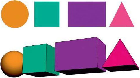
FIG 1.2 Here are examples of shapes and forms. Notice how it is shadow that turns a circle into a sphere.
Form is three-dimensional (height, width, and depth) and includes simple objects like spheres, cubes, and pyramids. See Figure 1.2 for examples and visual comparisons. You will see later that as a texture artist, you are creating art on flat shapes (essentially squares and rectangles) that are later placed on the surfaces of forms. An example is shown in Figure 1.3, where a cube is turned into a crate (a common prop in many computer games). When a shape is cut into a base material in Photoshop and some highlights and shadows are added, the illusion of form is created. A texture can be created rather quickly using this method. See Figure 1.4 for a very simple example of a space door created using an image of rust, some basic shapes, and some standard Photoshop Layer Effects.
Of course, mapping those textures to more complex shapes like weapons, vehicles, and characters gets more complex, and the textures themselves reflect this complexity. Paradoxically, as the speed, quality, and complexity of game technology increase, artists are actually producing more simplified textures in many cases. The complexity comes in the understanding and implementation of the technology. This book will gradually introduce this complexity so you won’t be overwhelmed by it.
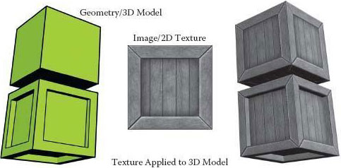
FIG 1.3 A game texture is basically a 2D image applied, or mapped, to a 3D shape to add visual detail. In this example, a cube is turned into a crate using texture. A more complex 3D shape makes a more interesting crate using the same 2D image.

FIG 1.4 Here is an example of how shapes can be cut into an image and with some simple layer effects can be turned into a texture in Photoshop.
As with shapes, you can practice looking for the forms that make up the objects around you. In Figure 1.5 you can see some examples of this concept.

FIG 1.5 Here are some examples of the forms that make up the objects around you.
Of all the topics in traditional art, light and shadow are arguably the most important due to their difficulty to master and importance to the final work. Light and shadow give depth to and—as a result—define what we see. At their simplest, light and shadow are easy to see and understand. Most of us are familiar with shadow—our own shadow cast by the sun, making animal silhouettes with our hands on a wall, or a single light source shining on a sphere and the round shadow that it casts. That’s where this book begins. Light and shadow quickly get more complicated, so the examples in this book will get more complex as well. The book starts by discussing the ability to see and analyze light and shadow in this chapter; moves up to creating and tweaking light and shadow in Photoshop using Layer Styles, for the most part; and finally looks at some basic hand tweaking of light and shadow. If you want to master the ability to hand-paint light and shadow on complex and organic surfaces, you are advised to take traditional art classes in illustration, sketching, and painting.
We all know that the absence of light is darkness, and in total darkness we can see nothing at all, but the presence of too much light will also make it difficult to see. Too much light blows away shadow, removes depth, and desaturates color. In the previous section, we looked at how shape and form differ. We see that difference primarily as light and shadow, as in the example of the circle and a sphere. But even if the sphere were lit evenly with no shadows and looked just like the circle, the difference would become apparent when the object was rotated. The sphere would always look round if rotated, whereas once you began to rotate the circle it would begin to look like an oval until it eventually disappeared when completely sideways. In Figure 1.4, in which a shape was cut into an image of rusted metal and made to look like a metal space door using Photoshop Layer Effects, the highlights and shadows were faked using the various tools and their settings. In Figure 1.6 you can see the same door texture rotated from front to side. Notice the complete lack of depth in the image on the far right. The illusion is shattered.

FIG 1.6 Here is the same door texture from the previous section. Notice the complete lack of depth as we look at it from angles other than straight on. The illusion of depth is shattered.
Understanding light and shadow is very important in the process of creating quality textures. We will go into more depth on this topic as we work through this book. One of the main reasons for dwelling on the topic is the importance of light and shadow visually, but in addition, you will see that many necessary decisions are based on whether light and shadow should be represented using texture, geometry, or technology. To make this decision intelligently in serious game production involves the input and expertise of many people. Although what looks best is ideally the first priority, what runs best on the target computer is usually what the decision boils down to. So keep in mind that in game development you don’t want to make any assumptions about light and shadow—instead, ask questions.
This book covers different scenarios of how light and shadow may be handled in a game. It can be challenging to make shadows look good in any one of the situations. Too little shadow and you lack depth; too much and the texture starts to look flat. Making shadows too long or intense is an easy mistake. Unless the game level specifically calls for that on some rare occasion, don’t do it. Technology sometimes handles the highlights and shadows. This feature is challenging because it is a new way of thinking that baffles many people who are unfamiliar with computer graphics. It can also be a bit overwhelming because you go from creating one texture for a surface to creating three or more textures that all work together on one surface. Naming and storing those textures can get confusing if you let the process get away from you.
Overall, you want your textures to be as versatile as possible, and to a great extent, that includes the ability to use those textures under various lighting conditions. See Figure 1.7 for an example of a texture in which the shadows and highlights have been improperly implemented and another one that has been correctly created. For this reason we will purposely use highlights and shadows to a minimal amount. You will find that if your texture needs more depth than a modest amount of highlight and/or shadow give you, you most likely need to create geometry or use a shader—or consider removing the source of the shadow! If there is no need for a large electrical box on a wall, for example, don’t paint it in if it draws attention to itself and looks flat. If there is a need for an object and you are creating deep and harsh shadows because of it, you might need to create the geometry for the protruding element.
You will find that as game development technology accelerates, things like pipes, doorknobs, and ledges will be easily created with the larger polygon budgets or by using the advanced shaders at our disposal. Many texture surface properties are no longer painted on. Reflections, specular highlights, bump mapping, and other aspects of highlight and shadow are now processed in real time.

FIG 1.7 The crate on the left has conflicting light sources. The shadow from the edge of the crate is coming up from the bottom, is too dark, is too long, and even has a gap in it. The highlights on the edges are in conflict with the shadow cast on the inner panel of the crate, and they are too hot, or bright. The crate on the right has a more subtle, low-contrast, and diffuse highlight-and-shadow scheme and will work better in more diverse situations.
The rest of this book takes various approaches to light and shadow using Photoshop’s Layer Effects to automate this process and other tools to handpaint highlights and shadows. One of the main benefits of creating your own highlights and shadows in your textures is that you can control them and make them more interesting, as well as consistent. Nothing is worse than a texture with shadows from conflicting light sources: harsh, short shadows on some elements of the texture and longer, more diffuse shadows on others. See Figure 1.8 for an example. The human eye can detect these types of errors even if the human seeing the image can’t quite understand why it looks wrong. One of the artist’s greatest abilities is not only being able to create art but also being able to consciously know and verbalize what he is seeing. In Figure 1.9, you can see the various types of shadows created as the light source changes. This is a simple demonstration. If you ever have the opportunity to light a 3D scene or movie set, you will discover that the range of variables for light and shadow can be quite large.
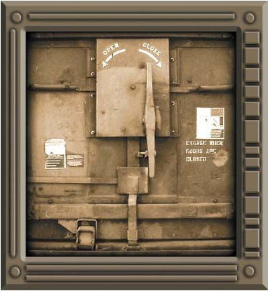
FIG 1.8 Here is a really bad texture created from two sources. Notice the difference in the shadows and highlights. The human eye can detect these errors, even if the human seeing it can’t understand why the image looks wrong.

FIG 1.9 With one light source and a simple object, you can see the range of shadows we can create. Each shadow tells us information about the object and the light source, such as location, intensity, and so on.
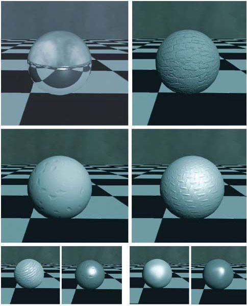
FIG 1.10 With one light source and a simple object with various highlights on it, you can see that the object appears to be created of various materials. Keep in mind that what you are seeing is only highlight and shadow. How much does only this aspect of an image tell you about the material?
Highlights also tell us a good bit about the light source as well as the object itself. In Figure 1.10, you can see another simple illustration of how different materials will have different highlight patterns and intensities. These materials lack any texture or color and simply show the highlights and shadows created on the surface by one consistent light source.
For a more advanced and in-depth discussion on the subject of light and shadow for 3D scenes, I recommend Essential CG Lighting Techniques with 3ds Max, by Darren Brooker (Focal, 2006).
In the bulk of this book, as in the game industry, we use the term texture to refer to a 2D static image. What we refer to as textures in this book are also sometimes called materials or even tile sets (from older games), but we will stick to the term texture. The one exception is that in this section we talk about the word texture as it is used in traditional art: painting, sculpture, and so on. A side note on vocabulary: Keep in mind that vocabulary is very important and can be a confusing aspect of working in the game industry. There is much room for miscommunication. Different words can often mean the same thing, and the same words can often mean many different things. Acronyms can be especially confusing: RAM, POV, MMO, and RPG all mean different things in different industries. POV means point of view in the game industry but personally owned vehicle in the government sector, and it also stands for persistence of vision. So to clarify, the term texture—usually meaning a 2D image applied to a polygon (the face of a 3D object)—in this section of this chapter refers to an aspect of an image and not the image itself. We draw this distinction for the following conversation on traditional art.
In traditional art, there are two types of texture: tactile and visual. Tactile texture is a term used when you are able to actually touch the physical texture of the art or object. Smooth and cold (marble, polished metal, glass) is as much a texture as coarse and rough. In art this term applies to sculptures and the like, but many paintings have thick and very pronounced brush or palette knife strokes. Vincent van Gogh was famous for this technique. Some painters even add materials such as sand to their paint to bring more physical or tactile texture to their work.
Visual texture is the illusion of what a surface’s texture might feel like if we could touch it. Visual texture is composed of fine highlights and shadows. As computer game texture artists, we deal solely with this aspect of texture. So, for example, an image on your monitor might look like rough stone, smooth metal, or even a beautiful woman … and if you try to kiss that beautiful woman, she is still just a monitor. Not that I ever tried that, mind you.
There are many ways to convey texture in a two-dimensional piece of art. In computer games we are combining 2D and 3D elements and must often decide which to use. With 2D we are almost always forced to use strictly 2D imagery for fine visual texture. And though the faster processors, larger quantities of RAM, and the latest crop of 3D graphic cards allow us to use larger and more detailed textures and more geometry, a great deal of visual texture is still static—noticeably so, to a trained artist. This limitation is starting to melt away as complex shader systems are coming into the mainstream of real-time games. The real-time processing of bump maps, specular highlights, and a long list of other, more complex effects add to our game worlds a depth of realism not even dreamed of in the recent past. This book will teach you both the current method of building texture sets and the increasingly common method of building material sets that use textures and shader effects together. I will discuss this more at length later in the book, but for now you can see some visual examples of these effects. In Figure 1.11 you can see how in the 2D strip the object rotates but the effects stay static on the surface, whereas on the 3D strip the object rotates and the effect moves realistically across the surface.

FIG 1.11 Visual texture is composed of fine highlights and shadows. A shader allows for the real-time processing of visual texture, among other effects, and adds much more realism to a scene as the surface reacts with the world around it. In this example I used a specular map. These effects are best seen in 3D, but you can see here that the windows in the building on the top row have a reflection of the sky in them and that reflection moves as the players do. The windows in the building on the lower row are painted textures and stay the same no matter where the player walks. The bottom two rows are close-ups to help you see the effect. If you pick one window in the close-up images and look closely, you will see that the cloud reflections are in different places in each frame.
The game artist’s job is often to consider what tools and techniques we have at our disposal and determine which one will best accomplish the job. We must often make a trade-off between what looks good and what runs well. As you begin to paint textures, you will find that some of the techniques of traditional art don’t work in the context of game texturing. As traditional artists, we usually do a painting that represents one static viewpoint, and we can paint into it strong light sources and a great deal of depth, but that amount of depth representation goes beyond tactile texture and becomes faked geometry and looks flat in a dynamic, real-time 3D world. As mentioned earlier in this chapter, this approach will not work in a 3D game in which a player can move about and examine the texture. Once again, we must choose what to represent using a static 2D image, what can be processed in real time using a shader, and what must be represented using actual geometry. There are many solutions for this problem; among them are restricting the players’ ability to move around the texture, removing the element of overt depth representation, or adding actual geometry for the parts of the texture represented by the overt depth representation (see Figure 1.12).

FIG 1.12 There are several possibilities in dealing with overt depth representation. Upper left: The pipes are painted into the texture and totally lack any depth; notice how they dead-end into the floor. Upper right: Restricting the players’ ability to move around the texture can alleviate some of the problem. Lower left: Adding actual geometry, if possible, for the parts of the texture that cause the overt depth is the best solution (this method uses less texture memory but more polygons). Finally, lower right: Adding the actual geometry into the recess is an option that looks pretty interesting and actually allows for a reduction of geometry. The removal of polygons from the backsides of the pipes more than offsets the added faces of the recess.
We all know what color is in an everyday fashion: “Get me those pliers. No, the ones with black handles.” “I said to paint the house green. I didn’t mean neon green!” That’s all fine for civilian discussions of color, but when you begin to speak with artists about color, you need to learn to speak of color intelligently, and that takes a little more education and some practice. You will also learn to choose and combine colors, too. In games, as in movies, interior design, and other visual disciplines, color is very important. Color tells us much about the world and situation we are in.
At one game company we developed a massive multiplayer game that started in a small town—saturated green grass, blue water, butterflies—you get the picture; this was a nice, safe place. As you moved away from town, the colors darkened and lost saturation. The grass went from a bright green to a less-saturated brownish-green. There were other visual clues to the change as well. Most people can look at grass and tell whether it is healthy, dying, kept up, or growing wild. Away from town, the grass was long and clumpy, dying, and growing over the path. But even before we changed any other aspect of the game—still using the same grass texture from town that was well trimmed—we simply lowered the saturation of the colors on the fly and you could feel the life drain from the world as you walked away from town. As you create textures, you will probably have some form of direction on color choice—or maybe not. You might need to know what colors to choose to convey what is presented in the design document and what colors will work well together.
This section lays out a simple introduction to the vocabulary of color, color mixing (on the computer), and color choices and their commonly accepted meanings. I decided to skip the complex science of color and stick to the practical and immediately useful aspects of color. Color can get very complex and esoteric, but you would benefit from taking your education further and learning how color works on a scientific basis. Although this chapter will be a strong starting point, you will eventually move on from working with only the colors contained in the texture that you are creating to determining how those colors interact with other elements in the world, such as lighting. To start with, however, a game texture artist needs the ability to communicate, create, and choose colors.
First, let’s discuss the way in which we discuss color. There are many color models, or ways of looking at and communicating color verbally. There are models that concern printing, physics, pigment, and light. They each have their own vocabulary, concepts, and tools for breaking out color. As digital artists, we use the models that describe light, because we are working with colored pixels that emit light. A little later we will take a closer look at those color systems from the standpoint of color mixing, but for now we will look at the vocabulary of color. In game development you will almost always use the red-green-blue (RGB) color model to mix color and the hue, saturation, and brightness (HSB) color model (both explained next) to discuss color. You will see that Photoshop allows for the numeric input and visual selection of color in various ways. When you discuss color choices and changes and then go to enact them, you are often translating between two or more models. Don’t worry; this is not difficult, and most people don’t even realize that they are doing it.

FIG 1.13 In this image you can see a representation of HSB.
First, we will look at the HSB model, since this is the most common way for digital artists to communicate concerning color. In Figure 1.13 you can see examples of these aspects of color. These three properties of color are the main aspects of color that we need to be concerned with when discussing color:
• Hue is the name of the color (red, yellow, green).
• Saturation (or chroma) is the strength or purity of the color.
• Brightness is the lightness or darkness of the color.
Hue
Most people use the word color when they really mean hue. Although there are many, many colors, there are far fewer hues. Variations of saturation and brightness create the nearly unlimited colors we see in the world. For example, scarlet, maroon, pink, and crimson are all colors, but the base hue is red.
Learning about color and its various properties is best done through visual examples. The most often used method is the color wheel, developed by Johannes Itten. We will look at the color wheel a little later. In Photoshop you will recognize the Color Picker, which offers various methods for choosing and controlling color, both numerically and visually. The Color Picker has various ways to choose color, but the most commonly used is RGB (Figure 1.14).

FIG 1.14 Here are Color Pickers from various applications.
Saturation
Saturation quite simply is the amount of white in a color. In Figure 1.15 you can see the saturation of a color being decreased as white is added. If you have access to a software package like Photoshop and open the Color Picker, you can slide the picker from the pure hue to a less saturated hue and watch the saturation numbers in the HSB slots go down as the color gets less saturated. Notice how the brightness doesn’t change unless you start dragging down and adding black to the color. Also, you might want to look down at the RGB numbers and notice how the red in RGB doesn’t change, but the green and blue do.

FIG 1.15 The saturation of the color red at 100%, decreasing to 0% by adding white.
Brightness

FIG 1.16 The brightness of the color red at 100%, decreasing to 0% by adding black.
Brightness is the amount of black in a color. In Figure 1.16 you can see the brightness of a color being decreased. As in the previous discussion of saturation, you can open the Color Picker in Photoshop and this time, instead of decreasing the saturation, you can decrease the brightness by dragging down. You can look at the HSB and the RGB slots and see the brightness numbers decreasing. Also notice that this time in the RGB slots the red numbers decrease, but the blue and green are already at zero and stay there.
Like most other aspects of color, brightness is affected by other factors. What colors are next to each other? What are the properties of the lights in the world? Another job of the texture artist is making sure that the textures in the world are consistent. That involves balancing the hue, saturation, and brightness of the color, in most cases. Figure 1.17 depicts an example of a texture that might have looked okay in Photoshop but that needed to be corrected to fit the scene. You can see that a great deal of contrast and intensity of color makes tiling the image a greater challenge.

FIG 1.17 Here is an example of a texture that might have looked okay in Photoshop but that needed to be corrected to fit in the scene correctly. This is a subtle example. Notice the patch of exposed stone in the concrete on the building that repeats?
Color Systems: Additive and Subtractive
There are two types of color systems: additive and subtractive. Subtractive color is the physical mixing of paints, or pigments, to create a color. It is called subtractive because light waves are absorbed (or subtracted from the spectrum) by the paint and only the reflected waves are seen. A red pigment, therefore, is reflecting only red light and absorbing all the others. In the subtractive system, you get black by mixing all the colors together—theoretically. It is a challenge to mix pigments that result in a true black or a vibrant color. That is one of the reasons art supply stores have so many choices when it comes to paint. One of our advantages of working in the additive system is that we can get consistent and vibrant results with light. We won’t dwell on the subtractive system since we won’t be using it.
In the additive system, light is added together (as it is on a computer screen) to create a color, so naturally we deal with the additive system as computer artists because we are working with light. In Figure 1.18 you can see how the additive system works. I simply went into 3ds Max and created three spotlights that were pure red, green, and blue and created my own additive color wheel, or a visual representation of how the colors interact. Black is the absence of light (the area outside the spotlights), and white is all light (the center area where all three lights overlap each other): The combination of red, green, and blue is the additive system. If you look at the Color Picker in Photoshop (Figure 1.19), you will see a vertical rectangle of color graduating from red through the colors and back to red. This allows you to select a hue and use the Color Picker Palette to change the value and intensity.

FIG 1.18 The additive system works by adding lights. Black is the absence of light (the area outside the spotlights), and white is all light (the center area where all three lights overlap each other): The combination of red, green, and blue is the additive system.

FIG 1.19 The Color Picker in Photoshop has a vertical rectangle of color graduating from red through the colors and back to red. This allows you to select a hue and use the Color Picker Palette to change the value and intensity.
Primary Colors
The three primary colors in the additive color system are red, green, and blue (RGB). They are referred to as primary colors because you can mix them and make all the other colors, but you can’t create the primary colors by mixing any other color. Many projection televisions use an additive system where you can see the red, green, and blue lens that project these three colors to create the image you see.
Secondary Colors
The secondary colors are yellow, magenta, and cyan. When you mix equal amounts of two primary colors together, you get a secondary color. You can see that these colors are located between the primary colors on the color wheel and on the Photoshop Color Picker vertical strip.
Color Emphasis
Color is often used for emphasis. Look at Figure 1.20. All things being equal, the larger shapes dominate, but the small shapes demand your attention once color is added. Of course, there are many other forms of emphasis that you can use in creating art, but color can be the most powerful—and overused. Ever come across a webpage that has a busy background and every font, color, and mode of emphasis devised by man splashed across it? There is almost no actual emphasis, since all the elements cancel each other out. Let this be a cautionary tale to you: Often, less is more.
In another example using a photograph, Figure 1.21, you can see that in the first black-and-white photo, your eye would most likely be drawn to the dark opening of the doghouse and you would most likely assume that the subject of this picture is the doghouse. In the second version, the colorful flower draws the primary interest; it still competes with the doghouse door for attention, but you would probably make the assumption that the focus of this picture was the flower.

FIG 1.20 All things being equal, the larger shapes dominate, but the small shapes demand your attention once color is added.

FIG 1.21 Your eye is most likely drawn to the open door in the black-and-white photo, but add color and the window above draws the primary interest.
In a game scene, you can see the use of color drawing the attention of a player to an important item. Look at Figure 1.22. In the first version of the scene, you are drawn to the fire and then to all the items in the shadows. In the second version, the red crate draws your attention and clearly means something. Depending on the world logic of the game you are playing, that could simply mean that you can interact with the object, or it could mean that the item is dangerous. That decision brings us to our next topic: color expression.

FIG 1.22 In a room full of normal objects, the players’ eyes will be drawn to the fire and then equally to the objects. In a room full of normal objects, a red crate draws attention, especially given the fact that there are other normal crates around it.
Color Expression or Warm and Cool Colors
When you start painting textures and choosing colors, you will want to know how they interact in terms of contrast, harmony, and even message. There is a lot of information on this topic, and once again, Johannes Itten (the guy who did the color wheel) enters the picture. Itten provided artists with a great deal of information on how color works and how colors work together. Itten was among the first people to look at color not just from a scientific point of view but from an artistic and emotional point of view. He was very interested in how colors made people feel. From his research we get the vocabulary of warm and cool colors.
We all are familiar with this convention, since it is mostly based on the natural world. When asked to draw a flame, we reach for the red or orange crayon. Ice is blue; the sun, yellow. Each warm and cool color has commonly associated feelings, both positive and negative. The brighter or more pure the color, the more positive the association. Darker and duller colors tend to have negative connotations associated with them.
The warm colors are red and yellow, and the cool colors are blue and green. Children will color the sun yellow and color ice blue and use the black crayon to scratch out things they don’t like. Traffic lights are hot when you should stop or be cautious (red and yellow) and cool when it is okay to go (green). Red and orange are hot and usually associated with fire, lava, and coals. How many red and black shirts do you see at the mall? Red and black together generally symbolize demonic obsession. Red by itself can mean royalty and strength as well as demonism. Deep red can be erotic. Yellow is a hot color like the sun—a light giver. Yellow is rich like gold as a pure color. A deep yellow (amber) window in the dark of a cold night can mean fire and warmth. But washed out or pale yellow can mean envy or betrayal. Calling a person yellow is an insult, meaning that he is a coward. Judas is portrayed as wearing yellow garments in many paintings. During the Inquisition, people who were considered guilty of heresy were made to wear yellow. For green, we think of lush jungles teeming with life. As green washes out, we get a sense of dread and decay (zombie and orc skin). Vibrant green in a certain context can be toxic waste and radioactive slime. Blue in its saturated state is cold like ice, but fresh like water and the sky. Darker blues indicate misery. Purple is mysterious and royal.
Keep in mind that color is context-sensitive. Water is generally blue (would you drink dark-green water?). But not just any blue will do. In the real world, if we come across water that is a saturated blue that we can’t see through, we get suspicious. Was this water dyed? Are there weird chemicals in there? If anything lives in that, what could it be?! Blood is generally red, but what if an enemy bled green? What if the game you are playing is about an alien race taking over earth and one of your companions bleeds green from an injury during combat? In a fantasy game, you might come across coins. Which coin do you take: the one made of bright yellowish metal or the one made of gray-green metal? With no previous information on the color of coins in this world, most people would pick the brighter yellow. Look at Figure 1.23. What are some of the assumptions you might make about these three scenes?

FIG 1.23 These three scenes are the same except for the ax. What questions and/or assumptions run through your mind looking at each version?
Looking at color in this way might make it seem a bit mechanical, but it still takes a talented artist to make the right color choices. You can memorize all the information in the world, but it usually comes down to having a good eye and being able to convey that vision in your work and to your coworkers.
We discussed earlier in this chapter that dramatic perspective (Figure 1.24) is usually not used in the creation of a game texture, although sometimes perspective is present and needs to be understood. In addition, understanding perspective is not only a valuable artistic tool to have available but will also help you when you are taking digital reference images and when you are cleaning and straightening those images. We will look at the artistic aspects of perspective now; later, in the chapter on cleaning and storing your assets, we will talk about fixing those images.
Quite simply, perspective is the illusion that something far away from us is smaller than closer objects. This effect can be naturally occurring, as in a photo, or a mechanically created illusion in a painting. You can see samples of this illusion in Figure 1.25. In 2D artwork, perspective is a technique used to recreate that illusion and give the artwork a 3D depth. Perspective uses overlapping objects, horizon lines, and vanishing points to create a feeling of depth. You can see in Figure 1.26 an image and the same image with the major lines of perspective as they converge on one point, called the vanishing point. Several types of perspective are used to achieve different effects.

FIG 1.24 Although dramatic perspective is used in traditional art, it is not used in a game texture. But there is some notion of perspective, so it is best to understand the concept.

FIG 1.25 Perspective is the illusion that something far away from us is smaller. Are the telephone poles actually getting smaller in this image? Are the train tracks really getting closer together?
One-Point Perspective
One-point perspective is when all the major lines of an image converge on one point. This effect is best illustrated when you’re looking down a set of straight railroad tracks or a long road. The lines of the road and track, although we know they are the same distance apart, seem to meet and join together at some point in the far distance—the vanishing point. In one-point perspective, all the lines move away from you (the z-axis) and converge at the vanishing point.
Vertical and horizontal or up and down and right and left lines (the x- and y-axes) remain straight, as seen in Figure 1.27.

FIG 1.26 In 2D artwork, perspective is a technique used to recreate that illusion and give the artwork a 3D depth.

FIG 1.27 In one-point perspective, all the lines that move away from the viewer seem to meet at a far point on the horizon. This point is called the vanishing point.

FIG 1.28 Two-point perspective has two vanishing points on the horizon line. All lines, except the vertical ones, will converge onto one of the two vanishing points.
Two-Point Perspective
One-point perspective works fine if you happen to be looking directly at the front of something or standing in the middle of some railroad tracks, but what if the scene is viewed from the side? Then you shift into two-point perspective. Two-point perspective has two vanishing points on the horizon line. All lines, except the vertical, will converge onto one of the two vanishing points. See Figure 1.28.
Three-Point Perspective
Three-point perspective is probably the most challenging of all. In three-point perspective every line will eventually converge on one of three points. Three-point perspective is the most dramatic and can often be seen in comic books when the hero is flying over buildings or kicking butt in the alley below as the buildings tower above. Figure 1.29 shows three-point perspective.
Perspective, from the texture artist’s point of view while photographing surfaces for game art, can be the enemy. We will look at that issue in a coming chapter when we talk about collecting and cleaning your images. From the art education point of view, knowing what perspective is and what it looks like is enough for now.

FIG 1.29 In three-point perspective, every line will eventually converge on one of three vanishing points.
Quick Studies of the World Around You
The following pages display some quick studies that I did of random objects. I tried to work through each of them as a game artist might to give you some quick and general examples of how a game artist might break them down. We will do this type of exercise in more depth throughout the book, but in the tutorial portions of the book, those breakouts will be more specific and focused on the goal at hand. This is a general look and introduction on the thought process of recreating surfaces and materials in a digital environment. I covered all that was introduced in this chapter: shape and form, light and shadow, texture, and color, as well as considering other aspects of the object or material. I didn’t touch on perspective in these exercises because I wanted to limit the exercise to recreating 2D surfaces (textures), and perspective is not as critical as the other concepts in this chapter. In the following pages, Figures 1.30 to 1.35 each have a caption that discusses the particulars of each study.
This chapter was an overview of the most basic yet critical aspects of traditional art. Understanding the concepts in this chapter and further exploring them on your own will make you a much better texture artist. We are now ready to get more technical and look at the mechanical issues of creating game textures.
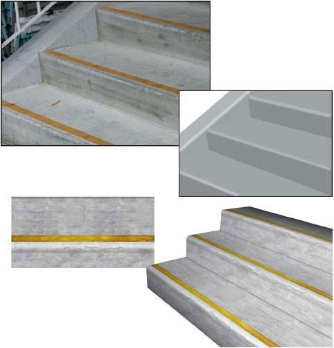
FIG 1.30 The upper-left image is a digital photo of some simple concrete stairs. You might have an art lead e-mail you an image like this and tell you that she wants a texture based on these stairs. Fortunately, this is a rather simple form; it doesn’t have a lot of color or detail to distract us. Look at the simple recreation of the stairs to the right showing the basic light and shadow patterns on the stairs. The lower-left image shows the 2D texture created in Photoshop to be applied to a 3D model of the stairs. If you look at the yellow stripe on the stairs and compare it to the stripe on the texture, you can see the highlights painted in the texture where the edge of the step is and the shadow under the lip of the edge. If you were able to closely examine the original digital image of the stairs, you would see an almost infinite amount of detail. Part of the texture artist’s job is to know when to draw the line. Here I didn’t include every scuff and mark from the original stair image because that approach wouldn’t work. You will learn in coming chapters that such details usually stand out and draw attention to the repeating pattern of a texture, or, in the case of fabrics and fine meshes, can create noise or static in the texture. I created this texture pretty quickly; given more time, I would experiment with the chips and wear on the edge of the steps to add more character.

FIG 1.31 This is a straight-on photo of an interior plaster wall. I included this obviously unexciting image to demonstrate that even in such a simple surface, there can be complex highlight and shadow going on. Look at the color swatches of the highlight, shadow, and midtone. Notice that the colors are not simple black, white, and gray. The highlight is not pure white or light gray, but a very pale green. Look at the close-up of the image. You can clearly see the consistent behavior of light as it highlights the upper ridges of the plaster and shadow falls from the lower edges. Once you start studying such seemingly commonplace things, like a wall that you walk by a hundred times a day, you will start to notice, understand, and remember how various lights, materials, and other factors affect a surface. Do you convey that simple raised pattern in the texture using geometry or a shader? Of course, that depends on many factors, and hopefully by the end of this book you will know what questions to ask to determine the answers to such questions.

FIG 1.32 This image simply shows the world that I need to wash my car. Seriously, look at the various parts of complex objects and you will see a variety of surface behaviors. Notice how the paint is highly reflective and mirrors the world around the car. The metal is not flat like a mirror, so notice the distortion of the reflected image. The windows, while reflecting the surrounding world as well, are translucent, so you can see what’s behind the window and on the other side of the car. The window also has a patina of dirt and spots on it. If you needed to recreate this object as realistically as possible, you would have to take all those aspects into consideration and determine the best way to achieve the effect. Look at the close-up of the rim. You can see that the highlights are not mirror-like in their accuracy but rather are a diffuse notion of highlight. This looks simple to paint, but wheels rotate and will instantly look bad if not painted properly. Using a real-time process for highlights eliminates this problem. Though the tires are flat black and reveal only a faint notion of highlight, depending on the detail level, you may be dealing with complex mapping and shader effects here, too. All of this seems obvious, but taking the time to examine the object you are recreating and to understand what you are seeing and how to verbalize it helps when turning the object into game art. If you were to make materials or textures for this vehicle, you would need to know many things about the technology and how the car will be used in the game. Can we have real-time environmental reflections? Can we fake them using a shader? Do we have to carefully paint in a vague notion of metallic highlights that work in all situations the car may be in? And the windows: Can we do a translucent/reflective surface with an alpha channel for dirt? If the car is used in a driving game in which the vehicle is the focus of the game and the player gets to interact up close and personal with the car, I am sure a lot of attention will be given to these questions. But if this car is a static prop sitting on a street that the player blazes past, then over-the-top effects may only be a waste of development time and computer resources.

FIG 1.33 This sewer intrigued me: a simple shape of a common item that many might overlook as not worthy of serious attention. Some may have the attitude that it is only a sewer grate, so make it and move on. But a shiny new sewer grate with clean edges would stand out in a grungy urban setting. Look at this sewer grate. It is made of iron and looks solid and heavy. It was probably laid down decades ago and has had thousands of cars drive over it, people walk over it, millions of gallons of rainwater pour through it. On the image at the upper left you can look at the iron and see how it is rusted, but it’s so well worn that the rust is polished off in most places. Dirt has built up in the cracks between the grate, the rim, and the concrete. Even little plants have managed to grow. Look at the close-up at the upper right and you can see just how beat-up this iron is and how discolored it has become. At the lower left, I desaturated and cleaned up a portion of the image to see just how the light and shadow are hitting it and to get a feel for the quality of the surface. In this image, you can more clearly see the roughness of the cement and the metal, and although the circular grate looks round from a distance, up close there are no straight edges and smooth curves. All this detail can’t be depicted 100% in a game texture, but knowing it’s there and understanding what you are seeing will allow you to convey a richer version of the grate as you learn to focus on those details that add realism and character. On the lower right is a texture I did, and you can see that I was able to quickly achieve a mottled and grungy look for the metal and the edges. There are a few places at the top where I started the process of eating away at the concrete and the metal a bit.

FIG 1.34 This image is similar to the sewer in approach. Here I wanted to point out how a simple shape can be turned into an ornate hinge with little effort. The top image is the original digital photo of the hinge. I drew the shape of the hinge in Photoshop. You may notice that I drew the screws separately. This is because you need the shapes separately to work with them in Photoshop—you will see why later in the book. In Photoshop I applied and adjusted the Layer Effects and then colored the hinge close to the overall color of the original. After that it was a matter of applying the right filters and doing some hand work to get the edges looking right. We will be doing this type of work throughout the book. I will remind you from time to time that although the best approach may be to use a photo source or any one of the other methods available, the focus of this book is to help you develop a set of Photoshop skills that will allow you to not depend on any one method. These skills will improve your abilities when you’re working in any of the other methods.

FIG 1.35 This light switch is a common object that you might need to create. Instead of taking the time to clean up and manipulate a photo, you can just make one more quickly from scratch. The switch is composed of simple shapes with the Layer Effects applied. The wall behind the switch was a quick series of filters to add a base for this exercise.
1. Examine and sketch your own series of basic shapes from world objects. Start with a ball, a cereal box, and other simple objects and work up to more complex items (what basic shapes is a car made from?). Pick three different objects and sketch each using only basic shapes. Compare the accuracy of your drawing by holding it at arm’s length next to the object in the background. If you are having trouble with this exercise, it may help to use a picture so that you can work side by side and compare the two images—yours and the original.
2. Train your eye to see light and shadow. Start with a flashlight or one light source in a dark room and shine it at an object on a bare tabletop. The shadow should be pretty easy to identify. Move the light back and at different angles and watch the shadow move. Now turn on another light source. Is it brighter than the light you are holding? Is it a different color? See how the dual shadows interact with each other. What happens to the shadow when the object is moved instead of the light? Also study how light and shadow affect color. Notice the various shades of color across a surface that may at first seem to be one solid color. Better yet, take an image into Photoshop and sample the various parts of the surface from darkest to lightest and take note of the range of shades the surface holds.
3. Focus on visual texture. Pick any object and look at it closely. A common mistake new artists make is to create a base texture and stop. A perfectly colored, shiny, and cleaner-than-clean plastic-looking object is going to look fake. In real life, even a new object has some texture—if not an actual texture, like a leather grain, then a notion of the imperfection of the real world. Sometimes a subtle noise or cloud overlay is enough to create the almost indistinguishable texture that creates a more believable surface. Any object in the real world will have scratches from wear and tear, and other signs of use will develop pretty quickly. Study the texture of common objects and see what has created this object’s texture. Is a wooden porch step smooth from use or rough due to weather and decay?
4. Look closely at what color you are “really” seeing. As noted in this chapter, we mentally fill in a lot of blanks when it comes to trying to determine what we are seeing. Color is no exception. Look at images from the Internet, or better yet, take digital images with your own camera and load them into Photoshop or a similar image program. Sample the colors of various spots and see that almost no color is going to be pure, perfectly even, or at all where you might think it would be on the color selector. A red mug is not going to be a pure red mug; it will most likely be a shade darker or lighter or contain other colors.
5. Color expression: Can you make a puppy look evil? Try painting its eyes red. Take an image of a garden and desaturate it. What other images can you take and simply change the colors (all of them across the image or only one color) and create various moods and messages? A house with rich amber windows at night might seem inviting. How does a window with a red tint or a green cast make you feel? Try combining colors, too. An amber window with a predominantly black surrounding may feel like a lonely sight in the void, as opposed to the fanciful and richer blue surrounding.
6. Do your own quick studies of the world. Take pictures or just examine a surface or object and determine every bit of information you can based on what you learned in this chapter. Define the basic shape, note how light and shadow play on the object and how the object affects the light and shadow of the world around it, and sample and determine the colors of the object and the amount of variation of the color along the surface of the object. How would you begin to create the surface of this object in Photoshop? Don’t try yet, but think about it. Later you will learn the tools necessary to create surfaces, but for now you need to be able to dissect a surface and determine what colors, shapes, and other qualities the surface contains.