
16. Creating Titles
Lesson overview
In this lesson, you’ll learn about the following:
• Using the Titler window
• Working with video typography
• Creating titles
• Stylizing text
• Working with shapes and logos
• Making text roll and crawl
• Working with templates
This lesson will take approximately 90 minutes.
You can use the Tilter in Adobe Premiere Pro CC to create text and shapes. These objects can then be placed above video or used as stand-alone clips to convey information to an audience. You can create both static and dynamic titles.
Getting started
While you will rely upon audio and video sources as the primary ingredients for building a sequence, you will often need to incorporate text into your project. Text is very effective when you need to convey information quickly to your audience. For example, you can identify a speaker in your video by superimposing her name and title during the interview (often called a lower-third or simply an ID). You may also use text to identify sections of a longer video (often called bumpers) or to acknowledge the cast and crew (with credits).
The proper use of text allows you to succinctly deliver information. It is clearer than the use of a narrator and allows for information to be presented in the middle of dialogue segments. Additionally, text can be used as a reinforcement of key information to the end viewer.
With Adobe Premiere Pro CC, you will find a versatile Titler tool. It offers you a range of text- and shape-creation tools that you can use to design effective titles. You can use the fonts loaded on your computer (and those included with your Creative Cloud membership). You can also control opacity and color. You can insert graphic elements or logos that were created using other Adobe applications, such as Adobe Photoshop or Adobe Illustrator. The Titler is an engaging and powerful tool. Its customizability makes it possible for you to create compelling titles to use in your productions.
An overview of the Titler window
In this lesson, let’s start with some preformatted text and modify its parameters. This approach is a good way to get a quick overview of the powerful features of the Adobe Premiere Pro Titler. Later in this lesson, you’ll build titles from scratch.
1. Start Adobe Premiere Pro, and open the project Lesson 16.prproj.
The sequence 01 Seattle should already be open.
2. Double-click Title Start in the Project panel.
The Titler window opens, with a title already loaded over a video frame. The textbox should be selected by default; if not, click once to choose it.
![]() Note
Note
You may have to expand the window to see all the Title Properties options.
Here’s a quick rundown of the Titler’s panels:
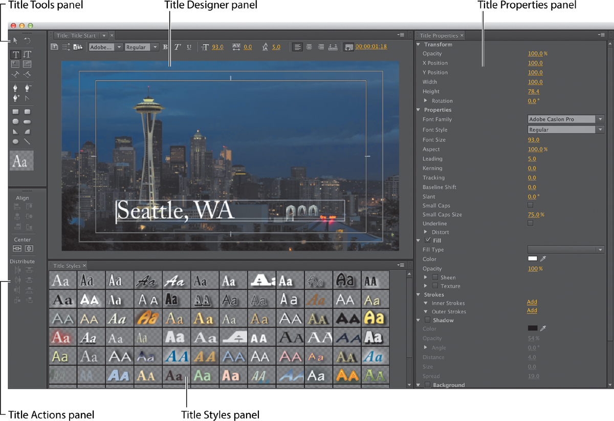
• Title Tools panel: These tools define text boundaries, set text paths, and select geometric shapes.
• Title Designer panel: This is where you build and view text and graphics.
• Title Properties panel: Here you’ll find text and graphic options such as font characteristics and effects.
• Title Actions panel: You’ll use these to align, center, or distribute text and groups of objects.
• Title Styles panel: Here you’ll find preset text styles. You can choose from several libraries of styles.
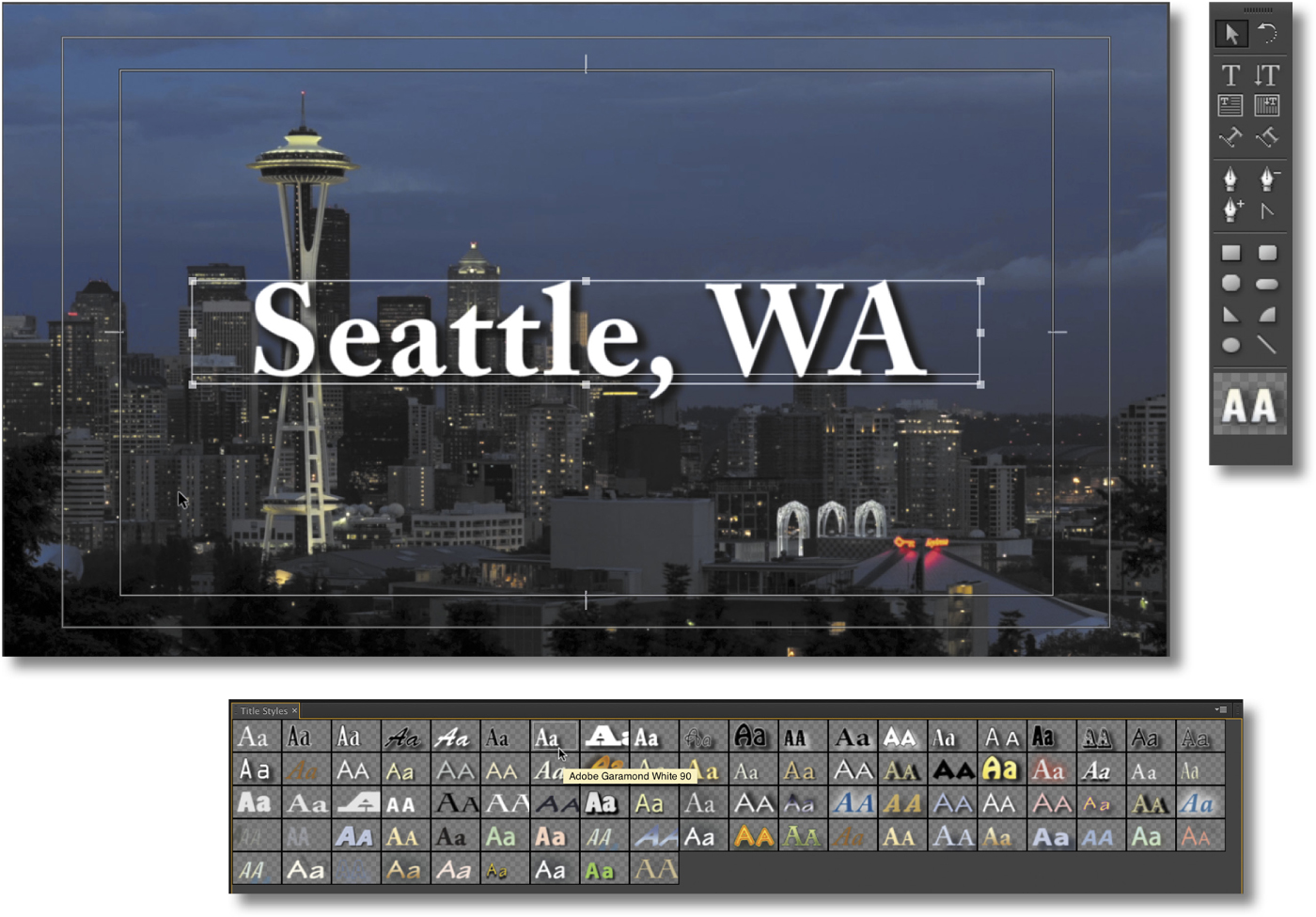
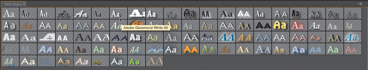
3. Click several different thumbnails in the Title Styles panel to acquaint yourself with the styles available.
Each time you click a new style, Adobe Premiere Pro instantly changes the active or selected text to that style. Some of the styles may use settings that cause the text to be hidden; we’ll adjust these settings shortly. When you’re finished checking out some of the styles, choose the style Adobe Garamond White 90 (shown here). This style works with the mood of the scene in the video.
4. Click the Font Browser menu in the Titler. Note that the current font is Adobe Garamond Pro.
5. Scroll through the fonts, and note that as you select a new font, you see immediately how it will work with your text.
The specific fonts loaded on each system will vary. Choose one that looks close to those used in this lesson.
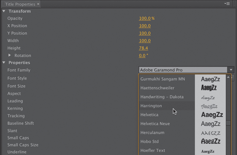
6. Click the Font Family menu in the Title Properties panel on the right of the Titler. This is another way to change fonts in the Titler. Experiment with changing the font through this panel. You can also experiment with the Font Style menu.
![]() Note
Note
With all the clicking and testing, you might have deselected the text. If there is no bounding box with handles around the text, select the text by clicking the Selection tool (in the upper-left corner of the Titler) and clicking anywhere in the text.
7. After you’re done experimenting, choose Adobe Caslon Pro (or a similar-looking font) from the Font Family menu. Choose Bold from the Font Style menu to make the text easier to read.
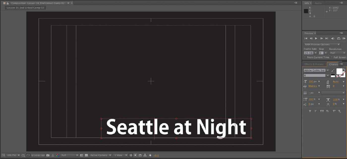
8. Change the font size to 140 by typing the new value into the Font Size field or by dragging the Size number until it reaches 140. The text may become hidden; if so, resize the textbox by dragging the top handle of the bounding box with the Selection Tool.

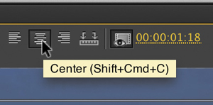
9. In the Title Designer panel, click the Center button to center the text.
10. Change Tracking to 3.0. Tracking changes the amount of space between all of the characters in the text block.
Let’s make the drop shadow more pronounced and easier to read.
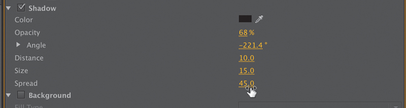
11. In the Title Properties panel, change Shadow Distance to 10, Shadow Size to 15, and Shadow Spread to 45. You can enter numbers into each field or drag the numbers to scrub their values.
12. In the Title Actions panel, click the Horizontal Center and Vertical Center buttons to align the text to the absolute center of the screen.
![]() Note
Note
Adobe Premiere Pro automatically saves your updated title in the project file. It does not show up as a separate file on your hard drive.
Your screen should look like the one shown here.

13. Drag the Titler floating window to the right—far enough to be able to see the Project panel.
14. In the Project panel, double-click Title Finished to load it in the Titler.
15. Toggle between the two titles by using the drop-down menu in the Titler main panel.
Your text should look similar to the Title Finished text.
16. Close the Titler by clicking either the little x in the upper-right corner (Windows) or the Close button (Mac OS).
![]() Note
Note
You can apply transitions to titles to fade them up or move them on or off the screen.
17. Drag Title Start from the Project panel to the Video 2 track on the Timeline, trim it so it fits above the video clip, and drag the playhead through it to see how it looks over that video clip.
Video typography essentials
When you design text for video, it is essential that you follow acceptable typography conventions. Because the text is often being composited over a moving background with multiple colors, you must attempt to achieve clarity in design. You must find a proper balance of legibility and style, all the while fitting enough information on the screen but not crowding it. Otherwise, the text will quickly become difficult to read and frustrating for the viewer.
![]() Tip
Tip
If you’d like to learn more about typography, consider the book Stop Stealing Sheep & Find Out How Type Works (Adobe Press, 2002), by Erik Spiekermann and E. M. Ginger.
Font choice
Your computer likely has hundreds (if not thousands) of fonts. This makes choosing a good font much more difficult. To simplify the selection process, try using a triage mentality and consider a few guiding questions:
• Readability: Is the font easy to read at the point size you’re using? Are all the characters in the line of text readable? If you look at it quickly and then close your eyes, what do you remember about the text block?
• Style: Using adjectives only, how would you describe the font you’ve chosen? Does the font convey the right emotion for your video? Type is like a wardrobe; picking the right font is essential to the success of the design.
• Flexibility: Does the font mix well with others? Does it come in various weights (such as bold, italic, and semibold) that make it easier to convey significance when using that font? Can you create a hierarchy of information that conveys different kinds of information, such as a name and title for a speaker’s lower-third graphic?
The answers to these guiding principles should help steer you toward better-designed titles. You may need to experiment to find the best font. Fortunately, you can easily modify an existing title or duplicate it and change the copy.
Color choice
Although you have a nearly infinite number of possible color combinations, choosing the right colors to use in a design can be surprisingly tricky. This is because only a few colors work well for text and remain clear to the viewer. This task becomes even more difficult if your video is for broadcast or if your design must stylistically match the branding for a series or product. The text must also work once it’s placed over a busy moving background (this issue is typically called type on pattern).

The white text in the image on the left has the most readability over the dark background. The blue text in the image on the right is more difficult to read because it is similar in color and tone to the sky.
While you may think you’re being conservative, the most common color for text in video is white. Not surprisingly, the second most popular color is black. When colors are used, they tend to be very light or very dark shades. Lighter colors that work well include light yellow, light blue, gray, and tan. Darker colors that can work include navy and forest green. The color you choose must provide suitable contrast from the background that the text is being placed over.
![]() Note
Note
When creating text for use in a video, you will often find yourself placing it over a background that has many colors present. This will make it difficult to achieve proper contrast (which is essential to preserving legibility). To help in this case, you may need to add a stroke, outer glow, or drop shadow to get a contrasting edge.
Kerning
As you build titles, you may decide that you want to modify the space between individual pairs of letters. This is typically done to improve the appearance of text and is a process called kerning. Taking the time to manually adjust text becomes more important the larger the font gets (because it makes improper kerning that much more visible). The goal is to improve the appearance and readability of your text, while creating optical flow.
![]() Tip
Tip
A common place to start kerning is to adjust between an initial capital letter and the succeeding lowercase letters, particularly in the case of a letter with very little “base” such as T, which creates the illusion of excessive space along the baseline.

The original kerning is a bit loose in spots (left). After you adjust it by hand, the overall readability improves (right). Kerning is best learned by studying professionally designed materials like posters and magazines.
In Adobe Premiere Pro (and other Adobe applications), kerning is easy to adjust.
1. Click to place your cursor, or move it using the arrow keys.
2. When the blinking I-bar is between the two letters you want to kern, hold down the Alt (Windows) or Option (Mac OS) key.
3. Press the Left Arrow key to pull the letters closer or the Right Arrow key to push them farther apart.
4. Move to the next letter pair and adjust as needed.

Tracking
Another text property is tracking (which is similar to kerning). This is the overall space between all letters in a line of text. Tracking can be used to globally condense or expand a line of text so it better fits onscreen. It is often employed in the following scenarios:
• Tighter tracking: If a line of text is too long (such as a lengthy title for a speaker’s lower-third), you may tighten it slightly to fit. This will keep the vertical height the same but fit more text into the available space.
• Looser tracking: A looser track can be useful when using all uppercase letters or if you need to apply an outside stroke to the text. It is used often for large titles or when text is used as a design or motion graphics element.
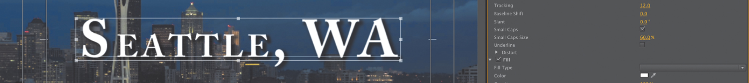
Tracking is combined with the use of the Small Caps option to create a stylized title that is still easy to read.
Tracking is typically done in the Title Properties panel in Adobe Premiere Pro (or the Character panel in other Adobe applications). Tracking, like kerning, is subjective, and you can learn best how to do it by studying professional examples and looking for inspiration and guidance.

Leading
Just as there is a need to control the space between characters horizontally, you’ll also want to control the vertical space between lines of text. This process is called leading, and it is pronounced ledd-ing (as in the metal) not leed-ing (as in sheep). The name is derived from the time when strips of lead were used on a printing press to create space between lines of text.

The original leading causes the two lines of text to become difficult to read (left). Changing the leading value from 5 to 24 in the Title Properties panel increases the space between lines and improves readability (right).
In most cases, you should use the default setting of Auto for leading your text. However, you can change leading as needed to fit text into a design template or to get more information on the screen at once. To fit more text on the screen, you’ll tighten the leading to produce less space between lines of text (you can also loosen it to spread text apart).
Don’t set the leading too tight; otherwise, descenders from the top line (like the downward lines on j, p, q, and z) will cross ascenders from the lower line (like the upward lines on b, d, k, and l). This collision will likely have a negative impact on the readability of your text.
Alignment
While you may be used to seeing text left-justified for things like a newspaper, there are no hard-and-fast rules for aligning video text. In a general sense, the text used for a lower-third title tends to be left- or right-justified.

On the other hand, you will often center text used in a title sequence or segment bumper. In the Titler (or the Paragraph panel, for other Adobe applications), you’ll find buttons for aligning your text. These can be used to align text left, right, or centered.
![]() Note
Note
When setting text in an Adobe application, you often don’t just want to click and type (called point text). Instead, you can drag using the Type tool to define the paragraph area first. This is called paragraph text and offers greater control over alignment and layout.
Safe title margin
When you’re designing in the Titler, you’ll see a series of two nested boxes. The first box shows you 90 percent of the viewable area, which is considered the action-safe margin. Things that fall outside of this box may get cut off when the video signal is viewed on a television set. Be sure to place all critical elements that are meant to be seen (like a logo) in this region.
![]() Note
Note
You can turn off the title-safe margins or action-safe margins by opening the Titler panel menu (or choosing Title > View) and then choosing Safe Title Margin or Safe Action Margin, respectively.
The second box, which is 80 percent of the viewable area, is called the title-safe zone. Just as this book you’re reading has margins to keep the text from getting too close to the edge, it’s a good idea to keep text inside the innermost, or title-safe, zone. This will make it easier for your audience to read the information.

The text on the left is too close to the edge (and outside the title-safe margin). The image on the right shows the text properly repositioned within the title-safe margin, which improves readability for video text.
Creating titles
When you create a title, you will need to make some choices about how the text is organized on the screen. The Titler panel offers three approaches to creating text, each offering both horizontal and vertical text-direction options:

• Point text: This approach builds a text bounding box as you type. The text runs on one line until you press Enter (Windows) or Return (Mac OS) or until you choose Title > Word Wrap. Changing the shape and size of the box changes the shape and size of the text.
• Paragraph (area) text: You set the size and shape of the textbox before entering text. Changing the box size later displays more or less text but does not change the shape or size of the text.
• Text on a path: You build a path for the text to follow by clicking points in the text screen to create curves and then adjusting the shape and direction of those curves using the handles.
In the Title Tools panel, you can select a tool from the left or right side. This will determine whether the text will orient horizontally or vertically.
Adding point text
Now that you have a basic understanding of how to modify and design a title, you can build one from scratch. Let’s work with a new sequence. You’ll be creating a title that will be used to promote a tourist destination.
1. If the Title panel is open, close it and then open the sequence 02 Cliff from the Project panel.
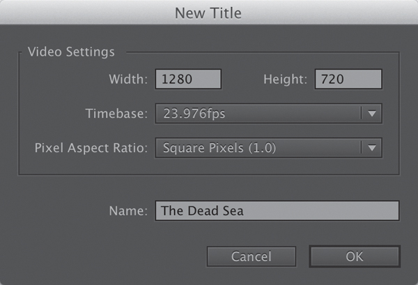
2. To open the New Title dialog, choose File > New > Title, or press Control+T (Windows) or Command+T (Mac OS).
3. Type The Dead Sea in the Name box, and click OK.
4. If you’d like, drag the timecode (directly to the right of the Show Background Video button) to change the video frame displayed on the text screen.
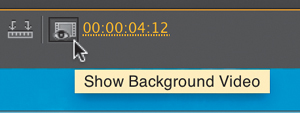
5. Click the Show Background Video button to hide the video clip.
The background now shows a grayscale checkerboard, which signifies transparency. This means that when the title is placed above a video track in your Timeline, the transparent areas will let the video show through. If you reduce the opacity of the text, you will see some of the background show through.
![]() Tip
Tip
Dragging the timecode with the text screen displayed is a useful way to position text relative to the video contents. You can also use it to evaluate how the text looks over your video and make adjustments to improve readability. The video frame displayed behind the title is not saved with the title. It is there only as a reference for positioning and styling your title.
Remember that an opacity of 100 percent means 0 percent transparency (and an opacity of 30 percent means 70 percent transparency).
6. Click the Myriad Pro White 25 style (shown here).
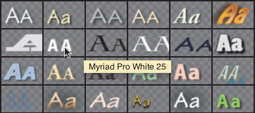
Let your cursor hover above a style for a few seconds to see its name.
7. Click the Type tool (shortcut T), and click anywhere in the Titler panel.
The Type tool creates point text.
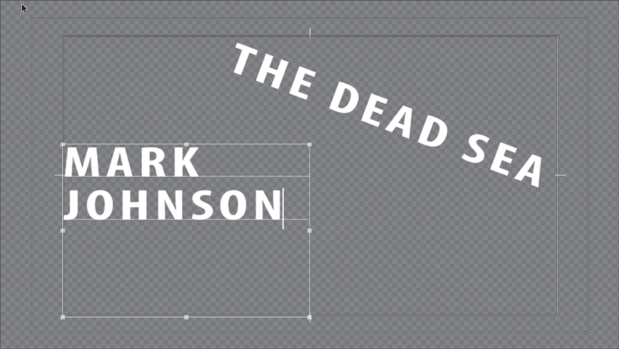
8. Type THE DEAD SEA to match the figure here.
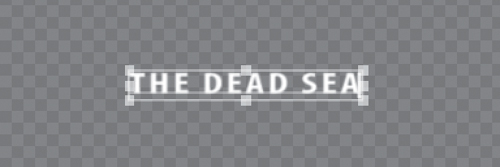
9. Click the Selection tool (the arrow in the upper-left corner of the Title Tools panel). Handles appear on the text bounding box.
![]() Note
Note
If you were to continue typing a long title, you’d notice that point text does not wrap automatically. This will cause your text to run off the screen to the right. To make text wrap automatically when it reaches the title-safe margin, choose Title > Word Wrap. If you want to force a new line to start, press Enter (Windows) or Return (Mac OS).
You won’t be able to use a keyboard shortcut, because you are typing into a text bounding box.
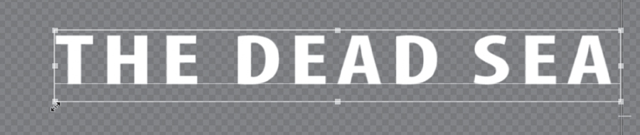
10. Drag the corners and edges of the text bounding box, and note that the text changes size and shape accordingly. Hold down the Shift key to constrain the text so it scales uniformly.
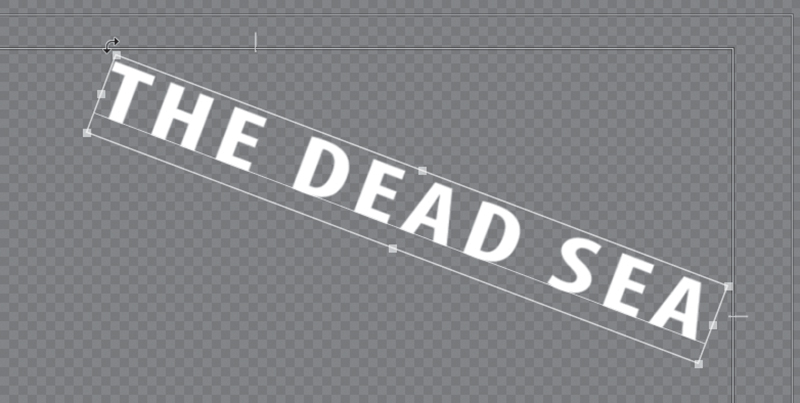
11. Hover the pointer just outside a corner of the text bounding box until a curved line pointer appears. Then drag to rotate the bounding box off its horizontal orientation.
![]() Tip
Tip
Instead of dragging bounding box handles, you can change values in the Transform settings in the Title Properties panel. Either type new values or position your pointer on a value and drag left or right. Your changes show up immediately in the bounding box (as long as it is selected).
12. Make sure the Selection tool is still active, click anywhere in the bounding box, and drag the angled text and its bounding box somewhere else on the Titler panel.
Try to approximately match this look. Adjust the size, rotation, and position of the text using the techniques you’ve learned so far.
Adding paragraph text
While point text is very flexible, you can take better control over layout with paragraph text. This option will automatically wrap the text as it reaches the edge of the paragraph textbox.
Continue working with the same title you have open from the previous exercise.
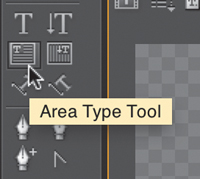
1. Click the Area Type tool in the Title Tools panel.
2. Drag into the Titler panel a text bounding box that fills the lower-left corner of the title-safe area.
The Area Type tool creates paragraph text.
3. Start typing. Start entering names of participants who will be attending the tour. You can use the names here or add your own.
This time, type enough characters to go beyond the end of the bounding box. Reduce the font size if needed so you can see a few lines of text at once. Unlike point text, area text remains within the confines of the bounding box you defined. It wraps at the bounding box borders.
The text in this screen is too large to fit on one line, so it automatically wraps to the next. By reducing the font size in the Title Properties panel, you can fit more text on one line.
4. Press Enter (Windows) or Return (Mac OS) to go down a line.
5. Select all the text, and adjust the Font Size setting to 60.
6. Click the Selection tool, and change the size and shape of the bounding box.
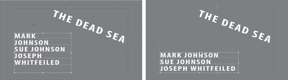
The original text is too large to fit on one line (left). Resizing the text bounding box allows more text to fit on one line (right).
The text does not change size. Instead, it adjusts its position on the bounding box baselines. If you make the box too small to fit all your text, the extra text scrolls below the bottom edge of the bounding box. In that case, a small plus (+) sign appears near the lower-right corner outside the bounding box.
7. Close the current title you have open.
Because Adobe Premiere Pro automatically saves text to the project file, you can switch to a new or different title and not lose whatever you’ve created in the current title.
![]() Tip
Tip
A good way to avoid spelling mistakes is to copy and paste text from an approved script or email that has been reviewed by your client or producer.
Stylizing text
Earlier you experimented with title styles, which quickly apply formatting to a selected text block. While title styles are fast and easy, they’re only the beginning. You can use the Title Properties panel to take precise control over the appearance of your text.
Changing a title’s appearance
In the Title Properties panel, you will find several options for modifying the appearance of your text. When you use them correctly (and with restraint), they can improve the readability of your type and its overall appearance or style. However, it’s possible to overdo it and add too many effects, which will produce amateurish results and affect readability.
![]() Tip
Tip
Instead of using the Color Picker to change the Color Stop color, you can use the Eyedropper tool (located next to the color swatch) to select a color from your video. Click the Show Video button at the top of the Titler panel, move to a frame you want to use by scrubbing the timecode numbers left or right, move the Eyedropper tool into your video scene, and click a color that suits your needs.
Here are some of the most useful tools for modern typographic design. You’ll find them in the Typographic Properties panel.
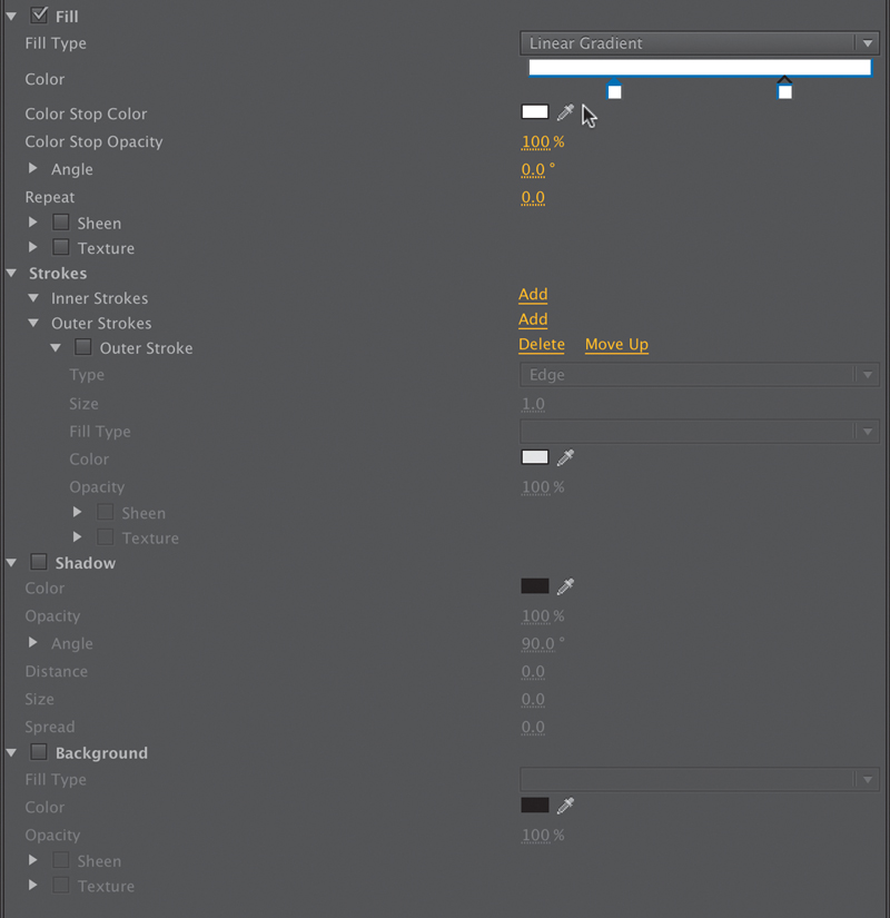
• Fill Type: You have several choices of fill type. The most popular ones are Solid and Linear Gradient, but you will also find additional gradient, bevel, and ghosting options.
• Color: Set the color for your text. You can click the swatch or enter numerical values in the Color Picker, or you can use the Eyedropper tool to sample from your video clip.
• Sheen: A gentle highlight can add depth to your title. Be sure to adjust the size and opacity so the effect is subtle.
![]() Note
Note
If you see an exclamation point next to the color you’ve chosen, Adobe Premiere Pro is warning you that a color is not broadcast-safe. This means it can cause problems when the video signal is put into a broadcast environment (and can be problematic when burned to a DVD or Blu-ray disc as well). Be sure to click the exclamation point to choose the closest color that is still broadcast-safe.
• Stroke: You can click to add inner and outer strokes. Strokes can be solid or gradient and add a thin edge to the outside of the text. Adjust the opacity of a gradient to create a gentle glow or soft edge. A stroke is commonly used to help keep text legible over a video or complex background.
• Shadow: The use of a drop shadow is a common addition to video text because it makes the text easier to read. Be sure to adjust the softness of the shadow. Also, be sure to keep the angle of shadows identical for all titles in a project for design consistency.
1. In the Project panel, double-click the title The Dead Sea.
2. Click the Show Background Video button to see the title over the video source.
3. Modify the The Dead Sea text block using the properties described in this section.

4. Continue designing until you have a look that is visually pleasing to you.
Saving custom styles
If you create a look you like, you can save time by storing it as a style. A style describes the color and font characteristics for a block of type. You can easily reuse a style to reformat the appearance of text with one click. All of the properties of the text update to match the preset.
Let’s create a style from the text you modified in the previous section.
1. Select a text block or object that has the properties applied that you want to save.
Use the text you formatted in the previous exercise.
2. In the Title Styles panel menu, click the submenu and choose New Style.
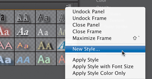
3. Enter a descriptive name, and click OK. The style is added to the Title Styles panel.
4. To view styles more easily, you can click the Title Styles submenu and choose to view the presets as Text Only, Small Thumbnails, or Large Thumbnails.
5. To manage a style, right-click its thumbnail. You can choose to duplicate a style to modify a copy, rename a style so it’s easier to find, or delete a style if you want to remove it.
6. Close the title to store its changes.
Creating an Adobe Photoshop graphic or title
1. In Adobe Premiere Pro, select the Project panel, and choose File > New > Photoshop File.
2. Examine the New Photoshop File window. The video settings should be correctly set for your project.
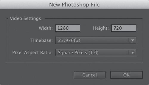
3. Click OK.
4. Choose a location to store your PSD file, name it, and click Save.
5. Adobe Photoshop opens, allowing you to edit the title.
The new Adobe Photoshop document you created will automatically match the current Adobe Premiere Pro Timeline in use (or the preset you chose). Now that you have a Photoshop document open, let’s take a quick look at some of the functionality in Adobe Photoshop.
6. Select the Text tool by pressing T.
7. Draw a text block and, by dragging, draw from the left edge of the title-safe area to the right edge. This creates a paragraph textbox to hold the text. As in Adobe Premiere Pro, the use of a paragraph textbox in Adobe Photoshop allows you to precisely control the layout of text.
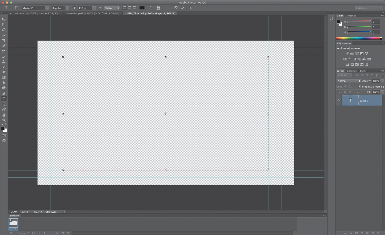
8. Enter the text you’d like to use.
9. Adjust the font, color, and point size to taste using the controls in the Options bar across the top of the screen.
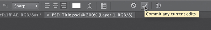
10. Click the check mark in the Options bar to commit the text layer.
11. Add a drop shadow by choosing Layer > Layer Style > Drop Shadow. Adjust to taste.
When you’re finished in Adobe Photoshop, you can close and save the title. It will be automatically updated in the Adobe Premiere Pro project. If you’d like to return to Adobe Photoshop, just select a title in the Project panel or Timeline and choose Edit > Edit in Adobe Photoshop.
Working with shapes and logos
When building titles for your program, you’ll likely need more than just words to build a complete graphic. Fortunately, Adobe Premiere Pro also offers the ability to generate vector shapes that can be filled and stylized to create graphic elements. You can also import completed graphics (like a logo) to enhance your Adobe Premiere Pro title.
Creating shapes
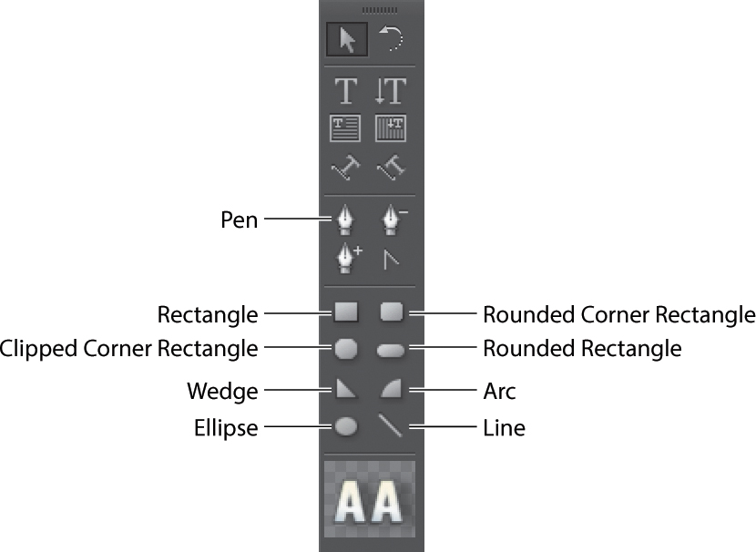
If you’ve created shapes in graphics-editing software such as Adobe Photoshop or Adobe Illustrator, you’ll find creating geometric objects in Adobe Premiere Pro quite similar. Simply select from the various shapes in the Title Tools panel, drag and draw the outline, and release the mouse button.
Follow these steps to draw shapes in Adobe Premiere Pro. This exercise is just for practice.
1. Press Control+T (Windows) or Command+T (Mac OS) to open a new title.
2. Type Shapes Practice in the Name box in the New Title dialog, and click OK.
3. Click the Show Background Video button to hide the video preview.
4. Select the Rectangle tool (R), and drag in the Titler panel to create a rectangle.
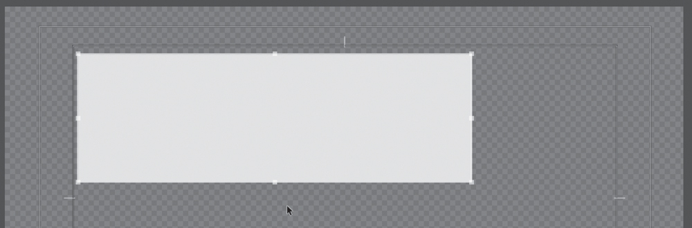
5. Click different title styles while the rectangle is still selected.
You’ll notice that title styles affect shapes as well as text. Experiment with different styles or create your own.
6. Shift-drag in another location to create a square.
7. Select the Rounded Corner Rectangle tool, and Alt-drag (Windows) or Option-drag (Mac OS) to draw from the center of the shape.
The center remains in the spot where you first clicked, and the figure changes shape and size around that point as you drag.
8. Select the Clipped Corner Rectangle tool, and Shift-Alt-drag (Windows) or Shift-Option-drag (Mac OS) to constrain the aspect ratio and draw from the center.
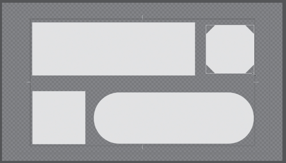
You’ll also find additional tools for creating lines and free-form paths.
9. Press Control+A (Windows) or Command+A (Mac OS) and then press Delete to make another clean slate.
10. Select the Line tool (L), and drag to create a single line.
11. Select the Pen tool, and click in a blank area of the title canvas to create an anchor point (don’t drag to create handles).
12. Click the Titler panel again where you want the segment to end (or Shift-click to constrain the segment’s angle to a multiple of 45 degrees). This creates another anchor point.
13. Continue clicking with the Pen tool to create additional straight segments. The last anchor point you add appears as a large square, indicating that it is selected.
14. Complete the path by doing one of the following:
• To close the path, move the Pen tool to the initial anchor point. When it is directly over the initial anchor point, a little circle appears underneath the Pen pointer. Click to make the connection.
• To leave the path open, Control-click (Windows) or Command-click (Mac OS) anywhere away from all objects, or select a different tool in the Title Tools panel.
15. Experiment with the different shape options. Try overlapping them and using different styles. The possibilities are endless.
16. Close the current title.
Adding a graphic
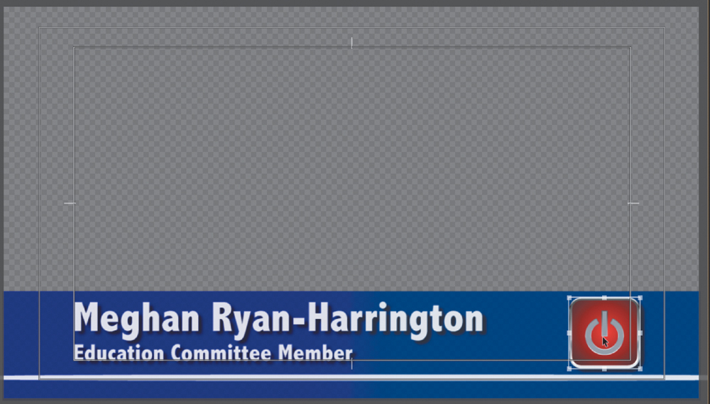
The use of a graphic allows you to integrate an image file into your title design. You can insert common file formats, including vectors (.ai, .eps) and still images (.psd, .png, .jpeg).
1. In the Project panel, double-click the file Lower-Third Start to open the title in the Titler panel.
2. Choose Title > Graphic > Insert Graphic.
3. Select the file logo.ai from the Lesson 16 folder, and click Open.
4. With the Selection tool, drag the logo to position it where you want it in the title.
If necessary, adjust the size, opacity, rotation, or scale of the logo. Hold down the Shift key to constrain proportions when you scale to prevent unwanted distortion.
![]() Note
Note
If you place a vector graphic into a title, Adobe Premiere Pro converts it into a bitmap graphic. The image will appear at its original size. You can scale it smaller; if you make it larger, the image may become pixelated.
5. When finished, close the title.
If you need to restore a logo to its default size, just select it and choose Title > Logo > Restore Logo Size. If you accidentally distorted the logo, select the logo and choose Title > Logo > Restore Logo Aspect Ratio.
Aligning shapes and logos
As you design titles, you will often want to keep the design uniform and neat. The Adobe Premiere Pro Titler offers the ability to align and distribute elements with a title. Align lets an object’s position match, such as the bottom edges or centers of two or more objects. You can also take three or more objects and evenly space them in relation to each other with a justify command.
1. In the Project panel, double-click the file Align Start to open the title in the Titler panel.
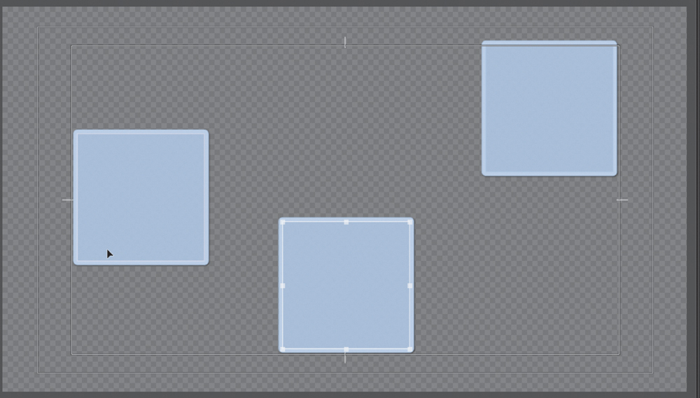
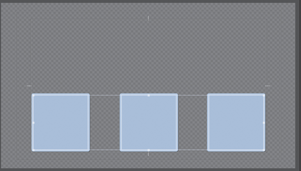
This title contains three shapes that are randomly positioned on the screen.
2. Select all three squares by Shift-clicking each one.
Notice that when more than one object is selected, the Align tools become active.
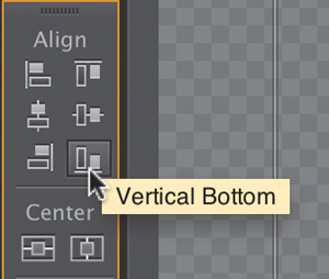
3. Click the Align Vertical Bottom button to align the bottom edges of the three objects.
The three objects are now aligned based on the bottommost object.
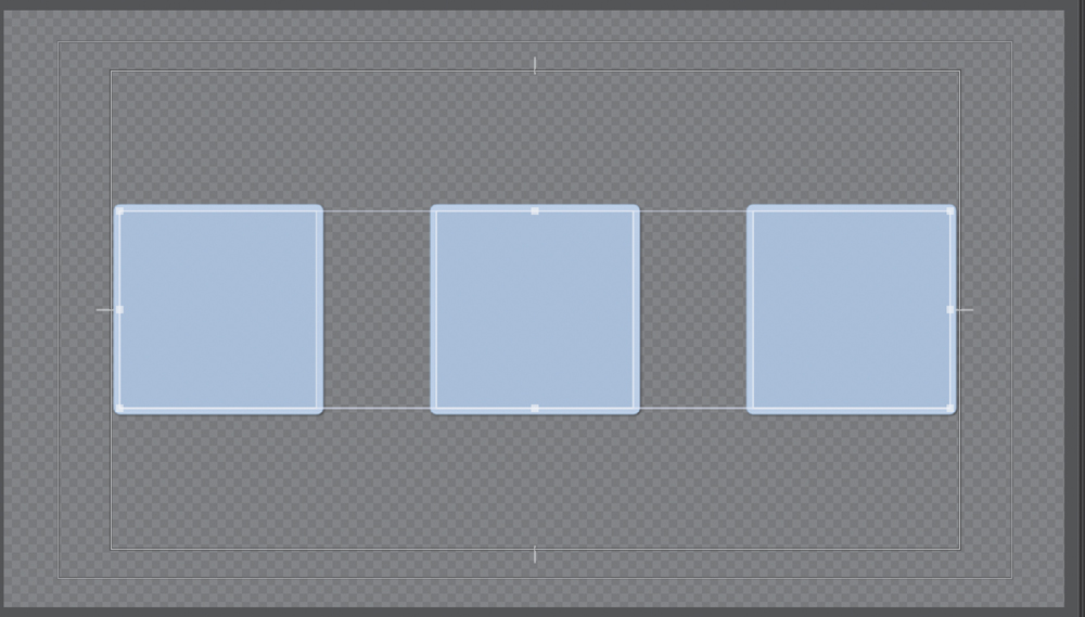
4. Click the Horizontal Center Distribute button to equally space the three objects from one another.
The objects are now evenly spaced and aligned with one another. Now, let’s space them in relation to the canvas.
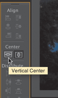
5. Click both the Horizontal Center and Vertical Center tools.
You should have three perfectly aligned squares centered in the title area.
6. When finished, close the title.
Making text roll and crawl
Using the Titler, you can make rolling text for opening and closing credits and crawling text for items such as headline bulletins.
1. From the Adobe Premiere Pro menu bar, choose Title > New Title > Default Roll.
2. Name your title Rolling Credits, and click OK.
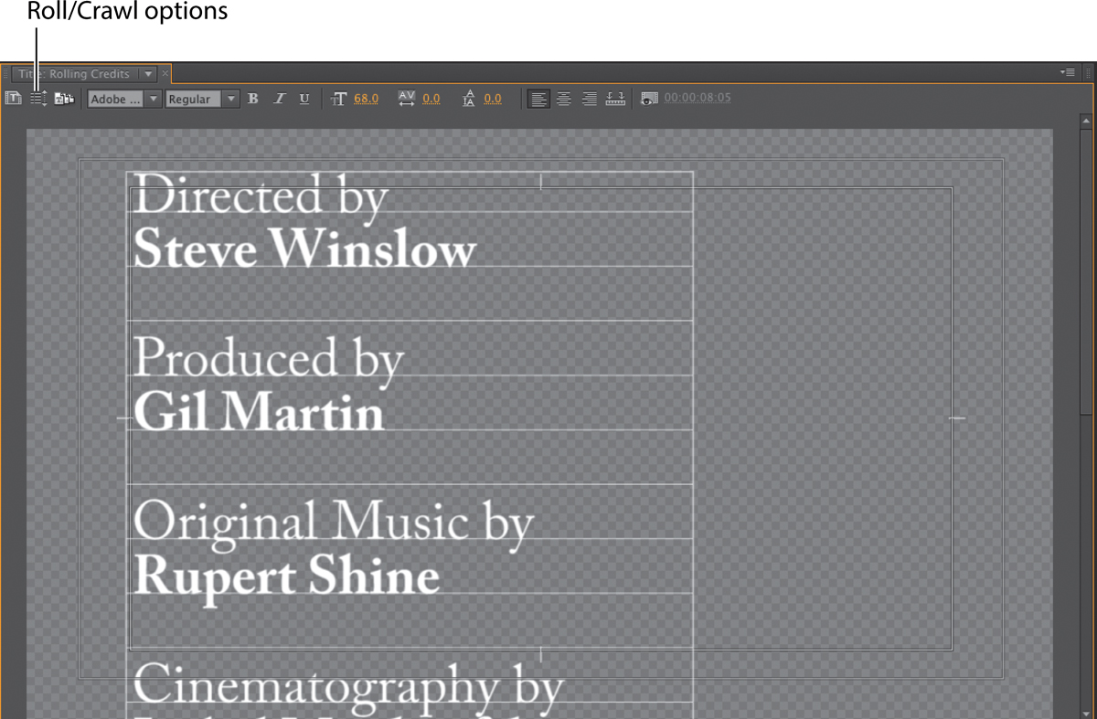
3. Select the Type tool, and then type some text with the Caslon Pro 68 style.
Create placeholder credits as shown here, pressing Enter (Windows) or Return (Mac OS) after each line. Type enough text to more than fill the screen vertically. Use the Title Properties panel to format your text as desired.
![]() Note
Note
With rolling text selected, the Titler automatically adds a scrollbar along the right side that enables you to view your text as it runs off the bottom of the screen (shown here). If you select one of the crawl options, that scrollbar will appear at the bottom to enable you to view text running off the right or left edge of the screen.
4. Click the Roll/Crawl Options button.
You have the following options:
• Still: This changes the credits to a still title.
• Roll (scroll text vertically): This should be selected already, because this title was created to scroll vertically, as often seen in movie credits.
• Crawl Left, Crawl Right: These indicate the crawl direction (rolling text always moves up the screen).
• Start Off Screen: This controls whether the credits start completely off the screen and roll on or whether they begin at the location as typed in the Titler.
• End Off Screen: This indicates whether the credits roll completely off the screen.
• Preroll: This specifies the number of frames before the first words appear onscreen.
• Ease-In: This specifies the number of frames at the beginning to gradually increase the speed of the roll or crawl from zero to its full speed.
• Ease-Out: This specifies the number of frames to slow down the roll or crawl at its end.
• Postroll: This specifies the number of frames that play after the roll or crawl ends.
5. Select Start Off Screen and End Off Screen, and type 5 for Ease-In and 5 for Ease-Out. Click OK.

![]() Note
Note
Dragging a rolling title to increase its length will cause it to roll slower. Dragging the rolling title to decrease its length will cause it to roll faster.
6. Close the Titler.
7. Drag your newly created Rolling Credits title to the Video 2 track of the Timeline above the video clip (if another title is there, drag this one directly on top of it to do an overlay edit).
8. With the Edit tool, grab the right edge of the Rolling Credits clip, and drag it to be the same length as the video clip in track 1.
![]() Tip
Tip
It’s often easier to set your credits in a word-processing application or text document. You can then copy and paste rather than type them into a title.
9. With the sequence selected, press the spacebar to view your rolling credits.
Animated text with Adobe After Effects
1. To create a new Adobe After Effects composition from within Adobe Premiere Pro, choose File > Adobe Dynamic Link > New After Effects Composition.
2. The New After Effects Comp window is automatically filled in with settings that match your project settings. Click OK. A new Adobe After Effects composition is added to both your Timeline and Project panels.
3. You are automatically switched to Adobe After Effects. Name the project, and click Save.
Store the project with your Adobe Premiere Pro project file so that your media path structure is easy to preserve. Any additional clips sent to Adobe After Effects from your current Adobe Premiere Pro project will automatically join this linked Adobe After Effects project.
4. Select the Text tool, and click in the After Effects Composition panel to enter text.
You can click the buttons beneath the composition window to turn on a title-safe overlay. If you are unsure of what a button does, just hover your cursor over it to see a tool tip.
5. Adjust the text properties with the Character panel to improve style and legibility.
6. An easy way to animate the layer is with presets. Select the text layer in the Timeline panel. Position the playhead at the start of the Timeline.
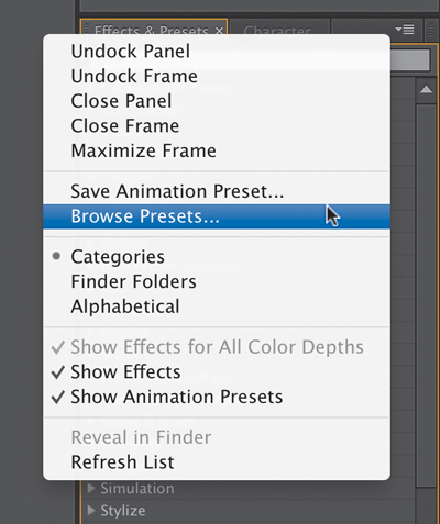
7. Select the Effects & Presets panel (if it’s not visible, you can choose it in the Window menu). Click the submenu in the upper-right corner of the Effects & Presets panel and choose Browse Presets. Adobe Bridge CC launches with the default presets shown.
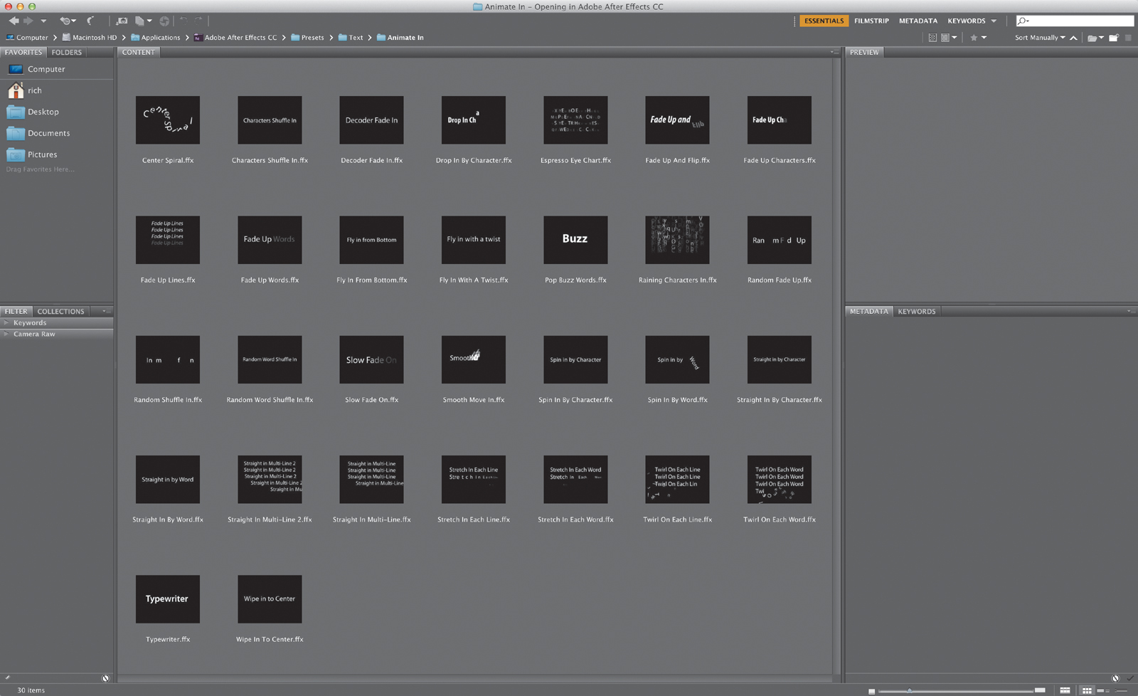
8. Select the folder named Text, and double-click to open it. Double-click other subfolders to examine other animation presets. You can click an .ffx file to see a preview movie in the Preview pane. Use the navigation path at the top of the window to switch to a different folder.
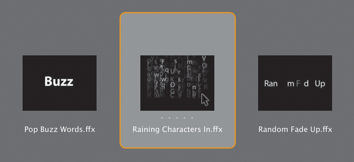
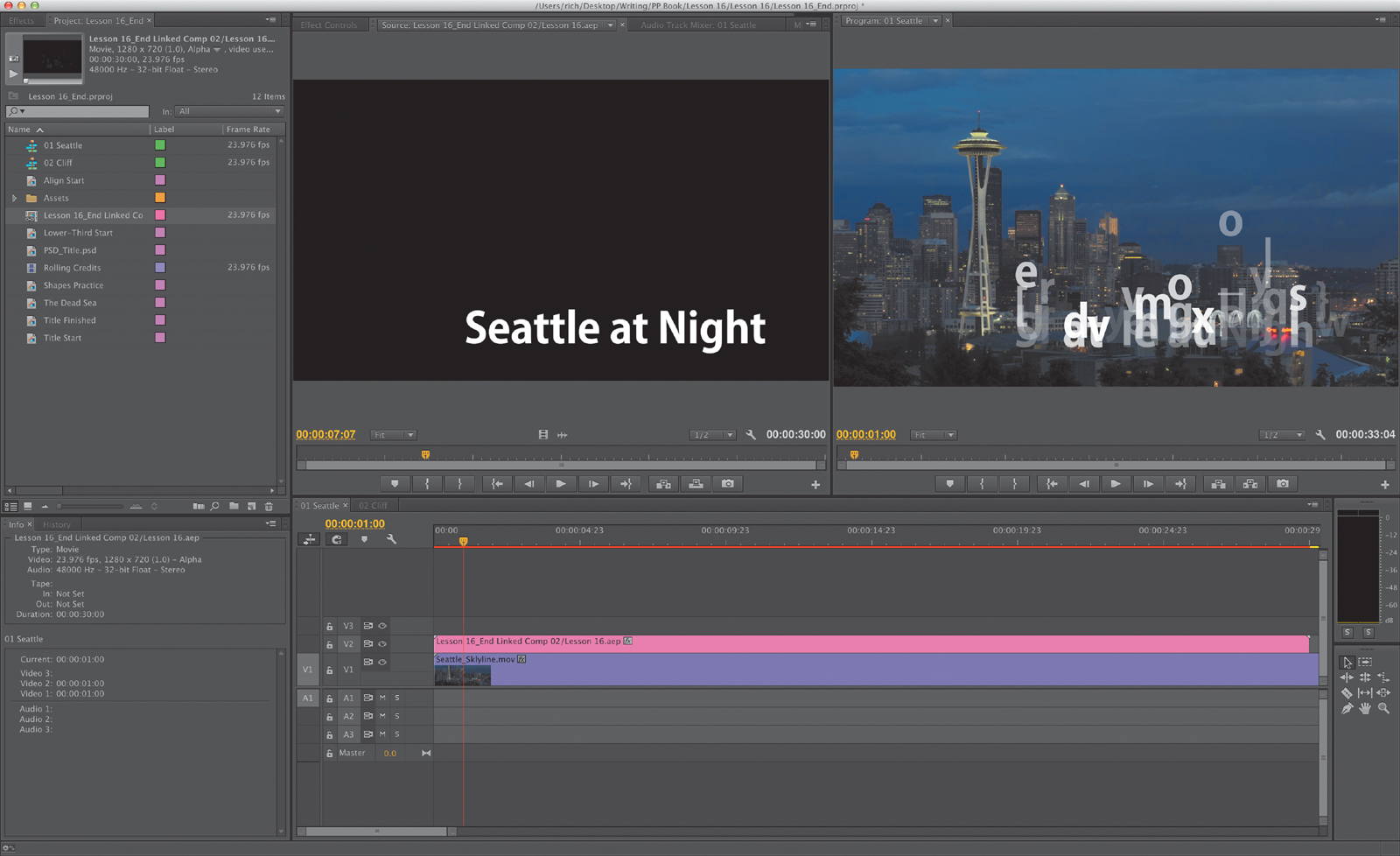
9. Select a preset effect and double-click to apply it to your selected text layer. For this exercise, choose Animate In > Raining Characters In.ffx. Adobe Bridge is minimized, and Adobe After Effects becomes the active application.
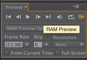
10. In the Preview panel, click the RAM Preview button to preview the text animation. In this animation, the timing might be different than you’d like, but you can easily modify it.
11. With the layer in Adobe After Effects selected, press U to see all your user-added keyframes. You can drag the keyframes to new positions in the Timeline to adjust the start and end time of the animation.
12. You can adjust the individual parameters of the text effects. Click the disclosure triangle next to the Range Selector to close it; then click it again to open it and show all the animation properties. Click the triangle next to Advanced to see all those properties as well.
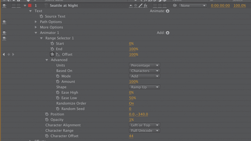
13. Experiment with the different Advanced properties to see the results. In particular, experiment with the following properties, and click RAM Preview occasionally to view the changes:
• Randomize Order: Randomizes the order in which the property is applied to the characters affected by the Range Selector.
• Random Seed: Affects the method used to calculate randomness. Try inputting a different value to produce a varied animation.
• Shape: Affects the shape used to select characters between the start and end of the range. Choosing different options will result in subtle but significant changes. You can choose Square, Ramp Up, Ramp Down, Triangle, Round, or Smooth.
14. If you’re happy with the animation as is, save your Adobe After Effects project and return to Adobe Premiere Pro. You can now edit the new Adobe After Effects composition into your Timeline just as you would any other title.
Review questions
1. What are the differences between point text and paragraph (or area) text?
2. Why display the title-safe zone?
3. Why might the Align tools be dimmed?
4. How do you use the Rectangle tool to make a perfect square?
5. How do you apply a stroke or drop shadow?
Review answers
1. You create point text with the Type tool. Its bounding box expands as you type. Changing the box shape changes the text size and shape accordingly. When you use the Area Type tool, you define a bounding box, and the characters remain within its confines. Changing the box’s shape displays more or fewer characters.
2. Some TV sets cut off the edges of the TV signal. The amount lost varies from set to set. Keeping your text within the title-safe margin ensures that viewers will see all your title. This is less of a problem with newer digital TVs, but it’s still a good idea to use the title-safe zone to frame your titles.
3. The Align tools become active only if more than one object is selected in the Titler. The Distribute tools also become active when more than two objects are selected.
4. To create a perfect square, hold down the Shift key as you draw using the Rectangle tool.
5. To apply a stroke or drop shadow, select the text or object to edit, and click its Stroke (Outer or Inner) or Shadow box to add a stroke or a drop shadow. Then start adjusting parameters, and they will show up on the object.