14 Producing and Printing Consistent Color
PROJECT: TRAVEL POSTER
To produce consistent color, you define the color space in which to edit and display RGB images, and the color space in which to edit, display, and proof CMYK images. This helps ensure a close match between onscreen and printed colors.
Lesson overview
In this lesson, you’ll learn how to do the following:
Understand how images are prepared for printing on presses.
Closely examine an image before final output.
Define RGB, grayscale, and CMYK color spaces for displaying, editing, and printing images.
Proof an image for printing.
Prepare an image for printing on a PostScript CMYK printer.
Save an image as a CMYK EPS file.
Create and print a four-color separation.
This lesson will take less than an hour to complete. Please log in to your account on peachpit.com to download the lesson files for this chapter, or go to the Getting Started section at the beginning of this book and follow the instructions under “Accessing the Lesson Files and Web Edition.”
As you work on this lesson, you’ll preserve the start files. If you need to restore the start files, download them from your Account page.
Preparing files for printing
![]() Note
Note
One exercise in this lesson requires that your computer be connected to a printer that supports Adobe PostScript. If you don’t have access to one, you can do most, but not all, of the exercises.
After you’ve edited an image to get the effect you want, you probably want to share or publish it in some way. Ideally, you’ve been editing with the final output in mind, and you’ve managed file resolution, colors, file size, and other aspects of the image accordingly. But as you prepare to output the file, you have another opportunity to make sure your image will look its best.
If you plan to print the image—whether you’ll print it to your own inkjet printer or send it to a service provider for professional printing—you should perform the following tasks for the best results. (Many of these tasks are described in greater detail later in this lesson.)
Determine the final destination. Whether you’re printing the file yourself or sending it away, identify whether it will be printed to a PostScript desktop printer or platesetter, an inkjet printer, an offset press, or some other device. If you’re working with a service provider, ask what format they prefer. In many cases, they may request a file exported to a specific PDF standard or preset.
Verify that the image resolution is appropriate. For professional printing, 300 ppi is a good starting point. To determine the best print resolution for your project, consult your production team or your printer’s user manual, because the optimal resolution can depend on factors such as the halftone screen of a press or the grade of paper.
Do a “zoom test”: Take a close look at the image. Zoom in to check and correct sharpness, color correction, noise, and other issues that can affect the final printed image quality.
Allow for bleeds if you’re sending an image for professional printing: If any color runs to the edge of the image, extend the canvas by 1/4 inch on all sides to ensure that the color is properly printed even if the trim line is not exact. Your service provider can help you determine whether you have bleeds and how to prepare your file to ensure it prints correctly.
Keep the image in its original color space until your service provider instructs you to convert it. Today, many prepress workflows keep content in its original color space throughout editing to preserve color flexibility as long as possible, and convert images and documents to CMYK only at final output time.
Consider flattening large documents, but always consult with your production team first. Some workflows may depend on other applications, such as Adobe InDesign, which can control Photoshop layers from within their own documents. These workflows may require preserving, not flattening, Photoshop layers.
Soft-proof the image to simulate how the colors will print.
Getting started
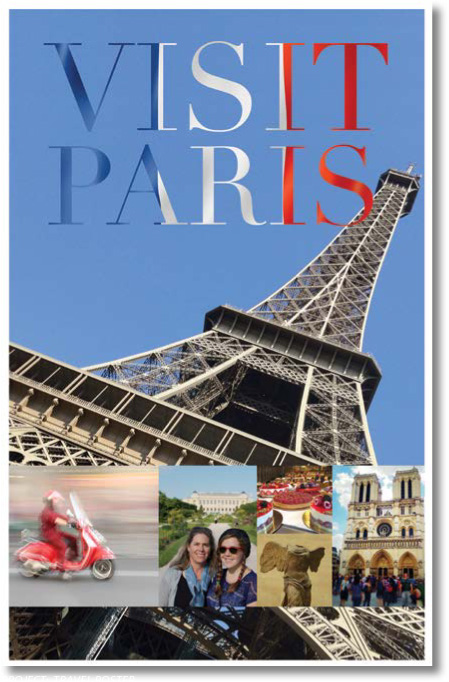
You’ll prepare an 11"×17" travel poster for printing on a CMYK press. The Photoshop file is quite large, because it contains several layers and has a resolution of 300 dpi, which is necessary for high-quality printing.
First, start Photoshop, and restore its default preferences.
Start Photoshop, and then immediately hold down Ctrl+Alt+Shift (Windows) or Command+Option+Shift (Mac) to restore the default preferences. (See “Restoring Default Preferences” on page 5.)
When prompted, click Yes to delete the Adobe Photoshop Settings file.
Choose File > Open, navigate to the Lesson14 folder, and double-click the 14Start.psd file. Because the file is large, it may open slowly, depending on your system.
Choose File > Save As, navigate to the Lesson14 folder, and save the file as 14Working.psd. Click OK if the Photoshop Format Options dialog box appears.

Performing a “zoom test”
![]() Tip
Tip
If your keyboard has Page Up, Page Down, Home, and End keys, you can use them to inspect a magnified Photoshop document. Home goes to the top left corner, and End goes to the bottom right corner. Add the Ctrl key (Windows) or the Command key (Mac) to make Page Up/Page Down keys navigate horizontally, and add the Shift key to scroll in smaller increments.
It’s expensive to redo a big print job, so before you send out an image for final output, take a few minutes to make sure everything is appropriate for your output device and that you haven’t overlooked any potentially problematic details. Start with the image resolution.
Choose Image > Image Size.
Verify that the width and height are the final output size and that the resolution is appropriate. For most printing, 300 ppi produces good results.
This image has a width of 11" and a height of 17", which is the final size of the poster. Its resolution is 300 ppi. The size and resolution are appropriate.
Click OK to close the dialog box.
Next, you’ll look closely at the image and correct any problems. When you prepare your own images for printing, zoom in and scroll to view the entire image closely.
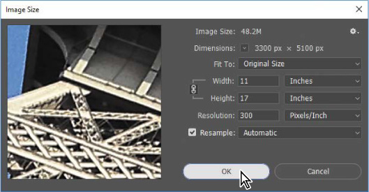
Select the Zoom tool in the Tools panel, and zoom in on the photos in the lower third of the poster.
The photo of tourists is flat and a little muddy-looking.
Select the Tourists layer in the Layers panel, and then click the Curves icon in the Adjustments panel to add a Curves adjustment layer.
Click the Clip To Layer button (
 ) at the bottom of the Properties panel to create a clipping mask.
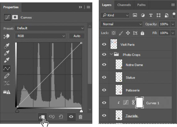
The clipping mask ensures that the adjustment layer affects only the layer directly below it in the Layers panel.
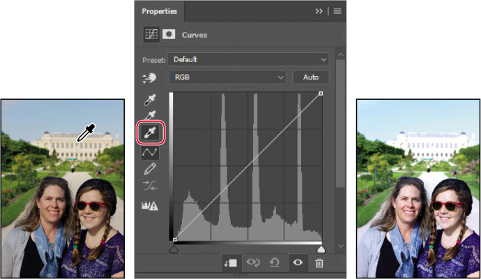
In the Properties panel, select the White Point eyedropper tool, and then click the light area of the building behind the tourists to brighten and correct the color in the image.
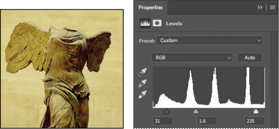
The image of tourists looks better. But the image of the statue appears flat and lacks contrast. You’ll fix that with a Levels adjustment layer.
Select the Statue layer in the Layers panel, and then click the Levels icon in the Adjustments panel to add a Levels adjustment layer.
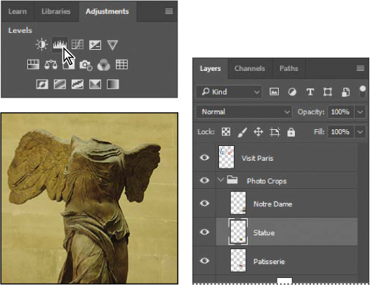
Click the Clip To Layer button at the bottom of the Properties panel to create a clipping mask, so that the adjustment layer affects only the Statue layer.
In the Properties panel, click the Calculate A More Accurate Histogram icon (
 ) to refresh the histogram display.
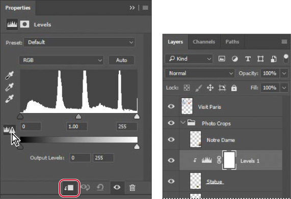
Cached histogram data displays more quickly, but is often less accurate. It’s a good idea to refresh the histogram before you make edits based on information in it.
Move the input level sliders to punch up the image. We used the values 31, 1.60, 235.
Save the file.
About color management
Because the RGB and CMYK color models use different methods to display colors, each reproduces a different color gamut (color range). For example, RGB uses light to produce color, so its gamut includes neon colors, such as those you’d see in a neon sign. In contrast, printing inks excel at reproducing certain colors that can lie outside the RGB gamut, such as some pastels and pure black.
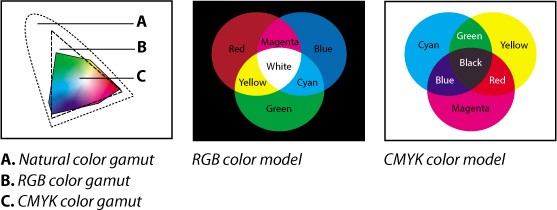
But not all RGB and CMYK gamuts are alike. Each monitor and printer model differs, and so each displays a slightly different gamut. For example, one brand of monitor may produce slightly brighter blues than another. The color space for a device is defined by the gamut it can reproduce.
The color management system in Photoshop uses International Color Consortium (ICC)-compliant color profiles that work like translators, helping to maintain color appearance when colors are converted from one color space into another. A color profile is a description of a device’s color space, such as the CMYK color space of a particular printer. You specify which profiles to use to accurately proof and print your images. Once you’ve selected the profiles, Photoshop can embed them into your image files, so that Photoshop and other applications can consistently maintain the colors of your images.
![]() Note
Note
Your monitor may have been factory-calibrated, but you may not know how precisely and to what standard. For example, if your print shop recommends that your monitor use the common prepress standard of a D65 white point, how do you know how well your monitor meets that standard? To make sure, calibrate and profile your monitor with D65 set as the target standard.
Specifying color-management settings
Even if your monitor is calibrated and profiled, accurately previewing colors onscreen also depends on correctly setting up the color-management controls in the Color Settings dialog box in Photoshop.
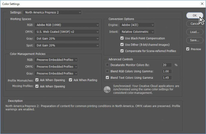
By default, Photoshop is set up for color gamuts that are more appropriate for an RGB-based digital workflow. If you’re preparing artwork for printing on a press, as in the document used in this lesson, you’ll want to change the settings to be more appropriate for CMYK-based prepress production rather than screen display.
You’ll create customized color settings.
Choose Edit > Color Settings to open the Color Settings dialog box.
The bottom of the dialog box interactively describes each option.
Without clicking (don’t change settings), hover the pointer over each part of the dialog box, including the names of sections (such as Working Spaces), the menu names, and the menu options. As you move the pointer, Photoshop displays information about each item in the Description area.
Now, you’ll choose a set of options designed for a print workflow.
Choose North America Prepress 2 from the Settings menu. The working spaces and color-management policy options change for a prepress workflow. Then click OK.
Identifying out-of-gamut colors
Colors on a monitor are displayed using combinations of red, green, and blue light (called RGB), while printed colors are typically created using a combination of four ink colors—cyan, magenta, yellow, and black (called CMYK). These four inks are called process colors because they are the standard inks used in the four-color printing process.
Many colors produced by digital cameras and scanners are within the gamut of typical CMYK print colors. But an RGB image may contain some colors, such as colored LED lights or vivid flowers, that are outside a printer’s CMYK gamut. Those colors may print with less detail and saturation than expected. Some intense blue colors in RGB can shift toward purple in CMYK.
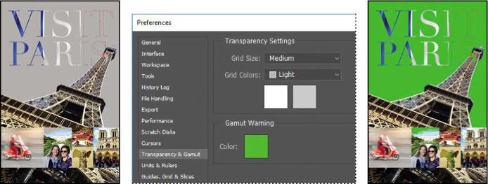
Before you convert an image from RGB to CMYK, you can preview which RGB color values are outside the gamut of CMYK.
Choose View > Fit On Screen.
Choose View > Gamut Warning to see out-of-gamut colors. Photoshop builds a color-conversion table, and displays a neutral gray in the image window to indicate where the colors are out of gamut.
The gray gamut warning covers much of the image, especially the blue areas. A typical CMYK press can reproduce a relatively narrow range of blue compared to most RGB gamuts, so it’s not unusual for an image to have RGB blue values that are outside a CMYK printing gamut.
Because the gray indicator color can be hard to distinguish in the image, you’ll change it to a more visible color.
Choose Edit > Preferences > Transparency & Gamut (Windows) or Photoshop CC > Preferences > Transparency & Gamut (Mac).
Click the color sample in the Gamut Warning area at the bottom of the dialog box. Select a vivid color, such as purple or bright green, and click OK.
Click OK to close the Preferences dialog box.
![]() Tip
Tip
If your gamut warning area looks different, you may be using different settings in the View > Proof Setup > Custom dialog box (see page 356).
The bright new color you chose appears instead of the neutral gray as the gamut warning color, and it should be much more obvious which areas are out of gamut.
Choose View > Gamut Warning to turn off the preview of out-of-gamut colors.
Next, you’ll simulate onscreen how the document colors might print, and then you’ll bring those colors into the printing gamut.
Proofing document colors on a monitor
You’ll select a proof profile so that you can view an onscreen simulation of what document colors will look like when printed. An accurate proof profile lets you proof on the screen (soft-proof) for printed output.
A proof setup defines the printing conditions, which determines the onscreen simulation. Photoshop provides a variety of settings that can help you proof images for different uses, including for different printers and devices. For this lesson, you’ll create a custom proof setup. You can then save the settings for use on other images that will be output the same way.
Choose View > Proof Setup > Custom. The Customize Proof Condition dialog box opens. Make sure Preview is selected.

 Tip
TipA printer profile represents not only the output device, but also a specific combination of settings, ink, and paper. Changing any of those components can change the color gamut being simulated by the onscreen proof, so choose a profile that’s as close as possible to the final printing conditions.
From the Device To Simulate menu, choose a profile that represents the final output device, such as that for the printer you’ll use to print the image. If you don’t have a specific printer, use the profile Working CMYK–U.S. Web Coated (SWOP) v2, the current default.
If you’ve chosen a different profile, make sure Preserve Numbers is not selected.
The Preserve Numbers option simulates how colors will appear if they’re not converted to the output device color space. This option may be named Preserve CMYK Numbers when you select a CMYK output profile.
Make sure Relative Colorimetric is selected for the Rendering Intent.
A rendering intent determines how the color is converted from one color space to another. Relative Colorimetric preserves color relationships without sacrificing color accuracy, and is the standard rendering intent for printing in North America and Europe.
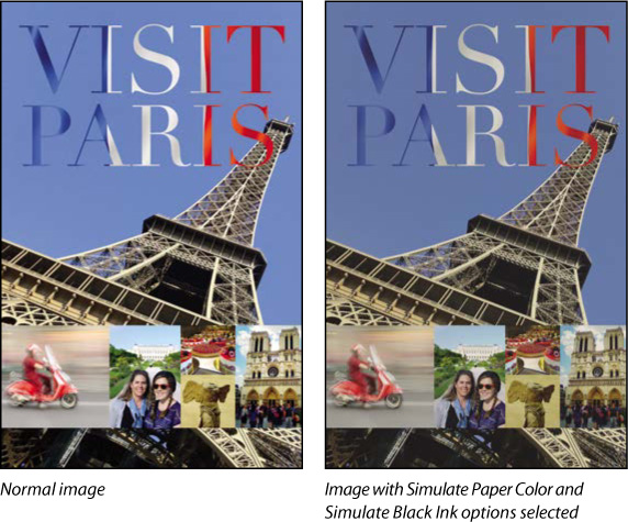
Select Simulate Black Ink if it’s available for the profile you chose. Then deselect it and select Simulate Paper Color; notice that selecting this option automatically selects Simulate Black Ink.
![]() Tip
Tip
When the Customize Proof Condition dialog box isn’t open, you can view the document with or without the current proof settings by selecting or deselecting the View > Proof Colors command.
Notice that the image appears to lose contrast. Paper Color simulates the dingy white of real paper, according to the proof profile. Black Ink simulates the dark gray that most printers actually produce, instead of solid black. Not all profiles support these options.
Don’t be alarmed by the loss of contrast and saturation that you may see when you turn on the Display Options. While the image might look worse, the soft-proofing simulation is just being honest about how the image will actually print; paper and ink simply cannot reproduce white and colors as brightly as a monitor. Choosing higher-quality paper stock and inks can help a printed image match the screen more closely.
Toggle the Preview option to see the difference between the image as it is displayed on screen and as it will print, based on the profile you selected. Then click OK.
Bringing colors into the output gamut
![]() Tip
Tip
It isn’t always necessary to correct colors that are indicated as out of gamut. The best use of the gamut warning is to know which colors to inspect more closely when you proof document colors. If out-of-gamut colors look acceptable when proofing, they may not need to be changed.
The next step in preparing an image for output is to make any necessary color and tonal adjustments. In this exercise, you’ll add some tonal and color adjustments to correct an off-color scan of the original poster.
So that you can compare the image before and after making corrections, you’ll start by making a copy.
Choose Image > Duplicate, and click OK to duplicate the image.
Choose Window > Arrange > 2 Up Vertical so you can compare the images as you work.
You’ll adjust the hue and saturation of the image to move all colors into gamut.
Select 14Working.psd (the original image) to make it active, and then select the Visit Paris layer in the Layers panel.
Choose Select > Color Range.
In the Color Range dialog box, choose Out of Gamut from the Select menu, and then click OK.
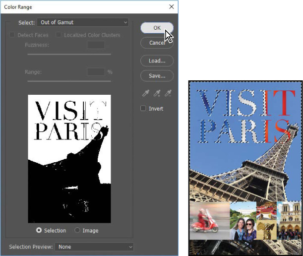
The areas that were marked as out of gamut earlier are now selected, so you can make changes that affect only those areas.
Choose View > Extras to hide the selection while you work with it.
The selection border can be distracting. When you hide extras, you no longer see the selection, but it’s still in effect.
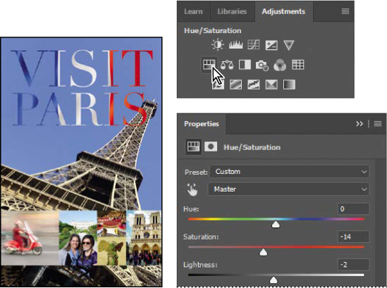
Click the Hue/Saturation button in the Adjustments panel to create a Hue/Saturation adjustment layer. (Choose Window > Adjustments if the panel isn’t open.) The Hue/Saturation adjustment layer includes a layer mask, created from your selection.
In the Properties panel, do the following:
Leave the Hue setting at the default value.
Drag the Saturation slider until the intensity of the colors looks more realistic (we used –14).
Drag the Lightness to the left to darken the image (we used –2).
Choose View > Gamut Warning. You have shifted most of the out-of-gamut colors so that they’re in the target gamut. Choose View > Gamut Warning again to deselect it.
Choose View > Extras to enable it, so that selection marquees and other non-printing aids are visible again.
Close the duplicate image file (the 14Working copy tab) without saving it.
![]() Tip
Tip
You can also make adjustments with Gamut Warning on, so that you know when the colors move into the printing gamut.
In this exercise, you shifted out-of-gamut colors into the printing gamut mostly by desaturating them. While this is quick and easy, it’s considered a basic technique. Skilled image editors use more advanced techniques to preserve color detail while maintaining as much of the original color saturation as possible. Also, when an out-of-gamut color doesn’t contain much detail, as in a flat blue sky, it may be acceptable to leave it unchanged.
Converting an image to CMYK
It’s generally a good idea to work in RGB mode as long as possible, so that your edits can take place within the larger color gamut of RGB. Also, converting between modes can cause color value rounding errors that may result in unwanted color changes, especially over multiple conversions.
Once you’ve made final corrections, you’re ready to convert the image to CMYK. If you think you may want to output the image to an inkjet printer or distribute it digitally later, save a copy in RGB mode before converting to CMYK mode.
Click the Channels tab to bring the Channels panel to the front.
The image is currently in RGB mode, so there are three channels listed: red, green, and blue. The RGB channel is not actually a channel, but a composite of all three. You also see a channel named Hue/Saturation 1 Mask; this channel contains the mask information for the layer currently selected in the Layers panel.
Choose Image > Mode > CMYK Color.
Click Merge in the message that warns you that you might lose some adjustment layers. Merging the layers helps preserve the appearance of colors.
Another message appears, saying: “You are about to convert to CMYK using the “U.S. Web Coated (SWOP) v2” profile. This may not be what you intend. To choose a different profile, use Edit > Convert To Profile.” This message lets you know that the active CMYK profile is U.S. Web Coated (SWOP) v2, the Photoshop default profile for CMYK color. That profile might not represent the actual prepress specification or proofing standard that will be used. In a real world job, you would ask the print service provider which CMYK profile to use for color conversions; they may be able to provide a custom profile that accurately represents the tonal and color range of their equipment.
Click OK in the message about the color profile used in the conversion.

The Channels panel now displays four channels: cyan, magenta, yellow, and black. Additionally, it lists the CMYK composite. The layers were merged during conversion, so there is only one layer in the Layers panel.
Saving the image as a CMYK EPS file
Some professional printers request that Photoshop images be submitted in EPS format. While this format is used less often in newer prepress workflows, it’s still good to know how to convert a document into it. You’ll save this image as an EPS file in CMYK mode.
Choose File > Save As.
In the Save As dialog box, do the following, and then click Save:
Choose Photoshop EPS from the Format menu.
Under Color, select Use Proof Setup. Don’t worry about the warning icon; you’ll save a copy.
Accept the filename 14Working.eps.

Click OK in the EPS Options dialog box that appears.
Save and then close the 14Working.psd file.
Choose File > Open, navigate to the Lessons/Lesson14 folder, and double-click the 14Working.eps file.
![]() Tip
Tip
Printing color separations on your desktop printer can help verify that colors will appear on the correct plate. But separations from a desktop printer won’t match the precision of an actual platesetter. Proofs you create for jobs intended for a press are more accurate on a desktop printer with an Adobe PostScript RIP (raster image processor).
Printing a CMYK image from Photoshop
You can proof your image by printing a color composite, often called a color comp. A color composite is a single print that combines the red, green, and blue channels of an RGB image (or the cyan, magenta, yellow, and black channels of a CMYK image). This indicates what the final printed image will look like.
If you’re printing color separations of an image directly from Photoshop, you will typically use the following workflow:
Set the parameters for the halftone screen. Consult with your print service provider for recommended settings.
Print test separations to make sure objects appear on the correct separation.
Print the final separations to plate or film. This is typically performed by your print service provider.
When you print color separations, Photoshop prints a separate sheet, or plate, for each ink. For a CMYK image, it prints four plates, one for each process color. In this exercise, you’ll print color separations.
With the 14Working.eps image open from the previous exercise, choose File > Print.
By default, Photoshop prints any document as a composite image. To print this file as separations, you must set it up accordingly in the Photoshop Print Settings dialog box.
In the Photoshop Print Settings dialog box, do the following:
In the Printer Setup section, make sure the selected Printer is the one you want to use.
In the Color Management area, choose Separations from the Color Handling menu.
In the Position and Size section, verify that the settings are correct. This 11"×17" document may be too large for many desktop printers to print at actual size; consider selecting Scale to Fit Media for basic proofing.
Click Print. (If you don’t actually want to print color separations, click Cancel or Done; the difference is that Done saves the current print settings.)
![]() Tip
Tip
In the Photoshop Print Settings dialog box, if the Separations option is not available in the Color Handling menu, click Done, and make sure the document is in CMYK mode (Image > Mode > CMYK Color).
![]() Tip
Tip
The Position and Size section of the Photoshop Print Settings dialog box is two sections below the Color Management section, so if you can’t see it, scroll down the right side panel. Also, you can enlarge the Photoshop Print Settings dialog box by dragging a corner or edge so that you can see more options at once.

This lesson has provided an introduction to printing and producing consistent color from Photoshop. If you’re printing on a desktop printer, you can experiment with different settings to find the best color and print settings for your system. If you’re preparing images for professional printing, consult with your print service provider to determine the best settings to use. For more information about color management, printing options, and color separations, see Photoshop Help.
Extra Credit
Sharing your work on Adobe Portfolio
Integrated into Adobe Creative Cloud is Adobe Portfolio, which you can use to quickly create a well-designed and functional website that showcases your creations, with one-click connections to your social media presence (such as your Instagram, Facebook, and Twitter feeds) and a pre-built contact form that makes it easy for potential clients and customers to get in touch with you. To test it out, you’ll first prepare this lesson’s image for viewing in a web browser.
Open the 14Start.psd file in Photoshop, if it isn’t already open. Click OK if the Embedded Profile Mismatch dialog box appears.
As the original RGB version of the image in this chapter, 14Start.psd contains a wider color gamut than the later version that was converted to CMYK for prepress.
Choose File > Export > Export As to prepare the image for display on a website. It’s a large, print-resolution image, so it may take a while to display in the Export As dialog box.
Choose JPG from the Format menu, and set Quality to 90%.
In the Image Size section, enter 918 for Height. This will proportionally resize the image to 918 pixels high, so that the entire image can be seen at 100% magnification on many displays.
In the Color Space section, select Convert to sRGB and Embed Color Profile to help ensure consistent color in Web browsers.
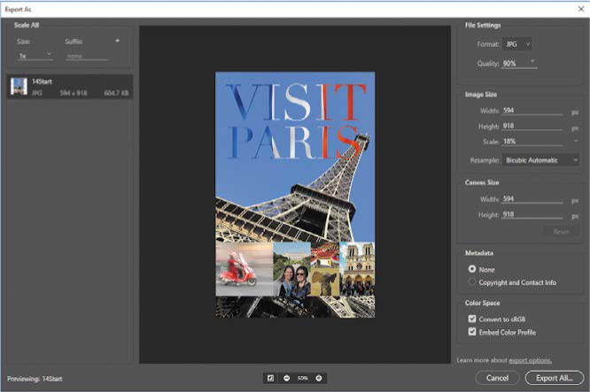
Click Export All. Navigate to the Lesson14 folder, and click Export or Save.
Now you can start your online portfolio. The Portfolio user interface you see may vary as Adobe updates the service.
In a web browser, go to myportfolio.com, the web address for Adobe Portfolio.
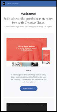
At the top of the Adobe Portfolio home page, click Sign In, enter your Adobe ID email address and password, and click Sign In.
Click Get Started Free or Edit Your Sites, scroll to preview the layouts you can use, and then choose Try This Layout. We picked Lina. If an “Edit Your Portfolio” button appears, click it.
Click the Add Content button, and then click Page. Enter Visit Paris, and then click Create Page. If a Continue button appears, click it.
Now add your work. Click Files, navigate to the Lesson14 folder, select 14Start.jpg, and then click Choose or Open (the button name depends on the web browser you use). Adobe Portfolio processes the image and adds it to the page.
In the Add Content section of the floating remote, click Text, and then type “Poster created for the Visit Paris campaign.” Highlight the text to select it, and a formatting bar appears above the text so that you can change text settings if you want.
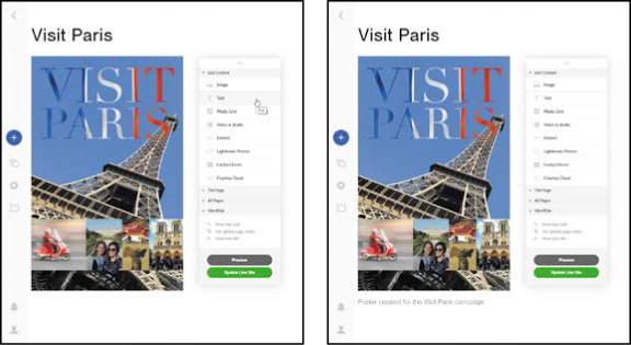
In the preview, click Preview. The buttons at the bottom of the preview show you how the page will look on different device displays and orientations, such as a smartphone held vertically or horizontally.
In the preview remote, click Back to Edit.
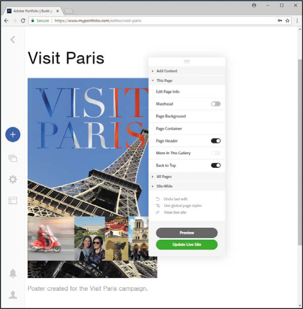
As you move the pointer over different page elements, a round edit icon appears in the top left corner of that page element. Click the edit icon to see options for editing that element.
Use the floating remote control to add or edit the content on this page, or click the Return to Home button at the top left corner to add and organize more pages on your Adobe Portfolio website.
You can change many design options for your Adobe Portfolio site, such as the fonts, font sizes, background colors, and spacing. You can also change the overall layout at any time. If you have your own Internet domain name, you can easily connect it to Adobe Portfolio so that your website’s address is fully consistent with your brand.
If your site looks good and you want the world to see it, click Publish Site. It’s live!
If you published the site but you don’t want the world to see it yet, click the Settings (gear) icon, click Unpublish Portfolio, choose options, and click the Unpublish Portfolio button. Alternatively, you can publish the site but set a password in the Password Protection section of the Settings panel.
Review questions
1 What steps should you follow to reproduce color accurately?
2 What is a gamut?
3 What is a color profile?
4 What are color separations?
Review answers
1 To reproduce color accurately, first calibrate and profile your monitor, and then use the Color Settings dialog box to specify which color spaces to use. For example, you can specify which RGB color space to use for online images, and which CMYK color space to use for images that will be printed. You can then proof the image, check for out-of-gamut colors, and adjust colors as needed.
2 A gamut is the range of colors that can be reproduced by a color model or device. For example, the RGB and CMYK color models have different gamuts. Within each color model, various printers, printing standards, and device displays reproduce different gamuts.
3 A color profile is a description of a device’s color space, such as the CMYK color space of a particular printer. Applications such as Photoshop can interpret color profiles in an image to maintain consistent color across different applications, platforms, and devices.
4 Color separations are separate plates for each ink used in a document being reproduced on press. Your print service provider will produce color separations of your files for the cyan, magenta, yellow, and black (CMYK) inks.