
Chapter 12
Dressing Up Images with Layer Styles
IN THIS CHAPTER
![]() Understanding layer styles
Understanding layer styles
![]() Applying layer styles with the Styles panel
Applying layer styles with the Styles panel
![]() Creating your own styles
Creating your own styles
![]() Preserving your custom layer style
Preserving your custom layer style
In artwork and photography, you use shadows and highlights in your image to produce the illusion of depth. Highlights and shadows lead the viewer to imagine that a light is falling on parts of a 3D object. You can also use a shadow or glow to make it appear that some distance exists between one object in the image and another object behind it. Photoshop’s built-in layer styles help you add shadows, glows, and other effects almost instantly.
In this chapter, I explain how transparent areas on layers enable lower layers to show through and let your layer styles appear on those lower layers. You get a good look at the Styles panel and how you use it to store and apply layer styles, including your very own custom styles. I then present the all-important (for layer styles) Layer Style dialog box and the various effects that you can add with it. I also show you how to save (and protect) your custom layer styles.
What Are Layer Styles?
A layer style comprises one or more effects that surround or are applied to all the pixels on your layer. Effects that surround pixels include strokes (thin or thick outlines of color), shadows (just like the one you’re casting right now), and glows (outlines of semitransparent color). Effects that are applied to pixels include overlays of color, patterns, or even gradients. But Photoshop offers even more, including the ever-popular Bevel and Emboss effect, which does a great job of giving the content of your layer a 3D look. And, of course, effects can be used in combination; check out Figure 12-1 for an example. You can add effects to layers in several ways, including through the Layer Style menu at the bottom of the Layers panel, as shown in Figure 12-2. I explain each of the effects individually later in this chapter in the section on creating your own custom layer styles.

FIGURE 12-1: Strokes, shadows, and bevels are just some of the effects available.

FIGURE 12-2: You can add a layer style through the Layers panel.
 Just so everyone is on the same sheet of music, when you refer to a drop shadow or an outer glow or a color overlay or any one of the other items shown in the menu in Figure 12-2, call it a layer effect or simply an effect.
Some layer effects, such as drop shadows and outer glows, appear outside the content of the layer. For those effects to be visible in your artwork, the layer must have at least some area of transparent pixels. If the layer is filled edge to edge, the effect has no place within the image to appear because the glow or shadow would logically be outside the image’s canvas. Take a look at a couple of layer style examples in Figure 12-3.

FIGURE 12-3: Some layer effects need transparent areas on the layer, or they won’t appear.
In the sample on the left, you can imagine that the shadow logically also appears to the lower right of the object as a whole (as it does in the sample to the right). However, that’s outside the image’s canvas, so that part of the shadow doesn’t appear in the artwork.
Keep in mind that every layer in an image has the same number of pixels — but some of those pixels can be transparent. When a layer has areas of transparency, layers below in the image can show through. In the two examples in Figure 12-3, the yellow background layer is visible, giving the upper layer’s shadows a place to fall. (And remember that a layer named Background can’t have areas of transparency. Convert it to a regular layer by clicking the Lock icon to the right of the layer name.) Chapter 10 is full of information on working with layers.
Using the Styles Panel
The Styles panel is hidden by default. Choose Window ⇒ Styles to make it visible. This panel, which you see with its menu open in Figure 12-4, is where you find and store layer styles and is the easiest way to apply a layer style to your active layer.

FIGURE 12-4: The Styles panel holds your preset and saved layer styles.
To apply a layer style via the Styles panel, make the target layer active by clicking it in the Layers panel; then click the style that you want to apply. It’s truly that simple! To remove a layer style from the active layer, click the leftmost button at the bottom of the Styles panel. You can click the middle button to save a custom layer style (which I explain later in this chapter), and you can drag a layer style to the Trash icon on the right to delete it from the panel.
Take a look at the Styles panel menu shown in Figure 12-4, starting from the top and making your way down to the bottom. The first command simply adds the style applied to the active layer to the panel (like clicking the Create New Style button).
In the second section of the menu, you can choose from five different ways to view the content of the Styles panel. The Text Only, Small List, and Large List options might come in handy after you create a bunch of custom styles with names you recognize, but until you become familiar with the styles in the panel, their names are pretty much meaningless. The Large Thumbnail option gives you a better view of the effects in the style, but you see fewer styles at a time in the panel than you can with the default Small Thumbnail view.
The Styles panel Preset Manager command opens the same Preset Manager that you access through the Edit ⇒ Presets menu. Use the Preset Manager (discussed at the end of this chapter) to save custom styles in sets on your hard drive to protect them from accidental loss.
The next four commands in the Styles panel menu are what I call “housekeeping commands” because you use them to control the content of the panel:
- Reset Styles: The Reset Styles command returns the content of the panel to its default. You have the option of adding the default set to the current panel content with the Append button or replacing the current content with the selected set by clicking OK.
- Load Styles: Use the Load Styles command to add additional styles from your hard drive (or another location). You can download sets from various websites and even purchase prepared sets of layer styles on CD. The set is added to the current content of the panel automatically.
- Save Styles: The Save Styles command lets you save the current content of the panel as a set of styles. All the layer styles in the panel at the time are saved in the set.
- Replace Styles: Use the Replace Styles command to remove the current content and then add the selected set.
Below in the Styles panel menu, you can find a list of all the layer style sets saved in Photoshop’s Presets ⇒ Styles folder. When you select a set from that list, you have the option once again of appending or replacing the current content of the panel. (The list in your Styles panel menu might differ from what’s shown in Figure 12-4.)
The last two commands in the Styles panel menu are used to control the visibility of the panel (Close) and the visibility of the panel and those panels nested with it (Close Tab Group), which depends on how you’ve arranged Photoshop’s panels in your workspace.
Creating Custom Layer Styles
You create a custom layer style by applying one or more layer effects to your active layer. (Once again, remember that you can’t apply layer effects or layer styles to a layer named Background.) When you have the effects looking just the way you want them, you can add that new style to the Styles panel and even save it for sharing with friends and colleagues. Combining multiple layer effects lets you create complex and beautiful layer styles that change simple shapes and text into art.
Exploring the Layer Style menu
In addition to the pop-up menu at the bottom of the Layers panel (refer to Figure 12-2), you can apply layer effects through the Layer ⇒ Layer Style menu. As you can see in Figure 12-5, the Layer Style menu has a few more commands than the menu at the bottom of the Layers panel.

FIGURE 12-5: You can use the Layer Style menu to apply layer effects and more.
The ten items on the Layer Style menu below Blending Options are the actual layer effects. A check mark to the left of the effect indicates that it’s currently applied to the active layer. The Copy Layer Style and Paste Layer Style commands come in handy, but if you’re more mouse- or stylus-oriented than menu-oriented, you’ll find it easier to add the style to the Styles panel and click the style to apply it to other layers. You can also Option/Alt+drag a layer style from layer to layer in the Layers panel to duplicate it. Clear Layer Style is the equivalent of using the leftmost button at the bottom of the Styles panel — it removes all layer effects from the target layer. The four commands at the bottom of the menu are worthy of a little special attention:
- Global Light: A number of layer effects are applied at an angle. Drop shadows, for example, simulate light coming from a specific angle (which, of course, determines where in your artwork that shadow falls). You use the Global Light command to set the default angle at which your effects are applied. Generally speaking, you want the angle to be consistent from effect to effect and from layer to layer in your artwork. There are exceptions, however, such as the situation shown in Figure 12-6. In that artwork, the two type layers have shadows receding at different angles to simulate a light source positioned immediately in front of and close to the image. (As you can read in the next section of this chapter, when you use layer effects that are applied at an angle, you have the option of using or not using the angle in Global Light.)
- Create Layers: Sometimes you need to edit a layer effect — say, to control where a drop shadow falls on the lower layers in the image. The Create Layers command rasterizes each layer effect (adds it to the image as a separate layer or layers containing pixels). You can then erase portions of the new layers, apply artistic filters, or otherwise customize each effect layer. Remember that after a layer style is rasterized with this command, you can no longer edit it through the Layer Style dialog box, but the original style (if you added it to the Styles panel) is still available.
- Hide All Effects: You can temporarily hide a layer style with the Hide All Effects command. Alternatively (and more conveniently), you can click the eyeball icon next to the layer style in the Layers panel to hide the effects.
- Scale Effects: Use the Scale Effects command to uniformly make the layer style larger or smaller.

FIGURE 12-6: Sometimes shadows in your artwork shouldn’t all use the Global Light setting.
Exploring the Layer Style dialog box
The first step in creating custom layer styles is to become familiar with the individual layer effects. Each of the ten effects available in the Layer Style dialog box (see Figure 12-7) has its own set of options. Most of the basic default values are very good starting points. You might need to change only a color or perhaps adjust a Size, Distance, or Opacity slider. You can, of course, do lots and lots of customizing for some of the effects.

FIGURE 12-7: The Layer Style dialog box has separate options for each layer effect.
In the column to the left in the Layer Style dialog box, you can select a check box to apply the effect, but you need to click the name of the effect to open that effect’s options pane. In Figure 12-7, the check marks show that this particular layer style includes a bevel, a stroke, color and pattern overlays, and a drop shadow. The options pane for Bevel and Emboss is visible, as you can tell by the highlighting in the left column (not to mention the subtle Bevel & Emboss at the top-center of the dialog box). And in the far right of the Layer Style dialog box, note the Preview check box (upper right, which shows what the layer style will look like) and the small sample just below. That sample shows how your style will look when applied to a square about 140x140 pixels. (The new larger size is great — the preview in earlier versions was a tiny 55x55 pixels and hardly useable.)
Take a look at the bottom of the Layer Style dialog box in Figure 12-7 to see the buttons Make Default and Reset to Default. In addition to saving a new layer style every time you hit upon a winning combination of settings, you can make those favorite settings the default. Change your mind later? One click is all it takes to reset to Photoshop’s defaults.
As you read the descriptions of the various sets of options, keep in mind some generalities about a few key options that you’ll see a number of times:
- Color Selection: When you see a color swatch — a small rectangle or square, usually near the Blending Mode option — you can click it to open the Color Picker and select a different color.
- Noise: When you see the Noise slider, you can add a speckling effect to help diffuse a glow or shadow.
- Contour: Glows, shadows, and the like can be applied linearly, with a steady fade from visible to not visible. Or you can elect to have that transition vary with a nonlinear contour. Generally speaking, nonlinear contours can be great for bevels, but linear is usually best for shadows and glows unless you intend to create concentric halos.
- Angle/Use Global Light: You can change the angle for several layer effects by entering a specific angle in the numeric field or by dragging in the circular Angle controller. If the Use Global Light check box is selected, you change all the angles for that layer style.
Layer effects basics
In this section, I explain the basics of each of the ten layer effects, showing the options available in the Layer Style dialog box for that effect in an insert, as well as one or more examples. And don’t forget to take a look at the nearby sidebar, “The four key blending modes.” Later in this chapter, you can read about the Opacity and the Fill sliders as well as some other advanced blending options.
Bevel and Emboss
Perhaps the most fun of all the Photoshop layer effects, Bevel and Emboss is a quick and easy way to add a 3D look to your artwork. You can apply a Bevel and Emboss layer effect to text or to buttons for your website. You can also use this effect to create more complex elements in your artwork, examples of which appear in Figure 12-8.
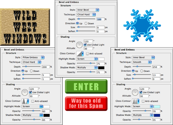
FIGURE 12-8: The Bevel and Emboss layer effect is very versatile.
 When you feel the need and have the time to let your imagination frolic through the fertile fields of Photoshop fun, filters are first, but the Bevel and Emboss layer effect follows fruitfully. Take the time to play with the various settings in the Bevel and Emboss pane of the Layer Style dialog box to see what they do. Add a new layer, create a simple shape (perhaps with one of the shape tools), select Bevel and Emboss from the pop-up menu at the bottom of the Layers panel, and experiment — that’s a far more efficient way to get to know this effect than reading technical explanations of each of the options. (One caveat: You won’t see any change in your layer with the Stroke Emboss style unless you’re also using the Stroke layer effect.) Don’t forget to play with the various Gloss Contour presets! Remember, too, that you can add a second contour effect and/or a texture using the two check boxes below Bevel and Emboss in the left column of the Layer Styles dialog box. (As with other effects, click directly on the name Contour or Texture to access the effect’s options.)
As you read this book, keep an eye out for the Bevel and Emboss layer effect. When you come across a bevel or emboss effect, such as those shown in Figure 12-9, you might want to take a moment to remember your experimentation and then try to puzzle out what settings I might have used.

FIGURE 12-9: Many illustrations in this book use the Bevel and Emboss layer effect.
Stroke
As you read this chapter, you’ll see the Stroke layer effect often. Many of the insets from the Layer Style dialog box in this section’s figures have a one-pixel black Stroke layer effect applied. Adding that tiny stroke helps set off the dialog box from the background.
Not only is Stroke a handy and practical production tool, but it’s also a wonderful creative effect, too, especially when you use it in conjunction with other layer effects. For example, a stroke of a contrasting color is a great way to redefine the edge of your object when working with an outer glow and an inner shadow. (In the Stroke effect’s options, remember that you click the color swatch to open the Color Picker.) A simple stroke can convert even the plainest text into an eye-catching statement. And don’t forget that without the Stroke effect, the Bevel and Emboss effect’s Stroke Emboss option does nothing for your artwork. Figure 12-10 has a few examples of layer styles that include a Stroke effect.

FIGURE 12-10: The Stroke effect can stand alone or be used with other layer effects.
Inner Shadow
You can do a couple of things with the Inner Shadow layer effect, as you can see in Figure 12-11. Compare the two sets of options. On the left, a soft, light-colored inner shadow using the Screen blending mode softens edges. On the right, a hard inner shadow, using a dark color and the Multiply blending mode, produces a totally different look. Despite what your eyes might be telling you, the layer effect is applied to the red shape on the upper layer.

FIGURE 12-11: Inner shadows can be soft or hard, light or dark.
Inner Glow
The Inner Glow effect is much like a non-directional Inner Shadow effect. As you can see in Figure 12-12, an Inner Glow can be the base for a neon glow style. (Add an Outer Glow effect, perhaps a Stroke effect, and there you go!)

FIGURE 12-12: Inner Glow offers more control than Inner Shadow.
You can also develop some rather amazing styles by using the Inner Glow and the Inner Shadow in combination. Using similar Size settings and varying the colors and blending modes lets you overlay a pair of effects in combination. And when you play with Inner Glow and Inner Shadow in combination, don’t overlook the Contour variations.
Satin
The Satin layer effect uses the shape of the object to produce a wave-like overlay. As you can see in Figure 12-13, it’s more effective with type and complex shapes than it is with large plain shapes.

FIGURE 12-13: The Satin layer effect is very effective with complex shapes.
Color Overlay
The key to using the Color Overlay layer effect is the blending mode. (See the sidebar, “The four key blending modes” earlier in this chapter.) When you use Normal, in effect, you paint all the pixels on the layer with the selected color. To blend the color with the original artwork or other effects (such as pattern overlays), choose an appropriate blending mode — Multiply with dark colors, Screen with light colors — or simply experiment with blending modes. However, using the Color Overlay layer effect with the Normal blending mode in a custom layer style is a good way to ensure consistency in artwork, such as buttons and banners for a website. Keep in mind, however, that Cover Overlay at 100% opacity used with the Normal blending mode completely hides any Gradient Overlay or Pattern Overlay effect.
Although you’ll generally find Color Overlay most useful for simple shapes in artwork and on web pages, you can certainly use it for more exciting effects, such as the ones shown in Figure 12-14. The original is in the upper left, and each example shows the color, blending mode, and opacity selected. Remember that when you use a layer effect, you can later return and alter or remove that change from your image.

FIGURE 12-14: Color Overlay can produce subtle or dramatic changes in your artwork.
Gradient Overlay
Unlike the Gradient Map adjustment (see Chapter 6), which applies a gradient to your image according to the tonality of the original, the Gradient Overlay effect simply slaps a gradient over the top of the layer content, using the blending mode and opacity that you select. You also control the shape of the gradient, the angle at which it’s applied, and the gradient’s scale. (See Figure 12-15.) And don’t forget that a Gradient Overlay using the Normal blending mode and 100% opacity will hide any Pattern Overlay effect.
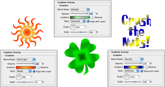
FIGURE 12-15: In keeping with its name, the Gradient Overlay effect overlays a gradient.
When working with gradients, you click the triangle to the right of the gradient sample to open the Gradient panel. You directly click the gradient sample itself to open the Gradient Editor. (See Chapter 14 for more information on editing and creating gradients.)
Pattern Overlay
Like the Color Overlay layer effect, Pattern Overlay relies on the blending mode and opacity settings to determine how the artwork (pattern) that it overlays interacts with your original artwork. As you see in Figure 12-16, you can scale the pattern, align it to the upper-left corner of your image (with the Snap to Origin button), and link the pattern to your layer so that the appearance of your artwork doesn’t change as you drag the layer into position. Click the triangle to the right of the sample pattern to open the Pattern panel and then select a pattern.

FIGURE 12-16: The Pattern Overlay layer effect adds texture to your layer’s artwork.
Outer Glow
The Outer Glow layer effect is much like a non-directional shadow when applied using a dark color. However, it also has a variety of uses with a light color and the Screen blending mode. As you can see in Figure 12-17, it has practical and whimsical uses. (Please remember that in real life, stars do not appear between the horns of a crescent moon!)

FIGURE 12-17: An Outer Glow layer effect (seen here on the left) is a multipurpose layer effect.
In the Structure area at the top of the Outer Glow options, you can select the blending mode and opacity, add noise if desired, and select between a color (click the swatch to open the Color Picker) or a gradient (click the sample to open the Gradient Editor). You define the size and fade of the glow in the Elements area. The Technique pop-up menu offers both Softer and Precise — try them both. And don’t overlook the options at the bottom, in the Quality area. Although you use Jitter only with gradients to add some randomness, the Range slider is an excellent way to control the distance at which your glow is offset. When you get a chance, play with different contours for an Outer Glow effect.
Drop Shadow
A drop shadow is a great way to separate the content of one layer from the rest of the image, as you can see by comparing the two versions of the artwork in Figure 12-18. In effect, the content of the target layer is copied, converted to black, and placed behind your layer. The blending mode and opacity determine how the shadow interacts with the layers below. You decide how much to offset and blur the duplicate with the sliders. (Remember that this is a layer style, so no extra layer is actually added to your image.) You’ll generally want to leave the Contour option of your drop shadows set to the linear default. As you saw in Figure 12-6, drop shadows are great with type layers!

FIGURE 12-18: Drop shadows can visually separate the upper layer from the lower layer.
Opacity, fill, and advanced blending
In the Blending Options area of the Layer Style dialog box and the upper-right corner of the Layers panel, you see a pair of adjustments named Opacity and Fill Opacity, as shown in Figure 12-19. Both have an impact on the visibility of the content of your layer.

FIGURE 12-19: The Opacity and Fill Opacity sliders control the visibility of a layer.
When you reduce the Opacity setting for the layer, you make the layer content and any layer style partially or completely transparent. Reducing the Fill slider changes the opacity of the pixels on the layer but leaves any layer effects fully visible. When might you want to use the Fill slider? The first thing that comes to mind is when creating the ever-popular Glass Type technique, which produces see-through text that’s perfect for your copyright notice on any image:
-
Add some text to an image with the Type tool.
This is a wonderful trick for adding your copyright information to sample images because everyone can see the image, but no one can use it without your permission. Start by adding your copyright information or perhaps the word Sample.
-
Apply a layer style to the type layer.
A bevel, a thin black stroke, and perhaps an inner shadow or white outer glow make an excellent combination. (Select the individual effects as described earlier in this chapter.)
-
Reduce the Fill slider to 0%.
Adjust Fill at the top of the Layers panel or in the Layer Style dialog box’s Blending Options pane. You can click and type in the Fill field, click the arrow to the right of the field and drag the slider, or simply click the word Fill and drag to the left. The type layer disappears, but the layer effect remains.
You can see all three steps in Figure 12-20.

FIGURE 12-20: Using the Glass Type effect is a great way to add copyright info to sample images.
The Blending Options pane of the Layer Style dialog box offers you a number of other choices in the Advanced Blending area, as shown in Figure 12-19.
Other than the Fill Opacity slider, you’ll probably never change the Advanced Blending options from their default settings, but you might be curious about what they do. Here’s a short explanation of each:
- Channels: Clear one or more of the color check boxes in the Advanced Blending area to hide the layer’s content in that color channel. Clear the R check box, for example, and you hide the target layer in the Red channel.
- Knockout: You can use the content on the target layer to create transparency on lower layers. The top layer becomes transparent, as do the layers below every place that the upper layer had visible pixels. (I think of it as a “cookie cutter” effect.) If you want to restrict the effect, use the Shallow option, and the knockout extends only to the lowest layer in your layer group. The Deep option knocks out to the Background layer (or to transparency if your image doesn’t have a background layer).
- Blend Interior Effects as Group: You can blend the Inner Glow, Satin, and your overlay effects before the layer as a whole is blended with lower layers. Use this option if it seems your layer effect’s blending mode is being canceled out by the layer’s own blending mode.
- Blend Clipped Layers as Group: If you have layers clipped together (see Chapter 10), you can elect to use the base layer’s blending mode for all the layers or let each layer interact independently. You generally want to leave this check box selected.
- Transparency Shapes Layer: This is another option that you’ll almost always want active. Transparency Shapes Layer restricts the layer style to the visible pixels on the target layer. If, for example, you’re working with a small rounded rectangle and a Color Overlay layer effect, deselecting the check box fills the entire layer — not just the rounded rectangle — with color.
- Layer Mask Hides Effects: If the target layer’s visibility is controlled with a layer mask (see Chapter 8), you can opt to have the layer style hidden by the mask, too. You can also use a layer mask to hide just the layer style with this option — say, when you need to make sure that your drop shadow doesn’t fall where it shouldn’t. Simply create a layer mask that hides those areas where you don’t want the style visible and select the Layer Mask Hides Effects check box.
- Vector Mask Hides Effects: This option uses a layer’s vector mask in exactly the same way that the Layer Mask Hides Effects option uses a layer mask. (Remember that a vector mask is a path that determines which areas of a layer are visible — see Chapter 11 for information on creating vector masks with paths.)
If you have an image with a plain white (or plain black) background, you can make that background disappear with the Blend If sliders. (See Figure 12-21.) In the Layers panel, unlock the Background layer by clicking the Lock icon to the right of the layer name. At the bottom of the Layers panel, click the second button from the right to add a new layer. Move the new layer below the original layer. With the original layer active, open the Blending Options pane of the Layer Style dialog box and drag the upper-right Blend If slider control to the left until the background disappears. As the white background disappears, the checkerboard transparency grid becomes visible. Press ⌘ +E (Mac)/Ctrl+E (Windows) to merge the layers and retain the now-transparent background.

FIGURE 12-21: Make a white background disappear with the Blend If sliders.
Saving Your Layer Styles
Creating custom styles takes some time and effort. Saving the styles means that you don’t have to spend time re-creating the style. Save your styles not only in the Styles panel but also on your hard drive.
Adding styles to the Styles panel
After you have your layer style looking just right, you can add it to the Styles panel. From the Styles panel, you can apply your custom style to any layer (except, of course, layers named Background) in any image with a single click. You simply make the target layer active in the Layers panel by clicking it; click your custom style in the Styles panel.
To add your style to the Styles panel, you must first create it. Select a layer in the Layers panel, open the Layer Style dialog box, and select the layer effects and options. Click the New Style button to save the style or, after clicking OK in the Layer Style dialog box, click the middle button at the bottom of the Styles panel. Then, in the New Style dialog box that appears, assign your custom style a name and click OK. If desired, you can also elect to save the target layer’s blending mode as part of the layer style.
Preserving your layer styles
 Adding your custom styles to the Styles panel makes them available day in and day out as you work with Photoshop. However, should you ever need to replace the Preferences file (see Chapter 3) or reinstall the program, all your custom styles are wiped from the Styles panel. To make sure that you don’t accidentally lose your custom styles, create and save a set of styles, which you can then reload into the panel whenever necessary.
The Styles panel menu offers the Save Styles command (refer to Figure 12-4), which lets you save all the styles currently in the panel as a set. However, for more control — to actually select which styles you want in your set — use Photoshop’s Preset Manager. (See Figure 12-22.) You can open the Preset Manager from either the Styles panel menu or through the Edit ⇒ Presets menu. (Make sure that you retain the .asl extension in the filename so that Photoshop recognizes the file as a set of styles!)

FIGURE 12-22: Use the Preset Manager to make sure your custom styles are safe.
As shown in Figure 12-22, you use Preset Manager to save many kinds of custom bits and pieces. And use it you should! Shift+click to select a series of items or ⌘ +click/Ctrl+click to select individual items; then click the Save Set button. Give the set a name (again, with the .asl file extension), pick a location, and click OK.
Saving sets of styles, brushes, custom shapes, and the like in the Photoshop Presets folder adds those sets to the various panels’ menus. That makes it quite easy to load the set into the panel: Just choose the set from the panel menu. However, you should also save a copy of the set someplace safe, outside the Photoshop folder, so it doesn’t accidentally get deleted when you upgrade or (horror!) reinstall.