
Chapter 6
Making Tonality and Color Look Natural
IN THIS CHAPTER
![]() Discovering tonality
Discovering tonality
![]() Making the easy Auto repairs
Making the easy Auto repairs
![]() Making adjustments with Levels and Curves
Making adjustments with Levels and Curves
![]() Using advanced tonality correction
Using advanced tonality correction
![]() Seeing reds, greens, and in-betweens
Seeing reds, greens, and in-betweens
![]() Sailing with the Photoshop color correction armada
Sailing with the Photoshop color correction armada
![]() Fixing flesh tones
Fixing flesh tones
When an image really pops — when it jumps off the page at you — it’s generally because the shadows are dark, the highlights are light, and the colors are rich. I’m sure it’s no surprise to you that Photoshop can handle the job. (That’s one of the reasons why you subscribe to the program, right?)
In this chapter, I introduce you to the concept of tonality, which is the range of brightness in your image. I also introduce to you the various commands that Photoshop offers for you to adjust your image’s tonality. A couple of tools even give you pin-point control of shadows and highlights. After reviewing and adjusting the tonality of the image, it’s time to work with color. The second half of this chapter explores the various features available for working with your image’s color.
Adjusting Tonality to Make Your Images Pop
Most photos look better with a little tweaking. For pictures that look good to begin with, you might still want to perk them up a little with a tonal adjustment. Making the shadows a little darker and the highlights a bit lighter increases your image’s perceived tonal range, which is sort of the distance between black and white. Take a look at Figure 6-1. It’s a pleasant enough snapshot, with decent composition and an interesting subject. But it lacks pizzazz.

FIGURE 6-1: A nice snapshot, but not art.
With Photoshop, you can darken the shadows and lighten the rest of the image to make it more interesting. By intensifying the difference between what the eye sees as dark and what the eye sees as light in the image, you add some semblance of depth to this simple picture. Comparing Figure 6-1 with Figure 6-2, you can see that one basic tonal adjustment can also make the colors seem richer and even produce a perceived increase in detail and sharpness.

FIGURE 6-2: One simple tonal adjustment darkens, lightens, enriches color, and brings out detail.
 You might hear a number of words used for the same concept: the lightness and darkness of your image. Tonality, luminosity, and even brightness can be used virtually interchangeably when you’re talking about the general subject. However, you typically use brightness when talking about specific pixels and tonality when referring to the image as a whole.
Histograms Simplified
In most photographs of general subject matter, your eye sees the darkest neutral (gray) tone as black and the lightest neutral as white. (If the darkest color is obviously purple and the lightest a bright yellow, you probably wouldn’t classify the photo’s subject matter as “general.”) In a given image, the shadow under the shoe might be just a dark gray, and the shirt looks like it might need some bleach, but your mind (in cooperation with your eye) compensates to some degree and lets you see black and white.
For a more accurate look at the tonal range of your image, Photoshop offers the Histogram panel, which displays the distribution of the pixels in your image at various luminosity values. The darker pixels (shadows) are stacked at the left end, the lighter pixels (highlights) are stacked at the right end, and the rest of the brightness values (midtones) are stacked between. The taller a column in the histogram, the more pixels at that luminosity value.
As you look at histograms in this chapter and in your own work, keep in mind that the color coding in the histogram shows where there are preponderances of pixels of specific color at certain luminosity values. Where the histogram shows red or green or blue, the pixels at that brightness level are primarily in one channel of an RGB image. The cyan and magenta and yellow areas of the histogram show pixels in two of the RGB channels. When pixels in a specific tonal range appear in all three RGB channels, you’ll see gray in the histogram.
Consider, if you will, an image that consists primarily of white pixels, perhaps a beautiful Alpine snow scene or an ugly creepy-crawly thing on porcelain (as you can see in Figure 6-3). Either image has a histogram skewed dramatically to the right — what you call a high-key image. Nothing is wrong with the image (despite the histogram); it just happens to have a huge number of light-colored pixels.

FIGURE 6-3: The histogram is skewed to the right because of the many white pixels. Or maybe it’s trying to escape the spider.
Likewise, a low-key image has a preponderance of dark pixels, which skews the histogram to the left. Just about any night scene has a very large number of very dark pixels, pulling the distribution to the left in the histogram. But many night scenes also include lights, which produce a spike at the far right end.
Keep in mind, too, that the heights of the individual columns in the histogram area are relative: The tallest goes all the way to the top of the box, and the others are scaled accordingly. For example, an image on a black background — say, a large black background — might have so many pixels in the leftmost column that the other columns in the image appear tiny and almost unreadable, like the histogram shown in Figure 6-4.

FIGURE 6-4: Too many pixels in the leftmost column make the distribution for the midtones hard to see.
 If the histogram is skewed to one end or the other, making it hard to read, you can make a selection within the image and the histogram updates to show information for only the selected area. (Read about making selections in Chapter 8.) If the image has multiple layers or adjustment layers, the little pop-up menu below the histogram (when in Expanded View mode) enables you to specify what layer to calculate.
As you read later in this chapter (in the section “Level-headed you!”), you can use the histogram to help avoid degrading your image while making adjustments, and (as you can read in Chapter 7) it’s very important for working with the Camera Raw plug-in. But don’t forget about your eyeballs — you don’t need the Histogram panel to spot a low-key or high-key image.
Using Photoshop’s Auto Corrections
Adjusting the tonality of your image can be as simple as selecting one of the Auto commands from Photoshop's Image menu. With many photos, the tonality (and even the color) jump to just the right look for your image. No muss, no fuss — just a great-looking picture with a single command. Auto Color usually does the best job for most images that are close-but-not-perfect. If you don’t like the result, simply use Undo and use one of Photoshop’s more powerful tools.
Although Auto Color (and, to a lesser extent, Auto Tone and Auto Contrast) might do a good job with images that need simple corrections, take an extra few seconds and try the Auto buttons in Levels and Curves. On the Image ⇒ Adjustments menu, choose Levels or Curves and click the Auto button, and the algorithm will search for an adjustment that, when applied, improves both brightness and contrast in all three channels in an RGB image.
If, for some reason, you prefer one of the other algorithms for Levels and Curves, open either dialog box, click the Options button, select your desired algorithm, and then click OK (see Figure 6-5).

FIGURE 6-5: The Enhance Brightness and Contrast algorithm is selected by default.
Levels and Curves and You
Sometimes you need (or simply want) more control than what’s offered by the Auto commands. You might have a more demanding problem or a more expansive artistic vision. You might need to make major corrections or create stupendous effects. Photoshop, not surprisingly, offers that sort of control over your image. In fact (and also not surprisingly), you have several features at your disposal to manipulate the tonality of your images. Two of the most commonly used are Levels and Curves, both found on the Adjustments menu at the bottom of the Layers panel (see Chapter 8), the Layer ⇒ New Adjustment Layer menu, and the Image ⇒ Adjustments menu.
You can also use the tonal adjustment tools in Camera Raw prior to opening the image into Photoshop. Camera Raw is also available as a filter for images that have already been opened into Photoshop. Using Camera Raw as a filter isn’t the same as using the plug-in on a Raw image. Read about working with Camera Raw in Chapter 7.
Before I introduce you to the Levels and Curves commands, let me quickly explain and dismiss a couple of other available options, one at the very top of the Adjustments menu the other at the very bottom. Since the early days of Photoshop, the Brightness/Contrast command has lurked among the Image ⇒ Adjustments commands. In fact, it was the image adjustment command way back when. Now, however, the feature is somewhat lacking in control and sophistication and is perhaps of most use when fine-tuning an alpha channel or layer mask. (Alpha channels are discussed in Chapter 8, and layer masks appear in Chapter 10.) In both alpha channels and layer masks, you use a grayscale representation to identify specific areas of your image. Brightness/Contrast is perfectly adequate for many adjustments that you might make to those channels. Although its behavior is vastly improved from the early days, it is still a two-slider adjustment. But if you're an old-timer and absolutely love that old-time behavior of the Brightness/Contrast adjustment, click the Use Legacy check box to restore the older adjustment performance.
Also of limited use is the Equalize adjustment. It finds the lightest pixel in the image and calls that white and also finds the darkest pixel and calls that black. The rest of the pixels in the image are distributed between those values, creating an extended tonal range. In practice, you’ll find that the adjustment results in extreme highlights and extreme shadows, with a rather garish image overall as well as a lack of details in the midtones.
Always keep in mind that you don’t have to make changes to the entire image. If only part of an image needs repair, make a selection of that area before opening the particular adjustment dialog box you want to use. (Read about making selections to isolate areas of your image in Chapter 8.) Say, for example, that you take a beautiful photo of a room in your house — “beautiful” except that the view out the window is far too bright. Isolate the window with a selection, and then use one of your image adjustment commands to tone it down.
Level-headed you!
The Image ⇒ Adjustments ⇒ Levels command (⌘ +L/Ctrl+L) or adding a Levels adjustment layer (discussed in Chapter 8) gives you control over shadows, highlights, and your image’s overall tonality individually. Using a slider with three controls, you adjust the picture both to suit your eye, and with an eye on a histogram for reference. You even have numeric fields in which you can type exact values, should you find the need.
To perform the basic Levels correction, spreading the image’s tonality over the full range of values available, simply drag the slider controls under the histogram in the Levels dialog box inward until they’re under the point where the histogram begins to rise in a mountain shape. Ignore those little flat tails that extend outward — they represent individual stray pixels — and drag the little pointers under columns that are at least a few pixels tall. The histogram in the Levels dialog box (as shown in Figure 6-6) is for reference as you make changes, showing changes to the overall luminosity of each pixel. Note, however, that while you work in Levels, the Histogram panel also updates, showing you the changes that will be made to each color channel.

FIGURE 6-6: Compare the Levels histogram and the Histogram panel.
Dragging the middle slider in Levels to the right moves the bulk of the histogram toward the left, making the overall appearance of the image slightly darker. Dragging the middle slider to the left lightens the overall image.
For good measure, note the Output Levels slider in Figure 6-6, which you generally use only when preparing an image for a gallery print or for a commercial printing press that requires you to compress the image’s tonal range. Otherwise, ignore Output Levels. And make a mental note of that pop-up menu at the top of the Levels dialog box — you can apply Levels to each color channel of your image individually, changing this tonal adjustment tool to a color correction feature.
When you’re working in Levels (or just about any dialog box), remember that holding down the Option/Alt key changes the Cancel button to Reset. When you click Reset, all values in the dialog box are restored to the defaults, letting you start over without having to cancel and reselect the command.
Earlier in this chapter, I mention that you can use the Histogram panel to avoid introducing problems into the image. Note in Figure 6-6 that the Histogram panel shows slight gaps appearing among the columns. Technically called posterization, these gaps represent tonal values that are being squished together into a single value. The pixels at one brightness level are being shifted to the next higher or the next lower value, leaving that empty column in the histogram. Is this a problem? No, as long as you don’t see wide gaps, representing a number of consecutive tonal values not in use. (Extensive posterization ruins the subtle transitions between colors in your image.) And that’s why you want to keep an eye on the Histogram panel — to make sure you’re not creating wide gaps in the histogram and noticeable posterization in your image.
Posterization is rarely a problem with an image captured in (and processed in) 16-bit color, such as a Raw photo brought into Photoshop through Camera Raw. If, however, you shoot JPEG (which requires 8-bit color), here’s an easy way to minimize that posterization, one that lets you make your Levels adjustment but keep a pretty histogram that doesn’t show posterization. Immediately after using Levels, choose Edit ⇒ Fade Levels and change the blending mode from Normal to Luminosity. As you see in Figure 6-7, the posterization is greatly reduced with a minimal change in the effect of the Levels adjustment. Remember that the Fade command is available only immediately after applying an adjustment (or filter or tool) — you can’t even use the Save command between. (Read more about the Fade command in Chapter 15.)

FIGURE 6-7: Change the Levels adjustment blending mode to Luminosity with the Fade dialog box.
Tonal corrections with the eyedroppers
The Levels dialog box (and the Curves dialog box, too) offers another way to make tonal corrections to your image — sort of a half-automated technique — using the three eyedroppers in the right side (Levels) or at the bottom (Curves) of the dialog box. (When adding an adjustment layer rather than the Adjustment commands, the eyedroppers are to the left in the Properties panel.) Open your image, open the Levels dialog box, and correct both tonality and color in your image with three little clicks:
-
Click the left eyedropper on something that should be black.
This might be a shadow, a piece of clothing, or the tire of a car. Generally, you click something in the image that’s already quite dark.
-
Click the right eyedropper on something that should be white.
A cloud, the bride’s dress, perhaps an eye … all are likely targets for the highlight eyedropper. You usually click something that’s already quite light.
-
Click the middle eyedropper on something that should be gray.
Click something that should be neutral in color (should be, not already is). It doesn’t have to be mid-gray, just something that should be neutral. This reduces or eliminates any unwanted color cast (tint) in the image. If you don’t like the result, click somewhere else in the image. Keep clicking until the colors in the image look right.
In Figure 6-8, the shadow under the bridge, the splash of water, and the weathered wood of the bridge itself provide excellent targets for the three eyedroppers.

FIGURE 6-8: Use the eyedroppers in Levels to set the black and white points; then neutralize your image’s colors.
Here's another way to adjust color using Levels. Duplicate the image layer by dragging it to the New Layer button at the bottom of the Layers panel and apply the Blur ⇒ Average filter. The layer becomes a solid color. Open the Levels dialog box. Click in the layer with the middle eyedropper and click OK. Delete that blurred layer. This technique doesn't work with every image (such as extremely bright, super-saturated images), but it does a great job on most.
Adjusting your curves without dieting
One step up from Levels in complexity, and about five steps ahead in terms of image control, is Image ⇒ Adjustments ⇒ Curves (⌘ +M/Ctrl+M). The Curves dialog box has a pair of slider controls (similar to the left and right sliders in Levels) to easily control the endpoints of your shadows and highlights. The curve line itself gives you control over various parts of the tonal range independently. Curves also offers eyedroppers for tonal and color correction. They’re used the same way you use the eyedroppers in Levels.
At the very beginning of this chapter, I show you how a simple tonal adjustment can add some drama and some interest to a rather bland image. Figure 6-9 shows the simple Curves adjustment that I applied to that image. Dragging the curve downward in the shadows makes them darker; dragging upward for the highlights makes them brighter. The midtones (that section of the tonal range between shadows and highlights) have improved contrast using this adjustment.

FIGURE 6-9: A simple “S-curve” adjustment makes the image more dramatic.
When you first open the Curves dialog box or add a Curves adjustment layer, you see a graph with a diagonal line running from an anchor point in the lower-left corner to another in the upper-right corner. You can click and drag that line up or down (not sideways) to add anchor points and make changes in the curve (and in your image). By default, the shadows are in the lower-left corner, so dragging down will darken and dragging up will lighten. (In the Show Amount Of area, switching from Light to Pigment/Ink will reverse the shadows/highlights. Use this option when preparing CMYK images for page layout programs.) You can add more than a dozen anchor points to the curve — although you generally need only between one and three new points.
Most snapshots can benefit from a slight tweak in Curves. Click at the intersection of the first vertical and horizontal gridlines in the lower left (the three-quarter tones) and drag down slightly. The Input field should read 64, and the Output field should be somewhere between 55 and 60 for a shot that looks pretty good to start. Next, click at the intersection of the grid lines in the upper right (the quarter tones) and drag up slightly. The Input field should show 192, and the Output field can be anywhere from 195 to 205. This is called a basic S-curve.
Both the Curves and Levels dialog boxes offer you the Load and Save options using the gear-shaped button to the right of the Preset menu. If there’s a correction that you’ll use more than once or a correction that needs to be precise time after time, use Save. Then, later, you can click Load to apply that adjustment to another image. If, for example, you used the wrong setting in your camera while taking a series of shots all under the same lighting conditions, they probably all need the same correction. Make the adjustment once, save it, and then apply it to the other images with the Load button.
If you want to correct a specific area in the image, move the cursor into the image window (where it appears as the Eyedropper tool). Hold down the mouse button and you’ll see a circle on the curve, telling you where those pixels fall in the tonal range. To add an anchor point there, ⌘ +click/Ctrl+click in the image.
Curves offers the option to adjust the curve by clicking and dragging right in your image window. Activate the on-screen adjustment option by clicking the tool to the lower left of the grid in the Curves dialog box (or to the upper left of the grid when adding a Curves adjustment through the Properties panel). With the on-screen adjustment option active, click in the image window on an area that needs improvement and drag upward to lighten or downward to darken. (See Figure 6-10.) The adjustment is applied to the entire image or selection, not just the area where you click. (Working with adjustments layers in the Properties panel is discussed in Chapter 8.)

FIGURE 6-10: Drag up to lighten, down to darken. Adjustments are applied throughout the image.
When your curve has multiple anchor points, the active anchor point shows as a filled-in square. Deselected anchor points are hollow squares. For precision, you can use the arrow keys on your keyboard to move the active anchor point, or you can type specific values in the Input field (starting position for the anchor point) and Output field (where you want the anchor point to go).
Option+click/Alt+click in the grid area to toggle between a 4x4 grid and a 10x10 grid or use the two buttons in the Grid Size section to switch back and forth. And, rather than clicking and dragging on the curve, you can activate the Pencil tool and draw your curve by hand. When hand-drawing your curve, the Smooth button is available, too, to ensure that the transitions in your tonal adjustments aren’t too severe.
Grabbing Even More Control
The Image ⇒ Adjustments menu in Photoshop includes a couple more extremely powerful ways to work with tonality in your images. You can use the Shadow/Highlight adjustment to isolate and change whatever range of dark and light pixels you want. By specifying what range of tonal values that you want to be considered dark or light, you control how broadly or narrowly your change is applied. The Exposure feature lets you change the overall tonality of the image, much as if you’d taken the photo with a different camera setting. And don’t forget about making spot corrections with the Dodge and Burn tools!
The Image ⇒ Adjustments ⇒ HDR Toning command is designed — like the Exposure adjustment — to be used with 32-bit/channel high-dynamic range images. You can read about HDR (and HDR Toning) in Chapter 20.
The Shadow/Highlight and Exposure adjustments are not the same as working with Raw images in the Camera Raw plug-in. (See Chapter 7.) Camera Raw works with unprocessed image data, the so-called digital negative. Using Photoshop’s Adjustment commands or using Camera Raw as a filter within Photoshop, you’re working with image data that has already been manipulated in the camera, in Photoshop, or both. When working with unprocessed data in Camera Raw, you truly have control over the exposure, the shadows, the highlights, and much more.
The Shadow/Highlight adjustment is not available as an adjustment layer. Changes that you make with the Shadow/Highlight command are a permanent part of your image. However, if you convert the layer to a Smart Object, Shadow/Highlight can be applied as a Smart Filter. (Smart Objects are introduced in Chapter 10, and Smart Filters are discussed in Chapter 15.)
Using Shadow/Highlight
The Shadow/Highlight adjustment is designed to rescue two specific sorts of images — you’ve seen them (and maybe taken them): The background is perfectly exposed, but the subject in the foreground is in horrible shadow. Or, equally bad, the background looks great, but the subject is washed out by a strong flash. (See both examples in Figure 6-11.) By controlling the shadows and highlights separately from the rest of the image, this feature helps you restore more balance to the image.

FIGURE 6-11: Shadow/Highlight does a rather good job with these very common problems.
The default settings in Shadow/Highlight are intended to repair backlighting problems, as you see on the left in Figure 6-11. When the foreground lacks detail because of flash (as you can see in the top dog image on the right), minimize changes to the shadows and drag the Highlights slider to the right. And, as shown in Figure 6-12, with Show More Options selected, Shadows/Highlights gives you incredible control over images that have problems at both ends of the tonal range.

FIGURE 6-12: Some images need help to show detail in both shadows and highlights.
In the Shadows/Highlights dialog box, the Shadows slider lightens the darker areas of your image and the Highlights slider darkens the lighter areas. Generally, you’ll use one slider or the other to fix a specific problem in an image, but you can use both if you need to lighten shadows and tone down highlights in the same image.
When you enable the Show More Options check box, Shadow/Highlight has a rather intimidating set of controls. Not to worry! It’s actually pretty simple:
- Amount: For both Shadows and Highlights, the Amount slider is how much of a correction you’re making. This is the nuts and bolts of the Shadow/Highlight adjustment. For a backlit subject, you’ll use the Shadows slider a lot and not the Highlights slider. When working with a washed-out subject, you’ll probably move the Shadows slider to 0% and work with the Highlights slider.
- Tone: Use the Tone sliders to specify how much of the image’s tonal range you want to include as shadows or highlights. If you drag either Tone slider to 100%, you’re working on the entire tonal range of the image — not a particularly appropriate job for Shadow/Highlight. (Use Curves instead.) The default of 50% is rather too high most of the time. Instead, start your adjustment with a range of perhaps 20% and fine-tune from there.
- Radius: You adjust the Radius sliders to tell Shadow/Highlight which pixels should be identified as being in the shadow or highlight. With too low of a Radius setting, an individual black pixel stuck in the middle of a light area in your image might get classified as a shadow area. Too high of a setting has a tendency to apply the adjustment to the entire image. Generally speaking, start with a Radius of perhaps 10 pixels for very small images and 30 pixels for large digital photos. After adjusting your Amount and Tonal Width sliders, move the Radius slider back and forth while watching some of the smaller patches of shadow or highlight (whichever you’re correcting) to make sure that those areas are being included in the adjustment.
- Color/Brig: This slider changes its name to match your image’s color mode. When working with a color image, you see Color. When you apply Shadow/Highlight to a grayscale image, the slider’s name changes to Brig (Brightness). Don’t use this slider until you make your Amount adjustment. In a color image, lightening the shadows or darkening the highlights shows the actual color of the pixels in those areas. Use this slider to increase (drag to the right) or decrease (drag to the left) the saturation of those pixels. Remember that Color slider works only on the pixels that you identify with the Tonal Width and Radius sliders. (If you set both sets of Tonal Width and Radius sliders to 0%, Color Correction has no effect on the image at all.) When you correct a grayscale image, on the other hand, the Brightness slider affects all pixels except those that are already pure white or pure black.
- Midtone: You can increase or decrease the contrast throughout the image with the Midtone slider. Much like clicking in the middle of the curve in the Curves dialog box and dragging up or down, you adjust the whole range of your image, including the shadows and highlights. When the overall appearance of your image needs improvement, start with Midtone and then work with your shadows and highlights individually.
- Clip: Most of the time, you don’t want to change the clipping values. Clipping takes pixels that are almost black and forces them to pure black, or it takes pixels that are almost white and forces them to pure white. Clipping your shadows or highlights reduces those subtle differences in color that provide the detail in the shadows and highlights. When would you want to clip shadows or highlights? When you don’t care about detail in those areas of your image and need more contrast through the midtones.
Changing exposure after the fact
Photoshop also offers the Exposure feature in the Image ⇒ Adjustments menu. It simulates how the image would have looked if you changed the exposure setting on your camera before clicking the shutter. Think of it as an across-the-board adjustment of tonality in the image or within a selection in the image. The Offset and Gamma Correction sliders are designed primarily to work with very high-bit images (the special 32-bit/channel high-dynamic-range images), and you likely will find them too sensitive to be of much use for most images.
Exposure is a rather specialized tool, and you probably won’t find it nearly as user friendly or effective as Curves and Shadow/Highlight. If you do actually work with 32-bit/channel images, take it for a test drive; you might decide that it fills a need.
Using Photoshop’s toning tools
You have a couple more ways to work with tonality in Photoshop — the toning tools. These two brush-using tools let you paint corrections on your image, giving you incredible control over the appearance. Select the Burn tool to darken or the Dodge tool to lighten. Select a brush tip on the Options bar and drag the tool in your image to apply the correction. (You can read about controlling the brush-using tools and that incredibly powerful Brush panel in Chapter 14.) In Figure 6-13, you see the Burn tool darkening a specific area of the fence on the right.

FIGURE 6-13: “Painting” the fence with the Burn tool to darken the rails.
The Dodge tool is great for minimizing (without removing) shadows in an image. You’ll find it particularly useful for reducing wrinkles in faces and other such jobs that require lightening specific areas of an image. Figure 6-14 compares the original (left) with a working copy in which I’m using the Dodge tool to reduce the appearance of the wrinkles. By reducing rather than eliminating those wrinkles completely, I retain the character of the man’s face as well as prevent that phony, just-out-of-plastic-surgery look.

FIGURE 6-14: Use the Dodge tool to minimize wrinkles without removing them.
In almost all circumstances when working with the Dodge and Burn tools, you should activate the Protect Tones option on the Options bar. With this option selected, the tools do a much better job of protecting color and retaining detail in shadows and highlights. To the right on the Options bar is a button you can use to enable pressure sensitivity when you're working with a Wacom tablet, overriding any pressure-sensitivity setting in the Brush panel.
For most of the work that you do with the Dodge and Burn tools, the default Exposure setting of 50% is way too strong. In the Options bar, reduce the Exposure to about 15–20% for most work. And unless you’re specifically working on lightening shadows or toning down highlights, set the tools’ Range to Midtones in the Options bar.
What Is Color in Photoshop?
In the end (and the middle and the beginning), your image in Photoshop is nothing but little squares of color. Each square — each pixel — can be exactly one color. Which color for which square is up to you. I’ll say it again: There is no car or circle or tree or Uncle Bob in your Photoshop image — just a bunch of little squares of color.
Photoshop works with digital images — including digital photos, images that have been digitized with a scanner, and artwork that you create from scratch in Photoshop. The digits are the computer code used to record the image’s information. The number of pixels, the color of each pixel, and any associated information are all recorded in a series of zeros and ones on your hard drive. Color, therefore, is nothing more than numbers — at least as far as Photoshop and your computer are concerned. For you and me, however, color is far more than binary code on a hard drive. It’s the image, the artwork, the message. The artwork is the color, and color is the artwork, pixel by pixel.
Photoshop records the color of each pixel in your image in any of several different ways. Every pixel in any given image has all color recorded in a single color mode, which is the actual color format for the image file. While working with your image, however, you can define specific colors in any of a variety of color models, which are sort of the formula or recipes with which you mix color. And an image can have only one color depth, which is the limitation on the number of colors in an image.
Before I get into too many details, you need to understand one of the basic concepts of color: gamut. Consider gamut to be the range of colors that can be theoretically reproduced in a specific color mode or with a specific color profile. A wide gamut, therefore, has many more colors available than does a limited gamut. Those extra colors are generally the brighter, more vibrant colors … the ones that make an image come alive. The red/green/blue (RGB) color mode generally offers you a wider range of colors than does cyan/magenta/yellow/black (CMYK). See, for example, the comparison in Figure 6-15, paying particular attention to the purples, oranges, and yellows. And keep in mind that the specific color profile (the working space that you select; see Chapter 4) also has an impact on the colors in your image.
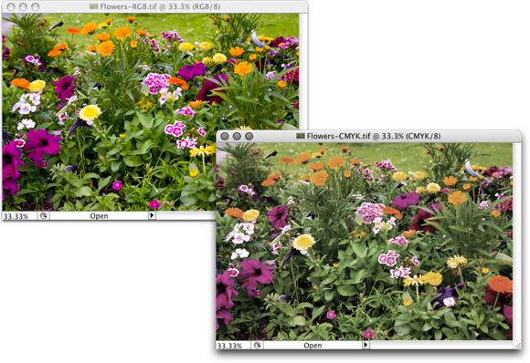
FIGURE 6-15: A wide-gamut image (on the left) and the same picture with a smaller gamut.
Which color mode should you choose?
If you’ll be printing to an inkjet printer, sending photos to a lab for prints, or posting your image on the web, you need RGB color mode. (Despite the CMYK inks that you load into your inkjet printer, the printer’s software expects and must receive RGB color data.) If you’re prepping an image for inclusion in an InDesign document destined for a commercial offset press, you need CMYK. You select the image’s color mode from the Image ⇒ Mode menu. That’s the simple summary. Here’s a bit more detail, presented in the order in which you’re likely to need the various color modes:
- RGB: RGB is the color mode for digital photos, computer monitors, the World Wide Web, and inkjet printers. All colors are recorded as proportions of the three component colors: red, green, and blue. RGB color is recorded in the three color channels (described a bit later in this chapter). RGB is an additive color mode — that is, the more of each component color you add, the closer you get to white.
- CMYK: CMYK is used primarily for printing on a commercial offset press, but you might need it for a color laser printer or a high-end inkjet printer with which you use a RIP (raster image processor, which is a specialized bit of hardware or software that lets your inkjet pretend it’s a printing press). CMYK is the color mode of magazines, books, and other mass-produced printed material, such as the example in Figure 6-16. CMYK is a subtractive color mode — that is, the less of each component color you have, the closer you are to white (or the color of the paper on which you’re printing).
- Grayscale: When most people talk about a black-and-white photo, they really mean grayscale. The image does contain black and white but also a wide range of grays in between. You might use grayscale mode for web-based images or for prints. Keep in mind that unless your inkjet printer is designed to reproduce grayscale images with black and gray inks (or black and light-black inks), you probably won’t be happy with grayscale output. Using just one black ink doesn’t reproduce the full range of grays in the image. Using the color inks adds a tint to the image. You do have an alternative for grayscale images: Send them to the local photo lab for printing.
- Indexed Color: Using a color table, or a list of up to 256 specific colors, Indexed Color mode is for the web. You save GIF and PNG-8 images in Indexed Color, but only those file formats require such a limited number of colors. Things like buttons on your web page, which need only a couple of colors, should be created as GIFs using Indexed Color mode. That keeps the file size down, reducing the amount of space the image requires on your web server and also speeding the download time (how long it takes for the image to appear on your site-visitor’s monitor).
-
Lab: Also known as L*a*b and CIELAB (and pronounced either lab, as the dog or a research facility, or verbally spelled out, as el-ay-be), this is a color mode that you might use when producing certain special effects or using certain techniques in Photoshop, but it’s not one in which you’ll save your final artwork. The three channels in a (or “an”) Lab image are
- Lightness, which records the brightness of each pixel
- a, which records the color of the pixel on a green-to-red axis
- b, which records each pixel’s color value on a blue-to-yellow axis
You shouldn’t try to print Lab images on an inkjet or post them on your website. You might see (not in this book!) a tip that you should convert your RGB or CMYK images to Lab mode before using one of Photoshop’s Sharpen filters. Bah! Apply the Sharpen filter, choose Edit ⇒ Fade Unsharp Mask (or Fade Smart Sharpen — the Fade command changes its name to match the last-used filter, adjustment, or tool), and change the blending mode from Normal to Luminosity. Same result, less work, and less potential for degradation of your image.
- Duotone: Duotone (including tritone and quadtone) is a very specialized color mode, exclusively for commercial printing, that uses only two (or three or four) inks spread throughout your image. Although that might sound good for an inkjet printer, in fact, Duotone is not an acceptable color mode for inkjets. Duotone images require that specific premixed inks are poured into the printing presses, which isn’t something that you can do to your inkjet.
- Multichannel: Like Duotone, the Multichannel color mode is restricted to commercial printing because it depends on specific premixed colors of ink that are applied to the paper. Unlike Duotone, in which the inks are generally spread across the page, Multichannel images use certain inks in certain areas. You might need Multichannel mode when creating a logo for a client.
- Bitmap: Bitmap color mode is true black and white (as you see in Figure 6-17). Each pixel is either black or white. The placement of the black and white pixels produces shading, but the image doesn’t really have any gray pixels. You might use Bitmap mode to create images for some wireless devices, use on the web, or commercial print, but that’s about it.

FIGURE 6-16: You typically use CMYK images for bulk-print materials.

FIGURE 6-17: Bitmap images contain only black and white pixels; no grays, no colors.
 Converting between color modes or gamuts (done with the Image ⇒ Mode menu) can reduce the quality of your image by compressing variations of a color into a single color value. You would not, for example, want to convert from RGB (which has a comparatively large number of colors available) to CMYK (with a more restricted color gamut) and then back to RGB. After colors are compressed by a conversion, you can’t restore their original values by converting back to a wider gamut.
Does a color model make a difference?
Although the image itself has a single color mode, you can use any of the available color models when defining a color in Photoshop. Say, for example, that you’re preparing to use the Brush tool to paint some artistic elements for your latest project. The project is in RGB mode because you’ll be printing it with your inkjet printer. You can use the Color panel to define your foreground color any way you please — RGB, CMYK, Grayscale, Lab, or even HSB (hue/saturation/brightness, which isn’t available as a color mode, just a color model). It doesn’t matter how you set up the Color panel, which you do through the panel’s menu, as shown in Figure 6-18. When you add the color to your image, Photoshop uses the nearest RGB (or CMYK) equivalent.

FIGURE 6-18: Choose your preferred color model from the Color panel menu.
Notice that the Color panel menu in Figure 6-18 doesn’t list Duotone or Multichannel. Those are color modes only, not color models. A couple of other things to note about working with the Color panel: The warning triangle visible in Figure 6-18 in the lower-left corner of the panel indicates that the selected color is outside the CMYK color gamut. Clicking the swatch to the right of the triangle would select the nearest equivalent color (if, that is, you were actually working in CMYK mode). Also note that the foreground swatch is selected in the panel, highlighted with a black outline — click the background swatch to make changes to the background color.
You can also select or define a color using the Color Picker, which you open by clicking the foreground or background color swatches near the bottom of the Toolbox or in the Color panel. The Color Picker is explained in detail in Chapter 14.
Why should you worry about color depth?
Color depth is the actual number of different colors that you have available. (Remember that each pixel can be only one color at any time.) When you work in 8-bit-per-channel color, simply called 8-bit color, each of the component colors is recorded with exactly 8 bits of information per pixel in the computer file. (At the beginning of this section, I mention digits. These are the actual numbers — the zeros and ones recorded on the hard drive to track each pixel’s color.) In an 8-bit RGB image, each pixel’s color is recorded with three strings of eight characters. When you work with 16-bit-per-channel, or 16-bit color, each of the component colors is recorded with 16 digits. The larger numbers mean more possible ways to record each color, which means more possible variations of color (as well as files that take up more space on your hard drive).
What that means to you, in practical terms, is possibly a better-looking image when working in 16-bit color. You’ll have smoother transitions between colors throughout your image, no banding in gradients (those annoying areas in a gradient where you can actually see one shade of a color stop and the next shade of that color start), and no splotchy shadows. Posterization, which I explain earlier in this chapter, is the degradation of your image’s appearance when similar colors are forced to the same color, making transitions between colors more abrupt. Many tonal and color corrections that produce posterization in your 8-bit images won’t harm a 16-bit image in the least. Take a look at Figure 6-19. To the left, the Histogram panel shows the result of a Levels adjustment for a 16-bit image. When the same adjustment is applied to an 8-bit version of the image, posterization becomes visible in the Histogram panel (represented by the gaps in the histogram).

FIGURE 6-19: Compare the Histogram panels to see posterization (right).
Some of the top inkjet printers, when printing on a Mac, can process and use 16-bit color — but unless Photoshop’s Print dialog box offers the Send 16-Bit Data option (shown in Figure 6-19), you won’t be using more than 8 bits of color data.
So, should you use 16-bit color all the time? No. You can’t post a 16-bit image on the web, and 16-bit color is rarely used for CMYK images. Digital photos taken in JPEG format are 8-bit because that file format doesn’t support 16-bit color. And unless you’re using a 16-bit-capable inkjet printer, you won’t see any improvement in the final print. If you shoot in 16-bit color, typically using a Raw file format, it makes sense to keep the image in 16-bit color. Do all the processing in 16-bit color, save the file as a 16-bit image, and send the 16-bit data to your inkjet printer. If you’ll be sending the file off to a print lab or eventually posting the image on a website, create a copy of the file and convert the copy to 8-bit/channel color through the Image ⇒ Mode menu.
You might consider converting an 8-bit image to 16-bit color as part of a larger project, perhaps one that includes a large gradient as part of the artwork. But, generally speaking, if the image was captured in 8-bit color, keep it in 8-bit color; if the image was captured in 16-bit color, keep it in 16-bit color.
One other note on color depth: Photoshop can work with 32-bit/channel images. These monstrous files are called high dynamic range (HDR) images and are typically constructed by combining different exposures of the same photo. Chapter 20 takes a look at HDR.
Making Color Adjustments in Photoshop
Sometimes you have an image that needs some help in the color department. It might have been shot with an incorrect camera setting, it might have a color cast (an unwanted tint of a specific color), or it might just be dull and dingy. Photoshop provides you with an incredible array of commands and tools to make the colors in your images look just right. You’ll hear the term color correction being tossed about, but not all images have incorrect color. Some have very good color that can be great color. Instead of color correction, I like to think in terms of color improvement. And just about every image can use a little tweaking to improve its color.
How do you know when the color is right? Your primary tool for the job is in your head. Literally. Make your decisions based primarily on what your eyes tell you. Sure, you can check the Info panel and the Histogram panel to make sure that your shadows are black and your highlights are white, but adjust your images until they look good to you — until you’re satisfied with the color.
That little symbol to the left of this paragraph is a little scary, but it does get your attention, doesn’t it? This isn’t a your-computer-will-blow-up sort of warning but more of a you-don’t-want-to-waste-your-time-and-effort warning. Do your tonal adjustments before you start working with the image’s colors. Go through the procedures in the first part of this chapter first and then use the techniques here. Why? If you get perfect hue and saturation and then start making tonal adjustments, you’re likely to knock your colors out of whack again. And, of course, there’s also the possibility that adjusting your image’s tonality will make the colors look perfect!
Choosing color adjustment commands
Photoshop offers almost two dozen different commands that you can use to improve the appearance of your images, all of which are easily accessed through the Image ⇒ Adjustments menu (as you see in Figure 6-20). Some have specialized purposes, and some are extremely versatile, but all are worth understanding so that you choose the most appropriate feature for the problem staring at you from the screen. Most (but not all) of the commands that I discuss here can be added to your images as an adjustment layer, which gives you added flexibility. (Adjustment layers are discussed in detail in Chapter 8.)

FIGURE 6-20: Photoshop’s flexibility is truly evident on the Image ⇒ Adjustments menu.
In addition to the Adjustment commands and adjustment layers, you can also take advantage of the color adjustment features of Camera Raw. If shooting Raw, you can open the image directly into Camera Raw, or after the image has been opened in Photoshop, you can use the Camera Raw filter. (See Chapter 7 for information about working with Camera Raw.)
Brightness/Contrast, Levels, Curves, Exposure
These commands are generally used to work with tonality rather than color (discussed earlier in this chapter). However, you can select an individual channel in Levels or Curves, as shown in Figure 6-21, to adjust color in an image. Keep in mind that changes to an individual color channel are reflected throughout all colors in an image.

FIGURE 6-21: Correct each channel individually with Curves to adjust color in your image.
Vibrance
The Vibrance adjustment gives you control over both vibrance (the saturation of near-neutral colors) and saturation (the saturation of colors throughout the image). You can increase Vibrance to make the near-neutral colors more saturated, or you can reduce Vibrance to make those colors even more neutral, while increasing Saturation to make the brighter colors in your image stand out even more.
Hue/Saturation
Often overlooked and rarely exploited to the fullest, Hue/Saturation is a very powerful tool. Using the three sliders together, you can adjust the hue to eliminate a color cast, increase saturation so that your colors appear richer and more vibrant, and adjust lightness to improve your image’s tonality. (See Figure 6-22.) Keep in mind that when you adjust something that’s very dark, start with the Lightness slider so that you can evaluate the other changes (Hue and Saturation) properly. Remember, too, that you can apply Hue/Saturation (like a number of other adjustments) to a specific range of colors in the image, selected in the pop-up menu at the top of the dialog box or at the top of the Properties panel when adding an adjustment layer.
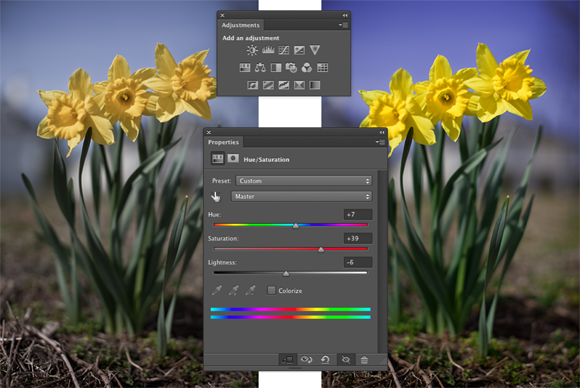
FIGURE 6-22: Hue/Saturation can cure three problems at once.
Using the pop-up menu (shown with the default Master visible in Figure 6-22), you can elect to apply an adjustment to only a certain part of the color in your image. After a color is selected, the eyedroppers become active, to add to or subtract from the range of color being adjusted, and sliders become active between the gradients at the bottom, giving you yet another way to control the range of color being adjusted.
Visible in Figure 6-22 are the Adjustments and Properties panels, which you use to add adjustment layers to your images. Select the type of adjustment in the Adjustments panel, or in the menu at the bottom of the Layers panel, or through the Layer ⇒ New Adjustments Layer menu. Make the actual adjustment in the Properties panel. (Adjustment layers are discussed in more detail in Chapter 8.) The content of the Properties panel offers the same options as the Image ⇒ Adjustments ⇒ Hue/Saturation dialog box, but the Preview check box is replaced by the eyeball icon you see at the bottom of the panel in Figure 6-22 (the second icon from the left), which toggles the visibility of the new adjustment layer on and off. Use the Adjustments panel to add adjustment layers for the 16 commands you saw in the top three sections of the Adjustments menu (refer to Figure 6-20).
Color Balance
The Color Balance command presents you with three sliders that you use to make changes to the balance between your color opposites. If the image is too blue, you drag the third slider away from Blue and toward Yellow. (This is also a great way to remember which colors are opposite pairs!)
You can control the highlights, midtones, and shadows of your image individually by using radio buttons in the Color Balance dialog box and the Adjustments panel. And, in almost all cases, you’ll want to leave the Preserve Luminosity check box marked so that the brightness of the individual pixels is retained.
You can also use Color Balance to throw an image out of whack for special effects or (getting back to the adjustment’s roots) compensating for a color cast being introduced by the printing device.
Black & White
The Black & White adjustment creates outstanding grayscale copies of your color images. As you can see in Figure 6-23, you can control the amount of each major range of color used to create the grayscale copy. In this particular example, the original consists primarily of greens and browns, so the top three sliders are key. Reducing Reds and increasing Yellows both lighten the browns and greens and increases contrast among the brown tones. When adding a Black & White adjustment layer, you have an on-screen adjustment tool available, which you click in the image and drag up or down to adjust the brightness of a color throughout the image.

FIGURE 6-23: Black & White enables you to determine grayscale tones by mixing color values.
Note the Tint check box, with which you can easily create sepia or Duotone looks for your images. Click the color swatch to the right of Tint to open the Color Picker to select a specific tint. If you'll be printing on an inkjet printer (rather than sending the file to your photo lab), you’ll want to use a Black & White adjustment layer rather than the menu command. Your inkjet printer may introduce an unwanted color shift. If so, you can reopen the adjustment layer and work with the sliders to compensate. Keep in mind that the Black & White adjustment you open through the Image ⇒ Adjustments menu offers Hue and Saturation sliders when adding a tint.
Photo Filter
Photoshop’s Photo Filter is actually an image adjustment rather than a filter. The filter in the name refers to those physical photographic filters that you screw onto the end of a lens. This adjustment is a great way to correct problems with temperature in an image — the perceived warmth or coldness of an image. When the camera takes a picture under unexpected lighting conditions, a color problem is apparent. (Say, for example, that the camera is set to Daylight when shooting indoors.) When an image is too blue, it’s too cool; conversely, an image that’s orangey is too warm. (Remember that these are perceptual evaluations — blue light is technically hotter than yellow or red light.)
Channel Mixer
Designed to repair a defective channel in an image, Channel Mixer lets you use sliders to replace some of (or all of) the intensity of one color channel with content from the others. Should you come across an image with damage in one channel, you can certainly use the Channel Mixer adjustment to work on it (with some degree of success). You reduce the value of the target channel by dragging the slider to the left. You then drag one or both of the other sliders toward the right. Generally speaking, you want to add an amount (combined between the two other channels) just about equal to what you subtract from the target channel.
If you drag a slider to the left past 0 (zero), you invert the content of the channel. You can produce some incredible (and incredibly weird) effects with this technique, partially inverting one or two channels. When you get a chance, give it a try. Using the Monochrome check box in Channel Mixer gives you an alternative to the Black & White adjustment for a controlled grayscale effect.
Color Lookup
A color lookup table is, at its most basic, a formula for applying color changes. Color Lookup takes the image’s original colors and maps them to new colors based on the table you select in the dialog box. (See Figure 6-24.) Typically used with video, it may have some applicability to your work (depending on what lookup tables — “LUTs” — you find online). The “3D” in “3DLUT,” by the way, refers to three color channels (RGB) and has nothing to do with 3D objects.

FIGURE 6-24: Color lookup tables are often used to match lighting in a computer-generated scene to live-motion video or film.
Invert
More creative than corrective, the Invert command (no dialog box) simply reverses the colors in your image or the selected area. Although inverting areas of an image (like desaturating) can draw attention to the subject of the image, it’s an edgier technique and generally requires touch-up after inverting. You’ll find that any specular highlight — a pure-white area (mainly reflections) — becomes a distracting black spot.
Posterize
The Posterize command forces your image’s broad range of colors into a few selected colors. You automatically get black and white, and then a limited number of additional colors, based on the content of the original. You pick the number of colors that you want to use, and Photoshop picks which colors to use. You can use as few as two colors (plus black and white) or as many as 255, which pretty much gives you your original image. Posterize can create a rather pleasing rendering of a photo with very few colors.
When experimenting with Posterize, click in the Levels field and use the up- and down-arrow keys to preview different numbers of colors. Start low and work your way up. If you see something that you like, you can stop or you can keep going and come back to that number later — the image will look exactly the same when you try that number again.
Threshold
Threshold converts each pixel to either black or white (no colors, no grays). You adjust the border between black and white with a slider or by entering a value in the Threshold Level box. For an eye-catching special effect, open a color image and make a selection of the background (or the subject!) and apply Threshold, mixing color and black and white.
Sometimes, when adjusting color in an image, you need to find the darkest and lightest pixels in an image (for use with the eyedroppers in the Curves dialog box, for example). Open Threshold, drag the slider all the way to the left and then slowly back to the right. The first black spot you see is the darkest in the image. Add a color sampler (so you can find the spot again) by Shift+clicking in the image. Drag the slider all the way to the right and then slowly back to the left to find and mark the lightest pixels. After placing your color samplers, click Cancel.
Gradient Map
Again, more creative than corrective, the Gradient Map feature re-creates your image by using a gradient. The leftmost color stop (the anchor points where a gradient color is assigned) in the gradient is mapped to the shadows the right-most to the highlights, and any color stops in between are appropriately assigned to the rest of the tonal range. In Figure 6-25, you can see how a two-color gradient (upper left) lacks detail compared with the four-color gradient being created for the lower image.

FIGURE 6-25: Using more colors in your gradient produces more detail.
Generally speaking, you use darker colors for the color stops on the left and lighter colors for the color stops on the right (although you can create extremely interesting effects by mixing things up). Using a black-to-white gradient produces a grayscale image.
To edit the gradient, simply click directly on the sample gradient in the Gradient Map dialog box. Click to add color stops, drag to move color stops, and click the color swatch near the bottom to change the color of the selected stop. (You can find more detailed information on creating and working with gradients in Chapter 14.)
Selective Color
Although designed to help you compensate for the vagaries of printing presses, Selective Color can do other great things for you! The command’s dialog box, shown in Figure 6-26, has a pop-up menu that offers the six basic colors of Photoshop, as well as Whites, Neutrals, and Blacks. You select which range of colors to adjust and then drag the sliders. You can work on one set of colors, switch to another and make adjustments, switch to another, and so on without having to click OK in between. For example, you can adjust the reds in the image and leave the blues untouched, or you can adjust the reds and then tweak the blues without having to exit the dialog box.

FIGURE 6-26: Tweaking the Neutrals can adjust the overall appearance of an image.
When you have reasonably small adjustments to make and are using the Selective Color adjustment (or as an adjustment layer), select the Relative radio button at the bottom. If you have substantial changes — rather radical alterations — select the Absolute radio button.
Shadow/Highlight
The Shadow/Highlight adjustment is discussed at length earlier in this chapter as a tonal-correction tool, the job for which it was designed. However, keep in mind that the Shadow/Highlight dialog box also includes the Color Correction slider. After you lighten shadows or tone down highlights, you can increase or decrease the saturation of the colors in the adjusted areas of your image with the Color Correction slider.
HDR Toning
Designed for use with high dynamic range images (32-bits/channel), the HDR Toning adjustment provides a different way to adjust color. It can be used with flattened images in 8-bit or 16-bit color, but keep in mind that small adjustments are usually required. HDR Toning is examined in Chapter 20.
Desaturate
The Photoshop Desaturate command creates a grayscale representation of a color image without changing the color mode. However, with no dialog box or adjustments, it doesn't offer the control you get by using a Black & White adjustment.
Match Color
Now this is a feature to savor! There you are, adding Cousin Joe to the family reunion photo because he wasn’t bailed out in time, and you see that the lighting is all kinds of different and he sticks out like a sore thumb (or bum). Or you return from a major shoot only to find that something wasn’t set correctly in the camera, and all your images have a nasty color cast.
Match Color lets you adjust one image to another (and you can even use selections to identify areas to adjust or areas of the images to use as the basis for adjustment), but keep in mind that you get better results with images that are already rather similar. You can also fix one shot and use that shot as a standard by which others are corrected. (Like most image adjustments, you can record a change in an Action and use Photoshop’s Batch command to apply that adjustment to a series of images. Read more about Actions and the Batch command in Chapter 16.) Take a look at Figure 6-27 to see the Match Color dialog box.

FIGURE 6-27: The small image to the upper right shows the results of using Match Color.
Because Match Color is such a powerful tool, it’s worth taking a look at what’s going on in the dialog box:
- Ignore Selection when Applying Adjustment: If you have an active selection in the target layer or image (for calculating the adjustment; see the upcoming bullet on that) and you want the adjustment to be applied to the entire target, select this check box. If the box is left clear, the adjustment is applied only within the selection. Note that you can use selections to apply Match Color to only a portion of your image, such as flesh tones, or you can adjust sections of the image one at a time.
- Luminance: After the preview shows in your image window, you can tone down or brighten up the target area with the Luminance slider.
- Color Intensity: Think of this slider as a saturation adjustment.
- Fade: Using Fade lets you blend the adjustment, reducing its intensity.
- Neutralize: If a color cast is introduced by the adjustment, selecting the Neutralize check box often eliminates it.
- Use Selection in Source to Calculate Colors: You can make a selection in the image to which you’re trying to match (the source) and use the colors within that selection as the basis for the Match Color calculation.
- Use Selection in Target to Calculate Adjustment: You can make another selection in the target layer or image that presents Match Color with a sample of those pixels to use for calculating the adjustment.
- Source: The Source pop-up menu lists all the open images that can be used as a basis for adjustment. Only images of the same color mode and color depth get listed. Think of source as the image whose colors you’re trying to match. (The selected image or the active layer within an image is what you’re adjusting.)
- Layer: When a multilayer image is selected in the Source pop-up menu, you can designate which layer (or a merged copy of the layers) is the actual source.
- Load Statistics/Save Statistics: If you’re doing a series of images and you want to speed things up, click the Save Statistics button to record the adjustment you’re making and then click the Load Statistics button with other images.
In Figure 6-27, an area of water is selected in the target image and a comparable area of water is selected in the source image. (The selection in the source image is visible in Figure 6-27 for illustrative purposes only — a selection in an inactive image window isn’t normally visible.) With the two selections, I tell Match Color to adjust the target image based on the difference between the water color in the two images. Using selections prevents any skewing of the adjustment that would be caused by the colors in the sail (source image) and the trees (target image). But with the Ignore Selection When Applying Adjustment check box enabled as well, I make sure the entire target image is adjusted, not just the areas within the selection.
Replace Color
Sort of a cross between the Select ⇒ Color Range command (see Chapter 8) and the Hue/Saturation adjustment, Replace Color is an outstanding tool for swapping out one color for another. It’s truly great in a production environment where, for example, a certain blouse is available in several colors. Shoot one color and then use Replace Color to produce the additional product shots.
The Replace Color dialog box, as shown in Figure 6-28, has two separate parts: Selection and Replacement. Click with the left eyedropper in either the preview area or in the image windows and adjust the Fuzziness slider (how much variation counts as “selected”) to make your initial selection. Use the middle eyedropper to add colors or shades of your initial color, and use the right eyedropper to subtract from the selection. Choose only variations of one color. Then drag those Hue, Saturation, and Lightness sliders in the Replacement section of the dialog box to produce your new look.

FIGURE 6-28: Make a selection and change the selection’s hue, saturation, and lightness.
Rather than switching eyedroppers back and forth, use the left eyedropper and the Shift key (to add) or the Option/Alt key (to subtract). You can also hold down the Shift key and drag through an area to select all the colors in the area. If you accidentally select some colors you don’t want, release the Shift key and click once to start over.
When the Localized Color Clusters option (at the top of the Replace Color dialog box) is active, Replace Color looks at each range of color you add to the selection as a separate entity. This enables much better technical control over the colors selected, but may not be appropriate for most uses of Replace Color, in which you generally want smooth and complete transformation of all of the selected colors.
Equalize
When you select the Equalize adjustment, Photoshop finds the darkest pixel in the image and maps it to black, maps the lightest pixel to white, and distributes the rest of the tonal values between. You can pretty much skip Equalize — use Auto Color or — even better — the Auto button in Curves or Levels.
Manual corrections in individual channels
Sometimes different areas of an image require different corrections or adjustments. You can, for example, “paint” corrections into specific areas of a channel by using the toning tools in Photoshop’s Toolbox. The image in Figure 6-29 has a distinct problem (okay, well, maybe a few problems). In the lower-left corner is a light-green blob that needs to be eliminated if there’s any chance of salvaging this photo. By using the Burn tool on one channel at a time, you can darken that specific area of each channel — each channel according to its needs.

FIGURE 6-29: The problem is only in one area of each channel, but you can fix it manually.
On the left, you can see the distinct light area in the thumbnail of the Red and Green channels. On the right, after using the Burn tool, those lighter areas are gone in the Green channel, and a similar adjustment to the Red channel eliminates the problem completely.
In addition to the Burn tool, you can use the Dodge, Blur, Sharpen, and Smudge tools. You can use the Brush tool and paint with black, white, or gray. You can use Levels or Curves on an individual channel or even a selection within one or more channels. When fine-tuning (or salvaging) an image, don’t be afraid to work in one channel at a time, perfecting that channel’s contribution to the overall image.
Take another look at the two Channels panels shown in Figure 6-29. Obviously that’s a composite image because there’s only one Channels panel in Photoshop, right? On the right, the Green channel is active (you can tell because it’s highlighted), and only the Green channel is visible (only it shows the eyeball icon to the left). The other channels are invisible, and you see only the grayscale representation from the Green channel in the image window. On the left, however, only the Red channel is active, but all the channels are visible (indicated by the eyeball to the left of each channel). Any change I make to that image in that state is applied only to the Red channel. But because all channels are visible, I can see the overall impact on my image.
Sometimes you want only one channel visible, such as when you’re trying to balance the tonal range throughout the channel, for example. But most of the time, you want to see what’s going on in the image as a whole. Click the one channel (or Shift+click two channels) in which you need to work. Then click in the left column next to the composite channel at the top to make all channels visible.
The People Factor: Flesh Tone Formulas
One of the toughest and yet most important jobs in Photoshop is making sure that skin looks right. People come in a wide variety of colors and shades and tints, and all people vary in color in different places on their bodies and at different times of the year. (The top and bottom of your forearm are likely different colors, and the difference is generally much greater in summer than in winter.) There are even some exceptions to those broad generalities. Making skin tones look great is often a major, yet often critical, challenge. Many of today’s DSLRs can identify skin in an image (particularly faces) and expose the image based on the skin color.
When you have skin in your image, it’s generally part of the focus of the image — the person whom you’re photographing. And even when a person isn’t the subject of the image, skin attracts attention in the image. The eye naturally goes to people in just about any image (perhaps not first, but eventually).
You’ll also find that unnatural variations in skin color are very noticeable. Consider how often you think to yourself that someone looks a little pale, or flushed, or sunburned, or tanned, or just plain sick. You’re making that judgment call based to a large degree on the appearance of the skin.
Keeping in mind that the numbers shown in Figure 6-30 are general guidelines and that real people vary quite a bit, I’ve prepared for you some target values for skin tones. Use these formulas loosely when using the techniques in this chapter to adjust the color in your images, keeping in mind the individual you photographed and the lighting at the time.

FIGURE 6-30: These are guidelines only, not absolute values!
Note that the numbers are CMYK, even for use with RGB images. Open the Info panel menu, choose Panel Options, and set the Second Color Readout to CMYK Color. (See Figure 6-31.) Remember, too, that you can use the Color Sampler tool to add placeholders in the image, monitoring the changes that you’re making in the Info panel. Set the color sampler readings to CMYK in the Info panel itself by clicking the eyedropper symbol to the left of the color mode listed for each sampler.

FIGURE 6-31: Use the panel options to set up the Info panel.
Promise me that you’ll keep in mind that these numbers are for reference only, okay? Your individual image determines what the correct adjustment should be. You can use these numbers as a starting point, but trust your eyes and evaluate your image as you work.