
Chapter 19. Monitoring the Release Plan
“The stars might lie, but the numbers never do.”
—Mary Chapin Carpenter, “I Feel Lucky”
Ancient sailors had two problems. First, they had to know their latitude—that is, their north-south position on a map. Second, they had to know their longitude, or east-west position. Determining latitude by observing the North Star was relatively easy and had been done as early as 300 BC. Longitude presented a more difficult problem because it relied on the use of a relatively accurate clock, or chronometer. Unfortunately, there were no sufficiently accurate chronometers (especially that would fit and work aboard a ship) until the early eighteenth century.
Before the invention of the chronometer, a sailor could only guess at his longitude. To make these guesses, sailors applied a series of guesses and adjustments known as dead reckoning, which is generally considered to be short for deduced reckoning. Dead reckoning involved guessing how far east or west a ship had sailed and then adjusting that guess by guesses at the impact of the wind and the drift of the sea. Suppose that the speedometer on your yacht says you are traveling eight miles per hour. However, if you are heading into waves, wind, and current you may be making only five miles per hour of progress. Your dead reckoning guesses would need to reflect all of this, or you would incorrectly estimate your longitude.
Tracking the progress of a software team is very similar to charting a ship’s position, especially by dead reckoning. We would like to sail our software development project in a straight line from Point A to Point B. This rarely happens, though, because requirements change or are refined, our rate of progress isn’t always what we expect, and we sometimes make mistakes in how we measure our position. The sections of this chapter describe techniques for tracking progress that are designed to minimize the effect of these and similar problems.
Tracking the Release
At the start of a release, we establish a plan that says something like “Over the next four months and eight two-week iterations we will complete approximately 240 story points [or ideal days] of work.” As we learn more about our users’ true needs and about the size of the project, this estimate may change. However, at any point we would like to be able to assess where we are relative to the goal of completing a certain amount of work in a given amount of time.
In doing so, there are many forces at work, and each needs to be considered. First, and ideally most significant, is the amount of progress made by the team. Second, however, is any change in the scope of the project. The product owner may have added or removed requirements. If the product owner adds forty story points and the team completes thirty, the team has more work to complete than when they started the prior iteration. The target has shifted, and it will be useful to know how far away the team is from the new target. Similarly, the developers may have learned things during the iteration that make them want to revise the story-point estimates assigned to some of the work coming later in the release plan.
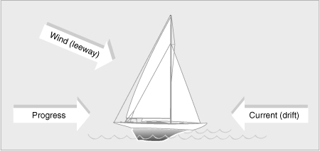
These forces (completed work, changed requirements, and revised estimates) can be thought of as being similar to the forces of the wind (called leeway) and the forces of the sea (called drift) on a boat. Consider Figure 19.1, which shows the forces at work on a boat. The boat shown in this diagram will travel less distance than would be inferred from its speedometer. Similarly, even though the boat’s compass pointed due east for its entire voyage, the wind will have caused it to make leeway to the south. Without course adjustments, this boat will take longer to get somewhere not quite its original destination. Mentally relabel the arrows of Figure 19.1 so that drift and leeway become requirements changes (adding or removing functionality) and changes to estimates. Figure 19.1 then reflects the challenges of tracking the progress of a software project against its schedule.
Figure 19.1. The forces at work on a boat.
Velocity
A boat measures its rate of progress in knots; an agile team measures its rate of progress with velocity. Velocity is expressed as the number of story points (or ideal days) completed per iteration. For a team that finished twelve stories worth a total of thirty story points in their last iteration, we say that their velocity is “thirty” or “thirty points per iteration.” Assuming that the scope of the project hasn’t changed, the team has that much less work to complete.
Because velocity is the primary measure of a team’s progress, it is important to establish some ground rules for how it is calculated. The most important rule is that a team counts points toward velocity only for stories or features that are complete at the end of the iteration. Complete doesn’t mean something like “The coding is done, but it hasn’t been tested” or “It’s coded but needs to be integrated.” Complete means code that is well written, well factored, checked-in, and clean; complies with coding standards; and passes all tests. To know how much progress has been made, we count only the points for work that is complete. Opening the door to counting partially finished work, perhaps giving partial credit, makes it impossible to know exactly where we are.
There are three main problems with counting unfinished work. First, it is extremely hard to measure unfinished or incomplete work. Which is further along: A user story that has been programmed but has had no tests run against it or a story that has been partially programmed and partially tested? How far along is a programmer who has designed a solution for a story but hasn’t started coding it? We’re good at knowing when something hasn’t been started, and we’re fairly good at knowing when it’s done. We should assess work to be in one of those two states and leave it at that.
Second, incomplete stories break down the trust between the developer team and the customer team on the project. If a story cannot be completed as planned during an iteration, the developers and the customer team need to collaboratively resolve the issue as soon as it’s discovered. Usually, this means the story will be moved out of the iteration or split and parts of it moved out. The product owner and customer team can make these decisions in real time during the iteration and may choose to reprioritize based on the new knowledge about the cost of the story. Alternatively, the customer team may decide to alter the acceptance criteria for the story, accepting it under lessened criteria. They wouldn’t go so far as to accept a buggy or untested version of the story, but they may reduce performance requirements, handling of special cases, and so on.
Third, and most important, unfinished work leads to a buildup of work in process in the development process. The more work in process a team allows to build up, the longer it will take new features to be transformed from raw ideas into functioning software. Over time, this will decrease the throughput of the whole team. Similarly, with large amounts of work in process, it takes longer for the team to get feedback on what they’re developing. This means that learning is also delayed.
If a team has unfinished stories at the end of an iteration, they are working with features or stories that are too large. Small stories lead to a steady flow through the development process. If stories are left unfinished, they need to be split into smaller stories. Ideally, this should happen prior to the start of the iteration. However, if during an iteration a story is found to be larger than expected, it needs to be brought to the attention of the product owner. The product owner, in collaboration with the team, finds a way to split the story or reduce its scope such that a portion can ideally still be completed within the iteration, with the remainder moved to a future iteration.
So how should a team count a partially finished story when determining velocity? How they count such a story is less important than that they determine why it happened and how they can prevent it from happening again. It may have happened because it was underestimated. If so, the team should think about what type of work was underestimated or forgotten and try to remember to take care when estimating that type of work in the future. Or the story may have been unfinished because too many stories were pulled into the current iteration. If that was the cause, care should be taken to plan iterations more carefully.
Release Burndown Charts
Figure 19.2 shows a release burndown chart (Schwaber and Beedle 2002). The vertical axis shows the number of story points remaining in the project. (It could just as easily show the number of ideal days remaining.) Iterations are shown across the horizontal axis. A release burndown chart shows the amount of work remaining at the start of each iteration. This becomes a powerful visual indicator of how quickly a team is moving toward its goal. Figure 19.2 shows a hypothetical burndown for a project with 240 story points delivered in equal amounts over eight iterations.
Figure 19.2. A 240-point project completed in eight iterations.

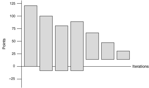
Of course, it’s unlikely that a team that expects to have a velocity of thirty will have that exact velocity in each iteration. A more likely burndown chart of the 240-point release might appear as in Figure 19.3.
Figure 19.3. A more realistic burndown on a 240-point project after the third iteration.

Figure 19.3 shows a team’s progress after three iterations. Their progress has been inconsistent. During the first iteration they completed what appears to be about the planned thirty points of work. But at the end of the second iteration they actually had more work left to do than when they’d started that iteration. This could happen if, for example, the team realized that developing the user interface would be much more involved than they’d initially estimated and increased their estimates for all remaining user interface stories.
Alternatively, the burndown chart may show a burnup because work has been added to the release. Think of this as equivalent to a sailboat making 8 miles per hour of progress but sailing directly into a current running 12 miles per hour in the opposite direction. In the sailboat’s case, it ends up farther away from its initial target. However, in the case of the software project, the added work may be the result of the team’s having learned something that directs them toward a more valuable release.
To see how this works, suppose that in the second iteration the team again completed the planned thirty points of work but that the product owner identified another forty points of work that is needed in the release. In this case, the net result is that there is more work to do at the end of the iteration than there was when it began. Because a burndown chart reflects the team’s net progress, the chart is drawn to reflect this increase.
You may wonder why we’d draw the chart this way. We draw it this way because it allows a single burndown chart to show clearly and simply the two most important numbers we can use to see if a project is on track: how much work is remaining and the team’s rate of progress net of all changes to the scope of the project. Imagine that you are on the team whose progress is shown in Figure 19.3. At the end of the third iteration, you are asked if the release will be finished within the planned eight iterations. And if it won’t be, you are asked to provide a better estimate of when it will be finished. You can answer this question just by looking at the burndown chart in Figure 19.3. Simply line up a straight edge between the 240 points on the vertical axis and the number of points currently remaining in the project. Where the straight edge intersects the horizontal axis is when you can expect the project to finish. A casual look at Figure 19.3 tells you enough to know it won’t finish in the planned eight iterations.
A Release Burndown Bar Chart
At one level, the release burndown chart of Figure 19.3 is great. It’s easy to understand and can be explained quickly to anyone in the organization. A release burndown chart like this is very informative and tells us when the project is likely to finish if all factors affecting the project remain unchanged. However, sometimes it’s useful to draw the release burndown chart so that you can easily see the team’s velocity and the scope changes separately. To do this, draw a release burndown bar chart like the one shown in Figure 19.4.
Figure 19.4. Separating the impact of velocity and scope changes.

Each bar in Figure 19.4 shows the amount of work in a release as of the start of an iteration. This type of burndown chart uses bars rather than lines to help distinguish the regions above and below the horizontal axis at 0. The bottom of the bar is lowered whenever work is added to the project. The bottom is moved up whenever work is removed from an iteration. If the bottom is below the horizontal axis at 0, it means that overall work has been added to the release.
An example is the best way to see how this works. In Figure 19.4, a release is planned to include 240 points of work. At the start of the first iteration the burndown chart is drawn with a single bar extending from 0 to 240. As before, the team expects an average velocity of thirty and expects to be done after eight iterations. During the first iteration, the team achieves the expected velocity, and the top of the second bar is drawn at 210. However, the product owner has realized that the release needs more features than originally thought. An additional fifty story points of work is identified that will be needed in this release. This causes the bar for the second iteration to extend below the 0 line. The second bar is drawn ranging from –50 to 210. In other words, the release now needs 260 points of work, which is more than when it was begun. By the end of the second iteration Figure 19.4 reveals three interesting facts.
1. The velocity of the team is as expected. This can be seen from the burndown across the top of the first two bars.
2. A great deal of work has been added. You can see this from the drop at the bottom of the second bar. Presumably, work has been added because it will lead to a more valuable release. However, it may be worth paying attention to the rate of scope change on this project—so far, more has been added than has been completed. This may not be something to worry about; it will depend on whether the trend is likely to continue and how important the initial target release date is.
3. The total amount of work remaining in the release is greater than when the project started. This is evident because the overall height of the second bar is greater than the first.
Clearly, there is a great deal more expressive power in drawing a burndown chart in this way. The drawback to it is that the meaning of the chart is not as immediately clear.
Let’s look at the second and third iterations of the project in Figure 19.4. During the second iteration the team again achieves their target velocity. The product owner has again added work, but at least less was added than during the previous iteration.
But what happened during the third iteration? During this iteration, velocity has slowed to only twenty. This may be the result of underestimating some stories done in that iteration, a team member’s being sick or on vacation, or the re-estimation of some of the remaining work. The team may have completed their planned thirty points of work but may have increased estimates on some remaining stories such that net progress is twenty rather than thirty.
What is most interesting, however, about the third iteration is shown at the bottom of the fourth bar. During this iteration, the product owner removed features from the release. When it’s released, this project will still involve more story points than initially planned. We can tell this because the bar still extends below the x-axis at 0. However, at this point the project contains fewer planned points than it did at the start of the previous iteration. It’s not important whether the features removed were ones in the original release plan or ones the product owner added in previous iterations. Prioritization of work is still up to the product owner, who can add or remove functionality as desired. The net effect is shown at the bottom of the burndown bar.
There are four simple rules to keep in mind when drawing this type of burndown chart.
• Any time work is completed, the top is lowered.
• When work is re-estimated, the top moves up or down.
• When new work is added, the bottom is lowered.
• When work is removed, the bottom is raised.
Let’s take a look at a release burndown bar chart from a real project, as shown in Figure 19.5. What we see here is that the team made good progress during the first two iterations. The product owner added a small amount of work prior to the start of the second iteration, which is a fairly common occurrence on many teams. During the third iteration, the team discovered that some of their user stories were underestimated, and they re-estimated some of the remaining work. This led to the increase at the top of the fourth bar in Figure 19.5. Prior to the start of the fourth iteration, the product owner removed work from the release plan. This resulted in the bottom moving upward, even above the 0 line. During that iteration, the team made good progress. From that point on, the release plan stayed the same, and consistent progress was made until the end.
Figure 19.5. Removing work from a release.
A Caveat on Using the Release Burndown Bar Chart
Although I find the release burndown bar chart more expressive (and, therefore, often more useful) than the traditional burndown chart, I do have a couple of caveats on its use. First, the burndown bar chart is harder to understand, so I almost always start a new team with the simpler burndown line chart. Second, the burndown bar chart is for use only in organizations mature enough not to argue about whether something belongs above the line or below the line. At the first sign of an argument of this nature, I tell everyone involved that we can’t use the burndown bar chart and we’re reverting to the line chart.
A Parking-Lot Chart
Jeff DeLuca (2002) has suggested another useful way of visualizing how a team is doing at completing the planned functionality of a release. Figure 19.6 shows a variation of what DeLuca calls a parking-lot chart. A parking-lot chart contains a large rectangular box for each theme (or grouping of user stories) in a release. Each box is annotated with the name of the them, the number of stories in that theme, the number of story points or ideal days for those stories, and the percentage of the story points that are complete.
Figure 19.6. A parking-lot chart shows how much of each theme has been completed.
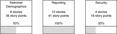
In the Swimmer Demographics box of Figure 19.6 you can see that this theme comprises eight stories, which are estimated at an aggregate of thirty-six story points. Eighteen of these story points are done, because we know that 50% of the feature is complete. We cannot tell how many of the specific user stories are done. The individual boxes on a parking lot chart may even be colored to indicate whether a theme is done or on schedule, needs attention or is significantly behind schedule.
A parking-lot chart is a powerful method for compressing a great deal of information into a small space. In many cases, all of a release’s themes can be summarized on one page using a parking-lot diagram.
Summary
Velocity measures the amount of work completed by a team each iteration. Velocity should be calculated using an all-or-nothing rule. If a story is finished, the team counts its full estimate when counting velocity. If a story is partially completed during an iteration, it is not counted at all when determining velocity.
A release burndown chart shows the number of story points or ideal days remaining in the project as of the start of each iteration. A team’s burndown is never perfectly smooth. It will vary because of inaccurate estimates, changed estimates, and changes in scope, for example. A burndown chart may even show a burnup during an iteration. This means that even though the team probably completed some work, they either realized that the remaining work was underestimated or increased the scope of the project. A key to interpreting a release burndown chart is understanding that it shows the team’s net progress—that is, their progress minus any work added to the release.
A release burndown bar chart offers a sometimes-useful variation on the standard release burndown chart. It does so by separating a team’s progress against planned work and changes to the scope of the release. Scope changes are shown by dropping the bar below the horizontal axis. This type of chart is more expressive than a standard burndown chart but must be used with care, as it may cause arguments in some organizations about whether a change affects the top or the bottom of a bar in the chart.
A parking-lot chart is useful for presenting a high-level view of a team’s progress toward implementing the various themes planned in a project.
Discussion Questions
1. If you are not using a release burndown chart on your current project, what would be the result of producing one at the end of each iteration?
2. Which of the progress monitoring and reporting techniques described in this chapter would be most beneficial to your current project?
3. Which stakeholders on your project are not receiving information about the project that they would find useful?