Twitter: Information flows, influencers, and organic communities
Abstract
This chapter guides you from the early stages of data collection of Twitter topical conversations (i.e., search networks), through the analysis of the network structure at the vertex, cluster and network-levels, and key content characteristics of tweets, to visualization of the network. The process is illustrated by analyzing the #p2 (Progressives 2.0) twitter search network. The NodeXL Twitter importers include many Twitter metrics (e.g., Twitter Followers) and content (e.g., Tweet content). Network analysis of Twitter networks, created by individuals, such as activists or consumers, as they discussing brands, organizations or issues, can capture clusters—subgroups of interconnected users—their key information sources and distinctive content characteristics they post and share (i.e., via posted URLs). Furthermore, it allows researchers and brand managers to identify keys users in the network and consumers that allow the brand to reach out to other users that do not interact with it directly.
Keywords
Twitter; Twitter search network; Importer; Hashtag; #p2; Network clusters; Hubs; Bridges; Selective exposure; Information silos; Influencers
11.1 Introduction
In social media, users form social networks by making relationships with other users. On Twitter, users make relationships when they follow other users, mention users in a tweet, reply to a tweet, or “retweet” another tweet. Once you follow another user by subscribing to their posted content, this content will then appear on your Twitter feed. This can be thought of as an awareness connection. Mentioning another user in a post is an indication of attention and therefore exposure to content. A retweet is a key mechanism on Twitter for amplifying content. The collection of the relationships formed by these activities create social networks.
In this chapter you will learn to collect, analyze and visualize topic-specific Twitter conversation networks. You will first use NodeXL's Twitter Importers to collect Twitter network data—the content of a set of Tweets, and the relationships and user-information that can be extracted from them. Twitter data can be collected about any topic of your interest, from archery to zebras. This chapter will take you step-by-step through the process of calculating and interpreting key social networks metrics, at the user, group and network levels. It builds upon and extends the analysis of the CSCW 2018 Twitter network explored in Chapters 6 and 7, which should be read beforehand. You will conclude this chapter by visualizing Twitter networks and highlighting key findings. Identifying the prominent users who can influence large groups or understanding the polarized discussions will help you to intervene successfully, avoid conflicts, and understand the roles of competing groups.
11.2 Defining your topic-networks: Formulating a social media monitoring query
Twitter is not explicitly organized into topic specific discussions, like discussion forums (Chapter 10). Instead, individual users can tweet about a wide range of personal, political and social topics. On Twitter, the only indication of a tweet's topic is found within its content, which includes hashtags or keywords relevant to the topic. As a result, discussion “communities” are much more dynamic and emergent. Subgroups of users are selected based on their use of a particular keyword. For example, the relationships of all users who mentioned “HPV” (short for human papilloma virus) during a particular period of time creates a dataset containing a slice of the HPV topic-network. You can use NodeXL to collect, analyze and visualize this type of social media network data from Twitter.
Twitter conversations span a wide range of topic and issues. In order to collect topic-specific Twitter network data, you must first define your topic. State your topic first (e.g., Soft drinks and obesity, or the name of a political party, celebrity, or product). Next, explore related keywords and hashtags using the built-in Twitter Search and third party apps such as https://hashtagify.me to identify trends, popularity, and related terms. In order to communicate your topic to Twitter, you will use a Boolean search query that combines these terms into a specific machine-readable format.
A Boolean search is a query technique that utilizes Boolean Logic to connect individual keywords or phrases within a single query. The term “Boolean” refers to a system of logic developed by the mathematician and early computer pioneer, George Boole. Boolean searching includes three key Boolean operators: AND, OR, and NOT.
- • An AND operator narrows your search. Between two keywords it results in a search for posts containing both of the words. For instance, the Boolean search “Cats AND Dogs” will retrieve all posts that contain both words. A lack of an operator between words is interpreted as an AND operator within NodeXL. For example: “Cats Dogs” is treated the same as “Cats AND Dogs”.
Example returned post: “Vaccinate your dogs, cats and ferrets. Show your pets you care!”
- • An OR operator expands your search. An OR operator will return any posts that contain at least one of the search terms. For instance, the Boolean search “Cats OR Dogs” will retrieve posts that contain either word.
Example returned post: “love all dogs!”
- • A NOT operator excludes posts containing the keyword. Using the NOT operator will exclude any posts containing the keyword following the operator. For instance, the Boolean search “Cats NOT Dogs” will retrieve all posts that have the word “Cats” in them, unless it also has the word “Dogs.” Twitter also recognizes the minus sign (−) as a NOT operator (E.g.” Cats -Dogs”) within Boolean searches. When collecting data using NodeXL you should use the “-” operator rather than the word NOT.
This post will be included: “I love cats!”
This post will not be included: “I love cats and dogs!”
Two other indicators that are helpful in constructing a Boolean search are parentheses and quotation marks.
- • Quotation marks requires words to be searched as a phrase, in the exact order you type them. For example, searching for posts about the movie Love Actually, using the quotation marks will search for the phrase exactly as it appears (i.e., “Love Actually”).
This post with be included: “Hugh Grant is a great fit for his role in Love Actually.”
This post will not be included: “Actually, falling in love is not as simple as you may think.”
- • Parentheses require the terms and operations that occur inside them to be searched first. Sometimes called nesting, parentheses add a level of organization for your Boolean search, allowing you to formulate complex search strings. Consider the following Boolean search: “(Cats OR Kittens) AND (Dogs OR Puppies).” The search will first be performed within the parentheses, and only then between them. Results would include any post that contains a combination of the two nested boolean queries.
These post will be included: “I love all kittens and puppies; I love dogs and cats.”
This post will not be included: “I love cats and especially kittens.”
You can learn more about Twitter search operators on the Twitter search page (https://twitter.com/search-home). Check out the operators and advanced search links.
Once you construct a Boolean search to collect your topic network you can use the Twitter search page to test your search string (https://twitter.com/search-home). You can learn more about search options by clicking on the operators link in the Twitter search page. Include keywords, pairs of words, relevant hashtags, and handles as appropriate. Revise and retest your search result, until you you feel that it captures the data you need. Once you feel your search string properly captures the tweets you want to analyze, it helps to make a copy of the string for future reference.
11.3 Twitter data collection
Open NodeXL Pro and click on the NodeXL Pro tab along the top menu ribbon in Excel. Click Import in the Data section of the NodeXL ribbon. In the drop-down menu, choos From Twitter Search Network as shown in Figure 11.1.

You can use the NodeXL Twitter Search Network importer dialog (see Figure 11.2) to extract networks for your search string. Several options are available to refine data requests using this importer. The NodeXL data collector starts by performing a query against the Twitter Search service at http://search.twitter.com. Searches can be performed for any string of characters. This service returns up to 18,000 tweets that contain a requested search string.
- • Enter your search query in the Search for tweets that match this query field.
- • Select Basic network. This option will collect tweets associated with your search term and generate a network based on their Mention and Reply-to relationships. The second option collects the Follow relationships, however it is very slow due to data restrictions imposed by Twitter and should only be used for very small datasets.
- • If it is the first time you are using NodeXL to collect Twitter data, select I have a Twitter account, but I have not yet authorized NodeXL to use my account to import Twitter networks. Take me to Twitter's authorization page. NodeXL will send you to Twitter to login to your account. When you grant NodeXL access, Twitter will provide you with an eight digit code. Copy it and paste it back in NodeXL in a box that will pop up.
- • After the one-time authorization process, the second option (I have a Twitter account, and I have authorised NodeXL to use my account to import Twitter networks.) will be selected.
- • Set the maximum number of tweets you wish to collect. By default, this value is set to 18,000 tweets, the maximum allowed by Twitter's API limits.
- • Make sure that Expand URLs in Tweets is selected. NodeXL will expand the commonly used shortened URLs (e.g., tinyurl.com, ow.ly, etc.) to make sure they appear in their original long form.
- • Click OK to tell NodeXL to begin collecting data. This can take a long time because of limits in the rate of data delivery imposed by Twitter. It can take up to an hour to collect a very large dataset.
- • When data collection is complete, you may be asked to allow Excel to wrap text in columns. Choose Yes.
- • You may ask yourself “Do I have enough data?” There is no definitive answer, of course, as the dataset captures the recent Twitter conversation about your topic. For this exercise, it would be ideal if you have at least 1,000 vertices and 1,000 edges.
- • Save your data. When naming the file, use indicators such as Twitter, date of data collection and the first few keywords in the query used to collect the data.
- • Make a backup copy of your data. Use it for your analysis, so you can always return to the original raw data if needed. Just like in real life, there are no redos in NodeXL!

Alternatively, you may choose to work with the sample dataset that was used for this chapter: http://nodexlgraphgallery.org/Pages/Graph.aspx?graphID=172973
11.4 The raw data layout
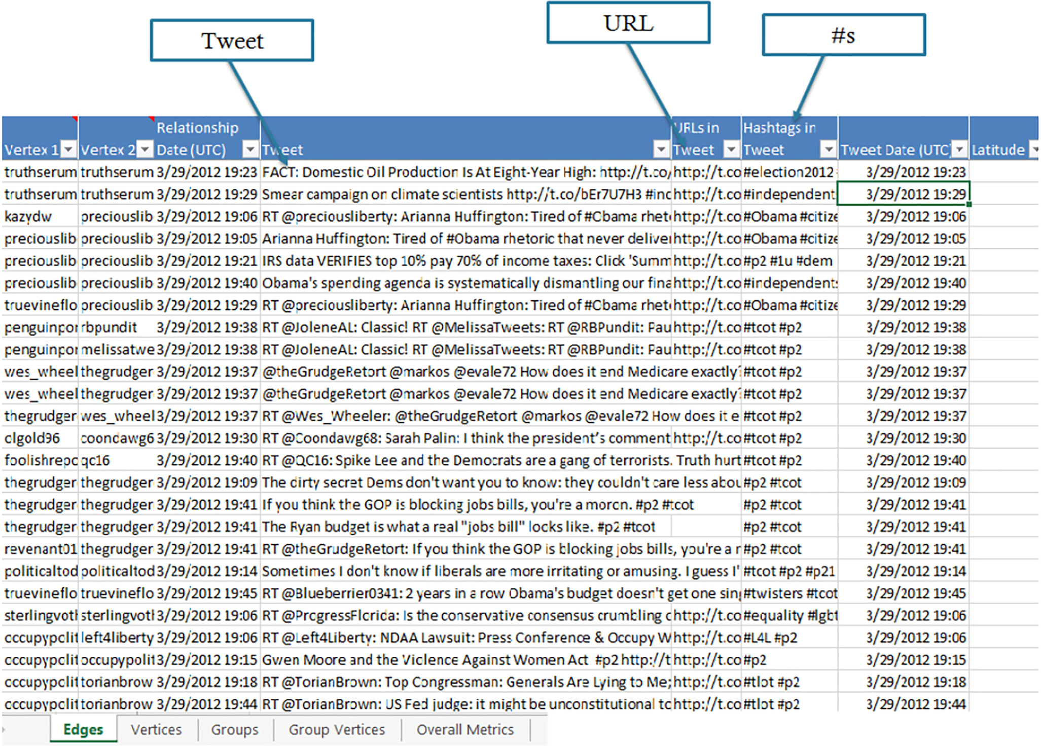
The raw Twitter data you have just downloaded will populate the Edges and Vertices worksheets. In this Twitter analysis, the Edges worksheet contains a row for each edge which represents a connection event between two people who tweeted within the collected dataset. Edges represent the various kinds of relationships that can be created through Twitter. NodeXL constructs four different types of Twitter edges: Mentions, Replies to, Retweet, and Tweet. A Mentions edge is created when one user creates a tweet that contains the name of another user, which is NOT at the beginning of the tweet (indicated with a preceding “@” character: “just spoke about social media with @marc_smith”). If more than one users are mentioned in a tweet, a new edge (e.g., row on the Edges worksheet) will be created for each mentioned user. For example, “just spoke with @marc_smith and @shakmatt about NodeXL” would create an edge pointing from the sender to @marc_smith and another from the sender to @shakmatt. A Replies to edge is created whenever there is a username at the very beginning of a tweet (e.g., “@marc_smith just spoke about social media”). If multiple people are mentioned in such a tweet, a Replies to edge is only created for the first person mentioned. A Retweet edge is created when a user reposts or forwards a tweet written by someone else. The Retweet ID column includes the ID of the original post and the Retweet Count column includes details on how many times it was retweeted. A Tweet edge is created when it does not fall into any of the other categories (i.e., no usernames are included and it is an original message). Tweet edges are “self-loops” with the same user linking back to themselves. Meanwhile, in the Vertices worksheet, each Vertex refers to a specific Twitter user who appears within the dataset.
In the edges worksheet, then, a single tweet is converted into one or more edges. Each row in the edges worksheet represents a connection between two users (see Figures 11.3 and 11.4).
- • Vertex 1 and Vertex 2 represents the two users connected by a tweet. Vertex 1 is the author of the tweet and Vertex 2 is the target of the tweet by virtue of being mentioned, replied-to, retweeted, or tweeted (in which case the same username shows up in both columns). Note that Twitter networks are Directed networks.
- • The Visual Properties and Labels columns are not part of the raw data, and therefore empty at the start of the analysis. You will learn more about these values after they are populated.
- • The type of connection, Mentions, Replies to, Retweet, and Tweet, is identified in the Relationship column.
- • Relationship Date refers to the date and time when the tweet was posted in Coordinated Universal Time (UTC), also known as Greenwich Mean Time (GMT-0).
- • The Tweet column includes the text of the tweet itself.
- • The URLs column lists the full expanded hyperlinks of any shortened links mentioned in the tweet text. This is created when the expand URLs in Tweets option is selected.
- • The Hashtags in Tweets column extracts the hashtags from the tweet for further analysis.

The Vertex worksheet provides information about individual users in the network. Each row represents a twitter user in the network. You will find vertex-level metrics, once calculated, in this worksheet. The Vertex worksheet also includes metadata information from the Twitter platform about users in the network. This includes the user's “handle” in the Vertex column; the number of users who follow them (i.e., Followers), the number of users they follow (i.e., Followed), and profile information such as Description, Location and Website (see Figure 11.5).

11.5 Network analysis
11.5.1 Vertex-level metrics
Applying social network analysis to Twitter activity, users are characterized based on their connectivity in the network. Measuring how central users are in the network reveals the influential users and their connections to one another. Chapters 3 and 6 provide a detailed description of the metrics used in this chapter. Open the Graph Metrics dialog in the NodeXL Ribbon and select the metrics you will use in this chapter, which are shown in Figure 11.6.

In and out degree centrality
Degree centrality metrics count the number of connections (edges) a user (vertex) has in the network. Because Twitter networks are directed (e.g., @Aviva may mention @Hans, but @Hans may not mention @Aviva), degree centrality can take two forms. In-degree centrality measures the number of edges others have initiated with a vertex. For instance, if @Aviva was mentioned 5 times by users in a Twitter topic-network, her in-degree centrality metric would be 5. Out-degree centrality counts the number of edge a vertex has initiated with others. If @Hans mentioned 10 other users in his tweet, his out-degree centrality would be 10.
In and out degree centrality have important implications for evaluating the importance of users in Twitter networks. Users with high in-degree centrality gain attention to their tweets among the community of users who participate in the conversation about that topic. Users' in-degree centrality, thus, captures the community's engagement with them. Those with high in-degree centrality scores can be thought of as conversational hubs, since others have mentioned, replied to, or retweeted their posts. In-degree centrality, therefore, is an indication of the cascades of information flow initiated by a user. Keep in mind that a user may have high in-degree in one topic-network and low in-degree in another. For example, a food blogger may have high in-degree centrality in a food-related topic network, but low in a car-related network. Out-degree centrality captures the outreach of a user to the community. A high out-degree centrality value indicates that a user tweets a lot about a topic, aiming to reach users' attention by mentioning or replying to them. Out-degree centrality, then, captures the level of engagement a user initiates with members of the community.
In and out degree centrality metrics capture users' engagements with other users and their content. It indicates actual attention given to content and actions users took to disseminate information. This is in contrast to the number of followers one has on Twitter, which only indicates the potential reach of a tweet. A high number of followers doesn't necessarily equate to all followers actually reading tweets, though it does indicate a certain level of popularity. Another important difference between the the degree and follow metrics is that the in and out degrees measure centrality within the topic-network, whereas following and follower metrics define centrality within the entire Twitter network, and are not topic-specific. It is often useful to differentiate between “local” conversation hubs (i.e., those with high in degree in a topical network) and “global” hubs (i.e., those with high number of Twitter followers). Both can be valuable to identify, but often for different reasons.
Now look at the degree centrality values. Select the Vertices worksheet and find the in-degree centrality and out-degree centrality metrics columns. Using the sort option in NodeXL (Figure 11.7), you can answer the following questions:
- • Who are the top in-degree users?
- • Who are the top out-degree users?
- • Who are the users with the most Twitter followers?

Explore some of the other columns, such as description and web, to learn more about your top users.
Betweenness centrality
Degree centrality metrics define a vertex's centrality by number of connections in a network. A user (i.e., a vertex) may also be central in a network because it connects users that would otherwise be disconnected or less connected. Betweenness centrality measures the extent to which a vertex plays this bridging role in a network. Specifically, betweenness centrality measures the extent that the user falls on the shortest path between other pairs of users in the network (see Chapter 6). The more people depend on a user to make connections with other people, the higher that user's betweenness centrality becomes.
Burt's [1] theory of structural holes examines social actors (e.g., individuals and organizations) in unique positions in a social network, where they connect other actors that otherwise would be much less connected, if at all. In Burt's [2] words, “A bridge is a (strong or weak) relationship for which there is no effective indirect connection through third parties. In other words, a bridge is a relationship that spans a structural hole.” A lack of relationships among social actors, or groups of actors, in a network gives those positioned in structural holes strategic benefits, such as control, access to novel information, and resource brokerage. Actors that fill structural holes are viewed as attractive relationship partners precisely because of their structural position and related advantages [1]. These actors are called brokers (as they fill a brokerage position) or bridges. These actors form non-redundant, often weak ties among otherwise less connected actors [3].
To use a contemporary example, Indira may have a group of Twitter college friends, with whom she has strong relationships. She may also interact via Twitter with Gerhard, whom she briefly met during an internship abroad. For Indira's friends, her weak relationship with Gerhard may be an important network path to a group of professionals abroad. It is also a non-redundant relationship, as others in his strong and immediate social networks, which may be highly interconnected with one another, are not connected to this group of professionals. Indira, then, is located in a powerful structural position in her networks as a broker or a bridge.
This example demonstrates that weak ties often provide less redundant connections – or, in other words, relationships with people one's friends are not connected to. Such non-redundant weak connections are beneficial to individuals, as they gain information not available through their other social ties, such as solutions for problems, employment opportunities, etc. These ties are also advantageous because one's friends depend on that individual for this type of novel information [3]. Those with high betweenness centrality often connect users found in different groups (i.e., network clusters), which helps explain information flow across groups.
Look at your data. Sort the betweenness centrality column by size (large to small).
- • Identify the users with the highest betweenness centrality. Who are they? what can you learn about them from the data in NodeXL? What can you learn about them by searching the web?
Twitter is a directed network and therefore the flow of information or influence, for instance via a bridge can be one-way to either direction or two-way, depending on the direction of relationships with others in the network. Understanding the role of users with high betweenness, then, depends not only on the connectedness, but also on the directionality of connections. Literature about structural holes, however, has traditionally assumed full symmetry of relationships in a network [4] and the betweenness centrality metrics does not take into consideration the direction of links. When evaluating key users as bridges, you will learn much by examining their in and out degree values.
Examining the interaction between organizations and the public on Twitter, users with high betweenness centrality play a key role in reaching out to users that do not interact directly with the organization. In their research, Himelboim et al. [5] define social mediators as “the entities which mediate the relations between an organization and its publics through social media,” as they regard mediated public relations as “communicative relationships and interactions with key social mediators which influence the relationship between an organization and its publics.” They defined social mediators as users with both high betweenness and high in-degree centrality values.
- • Who are the social mediators in your network? Find users with high betweenness and high in-degree centrality values.
User reciprocity
A relationship between two users is reciprocal, or mutual, if each user has initiated a tie with the other user (see Chapter 6). Reciprocal relationships between individuals may indicate a wide range of social attributes, such as cooperation, trust, exchange of opinions, and power balance. At the user level, the Reciprocated Vertex Pair Ratio is measured as the number of users one is connected with (alters) that are reciprocal over the total number of alters. In other words, the portion of reciprocated relationships of the total number of relationships a vertex has with others in the network. On Twitter, for example, a reciprocal or mutual relationship between two users can be established if they follow one another. If Aviva is connected with 10 other users on Twitter (whether following or being followed), and 5 of these users relationships are mutual (i.e., Aviva follows 5 users who also follow her), Aviva's reciprocity value will be 0.5. Reciprocity can be used to evaluate users' relationship building. When establishing a social media presence, users often aim to attract the attention of influential users by giving them attention (retweeting, posting hyperlinks, tagging, mentioning, etc.). Reciprocity metrics can be used to evaluate the success of this strategy. Reciprocity can also be measured for the entire network, or clusters in it, as will be discussed later in this chapter.
In your dataset, sort the Reciprocated Vertex Pair Ratio column from largest to smallest.
- • What is the highest reciprocity ratio?
You probably found one of more users who has a reciprocity value of 1. A closer look will reveal that users with such a perfect reciprocity value, are not highly connected in the network. Find their in and out degree metrics. Pretty low, right? The reason is simple: the more connected users are in the network, the less likely they are to have all their connections reciprocated. There is typically an overall negative correlation between between users' degree (in or out) and their reciprocity values. The more connected users are, the lower their reciprocity value is likely to be. It is therefore helpful to first find the top users in your network, and then compare and contrast their reciprocity ratios.
Looking at reciprocity ratios, you are probably asking yourself: are these values high? Are they low? How can you tell? The short answer is that it depends on the network and comparing them to others in the network is the most useful way to determine what is high or low. An example from a Delta Airlines Twitter topic-network helps illustrate how to evaluate reciprocity values (Figure 11.8). Two users have about the same in-degree values: @Itoddwood and @deptapoints. However, their reciprocity levels are quite different. @Itoddwood has a low reciprocity of 0.023, while @deltapoints has a higher value of 0.256. Comparing the two, enables you to evaluate the reciprocity metrics. One user, is reaching out to many other users, by mentioning and replying to them, resulting in a high out-degree. In this particular network, @Itoddwood has little success in having these relationships reciprocated, as its low reciprocity value indicates. In contrast, @deltapoints was much more successful in attracting reciprocated relationships. About one of four ties it has with other users, is reciprocated. Reciprocity, then, should be evaluated in comparison with other users.
- • In your dataset, among the top users by in-degree, find the users that stand out in terms of their relatively high Reciprocated Vertex Pair Ratio values? Who are these users?

11.5.2 Network-level metrics
Overall metrics
Taking a social networks approach to data analysis shifts the focus from individual characteristics of users, to their connectivity-related characteristics. You've already seen how this approach is applied to user-level metrics. Another unique characteristic of social network analysis is the focus on metrics that describe a group of users in a connected component. On the Edges worksheet, an edge is the unit of analysis. On the Vertices worksheet, the vertex (the user) is the unit of analysis. In the Overall Metrics worksheet, the entire network is the unit of analysis. Metrics on this worksheet will describe the network as whole. You may be familiar with these metrics from Chapters 3 and 6. Key network metrics are reviewed here, within the context of Twitter topic-networks.
- • Vertices. The number of users in the Twitter search network.
- • Unique Edges. The number of ties in the networks, excluding duplicates. For example, if @Joelle mentioned @Muhammad in two tweets within this network it will be counted as a single unique edge between @Joelle and @Muhammad.
- • Edges With Duplicates. The number of duplicate relationships between users. For example, if @Joelle mentioned @Muhammad in two tweets within this network, this will be considered an edge with duplicates.
- • Total Edges. The sum of Unique Edges and Edges With Duplicates.
- • Self Loops. In its original use, an edge is counted as a self loop when a user initiates a tie with itself. For instance, a user may mention itself in a tweet. However, in Twitter networks, a self loop captures all tweets that did not have a relationship embedded in them. As you recall, the Tweet relationship is used in the Edges worksheet, when there are no mentions or replies in a tweet, and it is not a retweet. The self loops metrics, then, captures the number of tweets with no relationships in the network.
- • Connected Components. A component is a unit of one or more users that have connections among them. The Connected Components is a simple count of these components.
Note: Do not confuse components with clusters. Cluster, as discussed later, are sub-groups of users that are loosely connected to one another. Components are disconnected from other components. - • Single-Vertex Connected Components. These are isolated users who are talking about the topic of your network, but in a given dataset, are not connected to others by an edge. In Twitter networks, these will be individuals who post a tweet that is not a mention, reply to, or retweet.
Graph density
Twitter networks vary in terms of their interconnectedness. Some networks are more tightly interconnected, by mentioning and replying to one another. In other networks, users are only sparsely connected, rarely mentioning or replying to others. Network density is measured as the number of possible or potential connections (i.e., edges), over the number of actual connections (see Chapter 6). Density values range between zero and one, and can be thought of as the percent of all possible edges that are realized. The calculation is a slightly different for directed and undirected networks, as directed networks have twice as many possible edge (i.e., from vertex A to vertex B, and from vertex B to vertex A).
The extent to which a network is densely interconnected impacts the rate of information flow within it. Interaction between individuals leads to shared knowledge, and shared knowledge leads to even more interaction. Granovetter [3] states that tightly interconnected individuals are typically connected by strong and redundant ties. Burt [2] notes that networks in which people are very highly interconnected are better at transmitting information. Others also demonstrate an important outcome of strongly embedded close relationships as an increase in trust between individuals, which can lead to increased information transfer. On Twitter the rate at which information is spread through a network was found to depend on its density; the greater the density, the faster information spreads [6].
- • What is the density of your network?
Your network size often affects whether the density value is high or low. If you have a large network, and chances are you do, the density value will be rather low. As a network grows, its density is likely to shrink. Similar to the discussion about reciprocity earlier, density should be evaluated in comparison with other networks. Within a network, it is hard to determine whether a density value should be considered low or high. Often, analysts collect several datasets of the same topic-networks over time, which allows them to evaluate a change in density. Later in this chapter, networks clusters will be discussed. As a network may contain several clusters, this will give us an opportunity to compare clusters, in terms of their density.
Graph reciprocity
Reciprocity metrics at the user level were discussed earlier. At the network level, reciprocity measures the extent to which ties among a group of vertices are mutual. Reciprocity is measured as a proportion of mutual edges to the overall number of edges in a network. Values range between 0 (i.e., no mutual ties in the network) to 1 (i.e., all edge are mutual in the network). Other approaches to reciprocity metrics exist. Similarly to network density, reciprocity is associated with network size (number of vertices). The larger the network, the smaller the reciprocity are likely to be. Comparing networks in terms of their reciprocity, you should take into consideration the network size.
- • What is the graph density of your network?
11.5.3 Groups
In social networks, smaller sub-groups of densely interconnected users – clusters – often arise (see Chapter 7). Clusters, also referred to as communities, refer to subgroups in a network in which vertices are substantially more connected to one another than to vertices outside that subgroup. In Twitter political networks, users' exposure to tweets derives from the users they follow. Twitter users, then, are more likely to read content posted by their cluster-mates than by users in other clusters. Likewise, users in a given cluster choose to expose themselves to the same set of hubs, which serve as popular information sources among these users.
Clusters, then, define the boundaries of information flow, attention and influence, among users on Twitter. Researchers have deployed an array of metaphors to describe the idea of subgroups of individuals who selectively expose themselves to politically like-minded others and their information sources. A few examples include “enclave”, “filter bubbles”, “gated communities”, “sphericules”, “monadic clusters”, and “cyber-balkans”. Sunstein's [7] term “enclave,” is also a helpful metaphor here as it describes the result of filtering news selection based on political opinions.
Clusters are identified by applying a mathematical algorithm that assigns vertices (i.e., users) to subgroups of relatively more connected groups of vertices in the network. The Clauset-Newman-Moore algorithm [8], used in NodeXL, enables you to analyze large network datasets to efficiently find subgroups. As explained in Chapter 7, you can also use two other algorithms are in NodeXL: the Girvan-Newman and Wakita-Tsurumi.
Identify clusters by following these steps:
- • In the Analysis section of the NodeXL Ribbon, click on Groups and select Group by Cluster… (Figure 11.9)

Figure 11.9 Choosing Group by Cluster… from the Groups drop-down menu. - • In the pop up menu, select Clauset-Newman-Moore and check the Put all neighborless vertices into one group checkbox. The latter will create a “fake” cluster to accommodate all users who are not connected to others (isolates). Click OK. (Figure 11.10)

Figure 11.10 Choosing the Clauset-Newman-Moore clustering algorithm in the Group by Cluster dialog. - • A new worksheet will appear, called Groups.
- • To calculate group-level metrics: Click on Graph Metrics, then Deselect All, and then select Overall Graph Metrics and Group Metrics. Click Calculate Metrics.
Note: the Groups in this worksheet are network clusters. While NodeXL uses the more generic name, groups, clusters are the specific type of groups that are calculated.
The new Groups worksheet (Figure 11.11) uses groups and clusters interchangeably. The unit of analysis in this worksheet is a cluster, meaning that each row represents a cluster, and metrics describe characteristics of clusters. NodeXL assign group numbers (e.g., G1, G2, etc.) based on the cluster size (i.e., number of vertices). Find the group-level metrics. You should be familiar with all of them by now, as they are available at the Overall Metrics worksheet. One of your groups is the group of neighborless users, defined at the previous step. This group shows Not Applicable for some group metrics, because these are disconnected users, and therefore cannot produce meaningful network metrics.

Looking at the group size (i.e., number of vertices) and volume (i.e., number of edges) you will soon find that most groups are very small. In most cases, you will be interested in the largest groups, which host most users. You can use several techniques to select the group inclusion threshold. For this exercise, a simple one is suggested: look for a drop in the number of vertices in groups. In Figure 11.11, the largest group (G1) has 465 vertices, followed by G2 with 258 Vertices and G3 with 117 Vertices. The isolates group (G4), as indicated by the Not Applicable cells, has 78 vertices. The rest are much smaller and can be filtered out by using the Visibility column on the Group worksheet (see Chapter 7).
- • Find the largest clusters in your topic-network.
- • Filter out groups that are too small or not important.
Earlier you learned about of density and reciprocity (and other Network-Level metrics). You should evaluate these metrics in comparison with other networks. The availability of these metrics at the cluster level helps you assess and compare groups. Group G2 is larger than G3 and yet the density for G2 (0.044) is slightly higher than G3 (0.041). As larger groups tend to show smaller density values, this finding is meaningful, suggesting that users in G2 are more interconnected than users in G3. You also learn that relationships (i.e., edges) in G2 are overall more reciprocal (0.317) than in G3 (0.291). Here again we would expect the opposite direction, which makes these findings meaningful.
Look back at your data, in the Groups worksheet:
- • Which group is the isolates group? What portion of all users are isolated?
- • Find the largest clusters. These are the groups that you will further analyze.
- • Taking into consideration the size of the clusters, what can you tell about the density and reciprocity of these clusters?
When identifying groups, two other worksheets are created: Group Vertices and Group Edges. The Group Vertices worksheet lists users by group. This is an easy way to find which users are in each cluster. You can use this worksheet to look for commonality among users within the same cluster. As you recall, metrics in the Groups worksheet measure the interconnectivity within each cluster. The Group Edges worksheet shows the connectivity across clusters. Some clusters are more interconnected, while others are more loosely connected. Since edge are directed, you can find the frequency of edges across clusters in each direction. For example: 15 edges went from G1 to G2, indicating that in this data, 15 tweets were made by users in G1 that mentioned, retweeted, or replied to users in G2. 10 edges went from G2 to G1, indicating that in your data, 10 tweets were made by users in G2 that mentioned, retweeted, or replied to users in G1.
- • Examine the connectivity across your major clusters. Which pairs of clusters are more strongly interconnected? In which direction? Which pairs of clusters are less interconnected?
Remember from Chapter 7 that when calculating group metrics, NodeXL automatically assigns colors and shapes to vertices, based on their cluster. Visualizing the graph, it is the default option that all users in a single group will share the same color and shape. This can be changed using the Group Options dialog found in the Groups drop-down menu in the NodeXL Ribbon. For now, choose Skip groups—don't show them in the Graph Pane. In the next section, you will learn to change shape and colors of individual users, regardless of their group affiliation. The first step is to change this default option.
11.6 Visualization
The network analysis metrics explored in this chapter provide insights regarding the connectivity of your topic-network (network-level metrics), users in key positions (vertex-level metrics), and communities (clusters and their metrics). Visualizing each topic network can help tell their unique story. Start visualizing your network by clicking on the Show Graph button (at the top of the graph pane). In its raw form, it will probably make very little sense (Figure 11.12), so you will need to customize the graph's visual properties.

11.6.1 User-level visual properties
By now, you have already identified your top users. In particular, you have calculated users' in-degree and betweenness centrality values. Use the Autofill Columns tool to associate users' visual properties with centrality metrics (see Chapter 5).
- • Open the Autofill Columns dialog using the NodeXL Ribbon
- • In the Autofill Columns dialog, choose In-Degree for Vertex Size. See Figure 11.13.

Figure 11.13 Autofill Pane: Vertices' Visual Properties. - • If needed, you can define the range of values that vertex size may take. To do so, click on the arrow next to the relevant visual property, selecting Vertex Size Options. See Figure 11.14.

Figure 11.14 Autofill Pane: Vertex Size Options. - • Check the Ignore outliers box if there are outliers in your dataset (e.g., users with an extremely high In-Degree). This will ignore users that have high and disproportionate values. Such extreme values may skew the distribution of size values across vertices, making differences between other vertices indistinguishable.
- • Consider checking the Use a logarithmic mapping box. This will place more visual distinction between the small variations in the low values (which often include the majority of vertices) and less visual distinction between the wide variations in the high values (which often include a small minority of the vertices).
- • Click Autofill. Then click Refresh Graph in the Graph Pane. You can see that a few vertices are much larger than others. These are your local topic hubs.
- • You can change the scale in the Graph Pane in order to find the best visibility of your graph.
Rather than simply identifying the key actors by their size, add labels to the key users. Because you are interested in changing users' visual properties, turn to the Vertices worksheet.
- • Find the In-Degree column and sort it by size, from large to small.
- • Find the Shape column and set it to the type Label (as described in Chapter 5) for the users with the highest in-degree.
- • When selecting Label as the shape, NodeXL looks for the actual label in the corresponding cell in the Label column. This cell is currently empty. Type a label in it. A good label would be either the name of the user (e.g., NodeXL Project) it its Twitter handle (e.g., @nodexl).
- • Refresh the graph. Can you see the labels?
- • Change the size manually to something larger if needed. Refresh the graph.
- • Change the color. Just type in a major color in the corresponding cell in the Color column (e.g. Red). Refresh the graph.
- • Continue and assign labels and colors to all your top in-degree users. Be creative. You can select labels for all top in-degree users and select different colors, based on the identity of these users (e.g., news media, bloggers, politicians, etc.).
- • You can also make the changes, by right-clicking on a vertex in the graph and selecting Edit selected vertex properties.
- • You may notice than other nodes may cover the labeled nodes. To resolve this issue use the Autofill Columns dialog to set the Vertex Layout Order to In-Degree.
11.6.2 Cluster-level layout and visual properties
NodeXL provides an array of network layout options. It is often helpful to layout the network by groups, so clusters are highlighted. Earlier, you got NodeXL to disregard groups in the graph pane. Now, though, reversing this will let you better organize your graph layout:
- • Open the Group Options from the Groups drop-down menu on the NodeXL Ribbon.
- • Deselect Skip Groups.
- • You can decide where the visual properties (Shape and Color) for vertices come from, the Vertices or the Groups worksheets.
- • Keep the Colors coming from the Groups worksheet (the first option).
- • Select the Vertices worksheet as the source of Shapes (the second option). This will allow you to keep the hub labeling.
Next, layout the graph by clusters:
- • In the Graph Pane click on the layout algorithm drop down menu (see Chapter 4). Choose Layout Options as shown in Figure 11.15.

Figure 11.15 Layout Options. - • In the Layout style, select the second option: Lay out each of the graph's groups in its own box. Remember the clusters that you identified earlier in this chapter (Section 11.5.3)? You can now use NodeXL to highlight them, by visually separating them in boxes.
- • Box layout algorithm has several options. Select Treemap.
- • Click OK. Your graph should resemble Figure 11.16.

Figure 11.16 Graph Layout by Groups. - • Change to a different algorithm in the Box layout algorithm. Choose the one you like the best.
Laying out the network by groups, also allows you to customize each group (see Chapter 7). You will find the visual properties for groups in the Groups worksheet. Adding a label to a group can help describe what the users in the group have in common.
- • Change the color of G1.
- • Add a label to G1.
- • Label the Isolates cluster as such.
- • Refresh the graph.
This chapter showed you how to identify users with the highest in-degree values. As clusters define the boundaries of information flow among users, you now know that not all users will be exposed to the same list of highly connected users. Now find the top users by cluster.
- • In the Vertices worksheet, make sure that rows are sorted by in-degree, highest to lowest.
- • In the Groups worksheet, click on your largest group (not isolates).
- • Can you see it highlighted in red in the graph pane?
- • Select the Vertices worksheet. You will find the vertices in that cluster highlighted as well. Scroll up and find out the top in-degree users in that cluster. Looking at the network's highest in-degree users, the highlighted ones are associated with the selected group.
- • Repeat for each of the top clusters.
- • Some of the top users already appear as labels in the graph, from an earlier exercise. Make sure that the top users for each of the top cluster have their Shape set to Label.
Explore your clusters. Who are the key users in each of the major clusters? In this example, one may conclude that the top two clusters (G1, G2) are left of the political center, while G3 is more to the right. Note that the clusters G1 and G2 are more connected, while G3 is less connected to the rest of the network. You can explore the Group Edges worksheet to quantify cross-cluster connections. What can you conclude about the interactions across the political spectrum? We will continue and explore the unique characteristics of clusters by looking into the content of the tweets.
11.7 Analysis of content
The metrics and analyses discussed so far in this chapter have focused on network connectivity among users. NodeXL also calculates content-related metrics (see Chapters 6 and 8). As you recall, the Edges worksheet provides information about tweets, including the tweet itself, hyperlinks and hashtags in it. This content can be aggregated to describe the entire network and clusters in it.
- • Open the Graph Metrics dialog (Figure 11.17) and select Network top items and click Options. Make sure that this is the only one selected.

Figure 11.17 Twitter search network top items metrics. - • Select Tweet as Status Column.
- • Click Add → Column Containing the Items → URL in Tweet → OK. This identifies the top URLs.
- • Click Add → Column Containing the Items -> Hashtags in Tweet -> OK. This identifies the top Hashtags.
- • Click OK and then click Calculate Metrics.
- • For larger datasets, this may take a little time.
A new worksheet was just added to your NodeXL workbook called Network Top Items. Find it and click on it. This new worksheet reports frequencies of content and key users by type and by cluster (for the first 10 groups). Reviewing it, make sure you recall the top clusters you identified and which of the clusters is the neighborless one. Examine the values associated with these “top 10 lists,” to determine how meaningful they are for your analysis.
- • Top URLs. The frequency of of hyperlinks is calculated and the top 10, for the entire network and by cluster, are reported. Top URLs can trace individual hyperlinks that were shared (e.g., retweeted) many times among users in the network, or within a cluster.
- • Top Domains. The domain is the core of any hyperlink. Put simply, it refers to the website that the hyperlink is in. Top domains is an indicator for sources of information commonly referred to by users within a topical network. For example, the domain for the URL: http://nodexlgraphgallery.org/Pages/Graph.aspx?graphID=55977 is nodexlgraphgallery.org
- • Top Hashtags in Tweet. The most popular hashtags found in tweets.
- • Top Words. The most common words in tweets.
- • Top Word Pairs. The most common words that show up together in tweets.
Metrics in the “Network Top Items” worksheet can provides a glance into the conversation. One helpful use for these metrics is identifying the unique characteristics of clusters. Examine the metrics by cluster:
- • What are the key characteristics of each cluster, in terms of URLs, hashtags and words?
- • Comparing the clusters, which metrics are most meaningful in distinguishing clusters from one another? In other words, which findings here are unique to clusters?
- • Write up, just a sentence or two for each of the top clusters, to describe each cluster.
- • Label each cluster, using the Groups worksheet, or refine the labels you drafted earlier.
If you are using the sample dataset provided in the beginning of this chapter, you can compare your work with this analyzed network: http://nodexlgraphgallery.org/Pages/Graph.aspx?graphID=172972
11.8 Share your work on the NodeXL graph gallery
Congratulations! You have analyzed and visualized your network. Now, if you collected your own data for this chapter, make it public. The NodeXL Graph Gallery is a repository of network data uploaded by NodeXL users. This is a great way to communicate your findings to others and share it via social media posts. Since Twitter search network data is public by default, it is reasonable to share publicly.
- • Select the Export drop-down from the NodeXL Ribbon and choose To NodeXL Graph Gallery…
- • Most metadata is already set. Update the Title so it reflects your data (e.g., NodeXL Twitter data collected on 10-23-2015).
- • Check Also includes the workbook and its options to allows other users to download and re-analyze your network.
- • If you do not have a NodeXL Graph Gallery account, you can login as a guest. One advantage of creating an account and using it to upload your graph, is that you will be able to revise or remove your uploaded graph.
- • Visit nodexlgraphgallery.org and find your graph.
- • You can now share it. If you click on the Tweet button, you will find a suggested tweet format. This format includes, aside from a link to the graph and #nodexl, also the key users you found in the network. This allows you to attract the attention of these users. You can also include an image of the graph in your tweet, for better attention.
11.9 Practitioner's summary
This chapter guided you from the early stages of data collection, through the analysis of the network structure at the vertex, cluster and network-levels, and key content characteristics of tweets, to visualization of the network in a way that highlights your findings.
Twitter network structures have important implications for social media practitioners. For instance, advertising, public relations and marketing professional can consider clustering analysis as a different way for segmenting their consumers. Network analysis of the Twitter networks that consumers created when discussing a brand can capture these subgroups, as well as the key information sources and distinctive content characteristics they post and share (i.e., via posted URLs). Furthermore, social network analysis allows brand managers to identify keys users in the network (e.g., by in-degree and betweenness centrality) and consumers that allow the brand to reach out to other users that do not interact with it directly. One useful way to think about clusters in brand communities is in terms of Direct Consumers that form clusters surrounding the brand account on Twitter, and Indirect Consumers, that are captured by other clusters. Network analysis allows social media practitioners to identify clusters of indirect communities and the characteristics that helps the brand reach out to them successfully.
11.10 Researcher's agenda
Researchers often aim to interpret network structures to understand patterns of information flow and consumption in social media. The Selective Exposure theoretical framework suggests that individuals prefer turning to information sources that they agree with [9]. Examining the top in-degree users within each cluster can shed light on the process of selective exposure, and under which topics it is more or less likely to take place. Furthermore, users with high betweenness centrality can bridge and possibly decrease the effects of selective exposure. Homophily provides another framework to understand how people choose to interact with others. It is defined as “a basic organizing principle” that “a contact between similar people occurs at a higher rate than among dissimilar people” [10]. Network clusters capture sub-groups of people who selected to interact with one another more than with others. The Twitter search network top items provides vital information for identifying the characteristics of each cluster of users, including their similarities in content posted, key users mentioned, etc. The analysis discussed in this chapter can address questions such as: What types of users mediated the flow of information across clusters? What type of content flows across clusters? How does the characteristics of these unique users and content differ across different content-type Twitter conversations?