Chapter 13
Navigation
Some of the navigation patterns have “bled” into previous chapters of the book and for good reason: Navigation is the third most important topic of the book. Together with search and data entry, navigation forms the triumvirate of effective mobile User Experience. And Android navigation is a huge topic—one that deserves its own book. Unfortunately, it has only one chapter, so it includes only the most advanced, hotly debated, and most commonly screwed up topics as subjects to provide the most value to you.
This chapter explores the patterns that make navigation possible and even enjoyable on tiny mobile screens. Topics such as panorama integration and immersive experiences might be just around the corner, but they have not yet found a way into the collective Android design consciousness. As new, specific mobile navigation patterns continue to evolve on a daily basis (almost), it becomes more important to focus on the solid, authentically mobile design foundation that enables you to adopt new and emerging mobile patterns to your needs.
 13.1 Antipattern: Pogosticking
What sounds like a fun childhood game becomes an extreme sport on the small bit of real estate offered by mobile screens. Here is how to avoid breaking a leg.
When and Where It Shows Up
Pogosticking is an insidious mobile navigation problem. It shows up any time there is a list view linked to a more detailed view that contains additional information.
Example
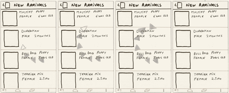
Pogosticking is frequently an issue for the larger desktop web screens, but it is even more of a problem for mobile. For example, the popular app TripAdvisor displays only a fraction of information about a hotel in the list view: only four pieces of information (see Figure 13-1). This makes navigating such a view a challenge.
Figure 13-1: This example of the Pogosticking antipattern is from the TripAdvisor app.
The small size of mobile screens does not automatically guarantee that you must skimp on list-level item information. Compare the TripAdvisor app (refer to Figure 13-1) with the Yelp app list view, as shown in Figure 13-2. Yelp shows customers six pieces of information—that’s two more than TripAdvisor!
Figure 13-2: This is Yelp’s solution to the Pogosticking antipattern.
Moreover, Yelp manages to alleviate the pogosticking issue while actually showing more search results on the same size screen—approximately 1.5 Yelp results for each result shown by TripAdvisor, which is quite an accomplishment. Yelp does this through improved layout of the individual list result.
Why Avoid It
As UX expert Jared Spool—who coined the term pogosticking—explains, most of the effective navigation decisions are made on the gallery (list) pages, and drilling down should be necessary only to actually engage with the item. In pages with excessive pogosticking, the gallery or list page does not provide enough information to make a good navigation decision, so the customer must jump in and out of the multiple detail pages like a child on a pogostick. This wastes valuable time and customer attention span and detracts from productive activities that make your company money, connect, inform, and entertain, which are the activities you want your customers engaged in. Worse yet, due to excessive pogosticking, customers may never find what they are looking for and give up trying, abandoning your app altogether.
Additional Considerations
Pogosticking is a big enough topic to warrant its own chapter, which you can find in my book Designing Search (Wiley, 2011, ISBN: 978-0-470-94223-9).
Related Patterns
All patterns in Chapter 7, “Search.”
13.2 Antipattern: Multiple Featured Areas
All customers enjoy a good deal. And if one type of featured content is good, more must be better, right? Wrong. The Multiple Featured Areas antipattern is one of the most common mistakes in the mobile space.
When and Where It Shows Up
This antipattern shows up whenever there is more than one type of featured results. This is especially common when marketing folks step in, insisting on different brand-named featured areas with funky flavors, usually to match the website.
Example
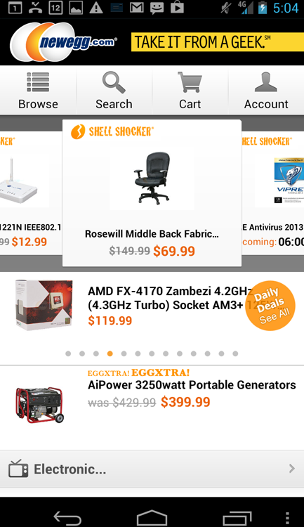
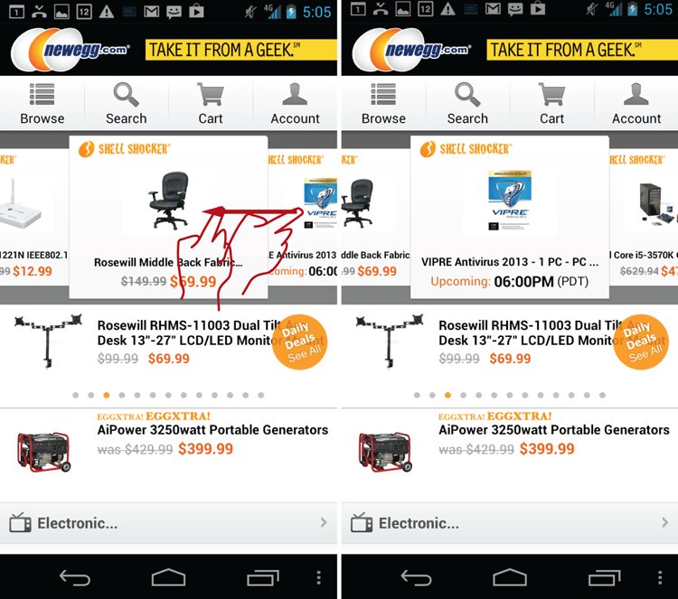
Examples of this antipattern abound everywhere you look. One of my favorites is in the NewEgg app, whose homepage proudly features Shell Shocker deals, automatically rotating Daily Deals and the EGGXTRA! EGGXTRA! section (see Figure 13-3)—all in addition to “normal” search results (that is, if people can figure how to get to them).
Figure 13-3: There’s a lot going on in the Multiple Featured Areas antipattern in the NewEgg app.
Why Avoid It
Prominent and respected UX practitioners like Steve Krug and Jacob Nielsen have reported many times that branded controls and offerings confuse customers. This is completely supported by my experience doing research for top e-commerce firms. That goes triple for multiple branded offerings on a small mobile screen. What’s the difference between the different types of deals? Who cares? Most of your customers certainly do not, and on a smaller screen, over-promotion quickly turns into missed revenue opportunities.
If your customers can’t explain to you clearly the difference between these various marketing offerings, chances are they are instead confused, asking themselves, “Am I actually getting the best deal with a Shell Shocker? Or should I look at the EGGXTRA! EGGXTRA! item instead? What if the best deal on a new tablet can be found under the Daily Deals?” Now instead of actually buying something, the customer is flipping between the marketing promos trying to figure out how to make sense of your bad marketing plan. In the UX world, the term for this behavior is churning—unproductively navigating between useless entries that do not meet the customer’s goals.
Additional Considerations
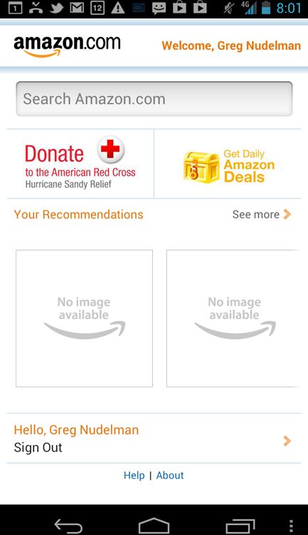
If you get tired of fighting the marketing folks and want to work with them by offering options that support the free expression of their awesome marketing genius without the negative impact on the mobile customer experience, consider the Amazon.com app model: different deal types aggregated under the same title of Gold Box (see Figure 13-4).
Figure 13-4: The Multiple Featured Areas antipattern in the Amazon.com app is hidden under Gold Box.
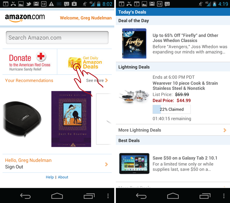
Yes, these are all different deal mechanisms, names, and branding. What makes this example different from the NewEgg Shell Shocker mentioned earlier is that Amazon.com did not attempt to show all the featured items on the homepage. Instead, the promos are generally well hidden under the Gold Box label, which is somewhat confusing and ambiguous, so most customers are not assaulted by the bevy of confusing options unless they deliberately aim to seek them out. In which case, the over-the-top branding of the Gold Box is a fair warning for the uninitiated that they are about to step into an unknown and possibly confusing territory of discounted, featured products.
Related Patterns
See all patterns in this chapter for alternative navigation ideas.
13.3 Pattern: Carousel
Speaking of browsing featured products, one of the best navigation patterns for a small collection of visually appealing products is the Carousel pattern.
How It Works
The customer sees several images of products across the row. To explore more products the customer can swipe across the row to navigate horizontally to the next set of products. An arrow indicating the direction of the Carousel movement is usually provided as a clue for the required interaction. Alternatively, one of the products may be partially hidden, creating a teaser, indicating that more content can be visible by swiping.
Example
One excellent example of this pattern is the Amazon.com app’s home screen (see Figure 13-5).
Figure 13-5: The Amazon.com app features an excellent example of the Carousel pattern on the home screen.
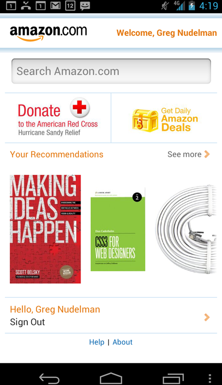
This implementation of the Carousel pattern uses the teaser method of suggesting the required interaction. In Figure 13-5, only a small, tantalizing glimpse of the naked CAT5E Ethernet cable is visible, which is completely irresistible to its more impressionable customers, who can’t help but swipe across to get to more content.
When and Where to Use It
You can use this pattern any time you have a small set of 8 to 20 products or items that are easily recognizable by their picture.
Why Use It
Carousel is an attractive and still fairly unusual control for presenting visual information. Carousel takes full advantage of the multitouch gesture of swiping that is available on the mobile device. Carousel is easy and intuitive to operate and takes full advantage of the compressed mobile real estate when few words are needed to support the content.
Other Uses
One of the best features of carousels is that they work well in a wide variety of device sizes and screen resolutions. This includes the ever-tricky horizontal orientation (see Figure 13-6), where Carousel works even better than it does in the vertical orientation.
Figure 13-6: The Carousel pattern in the Amazon.com app adjusts to various screen sizes and works even better in the horizontal orientation.
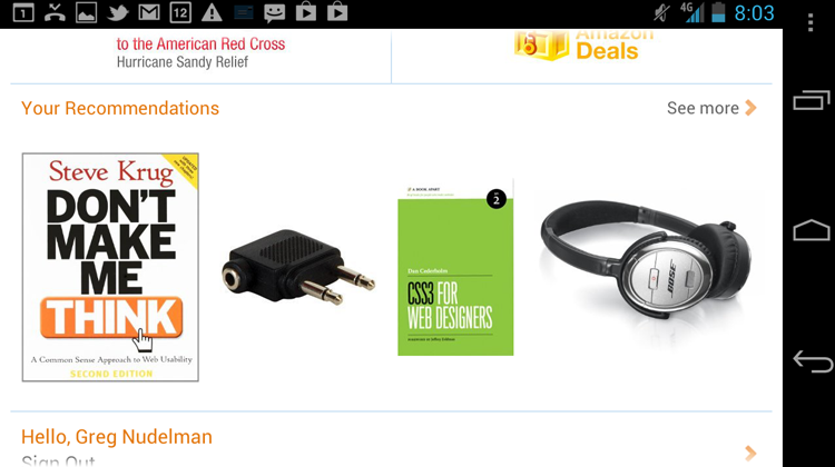
Whereas the usefulness of the traditional search results would be severely affected by the lack of vertical space, a well-designed Carousel shines by showing off even more inventory.
Also noteworthy is the presence of the See More link that navigates to the featured search results (see Figure 13-7).
Figure 13-7: The See More link in the Carousel pattern navigates to the featured search results.
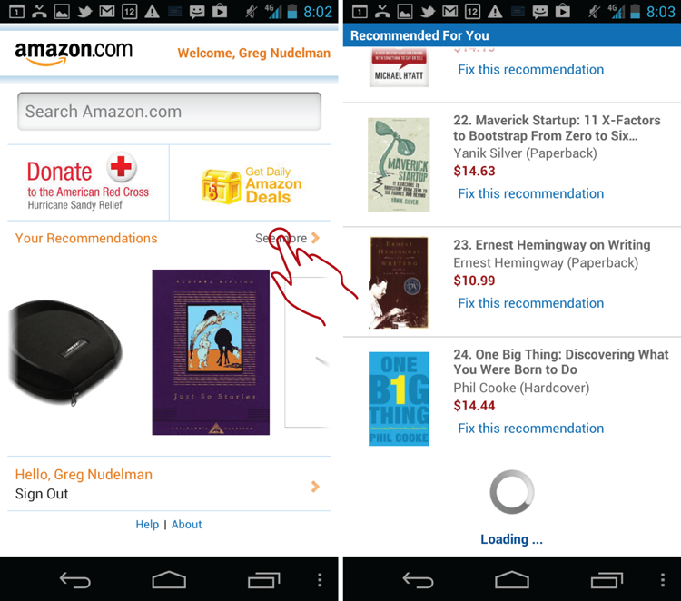
This is an excellent idea if your small subset of items in the carousel control fails to meet the customers’ needs but piques their interest. You can find more on this pattern in the 2-D More Like This pattern in Chapter 14, “Tablet Patterns.” In this instance, the entire carousel control acts as an advertisement of sorts, engaging the customer in exploring the relevant corner of the massive Amazon.com inventory.
Pet Shop Application
The Pet Shop app can use the carousel to show off featured pets or relevant new arrivals. For example, new items matching the customers’ last search of “Guard Dog Puppies” in their local area would be a sure winner. See the wireframe for the 2-D More Like This pattern in Chapter 14. (Looking for the source code for this pattern? Head to http://androiddesignbook.com for the downloadable mini demo app of the Carousel pattern complete with source code you can use right away in your own app.)
Tablet Apps
This is an exceptionally great pattern tailor-made for large swiping gestures that tablet devices invite. The Carousel pattern on tablet devices is even better as a 2-D set of carousel controls. See the 2-D More Like This pattern in Chapter 14.
 Caution
With any pattern, there are many ways to create an implementation that does not feel quite right. One example is the NewEgg app’s Shell Shocker Carousel implementation, as shown in Figure 13-8.
Figure 13-8: The NewEgg Carousel has a few issues.
The discussion of UX issues with the NewEgg implementation would prove instructive. When designing a carousel control it helps to think of its real-world counterpart: the carousel ride at the country fair. Here are a few recommendations to make your carousel ride the best of the bunch.
- Scroll smoothly: To begin with, the NewEgg carousel is structured more like the Apple OS cover flow, with the large central element and two partial views on each side on the periphery. Like the Amazon.com carousel, this one can be swiped to advance through the list of additional products. However, the NewEgg carousel moves jerkily because of the structure of the central element, making it hard to see the intermediate states during scrolling, which is a major disadvantage. It is particularly hard to see the two peripheral elements changing; things are hopping all over the place, instead of smoothly swimming by the way they do in the Amazon.com app. Higher-end and classic carousel rides ease in and out of the speed smoothly and provide a pleasant, mellow, smooth ride. A Carousel is a high-end visual viewing experience that is meant to promote flow, not stress out the viewer. All parts of the control, including transitions, need to work smoothly together.
- Indicate initial scroll direction: NewEgg appears to be scrollable to both the left and right directions, creating confusion: Is this Carousel meant to represent a circle? Have you seen everything already or do you need to keep scrolling? Amazon.com uses the standard Android 4.0 screen tilt boundary treatment to signal the end of the line—a much better approach (if the customer attempts to scroll past the end of the carousel, the screen content tilts to indicate that further navigation in this direction is not possible). Just like a real carousel has horses that point in a certain unambiguous direction (you would not sit backward on a horse, would you?) so your own carousel implementation must show which way the ride runs.
- End the ride quickly: The better carousel implementations indicate the end of the list with the same screen tilt boundary treatment as the beginning, and only present 8 to 20 items, after which the ride is over and the customer can get off the carousel. The customer needs to leave the ride with the feeling of still wanting more. In contrast, the NewEgg carousel seems to go on forever, so the customers do not get off until they are feeling bored (or given the jerky transitions, more likely weak in the stomach). A much better approach is to use the last element in the carousel to provide an obvious built-in More Like This link for jumping into the search results that are more efficient for scanning through large quantities of data and are more likely to be relevant through sheer volume of items (see the 2-D More Like This pattern in Chapter 14 for an example of how this looks).
- Make sure your horses look amazing: No matter how smooth the ride is or how far or how fast the carousel goes, the best carousels have the best-looking horses—period. Make sure your picture thumbnails (the horses) tell the story you want your audience to see. For example, the Amazon.com thumbnails are much better looking than those from NewEgg; although sometimes even the m-commerce giant screws up the ride, dropping the thumbnails entirely (see Figure 13-9).
Figure 13-9: Amazon.com’s Carousel sometimes omits the thumbnails.
It goes without saying that ghost horses make for a terrible ride, even on Halloween. Which brings up the next point: Some products are just not that visual, which makes them poor candidates for inclusion in the Carousel. It is sometimes better to have some text in the individual tile to provide an additional information scent for the technical gadgets, like those sold by NewEgg. If the picture tells only half the story and you have to include a great deal of text, you have to increase the size of the individual element to the point where the carousel may no longer be the best presentation. For those items think twice if you even need a carousel, or if a simple vertical list (more akin to a themed rollercoaster ride) would create a better experience.
Related Patterns
14.5 Pattern: 2-D More Like This
13.4 Pattern: Popover Menu
On the desktop, you have the right mouse button to provide a contextual menu. However, the desktop web historically has had access to only a single mouse button, so it introduced the concept of an action menu activated by a left-click.
The mobile platform is special because the left and right mouse buttons do not immediately translate to touch. However, the first iPad version of the iOS introduced the tap-and-hold popover menu that provides additional menu functionality similar to that of the mouse right-click (tap-and-hold is also common on Windows Phone for contextual/secondary actions and information). Although tap-and-hold menus are a creative and interesting solution, they have many discoverability issues. In the Android platform, the emerging dominant paradigm seems to be a simple single tap menu that expands the choice of actions available to the customer.
How It Works
When the customer taps the “actions” element or arrow, the popover menu of actions opens to reveal more choices in a popover element on top of the existing content.
Example
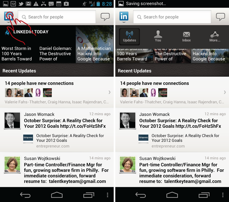
One interesting example of using the popover menu for navigation comes from the LinkedIn app. Tapping the logo opens the navigation layer as indicated by the down arrow under the logo (see Figure 13-10).
Figure 13-10: LinkedIn app uses the Popover Menu pattern for navigation.
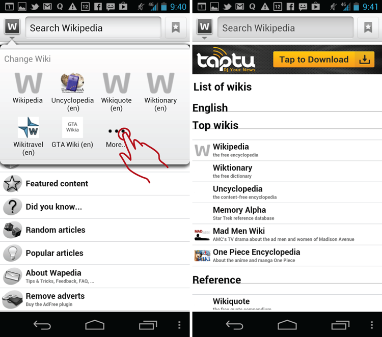
Another example of the similar popover used under the menu is one from the Wapedia app, where the popover menu is used mainly to attenuate the search domain. (See Figure 13-11.)
Figure 13-11: The Popover Menu pattern is used for selecting a search domain in the Wapedia app.
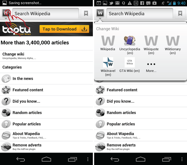
This is siloed search, the inverse of the usual pattern where a single search is performed over various databases (what is known as federated search, such as Google or the Library of Congress.) In the Wapedia example, the customer must manually switch between various databases, providing what Peter Morville calls “advanced, focused queries over a particular collection.” Although the discussion of federated search is beyond the scope of this book, it is generally accepted that figuring out the person’s goal is more important than allowing them to select a particular collection because people who are not skilled librarians usually have a hard time differentiating between various databases. If you’re interested in the topic, pick up a copy of Peter Morville’s essential book, Search Patterns: Design for Discovery (2010, O’Reilly).
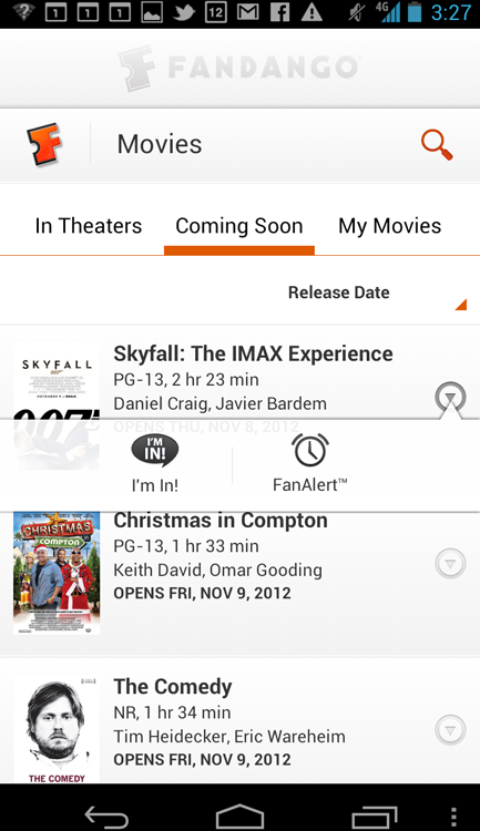
Finally, Figure 13-12 shows an example of a popover menu used to expand row-level functions in the Fandango app. Each row of the results includes a gray down arrow that opens a popover to reveal two additional functions, making a record total of three possible row-level alternatives for a customer to choose from.
Figure 13-12: The Popover Menu pattern is used to expand row-level functions in the Fandango app.
When and Where to Use It
Any time you need to have more actions available to the customer than the confined mobile space allows, use the Popover Menu pattern.
Why Use It
Mobile apps have rapidly increased in complexity since their launch only a handful of years ago. Customers demand to have access to as many (if not more) functions on their mobile devices and tablets as are available on the desktop applications and desktop websites. This preference, with the fat-finger pointers humans are forced to employ, leads to a crisis of real estate. Showing more actions, filters, and navigation options becomes simply impossible in a confined mobile screen. Popover menus offer a flexible, extensible, and elegant solution to the problem by multiplying the real estate’s capabilities through reusing space and opening a layer on top of the existing content.
Other Uses
There are simply too many popover menu uses to mention here. One important application is map-based navigation, where tapping a pin on the map brings up the popover menu. Another one worth mentioning is the Android navigation menu that comes standard with many older pre-4.0 Android apps. This menu had been the differentiating factor of the Android platform from the days of its inception, and it is the one popover menu whose evolution you definitely don’t want to lose track of (see the later “Caution” section).
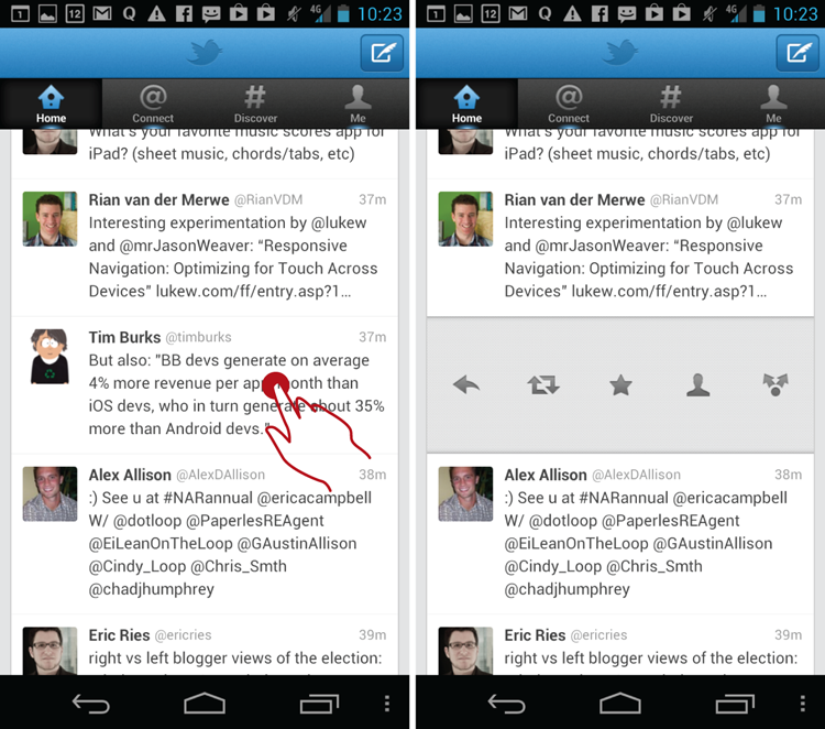
An alternative way to introduce row-level function expansions comes from Twitter. A tap-and-hold gesture on the individual row changes that row into a menu of actions (see Figure 13-13). Scrolling the page again dismisses the menu.
Figure 13-13: The Twitter app uses a tap-and-hold overlay menu variant to expand row-level functions.
This functionality is undoubtedly advanced, meaning that it has serious discoverability issues, and most people using the Twitter app have no idea that this function exists. It is also safe to say that a large number of those who do use the function have discovered it accidentally. This is largely because tap-and-hold menus are virtually unknown in Android; none of the native functions work this way, so the Android customers don’t have a chance to learn the action. Nevertheless, in my opinion, this twist on the popover is by far the finest way to present row-level functions. It is elegant, minimalist, and authentically mobile, and it uses the confined real estate in the most effective manner. It would be a shame if the Google-Apple patent wars were to prevent this pattern from gaining universal acceptance.
Pet Shop Application
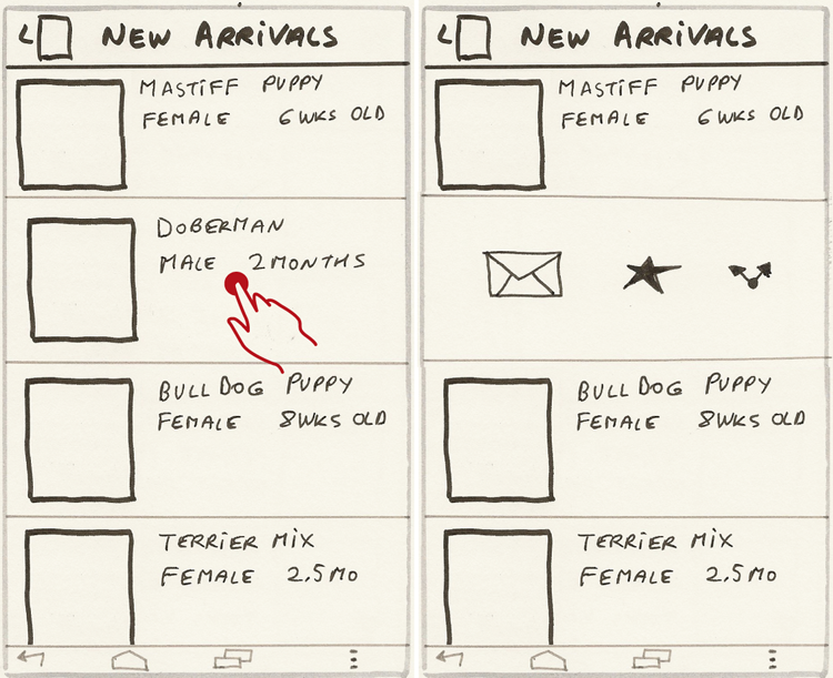
For the Pet Shop app, the most promising application of the Popover Menu pattern is the row-level action menu that enables actions such as Contact the Seller, Add to Favorites, and Share. Instead of using the Fandango app’s model, however, the in-row menu variant introduced by Twitter is used—the tap-and-hold variant (see Figure 13-14).
Figure 13-14: The tap-and-hold overlay menu variant expands row-level functions in the Pet Shop app.
In some apps, the action needed to call up the menu is changed from tap-and-hold to row-level, right-to-left swipe, which is also borrowed from the iOS multitouch toolkit; although they aren’t discussed here.
Tablet Apps
Tablets do not suffer as badly as their smaller mobile counterparts from the lack of real estate used for navigation. Tablets are also more conducive to multitouch explorations, as observed in many field studies. This is mainly because of their “gaming DNA”; experienced tablet owners are more likely to expect funky and unusual multitouch behaviors from their devices and are more apt to look for these gestures during work and play.
There’s another unspoken expectation that I have dubbed “Is this all there is?” Most owners expect that a tablet will have greater functionality than the mobile device, even if it is just shortcuts and action accelerators. Regardless of the device, however, the discoverability of the “hidden” navigation options, such as row-level functions, is always a challenge. See the next pattern, Watermark, for ideas on how you can communicate the action necessary to unlock the “hidden” multitouch functions to your customers in a virtually foolproof way.
Caution
Make sure to consider all menus. In the earlier LinkedIn app example, the popover menu is used for navigation. Unfortunately, this makes the Android device bar menu almost obsolete because it now displays only a single function: Refresh under the Updates tab. Worse yet, under the You tab, the Android device bar menu is completely nonfunctional, and tapping it shows no options and has no effect on the app (see Figure 13-15).
Figure 13-15: An antipattern occurs in the LinkedIn app where it strongly deprecates the Android device menu in favor of the popover menu.
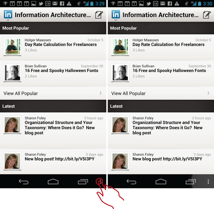
This behavior is confusing and contrary to both the Android data model and customer expectations.
Also, don’t mix selection with navigation. In the earlier Wapedia example, the popover menu is used for selecting the collection for searching. However, it has one additional use: navigation to the More section. Navigating to the More section retains the search box and resets the collection choice to Search Wikipedia, which is somewhat unexpected and confusing because it is at odds with the previous options, essentially mixing the navigation options with filtering in the same menu (see Figure 13-16).
Figure 13-16: This antipattern in the Wapedia app popover mixes filtering with navigation.
Do these issues signal the end of the world as you know it? No, of course not. However, there is a much better model in the native Android Google apps, as exemplified by the latest incarnation of Google Plus, which removes the navigation bar Android menu in favor of using two top menus in the action bar (see Figure 13-17). Much like in the LinkedIn example, the top-left action bar menu is used for global navigation, whereas the additional Android overflow menu in the top-right corner is used for section-level and global functions, such as Search and Settings. The more commonly used functions such as Refresh and Compose are given dedicated icons in the top action bar (see more about the Drawer element in the Google Plus app in Chapter 1, “Design for Android: A Case Study”).
Figure 13-17: The Google Plus app divides and conquers navigation and functionality with two popover menus.
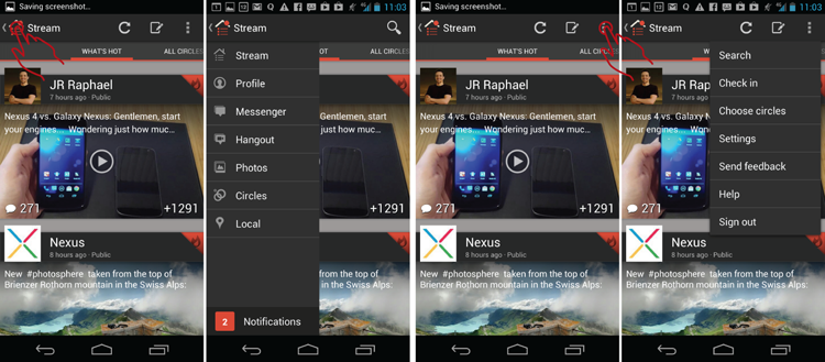
This is an elegant and novel model that is clearly and loudly signaled by Google as a departure from the traditional bottom navigation-bar menu that had been the Android mainstay feature from day one. When using the popover menu for your own navigation, consider which options need to be included in which menu, and be sure to test various options with your target customers.
Related Patterns
13.5 Pattern: Watermark
13.5 Pattern: Watermark
Watermark provides the essential hint that enables customers to discover “hidden” multitouch gestures and accelerometer actions that can be used for navigation.
How It Works
When the multitouch gestures and accelerometer motions exist on the system, the screen shows a semitransparent watermark (in some cases shown underneath the content). The Watermark pattern provides the hint of the gesture or motion that the customer needs to perform for a specific system action. It is shown briefly and then melts away. Usually the sequence is repeated several times at each start of the app, or until the customer performs the action the first time. After that, the watermark appears at regular intervals (biweekly for example) as a reminder if the system detects that the multitouch gesture/accelerometer motion has not been performed in a while.
Example
Games provide great examples of cutting-edge patterns. Watermark is no exception. For example, in the delightful politically incorrect game Major Mayhem, The Major shoots at ninjas in a jungle. At the start of the game, a free-form animated contextual watermark shows how to use your finger to perform two functions: the basic tap-to-shoot, and the more complex motion of tap-and-drag (see Figure 13-18), which drags poor ninjas from behind obstacles and defenses.
Figure 13-18: Here the Watermark pattern is demonstrating in-game gestures in the Major Mayhem app.
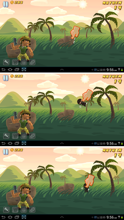
As the game progresses, more actions, such as jump, are demonstrated for the player until she learns all of the available multitouch gestures.
Chapter 5, “Welcome Experience,” already touched on this subject of contextual tutorials. What makes the Watermark pattern different is that it is not an overlay that you need to dismiss; instead it’s a gentle invitation. Watermark is completely integrated into the context of the current task, so the customer can simply proceed with the task without following the motion or action suggestion in the tutorial. The customer retains her freedom, and the watermark is simply there to remind the customer that the action can be performed. In the Major Mayhem example, the customer does not have to perform the tap-and-drag action of pulling the ninja out from behind the obstacle; the person is free to shoot the ninja instead. In this way, the watermark is unobtrusive enough not to interfere with the primary task (shooting those pesky ninjas).
When and Where to Use It
Any time you employ gestures other than the simple tap, it’s a great idea to use the Watermark pattern to help your customer discover and remember the gestures and avoid any confusion.
Why Use It
Multitouch and accelerometer offer a fantastic array of both natural and novel gestures that can help your customers navigate complex applications on mobile devices, without adding bulky navigation options. Unfortunately, these gestures are largely undiscoverable without some sort of a hint. Watermark provides a playful hint, a gentle reminder about the available actions while still allowing the primary task to proceed. After you decide to use a Watermark, it is tremendously freeing and beneficial to the design of the app and the resulting customer experience because it instantly liberates your team to explore alternative, more compact and elegant, authentically mobile navigation layouts. Patterns like Watermark are also more likely to help create simple, uncluttered displays necessary for immersive experiences—the subject you explore in the next section.
Other Uses
Watermark is not just for games; see the “Pet Shop Application” section for some examples of how to use this pattern for “serious” e-commerce and social media applications.
Pet Shop Application
For the Pet Shop app, imagine that a simple filtering action can be accessed via a shake, as in “shaking up the search results,” instead of using a dedicated Filter button. A simple way to show this would be with a Watermark pattern that shows the shaking action (see Figure 13-19).
 Figure 13-19: The Watermark pattern demonstrates the shaking action for accessing filtering and sorting in the Pet Shop app.
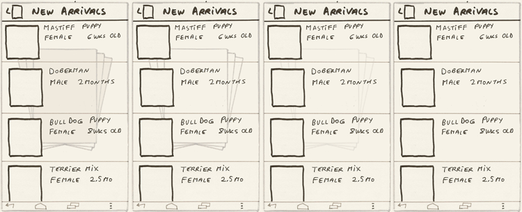
Note that the wireframes show the watermark melting away after a short while both to remove the potential annoyance and to draw attention gently to the invitation for the additional action. Remember, you don’t need to actually show what will happen when the shaking occurs, only to reminder customers gently to try it out and allow them to discover the result on their own, and so naturally fall in love with your app.
Another novel way to perform the filtering action utilizing a multitouch gesture might be to draw a circle on the screen with a finger—perhaps reminiscent of the motion of mixing marbles (results) in a bag (results set). The wireframe in Figure 13-20 shows how this might look using the same set of results.
Figure 13-20: The Watermark pattern in this case demonstrates drawing a circle to access filtering and sorting in the Pet Shop app.
Notice that none of the watermarks in this section interfere with viewing the results. They merely hint at actions the customer might want to try out to access additional functionality.
Tablet Apps
See the “Tablet Apps” section in the “13.4 Pattern: Popover Menu.”
Caution
The customer will expect that if she does not perform the action suggested by the watermark, it might go away and then re-appear at some point as an additional reminder. However, when the customer performs the action, it’s expected that she will not see the watermark again for quite some time (think weeks, not days) and that eventually it might go away altogether.
It is an art of how to remind without being annoying. The design field is littered with loathsome examples of annoying tutorials, such as Microsoft’s Clippy, as shown in Figure 13-21 (image credit: Mark Stanger, “Why Service-now.com won’t ever have an animated help assistant,” December 29, 2009, http://www.servicenowguru.com/service-now-miscellaneous/servicenowcom-animated-assistant).
Figure 13-21: Microsoft’s Clippy was possibly the most universally hated contextual tutorial agent of all time.

Although the Watermark pattern has the general advantage of being more unobtrusive than most, it is always better to err on the side of giving too little help rather than too much, particularly for animations, including appearing and disappearing, which tend to draw a lot of customer’s attention. You might want to have a built-in dead-switch where the watermark goes away after being shown a total of four or five times, or remind people at most once a month. You may even want to consider having a settings (On/Off) switch, such as “Display reminders?” It is a safe bet that if the customer performs the action on her own within 10 minutes of using your app, she has learned the action by heart and does not need to be reminded again for at least 2 weeks. Regardless of the strategy you choose, make sure you test the Watermark interaction thoroughly with your target audience.
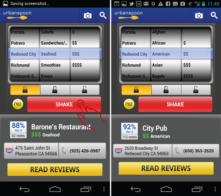
Another thing to remember is not to over-indulge; reserve multitouch gestures for unique, special actions the customer might take once in a while. For actions that require multitouch as the primary action, be sure to provide a simple push-button alternative. For example, a popular app called Urbanspoon uses the gesture of shaking the device to communicate to the system the action of searching. From the first glance this interaction was cool, and indeed, this unique feature did draw a great many people to download the app initially. However, people quickly discovered that shaking every single time you need to search is actually tedious, so designers were quick to add a Shake button (see Figure 13-22) that performs the same action. This shortcut turned out to be the magic sauce to success: Draw the customers in with the cool multitouch gesture but provide the back-door access to advanced users who are familiar with the system.
Figure 13-22: Urban Spoon provides back-door access to its shaking gesture.
In general, on mobile devices, consider having push-button, back-door access for your key multitouch gestures that are repeated frequently. Place the button in a location that is ergonomically convenient to access with a one-handed, right-hand grip. (See the device ergonomics section in Chapter 3, “Android Fragmentation” for details on where the convenient access “hot zone” is located on various touch devices.) It’s a great idea to label the action with the name of the multitouch gesture, such as Shake, Swipe, and so on. This can also serve as a reminder of the multitouch action. After the novelty has worn off, the button is likely to be the primary way your customers access the action.
Related Patterns
5.5 Pattern: Tutorial
13.6 Pattern: Swiss-Army-Knife Navigation
If you ever played a game on your mobile device, you know that navigation generally recedes into the background in favor of lending the entire screen to the primary task of entertainment and challenge. This pattern shows you how to adopt this type of Swiss-Army-Knife Navigation to any application.
How It Works
This pattern is all about exploring the experimental trends that use navigation that recedes into the background so that the content can shine. Most of the pattern implementations accomplish this with the hidden navigation menu that opens by tapping a button in the corner of the device. In the various modifications, navigational menus come down as window shades, slide the content over, appear in the overlays, and use all manner of creative elements and transitions. In games, the menu button is frequently semitransparent, allowing for the entire screen real estate to be used for play.
Example
A favorite example of a successful immersive experience is the game Angry Birds. With more than a billion copies downloaded (according to Wikipedia—http://en.wikipedia.org/wiki/Angry_Birds), Angry Birds is a model for a successful immersive experience that uses the Swiss-Army-Knife Navigation pattern (see Figure 13-23).
Figure 13-23: The Angry Birds app is an excellent model of an immersive experience with its semi-transparent button and window shade menu.
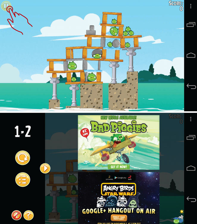
The entire area of the screen is devoted to the immersive task of squashing the pesky pigs. The only navigational control is the semi-transparent round pause button that opens the custom window shade menu that flies in from the left side of the screen. Note that the menu is highly customized to appear as part of the game, and when it flies in, the menu appears to come on top of the game’s content, keeping the player immersed in the flow of the game and maintaining the context. To accomplish this, the menu does not cover the entire game area of the screen, and the main area of the screen is subtly darkened during the smooth transition. When creating an immersive experience, seemingly small elements like shading, icons, and transitions make the key difference.
Another window shade navigation experience is offered by the Wells Fargo Bank app (see Figure 13-24). It is remarkable because although the app is a hybrid app (that is, it uses HTML elements in a captured browser window), the window shade transition is smooth and believable. This app is a tribute to both the developers and designers as well as the capabilities of the HTML 5 apps in general.
Figure 13-24: Here’s the Swiss-Army-Knife Navigation in the Wells Fargo app.
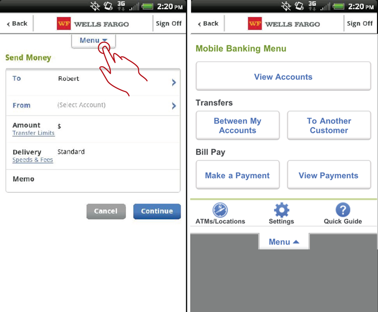
Despite the masterful execution of the menu element, the quality of the stage set for having an immersive experience does not quite match that of the Angry Birds app because of the additional navigation elements present in the app. But maybe it does not have to; banking apps are different from games. Instead, the Swiss-Army-Knife Navigation menu button accomplishes its purpose of providing Wells Fargo customers with reliable, complete navigation access throughout the entire app.
The lesson here is that although the main purpose of the Swiss-Army-Knife Navigation pattern is to devote more of the screen real estate to crucial content, the pattern also offers significant fringe benefits of providing universal navigation throughout the app. Universal navigation makes it possible to completely dispense with the need for the List of Links pattern discussed previously in Chapter 6, “Home Screen.” Instead, when freed from the burden of navigation, the homepage (and indeed, the entire app) can be made relevant to the customer through patterns such as Updates and Browse, showing local, relevant information and deals.
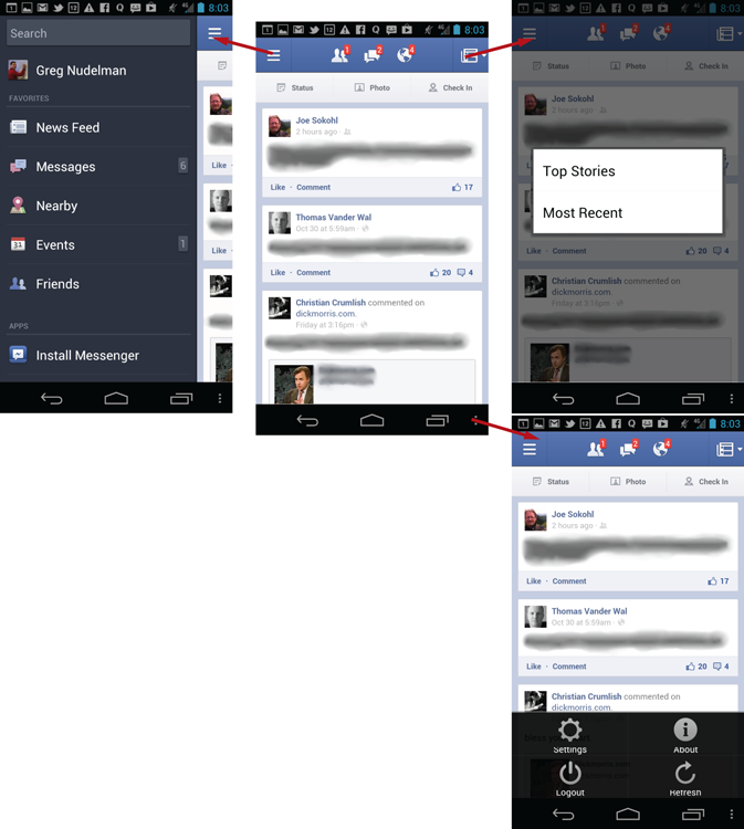
One of the apps that takes full advantage of the immersive navigation capabilities is Facebook, which recently redesigned the global navigation using the side menu teaser variation of the Swiss-Army-Knife Navigation pattern (see Figure 13-25). Tapping the top-left corner opens a sliding menu that comes in from the left side, leaving just a teaser of the main content on the right side of the screen.
Figure 13-25: The Facebook app uses excellent Swiss-Army-Knife Navigation.
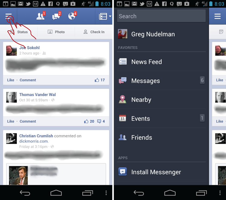
Many designers and developers argue endlessly about the differences between the Angry Birds and Facebook implementation of this pattern, but you, the gentle reader, can dig deeper and recognize the common design DNA of both approaches. No matter if the menu has a slick transition or not, and whether the menu is scrollable or if it overlays the content as it does on Angry Birds or pushes it over as in Facebook, both have the same purpose in mind: giving content center stage while allowing universal navigation from every screen in the application. That’s power.
When and Where to Use It
Use this pattern any time you need to devote more of your real estate to content, and promote the state of flow in your customers’ activities. You should also use it when you want to show more of the content and less chart junk (navigation) or when your customers are savvy enough to figure out how to get to the navigation.
Why Use It
Swiss-Army-Knife Navigation promotes flow and immersive experiences. This is especially true on the small mobile screen, where the real estate devoted to navigation usable by fat fingers encroaches on and distracts from the real estate that can be devoted to usable content. Swiss-Army-Knife Navigation provides an elegant approach to removing navigation from view until it is needed and then devoting almost full-screen real estate to it when the customer decides to navigate somewhere else.
In the words of Marissa Mayer, “Google has the functionality of a really complicated Swiss Army knife, but the home page is our way of approaching it closed. It’s simple, it’s elegant, you can slip it in your pocket, but it’s got the great doodad when you need it. A lot of our competitors are like a Swiss Army knife open—and that can be intimidating and occasionally harmful.” (“The Beauty of Simplicity,” Fast Company, November 2005). The Swiss-Army-Knife Navigation pattern is about translating this same sentiment to mobile navigation.
Other Uses
Swiss-Army-Knife Navigation doesn’t need to always be implemented as a button that causes the menu to fly out. Other models have also been proven successful for a variety of specialized applications. For example, while viewing a photo in a native Photo Gallery app, a single tap in the middle of the image brings up a semitransparent overlay with various functions, such as sharing, e-mailing, deleting, and so on (see Figure 13-26).
Figure 13-26: Swiss-Army-Knife Navigation in the Photo Gallery app uses a single tap in the middle of the screen instead of a button.
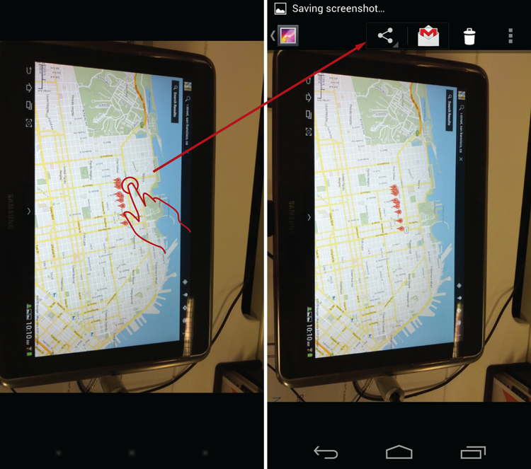
This same overlay never appears in the viewing mode of swiping through the image collection, so the navigation stays hidden, and the customer remains in the flow of viewing the images.
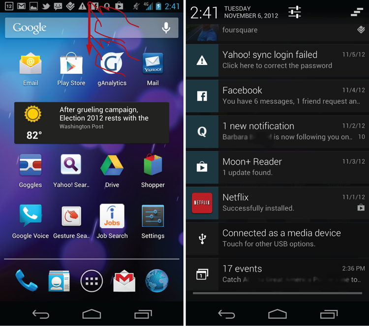
Of course, this is a specialized application of this design pattern that works only because the viewing mode uses multitouch gestures. It does not work for most apps that require tapping somewhere in the screen. But maybe the inverse approach might work. For example, you might consider retracting the navigation while in the flow mode and using some special multitouch gesture to bring it back. This is exactly how the native notification function works on the Android platform. Notifications are almost completely hidden at the top of the screen. Swiping down brings up the menu as shown in Figure 13-27. (Curiously, this exact multitouch motion is used by Windows RT to return to the home screen.)
Figure 13-27: The Swiss-Army-Knife Navigation pattern is used to bring up the Android Notifications screen.
As the most popular top-to-bottom swipe is taken by the native notification control, you might want to consider using a side-to-side swipe (popular in Windows Modern UI), diagonal swipe, or shake instead. Another alternative is to use a touch screen to draw a letter like “G” for “Go” or “M” for “Menu.”
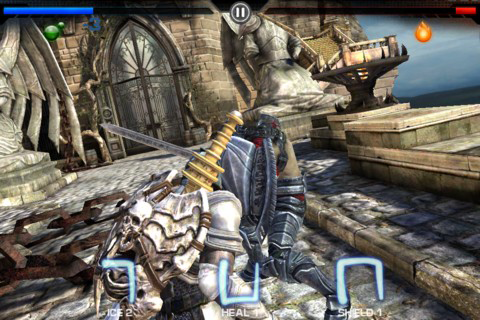
Be sure to also consider and experiment with “made up” gestures that are easy to draw. A game called Infinity Blade uses touch screen gestures to cast spells quickly in the midst of battle. As author’s ample experience with this awesome game shows, a simplified gesture similar to the Cyrillic letter “Gh” (that looks like the inverted “L”) is one of the easiest and quickest to draw, as is letter “C” (half-circle) in any orientation, whereas drawing a “U” reliably and quickly is difficult (see Figure 13-28).
Figure 13-28: These novel multitouch gestures are from Epic’s Infinity Blade game.
Finally, if you can’t remove the navigation entirely, consider making it semitransparent instead, as exemplified by Google Maps and Google Earth, as shown in Figure 13-29.
Figure 13-29: The Google Maps and Google Earth apps use semitransparent action bars.
Although both action bars are always displayed on screen, they are semitransparent, which enables customers to see the map contours under the bars. This is a good intermediate solution if you cannot go all the way to creating a Swiss-Army-Knife Navigation because you can still take advantage of some of the benefits offered by this pattern.
Pet Shop Application
For the Pet Shop app implementation of the Swiss-Army-Knife Navigation pattern, see the wireframe in Figure 13-30 for a four-corners pattern variation. The idea is simple: Instead of using only a single semitransparent menu button as in the Angry Birds game, the app uses all the corners of the screen as partially transparent shortcuts to key areas of the app. For example, in the search results shown, the two top spots are Map and Shopping Cart, whereas the bottom-left corner is occupied by the Filter and the top-right corner by the menu.
Figure 13-30: The Pet Shop App uses the four-corners Swiss-Army-Knife Navigation variant.
The corner shortcuts are also combined with the semitransparent Filter Strip element (see the “8.3 Pattern: Filter Strip” section in Chapter 8, “Sorting and Filtering”). Together, this design enables 100 percent of the screen real estate to be used to scroll through the cute pictures of puppies. At the same time the key areas and capabilities of the app are well exposed, all without the slightest possibility of accidentally hitting a button and triggering an unwanted action.
Why this choice of placement? Placing the menu in the bottom-right corner makes sense—this is where the Android navigation menu traditionally rested in older apps, so it makes sense there when you replace it with a custom window shade. Also it is easily accessible by the right thumb in a right-handed one-hand grip. The Filter button is on the bottom left because it is the most likely button to be used again and again in the context of a particular search. Ergonomically, Filter is in the easiest corner to access because the thumb naturally rests in that area in a one-handed, right-hand grip that you see commonly in mobile devices. The top-corner buttons are there mainly to raise awareness of the features that may not be immediately top-of-mind, such as Map, and to house the ubiquitous Shopping Cart button. Although this arrangement makes sense, many other arrangements with various functions are possible. Experiment with your own designs to determine what works best. The key is to try to devote as much space as possible to content while at the same time giving access to key functionality.
Tablet Apps
For larger 10-inch tablets, this space-saving pattern is not needed because there is much more space available for navigation, toolbars, and the like. However, for 7-inch tablets it should be definitely considered. High-end visual adaptations of the four-corners design variations are also fun to design and use. For example, you can imagine a slick text editor devoid of extraneous controls, menu bars, and buttons—a blank canvas on which to write the next great American novel. The bottom-right corner of the canvas could be subtly raised (as though it is a physical piece of paper). This corner, when tapped, can be used to call up the menu which is revealed behind the screen by rolling up the canvas in a smooth transition.
Caution
My biggest caution here is not to wait to use this pattern before your competitors do! If you are worried about discoverability of the hidden Menu button, don’t be. All of the several billion people who downloaded Angry Birds and other games that use the same pattern learned to use it successfully. In a study sponsored by a telecom giant, more than 25 people revealed that when presented with only a single action button, people will click it and discover the meaning behind it experimentally, even without full understanding of what the button does. With two or more buttons, things do get trickier, so make sure to use good icons and test the interface early and thoroughly with your target audience.
Remember, you don’t need to use all four corners. For example, the Facebook app (see Figure 13-31) uses the two top corners plus a native Android navigation bar menu on the right-bottom side of the screen (which makes three corners total). The design is slightly different from the one presented in the Pet Shop app, but the general approach presents an excellent paradigm for your own experimentation.
Figure 13-31: The Facebook app uses a Three-Corner Swiss-Army-Knife Navigation pattern.
You might prefer to have icons that are a bit more differentiated than those that Facebook uses. This is essentially a problem of figuring out which action is under which corner menu. When in doubt, try using one main menu and abstracting additional key functions only after the menu contents have been largely worked out.
Related Patterns
8.3 Pattern: Filter Strip
13.7 Pattern: Integration: The Final Frontier
This final mobile pattern departs somewhat from the single-app theme, heretofore used in this book in favor of showing how navigation looks when control is passed between the apps. It also discusses exciting widget and OS-level opportunities for aggregating data from various apps into highly usable mobile dashboards.
How It Works
When the needs of your customers exceed the capabilities of your app, you need to navigate to a different app that takes over the task for the customer. Besides the purely procedural integration, opportunities exist to offer integration of data feeds from various apps and display them on custom dashboards, widgets, and panoramas that serve as jumping off points for engaging with these apps.
Example
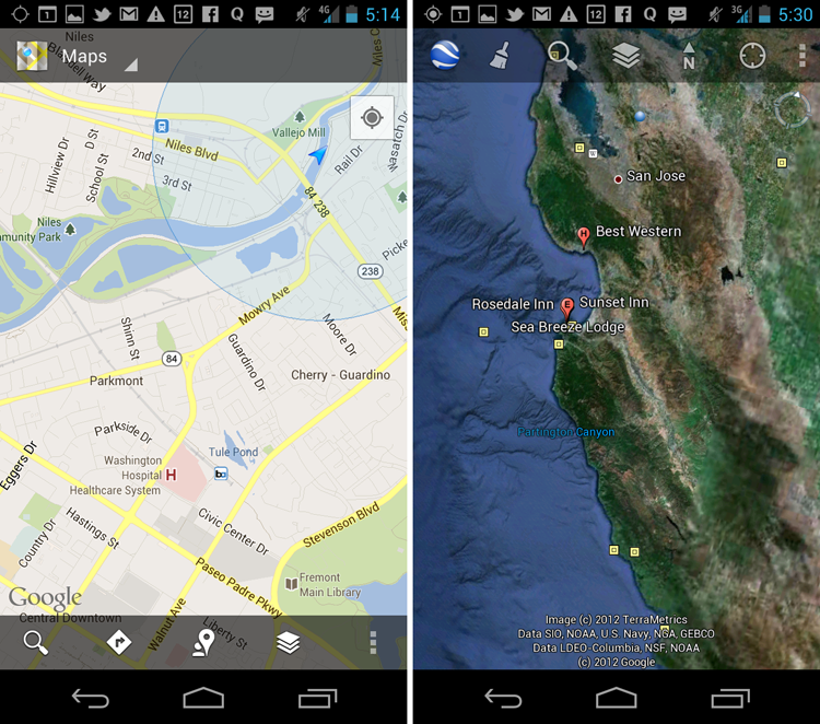
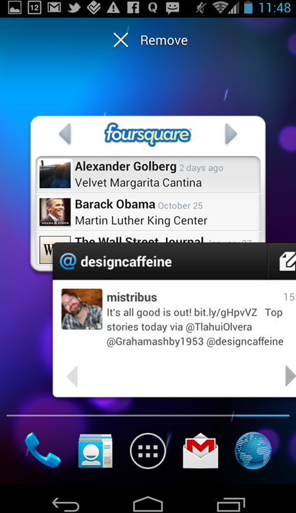
One example of a seemingly simple procedural integration is the FourSquare app. The app offers a “captured” version of the Google maps that is licensed specifically for displaying the list of places of interest in the map format. However, to obtain directions, the customers must navigate to the separate native Google Maps app (see Figure 13-32).
Figure 13-32: The Foursquare app uses a process-driven integration with Google Maps.
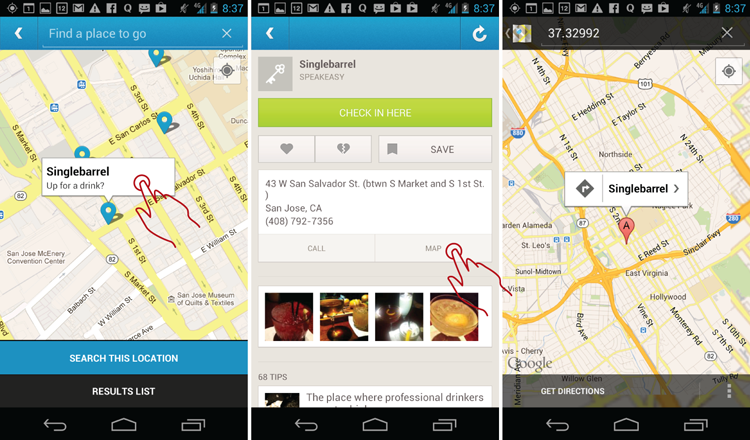
Foursquare is fairly well integrated. It passes to the Maps what appears to be a decimal number, which actually is a destination code. The Google Maps app correctly obtains the name and the address of the place of interest, presumably directly from Google’s database. (Other integrations are not so lucky—see the later “Caution” section.)
When and Where to Use It
Use this pattern any time your app needs to provide services that are already well developed in a different app with which the customer is familiar.
Why Use It
Life is simpler when you don’t reinvent the wheel. Also, there are excellent opportunities to improve the mobile experience and add value in pulling the data from various apps and aggregating it in an easy-to-scan format (see the next section).
Other Uses
One of the biggest opportunities in mobile is to offer skillful aggregation of data feeds from various apps. The main reason you do not yet derive full value from mobile apps is that communication is tightly subdivided into technological silos—e-mail, instant messaging, LinkedIn, Twitter, Facebook, and so on—and information is not semantically labeled and sorted into buckets people can actually use. Instead, people are forced to continuously check various communication channels for fear of losing an important communication and to get the constant dopamine hit of staying in touch and up to date. Keeping up with all methods of communication takes a lot of time and almost superhuman effort. Companies wanting to make advances in mobile communication should make a serious effort to separate the message from the technology medium.
One approach would be to integrate and prioritize various information feeds within a single unified inbox. Rather than switching apps to stay in touch on all the networks, you can get all of the feeds in one place. Instead of tracking down the people you need to get in touch with, you can select everyone you need and send a single communication to the right people in one shot, from one central location. Even better, people you want to reach could receive your communication in the way they prefer.
The way Android allows this kind of “integration” currently is purely accidental and unmanaged, via various widgets placed on the home screen (refer to Figure 13-33).
Figure 13-33: It’s an antipattern that Foursquare and Twitter widgets can’t be integrated on a single homepage screen.
Although this works well in theory, in practice, unfortunately, such widgets fail to meet the rising demands of people coping with the social networking feed information coming out of the internet firehouse. Even just looking at the FourSquare and Twitter widgets, there is a great deal of whitespace, little or no flexibility of what displays in the widget, and the sheer impossibility of putting both widgets on the same page because of their size. If the widgets were more integrated, you could fit Foursquare, Twitter, Facebook, and more on the same page. Individual sections of this mega-widget can function either as links or as sections that open to reveal more social feed information.
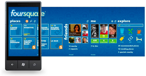
One intriguing opportunity to accomplish this on mobile devices and tablets actually came from the Windows Phone Panorama control, like the one shown in Figure 13-34 for Foursquare (image credit: Liz Ngo Global ISV, “Updated Announcement: Official foursquare 2.X App for Windows Phone Unveiled and Now Available for Download,” MSDN.com website, June 28, 2011, http://blogs.msdn.com/b/msftisvs/archive/2011/06/28/official-foursquare-2-0-app-available-for-windows-phone.aspx).
Figure 13-34: The Foursquare app on Windows Phone uses this Panorama Control.
Every day new and different ways to communicate pop up all over the mobile landscape. Facebook enables more than 10 different ways to send and receive messages (poke, post on the wall, comment on photo, and so on.
Aggregating these various messages into a dashboard panorama makes sense. Unfortunately, it also comes up short of mobile technology’s full potential. Instead of aggregating the information from various apps into a single panorama, various apps have created their own, individual dashboard panoramas, thereby again locking down the information silos.
This creates an excellent opportunity for agile and hungry Android product teams, who never shied from borrowing the most promising ideas from all kinds of sources. Imagine a teenager’s (and small business owner’s) dream: an open customizable Android Panorama dashboard for various network feeds, pokes, wall messages, check-ins, and alerts. Or imagine a CRM-in-Your-Pocket: a powerful individual dashboard for each of your contacts that includes the name and picture; Twitter, Facebook, and Tumblr updates; Foursquare check-ins; the last conversation you had with them; and any IMs and voicemails you exchanged translated via voice-to-text. Imagine just how connected, informed, and engaged your customers would feel in the lives of their contacts! This is entirely possible to have today, yet no one has made an effort to use the Integration pattern in this fashion.
The collective mobile experience doesn’t need to be about the technology silos, but rather about the goal of connecting, and the system should take on the task of aggregating and prioritizing various communication channels to present just the right amount of information. The system should prioritize messages and expressly alert people only to the most important and urgent messages. Android is actually the best platform to pull off these integration touch points because of the open standards and the spirit of experimentation it embodies.
Pet Shop App
What kinds of apps can the Pet Shop app be integrated with? Certainly maps for finding and displaying pets near you and getting directions for pick up. It could also have integration for news, events, and happenings in the customer’s area, specifically for the pet category of interest (such as Guard Dogs). In this last mobile pattern in the book, I would like to invite you to brainstorm and sketch the possibilities!
Tablet Apps
Tablets are the best media consumption devices that are practically made for integration, period. Widgets and apps taking advantage of various smart integrations and aggregate dashboards are going to be the next hottest growth area for tablet app developers.
Caution
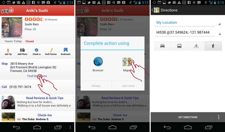
Interapp integration is wrought with peril. Even “simple” map integration in major industry players such as Yelp and Kayak is far from perfect.
Figure 13-35 shows the data Yelp passes to the map is a combination of latitude and longitude (which is standard in Google maps) instead of the street address. This creates problems, such as not actually seeing the address or the name of the business in the Maps app. The Google Maps app also does not “remember” the business address in its drop-down of recent destinations, making it difficult, if not impossible, to multitask or try out different locations and then go back to the previous address, which are all standard tasks that anyone making a reservation would expect to do. Anyone watching the tap-flows that involve the maps component would notice that the same destinations are accessed several times in a row by the same person, indicating a subpar integration experience.
Figure 13-35: The coordinates-driven process-driven integration of Yelp and Google Maps has serious drawbacks.
You can achieve a deeper level of integration sometimes by “capturing” (or more correctly licensing) another app. One example of this is the Kayak app (see Figure 13-36), where the Bing maps app is used to display the location of the hotel on the map. Unfortunately, this integration looks better on paper than it does in reality. Just try to get directions to the hotel—you can’t!
Figure 13-36: “Captured” Bing maps do not offer directions in the Kayak app.
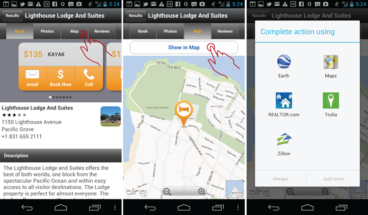
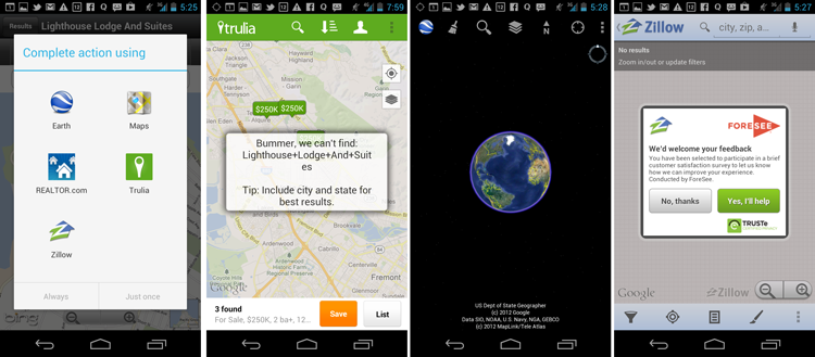
Instead, the Bing-Kayak hybrid offers a funky-styled button labeled Show in Maps, which opens a puzzling array of apps (Google Earth, Zillow, Trulia, and Realtor.com) most of which use maps peripherally. Actually trying out those options yields errors and zero results, and for good reason: It appears upon careful examination that the Kayak-Bing hybrid passes “Lighthouse+Lodge+And+Suites,” which you can see in Figure 13-37 comes up empty at (almost) every integration point (in the case of Google Earth actually failing without indicating that no results were found).
Figure 13-37: On Kayak, all integration points except Maps fail to find the target or provide directions.
Google Maps is the only one that actually yields something useful—the name and address located in the city of Pacific Grove—that can be used to obtain the directions originally desired by the customer. But why offer these other integration choices that do nothing but confuse customers?
Related Patterns
6.2 Pattern: Dashboard
9.1 Antipattern: Ignoring Visibility of System Status