Chapter 14
Tablet Patterns
Tablets are a huge area of mobile technology—these devices deserve their own separate book. The patterns included in this chapter are specific for small and large tablets with more screen area than a smartphone. Designing for tablets is one area in which a team willing to experiment can rapidly overtake the competition in creating a superior experience that is most closely suited to the unique tablet shape and device capabilities. Before tackling this chapter, review Chapter 3, “Android Fragmentation,” for a refresher on the hot zones and most likely grip positions offered by various devices.
14.1 Pattern: Fragments
To address device fragmentation, Android raced ahead of the competition by offering the somewhat ironically named Fragments UI framework. Fragments forms the primary “pure Android” pattern of User Interface (UI) design.
How It Works
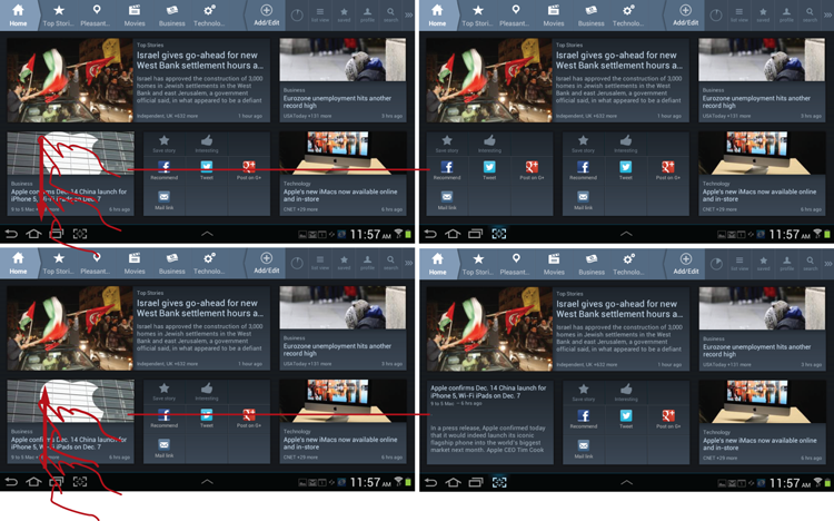
The content on the screen is broken out into tiles called fragments. Each fragment is positioned based on the device size and orientation to best occupy the available space. Scrolling of the individual tiles is limited so that essential elements, such as action buttons, do not scroll offscreen.
Example
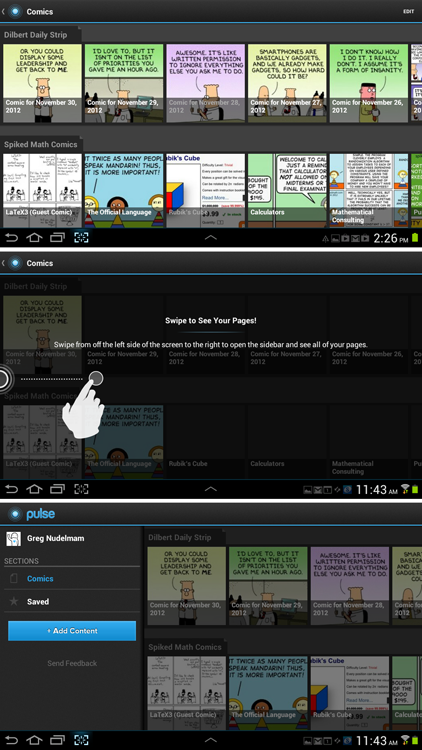
My favorite example of the Fragments UI is the Google Play app. It is an example of a truly of a “responsive” native app that works surprisingly well on a variety of devices, as shown in Figures 14-1 and 14-2.
In the horizontal orientation on the 7-inch tablet pictured in Figure 14-2, the elements of the Google Play screen flow into two columns as needed to occupy space most efficiently. When the tablet is in the vertical orientation, the elements stack instead into a single-column design as shown in Figure 14-1. Even though content within each of the elements scrolls independently, action buttons remain visible at all times. In each case the elements are arranged for optimal layout.
Figure 14-1: The Fragments pattern in the Google Play app forms a single column on a 7-inch tablet in the vertical orientation
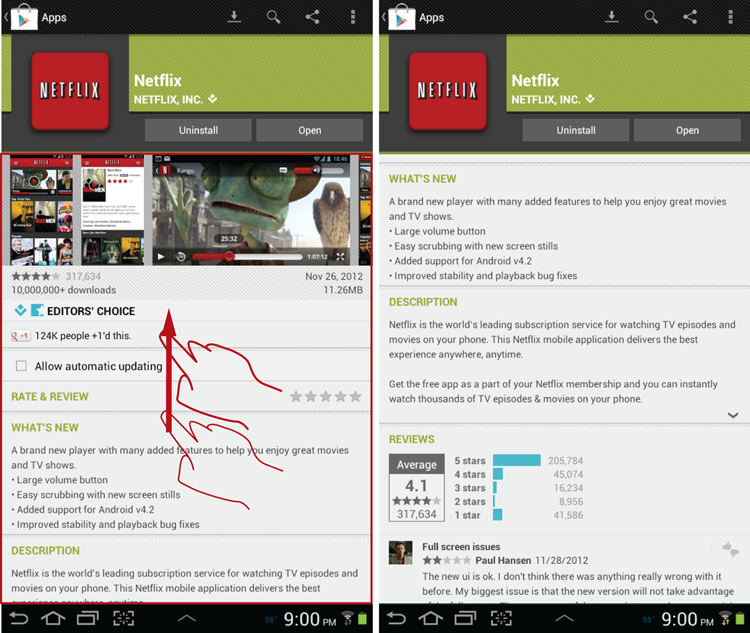
Figure 14-2: The Fragments pattern in the Google Play app forms two columns on a 7-inch table in a horizontal orientation.
When and Where to Use It
Translating existing app designs to small and large tablets is best accomplished using the Fragments framework. It offers plenty of capabilities and is easy to use.
Why Use It
The Fragments framework pattern offers the first serious stab at a one-size-fits-most approach. The Fragments pattern provides a decent experience on most devices while eliminating the need to create custom apps for various devices such as small and large tablets.
Other Applications
Much of what is written about responsive web design also applies to Fragments. However, the Fragments framework has been specifically optimized for responsive design, whereas much of the web design is done through CSS and JavaScript hacks. Read more about the Fragments framework at http://developer.android.com/training/basics/fragments/index.html.
 Caution
When laying out the fragment content for tiles that house the action buttons, limit the minimum size of the fragment to ensure that all the action buttons are shown to the customer, at least partially. This is important because a fragment with action buttons is difficult to scroll, and most people will not attempt to do so. Thus the owners of these devices will not discover the additional functions hidden below the fold of the fragment.
Be aware that no matter how great the intention, responsive design will not, in many cases, perform as well as a dedicated app designed specifically for a certain size of the device. If you are serious about providing a good tablet experience for your customers, you must take the time to optimize for certain popular sizes and test your Fragments UI on two or three popular device sizes in both orientations.
Related Patterns
14.2 Pattern: Compound View
Whenever the tablet is in the horizontal orientation, there is an opportunity to present the list with the detail element. This format is called the Compound View (also known as Two-Panel Selector, http://designinginterfaces.com/patterns/two-panel-selector/).
How It Works
Typically, on the smaller mobile devices, the list view is presented first and then the customer can drill down into the detail view. To get back to the list view, the customer has to tap the Back button. In contrast, tablets, especially in the horizontal orientation, are large enough to display both the list and the detail, making it easier and more efficient to drill into details without having to pogostick between the two views.
Example
A good example is the Settings app on the tablet device, as shown in Figure 14-3. The left side of the app’s screen shows the list of settings, and the right side shows the details.
Figure 14-3: The Settings app shows an excellent Compound View implementation.
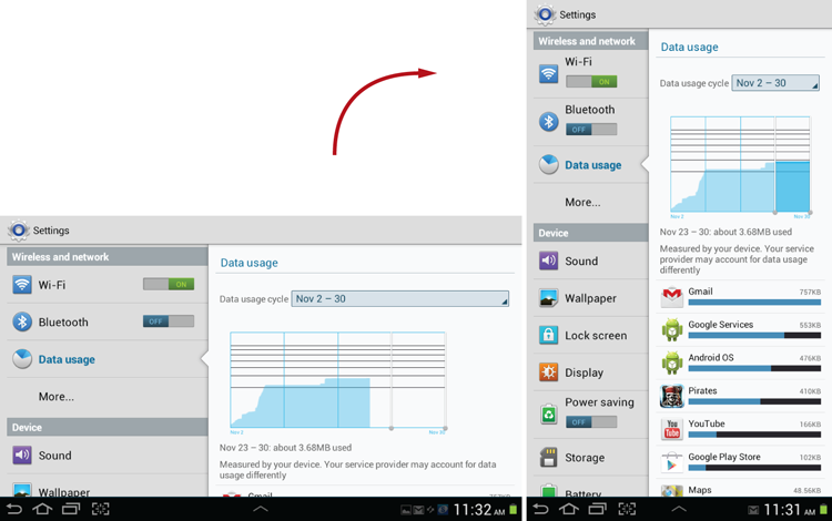
The Settings app makes an honest attempt to show the same information on both the vertical and horizontal orientations. It does this by performing a stretch/compress action, adjusting the column width of the left pane to achieve a balanced layout in both orientations.
When and Where to Use It
Any time you have a list and detail view Information Architecture (IA) consider using the Compound View pattern.
Why Use It
Compound View is effective in giving the overview, while also allowing efficient random access navigation (that is, the person can navigate anywhere in the list view and see the detail without losing the context of the whole).
Other Applications
In some cases, the list column actually represents app navigation. In those cases, the Compound View pattern collapses into the useful and effective Side Navigation pattern covered in the next section of this chapter.
Caution
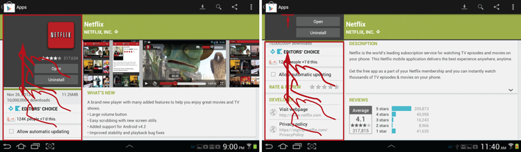
Depending on the size of the device and the two columns of the compound view, some apps, such as the Gmail app, use a slightly different approach. In a horizontal orientation, they show the same two columns—list and detail—whereas in the vertical orientation they show only the detail column. In the vertical orientation, the list can be obtained by using the up navigation, as you would do while using a mobile phone.
Unfortunately, not all apps implement this correctly. Some, like the Ustream app shown in Figure 14-4, do not allow the customer access to the list view in a vertical orientation. Even more confusing, the column labeled Categories shows up on the screen just briefly before it slides out of view, without any way to get it back while the device is in a vertical orientation.
 Figure 14-4: The Ustream app does not allow the Categories list to be accessed in a vertical view, which is an antipattern.
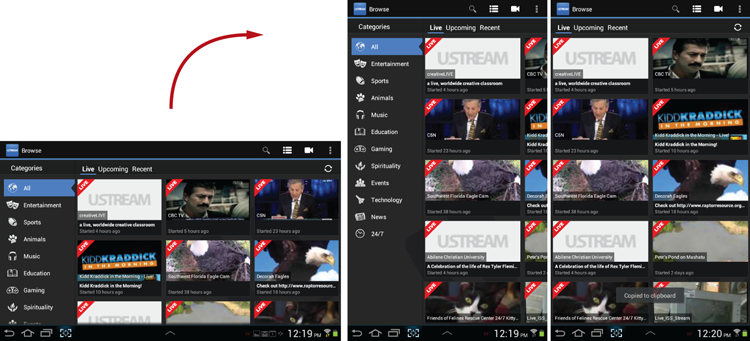
Fortunately, the customer can access the Categories list again by rotating the device back into the horizontal view. Despite that, this app design is an antipattern. To quote the Android guidelines, “Screens should strive to have the same functionality regardless of orientation.” The keyword is strive—which means not all apps will have the same functionality in every orientation, and that is OK. However, when the constraints do force the list and detail screens to split, the list should always be readily accessible, and Ustream breaks that basic guideline, creating a very confusing experience.
Related Patterns
 14.3 Experimental Pattern: Side Navigation
Side Navigation places the key functionality in the up/down orientation along the left and right sides of the device, where it is easily and ergonomically accessible without letting go of the device, which is particularly important for large tablets.
How It Works
Before deciding to follow the standard Android navigation guidelines, consider the ergonomics carefully, particularly for large tablets. As you recall from Chapter 3, for large tablets the sides of the device are more easily accessible than the middle of the top action bar. For apps that need to present a lot of navigation and functionality, running the functions up and down along the sides of the device in a compact menu makes a lot of sense.
Example
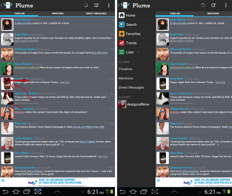
One example of a modified Side Navigation pattern is the Plume app. Plume is a popular, rich Twitter client for Android tablets. It displays the essential functions such as Home, Search, Favorites, and more in a Drawer element along the left side of the device (see Figure 14-5). Although it’s not a bad implementation of the concept, you get the feeling that the design is not entirely complete, authentic, and minimalist. The Drawer menu is partially hidden most of the time, so the app must constantly remind the customer by moving the main content pane slightly, which jiggles the content periodically. There is also a great deal of other navigation along the top of the action bar and in the right side overflow menu, which makes the entire interface feel busy and incomplete, especially for a tablet that typically has plenty of navigational space.
Figure 14-5: The Plume app includes a decent implementation of the Side Navigation as a Drawer pattern.
A cleaner implementation of the same functionality, which creates a better customer experience, is in the Twitter app on the Apple iPad. On the Android platform, this is, of course, an experiential implementation that nevertheless would work exceedingly well (see Figure 14-6).
Figure 14-6: An excellent implementation of the Side Navigation pattern is available on the Twitter iPad app.
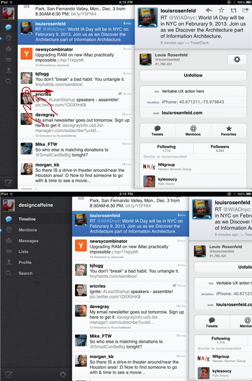
The Twitter app was one of the first and most elegant and successful implementations of the Side Navigation pattern. The key feature of the left menu is that it never disappears offscreen. Depending on the orientation of the device and the position of the various panes of the application, the menu opens as a long list with icons and text, or collapses to just the thin, vertical row of icons by a simple, horizontal swipe. In contrast with the Plume app, there are no general icons and controls elsewhere in the app—all the functionality in the iPad Twitter app is located in the left menu.
When and Where to Use It
Any time you have a large tablet device, consider the Twitter iPad app style icons menu that remains on screen and does not completely disappear like the standard Android drawer. Depending on the goals and functionality of your app, consider this pattern for mid-size 7-inch tablets as well.
Why Use It
There are three reasons to use this pattern instead of the standard drawer:
Other Applications
Consider using the left nav icons in the vertical orientation if there is not enough space for the icons and text together. For instance, referring to Figure 14-4—how much more effective would the Plume app be if, after the initial load of the full two-column screen, the text would collapse, and only the category icons remained visible in the vertical orientation, while the full icons and text were available with a simple swipe? Figure 14-7 shows a hi-def wireframe of how this might look.
Figure 14-7: This proposed wireframe shows an alternative design of the Plume categories with icons that can slide out to a full menu.
In the horizontal orientation, the list can remain as-is or also collapse the same way, as needed, depending on the size of the device and the need to show more content in the right pane.
If you don’t want to implement the icons in the left nav, at least consider using a simple bevel to show that the drawer is available and can be accessed by swiping, as in the AutoTrader case study in Chapter 1, “Design for Android: A Case Study.”
Caution
Caution here is of a political nature: Although it works extremely well, side navigation is not an accepted Android pattern—yet.
Related Patterns
14.4 Pattern: Content as Navigation/Multitouch Gestures
Whenever possible, on tablets, use the content as a sweeping navigational element, avoiding tiny buttons that need to be tapped carefully.
How It Works
Every element of content is also a navigational element that can be accessed through various multitouch gestures.
Example
One of the smoothest examples of using content as navigation is Flipboard. (See Figure 14-8.) The app is not only beautifully designed, but it is highly functional as well, which leads people to truly fall in love with it.
Figure 14-8: The Flipboard app provides an excellent implementation of the Content as Navigation pattern.
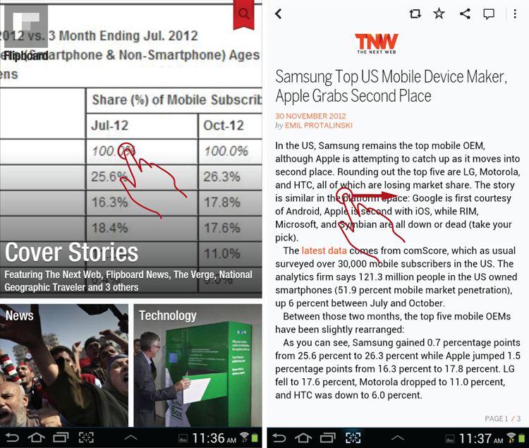
The customer can access all the content simply by tapping on the large tile to see the rest of the story, swiping up to see more stories, and swiping right to left to go back. Even though there are no navigational buttons, few people have any trouble using the app because of its intuitive resemblance to a magazine.
A slightly different example comes from a creative app called News 360, which is shown in Figure 14-9. Each story is presented as a unique “cube” that can be rotated with an up/down swipe. A down swipe implies a “drill down” and reveals more information about the story. The up swipe reveals sharing functionality and additional navigation. The implementation adds a playful element through clever use of transitions and unique mapping of gestures to system actions that begs to be discovered and appreciated.
Figure 14-9: Playful content as navigation is implemented in the News 360 app.
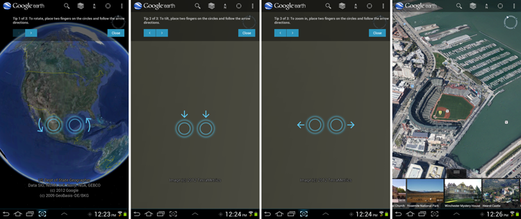
However, simple directional swiping is only the beginning of the multitouch and gesture capabilities available on tablet devices. The Google Earth app (see Figure 14-10) enables people to interact directly with the real-world view they are looking at, creating an almost surreal virtual reality. Creative two-finger gestures such as Rotate and Pan are used effectively alongside the familiar stretch-and-pinch zoom function.
Figure 14-10: Complex multitouch gestures are used to manipulate the real-world content directly in the Google Earth app.
No one using the tablet version of the app fails to fall in love with the capabilities of the app or believe within minutes that this is “the only way to fly!”
When and Where to Use It
Use direct-access navigation whenever possible for all tablet applications.
Why Use It
Tablets, especially large ones, lend themselves well to sweeping multitouch gestures. This has to do with the size and form factor of the device and also with the awesome and playful touch interactivity. Multitouch is a part of the two-handed committed use of the tablet and its touch DNA. As mobile User Experience expert Josh Clark says in his brilliant sidebar in my first book, Designing Search (2011, Wiley), “buttons are a hack.” I couldn’t agree more. Of course, buttons are still good for some commands that don’t map to the basic set of well-known gestures, but overall, buttons on tablets are greatly overused and you should consider gesture and multitouch alternatives whenever possible.
Other Applications
As Richard Saul Wurman famously quipped at the 2010 IA Summit Keynote: “Everything we have done with computers and websites is still really primitive. We are in a really rapid changing time during which you can't invest in the finality and finish of anything. As a result most things are really bad. The web is not going to end up as a collection of pages. It needs to be a fluid movie and provide a journey. You need to be able to fly through the information of your choosing. You need to be able to direct where you want to go. The metaphor of the book for the web does not support that.”
Substitute “information” for the word “web” and you have the model for how to view the future of the customer’s relationship with your data. We are only just scratching the potential of direct manipulation of content through multitouch. The applications of this pattern are truly limitless.
Here’s a simple, yet concrete, example of one way this could possibly work: Using a picture of a riveted boot, a customer should find similar boots by circling the features she likes (rivets), enlarging the features she wants to make bigger (as in a wider toe, for example), and literally crossing out the features she does not want (the heel). Consequently, the results the app suggests would be a bunch of riveted boots with a wide toe and no heel.
Other recent explorations into this highly immersive “flight through information” include rich tablet magazines such as Opening Ceremony magazine, and multimedia stories that include touch, such as The Fantastic Flying Books of Mr. Morris Lessmore. For these single-use touch gestures, remember to keep the touch portion of the story light and engaging, and the multitouch motions simple and intuitive so that people can recognize them using simple onscreen cues without having to engage in a long tutorial.
Caution
Some gestures are not as discoverable as others. To avoid “mystery meat” navigation and undiscoverable functionality, use watermark tutorials, overlays, and animations to show interactivity, as Google Earth does so effectively (refer to Figure 14-10 and see the “Related Patterns” section).
Keep in mind that tablets do not lend themselves well to some accelerometer motions, even though the motions are “allowed.” For example, gentle tilting is fine, but shaking and flipping is quite awkward, especially for larger, heavier devices.
Related Patterns
14.5 Pattern: 2-D More Like This
2-D More Like This is a simple but powerful content browsing design pattern. It’s particularly effective for larger touch devices such as tablets, where it can be used to transform a variety of search tasks into a pleasurable, visual browsing experience.
How It Works
Search results are placed in a gallery format across several rows, with each row representing a particular subdivision of the result set. Rows can be created from any division that makes sense, such as subcategory, brand, date, or price ranges. Each row is equipped with a carousel control (see the “13.3 Pattern: Carousel” section): In addition to a few thumbnails that can be displayed to the customers, each row also extends two or three screen widths to the right, which enables the customer to view additional elements in each row by swiping right to left. The customer can also scroll the page up to see more rows. The result is a two-dimensional scrollable matrix of thumbnails that are organized by topic.
Each row is also equipped with a More Like This link that’s somewhere in the row so that no scrolling is required to select it. On touch screens, you can typically accomplish this by making the row title act as a link. For best results, the More Like This link could also be placed as the last spot in the scrollable carousel. That way, if the customer does not find what he is looking for in the carousel, he can tap the link to see more search results that match both his query and the topic of that particular row.
Example
One of the first apps to successfully use the pattern is Netflix, as shown in Figure 14-11.
Figure 14-11: The Netflix app includes an excellent 2-D More Like This pattern implementation.
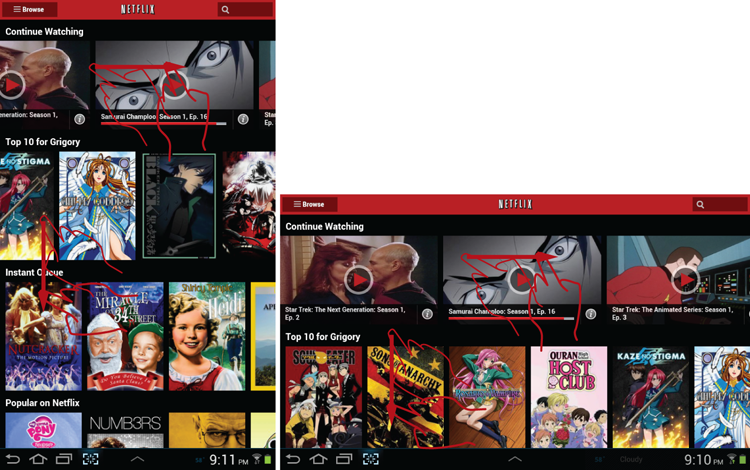
This pattern works equally well in the vertical and horizontal orientations—one displays more rows; the other displays more items in each row. The customer can rotate the tablet to fit his needs for the specific task.
When and Where to Use It
You can use the 2-D More Like This pattern to support a variety of browsing tasks for content that is easily categorized. This pattern works best for result sets that are primarily visual, but it can include additional captions or even text snippets.
Why Use It
Tablets lend themselves to “contemplative consumption” of information accessed using large, sweeping gestures, appropriate to the larger size of the device, with minimal typing. There are few search design patterns better suited to taking advantage of this than 2-D More Like This.
Well-designed More Like This pages take full advantage of the full available surface area of the device, work well in both landscape and portrait, and provide excellent ergonomics. Overall, this pattern contributes to the feeling of flow: immersive, elegant, strain-free flight through visual information.
Other Applications
The 2-D More Like This pattern combines easily with other multitouch UI elements, such as slide-out menus. For example, in the elegant implementation of the 2-D More Like This pattern in the Pulse app that’s shown in Figure 14-12, sliding the screen further left reveals a menu drawer.
Figure 14-12: This elegant 2-D More Like This pattern implementation with a menu drawer is from the Pulse app.
Caution
You should strive to avoid the following common pitfalls of the 2-D More Like This pattern:
Related Patterns
14.6 Experimental Pattern: C-Swipe
If the recent Windows 8 developments are any guide, tablets are going to get larger over time. Already the lineup includes 12-, 15- and 21-inch touch screens, and touch-friendly applications are becoming more complex and full-featured. It’s only a matter of time before Android will be forced to catch up, yet scaling the current action bar scheme may not be realistic or ergonomically desirable. C-Swipe is a futuristic, experimental pattern that forms the basis for an alternative navigation scheme. It can be used to bring up a contextual menu anywhere on the touch screen using a natural semi-circular arc described by the human thumb along the surface of a flat touch screen. This gesture is roughly in a shape of a letter C, hence the name of this pattern.
How It Works
Imagine this: The entire surface of the tablet is devoted to content. To use functionality or navigation, the customer swipes the screen with her right thumb in a natural semicircle gesture near the edge of the device. She can make the gesture while holding the device comfortably and securely with her wrist and the remaining four fingers of her right hand and the entire five fingers and a palm of her left hand.
The swipe of the thumb causes a semicircular contextual menu to display. The most commonly used function is on the top, near the final position of the thumb following the completion of the C-Swipe gesture. Icons and associated text of the menu are positioned in such a way as not to be blocked by the thumb. The person taps the function she wants, and the menu once again disappears as the action is performed.
Example
As mentioned earlier, Flipboard is an elegant app that uses multitouch effectively. Yet on detail pages some functions—Back, Favorite, and Like—are on the top action bar. I propose an alternative access to these functions using the C-Swipe pattern (See Figure 14-13).
Figure 14-13: This wireframe shows a redesign of the Flipboard app with a C-Swipe menu.
A semicircular swipe with a thumb anywhere on the screen brings up a hidden menu containing the app’s menu functions.
When and Where to Use It
The C-Swipe pattern is basically a complete replacement of the current Android action bar menu, so you can use it anywhere you might currently use an action bar. Particularly good candidates include tasks that today call for the lights-out mode of hidden Swiss-Army-Knife navigation, such as reading or browsing magazines.
Why Use It
The C-Swipe pattern has a number of important benefits:
- It is a highly immersive pattern that keeps the functionality hidden until it is needed, enabling 100 percent of the screen to be devoted to uniquely immersive touch experiences such as virtual reality.
- The C-Swipe pattern is unique because it can be used to create navigation anywhere on the screen, and the menu always shows up exactly where the hand is already positioned, so there is minimal strain and no need to change hand positions to access functionality.
- The C-Swipe pattern uses a unique gesture, which is not (as of the time this book is being written) used for anything else. Thus the menu is unlikely to be triggered accidentally, and when it is opened, it is easy to close by tapping anywhere on the screen outside the menu.
Other Applications
The C-Swipe pattern does not need to be activated near the edge. For larger touch screens that are tilted to enable the operator to remain comfortably standing, the C-Swipe navigation can be opened anywhere by making a swiping semicircular gesture with a thumb. Usually one of the other fingers, such as the index finger, must touch the screen first to support the compact gesture.
The C-Swipe pattern is unique because it comes with its own “natural” animated transition, which simply spins out the menu in a semicircular path that follows the movement of the thumb as closely as possible.
Caution
The C-Swipe pattern is not easily discoverable. However, its discoverability can be boosted using an animated watermark or similar pattern. Stating something such as, “Swipe with your thumb anywhere on the screen,” or playing the animated watermark several times in different places on the screen can help customers discover the gesture. After the initial discovery, the C-Swipe pattern quickly becomes familiar because it is so natural for a human hand.
Some people believe that the drawback of the C gesture is that it is ergonomically complex and does not translate into anything “real” such as scroll/pan. Other designers instead prefer larger gestures of the Windows Modern UI that use the entire arm to transverse the screen from left to right and top to bottom. Yet still other designers prefer another alternative for large displays: a special multitouch gesture, for example a five-finger tap or five-finger pinch. I disagree. Although each of these alternatives to the C-Swipe pattern holds a great deal of promise, I find the C-Swipe pattern to be the most natural, authentic, and economical of touch movements. Much testing with a broad range of people is needed to confirm this. However, one thing is clear: Regardless of the gesture, the concept behind a hidden menu is the correct one for the future of touch on larger tablets, so my biggest caution would be against ignoring this important trend.