
Earlier you customized the buttons in BeatBox by manually setting a style attribute in the res/layout/list_item_sound.xml file. If you have a more complex app, with buttons throughout many activities or fragments, setting a style attribute on each and every button does not scale well. You can take your theme a step further by defining a style in your theme for every button in your app.
Before adding a button style to your theme, remove the style attribute from list_item_sound.xml.
Listing 21.9 Be gone! We have a better way (res/layout/list_item_sound.xml)
<Button
    style="@style/BeatBoxButton.Strong"
    android:layout_width="match_parent"
    android:layout_height="120dp"
    android:onClick="@{() -> viewModel.onButtonClicked()}"
    android:text="@{viewModel.title}"
    tools:text="Sound name"/>
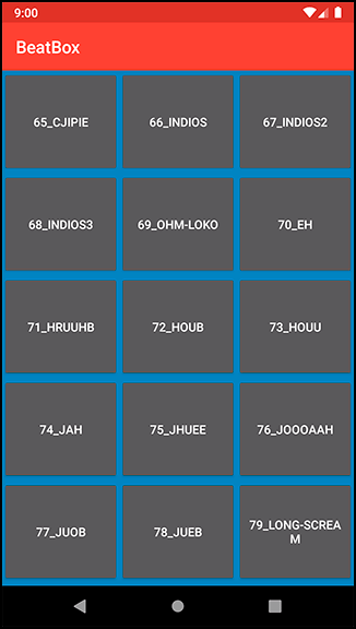
Run BeatBox again and verify that your buttons are back to the old, bland look (Figure 21.8).
Go theme spelunking again. This time, you are looking for buttonStyle. You will find it in Base.V7.Theme.AppCompat.
    <style name="Base.V7.Theme.AppCompat" parent="Platform.AppCompat">
        ...
        <!-- Button styles -->
        <item name="buttonStyle">@style/Widget.AppCompat.Button</item>
        <item name="buttonStyleSmall">@style/Widget.AppCompat.Button.Small</item>
        ...
    </style>
buttonStyle specifies the style of any normal button within your app.
The buttonStyle attribute points to a style resource rather than a value. When you updated the windowBackground attribute, you passed in a value: the color. In this case, buttonStyle should point to a style. Navigate to Widget.AppCompat.Button to see the button style. (If you cannot Command-click [Ctrl-click] on the style, just search for it in the same values.xml file and you will find its style declaration.)
<style name="Widget.AppCompat.Button" parent="Base.Widget.AppCompat.Button"/>
Widget.AppCompat.Button does not define any attributes itself. Navigate to its parent to see the goods. You will find that there are two versions of the base style. Choose the values/values.xml version.
    <style name="Base.Widget.AppCompat.Button" parent="android:Widget">
        <item name="android:background">@drawable/abc_btn_default_mtrl_shape</item>
        <item name="android:textAppearance">?android:attr/textAppearanceButton</item>
        <item name="android:minHeight">48dip</item>
        <item name="android:minWidth">88dip</item>
        <item name="android:focusable">true</item>
        <item name="android:clickable">true</item>
        <item name="android:gravity">center_vertical|center_horizontal</item>
    </style>
Every Button that you use in BeatBox is given these attributes.
Duplicate what happens in Android’s own theme in BeatBox. Change the parent of BeatBoxButton to inherit from the existing button style (Listing 21.10). Also, remove your BeatBoxButton.Strong style from earlier.
Listing 21.10 Creating a button style (res/values/styles.xml)
<resources>

    <style name="AppTheme" parent="Theme.AppCompat">
        <item name="colorPrimary">@color/red</item>
        <item name="colorPrimaryDark">@color/dark_red</item>
        <item name="colorAccent">@color/gray</item>

        <item name="android:windowBackground">@color/soothing_blue</item>
    </style>

    <style name="BeatBoxButton" parent="Widget.AppCompat.Button">
        <item name="android:background">@color/dark_blue</item>
    </style>

    <style name="BeatBoxButton.Strong">
        <item name="android:textStyle">bold</item>
    </style>

</resources>
You specified a parent of Widget.AppCompat.Button. You want your button to inherit all of the properties that a normal button would receive and then selectively modify attributes.
If you do not specify a parent theme for BeatBoxButton, you will notice that your buttons devolve into something that does not look like a button at all. Properties you expect to see, such as the text centered in the button, will be lost.
Now that you have fully defined BeatBoxButton, it is time to use it. Look back at the buttonStyle attribute that you found earlier when digging through Android’s themes. Duplicate this attribute in your own theme.
Listing 21.11 Using the BeatBoxButton style (res/values/styles.xml)
<resources>

    <style name="AppTheme" parent="Theme.AppCompat">
        <!-- Customize your theme here. -->
        <item name="colorPrimary">@color/red</item>
        <item name="colorPrimaryDark">@color/dark_red</item>
        <item name="colorAccent">@color/gray</item>

        <item name="android:windowBackground">@color/soothing_blue</item>
        <item name="buttonStyle">@style/BeatBoxButton</item>
    </style>

    <style name="BeatBoxButton" parent="Widget.AppCompat.Button">
        <item name="android:background">@color/dark_blue</item>
    </style>

</resources>
Notice that you do not use the android: prefix when defining buttonStyle.
This is because the buttonStyle attribute that you are overriding is implemented in the AppCompat library.
You are now overriding the buttonStyle attribute and substituting your own style: BeatBoxButton.
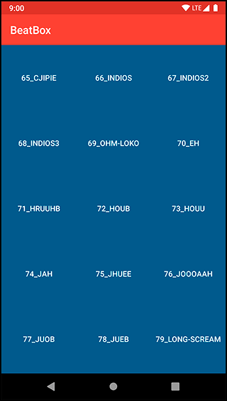
Run BeatBox and notice that all of your buttons are dark blue (Figure 21.9). You changed the look of every normal button in BeatBox without modifying any layout files directly. Behold the power of theme attributes in Android!
It sure would be nice if the buttons were more clearly buttons. In the next chapter, you will fix this issue and make those buttons really shine.