One of the biggest changes to Android in recent years was the introduction of a new design style: material design. This new visual language made a big splash when it was released with Android 5.0 (Lollipop), and it came accompanied by a wonderfully exhaustive style guide.
Of course, as developers we are usually only peripherally concerned with questions of design. Our job is to get it done, no matter what “it” is. However, material design introduces some new interface concepts in addition to the design sensibilities. If you familiarize yourself with them, you will find it much easier to implement these new designs.
This final chapter is a little different from previous chapters. You can think of it as an enormous For The More Curious section. There is no example app to work through, and most of this information is not required reading.
For designers, material design emphasizes three big ideas:
-
Material is the metaphor: The pieces of the app should act like physical, material objects.
-
Bold, graphic, and intentional: App designs should jump off the page like they would in a well-designed magazine or book.
-
Motion provides meaning: The app should animate in response to actions taken by the user.
The only one of these that our book has nothing to say about is bold, graphic, and intentional. This is a designer’s responsibility. If you are designing your own app, check out the material design guidelines (developer.android.com/design/material/index.xhtml) to see what they mean by that.
For the material is the metaphor part, designers need your help to build out the material surfaces. You will need to know how to position them in three dimensions using z-axis properties, and you will need to know how to use material widgets such as toolbars, floating action buttons, and snackbars.
Finally, to live up to the directive that motion provides meaning, you can learn a new set of animation tools: state list animators, animated state list drawables (yes, you read that right – they are different from state list animators), circular reveals, and shared element transitions. These can be used to add the visual interest that bold designers crave.
As a developer, the single most important idea you should be familiar with in material design is the idea of material surfaces.
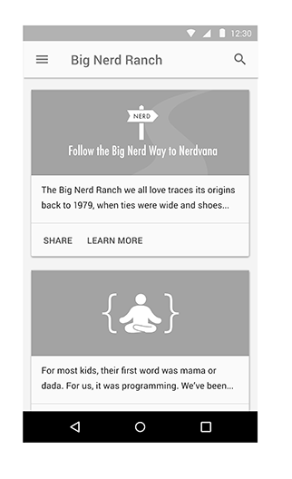
Designers think of these as 1dp-thick bits of cardstock.
These bits of cardstock act like magically changeable bits of paper and ink: They can grow, they can show animated pictures, and they can show changing text
(Figure 35.1).
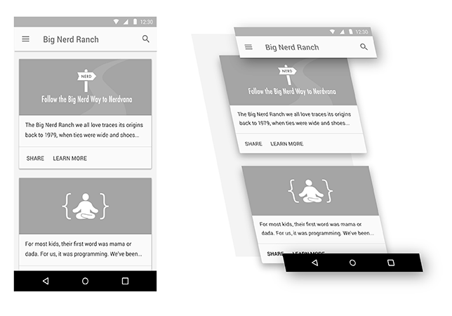
However, as magical as they may be, they still behave like real pieces of paper. For example, one sheet of paper cannot move right through another. The same logic applies when you animate material surfaces: They cannot animate through one another.
Instead, surfaces exist and maneuver around one another in 3-D space. They can move up toward your finger, or down and away (Figure 35.2).
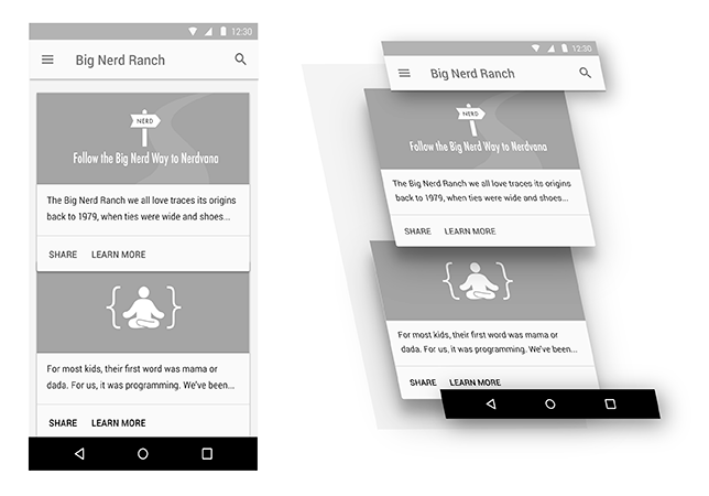
To animate one surface across another, you move it up and across the other surface (Figure 35.3).
The most apparent way users will see the depth in your interface is by seeing how elements of your app cast shadows on one another. Some might think that a perfect world would be one where the designers worry about drawing those shadows and we developers go eat bagels. (Opinions differ on what a perfect world looks like.)
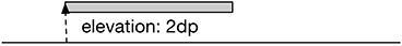
But doing that with a variety of surfaces in play – while animating, no less – is not possible for designers to do by themselves. Instead, you let Android take care of drawing the shadows by giving each of your Views an elevation.
Lollipop introduced a z-axis to the layout system, allowing you to specify where a view lives in 3-D space. Elevation is like the coordinates assigned to your view in layout: You can animate your view away from this position, but this is where it naturally lives (Figure 35.4).
To set the elevation value, you can either call the View.setElevation(float) method or set the value in your layout file.
Listing 35.1 Setting elevation on a view in a layout file
<Button xmlns:android="http://schemas.android.com/apk/res/android"
    android:layout_width="wrap_content"
    android:layout_height="wrap_content"
    android:elevation="2dp"/>
Because this is intended to be your baseline Z value, using the XML attribute is preferred. It is also easier to use than setElevation(float), because the elevation attribute is silently ignored on older versions of Android, so you do not need to worry about compatibility.
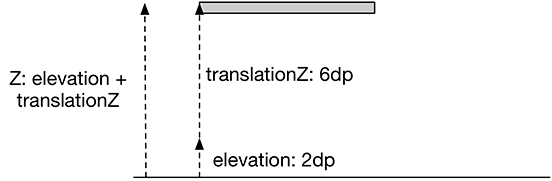
To change a View’s elevation, you use the translationZ and Z properties.
These work exactly like translationX, translationY, X, and Y, which you saw in Chapter 32.
Z’s value is always elevation plus translationZ.
If you assign a value to Z, it will do the math to assign the right value to translationZ (Figure 35.5).
Material applications are often designed with many animated user interactions. Press a button on a device running Lollipop or later to see one example: The button will animate up on the z-axis to meet your finger. When you release your finger, it will animate back down.
To make implementing these animations easier, Lollipop introduced state list animators. State list animators are the animation counterpart to the state list drawable: Instead of switching out one drawable for another, they animate the view into a particular state. To implement an animation that raises the button up when you press it, you can define a state list animator that looks like this in res/animator:
Listing 35.2 An example state list animator
<selector xmlns:android="http://schemas.android.com/apk/res/android">
    <item android:state_pressed="true">
        <objectAnimator android:propertyName="translationZ"
                        android:duration="100"
                        android:valueTo="6dp"
                        android:valueType="floatType"
                        />
    </item>
    <item android:state_pressed="false">
        <objectAnimator android:propertyName="translationZ"
                        android:duration="100"
                        android:valueTo="0dp"
                        android:valueType="floatType"
            />
    </item>
</selector>
This is great if you need to use a property animation. If you want to perform a framed animation, you need to use another tool: the animated state list drawable.
The name “animated state list drawable” is a little confusing. It sounds similar to “state list animator,” but the purpose is totally different. Animated state list drawables allow you to define images for each state, like a normal state list drawable, but they also allow you to define frame animation transitions between those states.
Back in Chapter 23, you defined a state list drawable for BeatBox’s sound buttons. If a sadistic designer (like our own Kar Loong Wong) wanted to have a multiframe animation each time the button was pressed, you could modify your XML to look like Listing 35.3. (This version would need to live inside a res/drawable-21 directory because this feature is not supported prior to Lollipop.)
Listing 35.3 An animated state list drawable
<animated-selector xmlns:android="http://schemas.android.com/apk/res/android">
    <item android:id="@+id/pressed"
          android:drawable="@drawable/button_beat_box_pressed"
          android:state_pressed="true"/>
    <item android:id="@+id/released"
          android:drawable="@drawable/button_beat_box_normal" />

    <transition
        android:fromId="@id/released"
        android:toId="@id/pressed">
        <animation-list>
            <item android:duration="10" android:drawable="@drawable/button_frame_1" />
            <item android:duration="10" android:drawable="@drawable/button_frame_2" />
            <item android:duration="10" android:drawable="@drawable/button_frame_3" />
            ...
        </animation-list>
    </transition>
</animated-selector>
Here, each item in the selector gets an ID.
You can then define a transition between different IDs to play a multiframe animation.
If you want to provide an animation when you release the button, too, that requires an additional transition tag.