
49. An Android RecyclerView and CardView Tutorial
In this chapter an example project will be created that makes use of both the CardView and RecyclerView components to create a scrollable list of cards. The completed app will display a list of cards containing images and text. In addition to displaying the list of cards, the project will be implemented such that selecting a card causes messages to be displayed to the user indicating which card was tapped.
49.1 Creating the CardDemo Project
Select the Create New Project quick start option from the welcome screen and, within the resulting new project dialog, choose the Basic Activity template before clicking on the Next button.
Enter CardDemo into the Name field and specify com.ebookfrenzy.carddemo as the package name. Before clicking on the Finish button, change the Minimum API level setting to API 26: Android 8.0 (Oreo) and the Language menu to Java.
Modifying the Basic Activity Project
Since the Basic Activity was selected, the layout includes a floating action button which is not required for this project. Load the activity_main.xml layout file into the Layout Editor tool, select the floating action button and tap the keyboard delete key to remove the object from the layout. Edit the MainActivity.java file and remove the floating action button code from the onCreate method as follows:
@Override
protected void onCreate(Bundle savedInstanceState) {
super.onCreate(savedInstanceState);
setContentView(R.layout.activity_card_demo);
Toolbar toolbar = findViewById(R.id.toolbar);
setSupportActionBar(toolbar);
}
The project will also not require the default navigation features, so open the content_main.xml file and delete the NavHostFragment object from the layout so that only the ConstraintLayout parent remains.
49.2 Designing the CardView Layout
The layout of the views contained within the cards will be defined within a separate XML layout file. Within the Project tool window right-click on the app -> res -> layout entry and select the New -> Layout Resource File menu option. In the New Resource Dialog enter card_layout into the File name: field and androidx.cardview.widget.CardView into the root element field before clicking on the OK button.
Load the card_layout.xml file into the Layout Editor tool, switch to Code mode and modify the layout so that it reads as follows:
<?xml version="1.0" encoding="utf-8"?>
<androidx.cardview.widget.CardView
xmlns:android="http://schemas.android.com/apk/res/android"
xmlns:app="http://schemas.android.com/apk/res-auto"
android:layout_width="match_parent"
android:layout_height="wrap_content"
android:id="@+id/card_view"
android:layout_margin="5dp"
app:cardBackgroundColor="#81C784"
app:cardCornerRadius="12dp"
app:cardElevation="3dp"
app:contentPadding="4dp" >
<androidx.constraintlayout.widget.ConstraintLayout
android:id="@+id/relativeLayout"
android:layout_width="match_parent"
android:layout_height="wrap_content"
android:padding="16dp">
<ImageView
android:id="@+id/item_image"
android:layout_width="100dp"
android:layout_height="100dp"
app:layout_constraintLeft_toLeftOf="parent"
app:layout_constraintStart_toStartOf="parent"
app:layout_constraintTop_toTopOf="parent" />
<TextView
android:id="@+id/item_title"
android:layout_width="236dp"
android:layout_height="39dp"
android:layout_marginStart="16dp"
android:textSize="30sp"
app:layout_constraintLeft_toRightOf="@+id/item_image"
app:layout_constraintStart_toEndOf="@+id/item_image"
app:layout_constraintTop_toTopOf="parent" />
<TextView
android:id="@+id/item_detail"
android:layout_width="236dp"
android:layout_height="16dp"
android:layout_marginStart="16dp"
android:layout_marginTop="8dp"
app:layout_constraintLeft_toRightOf="@+id/item_image"
app:layout_constraintStart_toEndOf="@+id/item_image"
app:layout_constraintTop_toBottomOf="@+id/item_title" />
</androidx.constraintlayout.widget.ConstraintLayout>
</androidx.cardview.widget.CardView>
Select the content_main.xml layout file and drag and drop a RecyclerView object from the Containers section of the palette onto the layout so that it is positioned in the center of the screen where it should automatically resize to fill the entire screen. Use the Infer constraints toolbar button to add any missing layout constraints to the view. Using the Attributes tool window, change the ID of the RecyclerView instance to recyclerView and the layout_width and layout_height properties to match_constraint.
In addition to the two TextViews, the card layout also contains an ImageView on which the Recycler adapter has been configured to display images. Before the project can be tested these images must be added. The images that will be used for the project are named android_image_<n>.jpg and can be found in the project_icons folder of the sample code download available from the following URL:
https://www.ebookfrenzy.com/retail/androidstudio41/index.php
Locate these images in the file system navigator for your operating system and select and copy the eight images. Right click on the app -> res -> drawable entry in the Project tool window and select Paste to add the files to the folder:

Figure 49-1
49.5 Creating the RecyclerView Adapter
As outlined in the previous chapter, the RecyclerView needs to have an adapter to handle the creation of the list items. Add this new class to the project by right-clicking on the app -> java -> com.ebookfrenzy.carddemo entry in the Project tool window and selecting the New -> Java Class menu option. In the new class dialog, enter RecyclerAdapter into the Name field and select Class from the list before tapping the Return keyboard key to create the new Java class file.
Edit the new RecyclerAdapter.java file to add some import directives and to declare that the class now extends RecyclerView.Adapter. Rather than create a separate class to provide the data to be displayed, some basic arrays will also be added to the adapter to act as the data for the app:
package com.ebookfrenzy.carddemo;
import android.view.LayoutInflater;
import android.view.View;
import android.view.ViewGroup;
import android.widget.ImageView;
import android.widget.TextView;
import androidx.recyclerview.widget.RecyclerView;
public class RecyclerAdapter extends RecyclerView.Adapter<RecyclerAdapter.ViewHolder> {
private String[] titles = {"Chapter One",
"Chapter Two",
"Chapter Three",
"Chapter Four",
"Chapter Five",
"Chapter Six",
"Chapter Seven",
"Chapter Eight"};
private String[] details = {"Item one details",
"Item two details", "Item three details",
"Item four details", "Item five details",
"Item six details", "Item seven details",
"Item eight details"};
private int[] images = { R.drawable.android_image_1,
R.drawable.android_image_2,
R.drawable.android_image_3,
R.drawable.android_image_4,
R.drawable.android_image_5,
R.drawable.android_image_6,
R.drawable.android_image_7,
R.drawable.android_image_8 };
}
Within the RecyclerAdapter class we now need our own implementation of the ViewHolder class configured to reference the view elements in the card_layout.xml file. Remaining within the RecyclerAdapter.java file implement this class as follows:
public class RecyclerAdapter extends RecyclerView.Adapter<RecyclerAdapter.ViewHolder> {
.
.
class ViewHolder extends RecyclerView.ViewHolder {
ImageView itemImage;
TextView itemTitle;
TextView itemDetail;
ViewHolder(View itemView) {
super(itemView);
itemImage = itemView.findViewById(R.id.item_image);
itemTitle = itemView.findViewById(R.id.item_title);
itemDetail = itemView.findViewById(R.id.item_detail);
}
}
.
.
}
The ViewHolder class contains an ImageView and two TextView variables together with a constructor method that initializes those variables with references to the three view items in the card_layout.xml file.
The next item to be added to the RecyclerAdapter.java file is the implementation of the onCreateViewHolder() method:
@Override
public ViewHolder onCreateViewHolder(ViewGroup viewGroup, int i) {
View v = LayoutInflater.from(viewGroup.getContext())
.inflate(R.layout.card_layout, viewGroup, false);
ViewHolder viewHolder = new ViewHolder(v);
return viewHolder;
}
This method will be called by the RecyclerView to obtain a ViewHolder object. It inflates the view hierarchy card_layout.xml file and creates an instance of our ViewHolder class initialized with the view hierarchy before returning it to the RecyclerView.
The purpose of the onBindViewHolder() method is to populate the view hierarchy within the ViewHolder object with the data to be displayed. It is passed the ViewHolder object and an integer value indicating the list item that is to be displayed. This method should now be added, using the item number as an index into the data arrays. This data is then displayed on the layout views using the references created in the constructor method of the ViewHolder class:
@Override
public void onBindViewHolder(ViewHolder viewHolder, int i) {
viewHolder.itemTitle.setText(titles[i]);
viewHolder.itemDetail.setText(details[i]);
viewHolder.itemImage.setImageResource(images[i]);
}
The final requirement for the adapter class is an implementation of the getItem() method which, in this case, simply returns the number of items in the titles array:
@Override
public int getItemCount() {
return titles.length;
}
49.6 Initializing the RecyclerView Component
At this point the project consists of a RecyclerView instance, an XML layout file for the CardView instances and an adapter for the RecyclerView. The last step before testing the progress so far is to initialize the RecyclerView with a layout manager, create an instance of the adapter and assign that instance to the RecyclerView object. For the purposes of this example, the RecyclerView will be configured to use the LinearLayoutManager layout option. Edit the MainActivity.java file and modify the onCreate() method to implement this initialization code:
package com.ebookfrenzy.carddemo;
.
.
import androidx.appcompat.app.AppCompatActivity;
import androidx.appcompat.widget.Toolbar;
import androidx.recyclerview.widget.LinearLayoutManager;
import androidx.recyclerview.widget.RecyclerView;
import android.view.View;
import android.view.Menu;
import android.view.MenuItem;
public class MainActivity extends AppCompatActivity {
private RecyclerView recyclerView;
private RecyclerView.LayoutManager layoutManager;
private RecyclerView.Adapter adapter;
@Override
protected void onCreate(Bundle savedInstanceState) {
super.onCreate(savedInstanceState);
setContentView(R.layout.activity_card_demo);
Toolbar toolbar = findViewById(R.id.toolbar);
setSupportActionBar(toolbar);
recyclerView = findViewById(R.id.recyclerView);
layoutManager = new LinearLayoutManager(this);
recyclerView.setLayoutManager(layoutManager);
adapter = new RecyclerAdapter();
recyclerView.setAdapter(adapter);
}
.
.
}
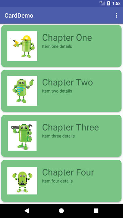
Compile and run the app on a physical device or emulator session and scroll through the different card items in the list:
49.8 Responding to Card Selections
The last phase of this project is to make the cards in the list selectable so that clicking on a card triggers an event within the app. For this example, the cards will be configured to present a message on the display when tapped by the user. To respond to clicks, the ViewHolder class needs to be modified to assign an onClickListener on each item view. Edit the RecyclerAdapter.java file and modify the ViewHolder class declaration so that it reads as follows:
.
.
import com.google.android.material.snackbar.Snackbar;
.
.
class ViewHolder extends RecyclerView.ViewHolder{
ImageView itemImage;
TextView itemTitle;
TextView itemDetail;
ViewHolder(View itemView) {
super(itemView);
itemImage = itemView.findViewById(R.id.item_image);
itemTitle = itemView.findViewById(R.id.item_title);
itemDetail = itemView.findViewById(R.id.item_detail);
itemView.setOnClickListener(new View.OnClickListener() {
@Override public void onClick(View v) {
}
});
}
}
Within the body of the onClick handler, code can now be added to display a message indicating that the card has been clicked. Given that the actions performed as a result of a click will likely depend on which card was tapped it is also important to identify the selected card. This information can be obtained via a call to the getAdapterPosition() method of the RecyclerView.ViewHolder class. Remaining within the RecyclerAdapter.java file, add code to the onClick handler so it reads as follows:
@override
public void onClick(View v) {
int position = getAdapterPosition();
Snackbar.make(v, "Click detected on item " + (position + 1),
Snackbar.LENGTH_LONG)
.setAction("Action", null).show();
}
});
The last task is to enable the material design ripple effect that appears when items are tapped within Android applications. This simply involves the addition of some properties to the declaration of the CardView instance in the card_layout.xml file as follows:
<?xml version="1.0" encoding="utf-8"?>
<androidx.cardview.widget.CardView
xmlns:android="http://schemas.android.com/apk/res/android"
xmlns:card_view="http://schemas.android.com/apk/res-auto"
android:layout_width="match_parent"
android:layout_height="match_parent"
android:id="@+id/card_view"
android:layout_margin="5dp"
app:cardBackgroundColor="#81C784"
app:cardCornerRadius="12dp"
app:cardElevation="3dp"
app:contentPadding="4dp"
android:foreground="?selectableItemBackground"
android:clickable="true" >
Run the app once again and verify that tapping a card in the list triggers both the standard ripple effect at the point of contact and the appearance of a Snackbar reporting the number of the selected item.
This chapter has worked through the steps involved in combining the CardView and RecyclerView components to display a scrollable list of card based items. The example also covered the detection of clicks on list items, including the identification of the selected item and the enabling of the ripple effect visual feedback on the tapped CardView instance.