
57. Working with the AppBar and Collapsing Toolbar Layouts
In this chapter we will be exploring the ways in which the app bar within an activity layout can be customized and made to react to the scrolling events taking place within other views on the screen. By making use of the CoordinatorLayout in conjunction with the AppBarLayout and CollapsingToolbarLayout containers, the app bar can be configured to display an image and to animate in and out of view. An upward scrolling motion on a list, for example, can be configured so that the app bar recedes from view and then reappears when a downward scrolling motion is performed.
Beginning with an overview of the elements that can comprise an app bar, this chapter will then work through a variety of examples of app bar configuration.
The app bar is the area that appears at the top of the display when an app is running and can be configured to contain a variety of different items including the status bar, toolbar, tab bar and a flexible space area. Figure 57-1, for example, shows an app bar containing a status bar, toolbar and tab bar:

The flexible space area can be filled by a blank background color, or as shown in Figure 57-2, an image displayed on an ImageView object:

As will be demonstrated in the remainder of this chapter, if the main content area of the activity user interface layout contains scrollable content, the elements of the app bar can be configured to expand and contract as the content on the screen is scrolled.
For the purposes of this example, changes will be made to the CardDemo project created in the earlier chapter entitled “An Android RecyclerView and CardView Tutorial”. Begin by launching Android Studio and loading this project.
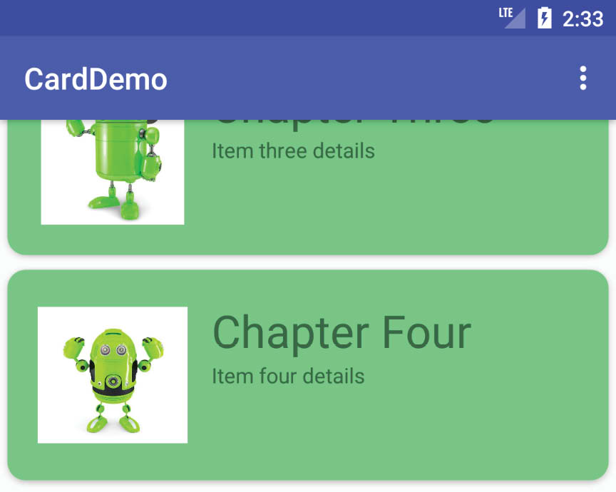
Once the project has loaded, run the app and note when scrolling the list upwards that the toolbar remains visible as shown in Figure 57-3:
The first step is to make some configuration changes so that the toolbar contracts during an upward scrolling motion, and then expands on a downward scroll.
57.3 Coordinating the RecyclerView and Toolbar
Load the activity_main.xml file into the Layout Editor tool, switch to Code mode and review the XML layout design, the hierarchy of which is represented by the diagram in Figure 57-4:

At the top level of the hierarchy is the CoordinatorLayout which, as the name suggests, coordinates the interactions between the various child view elements it contains. As highlighted in “Working with the Floating Action Button and Snackbar” for example, the CoordinatorLayout automatically slides the floating action button upwards to accommodate the appearance of a Snackbar when it appears, then moves the button back down after the bar is dismissed.
The CoordinatorLayout can similarly be used to cause elements of the app bar to slide in and out of view based on the scrolling action of certain views within the view hierarchy. One such element within the layout hierarchy shown in Figure 57-4 is the ConstraintLayout. To achieve this coordinated behavior, it is necessary to set properties on both the element on which scrolling takes place and the elements with which the scrolling is to be coordinated.
On the scrolling element (in this case the RecyclerView) the android:layout_behavior property must be set to appbar_scrolling_view_behavior. Within the content_main.xml file, locate the top level ConstraintLayout element and note that this property has been set by default:
<androidx.constraintlayout.widget.ConstraintLayout
xmlns:android="http://schemas.android.com/apk/res/android"
xmlns:app="http://schemas.android.com/apk/res-auto"
xmlns:tools="http://schemas.android.com/tools"
android:layout_width="match_parent"
android:layout_height="match_parent"
app:layout_behavior="@string/appbar_scrolling_view_behavior">
Next, open the activity_main.xml file in the layout editor, switch to Code mode and locate the AppBarLayout element. Note that the only child of AppBarLayout in the view hierarchy is the Toolbar. To make the toolbar react to the scroll events taking place in the RecyclerView the app:layout_scrollFlags property must be set on this element. The value assigned to this property will depend on the nature of the interaction required and must consist of one or more of the following:
•scroll – Indicates that the view is to be scrolled off the screen. If this is not set the view will remain pinned at the top of the screen during scrolling events.
•enterAlways – When used in conjunction with the scroll option, an upward scrolling motion will cause the view to retract. Any downward scrolling motion in this mode will cause the view to re-appear.
•enterAlwaysCollapsed – When set on a view, that view will not expand from the collapsed state until the downward scrolling motion reaches the limit of the list. If the minHeight property is set, the view will appear during the initial scrolling motion but only until the minimum height is reached. It will then remain at that height and will not expand fully until the top of the list is reached. Note this option only works when used in conjunction with both the enterAlways and scroll options. For example:
app:layout_scrollFlags="scroll|enterAlways|enterAlwaysCollapsed"
android:minHeight="20dp"
•exitUntilCollapsed – When set, the view will collapse during an upward scrolling motion until the minHeight threshold is met, at which point it will remain at that height until the scroll direction changes.
For the purposes of this example, the scroll and enterAlways options will be set on the Toolbar as follows:
<androidx.appcompat.widget.Toolbar
android:id="@+id/toolbar"
android:layout_width="match_parent"
android:layout_height="?attr/actionBarSize"
android:background="?attr/colorPrimary"
app:popupTheme="@style/Theme.CardDemo.PopupOverlay"
app:layout_scrollFlags="scroll|enterAlways" />
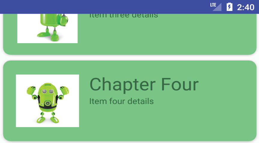
With the appropriate properties set, run the app once again and make an upward scrolling motion in the RecyclerView list. This should cause the toolbar to collapse out of view (Figure 57-5). A downward scrolling motion should cause the toolbar to re-appear.
57.4 Introducing the Collapsing Toolbar Layout
The CollapsingToolbarLayout container enhances the standard toolbar by providing a greater range of options and level of control over the collapsing of the app bar and its children in response to coordinated scrolling actions. The CollapsingToolbarLayout class is intended to be added as a child of the AppBarLayout and provides features such as automatically adjusting the font size of the toolbar title as the toolbar collapses and expands. A parallax mode allows designated content in the app bar to fade from view as it collapses while a pin mode allows elements of the app bar to remain in fixed position during the contraction.
A scrim option is also available to designate the color to which the toolbar should transition during the collapse sequence.
To see these features in action, the app bar contained in the activity_main.xml file will be modified to use the CollapsingToolbarLayout class together with the addition of an ImageView to better demonstrate the effect of parallax mode. The new view hierarchy that makes use of the CollapsingToolbarLayout is represented by the diagram in Figure 57-6:

Load the activity_main.xml file into the Layout Editor tool in Code mode and modify the layout so that it reads as follows:
<?xml version="1.0" encoding="utf-8"?>
<androidx.coordinatorlayout.widget.CoordinatorLayout
xmlns:android="http://schemas.android.com/apk/res/android"
xmlns:app="http://schemas.android.com/apk/res-auto"
xmlns:tools="http://schemas.android.com/tools"
android:layout_width="match_parent"
android:layout_height="match_parent"
tools:context=".MainActivity">
<com.google.android.material.appbar.AppBarLayout
android:layout_width="match_parent"
android:layout_height="wrap_content"
android:theme="@style/Theme.CardDemo.AppBarOverlay">
<com.google.android.material.appbar.CollapsingToolbarLayout
android:id="@+id/collapsing_toolbar"
android:layout_width="match_parent"
android:layout_height="match_parent"
app:layout_scrollFlags="scroll|enterAlways"
android:fitsSystemWindows="true"
app:contentScrim="?attr/colorPrimary"
app:expandedTitleMarginStart="48dp"
app:expandedTitleMarginEnd="64dp">
<ImageView
android:id="@+id/backdrop"
android:layout_width="match_parent"
android:layout_height="200dp"
android:scaleType="centerCrop"
android:fitsSystemWindows="true"
app:layout_collapseMode="parallax"
android:src="@drawable/appbar_image" />
<androidx.appcompat.widget.Toolbar
android:id="@+id/toolbar"
android:layout_width="match_parent"
android:layout_height="?attr/actionBarSize"
app:popupTheme="@style/AppTheme.PopupOverlay"
app:layout_scrollFlags="scroll|enterAlways"
app:layout_collapseMode="pin" />
</com.google.android.material.appbar.CollapsingToolbarLayout>
</com.google.android.material.appbar.AppBarLayout>
<include layout="@layout/content_main" />
</androidx.coordinatorlayout.widget.CoordinatorLayout>
In addition to adding the new elements to the layout above, the background color property setting has been removed. This change has the advantage of providing a transparent toolbar allowing more of the image to be visible in the app bar.
Using the file system navigator for your operating system, locate the appbar_image.jpg image file in the project_icons folder of the code sample download for the book and copy it. Right-click on the app -> res -> drawable entry in the Project tool window and select Paste from the resulting menu.
When run, the app bar should appear as illustrated in Figure 57-7:

Scrolling the list upwards will cause the app bar to gradually collapse. During the contraction, the image will fade to the color defined by the scrim property while the title text font size reduces at a corresponding rate until only the toolbar is visible:

Figure 57-8
The toolbar has remained visible during the initial stages of the scrolling motion (the toolbar will also recede from view if the upward scrolling motion continues) as the flexible area collapses because the toolbar element in the activity_main.xml file was configured to use pin mode:
app:layout_collapseMode="pin"
Had the collapse mode been set to parallax the toolbar would have retracted along with the image view.
Continuing the upward scrolling motion will cause the toolbar to also collapse leaving only the status bar visible:

Figure 57-9
Since the scroll flags property for the CollapsingToolbarLayout element includes the enterAlways option, a downward scrolling motion will cause the app bar to expand once again.
To fix the toolbar in place so that it no longer recedes from view during the upward scrolling motion, replace enterAlways with exitUntilCollapsed in the layout_scrollFlags property of the CollapsingToolbarLayout element in the activity_main.xml file as follows:
<com.google.android.material.appbar.CollapsingToolbarLayout
android:id="@+id/collapsing_toolbar"
android:layout_width="match_parent"
android:layout_height="match_parent"
app:layout_scrollFlags="scroll|exitUntilCollapsed"
android:fitsSystemWindows="true"
app:contentScrim="?attr/colorPrimary"
app:expandedTitleMarginStart="48dp"
app:expandedTitleMarginEnd="64dp">
57.5 Changing the Title and Scrim Color
As a final task, edit the MainActivity.kt file and add some code to the onCreate() method to change the title text on the collapsing layout manager instance and to set a different scrim color (note that the scrim color may also be set within the layout resource file):
package com.ebookfrenzy.carddemo
.
.
import android.graphics.Color
.
.
class MainActivity : AppCompatActivity() {
.
.
override fun onCreate(savedInstanceState: Bundle?) {
super.onCreate(savedInstanceState)
binding = ActivityMainBinding.inflate(layoutInflater)
setContentView(binding.root)
setSupportActionBar(binding.toolbar)
binding.collapsingToolbar.title = "My Toolbar Title"
binding.collapsingToolbar.setContentScrimColor(Color.GREEN)
layoutManager = LinearLayoutManager(this)
binding.contentMain.recyclerView.layoutManager = layoutManager
adapter = RecyclerAdapter()
binding.contentMain.recyclerView.adapter = adapter
}
.
.
}
Run the app one last time and note that the new title appears in the app bar and that scrolling now causes the toolbar to transition to green as it retracts from view.
The app bar that appears at the top of most Android apps can consist of a number of different elements including a toolbar, tab layout and even an image view. When embedded in a CoordinatorLayout parent, a number of different options are available to control the way in which the app bar behaves in response to scrolling events in the main content of the activity. For greater control over this behavior, the CollapsingToolbarLayout manager provides a range of additional levels of control over the way the app bar content expands and contracts in relation to scrolling activity.