
4. Basic Views
The most basic element of Android user interfaces is the View class. A view represents an area of the screen. Buttons, lists, webpages, and even empty spaces are represented by views. Android contains a rich array of pre-built View classes that provide much of the functionality you will need. When the built-in views aren’t enough, it’s possible to create special views that are just right for your application. In this chapter, you will learn about the basic view types you can use to build your layout, discover how to load and display images, and explore the more advanced views available in Android: MapView and WebView.
Creating a Basic Form
The TimeTracker app looks pretty good so far, but it’s time to add more than just a list of times. In this chapter, you’ll add some text entry forms and split the app into multiple activities. When you’re finished, you’ll have something that looks like Figure 4.1. This section will cover the basic widgets you see in the image, as well as how to arrange them.
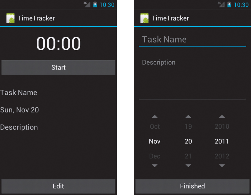
Figure 4.1 The TimeTracker app will have task detail and task edit screens.
TextView and EditText
The most basic view available on Android is the TextView, which allocates an area of the screen to display text. You will use this view a lot in your layouts. An EditText is a TextView that is configured to allow the user to edit the text inside it (Figure 4.2). Tapping an EditText will display a cursor and the device software keyboard, allowing the user to enter new text or edit the existing text. The TextView has optional attributes such as size, font, and color that allow you to change the appearance of the text.
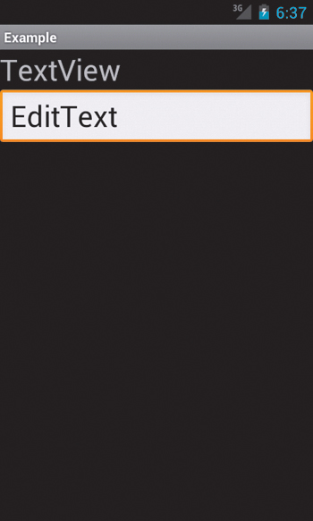
Figure 4.2 A TextView and an EditText
Creating the TextView
To create the new UI for the TimeTracker app, you’ll need to create two new layouts: task_detail.xml and edit_task.xml. They will look very similar, but edit_task.xml will use EditText instead of TextView. Here is the XML for task_detail.xml:
<LinearLayout
android:layout_width="match_parent"
android:layout_height="match_parent"
android:orientation="vertical" >
<TextView
android:id="@+id/counter"
android:layout_width="fill_parent"
android:layout_height="wrap_content"
android:gravity="center"
android:padding="10dp"
android:text="@string/sample_time"
android:textAppearance="?android:attr/textAppearanceLarge"
android:textSize="50sp" >
</TextView>
<Button
android:id="@+id/start_stop"
android:layout_width="match_parent"
android:layout_height="wrap_content"
android:layout_marginBottom="30dp"
android:text="@string/start" />
<TextView
android:id="@+id/task_name"
android:layout_width="match_parent"
android:layout_height="wrap_content"
android:layout_marginBottom="20dp"
android:text="@string/task_name"
android:textSize="20dp" >
</TextView>
<TextView
android:id="@+id/task_date"
android:layout_width="match_parent"
android:layout_height="wrap_content"
android:layout_marginBottom="20dp"
android:text="@string/date_select"
android:textSize="20dp" />
<TextView
android:id="@+id/task_desc"
android:layout_width="match_parent"
android:layout_height="0dp"
android:layout_marginBottom="20dp"
android:layout_weight="1"
android:text="@string/description"
android:textSize="20dp" />
</LinearLayout>
This XML layout keeps the counter and the Start/Stop button from Chapter 2, but the task list is replaced with the new task detail fields. Note the use of layout_weight on the description to fill the entire display.
Simplifying Text Entry
In addition to general text entry, you will probably want your users to enter textual data in a particular format. Data such as email addresses, phone numbers, and passwords are particularly common on a mobile device. With a hardware keyboard, the user just enters data normally, but because Android devices have a software keyboard, the keys can be changed to make entry of certain data types easier. For example, if you have a field that accepts only numerical data, the keyboard will display just the number pad.
 Note
Note
In addition to changing the input, Android supports changing the entire software input editor, or IME. The typical IME is a software keyboard, but Android also supports IMEs like voice input, handwriting recognition, or even Palm OS-inspired graffiti. While this is not something you control with your app, you can give hints about the actions that should be taken when inputting data into forms; those hints will then be used to select the appropriate IME.
The inputType attribute of your EditText class is a simple bit mask that defines the type of data you expect the user to enter. The system can then display an appropriate keyboard type. You can combine EditText flags (attributes) so that the system creates a targeted input keyboard. For example, the following EditText attributes will make the keyboard a number pad for easy entry of phone numbers (Figure 4.3):
<EditText
android:layout_width="match_parent"
android:layout_height="wrap_content"
android:inputType="phone" />
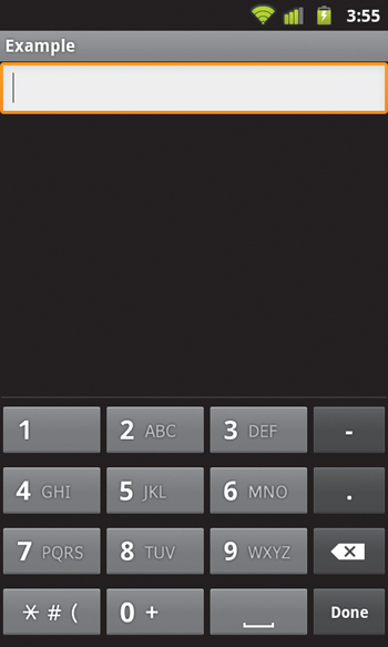
Figure 4.3 The keyboard displayed when the inputType of an EditText is set to phone
Along with changing the keyboard, you can use inputType to change the behavior of the EditText; for example, use flags like textCapSentences and textAutoCorrect to add capitalization and autocorrection to what the user types. In addition to configuring the input options, you can use an IME option to set the text for the Enter button, which appears in the lower-right corner of the stock Android keyboard: Use the imeOptions attribute to select actionGo, actionSearch, actionSend, actionNext, or actionDone to give the user a visual indication of what action will be taken when they are finished entering text.
Now you can create the content of the edit_task.xml layout. Create the file, and add the following XML:
<LinearLayout
android:layout_width="match_parent"
android:layout_height="match_parent"
android:orientation="vertical" >
<EditText
android:id="@+id/task_name"
android:layout_width="match_parent"
android:layout_height="wrap_content"
android:hint="@string/task_name"
android:layout_margin="10dp"
android:textSize="24dp" >
</EditText>
<EditText
android:id="@+id/description"
android:layout_width="match_parent"
android:layout_height="0dp"
android:layout_weight="1"
android:layout_margin="10dp"
android:hint="@string/description"
android:gravity="top|left" />
<DatePicker
android:id="@+id/datePicker1"
android:layout_width="wrap_content"
android:layout_height="wrap_content"
android:layout_gravity="center_horizontal"
android:calendarViewShown="false"
android:layout_margin="10dp" />
</LinearLayout>
Here you’re using the android:hint attribute rather than android:text. This displays the desired preset text but removes it as soon as the user starts typing a value into the field. This edit_task.xml layout also uses the DatePicker view to make date entry easier.
Buttons
You’ve already used buttons to build the current TimeTracker UI. Buttons are simply TextViews that have a special background image—this background is actually an XML file that lists the images that should be used for the different button states (normal, hovered, focused, and pressed). This type of XML resource is called a state list resource, and you’ll learn more about creating it later in this chapter.
1. Add a Finished button to the edit_task.xml layout:
<Button
android:id="@+id/finished"
android:layout_width="match_parent"
android:layout_height="wrap_content"
android:text="@string/finished" >
</Button>
2. Add an Edit button to the task_list.xml layout:
<Button
android:id="@+id/edit"
android:layout_width="match_parent"
android:layout_height="wrap_content"
android:text="@string/edit" >
</Button>
Boolean Buttons
Buttons are convenient for indicating on/off states. Android has a number of views, including toggle buttons, checkboxes, and radio buttons, that subclass the Button class and present a toggle between a true value and a false value. In addition, Android 4.0 introduced an option called the switch. Figure 4.4 shows all these options for the 4.0 release of Android.
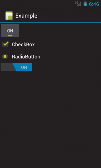
Figure 4.4 Boolean buttons on Android 4.0
Spinners
A spinner looks like a button and displays a list of choices when pressed. Figure 4.5 shows an example of a spinner choice list. The options presented by a spinner can be specified using the XML android:entries attribute, or you can use a data adapter to load entries programmatically (you’ll learn more about loading entries into views via data adapters in Chapter 6).
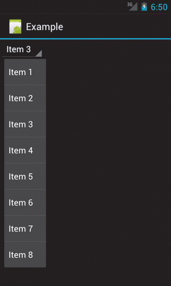
Figure 4.5 A spinner on Android 4.0
ScrollView
Adding entry fields to a form is simple, but what happens if you cannot fit all the views on one screen? In these cases, it’s often useful to allow scrolling in order to fit more elements in a single activity. To achieve this effect, you need to wrap your views in a ScrollView container. A ScrollView allows you to create a view that is larger than the physical screen on a device and scroll it to reveal the full contents. ScrollView is actually a subclass of FrameLayout, but it adds the ability to scroll its content. You typically place another layout container inside the ScrollView to arrange the child views.
 Tip
Tip
You should never use a ListView inside a ScrollView. The behavior will be erratic and unpleasant to the user. If you find yourself wanting to use both, consider redesigning your app to use one or the other.
Since you want the user to enter an arbitrary amount of description text in the time tracker, you’ll want to use a ScrollView so they can see it all. Wrap the existing LinearLayout contents in a ScrollView:
<ScrollView xmlns:android="http://schemas.android.com/apk/res/android"
android:layout_width="match_parent"
android:layout_height="match_parent"
android:fillViewport="true" >
<LinearLayout>
<!-- Rest of code here -->
</LinearLayout>
</ScrollView>
This code should be self-explanatory by now. The ScrollView simply wraps the LinearLayout, which contains the text and buttons you have already created. Notice the android:fillViewPort attribute? This prevents some odd behavior, which you’ll learn about next.
The FillViewPort attribute
A common issue you may experience with ScrollView is its interaction with child views that are smaller than the display. When the child view is larger than the display, the ScrollView behaves as expected, allowing you to scroll to see the full view. However, when the child view is smaller than the display, the ScrollView will automatically shrink itself to match the size of its content. The proper way to handle this is to use the fillViewPort attribute, which will cause the child views of a ScrollView to expand to the size of the display, if necessary; if they are already larger than the display, nothing happens. A simple example will demonstrate.
A frequent task is displaying a block of text with a button at the bottom (such as in a license agreement to which a user must agree). Figure 4.6 shows the desired result: a long block of text that scrolls to reveal a button. When the text is smaller than a single screen, the naive implementation of ScrollView results in Figure 4.7—the button should still be pinned to the bottom of the screen but is instead directly below the text. The ScrollView only takes up as much space as its content. To fix this, set the fillViewPort attribute to true. Here is the code to correctly implement scrolling for any size of text, resulting in Figure 4.8.
<?xml version="1.0" encoding="utf-8"?>
<ScrollView xmlns:android="http://schemas.android.com/apk/res/android"
android:layout_width="fill_parent"
android:layout_height="fill_parent"
android:fillViewport="true" >
<LinearLayout
android:layout_width="fill_parent"
android:layout_height="wrap_content"
android:orientation="vertical" >
<TextView
android:layout_width="fill_parent"
android:layout_height="0dp"
android:layout_weight="1.0"
android:text="@string/hello" />
<Button
android:layout_width="match_parent"
android:layout_height="wrap_content"
android:text="Button" />
</LinearLayout>
</ScrollView>
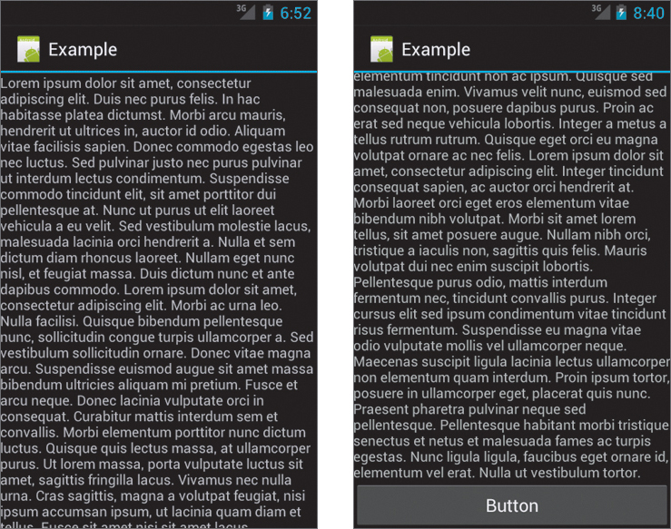
Figure 4.6 The desired ScrollView result, with a long block of text scrolling to reveal a button
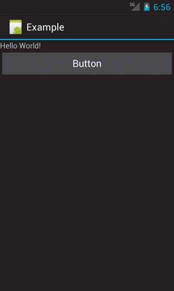
Figure 4.7 The ScrollView result if the fillViewPort attribute is not set to true
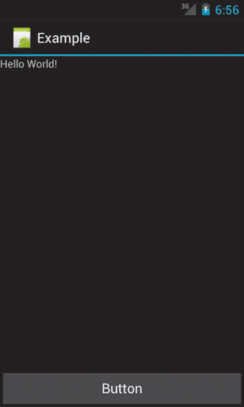
Figure 4.8 Because the android:fillViewPort attribute was used, the button is now correctly pinned to the bottom of the screen.
Try using ScrollView with and without the fillViewPort attribute to see how its behavior changes.
Displaying Images
Android phones feature large, high-resolution displays that are perfect for displaying images in your application. Images are an important way of conveying information to your users without explicitly stating it. Typically, images are displayed using the built-in image view. This view takes care of the loading and optimizing of the image, freeing you to focus on app-specific details like the layout and content. Unless you need special optimizations for your application, you should take advantage of the built-in image view whenever possible.
ImageView and Resources
The simplest way to display an image is to declare an ImageView in your layout file and set its source to a resource in your project. Image resources are placed in the /res/drawable folders. This example will display an image named “icon”:
<ImageView
android:id="@+id/image"
android:layout_width="match_parent"
android:layout_height="match_parent"
android:scaleType="center"
android:src="@drawable/icon" />
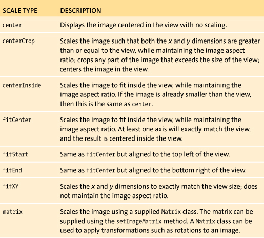
The ImageView handles all the loading and scaling of the image for you. Note the scaleType attribute? This defines how the images will be scaled to fit in your layout. In the example, using scale type center, the image will be displayed at its native resolution and centered in the view, regardless of how much space the view consumes. Other scaling options fit the image to the dimensions of the image view or scale the image based on the width and height of the device. Table 4.1 lists the scale type options and how they alter the image.
Table 4.1 ImageView Scale Types
Tip
The fitXY scale type allows you to set the exact size of the image in your layout. However, be mindful of potential distortions of the image due to scaling. If you’re creating a photo-viewing application, you will probably want to use the center or fitCenter scale types.
Figure 4.9 shows examples of the scale types. Using the correct scale type is important if you want to properly display images.
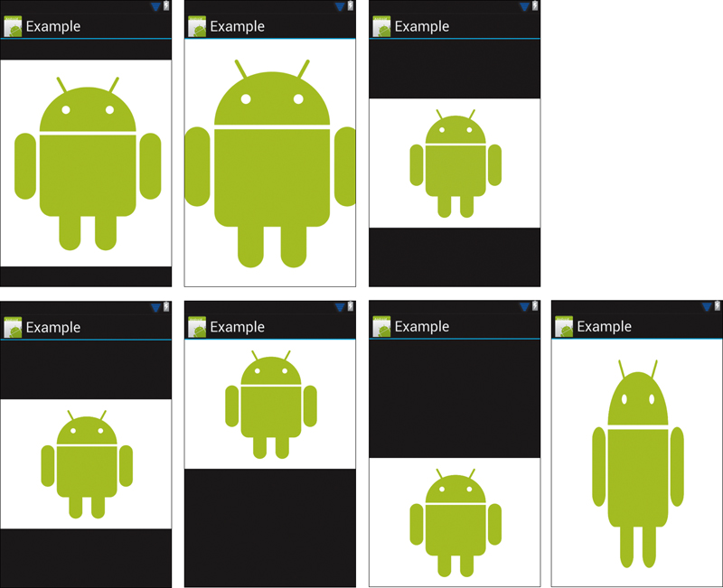
Figure 4.9 Examples of android:scaleType attribute. Top row (l-r) center, centerCrop, centerInside. Bottom row (l-r): fitCenter, fitStart, fitEnd, fitXY.
Bitmaps
Images used in your application are stored in the /res/drawable folders. These folders follow the device-configuration naming scheme to provide different images for different devices. Typically, you will create four different versions of each image and place them in the following folders: drawable-ldpi, drawable-mdpi, drawable-hdpi, and drawable-xhdpi. These represent the increasing resolutions of each device, and appropriately sized images should be placed in each. Use the same filename for each of the different versions, and then when you specify the drawable name, the Android resources manager will choose the image from the appropriate folder.
It’s not always necessary to create an image for a particular resolution; Android will display whatever image is the best match. In general, Android will prefer scaling an image down in size so that images are always crisp and not blurred. By default, you should create hdpi-resolution images. However, you should strive to create resources for all resolutions to prevent unnecessary hardware scaling, which slows down the drawing of your UI. Once your image resources are placed in the res/drawable folders, you can reference them the same way you reference your layout files: via the R.java file.
Note
Image resources in your project should be in one of three formats: PNG (preferred), JPEG (acceptable), and GIF (discouraged). Of course, 9-patch images are also accepted.
Including images in the res/drawable folders is a simple way of adding images to your app. However, it’s also possible to create images at runtime and add them to your layout. For example, you may want to download an image from the Internet and display it to the user. To do this, you create a Bitmap object to encapsulate the image, and then load it into your UI. The Bitmap class is simply an object that references a bitmap image. You can use a BitmapFactory to create a bitmap image from any source: a resource in your app, a file, or even an arbitrary InputStream. A bitmap can then be loaded into an image view by calling setImageBitmap. Here is an example:
Bitmap bitmap = Bitmap.createBitmap(100, 100, Bitmap.Config.ARGB_8888);
ImageView iv = (ImageView) findViewById(R.id.image);
iv.setImageBitmap(bitmap);
Drawables
Not all graphics need to be images—Android also lets you create graphics by using XML or writing custom drawing code. You’ll learn more about creating custom graphics using Canvas and other classes in Chapter 11. To create graphics using XML, you use the Drawable class. A drawable represents something that can be drawn on the screen. This can be an image, an XML resource, or a custom class. The Drawable class is the general abstraction for representing all of these in your UI.
The Android framework makes extensive use of drawables for all the built-in UI views. One of the most common is the Button class, which uses an XML file to define the possible states a button can have. Here is an example XML file for Button:
<?xml version="1.0" encoding="utf-8"?>
<selector xmlns:android="http://schemas.android.com/apk/res/android">
<item android:state_pressed="true"
android:drawable="@drawable/button_pressed" />
<item android:state_focused="true"
android:drawable="@drawable/button_focused" />
<item android:state_hovered="true"
android:drawable="@drawable/button_hovered" />
<item android:drawable="@drawable/button_normal" />
</selector>
This is called a StateListDrawable. It defines a set of drawables associated with different states. In this example, there are four possible states the button can be in: normal, hovered, focused, and pressed. Each item in the StateListDrawable defines a drawable that will be displayed when the button is in the specified state. In this case, the android:drawable attribute references an actual image drawable. The StateListDrawable does not select the best matching item, but rather selects the first item that meets the criteria for the current state. It performs this search from top to bottom, so the order in which you place each item is important. Using different drawables for button states provides feedback to the user when they are interacting with the UI.
There are more options than just defining states for a drawable. There are formats that create simple transformations of an existing bitmap or add padding and dithering to an image. You can combine several bitmaps to create a composite image. Or you can use XML to actually draw a shape using the ShapeDrawable class. You can add gradients, shadows, and rounded corners. The full range of XML drawable options is outside the scope of this book, but you should familiarize yourself with the available options. If you find yourself contemplating creating custom graphics to achieve the effects you want, consider using a drawable resource that may already be available.
In addition to displaying images using drawables and bitmaps, you have the option to create custom graphics using classes like Canvas, SurfaceView, and TextureView. You’ll learn more about this in Chapter 11.
Note
Drawing images into a view uses the system’s standard drawing process. In Android versions earlier than 3.0, this process is not fully hardware accelerated. Be aware that graphics-intensive applications using this process will not perform well on older versions of Android.
Creating Maps and Displaying Websites
The typical Android device ships with a built-in GPS receiver and an always-on network connection. This provides tremendous opportunities for developers to leverage these features and create compelling location-aware applications. Android devices include access to Google’s mapping technology, which you can use to add full-fledged navigation to your app. And the built-in Webkit browser gives you the power to create your own web-browsing applications. The next sections cover the basics of using these advanced views.
MapView
Unlike other views and classes in Android, maps are not part of the core library. They are provided by Google and are available to any application running on an Android-compatible device. Notably, this does not include devices that do not conform to the Android Compatibility Definition, such as the Kindle Fire. You will be unable to use Google Maps on those devices. However, most devices meet the Android specifications and support Google Maps integration.
Tip
Make sure you properly declare your permissions in the application manifest file. If you want to use location features in your application, you will need to request the location permissions in your app.
You can set up your project to use maps as follows:
1. Visit the Google APIs site (http://code.google.com/android/add-ons/google-apis/), and register for a map key. Map views are provided as part of the com.google.android.maps package, and you will need to register for a Google Maps API key in order to use this package.
2. Using the Android SDK Manager, download the Google APIs version of the Android SDK that you intend to support. You can use this SDK to create a new AVD image that supports MapView. Make sure you select a Google APIs target for your image.
3. Declare that your application requires the external Google Maps library to run by adding this to your manifest under the <application> element:
<uses-library android:name="com.google.android.maps" />
4. Google Maps requires a network connection, so you need to add the android.permission.INTERNET permission to your manifest:
<uses-permission android:name="android.permission.INTERNET" />
With those tweaks, you can use maps in your application. You add a map view to your layout like you would add any other view:
<com.google.android.maps.MapView
android:id="@+id/mapview"
android:layout_width="fill_parent"
android:layout_height="fill_parent"
android:apiKey="Your Maps API Key"
android:clickable="true" />
Note that the element name highlighted in the code is the full package name—anytime you use a custom view that is not part of the core Android library, you need to specify the full package name. You will need to declare the ID of the MapView as mapview. Also, there are two new attributes here. The first is the apiKey attribute, which is where you will place the Google Maps API key you get from Google. This enables you to use Google’s mapping service. The second new attribute is the clickable setting. Setting this to true allows the user to tap and scroll on the MapView in your UI; setting it to false will prevent all interaction with the map.
To actually use a map view in your layout, your activity will need to extend MapActivity, which handles all the setup of the map view, and override the isRouteDisplayed method, which is required by the Google Maps license agreement and should return a Boolean that indicates whether there is active routing information displayed on the map (Figure 4.10).
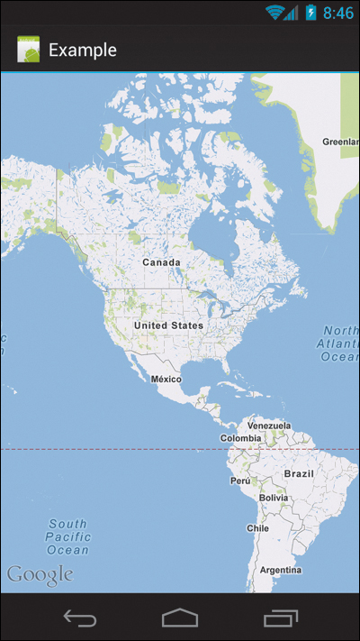
Figure 4.10 A MapView example.
Note
Because your activity must extend MapActivity, you cannot use fragments from the compatibility library and use a map view at the same time. For Android 3.0 and above, the fragment framework is built in to the Activity class, so this is not an issue.
WebView
Android includes a Webkit-based HTML rendering engine backed by the V8 JavaScript interpreter. You can use these technologies in your own application by using the WebView class. A web view renders HTML from web URLs, files stored on the device, or arbitrary strings you create in your app. Android’s WebView includes standard browser features like history, plugins, zooming controls, and JavaScript support. You can also enable advanced gestures like pinch to zoom, providing easy navigation on touchscreen devices.
Like the map view, the web view can be added to your application with a simple XML element:
<WebView
android:id="@+id/webview"
android:layout_width="match_parent"
android:layout_height="match_parent" />
You will need to enable the INTERNET permission in your manifest for your web view to access online webpages. The web view does all downloading and rendering of webpages, and you won’t need to extend any special activities or use a special ID. With a web view in your UI, loading a webpage is as simple as adding the following code:
WebView webView = (WebView) findViewById(R.id.webview);
webView.loadUrl("http://www.google.com");
With that, you can display any webpage to the user in your custom UI layout. Note that the supplied content highlighted in the example is an actual webpage URL. It’s also possible to load an arbitrary string containing HTML for display.
The web view defaults don’t include JavaScript or Flash support. To enable that, you’ll need to use a WebSettings object:
WebSettings webSettings = webView.getSettings();
webSettings.setJavaScriptEnabled(true);
webSettings.setPluginState(WebSettings.PluginState.ON);
This enables JavaScript and plugins—including Flash, if it’s installed—in the web view. Adding zoom controls and pinch-to-zoom functionality is also simple:
webSettings.setSupportZoom(true);
webSettings.setBuiltInZoomControls(true);
The first line indicates that the web view will support zooming its contents. The second line uses the web view’s built-in zoom controls for performing the zoom (this includes the tap-to-zoom and pinch-to-zoom functionality).
Finally, you will likely want to override the loading of new URLs in your web view. If you don’t do so, when the user taps on a new URL in the web view, the default browser will open to load the new link. To force the load to occur in your web view, add the following code:
webView.setWebViewClient(new WebViewClient() {
@Override
public boolean shouldOverrideUrlLoading(WebView view, String url) {
view.loadUrl(url);
return true;
}
});
Here the URL loading behavior is overridden, and the new URL is loaded in the existing web view. Returning true will discontinue the propagation of the event up the view hierarchy and prevent the browser from opening. Figure 4.11 shows the screen of this activity.
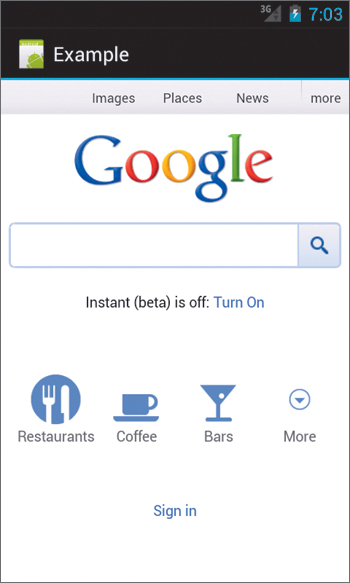
Figure 4.11 The web view displaying Google’s homepage
The web view allows you to present any HTML content to the user and provides an easy way to load pages from the Internet. You should take advantage of it whenever your application needs to display HTML content.
Wrapping Up
This chapter introduced the basic building blocks used to build a form on Android. You used these to refactor the TimeTracker app into a series of activities for displaying and entering tasks. You still need to save the data and display it, which we’ll cover later in the book. In this chapter, you learned that
• Android provides a set of simple input widgets that you can use to build forms.
• Use the proper android:scaleType attribute when displaying an image using ImageView.
• With the Drawable class, you can create complex image types using only XML.
• Adding a map to your application is as simple as extending MapActivity and adding the map view to your layout.
• Android’s Webkit-based WebView class allows you to display any HTML content.