
Chapter 9: Angular and the Angular CDK
Angular has an amazing ecosystem of tools and libraries, be it Angular Material, the Angular command-line interface (Angular CLI), or the beloved Angular Component Dev Kit (Angular CDK). I call it "beloved" because if you are to implement your own custom interactions and behaviors in Angular apps without having to rely on an entire set of libraries, Angular CDK is going to be your best friend. In this chapter, you'll learn what an amazing combination Angular and the Angular CDK are. You'll learn about some neat components built into the CDK and will also use some CDK application programming interfaces (APIs) to create amazing and optimized content.
Here are the recipes we're going to cover in this chapter:
- Using Virtual Scroll for huge lists
- Keyboard navigation for lists
- Pointy little popovers with the Overlay API
- Using CDK Clipboard to work with the system clipboard
- Using CDK Drag and Drop to move items from one list to another
- Creating a multi-step game with the CDK Stepper API
- Resizing text inputs with the CDK TextField API
Technical requirements
For the recipes in this chapter, make sure you have Git and Node.js installed on your machine. You also need to have the @angular/cli package installed, which you can do with npm install -g @angular/cli from your terminal. The code for this chapter can be found at https://github.com/PacktPublishing/Angular-Cookbook/tree/master/chapter09.
Using Virtual Scroll for huge lists
There might be certain scenarios in your application where you might have to show a huge set of items. This could be from either your backend API or the browser's local storage. In either case, rendering a lot of items at once causes performance issues because the Document Object Model (DOM) struggles, and also because of the fact that the JS thread gets blocked and the page becomes unresponsive. In this recipe, we'll render a list of 10,000 users and will use the Virtual Scroll functionality from the Angular CDK to improve the rendering performance.
Getting ready
The project that we are going to work with resides in chapter09/start_here/using-cdk-virtual-scroll, inside the cloned repository. Proceed as follows:
- Open the project in Visual Studio Code (VS Code).
- Open the terminal and run npm install to install the dependencies of the project.
- Once done, run ng serve -o.
This should open the app in a new browser tab, and it should look like this:
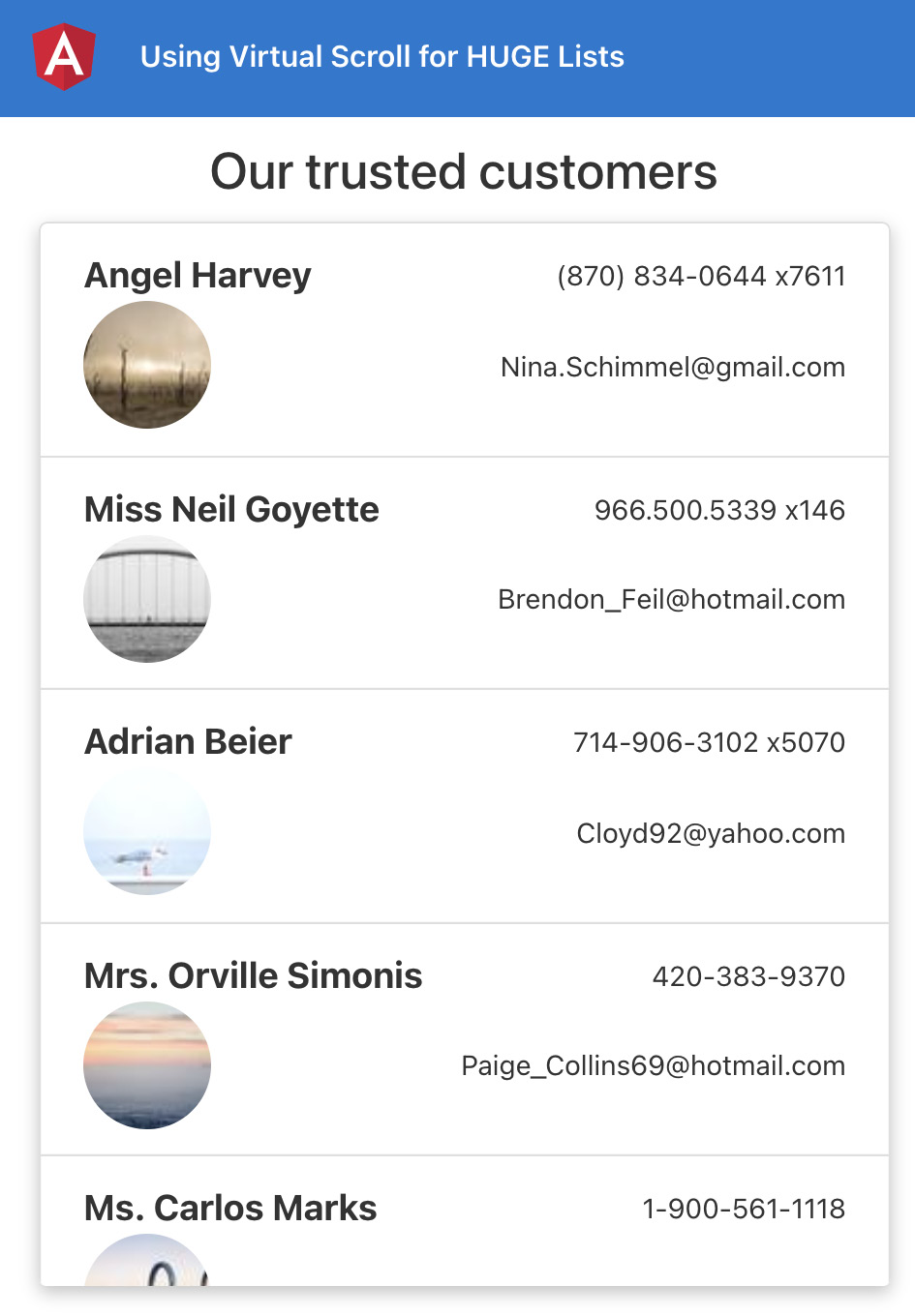
Figure 9.1 – The using-cdk-virtual-scroll app running on http://localhost:4200
Now that we have the app running locally, let's see the steps of the recipe in the next section.
How to do it…
We have a pretty simple Angular app, but with a lot of data. Right now, it shows a loader (button) for about 3 seconds, and then is supposed to show the data. However, you'll notice that right after 3 seconds, the loader keeps showing, the button is unresponsive, and we see a blank screen, as follows:
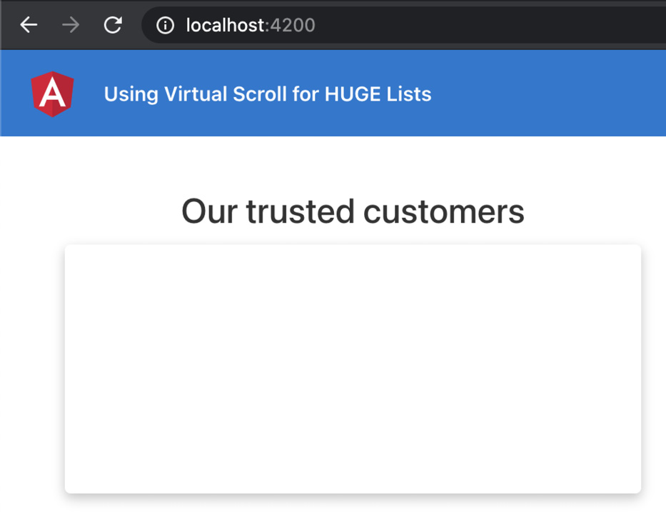
Figure 9.2 – App stuck with a blank screen while rendering list items
In fact, our entire application becomes unresponsive. If you scroll through—or even hover over—the items, you'll see that the hover animation on the list items is not smooth and is a bit laggy. Let's see the steps to use Angular CDK Virtual Scroll to improve the rendering performance, as follows:
- First, open a new terminal window/tab and make sure you're inside the ch8/start_here/using-cdk-virtual-scroll folder. Once inside, run the following command to install the Angular CDK:
npm install --save @angular/[email protected]
- You'll have to restart your Angular server, so rerun the ng serve command.
- Add the ScrollingModule class from the @angular/cdk package into your app.module.ts file, as follows:
...
import { LoaderComponent } from './components/loader/loader.component';
import { ScrollingModule } from '@angular/cdk/scrolling';
@NgModule({
declarations: [...],
imports: [
...
HttpClientModule,
ScrollingModule
],
providers: [],
bootstrap: [AppComponent]
})
export class AppModule { }
- We now have to implement the virtual scroll, modify the the-amazing-list-item.component.html file to use the *cdkVirtualFor directive instead of the *ngFor directive, and change the container <div> element to a <cdi-virtual-scroll-viewport> element, as follows:
<h4 class="heading">Our trusted customers</h4>
<cdk-virtual-scroll-viewport
class="list list-group"
[itemSize]="110">
<div
class="list__item list-group-item"
*cdkVirtualFor="let item of listItems">
<div class="list__item__primary">
...
</div>
<div class="list__item__secondary">
...
</div>
</div>
</cdk-virtual-scroll-viewport>
Kaboom! Within a few steps, and by using the Angular CDK Virtual Scroll, we were able to fix a big rendering issue within our Angular app. Now that you know how the basic routing is implemented, see the next section to understand how it works.
How it works…
The Angular CDK provides the Scrolling APIs, which include the *cdkVirtualFor directive and the <cdk-virtual-scroll-viewport> element. It is necessary to have <cdk-virtual-scroll-viewport> wrapping the element that has the *cdkVirtualFor directive being applied to it. Notice that we have an attribute on the cdk-virtual-scroll-viewport element named [itemSize], having its value set to "110". The reason for this is that each list item has a height of approximately 110 pixels, as shown in the following screenshot:

Figure 9.3 – Each list item has a height of approximately 110 pixels
But how does it improve the rendering performance? Glad you asked! In the original code for this recipe, when we loaded the 10,000 users, it would create a separate <div> element with the class="list__item list-group-item" attribute for each user, thus creating 10,000 DOM elements all being rendered at once. With virtual scroll in place, the CDK only creates a few <div> elements, renders them, and just replaces the content of those few <div> elements as we scroll through items.
For our example, it creates exactly nine <div> elements, as shown in the following screenshot:

Figure 9.4 – Showing only a few <div> elements rendered on DOM due to virtual scroll
Since we only have a few elements rendered on the DOM, we don't have performance issues anymore, and the hover animation also seems super-smooth now.
Tip
When implementing virtual scroll in your own applications, make sure that you set a specific height to the <cdk-virtual-scroll viewport> element, and also set the [itemSize] attribute equal to the expected list-item height in pixels, otherwise the list won't show.
See also
- CDK scrolling examples (https://material.angular.io/cdk/scrolling/examples)
Keyboard navigation for lists
Accessibility is one of the most important aspects of building apps with a great user experience. The apps should not only be fast and performant but also accessible. While there are a lot of things to consider when it comes to accessibility, in this recipe, we're going to make lists and list items more accessible by providing keyboard navigation for the items. With Angular CDK, it is super simple. We're going to use the ListKeyManager service from Angular to implement keyboard navigation for the users list in our target application.
Getting ready
The project for this recipe resides in chapter09/start_here/using-list-key-manager. Proceed as follows:
- Open the project in VS Code.
- Open the terminal and run npm install to install the dependencies of the project.
- Once done, run ng serve -o.
This should open the app in a new browser tab, as follows:

Figure 9.5 – The using-list-key-manager app running on http://localhost:4200
Now that we have the app running locally, let's see the steps of the recipe in the next section.
How to do it…
We have an app that already has some of the goodness of the Angular CDK—that is, it has virtual scroll implemented from the previous recipe. We'll now start making changes to the app to implement keyboard navigation, as follows:
- First, we need to create a new component for each item in the list as we'll need them to be able to work with the ListKeyManager class. Create a component by running the following command in the project:
ng g c components/the-amazing-list-item
- Now, we'll move the code from the the-amazing-list-component.html file to the the-amazing-list-item.component.html file for the item's markup. The code in the the-amazing-list-item.component.html file should look like this:
<div class="list__item__primary">
<div class="list__item__primary__info">
{{ item.name }}
</div>
<div class="list__item__primary__info">
{{ item.phone }}
</div>
</div>
<div class="list__item__secondary">
<div class="list__item__secondary__info">
<img src="{{ item.picture }}" />
</div>
<div class="list__item__secondary__info">
{{ item.email }}
</div>
</div>
- Let's update the respective component as well to include this item property used in the template. We'll make it an @Input() item for the TheAmazingListItemComponent class. Update the the-amazing-list-item.component.ts file, as follows:
import { Component, Input, OnInit, ViewEncapsulation } from '@angular/core';
import { AppUserCard } from 'src/interfaces/app-user-card.interface';
@Component({
selector: 'app-the-amazing-list-item',
templateUrl: './the-amazing-list-item.component.html',
styleUrls: ['./the-amazing-list-item.component.scss'],
encapsulation: ViewEncapsulation.None
})
export class TheAmazingListItemComponent implements OnInit {
@Input() item: Partial<AppUserCard>;
constructor() { }
ngOnInit(): void {
}
}
- Let's add the styles as well. We'll copy the styles from the the-amazing-list.component.scss file and paste them into the the-amazing-list-item.component.scss file, as follows:
.list__item {
transition: all ease 1s;
cursor: pointer;
&:hover, &:focus {
background-color: #ececec; transform: scale(1.02);
}
&__primary,
&__secondary {
display: flex;
justify-content: space-between;
align-items: center;
&__info { font-size: small; }
}
&__primary {
&__info {
&:nth-child(1) { font-weight: bold; font-size: larger; }
}
}
img { border-radius: 50%; width: 60px; height: 60px; }
}
- Update the the-amazing-list.component.scss file to contain only the styles for the list, as follows:
.heading {
text-align: center;
margin-bottom: 10px;
}
.list {
box-shadow: rgba(0, 0, 0, 0.24) 0px 3px 8px;
height: 500px;
overflow: scroll;
min-width: 400px;
max-width: 960px;
width: 100%;
}
- Now, update the the-amazing-list.component.html file to use the <app-the-amazing-list-item> component and to pass the [item] attribute to it, as follows:
<h4 class="heading">Our trusted customers</h4>
<cdk-virtual-scroll-viewport
class="list list-group"
[itemSize]="110">
<app-the-amazing-list-item
class="list__item list-group-item"
*cdkVirtualFor="let item of listItems"
[item]="item">
</app-the-amazing-list-item>
</cdk-virtual-scroll-viewport>
- The user interface (UI) is almost done now. We'll now implement the FocusableOption interface and some accessibility factors to our TheAmazingListItemComponent class, as follows:
import { Component, Input, OnInit, ViewEncapsulation } from '@angular/core';
import { AppUserCard } from 'src/interfaces/app-user-card.interface';
import { FocusableOption } from '@angular/cdk/a11y';
@Component({
selector: 'app-the-amazing-list-item',
templateUrl: './the-amazing-list-item.component.html',
styleUrls: ['./the-amazing-list-item.component.scss'],
encapsulation: ViewEncapsulation.None,
host: {
tabindex: '-1',
role: 'list-item',
},
})
export class TheAmazingListItemComponent implements OnInit, FocusableOption {
@Input() item: Partial<AppUserCard>;
constructor() { }
focus() { }
ngOnInit(): void {
}
}
- We now need to implement what happens in the focus() method. We'll use the ElementRef service to get the nativeElement and will set focus() on it, as follows:
import { Component, ElementRef, Input, OnInit, ViewEncapsulation } from '@angular/core';
import { AppUserCard } from 'src/interfaces/app-user-card.interface';
import { FocusableOption } from '@angular/cdk/a11y';
@Component({...})
export class TheAmazingListItemComponent implements OnInit, FocusableOption {
@Input() item: Partial<AppUserCard>;
constructor(private el: ElementRef) { }
focus() {
this.el.nativeElement.focus();
}
...
}
- We now need to implement the FocusKeyManager class in our TheAmazingListComponent class. We'll have to query our list items in the component to create an instance of the FocusKeyManager class. Update the the-amazing-list.component.ts file, as follows:
import { FocusKeyManager } from '@angular/cdk/a11y';
import { AfterViewInit, Component, Input, OnInit, QueryList, ViewChildren } from '@angular/core';
import { AppUserCard } from 'src/interfaces/app-user-card.interface';
import { TheAmazingListItemComponent } from '../the-amazing-list-item/the-amazing-list-item.component';
@Component({
...
styleUrls: ['./the-amazing-list.component.scss'],
host: { role: 'list' }
})
export class TheAmazingListComponent implements OnInit, AfterViewInit {
@Input() listItems: Partial<AppUserCard>[] = [];
@ViewChildren(TheAmazingListItemComponent) listItemsElements: QueryList <TheAmazingListItemComponent>;
private listKeyManager: FocusKeyManager<TheAmazingListItemComponent>;
constructor() { }
...
ngAfterViewInit() {
this.listKeyManager = new FocusKeyManager(
this.listItemsElements
);
}
}
- Finally, we need to listen to the keyboard events. For this, you could either use a keydown event or a window:keydown event. For simplicity of the recipe, we'll go with the window:keydown event, as follows:
import { FocusKeyManager } from '@angular/cdk/a11y';
import { AfterViewInit, Component, HostListener, Input, OnInit, QueryList, ViewChildren } from '@angular/core';
...
@Component({...})
export class TheAmazingListComponent implements OnInit, AfterViewInit {
...
@HostListener('window:keydown', ['$event'])
onKeydown(event) {
this.listKeyManager.onKeydown(event);
}
constructor() { }
...
}
Awesomesauce! You've just learned how to implement keyboard navigation using the Angular CDK. See the next section to understand how it works.
How it works…
The Angular CDK provides the ListKeyManager class, which allows you to implement keyboard navigation. There are a bunch of techniques we can use with the ListKeyManager class, and for this particular recipe, we chose the FocusKeyManager class. In order to make it work for a list of items, we need to do the following things:
- Create a component for each item in the list.
- Use ViewChildren() with QueryList in the list component to query all the list-item components.
- Create a FocusKeyManager instance in the list component, providing the type of the list-item component.
- Add a keyboard listener to the list component and pass the event to the instance of the FocusKeyManager class.
When we define the listKeyManager property in the TheAmazingListComponent class, we define its type as well by specifying it as FocusKeyManager<TheAmazingListItemComponent>. This makes it easier to understand that our FocusKeyManager class is supposed to work with an array of TheAmazingListItemComponent elements. Therefore, in the ngAfterViewInit() method, we specify this.listKeyManager = new FocusKeyManager(this.listItemsElements);, which provides a queried list of TheAmazingListItemComponent elements.
Finally, when we listen to the window:keydown event, we take the keydown event received in the handler and provide it to the instance of our FocusKeyManager class as this.listKeyManager.onKeydown(event);. This tells our FocusKeyManager instance which key was pressed and what it has to do.
Notice that our TheAmazingListItemComponent class implements the FocusableOption interface, and it also has the focus() method, which the FocusKeyManager class uses behind the scenes when we press the keyboard arrow-down or arrow-up keys.
See also
- Angular CDK accessibility documentation (https://material.angular.io/cdk/a11y/overview)
Pointy little popovers with the Overlay API
This is one of the advanced recipes in this book, especially for those of you who have already been working with Angular for a while. In this recipe, we'll not only create some popovers using the CDK Overlay API, but we'll also make them pointy, just like tooltips, and that's where the fun lies.
Getting ready
The project for this recipe resides in chapter09/start_here/pointy-little-popovers. Proceed as follows:
- Open the project in VS Code.
- Open the terminal and run npm install to install the dependencies of the project.
- Once done, run ng serve -o.
This should open the app in a new browser tab, as follows:
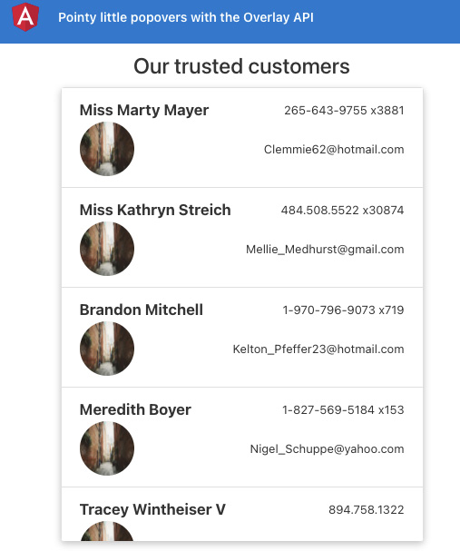
Figure 9.6 – The pointy-little-popovers app running on http://localhost:4200
Now that we have the app running locally, let's see the steps of the recipe in the next section.
How to do it…
Our app has a list of users that we can scroll through on the page. We'll add a popover menu to each item so that a drop-down menu is shown with some actions. We already have the @angular/cdk package installed, so we don't need to worry about that. Let's start with the recipe, as follows:
- First, we need to install the @angular/cdk as we need to import the OverlayModule class into our AppModule class so that we can use the Overlay API. Update the app.module.ts file, as follows:
...
import { TheAmazingListItemComponent } from './components/the-amazing-list-item/the-amazing-list-item.component';
import { OverlayModule } from '@angular/cdk/overlay';
@NgModule({
declarations: [...],
imports: [
...
ScrollingModule,
OverlayModule
],
providers: [],
bootstrap: [AppComponent]
})
export class AppModule { }
- We'll first add the Overlay's default styles so that when the overlay is displayed, it is positioned correctly. Open the src/styles.scss file and update it as per the following gist:
https://gist.github.com/AhsanAyaz/b039814e898b3ebe471b13880c7b4270
- Now, we'll create variables to hold the overlay trigger (for the origin of the positions of the opened overlay) and the actual relative position's settings. Open the the-amazing-list.component.ts file and update it, as follows:
import { FocusKeyManager } from '@angular/cdk/a11y';
import { CdkOverlayOrigin } from '@angular/cdk/overlay';
...
@Component({...})
export class TheAmazingListComponent implements OnInit, AfterViewInit {
@Input() listItems: Partial<AppUserCard>[] = [];
@ViewChildren(TheAmazingListItemComponent) listItemsElements: QueryList <TheAmazingListItemComponent>;
popoverMenuTrigger: CdkOverlayOrigin;
menuPositions = [
{ offsetY: 4, originX: 'end', originY: 'bottom', overlayX: 'end', overlayY: 'top' },
{ offsetY: -4, originX: 'end', originY: 'top', overlayX: 'end', overlayY: 'bottom' },
];
private listKeyManager: FocusKeyManager <TheAmazingListItemComponent>;
...
}
- Now, open the the-amazing-list.component.html file and add the cdkOverlayOrigin directive to the <app-the-amazing-list-item> selector so that we can have each list item as an origin for the pop-up menu, as follows:
<h4 class="heading">Our trusted customers</h4>
<cdk-virtual-scroll-viewport
class="list list-group"
[itemSize]="110">
<app-the-amazing-list-item
cdkOverlayOrigin #itemTrigger="cdkOverlayOrigin"
class="list__item list-group-item"
*cdkVirtualFor="let item of listItems"
[item]="item">
</app-the-amazing-list-item>
</cdk-virtual-scroll-viewport>
- We need to somehow pass the #itemTrigger variable from the template to assign its value to the popoverMenuTrigger property in the TheAmazingListComponent class. To do so, create a method named openMenu() in the the-amazing-list.component.ts file, as follows:
...
@Component({...})
export class TheAmazingListComponent implements OnInit, AfterViewInit {
...
ngOnInit(): void {
}
openMenu($event, itemTrigger) {
if ($event) {
$event.stopImmediatePropagation();
}
this.popoverMenuTrigger = itemTrigger;
}
...
}
- We also need a property to show/hide the popover menu. Let's create it and set it to true in the openMenu() method as well. Update the the-amazing-list.component.ts file, as follows:
...
@Component({...})
export class TheAmazingListComponent implements OnInit, AfterViewInit {
...
popoverMenuTrigger: CdkOverlayOrigin;
menuShown = false;
...
openMenu($event, itemTrigger) {
if ($event) {
$event.stopImmediatePropagation();
}
this.popoverMenuTrigger = itemTrigger;
this.menuShown = true;
}
...
}
- We'll now create an actual overlay. To do so, we'll create an <ng-template> element with the cdkConnectedOverlay directive. Modify your the-amazing-list.component.html file, as follows:
<h4 class="heading">Our trusted customers</h4>
<cdk-virtual-scroll-viewport>
...
</cdk-virtual-scroll-viewport>
<ng-template cdkConnectedOverlay [cdkConnectedOverlayOrigin]="popoverMenuTrigger"
[cdkConnectedOverlayOpen]="menuShown" [cdkConnectedOverlayHasBackdrop]="true"
(backdropClick)="menuShown = false"
[cdkConnectedOverlayPositions]="menuPositions"
cdkConnectedOverlayPanelClass="menu-popover"
>
<div class="menu-popover__list">
<div class="menu-popover__list__item">
Duplicate
</div>
<div class="menu-popover__list__item">
Edit
</div>
<div class="menu-popover__list__item">
Delete
</div>
</div>
</ng-template>
- We need to pass the #itemTrigger variable that we have on each list item to the openMenu() method on a click of the list item. Update the file, as follows:
<h4 class="heading">Our trusted customers</h4>
<cdk-virtual-scroll-viewport
class="list list-group"
[itemSize]="110">
<app-the-amazing-list-item
class="list__item list-group-item"
*cdkVirtualFor="let item of listItems"
(click)="openMenu($event, itemTrigger)"
cdkOverlayOrigin #itemTrigger="cdkOverlayOrigin"
[item]="item">
</app-the-amazing-list-item>
</cdk-virtual-scroll-viewport>
<ng-template>
...
</ng-template>
- If you refresh the app now and click on any of the list items, you should see a drop-down menu being shown, as follows:

Figure 9.7 – Working drop-down menu for each list item
- We now have to implement the part where we show a pointy little arrow with the drop-down menu so that we can correlate the drop-down menu with the list item. First, add the following styles to the .popover-menu class in the src/styles.scss file:
...
.menu-popover {
min-width: 150px;
height: auto;
border: 1px solid white;
border-radius: 8px;
&::before {
top: -10px;
border-width: 0px 10px 10px 10px;
border-color: transparent transparent white transparent;
position: absolute;
content: '';
right: 5%;
border-style: solid;
}
&__list {...}
}
You should now be able to see a pointy arrow on the top right of the drop-down menu, but if you try clicking the last item on the screen, you'll see that the drop-down menu opens upward but still shows the pointer at the top, as follows:
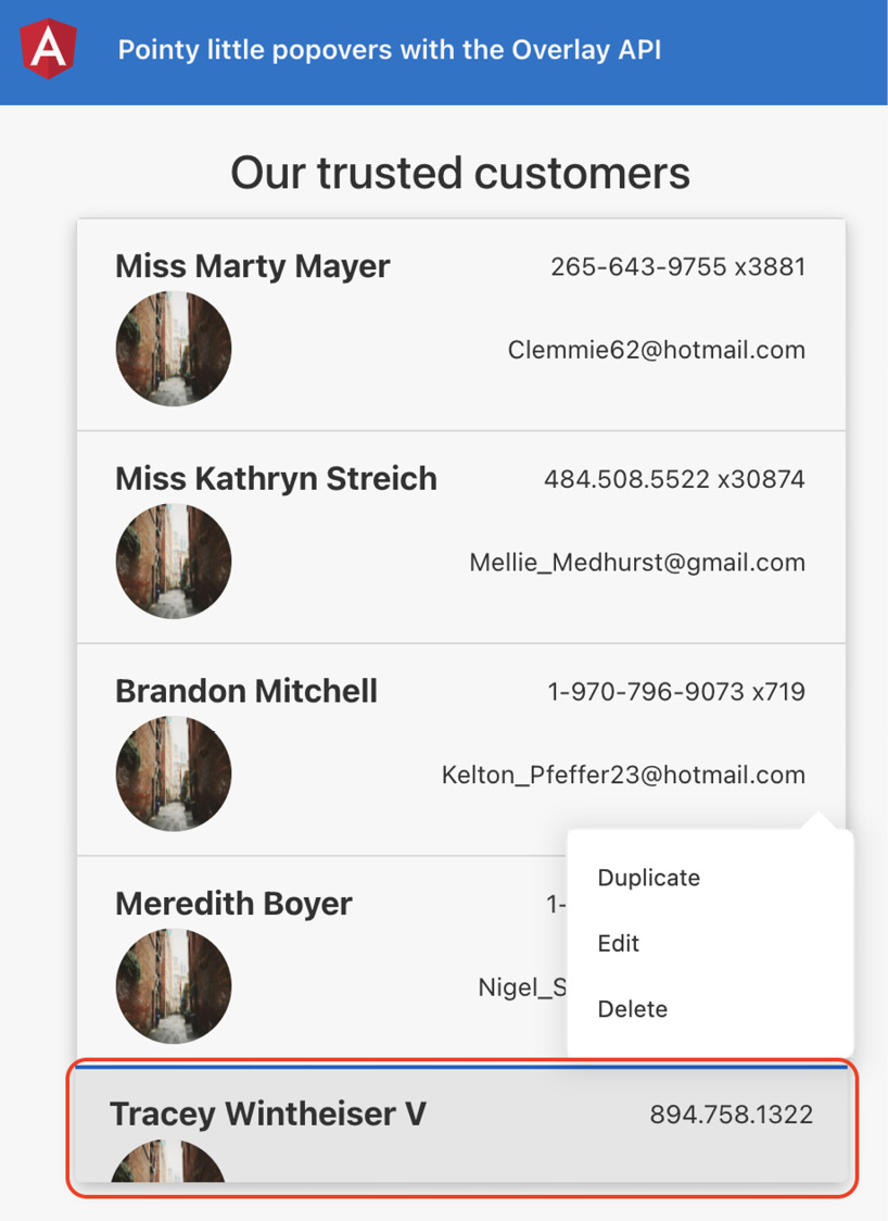
Figure 9.8 – Drop-down arrow pointing at the wrong list item
- To point to the actual origin of the popover/drop-down menu, we need to implement a custom directive that applies a custom class. Let's start by creating a directive, as follows:
ng g directive directives/popover-positional-class
- Update the code in the popover-positional-class.directive.ts generated file as per the following gist:
https://gist.github.com/AhsanAyaz/f28893e90b71cc03812287016192d294
- Now, open the the-amazing-list.component.html file to apply our directive to the cdkConnectedOverlay directive. Update the <ng-template> element in the file, as follows:
...
<ng-template cdkConnectedOverlay [cdkConnectedOverlayOrigin]="popoverMenuTrigger"
[cdkConnectedOverlayOpen]="menuShown" [cdkConnectedOverlayHasBackdrop]="true"
(backdropClick)="menuShown = false" [cdkConnectedOverlayPositions]="menuPositions"
appPopoverPositionalClass targetSelector= ".menu-popover" inverseClass="menu-popover--up"
[originY]="menuPopoverOrigin.originY" (positionChange)="popoverPositionChanged($event, menuPopoverOrigin)"
cdkConnectedOverlayPanelClass="menu-popover"
>
<div class="menu-popover__list">
...
</div>
</ng-template>
- We now need to create a menuPopoverOrigin property and a popoverPositionChanged() method in our the-amazing-list.component.ts file. Update this, as follows:
...
import { AfterViewInit, ChangeDetectorRef, Component, HostListener, Input, OnInit, QueryList, ViewChildren } from '@angular/core';
...
@Component({...})
export class TheAmazingListComponent implements OnInit, AfterViewInit {
...
menuPositions = [...];
menuPopoverOrigin = {
originY: null
}
...
constructor(private cdRef: ChangeDetectorRef) { }
popoverPositionChanged($event, popover) {
if (popover.originY !== $event.connectionPair. originY) {
popover.originY = $event.connectionPair.originY;
}
this.cdRef.detectChanges();
}
...
}
- Finally, let's reverse the popover pointer using this inverse class. Update the src/styles.scss file to add the following styles:
...
.menu-popover {
...
&::before {...}
&--up {
transform: translateY(-20px);
&::before {
top: unset !important;
transform: rotate(180deg);
bottom: -10px;
}
}
&__list {...}
}
And voilà! If you now refresh the page and tap each of the list items, you'll see the arrows point in the correct direction. See the following screenshot to view the popover arrow pointing downward for the last item, due to the popover being shown above the item:
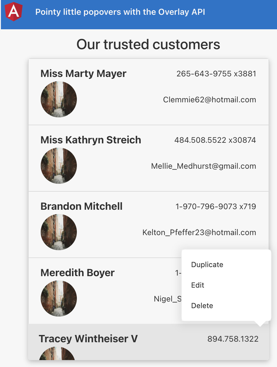
Figure 9.9 – Drop-down arrow pointing at the correct list item (pointing downward)
Great! You now know how to use the Angular CDK to work with overlays to create custom pop-up/drop-down menus. Moreover, you now know how to quickly implement the pointy arrows on the menu using a custom directive. See the next section to understand how it all works.
How it works…
Implementing an overlay using the Angular CDK Overlay API includes a couple of pieces to work with. We first have to import the OverlayModule class in our AppModule imports. Then, for creating an overlay, we need to have an overlay and an overlay trigger. In this recipe, since we're using the overlay to create a popover menu for each list item, we use the cdkOverlayOrigin directive on the <app-the-amazing-list-item> elements. Notice that the <app-the-amazing-list-item> elements are being rendered through the *ngFor directive. Therefore, in order to know which item was clicked or precisely which item we need to show the popover for, we create a #itemTrigger template variable on each list-item element, and you'll notice that we also bind the (click) event on the list items to call the openMenu() method, passing this itemTrigger template variable into it.
Now, if you have noticed the openMenu() method in the the-amazing-list.component.ts file, it looks like this:
openMenu($event, itemTrigger) {
if ($event) {
$event.stopImmediatePropagation();
}
this.popoverMenuTrigger = itemTrigger;
this.menuShown = true;
}
Notice that we assign the itemTrigger property to our class's popoverMenuTrigger property. This is because this popoverMenuTrigger property is being bound with the actual overlay in our template. You can also see that we set the menuShown property to true, and this is because it will decide whether the overlay should be shown or hidden.
Now, let's see the code for the actual overlay, as follows:
<ng-template cdkConnectedOverlay [cdkConnectedOverlayOrigin]="popoverMenuTrigger"
[cdkConnectedOverlayOpen]="menuShown" [cdkConnectedOverlayHasBackdrop]="true"
(backdropClick)="menuShown = false" [cdkConnectedOverlayPositions]="menuPositions"
appPopoverPositionalClass targetSelector=".menu-popover" inverseClass="menu-popover--up"
[originY]="menuPopoverOrigin.originY" (positionChange)="popoverPositionChanged($event, menuPopoverOrigin)"
cdkConnectedOverlayPanelClass="menu-popover"
>
...
</ng-template>
Let's discuss each of the cdkConnectedOverlay directive's attributes, one by one:
- The cdkConnectedOverlay attribute: This is the actual overlay directive that makes the <ng-template> element an Angular CDK overlay.
- The [cdkConnectedOverlayOrigin] attribute: This tells the Overlay API what the origin of this overlay is This is to help the CDK decide where to position the overlay when opened.
- The [cdkConnectedOverlayOpen] attribute: This decides whether the overlay should be shown or not.
- The [cdkConnectedOverlayHasBackdrop] attribute: This decides whether the overlay should have a backdrop or not—that is, if it has a backdrop, the user shouldn't be able to click anything else apart from the overlay when it is open.
- The (backdropClick) attribute: This is the event handler for when we click the backdrop. In this case, we're setting the menuShown property to false, which hides/closes the overlay.
- The [cdkConnectedOverlayPositions] attribute: This provides the positioning configuration to the Overlay API. It is an array of preferred positions that defines whether the overlay should be shown below the origin, on top of the origin, on the left, on the right, how far from the origin, and so on.
- The [cdkConnectedOverlayPanelClass] attribute: A Cascading Style Sheets (CSS) class to be applied to the generated overlay. This is used for styling.
With all of the attributes set correctly, we are able to see the overlay working when tapping the list items. "But what about the pointy arrows, Ahsan?" Well, hold on! We'll discuss them too.
So, the Angular CDK Overlay API already has a lot of things covered, including where to position the overlay based on the available space, and since we want to show the pointy arrows, we'll have to analyze whether the overlay is being shown above the item or below the item. By default, we have the following styles set in the src/styles.scss file to show the pointy arrow below the popover:
.menu-popover {
...
&::before {
top: -10px;
border-width: 0px 10px 10px 10px;
border-color: transparent transparent white transparent;
position: absolute;
content: '';
right: 5%;
border-style: solid;
}
&--up {...}
&__list {...}
}
And then, we have the --up modifier class, as follows, to show the overlay above the popover:
.menu-popover {
...
&::before {...}
&--up {
transform: translateY(-20px);
&::before {
top: unset !important;
transform: rotate(180deg);
bottom: -10px;
}
}
&__list {...}
}
Notice in the preceding code snippet that we rotate the arrow to 180deg to invert its pointer.
Now, let's talk about how and when this --up modifier class is applied. We have created a custom directive named appPopoverPositionalClass. This directive is also applied to the <ng-template> element we have for the overlay—that is, this directive is applied with the cdkConnectedOverlay directive and expects the following input attributes:
- The appPopoverPositionalClass attribute: The actual directive selector.
- The targetSelector attribute: The query selector for the element that is generated by the Angular CDK Overlay API. Ideally, this should be the same as what we use in cdkConnectedOverlayPanelClass.
- The inverseClass attribute: The class to be applied when the vertical position (originY) of the overlay is changed—that is, from "top" to "bottom", and vice versa.
- The originY attribute: The originY position of the overlay at the moment. The value is either "top" or "bottom", based on the overlay position.
We have a (positionChange) listener on the CDK Overlay <ng-template> element that triggers the popoverPositionChanged() method as soon as the overlay position changes. Notice that inside the popoverPositionChanged() method, upon getting a new position, we update the popover.originY property that is updating menuPopoverOrigin.originY, and then we're also passing menuPopoverOrigin.originY as the [originY] attribute to our appPopoverPositionalClass directive. Since we're passing it to the directive, the directive knows if the overlay position is "top" or "bottom" at any particular time. How? Because we're using the ngOnChanges life cycle hook in the directive to listen to the originY attribute/input, and as soon as we get a different value for originY, we either add the value of inverseClass as a CSS class to the Overlay element or remove it based on the value of the originY attribute. Also, based on the applied CSS classes, the direction of the popover arrow is decided for the overlay.
See also
- Angular CDK Overlay API (https://material.angular.io/cdk/overlay/overview)
- CdkOverlayOrigin directive documentation (https://material.angular.io/cdk/overlay/api#CdkOverlayOrigin)
Using CDK Clipboard to work with the system clipboard
You may have visited hundreds of websites over time, and you might have seen a feature called Click to copy on some of them. This is usually used when you have a long text or a link that you need to copy, and you'll find it way more convenient to just click to copy instead of selecting and then pressing the keyboard shortcuts. In this recipe, we're going to learn how to use the Angular CDK Clipboard API to copy text to the clipboard.
Getting ready
The project for this recipe resides in chapter09/start_here/using-cdk-clipboard-api. Proceed as follows:
- Open the project in VS Code.
- Open the terminal and run npm install to install the dependencies of the project.
- Once done, run ng serve -o.
This should open the app in a new browser tab, as follows:

Figure 9.10 – using-cdk-clipboard-api running on http://localhost:4200
Now that we have the app running locally, let's see the steps of the recipe in the next section.
How to do it…
We have an app right now with a couple of options that don't work—that is, we should be able to copy the link, the text from the text area, and the image. In order to do so, we'll use the CDK Clipboard API. Let's get started.
- First of all, we need to import the ClipboardModule class into the imports array of our AppModule class. Modify the app.module.ts file, as follows:
...
import { ClipboardModule } from '@angular/cdk/clipboard';
@NgModule({
declarations: [...],
imports: [
BrowserModule,
AppRoutingModule,
ClipboardModule
],
...
})
export class AppModule { }
- Now, we'll apply the click-to-copy functionality to the link. In order to do so, we'll use the cdkCopyToClipboard directive and will apply it on our link input in the app.component.html file, as follows:
...
<div class="content" role="main">
<div class="content__container">
<div class="content__container__copy-from">
<h3>Copy From</h3>
<div class="mb-3 content__container__copy-from__ input-group">
<input
#linkInput
[cdkCopyToClipboard]="linkInput.value"
(click)="copyContent($event, contentTypes. Link)"
class="form-control"
type="text" readonly="true"
value="...">
<div class="hint">...</div>
</div>
...
</div>
</div>
If you click on the link input now and then try to paste it anywhere (within or outside the app), you should see the value of the link.
- We'll now do something similar for the text input—that is, the <textarea>. Update the template again, as follows:
...
<div class="content" role="main">
<div class="content__container">
<div class="content__container__copy-from">
<h3>Copy From</h3>
...
<div class="mb-3 content__container__copy-from__ input-group">
<textarea
#textInput
class="form-control"
rows="5">{{loremIpsumText}}</textarea>
<button
[cdkCopyToClipboard]="textInput.value"
(click)="copyContent($event, contentTypes. Text)"
class="btn btn-dark">
{{ contentCopied === contentTypes.Text ? 'Text copied' : 'Copy text to clipboard'}}
</button>
</div>
...
</div>
</div>
- Finally, we'll do something different for the image. Since the CDK Clipboard API only works with strings, we will download the image, convert it into a blob, and copy the blob Uniform Resource Locator (URL). Let's update the template first with the logic, as follows:
...
<div class="content" role="main">
<div class="content__container">
<div class="content__container__copy-from">
<h3>Copy From</h3>
...
<div class="mb-3 content__container__copy-from__ input-group">
<img src="assets/landscape.jpg">
<button
(click)="copyImageUrl(imageUrl); copyContent($event, contentTypes.Image)"
class="btn btn-dark">
...
</button>
</div>
</div>
...
</div>
</div>
- Now, let's implement the copyImageUrl() method to fetch the image, convert it into a blob, and copy the URL to the clipboard. Update the app.component.ts file, as follows:
import { Clipboard } from '@angular/cdk/clipboard';
import { Component, HostListener, OnInit } from '@angular/core';
...
@Component({...})
export class AppComponent implements OnInit {
...
constructor(private clipboard: Clipboard) {
this.resetCopiedHash();
}
async copyImageUrl(srcImageUrl) {
const data = await fetch(srcImageUrl);
const blob = await data.blob();
this.clipboard.copy(URL.createObjectURL(blob));
}
...
}
Great! With this change, you can try refreshing the app. Now, you should be able to copy the link and the text, as well as the image, by clicking the input link and the buttons respectively. To understand all the magic behind this recipe, see the next section.
How it works…
In the recipe, we've used two main things from the CDK Clipboard API—one is the cdkCopyToClipboard directive, and the other is the Clipboard service. The cdkCopyToClipboard directive binds a click handler to the element this directive is applied to. It works both as the selector of the directive and an @Input() item for the directive so that it knows which value is to be copied to the clipboard when the element is clicked. In our recipe, for the link input, notice that we use [cdkCopyToClipboard]="linkInput.value". This binds a click handler to the <input> element and also binds the value property of the linkInput template variable, which points to the value of the input that is the actual link to be copied. When we click the input, it accesses the value of the input using the linkInput.value binding, and we do the same for the <text-area> input. The only difference is that the cdkCopyToClipboard directive is not bound to the <text-area> element itself. The reason is that we want to bind the click handler to the button below the text area instead. Therefore, on the button for copying the text, we have the [cdkCopyToClipboard]="textInput.value" binding.
For the image, we do something different. We use the Clipboard service from the @angular/cdk/clipboard package to manually copy the blob URL. We create a method named copyImageUrl(), which is called when clicking the button for copying the image. We pass the imageUrl property to this method, which in turn downloads the image, reads it as a blob, and generates the blob URL, which is copied to the clipboard using the copy() method of the Clipboard service.
See also
- CDK Clipboard documentation (https://material.angular.io/cdk/clipboard/overview)
Using CDK Drag and Drop to move items from one list to another
Have you ever used the Trello board app, or maybe other apps that also allow you to drag and drop list items from one list to another? Well, you can do this easily using the Angular CDK, and in this recipe, you'll learn about the Angular CDK Drag and Drop API to move items from one list to another. You'll also learn how to reorder the lists.
Getting ready
The project that we are going to work with resides in chapter09/start_here/using-cdk-drag-drop, inside the cloned repository. Proceed as follows:
- Open the project in VS Code.
- Open the terminal and run npm install to install the dependencies of the project.
- Once done, run ng serve -o.
This should open the app in a new browser tab, and it should look like this:
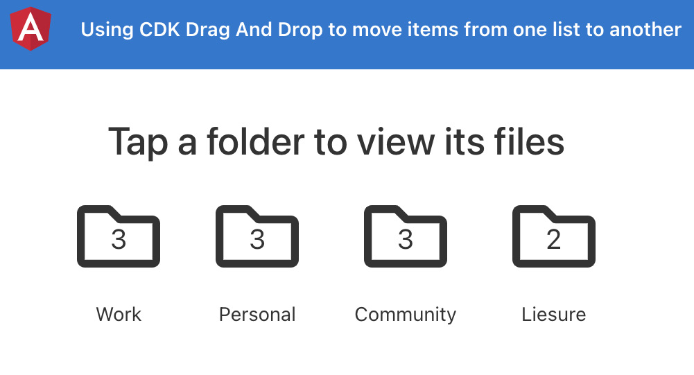
Figure 9.11 – The using-cdk-drag-drop app running on http://localhost:4200
Now that we have the app running locally, let's see the steps of the recipe in the next section.
How to do it…
For this recipe, we have an interesting app that has some folders and files. We're going to implement the drag-and-drop functionality for the files to be dragged to other folders, which should update the folder's file count instantly, and we should be able to see the file in the new folder as well. Let's get started.
- First of all, we need to import the DragDropModule class into the imports array of our AppModule class. Modify the app.module.ts file, as follows:
...
import {DragDropModule} from '@angular/cdk/drag-drop';
@NgModule({
declarations: [...],
imports: [
BrowserModule,
AppRoutingModule,
FontAwesomeModule,
DragDropModule
],
...
})
export class AppModule { }
- Now, we'll apply the cdkDrag directive to each of our files, and will apply the cdkDropList directive to each of the folders. Update the folders-list.component.html file, as follows:
<div class="folders">
...
<div class="folders__list">
<app-folder
cdkDropList
...
[folder]="folder"
>
</app-folder>
</div>
<div class="folders__selected-folder-files" *ngIf="selectedFolder">
<div>
<app-file
cdkDrag
*ngFor="let file of selectedFolder.files"
[file]="file"
></app-file>
</div>
</div>
</div>
- We'll also enable reordering of the files within a folder by adding the cdkDropList directive on the container elements for the files, as follows:
<div class="folders">
...
<div class="folders__selected-folder-files" *ngIf="selectedFolder">
<div cdkDropList>
<app-file ...></app-file>
</div>
</div>
</div>
- We'll now define the origin of the drag-and-drop interaction by specifying the [cdkDragData] attribute on each <app-file> element and the [cdkDropListData] attribute on each <app-folder> element, and on the files container as well. Update the template again, as follows:
<div class="folders">
...
<div class="folders__list">
<app-folder
cdkDropList
[cdkDropListData]="folder.files"
...
>
</app-folder>
</div>
<div class="folders__selected-folder-files" *ngIf="selectedFolder">
<div
cdkDropList
[cdkDropListData]="selectedFolder.files"
>
<app-file
cdkDrag
[cdkDragData]="file"
...
></app-file>
</div>
</div>
</div>
- We now need to implement what happens when the file is dropped. To do so, we'll use the (cdkDropListDropped) event handler. Update the template, as follows:
<div class="folders">
...
<div class="folders__list">
<app-folder
cdkDropList
[cdkDropListData]="folder.files"
(cdkDropListDropped)="onFileDrop($event)"
...
>
</app-folder>
</div>
<div class="folders__selected-folder-files" *ngIf="selectedFolder">
<div
cdkDropList
[cdkDropListData]="selectedFolder.files"
(cdkDropListDropped)="onFileDrop($event)"
>
...
</div>
</div>
</div>
- Finally, we need to implement the onFileDrop method. Update the folders-list.component.ts file, as follows:
...
import {
CdkDragDrop, moveItemInArray, transferArrayItem,
} from '@angular/cdk/drag-drop';
@Component({...})
export class FoldersListComponent implements OnInit {
...
onFileDrop(event: CdkDragDrop<string[]>) {
if (event.previousContainer === event.container) {
moveItemInArray(
event.container.data, event.previousIndex,
event.currentIndex
);
} else {
transferArrayItem(
event.previousContainer.data, event.container. data,
event.previousIndex, event.currentIndex
);
}
}
}
If you now refresh the app and try to drag a file to a folder, you should see something like this:
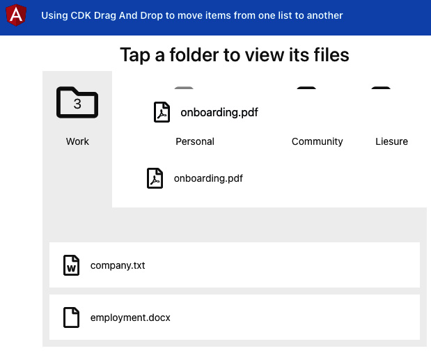
Figure 9.12 – Dragging and dropping a file to another folder
Ugly, isn't it? Well, this is because we have to fix the drag-and-drop previews in the next steps.
- In order to handle the drag-and-drop previews, we need to enclose them into an element with the cdkDropListGroup directive. Update the folders-list.component.html file and apply the directive to the element with the "folders" class, as follows:
<div class="folders" cdkDropListGroup>
...
</div>
- To apply a custom drag preview, we use a custom element with the *cdkDragPreview directive applied to it. Update the folders-list.component.html file, as follows:
<div class="folders" cdkDropListGroup>
...
<div class="folders__selected-folder-files" *ngIf="selectedFolder">
<div
cdkDropList
...
>
<app-file
cdkDrag
...
>
<fa-icon
class="file-drag-preview"
*cdkDragPreview
[icon]="file.icon"
></fa-icon>
</app-file>
</div>
</div>
</div>
- We'll also need some styles for the drag-and-drop previews. Update the folders-list.component.scss file, as follows:
$folder-bg: #f5f5f5;
$file-preview-transition: transform 250ms cubic-bezier(0, 0, 0.2, 1);
.folders {...}
.file-drag-preview {
padding: 10px 20px;
background: transparent;
font-size: 32px;
}
.file-drop-placeholder {
min-height: 60px;
transition: $file-preview-transition;
display: flex;
align-items: center;
justify-content: center;
font-size: 32px;
}
- Let's also add some styles to make sure the other list items move smoothly when reordering the items within a folder. Update the src/styles.scss file, as follows:
...
* {
user-select: none;
}
/* Animate items as they're being sorted. */
.cdk-drop-list-dragging .cdk-drag {
transition: transform 250ms cubic-bezier(0, 0, 0.2, 1);
}
/* Animate an item that has been dropped. */
.cdk-drag-animating {
transition: transform 300ms cubic-bezier(0, 0, 0.2, 1);
}
- Now, we need to create a drop preview template as well. For this, we use the *cdkDragPlaceholder directive on the preview element. Update the folders-list.component.html file, as follows:
<div class="folders" cdkDropListGroup>
...
<div class="folders__selected-folder-files" *ngIf="selectedFolder">
<div cdkDropList ...>
<app-file cdkDrag ...>
<fa-icon class="file-drag-preview"
*cdkDragPreview ... ></fa-icon>
<div class="file-drop-placeholder" *cdkDragPlaceholder>
<fa-icon [icon]="upArrow"></fa-icon>
</div>
</app-file>
</div>
</div>
</div>
- Finally, let's create an upArrow property using the faArrowAltCircleUp icon from the @fortawesome package. Update the folders-list.component.ts file, as follows:
import { Component, OnInit } from '@angular/core';
import { APP_DATA } from '../constants/data';
import { IFolder } from '../interfaces';
import { faArrowAltCircleUp } from '@fortawesome/free-regular-svg-icons';
import {
CdkDragDrop,
moveItemInArray,
transferArrayItem,
} from '@angular/cdk/drag-drop';
import { FileIconService } from '../core/services/file-icon.service';
@Component({...})
export class FoldersListComponent implements OnInit {
folders = APP_DATA;
selectedFolder: IFolder = null;
upArrow = faArrowAltCircleUp;
constructor(private fileIconService: FileIconService) {...}
...
}
And boom! We now have a seamless user experience (UX) for the entire drag-and-drop flow. Like it? Make sure that you share a snapshot on your Twitter and tag me at @muhd_ahsanayaz.
Now that we've finished the recipe, let's see in the next section how it all works.
How it works…
There were a couple of interesting directives in this recipe, and we'll go through them all one by one. First of all, as good Angular developers, we import the DragDropModule class into the imports array of our AppModule, just to make sure we don't end up with errors. Then, we start making the files draggable. We do this by adding the cdkDrag directive to each file element by applying the *ngFor directive to it. This tells the Angular CDK that this element will be dragged and, therefore, the Angular CDK binds different handlers to each element to be dragged.
Important note
Angular components by default are not block elements. Therefore, when applying the cdkDrag directive to an Angular component such as the <app-file> component, it might restrict the animations from the CDK being applied when we're dragging the elements. In order to fix this, we need to set a display: block; for our component elements. Notice that we're applying the required styles in the folders-list.component.scss file (line 25) for the .folders__selected-folder-files__file class.
After configuring the drag elements, we use the cdkDropList directive to each container DOM element where we're supposed to drop the file. In our recipe, that is each folder that we see on the screen, and we can also reorder the files within a folder. Therefore we apply the cdkDropList directive to the wrapper element of the currently displayed files, as well as to each <app-folder> item with the *ngFor looping over the folders array.
Then, we specify the data that we're dragging by specifying [cdkDragData]="file" for each draggable file. This helps us identify it in the later process, when we drop it either within the current folder or within other folders. We also specify in which array this dragged item will be added when dropped upon the particular list, and we do this by specifying [cdkDropListData]="ARRAY" statements on the elements that we've applied the cdkDropList directive to. When the Angular CDK combines the information from the cdkDragData and the cdkDropListData attributes, it can easily identify if the item was dragged and then dropped within the same list or in another list.
To handle what happens when we drop the dragged file, we use the (cdkDropListDropped) method from the Angular CDK on the element with the cdkDropList directive. We take the $event emitted from the CDK and pass it to our onFileDrop() method. What's great is that within the onFileDrop() method, we use the moveItemInArray() and transferArrayItem() helper methods from the Angular CDK, with a really simple logic to compare the containers. That is, the Angular CDK provides us enough information that we can get away with the whole functionality really easily.
Toward the end of the recipe, we customize how our drag preview should look when we are dragging a file using a custom template, by using the *cdkDragPreview directive on it. This tells the Angular CDK to not render it right away but to show it with the mouse when we start dragging a file. For our recipe, we only show the icon of the file as the drag preview. And finally, we also customize the drop preview (or drag placeholder) using the *cdkDragPlaceholder directive, which shows a transparent rectangle with an upward-arrow icon to reflect where the item is going to be added when dropped. Of course, we had to add some custom styles for both the drag preview and the drop preview.
See also
- Angular CDK Drag and Drop documentation (https://material.angular.io/cdk/drag-drop/overview)
Creating a multi-step game with the CDK Stepper API
If you try finding examples of the CDK Stepper over the internet, you'll find a bunch of articles revolving around creating multi-step forms using the CDK Stepper API, but since it is a stepper at its base, it can be used for various use cases. In this recipe, we're going to build a guessing game using the Angular CDK Stepper API, in which the user will guess what the output of a rolled dice will be.
Getting ready
The project that we are going to work with resides in chapter09/start_here/using-cdk-stepper, inside the cloned repository. Proceed as follows:
- Open the project in VS Code.
- Open the terminal and run npm install to install the dependencies of the project.
- Once done, run ng serve -o.
This should open the app in a new browser tab, and you should see something like this:

Figure 9.13 – The using-cdk-stepper app running on http://localhost:4200
Now, let's look at how to create a multi-step game with the CDK Stepper API in the next section.
How to do it…
We have a really simple yet interesting application at hand that has a couple of components built already, including the dice component, the value-guess component, and the leaderboard component. We'll create this game as a multi-step game using the Stepper API. Proceed as follows:
- First, open a new terminal window/tab and make sure you're inside the ch8/start_here/using-cdk-stepper folder. Once inside, run the following command to install the Angular CDK:
npm install --save @angular/[email protected]
- You'll have to restart your Angular server, so rerun the ng serve command.
- Now, import the CdkStepperModule class from the @angular/cdk package in your app.module.ts file, as follows:
...
import { LeaderBoardComponent } from './components/leader-board/leader-board.component';
import { CdkStepperModule } from '@angular/cdk/stepper';
...
@NgModule({
declarations: [...],
imports: [BrowserModule, AppRoutingModule, ReactiveFormsModule, CdkStepperModule],
providers: [],
bootstrap: [AppComponent],
})
export class AppModule {}
- Let's create our stepper component now. Run the following command in the project folder:
ng g c components/game-stepper
- To make our component a CdkStepper, we need to provide it using the CdkStepper token and have to extend our component class from CdkStepper as well. We can remove the constructor, the OnInit implementation, and the ngOnInit method. Modify the game-stepper.component.ts file, as follows:
import { Component } from '@angular/core';
import { CdkStepper } from '@angular/cdk/stepper';
@Component({
selector: 'app-game-stepper',
templateUrl: './game-stepper.component.html',
styleUrls: ['./game-stepper.component.scss'],
providers: [{ provide: CdkStepper, useExisting: GameStepperComponent }],
})
export class GameStepperComponent extends CdkStepper {
}
Notice that we have removed the usage of ngOnInit and the OnInit life cycle since we don't want these for this component.
- Let's add the template for our <game-stepper> component. We'll start by adding the header that will show the step label. Update your game-stepper.component.html file, as follows:
<section class="game-stepper">
<header>
<h3>
<ng-container
*ngIf="selected.stepLabel; else showLabelText"
[ngTemplateOutlet]=" selected.stepLabel.template"
>
</ng-container>
<ng-template #showLabelText>
{{ selected.label }}
</ng-template>
</h3>
</header>
</section>
- Now, we'll add the template to show our main content for the selected step—this is pretty simple to do. We need to add a div with the [ngTemplateOutlet] attribute, where we'll show the content. Update the game-stepper.component.html file, as follows:
<section class="game-stepper">
<header>
...
</header>
<section class="game-stepper__content">
<div [ngTemplateOutlet]="selected ? selected.content : null"></div>
</section>
...
</section>
- Finally, we'll add a footer element that'll contain the navigation buttons for our stepper— that is, we should be able to jump to the next and the previous step using those navigation buttons. Update the game-stepper.component.html file further, as follows:
<section class="game-stepper">
...
<section class="game-stepper__content">
<div [ngTemplateOutlet]="selected ? selected.content : null"></div>
</section>
<footer class="game-stepper__navigation">
<button
class="game-stepper__navigation__button btn btn-primary"
cdkStepperPrevious
[style.visibility]="steps.get(selectedIndex - 1) ? 'visible' : 'hidden'"
>
←
</button>
<button
class="game-stepper__navigation__button btn btn-primary"
cdkStepperNext
[style.visibility]="steps.get(selectedIndex + 1) ? 'visible' : 'hidden'"
>
→
</button>
</footer>
</section>
- Let's add some styles to our game-stepper component. Modify the game-stepper.component.scss file, as follows:
.game-stepper {
display: flex;
flex-direction: column;
align-items: center;
&__navigation {
width: 100%;
display: flex;
align-items: center;
justify-content: space-between;
> button {
margin: 0 8px;
}
}
&__content {
min-height: 350px;
display: flex;
justify-content: center;
align-items: center;
flex-direction: column;
}
header,
footer {
margin: 10px auto;
}
}
- We'll now wrap our entire template in the game.component.html file with the <app-game-stepper> component. Update the file, as follows:
<app-game-stepper>
<form (ngSubmit)="submitName()" [formGroup]="nameForm">
...
</form>
<app-value-guesser></app-value-guesser>
<app-dice></app-dice>
<app-leader-board></app-leader-board>
</app-game-stepper>
- We'll now modify our game.component.html file to break down the inner template into steps. For that, we'll use the <cdk-step> element to wrap around the content for each step. Update the file, as follows:
<app-game-stepper>
<cdk-step>
<form (ngSubmit)="submitName()" [formGroup]="nameForm">
...
</form>
</cdk-step>
<cdk-step>
<app-value-guesser></app-value-guesser>
<app-dice></app-dice>
</cdk-step>
<cdk-step>
<app-leader-board></app-leader-board>
</cdk-step>
</app-game-stepper>
- Now, we'll add a label for each step to show our main content for the selected step—this is pretty simple to do. We need to add an <ng-template> element within each <cdk-step> element. Update the game.component.html file, as follows:
<app-game-stepper>
<cdk-step>
<ng-template cdkStepLabel>Enter your name</ng-template>
<form (ngSubmit)="submitName()" [formGroup]="nameForm">
...
</form>
</cdk-step>
<cdk-step>
<ng-template cdkStepLabel>Guess what the value will be when the die is rolled</ng-template>
<app-value-guesser></app-value-guesser>
<app-dice></app-dice>
</cdk-step>
<cdk-step>
<ng-template cdkStepLabel> Results</ng-template>
<app-leader-board></app-leader-board>
</cdk-step>
</app-game-stepper>
If you refresh the app, you should see the first step as the visible step, as well as the bottom navigation button, as follows:

Figure 9.14 – The first step and the navigation button using CDKStepper
- Now, we need to make sure that we can only move forward to the second step once we have entered a name in the first step. Make the following changes to the game.component.html file:
<app-game-stepper [linear]="true">
<cdk-step [completed]="!!nameForm.get('name').value">
<ng-template cdkStepLabel> Enter your name</ng-template>
<form (ngSubmit)="submitName()" [formGroup]="nameForm">
<div class="mb-3" *ngIf="nameForm.get('name') as nameControl">
...
</div>
<button ← REMOVE THIS
type="submit"
[disabled]="!nameForm.valid"
class="btn btn-primary"
>
Submit
</button>
</form>
</cdk-step>
...
</app-game-stepper>
- We also need to disable the next button on the first step until we have entered a value for the player name. To do so, update the game-stepper.component.html file—specifically, the element with the cdkStepperNext attribute—as follows:
<section class="game-stepper">
...
<footer class="game-stepper__navigation">
...
<button
class="game-stepper__navigation__button btn btn-primary"
cdkStepperNext
[disabled]="!selected.completed"
[style.visibility]="steps.get(selectedIndex + 1) ? 'visible' : 'hidden'"
>
→
</button>
</footer>
</section>
- To handle the case when the user provides the name and hits the Enter key, resulting in the form submission, we can handle moving to the next step using a @ViewChild() in the GameComponent class. Modify the game.component.ts file as follows, and try entering the name and then pressing the Enter key:
import { CdkStepper } from '@angular/cdk/stepper';
import { Component, OnInit, ViewChild } from '@angular/core';
import { FormControl, FormGroup, Validators } from '@angular/forms';
@Component({...})
export class GameComponent implements OnInit {
@ViewChild(CdkStepper) stepper: CdkStepper;
nameForm = new FormGroup({
name: new FormControl('', Validators.required),
});
...
submitName() {
this.stepper.next();
}
}
- Now, let's write the flow for guessing the number. Update the game.component.ts file, as follows:
...
import { DiceComponent } from '../components/dice/dice.component';
import { ValueGuesserComponent } from '../components/value-guesser/value-guesser.component';
import { IDiceSide } from '../interfaces/dice.interface';
@Component({...})
export class GameComponent implements OnInit {
@ViewChild(CdkStepper) stepper: CdkStepper;
@ViewChild(DiceComponent) diceComponent: DiceComponent;
@ViewChild(ValueGuesserComponent)
valueGuesserComponent: ValueGuesserComponent;
guessedValue = null;
isCorrectGuess = null;
...
submitName() {...}
rollTheDice(guessedValue) {
this.isCorrectGuess = null;
this.guessedValue = guessedValue;
this.diceComponent.rollDice();
}
showResult(diceSide: IDiceSide) {
this.isCorrectGuess = this.guessedValue === diceSide.value;
}
}
- Now that we have the functions in place, let's update the template to listen to the event listeners from the <app-value-guesser> and <app-dice> components and to act accordingly. We'll also add .alert elements to show messages in case of a successful or wrong guess. Update the game.component.html file, as follows:
<app-game-stepper [linear]="true">
<cdk-step [completed]="!!nameForm.get('name').value">
...
</cdk-step>
<cdk-step [completed]="isCorrectGuess !== null">
<ng-template cdkStepLabel
>Guess what the value will be when the die is rolled</ng-template
>
<app-value-guesser (valueGuessed)="rollTheDice ($event)"></app-value-guesser>
<app-dice (diceRolled)="showResult($event)"> </app-dice>
<ng-container [ngSwitch]="isCorrectGuess">
<div class="alert alert-success" *ngSwitchCase="true">
You rock {{ nameForm.get('name').value }}! You got 50 points
</div>
<div class="alert alert-danger" *ngSwitchCase="false">
Oops! Try again!
</div>
</ng-container>
</cdk-step>
<cdk-step>...</cdk-step>
</app-game-stepper>
- Finally, we need to populate the leaderboards. Update the game.component.ts file to use the LeaderboardService class, as follows:
...
import { LeaderboardService } from '../core/services/leaderboard.service';
import { IDiceSide } from '../interfaces/dice.interface';
import { IScore } from '../interfaces/score.interface';
@Component({...})
export class GameComponent implements OnInit {
...
scores: IScore[] = [];
constructor(private leaderboardService: LeaderboardService) {}
ngOnInit(): void {
this.scores = this.leaderboardService.getScores();
}
...
showResult(diceSide: IDiceSide) {
this.isCorrectGuess = this.guessedValue === diceSide.value;
if (!this.isCorrectGuess) {
return;
}
this.scores = this.leaderboardService.setScores({
name: this.nameForm.get('name').value,
score: 50,
});
}
}
- Now, update the game.component.html file to pass the scores as an attribute to the <app-leader-board> component, as follows:
<app-game-stepper [linear]="true">
<cdk-step [completed]="!!nameForm.get('name').value">
...
</cdk-step>
<cdk-step [completed]="isCorrectGuess !== null">
...
</cdk-step>
<cdk-step>
<ng-template cdkStepLabel>Results</ng-template>
<app-leader-board [scores]="scores"></app-leader- board>
</cdk-step>
</app-game-stepper>
If you refresh the app now and play the game, you should be able to see the leaderboard, as follows:
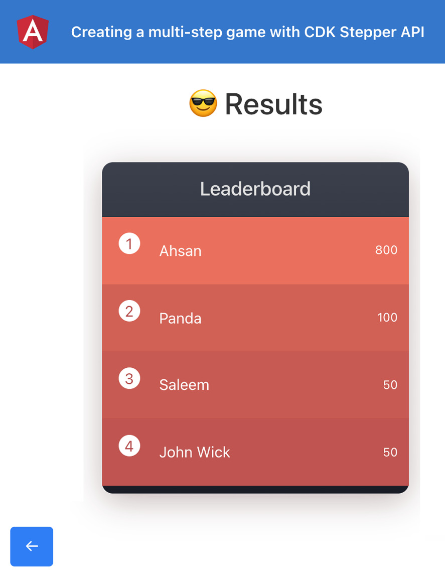
Figure 9.15 – Displaying results in the leaderboard at Step 3
Phew! That was a LONG recipe! Well, perfection requires time and dedication. Feel free to use this game yourself or even with your friends, and if you improve it, do let me know on my socials.
Now that you've finished the recipe, see the next section on how this works.
How it works…
There are a lot of moving parts in this recipe, but they're super-easy. First, we import the CdkStepperModule class into the imports array of our AppModule class. Then, we create a component that extends the CdkStepper class. The reason for extending the CdkStepper class is to be able to create this GameStepperComponent component so that we can create a reusable template with some styles, and even some custom functionality.
To start using the GameStepperComponent component, we wrap the entire template within the <app-game-stepper> element in the game.component.html file. Since the component extends the CdkStepper API, we can use all the functionality of the CdkStepper component here. For each step, we use the <cdk-step> element from the CDK and wrap the template of the step inside it. Notice that in the game-stepper.component.html file, we use the [ngTemplateOutlet] attribute for both the step's label and the step's actual content. This is a reflection of how amazing the CdkStepper API is. It automatically generates the step.label property and the content property on each step based on the values/template we provide for each step. Since we provide an <ng-template cdkStepLabel> inside each <cdk-step> element, the CDK generates a step.stepLabel.template automatically, which we then use inside the game-stepper.component.html file, as mentioned. If we didn't provide it, it would then use the step.label property as per our code.
For the bottom navigation buttons, you notice that we use <button> elements with the cdkStepperPrevious and cdkStepperNext directives for going to the previous step and the next step respectively. We also show/hide the next and previous button based on the conditions to check if there is a step to go to. We hide the navigation button using the [style.visibility] binding, as you see in the code.
One interesting thing about the CdkStepper API is that we can tell whether the user should be able to go to the next steps and backward, regardless of the state of the current step, or whether the user should first do something in the current step to go to the next one. The way we do it is by using the [linear] attribute on our <app-game-stepper> element, by setting its value to true. This tells the CdkStepper API to not move to the next step using the cdkStepperNext button, until the current step's completed property is true. While just providing [linear]="true" is enough to handle the functionality, we improve the UX by disabling the Next button—in this case, by using [disabled]="!selected.completed" on the cdkStepperNext button, as it makes more sense to just disable the button if it isn't going to do anything on click.
Also, we needed to decide when a step is considered complete. For the first step, it is obvious that we should have a name entered in the input to consider the step completed—or, in other words, the FormControl for the 'name' property in the nameForm FormGroup should have a value. For the second step, it makes sense that after the user has guessed a number, regardless of whether the guess is correct or not, we mark the step as completed and let the user go to the next step (the leaderboard) if the user wants to. And that's pretty much about it.
See also
- Angular CDK Stepper examples (https://material.angular.io/cdk/stepper/examples)
Resizing text inputs with the CDK TextField API
Text inputs are an essential part of our everyday computer usage. Be it filling a form, searching some content on Google, or finding your favorite YouTube video, we all interact with text inputs, and when we have to write a bunch of content into a single text input, it really is necessary to have a good UX. In this recipe, you'll learn how to automatically resize the <textarea> inputs based on the input value, using the CDK TextField API.
Getting ready
The project for this recipe resides in chapter09/start_here/resizable-text-inputs-using-cdk. Proceed as follows:
- Open the project in VS Code.
- Open the terminal and run npm install to install the dependencies of the project.
- Once done, run ng serve -o.
This should open the app in a new browser tab, and you should be able to see the app. Try typing a long text, and you'll see the text area displaying as follows:

Figure 9.16 – The resizable-text-inputs-using-cdk app running on http://localhost:4200
Now that we have the app running locally, let's see the steps of the recipe in the next section.
How to do it…
In Figure 9.16, you will notice that we can't see the entire content of the input—this is somewhat annoying at the best of times because you can't really review it before pressing the Action button. Let's use the CDK TextField API by following these steps:
- First, open a new terminal window/tab and make sure you're inside the chapter09/start_here/resizable-text-inputs-using-cdk folder. Once inside, run the following command to install the Angular CDK:
npm install --save @angular/[email protected]
- You'll have to restart your Angular server, so rerun the ng serve command.
- Now, we need to import the TextFieldModule class into the imports array of our AppModule class. Modify the app.module.ts file, as follows:
...
import { TextFieldModule } from '@angular/cdk/text-field';
@NgModule({
declarations: [...],
imports: [
BrowserModule,
AppRoutingModule,
TextFieldModule
],
...
})
export class AppModule { }
- Now, we'll apply the cdkTextareaAutosize directive to our <text-area> element so that it can be resized automatically based on the content. Update the write-message.component.html file, as follows:
<div class="write-box-container">
<div class="write-box">
<textarea
cdkTextareaAutosize
placeholder="Enter your message here"
class="chat-input"
[(ngModel)]="chatInput"
rows="1"
(keyup.enter)="sendMessage()"
></textarea>
</div>
<div class="send-button">
...
</div>
</div>
If you now enter some long phrases in the text input, you should see it being resized properly, as follows:

Figure 9.17 – text-area being resized based on the content
While this is awesome, you might notice that once the message is sent (that is, added to the messages list), the size of the <text-area> element isn't reset to its initial state.
- In order to reset the size of the <text-area> element to its initial size, we'll use the reset() method of the CdkTextareaAutosize directive. To do so, we'll get the directive as a ViewChild and will then trigger the reset() method. Modify the write-message.component.ts file, as follows:
import { CdkTextareaAutosize } from '@angular/cdk/text-field';
import {
...
EventEmitter,
ViewChild,
} from '@angular/core';
...
@Component({...})
export class WriteMessageComponent implements OnInit {
@Output() public onMessageSent = new EventEmitter<any>();
@ViewChild(CdkTextareaAutosize) newMessageInput: CdkTextareaAutosize;
public chatInput = '';
...
/**
* @author Ahsan Ayaz
* Creates a new message and emits to parent component
*/
sendMessage() {
if (this.chatInput.trim().length) {
...
this.chatInput = '';
this.newMessageInput.reset();
}
}
}
Great! With this change, when you refresh the page, enter a really long sentence in the input and hit the Enter key. You'll see the size of the <text-area> element being reset, as follows:

Figure 9.18 – <text-area> size being reset on new message creation
Now that you have finished the recipe, see the next section to understand how it works.
How it works…
In the recipe, we've used two main things from the CDK Clipboard API—one is the cdkCopyToClipboard directive, and the other is the Clipboard service. The cdkCopyToClipboard directive binds a click handler to the element this directive is applied to. It works both as the selector of the directive as well as an @Input() item for the directive so that it knows which value is to be copied to the clipboard when the element is clicked. In our recipe, for the link input, notice that we use [cdkCopyToClipboard]="linkInput.value". This binds a click handler to the <input> element and also binds the value property of the linkInput template variable that points to the value of the input—that is, the actual link to be copied. When we click the input, it accesses the value of the input using the linkInput.value binding, and we do the same for the <text-area> input. The only difference is that the cdkCopyToClipboard directive is not bound to the <text-area> element itself. The reason is that we want to bind the click handler to the button below the text area instead. Therefore, on the button for copying the text, we have the [cdkCopyToClipboard]="textInput.value" binding.
For the image, we do something different. We use the Clipboard service from the @angular/cdk/clipboard package to manually copy the blob URL. We create a method named copyImageUrl() that is called when clicking the button for copying the image. We pass the imageUrl property to this method, which in turn downloads the image, reads it as a blob, and generates the blob URL, which is copied to the clipboard using the copy() method of the Clipboard service.
See also
- CDK text-field documentation (https://material.angular.io/cdk/text-field/overview)