
Chapter 3: Building an Issue Tracking System using Reactive Forms
Web applications use HTML forms to collect data from users and validate them, such as when logging in to an application, performing a search, or completing an online payment. The Angular framework provides two types of forms, reactive and template-driven, that we can use in an Angular application.
In this chapter, we will build a system for managing and tracking issues. We will use Angular reactive forms for reporting new issues. We will also use Clarity Design System from VMware for designing our forms and displaying our issues.
We will cover the following topics:
- Installing the Clarity Design System to an Angular application
- Displaying an overview of issues
- Reporting new issues
- Marking an issue as resolved
- Turning on suggestions for new issues
Essential background theory and context
The Angular framework provides two types of forms that we can use:
- Template-driven: They are easy and straightforward to set up in an Angular application. Template-driven forms do not scale well and are difficult to test because they are defined in the template of the component.
- Reactive: They are based on a reactive programming approach. Reactive forms operate in the TypeScript class of the component, and they are easier to test and scale better than template-driven forms.
In this chapter, we will get hands-on with the reactive forms approach, which is the most popular in the Angular community.
Angular components can get data either from external sources such as HTTP or from other Angular components. In the latter case, they interact with components that have data using a public API:
- @Input(): This is used to pass data into a component.
- @Output(): This is used to get notified about changes or get data back from a component.
Clarity is a design system that contains a set of UX and UI guidelines for building web applications. It also consists of a proprietary HTML and CSS framework packed with these guidelines. Luckily, we do not have to use this framework since Clarity already provides a wide variety of Angular-based UI components that we can use in our Angular applications.
Project overview
In this project, we will build an Angular application for managing and tracking issues using reactive forms and Clarity. Initially, we will display a list of issues in a table that we can sort and filter. We will then create a form for allowing users to report new issues. Finally, we will create a modal dialog for resolving an issue. We will also go the extra mile and turn on suggestions when reporting an issue to help users avoid duplicate entries.
Build time: 1 hour
Getting started
The following software tools are required for completing this project:
- Angular CLI: A command-line interface for Angular that you can find at https://angular.io/cli
- GitHub material: The related code for this chapter that you can find in the Chapter03 folder at https://github.com/PacktPublishing/Angular-Projects-Second-Edition.
Installing Clarity to an Angular application
Let's start creating our issue tracking system by scaffolding a new Angular application:
ng new issue-tracker --defaults
We use the ng new command of the Angular CLI to create a new Angular application with the following characteristics:
- issue-tracker: The name of the Angular application.
- --defaults: This disables Angular routing for the application and sets the stylesheet format to be CSS.
We now need to install the Clarity library in our Angular application. The VMware team has created an Angular CLI schematic that we can use. Navigate to the issue-tracker folder that was created with the preceding command and run the following add command of the Angular CLI:
ng add @clr/angular
The previous command will perform the following modifications in our Angular CLI workspace:
- It will add all the necessary npm packages of the Clarity library to the dependencies section of the package.json file.
- It will add the necessary styles in the configuration file of the Angular CLI workspace, angular.json:
"styles": [
"node_modules/@clr/ui/clr-ui.min.css",
"src/styles.css"
]
- Finally, it will import ClarityModule in the main application module, app.module.ts:
import { NgModule } from '@angular/core';
import { BrowserModule } from '@angular/platform-browser';
import { AppComponent } from './app.component';
import { ClarityModule } from '@clr/angular';
import { BrowserAnimationsModule } from
'@angular/platform-browser/animations';
@NgModule({
declarations: [
AppComponent
],
imports: [
BrowserModule,
ClarityModule,
BrowserAnimationsModule
],
providers: [],
bootstrap: [AppComponent]
})
export class AppModule { }
It will also import BrowserAnimationsModule from the @angular/platform-browser/animations npm package. BrowserAnimationsModule is used to display animations when specific actions happen in our application, such as clicking a button.
Now that we have completed installing Clarity in our application, we can start building beautiful designs with it. In the following section, we will begin by creating a list for displaying our issues.
Displaying an overview of issues
Our Angular application will be responsible for managing and tracking issues. When the application starts up, we should display a list of all pending issues in the system. Pending issues are defined as those issues that have not been resolved. The process that we will follow can be further analyzed into the following:
- Fetching pending issues
- Visualizing issues using a data grid
Fetching pending issues
First, we need to create a mechanism for fetching all pending issues:
- Use the generate command of the Angular CLI to create an Angular service named issues:
ng generate service issues
The preceding command will create an issues.service.ts file in the srcapp folder of our Angular CLI project.
- Every issue will have specific properties of a defined type. We need to create a TypeScript interface for that with the following Angular CLI command:
ng generate interface issue
The previous command will create an issue.ts file in the srcapp folder of the project.
- Open the issue.ts file and add the following properties in the Issue interface:
export interface Issue {
issueNo: number;
title: string;
description: string;
priority: 'low' | 'high';
type: 'Feature' | 'Bug' | 'Documentation';
completed?: Date;
}
The completed property is the date that an issue is resolved. We define it as optional because new issues will not have this property set.
- Open the Angular service that we created in step 1 and add an issues property to hold our issue data. Also create a getPendingIssues method that will return all issues that have not been completed:
import { Injectable } from '@angular/core';
import { Issue } from './issue';
@Injectable({
providedIn: 'root'
})
export class IssuesService {
private issues: Issue[] = [];
constructor() { }
getPendingIssues(): Issue[] {
return this.issues.filter(issue =>
!issue.completed);
}
}
- We initialize the issues property to an empty array. If you want to get started with sample data, you can use the mock-issues.ts file from the srcassets folder that exists in the GitHub material of this chapter and import it as follows:
import { issues } from '../assets/mock-issues';
In the following section, we will create a component for displaying those issues.
Visualizing issues in a data grid
We are going to use the data grid UI component of the Clarity library to display data in a tabular format. A data grid also provides mechanisms for filtering and sorting out of the box. Let's create the Angular component that will host the data grid first:
- Use the generate command of the Angular CLI to create the component:
ng generate component issue-list
- Open the template of the main component of our application, app.component.html, and replace its content with the following HTML code:
<div class="main-container">
<div class="content-container">
<div class="content-area">
<app-issue-list></app-issue-list>
</div>
</div>
</div>
The list of issues will be displayed in the main component of the Angular application, as soon as it starts up.
- Currently, the app-issue-list component does not display any issue data. We need to connect it with the Angular service that we created in the Fetching pending issues section. Open the issue-list.component.ts file and inject IssuesService in the constructor of the IssueListComponent class:
import { Component, OnInit } from '@angular/core';
import { IssuesService } from '../issues.service';
@Component({
selector: 'app-issue-list',
templateUrl: './issue-list.component.html',
styleUrls: ['./issue-list.component.css']
})
export class IssueListComponent implements OnInit {
constructor(private issueService: IssuesService) { }
ngOnInit(): void {
}
}
- Create a method named getIssues that will call the getPendingIssues method of the injected service and keep its returned value in the issues component property:
import { Component, OnInit } from '@angular/core';
import { Issue } from '../issue';
import { IssuesService } from '../issues.service';
@Component({
selector: 'app-issue-list',
templateUrl: './issue-list.component.html',
styleUrls: ['./issue-list.component.css']
})
export class IssueListComponent implements OnInit {
issues: Issue[] = [];
constructor(private issueService: IssuesService) { }
ngOnInit(): void {
}
private getIssues() {
this.issues =
this.issueService.getPendingIssues();
}
}
- Finally, call the getIssues method in the ngOnInit component method to get all pending issues upon component initialization:
ngOnInit(): void {
this.getIssues();
}
We have already implemented the process for getting issue data in our component. All we have to do now is display it in the template. Open the issue-list.component.html file and replace its content with the following HTML code:
issue-list.component.html
<clr-datagrid>
<clr-dg-column [clrDgField]="'issueNo'"
[clrDgColType]="'number'">Issue No</clr-dg-column>
<clr-dg-column [clrDgField]="'type'">Type</clr-dg-column>
<clr-dg-column [clrDgField]="'title'">Title</clr-dg-
column>
<clr-dg-column [clrDgField]="'description'">Description
</clr-dg-column>
<clr-dg-column [clrDgField]="'priority'">Priority
</clr-dg-column>
<clr-dg-row *clrDgItems="let issue of issues">
<clr-dg-cell>{{issue.issueNo}}</clr-dg-cell>
<clr-dg-cell>{{issue.type}}</clr-dg-cell>
<clr-dg-cell>{{issue.title}}</clr-dg-cell>
<clr-dg-cell>{{issue.description}}</clr-dg-cell>
<clr-dg-cell>
<span class="label" [class.label-danger]=
"issue.priority === 'high'">{{issue.priority}}</span>
</clr-dg-cell>
</clr-dg-row>
<clr-dg-footer>{{issues.length}} issues</clr-dg-footer>
</clr-datagrid>
In the preceding snippet, we use several Angular components of the Clarity library:
- clr-datagrid: Defines a table.
- clr-dg-column: Defines a column of a table. Each column uses the clrDgField directive to bind to the property name of the issue represented by that column. The clrDgField directive provides us with sorting and filtering capabilities without writing even a single line of code in the TypeScript class file. Sorting works automatically only with string-based content. If we want to sort by a different primitive type, we must use the clrDgColType directive and specify the particular type.
- clr-dg-row: Defines a row of a table. It uses the clrDgItems directive to iterate over the issues and create one row for each issue.
- clr-dg-cell: Each row contains a collection of clr-dg-cell components to display the value of each column using interpolation. In the last cell, we add the label-danger class when an issue has a high priority to indicate its importance.
- clr-dg-footer: Defines the footer of a table. In this case, it displays the total number of issues.
If we run our Angular application using ng serve, the output will look like the following:

Figure 3.1 – Overview of pending issues
Important Note
In the previous screenshot, the application uses sample data from the mock-issues.ts file.
The data grid component of the Clarity library has a rich set of capabilities that we can use in our Angular applications. In the following section, we will learn how to use reactive forms to report a new issue.
Reporting new issues
One of the main features of our issue tracking system is the ability to report new issues. We will use Angular reactive forms to create a form for adding new issues. The feature can be further subdivided into the following tasks:
- Setting up reactive forms in an Angular application
- Creating the report issue form
- Displaying a new issue in the list
- Validating the details of an issue
Let's begin by introducing reactive forms in our Angular application.
Setting up reactive forms in an Angular application
Reactive forms are defined in the @angular/forms npm package of the Angular framework:
- Open the app.module.ts file and import ReactiveFormsModule:
import { ReactiveFormsModule } from '@angular/forms';
- Add ReactiveFormsModule into the imports array of the @NgModule decorator:
@NgModule({
declarations: [
AppComponent,
IssueListComponent
],
imports: [
BrowserModule,
ClarityModule,
BrowserAnimationsModule,
ReactiveFormsModule
],
providers: [],
bootstrap: [AppComponent]
})
ReactiveFormsModule contains all necessary Angular directives and services that we will need to work with forms, as we will see in the following section.
Creating the report issue form
Now that we have introduced reactive forms in our Angular application, we can start building our form:
- Create a new Angular component named issue-report:
ng generate component issue-report
- Open the issue-report.component.ts file and inject FormBuilder in the constructor of the IssueReportComponent class:
import { Component, OnInit } from '@angular/core';
import { FormBuilder } from '@angular/forms';
@Component({
selector: 'app-issue-report',
templateUrl: './issue-report.component.html',
styleUrls: ['./issue-report.component.css']
})
export class IssueReportComponent implements OnInit {
constructor(private builder: FormBuilder) { }
ngOnInit(): void {
}
}
FormBuilder is an Angular service that we use to build a reactive form in an easy and convenient way.
- Declare an issueForm property of the FormGroup type and initialize it inside the ngOnInit method:
import { Component, OnInit } from '@angular/core';
import { FormBuilder, FormGroup } from
'@angular/forms';
@Component({
selector: 'app-issue-report',
templateUrl: './issue-report.component.html',
styleUrls: ['./issue-report.component.css']
})
export class IssueReportComponent implements OnInit {
issueForm: FormGroup | undefined;
constructor(private builder: FormBuilder) { }
ngOnInit(): void {
this.issueForm = this.builder.group({
title: [''],
description: [''],
priority: [''],
type: ['']
});
}
}
FormGroup is used to group individual controls into a logical representation of a form. The group method of the FormBuilder class is used to build the form. It accepts an object as a parameter where each key is the unique name of a form control and each value an array that contains its default value. In this case, we initialize all controls to empty strings because the form will be used to create a new issue from scratch.
- We now need to associate the FormGroup object that we created with the respective HTML elements. Open the issue-report.component.html file and replace its content with the following HTML code:
<h3>Report an issue</h3>
<form clrForm *ngIf="issueForm" [formGroup]="issueForm">
<clr-input-container>
<label>Title</label>
<input clrInput formControlName="title" />
</clr-input-container>
<clr-textarea-container>
<label>Description</label>
<textarea clrTextarea
formControlName="description"></textarea>
</clr-textarea-container>
<clr-radio-container clrInline>
<label>Priority</label>
<clr-radio-wrapper>
<input type="radio" value="low" clrRadio
formControlName="priority" />
<label>Low</label>
</clr-radio-wrapper>
<clr-radio-wrapper>
<input type="radio" value="high" clrRadio
formControlName="priority" />
<label>High</label>
</clr-radio-wrapper>
</clr-radio-container>
<clr-select-container>
<label>Type</label>
<select clrSelect formControlName="type">
<option value="Feature">Feature</option>
<option value="Bug">Bug</option>
<option value="Documentation">Documentation
</option>
</select>
</clr-select-container>
</form>
The formGroup and clrForm directives are used to associate the HTML form element with the issueForm property and identify it as a Clarity form.
The formControlName directive is used to associate HTML elements with form controls using their name. Each control is also defined using a Clarity container element. For example, the title input control is a clr-input-container component that contains an input HTML element.
Each native HTML element has a Clarity directive attached to it according to its type. For example, the input HTML element contains a clrInput directive.
- Finally, add some styles to our issue-report.component.css file:
.clr-input, .clr-textarea {
width: 30%;
}
button {
margin-top: 25px;
}
Now that we have created the basics of our form, we will learn how to submit its details:
- Add an HTML button element before the closing tag of the HTML form element:
<button class="btn btn-primary" type="submit">
Create</button>
We set its type to submit to trigger form submission upon clicking the button.
- Open the issues.service.ts file and add a createIssue method that inserts a new issue into the issues array:
createIssue(issue: Issue) {
issue.issueNo = this.issues.length + 1;
this.issues.push(issue);
}
We automatically assign a new issueNo to the issue before adding it to the issues array.
Tip
The issueNo property is currently calculated according to the length of the issues array. A better approach would be to implement a generator mechanism for creating unique and random issueNo values.
- Return to the issue-report.component.ts file, import IssuesService, and inject it to the constructor of the TypeScript class:
constructor(private builder: FormBuilder, private issueService: IssuesService) { }
- Add a new component method that will call the createIssue method of the injected service:
addIssue() {
this.issueService.createIssue(this.issueForm?.value);
}
We pass the value of each form control using the value property of the issueForm object.
Important Note
The value property of a FormGroup object contains the model of the form. The keys of the model match the property names of the Issue interface, which is the type that the createIssue method accepts as a parameter. If those were different, we should convert the form model before passing it to the method.
- Open the issue-report.component.html file and bind the ngSubmit event of the form to the addIssue component method:
<form clrForm *ngIf="issueForm" [formGroup]="issueForm" (ngSubmit)="addIssue()">
The ngSubmit event will be triggered when we click on the Create button of the form.
We have now completed all the processes involved to add a new issue to the system. In the following section, we will learn how to display a newly created issue in the table of pending issues.
Displaying a new issue in the list
Displaying issues and creating new ones are two tasks delegated to different Angular components. When we create a new issue with IssueReportComponent, we need to notify IssueListComponent to reflect that change in the table. First, let's see how we can configure IssueReportComponent to communicate that change:
- Open the issue-report.component.ts file and use the @Output() decorator to add an EventEmitter property:
@Output() formClose = new EventEmitter();
Output and EventEmitter symbols can be imported from the @angular/core npm package.
- Call the emit method of the formClose output property inside the addIssue component method, right after creating the issue:
addIssue() {
this.issueService.createIssue(this.issueForm?.value);
this.formClose.emit();
}
- Add a second HTML button element in the template of the component and call the emit method on its click event:
<button class="btn btn-primary" type="submit">Create
</button>
<button class="btn" type="button"
(click)="formClose.emit()">Cancel</button>
IssueListComponent can now bind to the formClose event of IssueReportComponent and be notified when any of the buttons are clicked. Let's find out how:
- Open the issue-list.component.ts file and add the following property in the IssueListComponent class:
showReportIssue = false;
The showReportIssue property will toggle the appearance of the report issue form.
- Add the following component method that will be called when the report issue form emits the formClose event:
onCloseReport() {
this.showReportIssue = false;
this.getIssues();
}
The onCloseReport method will set the showReportIssue property to false so that the report issue form is no longer visible, and the table of pending issues is displayed instead. It will also fetch issues again to refresh the data in the table.
- Open the issue-list.component.html file and add an HTML button element at the top of the template. The button will display the report issue form when clicked:
<button class="btn btn-primary" (click)=
"showReportIssue = true">Add new issue</button>
- Group the button and the data grid inside an ng-container element. As indicated by the *ngIf Angular directive, contents of the ng-container element will be displayed when the report issue form is not visible:
<ng-container *ngIf="showReportIssue === false">
<button class="btn btn-primary" (click)=
"showReportIssue = true">Add new issue</button>
<clr-datagrid>
<clr-dg-column [clrDgField]="'issueNo'"
[clrDgColType]="'number'">Issue No</clr-dg-column>
<clr-dg-column [clrDgField]="'type'">Type</clr-dg-
column>
<clr-dg-column [clrDgField]="'title'">Title</clr-
dg-column>
<clr-dg-column [clrDgField]="'description'">
Description</clr-dg-column>
<clr-dg-column [clrDgField]="'priority'">Priority
</clr-dg-column>
<clr-dg-row *clrDgItems="let issue of issues">
<clr-dg-cell>{{issue.issueNo}}</clr-dg-cell>
<clr-dg-cell>{{issue.type}}</clr-dg-cell>
<clr-dg-cell>{{issue.title}}</clr-dg-cell>
<clr-dg-cell>{{issue.description}}</clr-dg-cell>
<clr-dg-cell>
<span class="label" [class.label-
danger]="issue.priority === 'high'">
{{issue.priority}}</span>
</clr-dg-cell>
</clr-dg-row>
<clr-dg-footer>{{issues.length}} issues</clr-dg-
footer>
</clr-datagrid>
</ng-container>
The ng-container element is an Angular component that is not rendered on the screen, and it is used to group HTML elements.
- Add the app-issue-report component at the end of the template and use the *ngIf directive to display it when the showReportIssue property is true. Bind also its formClose event to the onCloseReport component method:
<app-issue-report *ngIf="showReportIssue == true"
(formClose)="onCloseReport()"></app-issue-report>
We have successfully connected all the dots and completed the interaction between the report issue form and the table that displays issues. Now it is time to put them in action:
- Run the Angular application using ng serve.
- Click on the ADD NEW ISSUE button and enter the details of a new issue:
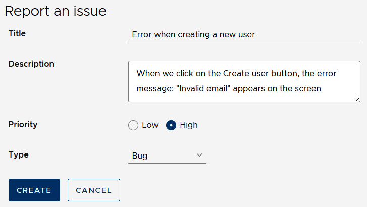
Figure 3.2 – Report issue form
- Click on the CREATE button, and the new issue should appear in the table:
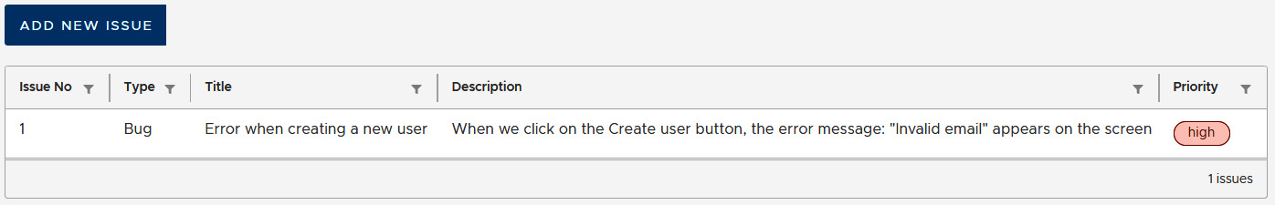
Figure 3.3 – Pending issues
- Repeat steps 2 and 3 without filling in any details, and you will notice that an empty issue is added to the table.
An empty issue can be created because we have not defined any required fields yet on our report issue form. In the following section, we will learn how to accomplish this task and add validations to our form to avoid unexpected behaviors.
Validating the details of an issue
When we create an issue with the report issue form, we can leave the value of a form control empty since we have not added any validation rules yet. To add validations in a form control, we use the Validators class from the @angular/forms npm package. A validator is added in each form control instance that we build using the FormBuilder service. In this case, we will use the required validator to indicate that a form control is required to have a value:
- Open the issue-report.component.ts file and import Validators from the @angular/forms npm package:
import { FormBuilder, FormGroup, Validators } from
'@angular/forms';
- Set the Validators.required static property in all controls except the description of the issue:
ngOnInit(): void {
this.issueForm = this.builder.group({
title: ['', Validators.required],
description: [''],
priority: ['', Validators.required],
type: ['', Validators.required]
});
}
We can use various validators for a form control, such as min, max, and email. If we want to set multiple validators in a form control, we add them inside an array.
- When we use validators in a form, we need to provide a visual indication to the user of the form. Open the issue-report.component.html file and add a clr-control-error component for each required form control:
<clr-input-container>
<label>Title</label>
<input clrInput formControlName="title" />
<clr-control-error>Title is required
</clr-control-error>
</clr-input-container>
<clr-textarea-container>
<label>Description</label>
<textarea clrTextarea formControlName="description">
</textarea>
</clr-textarea-container>
<clr-radio-container clrInline>
<label>Priority</label>
<clr-radio-wrapper>
<input type="radio" value="low" clrRadio
formControlName="priority" />
<label>Low</label>
</clr-radio-wrapper>
<clr-radio-wrapper>
<input type="radio" value="high" clrRadio
formControlName="priority" />
<label>High</label>
</clr-radio-wrapper>
<clr-control-error>Priority is required
</clr-control-error>
</clr-radio-container>
<clr-select-container>
<label>Type</label>
<select clrSelect formControlName="type">
<option value="Feature">Feature</option>
<option value="Bug">Bug</option>
<option value="Documentation">Documentation
</option>
</select>
<clr-control-error>Type is required
</clr-control-error>
</clr-select-container>
clr-control-error is a Clarity component that is used to provide validation messages in forms. It is displayed when we touch a control that is invalid. A control is invalid when at least one of its validation rules is violated.
- The user may not always touch form controls to see the validation message. So, we need to take that into account upon form submission and act accordingly. To overcome this case, we will mark all form controls as touched when the form is submitted:
addIssue() {
if (this.issueForm && this.issueForm.invalid) {
this.issueForm.markAllAsTouched();
return;
}
this.issueService.createIssue(this.issueForm?.value);
this.formClose.emit();
}
In the preceding snippet, we use the markAllAsTouched method of the issueForm property to mark all controls as touched when the form is invalid. Marking controls as touched makes validation messages appear automatically. Additionally, we use a return statement to prevent the creation of the issue when the form is invalid.
- Run ng serve to start the application. Click inside the Title input, and then move the focus out of the form control:
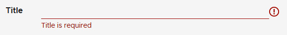
Figure 3.4 – Title validation message
A message should appear underneath the Title input stating that we have not entered any value yet. Validation messages in the Clarity library are indicated by text and an exclamation icon in red in the form control that is validated.
- Now, click on the CREATE button:

Figure 3.5 – Form validation messages
All validation messages will appear on the screen at once, and the form will not be submitted. Validations in reactive forms are an essential part of ensuring a smooth UX for our Angular applications. In the following section, we will learn how to create a modal dialog with Clarity and use it to resolve issues from our list.
Resolving an issue
The main idea behind having an issue tracking system is that an issue should be resolved at some point. We will create a user workflow in our application to accomplish such a task. We will be able to resolve an issue directly from the list of pending issues. The application will ask for confirmation from the user before resolving with the use of a modal dialog:
- Create an Angular component to host the dialog:
ng generate component confirm-dialog
- Open the confirm-dialog.component.ts file and create the following input and output properties in the ConfirmDialogComponent class:
import { Component, EventEmitter, Input, Output } from
'@angular/core';
@Component({
selector: 'app-confirm-dialog',
templateUrl: './confirm-dialog.component.html',
styleUrls: ['./confirm-dialog.component.css']
})
export class ConfirmDialogComponent {
@Input() issueNo: number | null = null;
@Output() confirm = new EventEmitter<boolean>();
}
We will use the @Input() decorator to get the issue number and display it on the template of the component. The confirm EventEmitter property will emit a boolean value to indicate whether the user confirmed to resolve the issue or not.
- Create two methods that will call the emit method of the confirm output property, either with true or false:
agree() {
this.confirm.emit(true);
this.issueNo = null;
}
disagree() {
this.confirm.emit(false);
this.issueNo = null;
}
Both methods will set the issueNo property to null because that property will also control whether the modal dialog is opened or not. So, we want to close the dialog when the user agrees to resolve the issue or not.
We have set up the TypeScript class of our dialog component. Let's wire it up now with its template. Open the confirm-dialog.component.html file and replace its content with the following:
confirm-dialog.component.html
<clr-modal [clrModalOpen]="issueNo !== null"
[clrModalClosable]="false">
<h3 class="modal-title">
Resolve Issue #
{{issueNo}}
</h3>
<div class="modal-body">
<p>Are you sure you want to close the issue?</p>
</div>
<div class="modal-footer">
<button type="button" class="btn btn-outline"
(click)="disagree()">Cancel</button>
<button type="button" class="btn btn-danger"
(click)="agree()">Yes, continue</button>
</div>
</clr-modal>
A Clarity modal dialog consists of a clr-modal component and a collection of HTML elements with specific classes:
- modal-title: The title of the dialog that displays the current issue number.
- modal-body: The main content of the dialog.
- modal-footer: The footer of the dialog that is commonly used to add actions for that dialog. We currently add two HTML button elements and bind their click events to the agree and disagree component methods, respectively.
Whether it is opened or closed, the current status of the dialog is indicated by the clrModalOpen directive bound to the issueNo input property. When that property is null, the dialog is closed. The clrModalClosable directive indicates that the dialog cannot be closed by any means other than programmatically through the issueNo property.
According to our specs, we want the user to resolve an issue directly from the list. Let's find out how we can integrate the dialog that we created with the list of pending issues:
- Open the issues.service.ts file and add a new method to set the completed property of an issue:
completeIssue(issue: Issue) {
const selectedIssue: Issue = {
...issue,
completed: new Date()
};
const index = this.issues.findIndex(i => i ===
issue);
this.issues[index] = selectedIssue;
}
The previous method first creates a clone of the issue that we want to resolve and sets its completed property to the current date. It then finds the initial issue in the issues array and replaces it with the cloned instance.
- Open the issue-list.component.ts file and add a selectedIssue property and an onConfirm method:
export class IssueListComponent implements OnInit {
issues: Issue[] = [];
showReportIssue = false;
selectedIssue: Issue | null = null;
constructor(private issueService: IssuesService) { }
ngOnInit(): void {
this.getIssues();
}
onCloseReport() {
this.showReportIssue = false;
this.getIssues();
}
onConfirm(confirmed: boolean) {
if (confirmed && this.selectedIssue) {
this.issueService.completeIssue(this. selectedIssue);
this.getIssues();
}
this.selectedIssue = null;
}
private getIssues() {
this.issues =
this.issueService.getPendingIssues();
}
}
The onConfirm method calls the completeIssue method of the issueService property only when the confirmed parameter is true. In this case, it also calls the getIssues method to refresh the table data. The selectedIssue property holds the issue object that we want to resolve, and it is reset whenever the onConfirm method is called.
- Open the issue-list.component.html file and add an action overflow component inside the clr-dg-row component:
<clr-dg-row *clrDgItems="let issue of issues">
<clr-dg-action-overflow>
<button class="action-item" (click)="selectedIssue
= issue">Resolve</button>
</clr-dg-action-overflow>
<clr-dg-cell>{{issue.issueNo}}</clr-dg-cell>
<clr-dg-cell>{{issue.type}}</clr-dg-cell>
<clr-dg-cell>{{issue.title}}</clr-dg-cell>
<clr-dg-cell>{{issue.description}}</clr-dg-cell>
<clr-dg-cell>
<span class="label" [class.label-danger]=
"issue.priority === 'high'">{{issue.priority}}
</span>
</clr-dg-cell>
</clr-dg-row>
The clr-dg-action-overflow component of Clarity adds a drop-down menu in each row of the table. The menu contains a single button that will set the selectedIssue property to the current issue when clicked.
- Finally, add the app-confirm-dialog component at the end of the template:
<app-confirm-dialog *ngIf="selectedIssue"
[issueNo]="selectedIssue.issueNo"
(confirm)="onConfirm($event)"></app-confirm-dialog>
We pass the issueNo of the selectedIssue property to the input binding of the dialog component. We use the ? safe navigation operator to avoid errors in our application because initially there is no issue selected and the issueNo property is not available.
We also bind the onConfirm component method to the confirm event so that we can be notified when the user either agrees or not. The $event parameter is a reserved keyword in Angular and contains the event binding result, which is dependent on the type of the HTML element. In this case, it contains the Boolean result of the confirmation.
We have put all the pieces into place for resolving an issue. Let's give it a try:
- Run ng serve and open the application at http://localhost:4200.
- If you don't have any issues, use the ADD NEW ISSUE button to create one.
- Click on the action menu of one row and select Resolve. The menu is the three vertical dots icon next to the Issue No column:
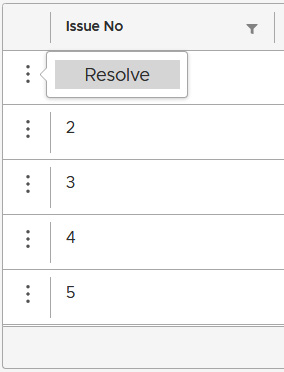
Figure 3.6 – Action menu
- In the Resolve Issue dialog that appears, click on the YES, CONTINUE button:
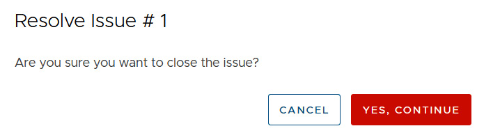
Figure 3.7 – Resolve Issue dialog
After clicking the button, the dialog will close, and the issue should not be visible on the list anymore.
We have provided a way for users of our application to resolve issues. Our issue tracking system is now complete and ready to put into action! Sometimes, users are in a hurry and may report an issue already reported. In the following section, we will learn how to leverage advanced reactive forms techniques to help them in this case.
Turning on suggestions for new issues
The reactive forms API contains a mechanism for getting notified when the value of a particular form control changes. We will use it in our application to find related issues when reporting a new one. More specifically, we will display a list of suggested issues when the user starts typing in the title form control:
- Open the issues.service.ts file and add the following method:
getSuggestions(title: string): Issue[] {
if (title.length > 3) {
return this.issues.filter(issue =>
issue.title.indexOf(title) !== -1);
}
return [];
}
The getSuggestions method takes the title of an issue as a parameter and searches for any issues that contain the same title. The search mechanism is triggered when the title parameter is more than three characters long to limit results down to a reasonable amount.
- Open the issue-report.component.ts file and add the following import statement:
import { Issue } from '../issue';
- Create a new component property to hold the suggested issues:
suggestions: Issue[]= [];
- The controls property of a FormGroup object contains all form controls as a key-value pair. The key is the name of the control, and the value is the actual form control object of the AbstractControl type. We can get notified about changes in the value of a form control by accessing its name, in this case the title, in the following way:
ngOnInit(): void {
this.issueForm = this.builder.group({
title: ['', Validators.required],
description: [''],
priority: ['', Validators.required],
type: ['', Validators.required]
});
this.issueForm.controls.title.valueChanges.subscribe((
title: string) => {
this.suggestions =
this.issueService.getSuggestions(title);
});
}
Each control exposes a valueChanges observable that we can subscribe to and get a continuous stream of values. The valueChanges observable emits new values as soon as the user starts typing in the title control of the form. We set the result of the getSuggestions method in the suggestions component property when that happens.
- To display the suggested issues on the template of the component, open the issue-report.component.html file and add the following HTML code right after the clr-input-container element:
<div class="clr-row" *ngIf="suggestions.length">
<div class="clr-col-lg-2"></div>
<div class="clr-col-lg-6">
<clr-stack-view>
<clr-stack-header>Similar issues
</clr-stack-header>
<clr-stack-block *ngFor="let issue of
suggestions">
<clr-stack-label>#{{issue.issueNo}}:
{{issue.title}}</clr-stack-label>
<clr-stack-content>{{issue.description}}
</clr-stack-content>
</clr-stack-block>
</clr-stack-view>
</div>
</div>
We use the clr-stack-view component from the Clarity library to display suggested issues in a key-value pair representation. The key is indicated by the clr-stack-header component and displays the title and the number of the issue. The value is indicated by the clr-stack-content component and displays the description of the issue.
Important Note
We display similar issues only when there are any available suggested ones.
Run ng serve and open the report issue form to create a new issue. When you start typing in the Title input, the application will suggest any related issues with the one that you are trying to create:

Figure 3.8 – Similar issues
The user will now see if there are any similar issues and avoid reporting a duplicate issue.
Summary
In this chapter, we built an Angular application for managing and tracking issues using reactive forms and Clarity Design System.
First, we installed Clarity to an Angular application and used a data grid component to display a list of pending issues. Then, we introduced reactive forms and used them to build a form for reporting a new issue. We added validations in the form to give our users a visual indication of the required fields and guard against unwanted behavior.
An issue tracking system is not efficient if our users are not able to resolve them. We built a modal dialog using Clarity to resolve a selected issue. Finally, we improved the UX of our application by suggesting related issues when reporting a new one.
In the next chapter, we will build a progressive web application for the weather using the Angular service worker.
Exercise
Create an Angular component to edit the details of an existing issue. The component should display the number of the issue and allow the user to change the title, description, and priority. The title and the description should be required fields.
The user should be able to access the previous component using the action menu in the list of pending issues. Add a new button in the action menu that will open the edit issue form.
After the user has completed updating an issue, the form should be closed, and the list of pending issues should be refreshed.
You can find the solution to the exercise in the Chapter03 folder of the exercise branch at https://github.com/PacktPublishing/Angular-Projects-Second-Edition/tree/exercise.
Further reading
- Angular forms: https://angular.io/guide/forms-overview
- Reactive forms: https://angular.io/guide/reactive-forms
- Validating reactive forms: https://angular.io/guide/form-validation#validating-input-in-reactive-forms
- Passing data to a component: https://angular.io/guide/component-interaction#pass-data-from-parent-to-child-with-input-binding
- Getting data from a component: https://angular.io/guide/component-interaction#parent-listens-for-child-event
- Getting started with Clarity: https://clarity.design/documentation/get-started