
The previous chapter introduced the event-driven and control-based programming model of ASP.NET. This model allows you to create programs for the Web using the same object-oriented techniques you would use to write a Windows application.
However, HTML server controls really show only a glimpse of what is possible with ASP.NET's server control model. To see some of the real advantages, you need to dive into the richer and more extensible web controls. In this chapter, you'll explore the basic web controls and their class hierarchy. You'll also delve deeper into ASP.NET's event handling, learn the details of the web page life cycle, and put your knowledge to work by creating a web page that lets the user design a greeting card.
Now that you've seen the new model of server controls, you might wonder why you need additional web controls. But in fact, HTML controls are much more limited than server controls need to be. For example, every HTML control corresponds directly to a single HTML element. Web controls, on the other hand, have no such restriction—they can switch from one element to another depending on how you're using them, or they can render themselves using a complex combination of multiple elements.
These are some of the reasons you should switch to web controls:
- They provide a rich user interface:
A web control is programmed as an object but doesn't necessarily correspond to a single element in the final HTML page. For example, you might create a single Calendar or GridView control, which will be rendered as dozens of HTML elements in the final page. When using ASP.NET programs, you don't need to know anything about HTML. The control creates the required HTML tags for you.
- They provide a consistent object model:
HTML is full of quirks and idiosyncrasies. For example, a simple text box can appear as one of three elements, including <textarea>, <input type="text">, and <input type="password">. With web controls, these three elements are consolidated as a single TextBox control. Depending on the properties you set, the underlying HTML element that ASP.NET renders may differ. Similarly, the names of properties don't follow the HTML attribute names. For example, controls that display text, whether it's a caption or a text box that can be edited by the user, expose a Text property.
- They tailor their output automatically:
ASP.NET server controls can detect the type of browser and automatically adjust the HTML code they write to take advantage of features such as support for JavaScript. You don't need to know about the client because ASP.NET handles that layer and automatically uses the best possible set of features. This feature is known as adaptive rendering.
- They provide high-level features:
You'll see that web controls allow you to access additional events, properties, and methods that don't correspond directly to typical HTML controls. ASP.NET implements these features by using a combination of tricks.
Throughout this book, you'll see examples that use the full set of web controls. To master ASP.NET development, you need to become comfortable with these user-interface ingredients and understand their abilities. HTML server controls, on the other hand, are less important for web forms development. You'll only use them if you're migrating an existing HTML page to the ASP.NET world, or if you need to have fine-grained control over the HTML code that will be generated and sent to the client.
If you've ever created a Windows application before, you're probably familiar with the basic set of standard controls, including labels, buttons, and text boxes. ASP.NET provides web controls for all these standbys. (And if you've created .NET Windows applications, you'll notice that the class names and properties have many striking similarities, which are designed to make it easy to transfer the experience you acquire in one type of application to another.)
Table 6-1 lists the basic control classes and the HTML elements they generate. Some controls (such as Button and TextBox) can be rendered as different HTML elements. In this case, ASP.NET uses the element that matches the properties you've set. Also, some controls have no real HTML equivalent. For example, when the CheckBoxList and RadioButtonList controls render themselves, they may output a <table> that contains multiple HTML check boxes or radio buttons. ASP.NET exposes them as a single object on the server side for convenient programming, thus illustrating one of the primary strengths of web controls.
Table 6.1. Basic Web Controls
Control Class | Underlying HTML Element |
|---|---|
Label | <span> |
Button | <input type="submit"> or <input type="button"> |
TextBox | <input type="text">, <input type="password">, or <textarea> |
CheckBox | <input type="checkbox"> |
RadioButton | <input type="radio"> |
Hyperlink | <a> |
LinkButton | <a> with a contained <img> tag |
ImageButton | <input type="image"> |
Image | <img> |
ListBox | <select size="X"> where X is the number of rows that are visible at once |
DropDownList | <select> |
CheckBoxList | A list or <table> with multiple <input type="checkbox"> tags |
RadioButtonList | A list or <table> with multiple <input type="radio"> tags |
BulletedList | An <ol> ordered list (numbered) or <ul> unordered list (bulleted) |
Panel | <div> |
Table, TableRow, and TableCell | <table>, <tr>, and <td> or <th> |
This table omits some of the more specialized controls used for data, navigation, security, and web portals. You'll see these controls as you learn about their features throughout this book.
ASP.NET tags have a special format. They always begin with the prefix asp: followed by the class name. If there is no closing tag, the tag must end with />. (This syntax convention is borrowed from XML, which you'll learn about in much more detail in Chapter 18.) Each attribute in the tag corresponds to a control property, except for the runat="server" attribute, which signals that the control should be processed on the server.
The following, for example, is an ASP.NET TextBox:
<asp:TextBox ID="txt" runat="server" />
When a client requests this .aspx page, the following HTML is returned. The name is a special attribute that ASP.NET uses to track the control.
<input type="text" ID="txt" name="txt" />
Alternatively, you could place some text in the TextBox, set its size, make it read-only, and change the background color. All these actions have defined properties. For example, the TextBox.TextMode property allows you to specify SingleLine (the default), MultiLine (for a <textarea> type of control), or Password (for an input control that displays bullets to hide the true value). You can adjust the color using the BackColor and ForeColor properties. And you can tweak the size of the TextBox in one of two ways—either using the Rows and Columns properties (for the pure HTML approach) or using the Height and Width properties (for the style-based approach). Both have the same result.
Here's one example of a customized TextBox:
<asp:TextBox ID="txt" BackColor="Yellow" Text="Hello World"
 ReadOnly="True" TextMode="MultiLine" Rows="5" runat="server" />
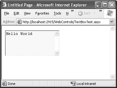
The resulting HTML uses the <textarea> element and sets all the required attributes (such as rows and readonly) and the style attribute (with the background color). It also sets the cols attribute with the default width of 20 columns, even though you didn't explicitly set the TextBox.Columns property:
<textarea name="txt" rows="5" cols="20" readonly="readonly" id="txt"
 style="background-color:Yellow;">Hello World</textarea>
Figure 6-1 shows the <textarea> element in the browser.
Clearly, it's easy to create a web control tag. It doesn't require any understanding of HTML. However, you will need to understand the control class and the properties that are available to you.
Web control classes are defined in the System.Web.UI.WebControls namespace. They follow a slightly more tangled object hierarchy than HTML server controls. Figure 6-2 shows most, but not all, of the web controls that ASP.NET provides.
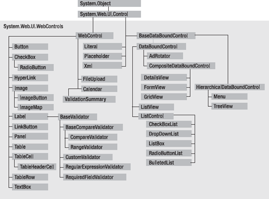
This inheritance diagram includes some controls that you won't study in this chapter, including the data controls, such as the GridView, DetailsView, and FormView, and the validation controls. You'll explore these controls in later chapters.
Most web controls begin by inheriting from the WebControl base class. This class defines the essential functionality for tasks such as data binding and includes some basic properties that you can use with almost any web control, as described in Table 6-2.
Table 6.2. WebControl Properties
The next few sections describe some of the common concepts you'll use with almost any web control, including how to set properties that use units and enumerations and how to use colors and fonts.
All the properties that use measurements, including BorderWidth, Height, and Width, require the Unit structure, which combines a numeric value with a type of measurement (pixels, percentage, and so on). This means when you set these properties in a control tag, you must make sure to append px (pixel) or % (for percentage) to the number to indicate the type of unit.
Here's an example with a Panel control that is 300 pixels high and has a width equal to 50 percent of the current browser window:
<asp:Panel Height="300px" Width="50%" ID="pnl" runat="server" />
If you're assigning a unit-based property through code, you need to use one of the shared methods of the Unit type. Use Pixel() to supply a value in pixels, and use Percentage() to supply a percentage value:
' Convert the number 300 to a Unit object
' representing pixels, and assign it.
pnl.Height = Unit.Pixel(300)

' Convert the number 50 to a Unit object
' representing percent, and assign it.
pnl.Width = Unit.Percentage(50)
You could also manually create a Unit object and initialize it using one of the supplied constructors and the UnitType enumeration. This requires a few more steps but allows you to easily assign the same unit to several controls:
' Create a Unit object.
Dim myUnit As New Unit(300, UnitType.Pixel)

' Assign the Unit object to several controls or properties.
pnl.Height = myUnit
pnl.Width = myUnit
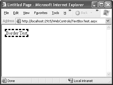
Enumerations are used heavily in the .NET class library to group a set of related constants. For example, when you set a control's BorderStyle property, you can choose one of several predefined values from the BorderStyle enumeration. In code, you set an enumeration using the dot syntax:
ctrl.BorderStyle = BorderStyle.Dashed
In the .aspx file, you set an enumeration by specifying one of the allowed values as a string. You don't include the name of the enumeration type, which is assumed automatically.
<asp:Label BorderStyle="Dashed" Text="Border Test" ID="lbl"
 runat="server" />
Figure 6-3 shows the label with the altered border.
The Color property refers to a Color object from the System.Drawing namespace. You can create color objects in several ways:
- Using an ARGB (alpha, red, green, blue) color value:
You specify each value as an integer from 0 to 255. The alpha component represents the transparency of a color, and usually you'll use 255 to make the color completely opaque.
- Using a predefined .NET color name:
You choose the correspondingly named read-only property from the Color structure. These properties include the 140 HTML color names.
- Using an HTML color name:
You specify this value as a string using the ColorTranslator class.
To use any of these techniques, you'll probably want to start by importing the System.Drawing namespace, as follows:
Imports System.Drawing
The following code shows several ways to specify a color in code:
' Create a color from an ARGB value
Dim alpha As Integer = 255, red As Integer = 0
Dim green As Integer = 255, blue As Integer = 0
ctrl.ForeColor = Color.FromArgb(alpha, red, green, blue)

' Create a color using a .NET name
ctrl.ForeColor = Color.Crimson

' Create a color from an HTML code
ctrl.ForeColor = ColorTranslator.FromHtml("Blue")
When defining a color in the .aspx file, you can use any one of the known color names:
<asp:TextBox ForeColor="Red" Text="Test" ID="txt" runat="server" />The HTML color names that you can use are listed in the Visual Studio Help. Alternatively, you can use a hexadecimal color number (in the format #<red><green><blue>) as shown here:
<asp:TextBox ForeColor="#ff50ff" Text="Test"
ID="txt" runat="server" />The Font property actually references a full FontInfo object, which is defined in the System.Web.UI.WebControls namespace. Every FontInfo object has several properties that define its name, size, and style (see Table 6-3).
Table 6.3. FontInfo Properties
Property | Description |
|---|---|
Name | A string indicating the font name (such as Verdana). |
Names | An array of strings with font names, in the order of preference. The browser will use the first matching font that's installed on the user's computer. |
Size | The size of the font as a FontUnit object. This can represent an absolute or relative size. |
Bold, Italic, Strikeout, Underline, and Overline | Boolean properties that apply the given style attribute. |
In code, you can assign a font by setting the various font properties using the familiar dot syntax:
ctrl.Font.Name = "Verdana"
ctrl.Font.Bold = True
You can also set the size using the FontUnit type:
' Specifies a relative size.
ctrl.Font.Size = FontUnit.Small

' Specifies an absolute size of 14 pixels.
ctrl.Font.Size = FontUnit.Point(14)
In the .aspx file, you need to use a special "object walker" syntax to specify object properties such as Font. The object walker syntax uses a hyphen (-) to separate properties. For example, you could set a control with a specific font (Tahoma) and font size (40 point) like this:
<asp:TextBox Font-Name="Tahoma" Font-Size="40" Text="Size Test" ID="txt"
 runat="server" />
Or you could set a relative size like this:
<asp:TextBox Font-Name="Tahoma" Font-Size="Large" Text="Size Test"
 ID="txt" runat="server" />
Figure 6-4 shows the altered TextBox in this example.

A font setting is really just a recommendation. If the client computer doesn't have the font you request, it reverts to a standard font. To deal with this problem, it's common to specify a list of fonts, in order of preference. To do so, you use the Font.Names property instead of Font.Name, as shown here:
<asp:TextBox Font-Names="Verdana,Tahoma,Arial"
 Text="Size Test" ID="txt" runat="server" />
Here, the browser will use the Verdana font (if it has it). If not, it will fall back on Tahoma or, if that isn't present, Arial.
When specifying fonts, it's a good idea to end with one of the following fonts, which are supported on all browsers:
Times
Arial and Helvetica
Courier
The following fonts are found on almost all Windows and Mac computers, but not necessarily on other operating systems like Unix:
Verdana
Georgia
Tahoma
Comic Sans
Arial Black
Impact
Unlike HTML server controls, every web control provides a Focus() method. The Focus() method affects only input controls (controls that can accept keystrokes from the user). When the page is rendered in the client browser, the user starts in the focused control.
For example, if you have a form that allows the user to edit customer information, you might call the Focus() method on the first text box in that form. That way, the cursor appears in this text box immediately when the page first loads in the browser. If the text box is partway down the form, the page even scrolls down to it automatically. The user can then move from control to control using the time-honored Tab key.
If you're a seasoned HTML developer, you know there isn't any built-in way to give focus to an input control. Instead, you need to rely on JavaScript. This is the secret to ASP.NET's implementation. When your code is finished processing and the page is rendered, ASP.NET adds an extra block of JavaScript code to the end of your page. This JavaScript code simply sets the focus to the last control that used the Focus() method. If you haven't called Focus() at all, this code isn't added to the page.
Rather than call the Focus() method programmatically, you can set a control that should always be focused by setting the DefaultFocus property of the <form> tag:
<form DefaultFocus="TextBox2" runat="server">
You can override the default focus by calling the Focus() method in your code.
Another way to manage focus is using access keys. For example, if you set the AccessKey property of a TextBox to A, pressing Alt+A focus will switch to the TextBox. Labels can also get into the game, even though they can't accept focus. The trick is to set the Label.AssociatedControlID property to specify a linked input control. That way, the label transfers focus to the associated control.
For example, the following label gives focus to TextBox2 when the keyboard combination Alt+2 is pressed:
<asp:Label AccessKey="2" AssociatedControlID="TextBox2" runat="server"
 Text="TextBox2:" />
<asp:TextBox runat="server" ID="TextBox2" />
Focusing and access keys are also supported in non-Microsoft browsers, including Firefox.
Along with control focusing, ASP.NET also allows you to designate a default button on a web page. The default button is the button that is "clicked" when the user presses the Enter key. For example, if your web page includes a form, you might want to make the submit button into a default button. That way, if the user hits Enter at any time, the page is posted back and the Button.Click event is fired for that button.
To designate a default button, you must set the HtmlForm.DefaultButton property with the ID of the respective control, as shown here:
<form DefaultButton="cmdSubmit" runat="server">
The default button must be a control that implements the IButtonControl interface. The interface is implemented by the Button, LinkButton, and ImageButton web controls but not by any of the HTML server controls.
In some cases, it makes sense to have more than one default button. For example, you might create a web page with two groups of input controls. Both groups may need a different default button. You can handle this by placing the groups into separate panels. The Panel control also exposes the DefaultButton property, which works when any input control it contains gets the focus.
The list controls include the ListBox, DropDownList, CheckBoxList, RadioButtonList, and BulletedList. They all work in essentially the same way but are rendered differently in the browser. The ListBox, for example, is a rectangular list that displays several entries, while the DropDownList shows only the selected item. The CheckBoxList and RadioButtonList are similar to the ListBox, but every item is rendered as a check box or option button, respectively. Finally, the BulletedList is the odd one out— it's the only list control that isn't selectable. Instead, it renders itself as a sequence of numbered or bulleted items.
All the selectable list controls provide a SelectedIndex property that indicates the selected row as a zero-based index (just like the HtmlSelect control you used in the previous chapter). For example, if the first item in the list is selected, the SelectedIndex will be 0. Selectable list controls also provide an additional SelectedItem property, which allows your code to retrieve the ListItem object that represents the selected item. The ListItem object provides three important properties: Text (the displayed content), Value (the hidden value from the HTML markup), and Selected (True or False depending on whether the item is selected).
In the previous chapter, you used code like this to retrieve the selected ListItem object from an HtmlSelect control called Currency, as follows:
Dim item As ListItem
item = Currency.Items(Currency.SelectedIndex)
If you used the ListBox web control, you can simplify this code with a clearer syntax:
Dim item As ListItem
item = Currency.SelectedItem
Some list controls can allow multiple selections. This isn't allowed for the DropDownList or RadioButtonList, but it is supported for a ListBox, provided you have set the SelectionMode property to the enumerated value ListSelectionMode.Multiple. The user can then select multiple items by holding down the Ctrl key while clicking the items in the list. With the CheckBoxList, multiple selections are always possible.
The SelectedIndex and SelectedItem properties aren't much help with a list that supports multiple selection, because they will simply return the first selected item. Instead, you can find all the selected items by iterating through the Items collection of the list control and checking the ListItem.Selected property of each item. (If it's True, that item is one of the selected items.) Figure 6-5 shows a simple web page example. It provides a list of computer languages and indicates which selections the user made when the OK button is clicked.
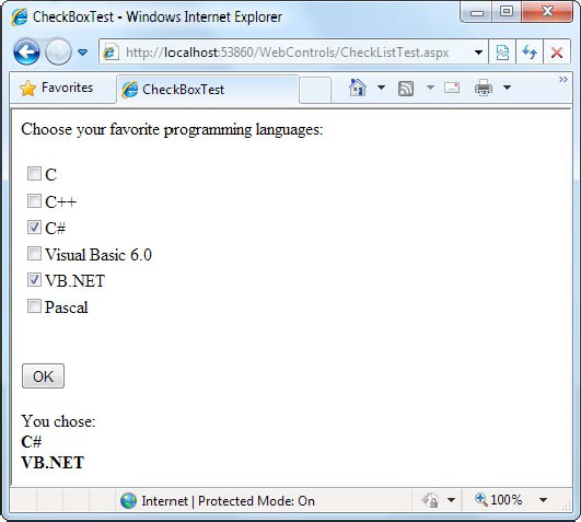
The .aspx file for this page defines CheckListBox, Button, and Label controls, as shown here:
<%@ Page Language="VB" AutoEventWireup="false"
    CodeFile="CheckListTest.aspx.vb" Inherits="CheckListTest" %>
<html xmlns="http://www.w3.org/1999/xhtml">
<head runat="server">
  <title>CheckBoxTest</title>
</head>
<body>
  <form runat="server">
    <div>
      Choose your favorite programming languages:<br /><br />
      <asp:CheckBoxList ID="chklst" runat="server" /><br /><br />
      <asp:Button ID="cmdOK" Text="OK" runat="server" />
      <br /><br />
      <asp:Label ID="lblResult" runat="server" />
    </div>
  </form>
</body>
</html>
The code adds items to the CheckListBox at startup and iterates through the collection when the button is clicked:
Public Partial Class CheckListTest
Inherits System.Web.UI.Page
Protected Sub Page_Load(ByVal sender As Object, _
ByVal e As EventArgs) Handles Me.Load
If Me.IsPostBack = False
chklst.Items.Add("C")
chklst.Items.Add("C++")
chklst.Items.Add("C#")
chklst.Items.Add("Visual Basic 6.0")
chklst.Items.Add("VB.NET")
chklst.Items.Add("Pascal")
End If
End Sub
Protected Sub cmdOK_Click(ByVal sender As Object, _
ByVal e As System.EventArgs) Handles cmdOK.Click
lblResult.Text = "You chose:<b>"
Dim lstItem As ListItem
For Each lstItem In chklst.Items
If lstItem.Selected = True Then
' Add text to label.
lblResult.Text &= "<br />" & lstItem.Text
End If
Next
lblResult.Text &= "</b>"
End Sub
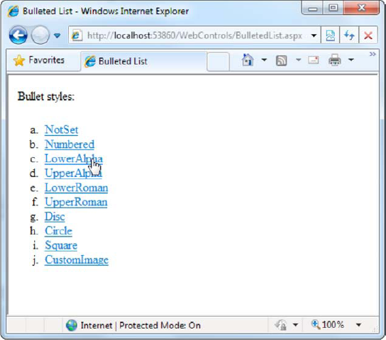
End ClassThe BulletedList control is a server-side equivalent of the <ul> (unordered list) and <ol> (ordered list) elements. As with all list controls, you set the collection of items that should be displayed through the Items property. Additionally, you can use the properties in Table 6-4 to configure how the items are displayed.
Table 6.4. Added BulletedList Properties
Property | Description |
|---|---|
BulletStyle | Determines the type of list. Choose from Numbered (1, 2, 3, . . .), LowerAlpha (a, b, c, . . .) and UpperAlpha (A, B, C, . . .), LowerRoman (i, ii, iii, ; . . .) and UpperRoman (I, II, III, . . .), and the bullet symbols Disc, Circle, Square, or CustomImage (in which case you must set the BulletImageUrl property). |
BulletImageUrl | If the BulletStyle is set to CustomImage, this points to the image that is placed to the left of each item as a bullet. |
FirstBulletNumber | In an ordered list (using the Numbered, LowerAlpha, UpperAlpha, LowerRoman, and UpperRoman styles), this sets the first value. For example, if you set FirstBulletNumber to 3, the list might read 3, 4, 5 (for Numbered) or C, D, E (for UpperAlpha). |
DisplayMode | Determines whether the text of each item is rendered as text (use Text, the default) or a hyperlink (use LinkButton or HyperLink). The difference between LinkButton and HyperLink is how they treat clicks. When you use LinkButton, the BulletedList fires a Click event that you can react to on the server to perform the navigation. When you use HyperLink, the BulletedList doesn't fire the Click event—instead, it treats the text of each list item as a relative or absolute URL, and renders them as ordinary HTML hyperlinks. When the user clicks an item, the browser attempts to navigate to that URL. |
If you set the DisplayMode to LinkButton, you can react to the Button.Click event to determine which item was clicked. Here's an example:
Protected Sub BulletedList1_Click(ByVal sender As Object, _
  ByVal e As BulletedListEventArgs) Handles BulletedList1.Click

    ' Find the clicked item in the list.
    ' (You can't use the SelectedIndex property here because static lists
    ' don't support selection.)
    Dim itemText As String = BulletedList1.Items(e.Index).Text
    Label1.Text = "You choose item" & itemText
End Sub
Figure 6-6 shows all the BulletStyle values that the BulletList supports. When you click one of the items, the list changes to use that BulletStyle. You can try this example page with the sample WebControls project for this chapter.
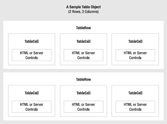
Essentially, the Table control is built out of a hierarchy of objects. Each Table object contains one or more TableRow objects. In turn, each TableRow object contains one or more TableCell objects. Each TableCell object contains other ASP.NET controls or HTML content that displays information. If you're familiar with the HTML table tags, this relationship (shown in Figure 6-7) will seem fairly logical.
To create a table dynamically, you follow the same philosophy as you would for any other web control. First, you create and configure the necessary ASP.NET objects. Then, ASP.NET converts these objects to their final HTML representation before the page is sent to the client.
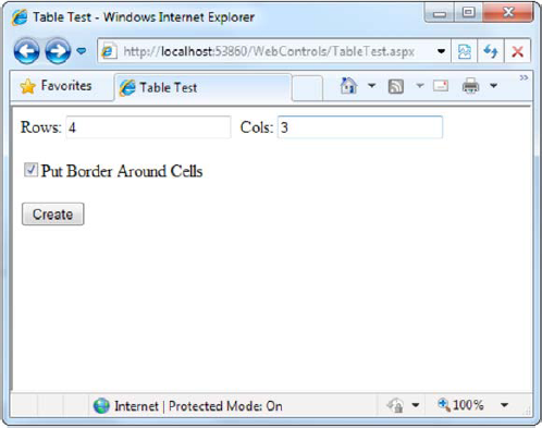
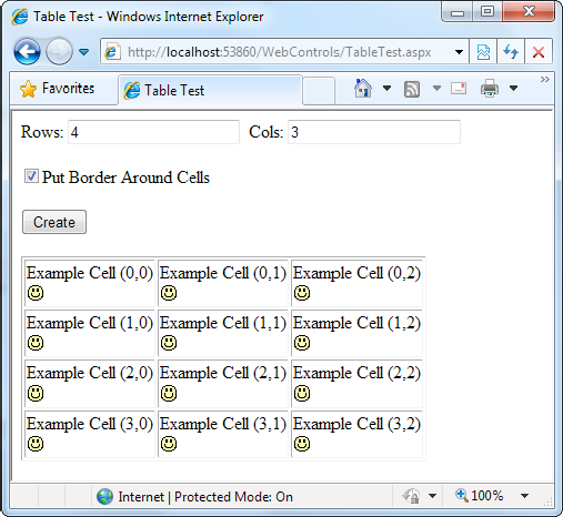
Consider the example shown in Figure 6-8. It allows the user to specify a number of rows and columns as well as whether cells should have borders.
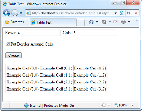
When the user clicks the Create button, the table is filled dynamically with sample data according to the selected options, as shown in Figure 6-9.
The .aspx code creates the TextBox, CheckBox, Button, and Table controls:
<%@ Page Language="VB" AutoEventWireup="false"
CodeFile="TableTest.aspx.vb" Inherits="TableTest" %>
<html xmlns="http://www.w3.org/1999/xhtml">
<head runat="server">
<title>Table Test</title>
</head>
<body>
<form runat="server">
<div>
Rows:
<asp:TextBox ID="txtRows" runat="server" />
Cols:
<asp:TextBox ID="txtCols" runat="server" />
<br /><br />
<asp:CheckBox ID="chkBorder" runat="server"
Text="Put Border Around Cells" />
<br /><br />
<asp:Button ID="cmdCreate" runat="server"
Text="Create" />
<br /><br />
<asp:Table ID="tbl" runat="server" />
</div>
</form>
</body>
</html>You'll notice that the Table control doesn't contain any actual rows or cells. To make a valid table, you would need to nest several layers of tags. The following example creates a table with a single cell that contains the text A Test Row:
<asp:Table ID="tbl" runat="server">
  <asp:TableRow ID="row" runat="server">
    <asp:TableCell ID="cell" runat="server">A Sample Value</asp:TableCell>
  </asp:TableRow>
</asp:Table>
The table test web page doesn't have any nested elements. This means the table will be created as a server-side control object, but unless the code adds rows and cells, the table will not be rendered in the final HTML page.
The TableTest class uses two event handlers. When the page is first loaded, it adds a border around the table. When the button is clicked, it dynamically creates the required TableRow and TableCell objects in a loop.
Public Partial Class TableTest
    Inherits System.Web.UI.Page

    Protected Sub Page_Load(ByVal sender As Object, _
      ByVal e As EventArgs) Handles Me.Load
        ' Configure the table's appearance.
        ' This could also be performed in the .aspx file,
        ' or in the cmdCreate_Click event handler.
tbl.BorderStyle = BorderStyle.Inset
tbl.BorderWidth = Unit.Pixel(1)
End Sub
Protected Sub cmdCreate_Click(ByVal sender As Object, _
ByVal e As EventArgs) Handles cmdCreate.Click
' Remove all the current rows and cells.
' This would not be necessary if you set EnableViewState = False.
tbl.Controls.Clear()
Dim row, col As Integer
For row = 0 To Val(txtRows.Text - 1)
' Create a new TableRow object.
Dim rowNew As New TableRow()
' Put the TableRow in the Table.
tbl.Controls.Add(rowNew)
For col = 0 To Val(txtCols.Text - 1)
' Create a new TableCell object.
Dim cellNew As New TableCell()
cellNew.Text = "Example Cell (" & row.ToString() & ","
cellNew.Text &= col.ToString() & ")"
If chkBorder.Checked = True Then
cellNew.BorderStyle = BorderStyle.Inset
cellNew.BorderWidth = Unit.Pixel(1)
End If
' Put the TableCell in the TableRow.
rowNew.Controls.Add(cellNew)
Next
Next
End Sub
End ClassThis code uses the Controls collection to add child controls. Every container control provides this property. You could also use the TableCell.Controls collection to add web controls to each TableCell. For example, you could place an Image control and a Label control in each cell. In this case, you can't set the TableCell.Text property. The following code snippet uses this technique, and Figure 6-10 displays the results:
' Create a new TableCell object.
Dim cellNew As New TableCell()

' Create a new Label object.
Dim lblNew As New Label()
lblNew.Text = "Example Cell (" & row.ToString() & ","
lblNew.Text &= col.ToString() & ")<br />" Dim imgNew As New System.Web.UI.WebControls.Image() imgNew.ImageUrl = "cellpic.png" ' Put the label and picture in the cell. cellNew.Controls.Add(lblNew) cellNew.Controls.Add(imgNew) ' Put the TableCell in the TableRow. rowNew.Controls.Add(cellNew)
The real flexibility of the table test page is that each Table, TableRow, and TableCell is a full-featured object. If you want, you can give each cell a different border style, border color, and text color by setting the corresponding properties.
The previous chapter explained that one of the main limitations of HTML server controls is their limited set of useful events—they have exactly two. HTML controls that trigger a postback, such as buttons, raise a ServerClick event. Input controls provide a ServerChange event that doesn't actually fire until the page is posted back.
ASP.NET server controls are really an ingenious illusion. You'll recall that the code in an ASP.NET page is processed on the server. It's then sent to the user as ordinary HTML. Figure 6-11 illustrates the order of events in page processing.
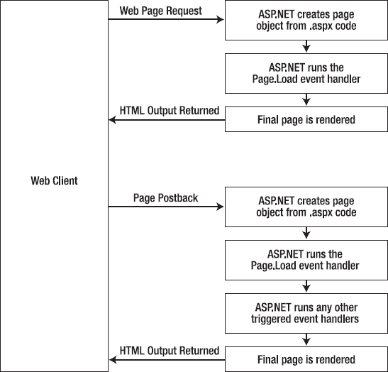
This is the same in ASP.NET as it was in traditional ASP programming. The question is, how can you write server code that will react immediately to an event that occurs on the client?
Some events, such as the Click event of a button, do occur immediately. That's because when clicked, the button posts back the page. This is a basic convention of HTML forms. However, other actions do cause events but don't trigger a postback. An example is when the user changes the text in a text box (which triggers the TextChanged event) or chooses a new item in a list (the SelectedIndexChanged event). You might want to respond to these events, but without a postback your code has no way to run.
ASP.NET handles this by giving you two options:
You can wait until the next postback to react to the event. For example, imagine you want to react to the SelectedIndexChanged event in a list. If the user selects an item in a list, nothing happens immediately. However, if the user then clicks a button to post back the page, two events fire: Button.Click followed by ListBox.SelectedIndexChanged. And if you have several controls, it's quite possible for a single postback to result in several change events, which fire one after the other, in an undetermined order.
You can use the automatic postback feature to force a control to post back the page immediately when it detects a specific user action. In this scenario, when the user clicks a new item in the list, the page is posted back, your code executes, and a new version of the page is returned.
The option you choose depends on the result you want. If you need to react immediately (for example, you want to update another control when a specific action takes place), you need to use automatic postbacks. On the other hand, automatic postbacks can sometimes make the page less responsive, because each postback and page refresh adds a short, but noticeable, delay and page refresh. (You'll learn how to create pages that update themselves without a noticeable page refresh when you consider ASP.NET AJAX in Chapter 25.)
All input web controls support automatic postbacks. Table 6-5 provides a basic list of web controls and their events.
Table 6.5. Web Control Events
Event | Web Controls That Provide It | Always Posts Back |
|---|---|---|
Click | Button, ImageButton | True |
TextChanged | TextBox (fires only after the user changes the focus to another control) | False |
CheckedChanged | CheckBox, RadioButton | False |
SelectedIndexChanged | DropDownList, ListBox, CheckBoxList, RadioButtonList | False |
If you want to capture a change event (such as TextChanged, CheckedChanged, or SelectedIndexChanged) immediately, you need to set the control's AutoPostBack property to True. This way, the page will be submitted automatically when the user interacts with the control (for example, picks a selection in the list, clicks a radio button or a check box, or changes the text in a text box and then moves to a new control).
When the page is posted back, ASP.NET will examine the page, load all the current information, and then allow your code to perform some extra processing before returning the page back to the user (see Figure 6-12). Depending on the result you want, you could have a page that has some controls that post back automatically and others that don't.
This postback system isn't ideal for all events. For example, some events that you may be familiar with from Windows programs, such as mouse movement events or key press events, aren't practical in an ASP.NET application. Resubmitting the page every time a key is pressed or the mouse is moved would make the application unbearably slow and unresponsive.
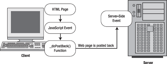
Chapter 1 explained that not all types of web programming use server-side code like ASP.NET. One common example of client-side web programming is JavaScript, which uses script code that's executed by the browser. ASP.NET uses the client-side abilities of JavaScript to bridge the gap between client-side and server-side code. (Another scripting language is VBScript, but JavaScript is the only one that works on all modern browsers, including Internet Explorer, Firefox, Opera, Safari, and Netscape.)
Here's how it works: If you create a web page that includes one or more web controls that are configured to use AutoPostBack, ASP.NET adds a special JavaScript function to the rendered HTML page. This function is named __doPostBack(). When called, it triggers a postback, sending data back to the web server.
ASP.NET also adds two additional hidden input fields that are used to pass information back to the server. This information consists of the ID of the control that raised the event and any additional information that might be relevant. These fields are initially empty, as shown here:
<input type="hidden" name="__EVENTTARGET" id="__EVENTTARGET" value="" />
<input type="hidden" name="__EVENTARGUMENT" id="__EVENTARGUMENT" value="" />
The __doPostBack() function has the responsibility for setting these values with the appropriate information about the event and then submitting the form. The __doPostBack() function is shown here:
<script language="text/javascript">
function __doPostBack(eventTarget, eventArgument) {
    if (!theForm.onsubmit || (theForm.onsubmit() != false)) {
        theForm.__EVENTTARGET.value = eventTarget;
        theForm.__EVENTARGUMENT.value = eventArgument;
        theForm.submit();
    }
  ...
}
</script>
Remember, ASP.NET generates the __doPostBack() function automatically, provided at least one control on the page uses automatic postbacks.
Finally, any control that has its AutoPostBack property set to True is connected to the __doPostBack() function using the onclick or onchange attributes. These attributes indicate what action the browser should take in response to the client-side JavaScript events onclick and onchange.
The following example shows the tag for a list control named lstBackColor, which posts back automatically. Whenever the user changes the selection in the list, the client-side onchange event fires. The browser then calls the __doPostBack() function, which sends the page back to the server.
<select ID="lstBackColor" onchange="__doPostBack('lstBackColor','')"
 language="javascript">
In other words, ASP.NET automatically changes a client-side JavaScript event into a server-side ASP.NET event, using the __doPostBack() function as an intermediary. Figure 6-13 shows this process.
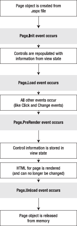
To understand how web control events work, you need to have a solid understanding of the page life cycle. Consider what happens when a user changes a control that has the AutoPostBack property set to True:
On the client side, the JavaScript __doPostBack function is invoked, and the page is resubmitted to the server.
ASP.NET re-creates the Page object using the .aspx file.
ASP.NET retrieves state information from the hidden view state field and updates the controls accordingly.
The Page.Load event is fired.
The appropriate change event is fired for the control. (If more than one control has been changed, the order of change events is undetermined.)
The Page.PreRender event fires, and the page is rendered (transformed from a set of objects to an HTML page).
Finally, the Page.Unload event is fired.
The new page is sent to the client.
To watch these events in action, it helps to create a simple event tracker application. All this application does is write a new entry to a list control every time one of the events it's monitoring occurs. This allows you to see the order in which events are triggered. Figure 6-14 shows what the window looks like after it's been loaded once, posted back (when the text box content was changed), and posted back again (when the check box state was changed).
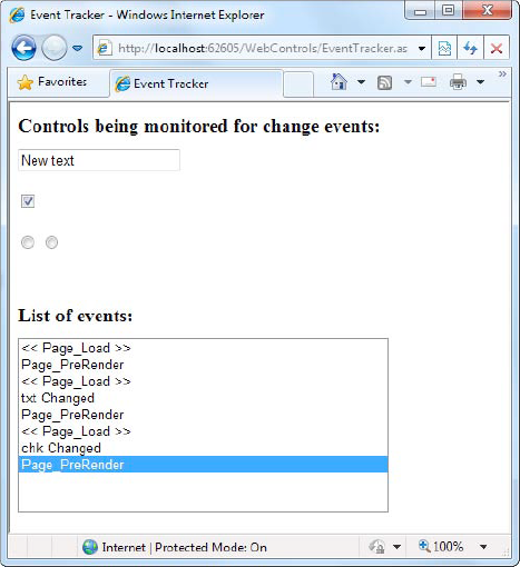
Listing 6-1 shows the markup code for the event tracker, and Listing 6-2 shows the code-behind class that makes it work.
Example 6.1. EventTracker.aspx
<%@ Page Language="VB" AutoEventWireup="false"
    CodeFile="EventTracker.aspx.vb" Inherits="EventTracker" %>
<html xmlns="http://www.w3.org/1999/xhtml">
<head runat="server">
  <title>Event Tracker</title>
</head>
<body>
  <form runat="server">
    <div>
      <h1>Controls being monitored for change events:</h1>
      <asp:TextBox ID="txt" runat="server" AutoPostBack="True" />
      <br /><br />
      <asp:CheckBox ID="chk" runat="server" AutoPostBack="True" />
<br /><br />
<asp:RadioButton ID="opt1" runat="server" GroupName="Sample"
AutoPostBack="True" />
<asp:RadioButton ID="opt2" runat="server" GroupName="Sample"
AutoPostBack="True" />
<h1>List of events:</h1>
<asp:ListBox ID="lstEvents" runat="server" Width="355px"
Height="150px" /><br />
<br /><br /><br />
</div>
</form>
</body>
</html>Example 6.2. EventTracker.aspx.vb
Public Partial Class EventTracker
    Inherits System.Web.UI.Page

    Protected Sub Page_Load(ByVal sender As Object, _
      ByVal e As EventArgs) Handles Me.Load
        Log("<< Page_Load >>")
    End Sub

    Protected Sub Page_PreRender(ByVal sender As Object, _
      ByVal e As EventArgs) Handles Me.PreRender
        ' When the Page.PreRender event occurs it is too late
        ' to change the list.
        Log("Page_PreRender")
    End Sub

    ' This control handles an event from all four controls.
    Protected Sub CtrlChanged(ByVal sender As Object, _
      ByVal e As System.EventArgs) _
      Handles chk.CheckedChanged, opt1.CheckedChanged, opt2.CheckedChanged, _
              txt.TextChanged
        ' Find the control ID of the sender.
        ' This requires converting the Object type into a Control class.
        Dim ctrlName As String = CType(sender, Control).ID
        Log(ctrlName & " Changed")
    End Sub

    Private Sub Log(ByVal entry As String)
        lstEvents.Items.Add(entry)

        ' Select the last item to scroll the list so the most recent
        ' entries are visible.
        lstEvents.SelectedIndex = lstEvents.Items.Count - 1
    End Sub

End ClassThe following points are worth noting about this code:
The code writes to the ListBox using a private Log() method. The Log() method adds the text and automatically scrolls to the bottom of the list each time a new entry is added, thereby ensuring that the most recent entries remain visible.
All the change events are handled by the same method, CtrlChanged(). The Handles clause for CtrlChanged() clearly reflects this. It lists all the events, separating each one with a comma. The event handling code in the CtrlChanged() method uses the source parameter to find out what control sent the event, and it incorporates that information in the log string.
The page includes an event handler for the Page.PreRender event. Unlike control events, you can't add the event handler for page events using the Properties window. Instead, you need to use one of two strategies. Your first choice is to type the Page_PreRender() method in by hand, being sure to include the Handles Me.PreRender clause at the end of the method declaration. Your second option is to use the drop-down lists at the top of the code window, which gets Visual Studio to create the method you need. To use the drop-down lists, pick "(Page Events)" from the first list (at the top-left) and then pick PreRender from the second list (at the top-right).
Now that you've had a whirlwind tour of the basic web control model, it's time to put it to work with the second single-page utility. In this case, it's a simple example for a dynamic e-card generator. You could extend this sample (for example, allowing users to store e-cards to the database), but even on its own, this example demonstrates basic control manipulation with ASP.NET.
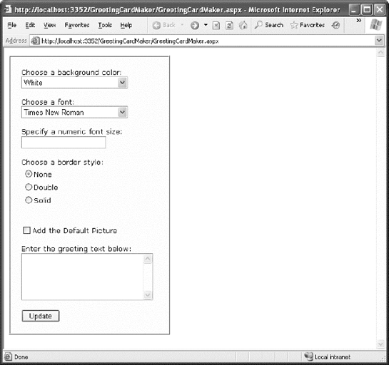
The web page is divided into two regions. On the left is an ordinary <div> tag containing a set of web controls for specifying card options. On the right is a Panel control (named pnlCard), which contains two other controls (lblGreeting and imgDefault) that are used to display user-configurable text and a picture. This text and picture represents the greeting card. When the page first loads, the card hasn't yet been generated, and the right portion is blank (as shown in Figure 6-15).
Tip
The <div> element is useful when you want to group text and controls and apply a set of formatting properties (such as a color or font) to all of them. The <div> element is also an essential tool for positioning blocks of content in a page. For these reasons, the <div> element is used in many of the examples in this book. You'll learn more about using the <div> for layout and formatting in Chapter 12.
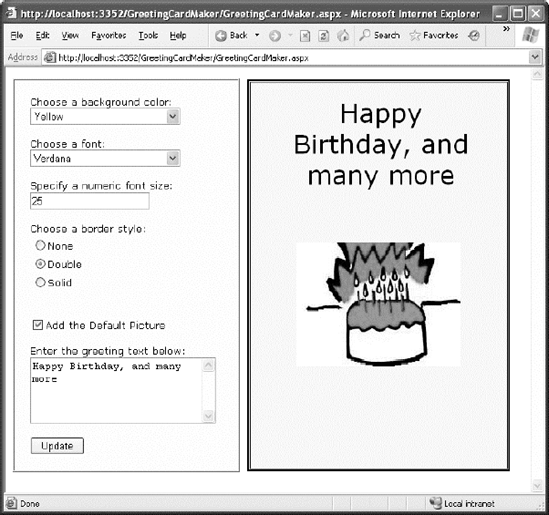
Whenever the user clicks the Update button, the page is posted back and the "card" is updated (see Figure 6-16).
The .aspx layout code is straightforward. Of course, the sheer length of it makes it difficult to work with efficiently. Here's the markup, with the formatting details trimmed down to the bare essentials:
<%@ Page Language="VB" AutoEventWireup="false"
    CodeFile="GreetingCardMaker.aspx.vb" Inherits="GreetingCardMaker" %>
<html xmlns="http://www.w3.org/1999/xhtml">
<head runat="server">
    <title>Greeting Card Maker</title>
</head>
<body>
  <form runat="server">
    <div>
      <!-- Here are the controls: -->
      Choose a background color:<br />
      <asp:DropDownList ID="lstBackColor" runat="server" Width="194px"
        Height="22px"/><br /><br />
      Choose a font:<br />
<asp:DropDownList ID="lstFontName" runat="server" Width="194px"
Height="22px" /><br /><br />
Specify a numeric font size:<br />
<asp:TextBox ID="txtFontSize" runat="server" /><br /><br />
Choose a border style:<br />
<asp:RadioButtonList ID="lstBorder" runat="server" Width="177px"
Height="59px" /><br /><br />
<asp:CheckBox ID="chkPicture" runat="server"
Text="Add the Default Picture"></asp:CheckBox><br /><br />
Enter the greeting text below:<br />
<asp:TextBox ID="txtGreeting" runat="server" Width="240px" Height="85px"
TextMode="MultiLine" /><br /><br />
<asp:Button ID="cmdUpdate" runat="server" Width="71px" Height="24px"
Text="Update" />
</div>
<!-- Here is the card: -->
<asp:Panel ID="pnlCard" runat="server"
Width="339px" Height="481px" HorizontalAlign="Center"
style="POSITION: absolute; TOP: 16px; LEFT: 313px;">
<br />
<asp:Label ID="lblGreeting" runat="server" Width="256px"
Height="150px" /><br /><br /><br />
<asp:Image ID="imgDefault" runat="server" Width="212px"
Height="160px" />
</asp:Panel>
</form>
</body>
</html>To get the two-column layout in this example, you have two choices. You can use HTML tables (which are a somewhat old-fashioned technique), or you can use absolute positioning with CSS styles (as in this example). The essence of absolute positioning is easy to grasp. Just look at the style attribute in the Panel control, which specifies a fixed top and left coordinate on the web page. When the panel is rendered to HTML, this point becomes its top-left corner.
Note
Absolute positioning is a feature of CSS, the Cascading Style Sheets standard. As such, it works in any XHTML element, not just ASP.NET controls. Absolute positioning is described in detail in Chapter 12.
The code follows the familiar pattern with an emphasis on two events: the Page.Load event, where initial values are set, and the Button.Click event, where the card is generated.
Imports System.Drawing

Public Partial Class GreetingCardMaker
    Inherits System.Web.UI.Page

    Protected Sub Page_Load(ByVal sender As Object, _
      ByVal e As EventArgs) Handles Me.Load
        If Me.IsPostBack = False Then
' Set color options.
lstBackColor.Items.Add("White")
lstBackColor.Items.Add("Red")
lstBackColor.Items.Add("Green")
lstBackColor.Items.Add("Blue")
lstBackColor.Items.Add("Yellow")
' Set font options.
lstFontName.Items.Add("Times New Roman")
lstFontName.Items.Add("Arial")
lstFontName.Items.Add("Verdana")
lstFontName.Items.Add("Tahoma")
' Set border style options by adding a series of
' ListItem objects.
' Each item indicates the name of the option, and contains the
' corresponding integer in the Value property.
lstBorder.Items.Add(New _
ListItem(BorderStyle.None.ToString(), BorderStyle.None))
lstBorder.Items.Add(New _
ListItem(BorderStyle.Double.ToString(), BorderStyle.Double))
lstBorder.Items.Add(New _
ListItem(BorderStyle.Solid.ToString(), BorderStyle.Solid))
' Select the first border option.
lstBorder.SelectedIndex = 0
' Set the picture.
imgDefault.ImageUrl = "defaultpic.png"
End If
End Sub
Protected Sub cmdUpdate_Click(ByVal sender As Object, _
ByVal e As EventArgs) Handles cmdUpdate.Click
' Update the color.
pnlCard.BackColor = Color.FromName(lstBackColor.SelectedItem.Text)
' Update the font.
lblGreeting.Font.Name = lstFontName.SelectedItem.Text
If Val(txtFontSize.Text) > 0 Then
lblGreeting.Font.Size = FontUnit.Point(Val(txtFontSize.Text))
End If
' Update the border style.
pnlCard.BorderStyle = Val(lstBorder.SelectedItem.Value)
' Update the picture.
If chkPicture.Checked = True Then
imgDefault.Visible = True
Else
imgDefault.Visible = False
End If' Set the text.
lblGreeting.Text = txtGreeting.Text
End Sub
End ClassAs you can see, this example limits the user to a few preset font and color choices. The code for the BorderStyle option is particularly interesting. The lstBorder control has a list that displays the text name of one of the BorderStyle enumerated values. You'll remember from the introductory chapters that every enumerated value is really an integer with a name assigned to it. The lstBorder also secretly stores the corresponding number so that the code can retrieve the number and set the enumeration easily when the user makes a selection and the cmdUpdate_Click event handler fires.
ASP.NET pages have access to the full .NET class library. With a little exploration, you'll find classes that might help the greeting-card maker, such as tools that let you retrieve all the known color names and all the fonts installed on the web server.
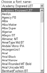
For example, you can fill the lstFontName control with a list of fonts using the InstalledFontCollection class. To access it, you need to import the System.Drawing.Text namespace. You also need to import the System.Drawing namespace, because it defines the FontFamily class that represents the individual fonts that are installed on the web server:
Imports System.Drawing
Imports System.Drawing.Text
Here's the code that gets the list of fonts and uses it to fill the list:
' Get the list of available fonts, and add them to the font list.
Dim fonts As New InstalledFontCollection()
For Each family As FontFamily In fonts.Families
    lstFontName.Items.Add(family.Name)
Next
Figure 6-17 shows the resulting font list.
To get a list of the color names, you need to resort to a more advanced trick. Although you could hard-code a list of common colors, .NET actually provides a long list of color names in the System.Drawing.KnownColor enumeration. However, actually extracting the names from this enumeration takes some work.
The trick is to use a basic feature of all enumerations: the shared Enum.GetNames() method, which inspects an enumeration and provides an array of strings, with one string for each value in the enumeration. The web page can then use data binding to automatically fill the list control with the information in the ColorArray. (You'll explore data binding in much more detail in Chapter 15.)
Note
Don't worry if this example introduces a few features that look entirely alien! These features are more advanced (and aren't tied specifically to ASP.NET). However, they show you some of the flavor that the full .NET class library can provide for a mature application.
Here's the code that copies all the color names into the list box:
' Get the list of colors.
Dim colorArray As String() = System.Enum.GetNames(GetType(KnownColor))
lstBackColor.DataSource = colorArray
lstBackColor.DataBind()
A minor problem with this approach is that it includes system environment colors (for example, ActiveBorder) in the list. It may not be obvious to the user what colors these values represent. Still, this approach works well for this simple application. You can use a similar technique to fill in BorderStyle options:
' Set border style options.
Dim borderStyleArray As String()
borderStyleArray = System.Enum.GetNames(GetType(BorderStyle))
lstBorder.DataSource = borderStyleArray
lstBorder.DataBind()
This code raises a new challenge: how do you convert the value that the user selects into the appropriate constant for the enumeration? When the user chooses a border style from the list, the SelectedItem property will have a text string like "Groove". But to apply this border style to the control, you need a way to determine the enumerated constant that matches this text.
You can handle this problem in a few ways. (Earlier, you saw an example in which the enumeration integer was stored as a value in the list control.) In this case, the most direct approach involves using an advanced feature called a TypeConverter. A TypeConverter is a special class that is able to convert from a specialized type (in this case, the BorderStyle enumeration) to a simpler type (such as a string), and vice versa.
To access this class, you need to import the System.ComponentModel namespace:
Imports System.ComponentModel
You can then add the following code to the cmdUpdate_Click event handler:
' Find the appropriate TypeConverter for the BorderStyle enumeration.
Dim converter As TypeConverter
converter = CType(TypeDescriptor.GetConverter(GetType(BorderStyle)), _
  TypeConverter)

' Update the border style using the value from the converter.
pnlCard.BorderStyle = converter.ConvertFromString(lstBorder.SelectedItem.Text)
This code gets the appropriate TypeConverter (in this case, one that's designed expressly to work with the BorderStyle enumeration). It then converts the text name (such as Solid) to the appropriate value (BorderStyle.Solid).
The last step is to use ASP.NET's automatic postback events to make the card update dynamically every time an option is changed. The Update button could now be used to submit the final, perfected greeting card, which might then be e-mailed to a recipient or stored in a database.
To configure the controls so they automatically trigger a page postback, simply set the AutoPostBack property of each input control to True. An example is shown here:
Choose a background color:<br />
<asp:DropDownList ID="lstBackColor" AutoPostBack="True" runat="server"
     Width="194px" Height="22px"/>
Next, you need to create an event handler that can handle the change events. To save a few steps, you can use the same event handler for all the input controls. All the event handler needs to do is call the update routine that regenerates the greeting card.
Protected Sub ControlChanged(ByVal sender As System.Object, _
ByVal e As System.EventArgs) _
Handles lstBackColor.SelectedIndexChanged, chkPicture.CheckedChanged, _
txtFontSize.TextChanged, lstBorder.SelectedIndexChanged, _
lstFontName.SelectedIndexChanged, lstForeColor.SelectedIndexChanged, _
txtGreeting.TextChanged
' Refresh the greeting card (because a control was changed).
UpdateCard()
End Sub
Protected Sub cmdUpdate_Click(sender As Object, e As EventArgs) _
Handles cmdUpdate.Click
' Refresh the greeting card (because the button was clicked).
UpdateCard()
End Sub
Private Sub UpdateCard()
' (The code that draws the greeting card goes here.)
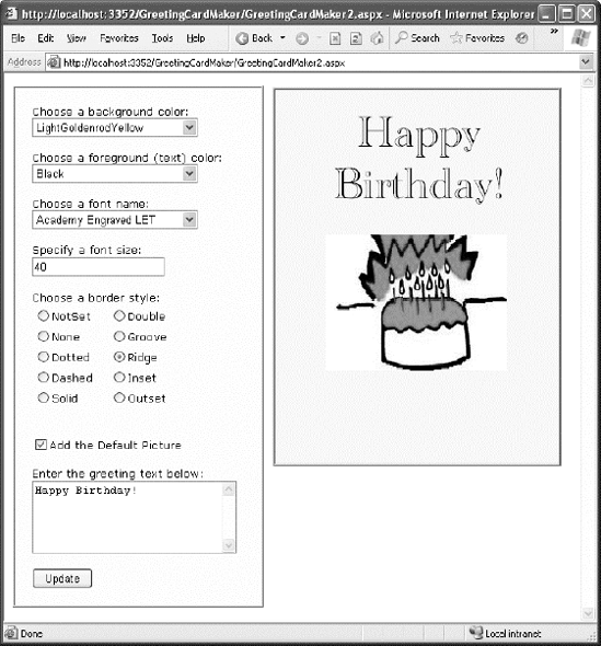
End SubWith these changes, it's easy to perfect the more extensive card-generating program shown in Figure 6-18. The full code for this application is provided with the online samples.
Tip
Automatic postback isn't always best. Sometimes an automatic postback can annoy a user, especially when the user is working over a slow connection or when the server needs to perform a time-consuming option. For that reason, it's sometimes best to use an explicit submit button and not enable AutoPostBack for most input controls. Alternatively, you might jazz up your web page with the ASP.NET AJAX features described in Chapter 25, which allow you to create user interfaces that feel more responsive, and can update themselves without a distracting full-page refresh.
This chapter introduced you to web controls and their object interface. As you continue through this book, you'll learn about more web controls. The following highlights are still to come:
In Chapter 10, you'll learn about advanced controls such as the AdRotator, the Calendar, and the validation controls. You'll also learn about specialized container controls, such as the MultiView and Wizard.
In Chapter 13, you'll learn about navigation controls such as the TreeView and Menu.
In Chapter 16, you'll learn about the GridView, DetailsView, and FormView— high-level web controls that let you manipulate a complex table of data from any data source.
For a good reference that shows each web control and lists its important properties, refer to the Visual Studio Help.