
Python plays a big role behind the scenes in some of the world's largest and most important server-side applications, but Python has also made a big impact on end-user applications. Writing a GUI is an expensive and painful project in C, C++, or even Java or C#, but it can be done quickly and easily in Python. Even if you only write simple Python scripts, being able to whip up a GUI can be a force multiplier that makes your script usable by less technical people, compounding its value. Python, being cross-platform and truly object oriented, has advantages that Visual Basic programmers would love to have in their rapid application development toolbox.
Python enables you to lay out GUIs one component at a time, like other programming languages. However, these days, no real programmer is writing GUI code by hand. If that's what you're used to, get ready to embrace all the rapid application development magic of Delphi with the power of a real language in Python. Of course, this kind of power is also available in other stacks, such as C#.
In this chapter you learn the basics of GUI programming in Python. A comprehensive guide to creating GUI applications would easily fill another book; what is contained herein merely scratches the surface. However, it should be enough to get you well on your way to writing elegant, interactive, and user-friendly applications.
In this chapter you learn to:
Create widgets such as labels and command, radio, and checkbox buttons
Lay out your graphical user interface
Modify the look of your widgets and customize their appearance
Create custom dialog boxes
Understand packing order
Insert functions in your widgets
There is wide support for writing GUIs with Python with many different toolkits: You can find a dozen options at www.python.org/moin/GuiProgramming to try out. These toolkits, binary modules for Python that interface with native GUI code written in C/C++, all have different APIs and offer different feature sets. Only one comes with Python by default, the venerable TK GUI toolkit. It's always possible that if you're just using Windows, you'll install win32all and use the Win32 API directly. The truly brave will write their entire GUI in pyGame and add sound to every slider.
Other options are wxPython, PyQT, and pyGTK. These differ in many ways, but one important way is the license. The PyQT web page shows this problem of how it could restrict the decisions you can make if you are trying to create certain classes of applications or libraries. You can see this in the following paragraph:
"PyQt is licensed under the GNU GPL (for UNIX/Linux and MacOS/X), under the QT Non-commercial License (for use with the QT v2.3.0 non-commercial version for Windows), under the QT Educational License (for use with the educational edition of QT for Windows), and under a commercial license (for Windows, UNIX/Linux and MacOS/X)... ."
They go on to state:
"When deploying commercial PyQt applications it is necessary to discourage users from accessing the underlying PyQt modules for themselves. A user that used the modules shipped with your application to develop new applications would themselves be considered a developer and would need their own commercial QT and PyQt licenses."
"One solution to this problem is the VendorID package. This enables you to build Python extension modules that can only be imported by a digitally signed custom interpreter. The package enables you to create such an interpreter with your application embedded within it. The result is an interpreter that can only run your application, and PyQt modules that can only be imported by that interpreter. You can use the package to similarly restrict access to any extension module."
As you can see, unless there is a very good reason, you'll probably want to skip the whole QT toolset for this section of the license alone. No one in their right mind wants to deal with that kind of confusing licensing landscape. The QT people would claim that the advantages of their toolkit overwhelm the cost of licensing for the few people who use Windows. If you agree, tread warily into their licensing minefield. Most people simply discount it.
One open-source option is wxPython. WxPython is based on wxWidgets, a portable (Windows, Linux, Mac OS X) graphics toolkit with a long history and a tradition of looking and running just like native code. You can find the best information on wxPython on the really nice wiki at http://wiki.wxpython.org/index.cgi/FrontPage.
Beginners to GUI creation may feel overwhelmed by wxPython. Although there is good user support in mailing lists and professional organizations, the wxPython library is intimidating. Nevertheless, it's a good option for people willing to climb the learning curve. At the time of this writing, not all of these programs support 3.1, though most promise to.
With this in mind, for the rest of this chapter you will be working with Tkinter. Tkinter is Python's standard GUI package and comes installed with Python. It is perhaps the most used GUI Programming kit and is portable across virtually every platform. For more information on this venerable standby, feel free to visit http://tkinter.unpythonic.net/wiki/. You can also visit its home page at http://wiki.python.org/moin/TkInter.
GUIs are not as simple as they look. Once you've understood the basic concepts, however, you'll find them understandable, and proper program design will help you navigate around the major roadblocks.
Not all Tkinter applications have to be complex. Your application may be a simple dialog box that you've written to automate a business process you often do. The same things that made large applications like CANVAS, Dashboard, and PythonCAD quick and easy to write make simple applications nearly trivial. Tkinter itself has been used to make many popular programs, including most famously, IDLE itself.
The first thing to understand is that most GUI frameworks, including Tkinter, are based on a widget model. A widget is a component of a GUI — buttons, labels, and text boxes are all widgets. Most widgets have graphical representations on screen, but some widgets, such as tables and boxes, exist only to contain other widgets and arrange them on the screen. A GUI is constructed out of an arrangement of widgets. In the following section, you create a simple GUI by defining some widgets and placing them inside each other.
Try It Out: Writing a Simple Tkinter Program
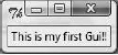
With Tkinter already in place, you're ready to write a real GUI application. This script, MyFirstGUI, creates a GUI of a simple window and a label. The label on the window displays a message:
import tkinter
from tkinter import *
widget = Label(None, text='This is my first Gui!!')      # create a label
widget.pack( )
widget.mainloop( )
Run this program and you'll see the "This is my first Gui!!" label in the window, as shown in Figure 13-1.
How It Works
The first thing to do is to import the Tkinter module. Next, you could either import Label from Tkinter, or simply import all (*) from Tkinter, as you did in the example. After that, you create an object for each widget (in this case, Label). The Label is then arranged in the parent window. Finally, the widget is displayed.
One problem with this script is that unlike most GUI applications, this one doesn't actually do anything. The reason for this is simple: The script as it is doesn't handle any GUI events. Don't worry; you fix this later in the chapter.
You may or may not have noticed a few things about the window you created. For starters, it had a built-in minimize and maximize button, along with an "X" button to close the window. In addition, the user could stretch out the window. Go ahead and grab the right side of the window and pull it to the right a few inches. You will note that the label stays in the center near the top. This is a good thing.
Now, grab the bottom of the window and stretch it out. See the problem? No matter how far down you stretch the window, the label stays at the top. Ideally, when the user changes the size or shape of a window, you want the widget(s) inside to behave appropriately. With this in mind, modify your code so that the label centers when the window is resized:
import tkinter
from tkinter import *
Label(text='My first GUI!').pack(expand=YES, fill=BOTH)
mainloop( )
When you run this program, try resizing the window; you'll see the "My first GUI!" label stay centered no matter what the window looks like, as shown in Figure 13-2.
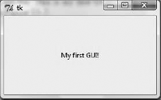
In this example, you imported all from Tkinter once more, and then created a label with some text. Next, you assign the values
Yesto expand, andBothto fill. This tells Python to expand the widget when the parent window is expanded. By default, this option is turned off.
You've seen one method to assign not only text to your label, but also how to configure some of the widget's options, such as expand and fill. Though the method you used was convenient in this instance, you may find yourself wanting to create your widgets first, and then configuring their options later on.
So far you've seen how to make a basic label, and how to format your widgets. But for a program to be successful, it not only has to look good; it has to actually do something. The next few examples not only teach you how to add more than one widget to your GUI, but teach you to apply actions to those widgets. Even more importantly, you learn to make the program respond to the user's actions.
You have learned how to create one type of widget so far — the label. In this example, you learn to create a button. Try typing the following code into a file called MyFirstButton.py:
import sys
from tkinter import *
widget = Button(None, text='Click Me', command=sys.exit)
widget.pack( )
widget.mainloop( )
This code is short and sweet and you may have noticed it looks very similar to the previous code. However, you will want to note that in addition to changing the widget type, you also added a new option, command. The value you added to command — sys.exit — tells Python to literally exit the system when the user clicks the button widget.
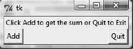
But what if you want to offer the user some option other than simply exiting the program? To do that, you have to add a second widget to your window. Create a new file and call it MultipleWidget.py:
from tkinter import *

def result( ):
    print('The sum of 2+2 is ',2+2)

win = Frame()
win.pack( )
Label(win,  text='Click Add to get the sum or Quit to Exit').pack(side=TOP)
Button(win, text='Add', command=result).pack(side=LEFT)
Button(win, text='Quit', command=win.quit).pack(side=RIGHT)

win.mainloop( )
This code introduces several new concepts we have yet to cover. First, you create a user-defined function, result(), and assign it the task of printing some text and returning the sum of 2+2. Next, you create three widgets. The first, a Label, holds some text, and has been giving the side=TOP option. Next, you create a button to call your user-defined function, which you place on the left side of the window. Lastly, you create a right-sided button and assign win.quit to command.
If the user clicks the Add button, it prints the text, "The sum of 2+2 is 4" to stdout. If the user clicks the Quit button, it closes the window.
One other thing to notice here is that for the first time we have introduced the use of the frame widget.
When creating a GUI, it is important to consider the hierarchy of your widgets. This hierarchy is commonly referred to as parent-child. In the preceding example, you created a number of widgets. The first widget is the top-level window, which acts as a parent. Next, you have a widget called win, which has a child of its own — a frame widget. The win widget, at this point, is a child of the top-level window.
Next, you have a label and two buttons, all of which are children of your frame widget. A frame widget is a widget whose purpose is to hold other widgets, and thus allow the programmer the flexibility to create a layout determining where on the window each widget should appear. As you get further into GUI programming, you will work with many different frame widgets, each occupying a specific spot on the top-level window, with each frame having its on set of widgets. These widgets that belong to each frame, being children of their respective frame, will be limited to the space provided them by their parent frame.
For example, if you have two frames of the same size, each taking up half of the window, and assign a button widget to each frame, the button assigned to the left frame will only be able to be placed within the left-hand side of the window. Likewise, the button assigned to the frame on the right side will be constrained to that section. If you were to pack the button in the left frame to the right, it would appear to the user to be in the center of the top-level window.
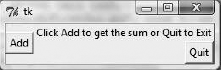
Another important aspect of layout is known as packing order. When you create each widget, and pack them, they are given all of the space for their region. For instance, if you pack a button on the LEFT, it will occupy all of the left-hand space. When you create a second widget and pack it to the left as well, the initial button is shrunk, but still holds the left-most space. This process continues, with each button shrinking to provide room for the other widgets. However, the buttons never move from their original space. The first button packed to the left will always be the left-most; likewise, the second button packed to the left will always be the second closest to the left.
Though this may sound confusing, simply rearranging your previous code should shed some light on the matter:
from tkinter import *

def result( ):
    print('The sum of 2+2 is ',2+2)

win = Frame()
win.pack( )
Button(win, text='Add', command=result).pack(side=LEFT)
Label(win,  text='Click Add to get the sum or Quit to Exit').pack(side=TOP)
Button(win, text='Quit', command=win.quit).pack(side=RIGHT)

win.mainloop( )
Figure 13-3 shows how the program originally looked, before you modified your code.
And Figure 13-4 is how it looks with the modified code.
Form and function are key to creating a well-rounded GUI. Thus far, you have learned to add some code to your interfaces, and learned the basics of layout (there is much more to learn, but it is beyond the scope of this chapter). In this section, you take your program one step further and learn to control the actual appearance of your widgets.
The following table is a list of the different ways that you can customize a widget:
Attribute | Description |
|---|---|
Border, relief | Border sets the border width (for example: bd=1). Relief is used to determine the border style (for example: relief=raised). |
Color | bg sets the background color, and fg sets the foreground. You can use simple color names or use hex form color codes. |
Cursor | Sets the type of cursor that appears when the widget is hovered over. (for example: cursor=cross). |
Font | Allows you to set the font family, size, and style (for example: Times, 24, italic bold underline). |
Padding | Allows you to set extra space around a widget. |
Pack expand and fill | As shown in previous examples. |
State | Sets the state of the object (for example: state=DISABLED). |
Size | Height and width settings control the size of the widget, allowing you to make it larger than the Tkinter Geometry Manager sets it to. |
So far you have worked with the following widgets: the top-level window, frames, labels, and buttons. These are all powerful widgets, but sometimes you may want to give your users more options. That is where radio buttons and checkboxes come into play.
Aside from appearance, radio buttons and checkboxes differ in one significant way: radio buttons offer users a list of options, but allow them to select only one; checkboxes offer users many options, and lets them choose as many as they want.
You can do something similar with checkboxes. In this instance however, you simply return whether the value of each checkbox is true or false:
from tkinter import *
states = []
def check(i):
    states[i] = not states[i]

root = Tk( )
for i in range(4):
test = Checkbutton(root, text=str(i), command=(lambda i=i: check(i)) )
test.pack(side=TOP)
states.append(0)
root.mainloop( )
print(states)If you run this program and check off boxes 2 and 3, then close the window, your result should be:
>>>
[0, True, True, 0]
Sometimes you want to give the user a piece of additional information. You are no doubt familiar with dialog boxes. They pop up anytime there is an error, or a program wants to confirm something, such as if you really want to uninstall a program, or if you want to display sensitive information.
Tkinter offers up two types of dialog boxes — modal and nonmodal. Modal dialog boxes wait for some action from the user before going away, and pause the progress of the program. Nonmodal dialog boxes do not interrupt the flow of the program.
This is just the tip of the iceberg when it comes to creating dialog boxes. Aside from warnings, error messages, and confirmations, dialog boxes can also be used to load files (think about using the open command in most applications), pick a color from a color wheel, and much, much more.
This chapter has covered many of the widget types so far, but many are still left to explore. A full guide to these is beyond the scope of this chapter, and indeed, this book, but at the very least you should be aware of their existence. The following table lists the different widget classes available to you, and offers an explanation of each one.
Widget Class | Description |
|---|---|
BitMapImage | A widget object that allows you to showcase bitmap images on top of other widgets. |
Button | A "clickable" button. |
Canvas | An object for displaying graphics, which can include circles, lines, images, text, and so forth. |
Checkbutton | A button widget that has two states; True and False. It is used to offer users multiple choices. |
Entry | A text entry field consisting of one line. |
Frame | A container that holds other widgets. |
Label | A widget where you can write text or a "label." |
Listbox | A box that holds a selection of data. |
Menu | A set of options. |
Menubutton | A menu that shows another menu of options and submenus. |
Message | Like a label, only for multiple lines. |
PhotoImage | The same as BitMapImage, only for full color images. |
Radiobutton | A button with a True/False state, used in multiple-choice situations. |
Scale | A widget that slides up and down and allows the user to choose options in that manner. |
Scrollbar | A widget that allows you to scroll other widgets. |
Text | A browse/edit widget that works on multiple lines. |
Toplevel, Tk | A new window. |
There's no limit to the things you can do with your GUI using Tkinter. You can take screenshots, display graphics, handle complex information sets in large windows, draw on a blank canvas, or simply pop up quick GUIs for custom command-line utilities, exposing them to less technically oriented users.
There are, of course, personal styles to every programming project. Many people have developed tools that enable automated application development. Python's bevy of introspection and OO (object-oriented) features enables you to dynamically handle all sorts of changes in your GUI. As you become more familiar with Tkinter, you'll find these sorts of techniques to be extremely natural.
Even if you don't use Tkinter, understanding how Tkinter works will be a valuable asset in your programming toolbox. Furthermore, there's always the possibility that you have a spare 15 minutes and want to write a custom GUI chat client for your friends.