
![]()
Big Data Visualization Patterns
Pie charts and bar charts have been the most common and often-used analytical charts. Data interpretation, per se, has now moved from a representation of sample data to a full-fledged analysis of all the data residing within the enterprise and also the “sentiments” that the data from social media analytics churns out. This chapter introduces commercial visualization tools in the big data domain, the use-cases that utilize the power of the Internet to derive meaningful insights, the marriage of machine-learning and visualization, and observations about how it is changing the landscape for business analysts and data scientists.
Introduction to Big Visualization
Problem
How is big data analysis different from the traditional business intelligence (BI) reporting?
Solution
Analysis of data has not always necessarily been conducted on all the data residing within the enterprise. (See Table 7-1.) It is sometimes sample data culled for a limited time period, or it is the volume of data that the reporting tools could handle to create a time-bound time report.
Table 7-1. Traditional BI vs. Big Data
Traditional BI Reporting |
Big Data Analysis |
|---|---|
Reporting tool like Cognos |
Visualization tool like QlikView or Tableau |
Sample data |
Huge volume of data |
Data from the enterprise |
Data from external sources like social media apart from enterprise data |
Based on statistics |
Based on statistics and social sentiment analysis or other data sources |
Data warehouse and data mart |
OLTP, real-time as well as offline data |
There was a need to break the mold of restricting reports to pie and bar charts and also to run reports on the full volume of data at the disposal of the enterprise. And that had to be done within the boundaries of time limits or maintenance windows. This necessitated the following:
- Storage for large volumes of data
- Business-specific visualization
- Faster processing of large volumes of data
- Ease of tool usage for data scientists and business analysts
As depicted in Figure 7-1, traditional reporting follows a sequential process of transferring OLTP data to a data warehouse, running statistical and analytical algorithms on the de-normalized data, and churning out reports in patterns like bar graphs, and pie charts, and others.
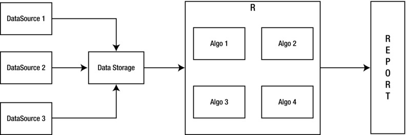
Figure 7-1. Traditional visualization
Big Data Analysis Patterns
Problem
What are the new big data analysis and visualization patterns that enable you to gain more insight from the huge volume of data?
Solution
Traditional analysis and visualization techniques need to be modified to provide that “helicopter” view of a large volume of data. The patterns will not be visible if the data is viewed in very granular detail. Visualization tools and graphics have to follow a more “planetary” view, where the data scientist is like an astronomer trying to find a new star or black hole in a huge distant galaxy.
Some of the analysis patterns mentioned in this chapter can be used in conjunction with “data access patterns.”
We will cover the following common data-analysis patterns in this chapter as shown in Figure 7-2:
- Mashup View Pattern: This pattern is used to maximize the performance of the queries by storing an aggregated mashup view in the HIVE layer that functions as a data warehouse. The MapReduce jobs are run in batches to update the warehouse offline.
- Compression Pattern: This pattern compresses, transforms, and formats data in a form that is more rapidly accessible.
- Zoning Pattern: Data can be split and indexed based on various attributes in different zones for faster access.
- First Glimpse Pattern: A scenario where the visualization is minimalist and provides a First Glimpse of the most relevant insights. A user can pull more information if required, which can be fetched in the interim while he is viewing the First Glimpse.
- Exploder Pattern: An extension of the First Glimpse pattern that allows you to visualize data from different sources in different visual perspectives.
- Portal Pattern: An organization that has an existing enterprise portal can follow this pattern to re-use the portal for visualization of big data.
- Service Facilitator Pattern: A pay-as-you go approach to big data analysis projects.
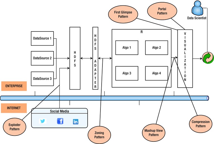
Figure 7-2. Big data analysis and visualization patterns
Solution
Commercial tools have emerged in the market that promise higher throughput over a large volume of data and provide business-specific visualizations. Here are some of the commercially known tools:
- QlikView
- TIBCO Spotfire
- SAS RA
- Tableau
These tools, along with market-known machine-learning tools (based on the R language) like “Revolution R” from Revolution Analytics, can be a good combination to ensure meaningful data discovery and visualization.
Problem
It takes a very long time to analyze data using MapReduce jobs. Is there a way to improve the performance?
Solution
HIVEover Hadoop, though good at storage and at running MapReduce jobs, is unable to do a good job when running complex queries consisting of JOINs and AGGREGATE functions.
Though most visualization and analytical tools can talk to Hadoop via HIVE queries, as in traditional methods, it makes sense to create an aggregated mashup view either within Hadoop or in abstracted storage like RDBMS/NoSQLl/Cache as shown in Figure 7-3. The Mashup View pattern reduces analysis time by aggregating the results of the MapReduce queries in the HIVE data warehouse layer.
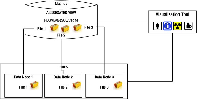
Figure 7-3. Mashup View pattern with data abstracted from Hadoop
As shown in Figure 7-4, the mashup can be achieved within the Hadoop layer also, instead of the HIVE layer, to save expensive storage dollars.
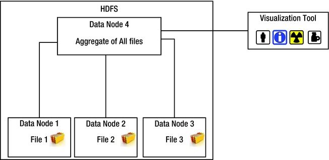
Figure 7-4. Mashup View pattern with data abstracted within Hadoop
This strategy is endorsed by many vendors and is provided by the following products in the market:
- IBM Netezza
- Cassandra
- HP Vertica
- Cloudera Impala
- EMC HAWQ
- Hortonworks Stinger
These products provide performance/latency benefits because they access the storage via aggregated views stored in HIVE or in the Hadoop layers, which play the role of a data warehouse.
Problem
Is there a faster way to access data without aggregating or mashing up?
Solution
Analysis tools like R support different compression formats—for example, .xdf (eXtended Data Format)—as shown in Figure 7-5. Instead of data being fetched from data storage, it can be converted to formats that R understands. This transformation not only provides performance benefits, but also ensures that data is valid and can be checked for correctness and consistency.
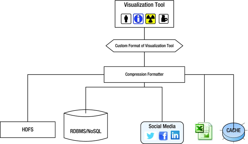
Figure 7-5. Compression pattern
Problem
Can I divide and rule the data in a fashion that is characterized by the attributes and hence is easier to locate?
Solution
As shown in Figure 7-6 data can be partitioned into zones at each layer (Hadoop, abstracted storage, cache, visualization cluster) to ensure that only the necessary data is scanned. The data can be divided (or partitioned) based on multiple attributes related to the business scenario in question.
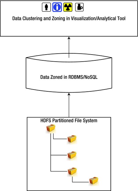
Figure 7-6. Zoning pattern
Problem
Do I need to see all the results always in a single view?
Solution
Since the volume of data is too huge, it makes sense to fetch only the amount of data that is absolutely essential and provide only the “first glimpse.” The First Glimpse (FG) pattern shown in Figure 7-7 recommends what is popularly known as “lazy-loading.” Let the end user decide how deep he/she wants to drill-down into details. Drill-down data should be fetched only if the user navigates into the subsequent layers of detail.
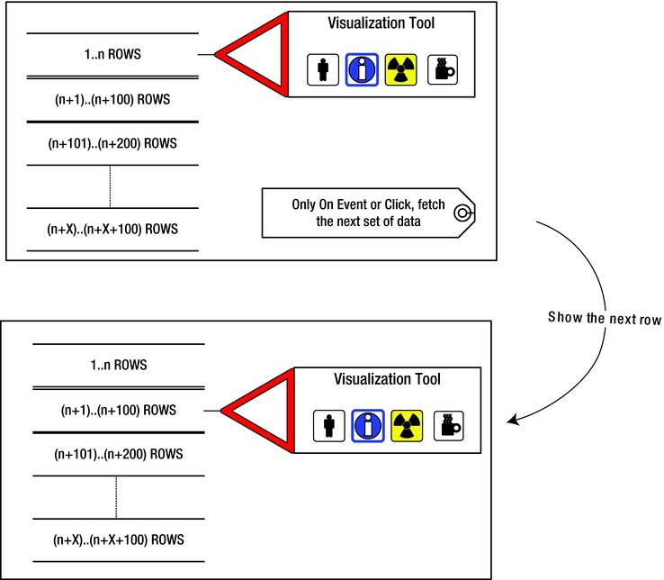
Figure 7-7. First Glimpse pattern
Problem
Do I need to see all the results always in a single view and be restricted to a similar visual pattern for the entire data?
Solution
This is an extension of the First Glimpse pattern. As shown in Figure 7-8, the difference is that the data may be fetched from a different source or might explode into an altogether different indexed data set. Also, the drill down on a click may produce a different chart type or visualization pattern.
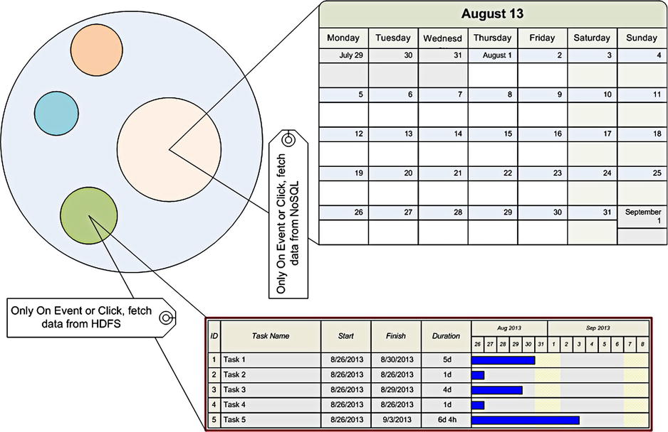
Figure 7-8. Exploder pattern
This pattern allows the user to look at different data sets, co-relate them, and also look at them from different perspectives visually.
Problem
I have already invested in an enterprise portal. Do I still need a new visualization tool?
Solution
If an organization is already using a web-based reporting solution and wants to continue without introducing new tools, the same existing portal can be enhanced to have a new frame with scripting frameworks like D3.js to enhance the legacy visualization. As shown in Figure 7-9, this ensures that the enterprise does not have to spend money on a new visualization tool.
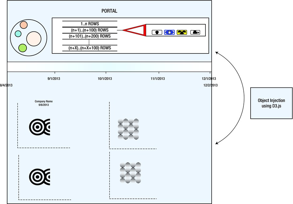
Figure 7-9. Portal pattern
Problem
I do not want to invest in the software and hardware to do my first pilot projects. Is big data analysis service available on a pay-as-you-go basis?
Solution
Big data analysis capabilities are available in an “as-a-Service mode” using cloud-enabled services—for example,
- Analytics as a Service
- Big Data Platform as a Service
- Data Set Providers
Organizations can look upon these providers as an alternative to circumvent infrastructure and/or skill constraints. Table 7-2 shows a list of “as-a-service” services available and providers.
Table 7-2. Providers for Various “as-a-service” Services
Service |
Service Provider |
|---|---|
Cloud Provider |
Amazon Web Services, Infochimps, Rackspace |
Platform Provider |
Amazon Web Services, IBM |
Data Set Provider |
UNICEF, WHO, World Bank, Amazon Web Services |
Social Media Data Provider |
Infochimps, Radian 6 |
These services can be searched on a service catalog and then used on a pay-as-you-go basis.
As shown in the Figure 7-10 dataset, providers provide large datasets that can complement an organization’s existing business cases. The data can be from a government organization, an NGO, or an educational institute, which can be leveraged to complement the analytical data coming from implementations of Google Analytics or Omniture.
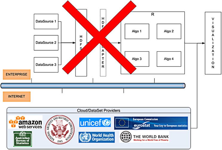
Figure 7-10. Service Facilitator pattern
Summary
Traditional reporting tools have been replaced by analytical and visualization tools that can read data from a Hadoop cluster, analyze data in-memory, and display it in a format that the business understands and in a more visually appealing form compared to traditional pie and bar charts. The business intelligence layer is now equipped with advanced big data analytics tools, in-database statistical analysis, and advanced visualization tools, in addition to the traditional components such as reports, dashboards, and queries.
With this architecture, business users see the traditional transaction data and big data in a consolidated single view. Business analysts and data scientists can now look beyond Excel sheets and reporting tools to create visually alluring graphs that can cater to huge volumes of data.