
CHAPTER 6
Big Is Beautiful: How Email Receipt Data Can Help Predict Company Sales
Giuliano De Rossi Jakub Kolodziej and Gurvinder Brar
6.1 INTRODUCTION
This chapter describes our experience working on a big data project. In this chapter our goal is twofold: 1. To assess the potential of electronic receipt data as a source of information, particularly to predict company sales in real time. 2. To document the challenges of dealing with such a large dataset and the solutions we adopted.
The dataset we employ in the analysis consists of a vast table that details the purchases made by a large sample of US consumers on the online platforms of a number of companies, including Amazon, Expedia and Domino's Pizza.
Consumer data organized in large panels is not a new phenomenon in economics and finance. For example, the University of Michigan's Panel Study of Income Dynamics (PSID) has followed 18 000 individuals (and their descendants) since 1968 by collecting responses to questionnaires at regular time intervals. The Quandl database, however, is very different from a ‘longitudinal panel’ in two respects.
First, the data is not collected with a view to building a representative sample. The individuals that opt in to the data sharing agreement with Quandl typically do so when they register to use the email productivity tools they have obtained from Quandl's partners. As a result, we know very little about the demographics, income and other characteristics of the sample. This may well introduce a bias if the sample is used to draw inferences about the overall population.
Second, the size of our sample and level of detail captured are completely different. Whereas the largest longitudinal panel can rely on around 25 000 individuals and biennial updates, our big data sample currently has more than 3 million active users that are sampled at weekly frequency. Longitudinal panels typically ask high‐level questions about the amount spent by each family on food, leisure and other categories of expenditure. With big data it is possible to obtain the full detail on a product‐by‐product basis of the goods and services purchased by each user. Because the data is based on actual transactions, it is free from the potential inaccuracies and distortions typically observed in self‐reported data. It is worth pointing out, however, that the history is very limited, i.e. unlike the cross‐sectional dimension, the length of the time series is currently modest.
One of the main goals of our statistical analysis will be to mitigate the potential bias while exploiting the sheer size of the sample.
Examples of the type of analytics that can be produced from the Quandl database are given in Figures 6.1–6.5. Figure 6.1 displays the breakdown by day of the week of Domino's Pizza orders available from our sample. The weekend is clearly the most popular time for pizza lovers. Figure 6.2 focuses on the time of the day when orders are placed, showing a distinct peak at lunchtime (between 12 p.m. and 2 p.m.) and a noticeable reduction in booking activity at night. The picture also shows that we are able to break down sales by pizza size, suggesting that the medium size dominates consistently. Figure 6.3 plots the frequency of the top 30 ingredients we identified from the orders placed in our sample. To our surprise, we found that the most requested ingredient by far (after cheese and tomato) is pepperoni. Bacon also turns out to be unexpectedly popular in the data.

Figure 6.1 Domino's Pizza sales peak at weekends…
Source: Macquarie Research, Quandl, September 2017.
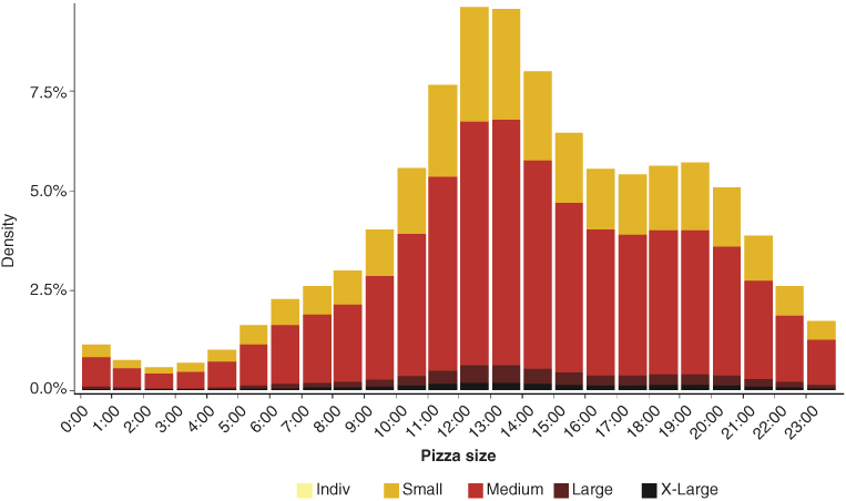
Figure 6.2 …and at lunchtime.
Source: Macquarie Research, Quandl, September 2017.

Figure 6.3 Most popular pizza toppings: the pepperoni effect.
Source: Macquarie Research, Quandl, September 2017.
The time pattern is completely different for an e‐commerce firm like Amazon. Figure 6.4 shows that the number of Amazon orders placed by users in our sample declines steadily from Monday until Saturday. If we plot the intraday pattern for each day of the week (Figure 6.5) we can see that Sunday is consistently the quietest day of the week for Amazon e‐commerce until about 10 a.m. Later in the day, Sunday orders grow faster than orders placed on weekdays and continue to grow even in the afternoon when other days display a decline. By 10 p.m. Sunday ranks as the third busiest day of the week.

Figure 6.4 Amazon customers prefer Mondays…
Source: Macquarie Research, Quandl, September 2017.

Figure 6.5 …and take it easy at the weekend.
These examples illustrate some of the important features of the Quandl database. The granularity of the information, down to the level of individual products, is remarkable. In addition, the fact that orders are collected with timestamps ensures that data trends can be captured at higher frequencies than was previously possible and in real time. It is also worth mentioning that although we do not pursue this idea here, it is possible to use the data to infer data patterns across different companies. An example would be to check whether customers tend to substitute Domino's products with those of its competitors or tend to spread their spending on restaurants in roughly constant proportions across alternative providers. It would also be possible to cluster sample participants based on their purchases (e.g. big spenders versus small spenders) and analyze any difference in data patterns between the clusters, which may identify early adopters.
6.2 QUANDL'S EMAIL RECEIPTS DATABASE
6.2.1 Processing electronic receipts
We start by describing the structure of the Quandl dataset which will be analyzed in the report. The dataset relies on a large sample of US consumers who agreed to share information on their online purchases with Quandl's partners. Typically, they opt in to this data sharing agreement when installing an email productivity enhancement application.
Our data provider is thus able to scan on a weekly basis the inboxes of all active sample participants in order to identify any electronic receipts they may have received from a number of participating online merchants (e.g. Amazon, Walmart, H&M). Figure 6.6 illustrates the process: the electronic receipt (shown on the left‐hand side) is scanned and transformed into a series of records, one for each individual product purchased. In our example, three distinct products were purchased but the total number of items is equal to four because the order included two units of the line tracking sensor. In the database, this is represented by three rows as shown on the right‐hand side of Figure 6.6. The data is delivered on Tuesdays with an eight‐day lag (i.e. it covers the period until the previous Monday).

Figure 6.6 How an email receipt is turned into purchase records.
Source: Macquarie Research, Quandl, September 2017. For illustrative purposes only. The actual Quandl data table comprises 50 fields, most of which are not shown in the figure.
Needless to say, each user is anonymized in the sense that we only observe a permanent id and all information on names, email addresses and payment methods is discarded. The user id can be used to query a separate table which contains additional information such as zip code, dates when the user entered and exited the sample, the date of his or her last purchase and so on. It is worth emphasizing that the user id is unique and permanent and therefore it is possible to reconstruct the purchase history of each individual user across different platforms (e.g. items ordered on Amazon, Tiffany and Walmart) and over time.
The table in Figure 6.6 displays a small subset of the fields that are actually provided by Quandl. These include permanent identifiers for the order, the product and the user each record refers to. We are also given a description of each product, quantity, price and many potentially useful additional fields such as tax, delivery cost, discounts and so on. Some of the fields refer to a specific product (e.g. price, description) while others like shipping costs and timestamp refer to the order as a whole.
The e‐commerce receipts database we used for our analysis is one of the alternative data products offered by Quandl (Figure 6.7). The product range covers, in addition to consumer data, data sourced from IoT devices, agricultural data from sensors in crop and fields, data on logistics and construction activity.

Figure 6.7 The structure of Quandl's data offering.
Source: Quandl, September 2017.
Each time a new user joins the sample, Quandl's partners scan their inbox looking for receipts that are still available in saved emails. For example, if a user joins in September 2017 but her email account retains Expedia receipts going back to September 2007, then those 10 years of Expedia bookings will be immediately added to the database. As a result, the database does contain a small number of transactions that occurred before the data collection exercise began. While there is no obvious reason to believe that this backfilling approach introduces a bias, it is true that backfilled observations would not have been available had we used the data in real time. As we detail below, for this reason we decide to concentrate on the transactions that were recorded while the user was actually part of the sample.
6.2.2 The sample
Figure 6.8 displays the total number of users that were active in the sample over time, i.e. those whose inbox was accessible to the tools deployed by Quandl's partners. As mentioned above, new users join the sample when individuals opt in to the data sharing agreement while some of the existing users drop off when their inboxes are no longer accessible. The data shows a sharp drop in the sample size at the end of 2015 when one of Quandl's partners withdrew. For the remainder of the sample period, size has grown consistently, with a notable acceleration in mid‐2016. The total number of unique users that make up the database is close to 4.7 million.

Figure 6.8 Sample size over time.
Source: Macquarie Research, Quandl, September 2017.
For our analysis we have access to data on the receipts issued by three companies: Amazon, Domino's Pizza and Expedia. Moreover, the dataset available to us ends in April 2017.
We mentioned that all users in our sample are located in the US. Figure 6.9 is a graphical illustration of their distribution (using the delivery postcode if available, otherwise the billing postcode) on the US territory as of April 2017. Darker colours correspond to zip code areas with larger numbers of users. The map shows a strong concentration around large urban areas around cities like Los Angeles, San Francisco, Houston, and New York.

Figure 6.9 Geographic distribution as of April 2017.
Source: Macquarie Research, Quandl, September 2017.
In order to put these figures in context, we display in Figure 6.10 the number of users as a percentage of the population of each US state (excluding Alaska and Hawaii) as of April 2017. Overall, the database tracked roughly 2.5 million users while the US population was approximately 325 million (a 0.77% ratio). Most states display a coverage ratio around that value, which indicates that our coverage is not concentrated on a few geographic areas. The extremes are Delaware (highest coverage) and New Mexico (lowest coverage).

Figure 6.10 Coverage of US population on a state‐by‐state basis as of April 2017.
Source: Macquarie Research, Quandl, September 2017.
By inspecting a number of Amazon transactions we were able to conclude that the majority of the users appear to be individuals or families. In a few cases, however, a user seemed to place orders on behalf of a much larger group. In one case we processed a purchase of 500 microcontrollers (with as many cases and electric adaptors) at the same time, which suggested that the order was placed on behalf of a school.
How frequently do individual users enter and exit the sample? Figure 6.11 is the histogram of the time spent in the sample by each of the 4.7 m unique users. We included the ones that are currently active (e.g. a user who joined on 1 January 2017 shows up as having a duration of three months as of 1 April regardless of whether he left the sample after 1 April zor not). The figure shows that the majority of users spend less than 12 months in the sample. This is not surprising given that the last 18 months have seen a surge in the number of participants. There seems to be a peak at exactly 12 months, which may be related to the length of a trial period or initial subscription to the applications provided by Quandl's partners. A significant proportion of users who joined the sample three years ago or earlier remain active while very few have been available for more than five years.

Figure 6.11 How long does a user typically spend in our sample?
Source: Macquarie Research, Quandl, September 2017.
In an attempt to gauge the quality of the data, we queried the database to identify the largest transactions that occurred on the Amazon e‐commerce platform over the sample period (Figure 6.12). Most of the items were sold by a third party rather than directly by Amazon. Of the six items in the table, three seem genuine data points: a rare poster for a movie that was never released, a luxury watch and a rare coin. The remaining products do seem suspicious. Nevertheless, the fact that very few of the items overall purport to have prices above US$100 000 suggests that data errors caused by poor parsing of the email receipts are unlikely to be an issue.

Figure 6.12 Six of the most expensive purchases made on Amazon.com.
Source: Macquarie Research, Quandl, September 2017.
Another simple check consists of aggregating the data and checking the total purchases made by Quandl's sample participants against the patterns we expect to see in retail e‐commerce. It is well known that Amazon sales display a strong seasonal pattern. By using accounting data, we can detect a peak in Q4 followed by a trough in Q2 (Figure 6.13). With our big data sample we can aggregate the purchases made on Amazon at a much higher frequency. In Figure 6.14 we compute average weekly sales for each of the 52 weeks of the year and rescale them so that the average value of the sales index is equal to one. The data clearly shows significant peaks that correspond to Amazon's prime days and Black Friday, which is traditionally considered the beginning of the Christmas shopping period. The peaks that characterize sales growth in Q4 (Figure 6.13) are concentrated on the weeks between Black Friday and the end of December.

Figure 6.13 Seasonal pattern in fundamental data: Amazon's quarterly sales.
Source: Macquarie Research, Factset, September 2017. The chart is plotted on a log scale.

Figure 6.14 Seasonal patterns in big data: Amazon's weekly sales. The sales index is computed by normalizing the weekly average amount spent on Amazon.com by each user so that the annual average is equal to one.
Source: Macquarie Research, Quandl, September 2017.
We mentioned in the introduction that deriving financial forecasts from big data is not always straightforward. A good example is the case of Expedia, one of the companies covered by Quandl's email receipts database. As the notes to Expedia's income statement explain, the company does not recognize the total value of the services booked by users of its platform as revenue. Instead, revenues are driven by the booking fees charged by Expedia which cannot be directly inferred from the receipts that are sent to its customers.
Even if the fees were calculated by applying a fixed percentage on the cost of the booking, we would not be able to derive an estimate of total sales from our data. Each of the business lines is likely to charge a different fee and the breakdown of sales by business segment changes significantly over time, as Expedia's receipt data clearly shows (Figure 6.15). For example, flights tend to command a lower margin compared with lodging.

Figure 6.15 Expedia's big data bookings split has changed significantly over the last three years.
Source: Macquarie Research, Quandl, September 2017.
Thus it is crucial to incorporate deep fundamental insights in the analysis in order to fully exploit the potential of big data. In this case, we would have to start from an estimate of the typical fee charged by the company for each business line (flights, lodging, car rental). We would then be able to forecast, using our big data sample, the total booked on a segment‐by‐segment basis and aggregate up to obtain an estimate of headline sales.
6.3 THE CHALLENGES OF WORKING WITH BIG DATA
The data we use in the analysis, which covers only three listed companies, occupies over 80 GB when stored in flat files. It includes 144.1 million purchases (rows) of 4.7 million unique users. As a consequence, the sheer size of our dataset (even though we have access to only three of the names covered by the Quandl database) makes it difficult to run even the simplest queries with standard database tools. Faced with this technological challenge, we experimented with alternative solutions to crunch the data in a reasonable timeframe.
Amazon Redshift turned out to be our preferred solution as it is optimized to do analytical processing using a simple syntax (only a few modifications of our standard SQL queries were necessary) and it offers, in our setup, a considerable speedup versus MySQL (around 10 times). Redshift stores database table information in a compressed form by column rather than by row and this reduces the number of disk Input/Output requests and the amount of data load from disk, particularly when dealing with a large number of columns as in our case.
Loading less data into memory enables Redshift to perform more in‐memory processing when executing queries. In addition, the Redshift query engine is optimized to run queries on multiple computing nodes in parallel and, to boost speed further, the fully optimized code is sent to computing nodes in the compiled format.
6.4 PREDICTING COMPANY SALES
One of the most important indicators followed by equity investors and analysts is the growth in a company's revenues. As a consequence, sales surprises are known to trigger stock price moves, and analyst‐momentum signals (i.e. revisions to sales forecasts) have been found to predict stock returns.
6.4.1 Summary of our approach
The purpose of this section is to convey the rationale behind our forecasting method. The setup is illustrated in Figure 6.16: our task is to predict sales for quarter t based on the guidance issued by management and the information available in our email receipts dataset.

Figure 6.16 A timeline for quarterly sales forecasts.
Source: Macquarie Research, September 2017.
As Figure 6.16 shows, the actual revenue figure for fiscal quarter t is available after the end of quarter t, typically well into quarter t + 1. An advantage of working with the receipts dataset is that we can generate a prediction immediately after the end of the quarter because all the sample information is updated weekly. In other words, all the information about purchases made during quarter t by the users that make up our sample becomes available a few days after the end of the quarter.
In addition, we can exploit the frequent updates to generate real‐time predictions during quarter t as new data on weekly purchases becomes available. We explain our methodology in more detail at the end of this section.
We exploit two sources of information: management guidance and email receipts. The former consists of a range of values (predicted revenues) which can be transformed into a range of growth rates on the latest reported quarter.1 We can start by measuring the increase in purchases for a group of users who were part of the sample over both quarters. This rate of growth can then be compared with the range implied by guidance in order to predict whether sales will come in at the lower or upper side of the range indicated by management. If the in‐sample growth rate falls outside the guidance range, then we can simply assume that sales will be either at the bottom or at the top of the range.
For example, during the third quarter of 2016 Amazon's guidance on sales was between US$31 billion and US$33.5 billion. This corresponds to a growth rate between 2% and 10.2% on the second quarter, when revenues totalled US$30.4 billion. If the sample of users monitored by Quandl spent 3.6% more in Q3 than in Q2, then we would take 3.6% as our estimate, close to the bottom of the range. If, however, the growth rate in our sample were 12.5% (outside the guidance range), then we would take this result to indicate that sales are likely to be at the top of the range indicated by management. Hence we would use 10.2% as our estimate.
The rest of this section shows that this simple approach can be justified in a formal statistical framework. In particular, we argue that a natural way to combine the two sources of information is to adopt a Bayesian approach and treat the guidance as prior information. We then process the data in order to characterize the posterior distribution of sales growth (Figure 6.17), i.e. the distribution of the growth rate given the data.

Figure 6.17 Bayesian estimation of quarterly revenue growth: An example. The chart plots the densities of the quantity denoted ϕ1 − 1 in the model. The prior distribution reflects management guidance while the posterior incorporates the information available from the email receipts database.
Source: Macquarie Research, September 2017.
As Figure 6.17 suggests, the prior distribution merely exploits the range implicit in the guidance, e.g. a growth rate between 2% and 10.2%. The mode of the posterior is the hypothetical in‐sample growth rate of 3.6% used in our example above.
6.4.2 A Bayesian approach
The goal is to estimate the change in sales between period 1 and period 2 based on two samples. Formally, we assume that two sets of observations are available: {y11, …, y1n} and {y21, …, y2n}. Let us for the moment leave aside two complications that will be dealt with later in this section:
- Our sample may introduce some selection bias because the ‘Quandl population’ is different from the overall population.
- The population grows over time.
We assume that each sample is drawn from a large population at two points in time. The individuals in the population remain the same: some will spend zero but no new users join and no user drops out. We also assume that, given the parameters of the distribution at each point in time, the amounts spent in the two periods are independent, i.e. the shape of the distribution summarizes all the relevant information about growth in consumption.
Each sample is assumed to be drawn from a negative exponential distribution with parameter λi:
The exponential distribution (Figure 6.18) is a simple device to model a positive random variable with a heavily skewed distribution. In practice, a sample of consumer purchases will be characterized by a long right tail which reflects a small number of users spending very large amounts during the period.2

Figure 6.18 Negative exponential distribution.
Source: Macquarie Research, September 2017.
Given the parameters λ1 and λ2, the two samples are assumed to be drawn independently. This is equivalent to assuming that the change in mean parameter summarizes all the information about the changes in the population between period 1 and period 2.
The mean of each population is 1/λi, a property of the exponential distribution.
6.4.2.1 Prior Distribution The main quantity of interest is the ratio of means ![]() , which captures the growth in the mean amount purchased from period 1 to period 2. We define φ1 = λ1/λ2 and impose a uniform prior as follows:3
, which captures the growth in the mean amount purchased from period 1 to period 2. We define φ1 = λ1/λ2 and impose a uniform prior as follows:3
where ![]() and
and ![]() are the bounds of the guidance range, expressed as (one plus) the growth rates on a quarter‐on‐quarter basis. We stress that the prior is uninformative in the sense that we do not impose any other structure on the model within the range of values indicated by management. This was illustrated in Figure 6.17.
are the bounds of the guidance range, expressed as (one plus) the growth rates on a quarter‐on‐quarter basis. We stress that the prior is uninformative in the sense that we do not impose any other structure on the model within the range of values indicated by management. This was illustrated in Figure 6.17.
The derivation, available from the authors upon request, starts by making a common choice for the prior distribution of the parameter λ, the Gamma distribution. This is our assumption for λ1: λ1∼Gamma(α, β). We then impose a prior on the mean of the population in period 2 so as to take into account the range of growth rates implied by the guidance on the stock:
where the quantity ![]() can be viewed as the mean of period 1 multiplied by a growth rate equal to the lower bound of guidance range.
can be viewed as the mean of period 1 multiplied by a growth rate equal to the lower bound of guidance range.
As an alternative, we also considered a Gaussian prior and the improper prior of Datta and Ghosh (1996) for φ1. Details can be obtained from the authors upon request.
6.4.2.2 Posterior Distribution This section characterizes the distribution of the parameter of interest, i.e. the growth rate in average spending, given the evidence in our receipts dataset. In deriving the posterior distribution we use our assumptions on the priors (Eq. (6.2)) (Gamma and uniform) and the likelihood (Eq. (6.1)) (exponential) to work out the distribution of the parameter φ1 given the data.
It can be shown that

where s = ∑iy2i/(β + ∑iy1i). The posterior distribution has, within the interval ![]() , a well‐known expression that belongs to the family of Pearson distributions and can be rewritten as a transformation of the F distribution.4 Hence its mode can be calculated explicitly while its mean and median can be computed with very little effort by integrating the pdf numerically. The posterior is illustrated on the right‐hand side of Figure 6.17.
, a well‐known expression that belongs to the family of Pearson distributions and can be rewritten as a transformation of the F distribution.4 Hence its mode can be calculated explicitly while its mean and median can be computed with very little effort by integrating the pdf numerically. The posterior is illustrated on the right‐hand side of Figure 6.17.
In practice, we can use the mode of the posterior distribution as an estimate of the growth in sales. We start by building estimators for the mean expenditure in each period:

It is worth noting that ![]() is just the mean of the posterior distribution of λ1 while
is just the mean of the posterior distribution of λ1 while ![]() is the inverse of the sample average in period 2. Then the maximum a posteriori (MAP) estimator of the growth rate is given by
is the inverse of the sample average in period 2. Then the maximum a posteriori (MAP) estimator of the growth rate is given by

Hence we can estimate the rate of growth by taking the ratio of the parameter estimates in the two periods. If the estimate falls outside the range implicit in the guidance, then we take either the lower or the upper bound as our estimate. It is worth noting that the effect of the prior distribution of λ1 on the estimate tends to disappear as the sample size increases, i.e. the parameters α and β become irrelevant.
6.4.2.3 Is our Sample Representative? In this section we introduce a simple adjustment that deals with the potential distortions due to sampling error. The population that is relevant for the Quandl dataset may be different in nature from the broader population of global customers and potential customers. Moreover, as detailed in the next section for the Amazon case study, the e‐commerce part of the business may not allow us to draw conclusions on the sales growth of the whole business.
Quarterly seasonal effects are likely to be a problem because the different parts of the business may have very different patterns. E‐commerce, in particular, may display more pronounced peaks in December and during the periods of seasonal sales, which would lead us to overestimate the impact of those effects. Also, we most likely capture a subset of the customers which tends to be younger and use e‐commerce platforms more extensively than the rest of the population.
A simple and pragmatic approach is to regard the growth rate measured from our sample as a signal that is related to the actual variable of interest, i.e. the growth rate over the whole population. Formally we could write this as
where gt is the growth rate in sales quarter‐on‐quarter. We can then use the data to fit a suitable function f, for example by using a nonparametric approach like kernel regression. In our case, however, due to the extremely short length of our historical sample, we prefer to focus on a linear model that takes seasonality into account:
where β is a 4 × 1 vector of quarterly slopes and ft a 4 × 1 vector that selects the correct slope according to the quarter indicated by the time index t, i.e. ft = (f1t, f2t, f3t, f4t)′ and
The product β′ft is a scaling factor that changes over time because of the seasonal effects. The coefficient vector β can be estimated from the data by regression. In the empirical analysis we also consider a simple variant where all components of β are equal.
Once the model has been estimated, it is possible to generate a bias‐corrected version of the big data forecast ![]() :
:
However, it seems important to allow for time variation of the seasonal components themselves. For example, if the relative importance of the different businesses of a company changes, then we can expect the optimal scaling coefficient to change as well. A simple way to deal with this potential issue is to treat the vector of slopes β as a (slowly) time‐varying coefficient. A popular model5 that can be used in this context is a state space model that treats the coefficient vector as a random walk:
where εt and ηt are disturbances with zero mean and ![]() ,
, ![]() . The model can be initialised with the prior β0∼N(1, κI) and estimated via the Kalman filter and smoother (KFS). The parameters
. The model can be initialised with the prior β0∼N(1, κI) and estimated via the Kalman filter and smoother (KFS). The parameters ![]() and κ can be calibrated on the data. We do not pursue this idea further due to the limited duration of our sample.
and κ can be calibrated on the data. We do not pursue this idea further due to the limited duration of our sample.
Another potential source of bias is represented by population growth. Our sample does include any users who are active (i.e. have opted into the Quandl database and are reachable) but choose not to make any purchases on the e‐commerce platform. This should capture one aspect of the growth in users at the general population level, i.e. new customers that start using the platform. However, changes in the size and demographic composition of the US population driven by births, deaths and migration are also likely to affect the growth in e‐commerce sales. For example, a strong inflow of migrants might increase sales. Similarly, a younger population may be more inclined to shop online.
In our analysis we keep the population constant deliberately when computing growth rates so that our results do not depend spuriously on the growth in app users that opt in to share their data with Quandl. Given that most of the revenues accrue in developed countries with low population growth,6 this effect seems negligible and we decide to ignore it. An alternative approach would be to model user growth explicitly and add it to the predicted growth in sales obtained from the sample.
6.5 REAL‐TIME PREDICTIONS
6.5.1 Our structural time series model
This section deals with the problem of generating forecasts of the quarterly sales numbers in real time, i.e. updating the current forecast as a new weekly update becomes available during the quarter. To avoid unnecessarily complicating the notation, we somewhat artificially divide each quarter into 13 periods which will be referred to as ‘weeks’. In practice, we allow for a longer or a shorter 13th ‘week’ when the quarter does not contain exactly 91 days. In leap years we always assume that week 9 of the first quarter has eight days. The full description of our naming convention is given in Figure 6.19.

Figure 6.19 Dividing each quarter into 13 weeks.
Source: Macquarie Research, September 2017.
Taking Amazon as an example, Figure 6.20 shows that the purchases captured in our dataset display strong seasonality patterns within each quarter. We plotted an index of weekly sales that is normalized to have unit average over each quarter (unlike in Figure 6.14, where we imposed unit average for the whole calendar year). It is therefore necessary to model seasonality in order to generate useful forecasts based on weekly data. For example, if we simply looked at the cumulative sales for the first half of Q4 we might end up underestimating growth because most of the purchases are typically made in December.

Figure 6.20 Seasonal patterns in big data: Amazon's weekly sales. The sales index is computed by normalizing the weekly average amount spent on Amazon.com by each user so that the quarterly average is equal to one. The quantity plotted is Yt,n/Yt (multiplied by 13, the number of weeks in a quarter) in the notation used in the text.
Source: Macquarie Research, Quandl, September 2017.
To keep notation simple, we will distinguish between quarterly sales Yt and weekly sales observed during quarter t, Yt, n, where n identifies a specific week and therefore 1 ≤ n ≤ 13. By construction ![]()
Our weekly time series model can be written as
where It,n is an irregular component that captures, e.g. the effect of Amazon's prime days on sales, Λn is the seasonal component and Mt,n is a multiplier that captures the effect of weeks with irregular duration (e.g. during the six‐day week at the end of Q1 Mt, n = 6/7). The term ut is an error with mean zero. The coefficients change according to the quarter we are modelling (i.e. the first week of Q1 is different from the first week of Q4) but we only use the subscript t to keep the notation simple.
It is important to note that the seasonal component Λn is assumed to be constant across different years, while both the date of prime day and the multiplier M change over time (the latter because of leap years). To close the model we impose the restriction

so that

and E(Y) can be viewed as the expected total quarterly sales.
6.5.2 Estimation and prediction
Because of the multiplicative nature of the model, we can estimate the parameters directly from the series of normalized sales illustrated in Figure 6.20, i.e. we can work with the ratio Yt,n/Yt. The effect of prime day, It, can be estimated by averaging the difference between normalized sales in a prime day week and normalized sales for the same week when no prime day takes place.
The multiplier Mt is known given the number of days in a year.
In order to estimate the seasonal component Λn we fit a cubic spline to the ratio Yt,n/Yt (after subtracting the irregular component) using the KFS.7 The estimates for Amazon are plotted in Figures 6.21–6.24. It is clear from the picture that seasonal effects are much more pronounced in the last quarter.
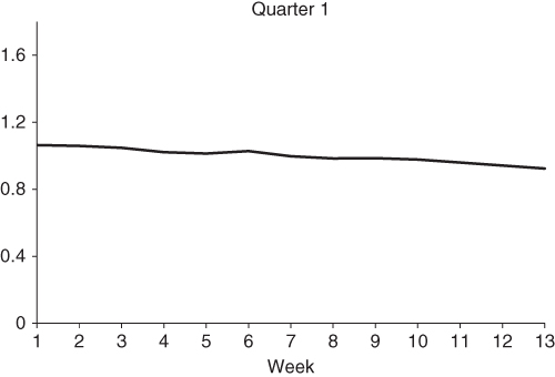
Figure 6.21 Estimated seasonal component, Q1.
Source: Macquarie Research, Quandl, September 2017.
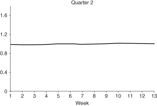
Figure 6.22 Estimated seasonal component, Q2.
Source: Macquarie Research, Quandl, September 2017.

Figure 6.23 Estimated seasonal component, Q3.
Source: Macquarie Research, Quandl, September 2017.

Figure 6.24 Estimated seasonal component, Q4.
Source: Macquarie Research, Quandl, September 2017.
Assuming that we have observed the weekly purchases of a sample of customers for s < 13 weeks in the new quarter, we can then predict the total for the whole quarter as

The quarter‐on‐quarter growth rate can then be predicted using the methodology introduced in the previous section.
6.6 A CASE STUDY: http://amazon.com SALES
6.6.1 Background
In this section we apply the methodology discussed above to the problem of predicting the quarterly revenues of Amazon. In the Quandl database, Amazon is by far the company with the largest number of observations. In addition, it is a good example of a company with a complex structure that requires a combination of quantitative and fundamental insights.
Amazon reports a quarterly split of sales by business segments, which has changed over time. In Figure 6.25 we plot the relative importance of two broad categories: e‐commerce and other sales (which includes Amazon Web Services, AWS). Because of the nature of our dataset, by concentrating on email receipts, we will only be able to investigate the trends in US e‐commerce sales. Figure 6.25 suggests that revenue from e‐commerce represent a large portion of the total, albeit a shrinking one due to the fast growth of AWS.8 Similarly, we can see from Figure 6.26 that sales to North American customers (the closest we can get to US sales) represent more than half of the total.

Figure 6.25 Sales breakdown per type, Amazon.
Source: Bloomberg, September 2017.

Figure 6.26 Sales breakdown per region, Amazon.
Source: Bloomberg, September 2017.
We are not, however, in a position to conclude that focusing on US e‐commerce will yield unbiased predictions. First, as we argued in the previous section, our sample may still be characterized by significant selection bias as we have no way to ascertain whether the Quandl sample is representative of the US population.
Second, even though both the proportion of sales that are not booked through the e‐commerce platform and the proportion of sales that happen outside the US are small, these segments may have very different growth rates and ultimately cause our prediction to be biased.
To address this potential issue we decompose sales growth (quarter‐on‐quarter) into regional contributions plus AWS (Figures 6.27–6.30). In each figure the total height of the bar represents the growth rate of Amazon's revenues for the corresponding quarter. The individual components are obtained by multiplying the relative weight of each segment by its quarterly growth rate.

Figure 6.27 Contributions to sales growth in Q1.
Source: Macquarie Research, Bloomberg, September 2017.
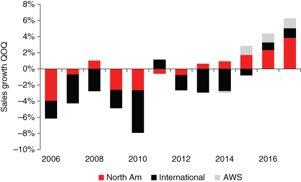
Figure 6.28 Contributions to sales growth in Q2.
Source: Macquarie Research, Bloomberg, September 2017.

Figure 6.29 Contributions to sales growth in Q3.
Source: Macquarie Research, Bloomberg, September 2017.

Figure 6.30 Contributions to sales growth in Q4.
Source: Macquarie Research, Bloomberg, September 2017.
The results suggest that the contribution of AWS to headline sales growth is still marginal, particularly in Q1 and Q4. However, it is becoming increasingly important for predictions in Q2 and Q3. North America and the rest of the world both contribute significantly to the overall growth rate but in most cases the former accounts for a larger share.
The conclusion is that focusing on the US is unlikely to result in a strong bias but ignoring the AWS segment (which has recently grown at much faster rates than e‐commerce) seems increasingly dangerous. The decomposition by business segment (omitted here in order to save space) yields similar results.
6.6.2 Results
We now turn to the problem of forecasting the headline sales number. Before doing so, however, we examine the differences between growth in total sales and growth in e‐commerce revenues through a scatterplot (Figure 6.31). Points above the solid black line represent quarters in which e‐commerce grew more rapidly than the total. As expected, this tends to happen in Q4 (when growth rates quarter on quarter exceed 30%) because of the Christmas peak. Figure 6.32 shows that focusing on US sales is unlikely to result in a significant bias per se.

Figure 6.31 e‐commerce vs. headline growth.
Source: Macquarie Research, Bloomberg, September 2017.

Figure 6.32 Headline growth vs. growth in North America.
Source: Macquarie Research, Bloomberg, September 2017.
We implement the estimator discussed in the previous section in order to predict Amazon's quarterly sales growth. Figure 6.33 presents our results for alternative versions of the forecast and compares them against consensus, i.e. the mean analyst estimate obtained from I/B/E/S one week after the end of the calendar quarter. By that time all the customer transactions for the quarter have been processed and added by Quandl to the database, hence both forecasts are available.

Figure 6.33 Combining big data and consensus delivers superior forecasts of total sales growth. The estimator without bias correction is  in the text, defined in Eq. (6.3). The version with bias correction corresponds to the estimator
  defined in Eq. (6.4). The combination is the simple average of consensus and our MAP estimator.
Source: Macquarie Research, September 2017.
The middle part of the table shows that the big data estimate compares favourably to consensus: both versions of the forecast display a lower mean absolute error (MAE) compared with the average analyst forecast. The root mean square error (RMSE) would favour consensus due to a few outliers that result in large errors early in the sample period. In the third column we display the hit rate, i.e. the number of times when our forecast improves on consensus, expressed as a percentage of the total sample size. We achieve an improvement two‐thirds of the time. While the number of observations in the time series is admittedly limited, our analysis seems to suggest that the big data estimate is at least as accurate as consensus.
Bias correction improves the estimate further (in terms of MAE), again suggesting that the Quandl sample is not free from selection bias. Nevertheless, our results suggest that the bias can be modelled accurately by using the simple solution detailed in the previous section, Eq. (6.4). As longer time series become available, one might need to use adaptive estimates as suggested earlier if the seasonal pattern that characterizes our sample bias changes over time.
At the bottom of Figure 6.33 we present the results of combining analyst estimates and big data. Here the two forecasts are combined simply by taking the average of the two values. This results in an improvement in accuracy as measured both by the MAE and by the hit rate, which reaches 75%. While in terms of RMSE the evidence is not as conclusive (the bias corrected version has a slightly higher error compared with consensus), overall the results highlight the improvement in forecasting ability that can be obtained by combining big data and fundamental insight from the analysts.
Figure 6.34 gives a graphical impression of the distance between forecast and actual value for the big data forecast (no analyst input is used in the chart). The prediction appears to follow closely the actual growth in sales and the estimation error seems to decrease as the number of time series observations increases. Again, this result can be attributed to the fact that, as the expanding window used in the estimation increases, the bias correction mechanism becomes more and more accurate.

Figure 6.34 Improving forecasting ability as the sample size increases. The plot refers to the version of the big data estimate that uses receipts data and guidance, with bias correction.
Source: Macquarie Research, September 2017.
6.6.3 Putting it all together
It is also useful to compare our big data estimate against consensus over time (Figures 6.35 and 6.36). In Figure 6.35 we plot the prediction errors of both estimators. Relatively large errors that occur early in the sample period (2014 Q4 in particular) cause the higher RMSE displayed by our forecast. Interestingly, consensus displays a seasonal pattern: analysts have tended to underestimate Q1 sales and overestimate in Q4. No such pattern can be found in the big data prediction.

Figure 6.35 Big data can be used to predict sales…
Source: Macquarie Research, September 2017.

Figure 6.36 …and sales surprises.
Source: Macquarie Research, September 2017.
Figure 6.36 represents the same information in a slightly different way by plotting the predicted and actual sales surprises. The actual figure is calculated as the difference between the reported figure (which would not have been accessible at the time when the forecast is formed) and consensus. The predicted surprise is the difference between our big data estimate and consensus, i.e. the surprise that would occur if our estimator turned out to be 100% accurate. The pattern of strong negative surprises in Q4 is apparent from the figure. With only two exceptions (Q3 2014 and Q4 2015), we would have been able to predict correctly the sign of the surprise in every single quarter.
A surprising result in Figure 6.33 is that the forecast combination that uses bias correction (last row of the table) underperforms the one without it. This is at odds with the evidence that the big data estimator, when used on its own, benefits from bias correction. Why does the conclusion change when our estimator is combined with consensus? It turns out that if we rely on Quandl data without trying to correct the bias, we tend to be less bullish than consensus in Q4 and more bullish Q1–Q3. As Figure 6.37 clearly shows, growth rates in our sample tend to be lower than the reported numbers for Q4 and higher for the rest of the year, particularly in Q1. This is exactly the opposite of the pattern of errors displayed by consensus (Figure 6.35). Hence, in contrast to the old saying that ‘two wrongs don't make a right’, when we combine the two estimates, the errors offset each other, which results in an improvement in MAE and particularly RMSE. However, we do not interpret our result as suggesting that one should use the raw estimator ![]() when combining big data with analyst forecasts. A better understanding of the drivers of the bias would be needed in order to draw a strong conclusion.
when combining big data with analyst forecasts. A better understanding of the drivers of the bias would be needed in order to draw a strong conclusion.

Figure 6.37 In‐sample vs. actual sales growth.
Source: Macquarie Research, Quandl, FactSet, I/B/E/S, September 2017.
The top half of Figure 6.38 assesses to what extent the performance of our big data estimator is driven by each of the two inputs, i.e. guidance and receipts data. We start by checking the sensitivity of the results to our choice of prior distribution. This is done in two ways:
- By deriving a forecast that relies solely on the Quandl data. This is equivalent to an improper prior on the rate of growth like the one advocated by Datta and Ghosh (1996).
- By using a model based on normal priors instead of our Gamma–exponential model.9

Figure 6.38 The results are robust. The data covers the period 2014Q2–2017Q1.
Source: Macquarie Research, Quandl, Fact Set, I/B/E/S, September 2017.
Our baseline model is referred to as Exponential in the table.
Ignoring the information available from management guidance results in a significant deterioration of the quality of the estimator, e.g. the MAE rises from 1.64% to 5.14%. The hit rate is just 33.3%. Nevertheless, guidance per se is not sufficient to match the predictive accuracy of our big data estimator. In Figure 6.38 we display the performance metrics for the guidance midpoint (i.e. the point in the middle of the guidance range) as an estimate of future quarterly growth. The resulting MAE (2.73%) and RMSE (3.23%) are clearly higher than any of the predictors in Figure 6.33. The hit rate is below 20%. To conclude, both ingredients in our approach (guidance and big data) play an important role in delivering remarkably accurate sales estimates. Our results suggest that guidance is important in reducing the range of likely outcomes while the Quandl dataset provides valuable information on the likelihood of growth rates within the range.
Figure 6.38 also contains the results for a naive forecast, the historical mean growth. Given the strong seasonal effects, we compute historical seasonal averages for each quarter (Q1–Q4) from expanding windows. Its performance is clearly much worse compared with the other methods considered so far.
6.6.4 Real‐time predictions
In this section we implement the methodology discussed in the previous section in order to simulate the real‐time estimation of sales growth as weekly updates to the Quandl database become available.
We extrapolate, given the first t < 13 weeks of data, the growth rate for the whole quarter and then apply the estimation procedure discussed above that corrects potential biases and incorporates the information available from management guidance.
The available database is far too short for a systematic analysis. Instead, we focus on the last four quarters of our sample period (Q2 2016–Q1 2017) and present the results of an out‐of‐sample analysis. The only parameters that are estimated using the full sample are the seasonal components that affect weekly sales (depicted in Figures 6.21–6.24), which are estimated using data from 2014 until 2016 and used to extrapolate weekly sales trends. We acknowledge that this potentially generates a slight look‐ahead bias. However, the bias does not affect the out‐of‐sample analysis for Q1 2017. In addition, any look‐ahead bias will be relevant only for the early part of each quarter because as more weeks of data become available, the effect of our extrapolation process on the result becomes less important. Once the calendar quarter is over, the estimate no longer changes and our estimates of the weekly seasonal effects are no longer needed.
Figures 6.39–6.42 display the results as time series plots. The grey line represents the consensus estimate while the black line shows the evolution of our real‐time big data prediction. In addition, we represent graphically the range of growth rates implied by management guidance as a grey shaded area which starts from the date when guidance is issued. Finally, the red dot in each picture represents the actual reported value.

Figure 6.39 Real‐time prediction of sales growth in 2016 Q2. The shaded area identifies the range of sales growth values implied by management guidance. The dot represents the actual growth rate reported by Amazon. The dotted line is the estimate obtained from receipts data ignoring the guidance.
Source: Macquarie Research, Quandl, Factset, I/B/E/S, September 2017.

Figure 6.40 Real‐time prediction of sales growth in 2016 Q3.
Source: Macquarie Research, Quandl, Factset, I/B/E/S, September 2017.

Figure 6.41 Real‐time prediction of sales growth in 2016 Q4.
Source: Macquarie Research, Quandl, Factset, I/B/E/S, September 2017.
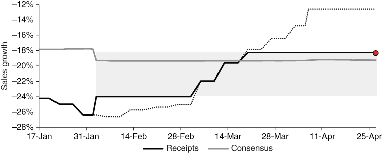
Figure 6.42 Real‐time prediction of sales growth in 2017 Q1.
Source: Macquarie Research, Quandl, Factset, I/B/E/S, September 2017.
In all four cases the big data estimate turns out to be more accurate than consensus when Amazon reports its results. Here we assess how long it takes for the information in the Quandl database to result in a sufficiently accurate estimate.
It is interesting to note that consensus tends to move relatively sharply when guidance is issued (Figure 6.39 is a clear example) and then remains within the range indicated by management. Relative to the guidance range, the consensus value tends to move very little after that point and remains typically in the top half.
Our big data estimate remains constant once the calendar quarter is over (e.g. on 30 June, with a one‐week lag in Figure 6.39) because no new information is available after that point. Throughout the period considered in this analysis, only in one case does the Quandl sample produce a growth rate that exceeds the guidance bounds (Figure 6.42). The dotted line in the figure represents the raw estimate. In Q3 2016 (Figure 6.40) the estimate starts above the upper bound (and is shrunk towards the middle), but as more weeks of data become available, it decreases until it enters the guidance range.
Our big data prediction is typically more volatile than consensus, particularly early in the quarter and even more markedly before guidance is issued. Nevertheless, it is worth highlighting that the two predictions – analyst forecast and big data forecast – rarely cross (only once in Figure 6.42), suggesting that the direction of the sales surprise can be predicted even early in the quarter.
REFERENCES
- Adrian, T. and Franzoni, F. (2009). Learning about Beta: time‐varying factor loadings, expected returns and the conditional CAPM. J. Empir. Financ. 16: 537–556.
- Ben‐Rephael, A., Da, Z., and Israelsen, R.D. (2017). It depends on where you search: institutional investor attention and underreaction to news. Rev. Financ. Stud., 30: 3009–3047.
- Brar, G., De Rossi, G., and Kalamkar, N. (2016). Predicting stock returns using text mining tools. In: Handbook of Sentiment Analysis in Finance (ed. G. Mitra and X. Yu). London: OptiRisk.
- Das, S.R. and Chen, M.Y. (2007). Yahoo! For Amazon: sentiment extraction from small talk on the web. Manag. Sci., 53: 1375–1388.
- Datta, G.S. and Ghosh, M. (1996). On the invariance of non‐informative priors. Ann. Stat., 24: 141–159.
- Donaldson, D. and Storeygard, A. (2016). The view from above: applications of satellite data in economics. J. Econ. Perspect., 30: 171–198.
- Drăgulescu, A. and Yakovenko, V.M. (2001). Exponential and power‐law probability distributions of wealth and income in the United Kingdom and the United States. Phys. A., 299: 213–221.
- Gholampour, V. and van Wincoop, E. (2017). What can we Learn from Euro‐Dollar Tweets? NBER Working Paper No. 23293.
- Green, T.C., Huang, R., Wen, Q. and Zhou, D. (2017). Wisdom of the Employee Crowd: Employer Reviews and Stock Returns, Working paper. Available at SSRN: https://ssrn.com/abstract=3002707.
- Johnson, N.L., Kotz, S., and Balakrishnan, N. (1995). Continuous Univariate Distributions, vol. 2. New York: Wiley.
- Madi, M.T. and Raqab, M.Z. (2007). Bayesian prediction of rainfall records using the generalized exponential distribution. Environmetrics, 18: 541–549.
- Perlin, M.S., Caldeira, J.F., Santos, A.A.P., and Pontuschka, M. (2017). Can we predict the financial markets based on Google's search queries? J. Forecast., 36: 454–467.
- Rajgopal, S., Venkatachalam, M., and Kotha, S. (2003). The value relevance of network advantages: the case of e–commerce firms. J. Account. Res., 41: 135–162.
- Trueman, B., Wong, M.H.F., and Zhang, X.J. (2001). Back to basics: forecasting the revenues of internet firms. Rev. Acc. Stud., 6: 305–329.
- Wahba, G. (1978). Improper priors, spline smoothing and the problem of guarding against model errors in regression. J. R. Stat. Soc. Ser. B 40: 364–372.