CONTRAST
10 Contrast in Composition
Contrast makes marks distinguishable. As a rule, the less contrast a mark has—both internally and with its surroundings—the harder it is to make it stand out.
The phrase “graphic identity” implies high contrast. A “graphic” identity has graphic form—it lives as an abstracted, simplified, high-contrast symbol of something. Good graphic identities often use contrast to draw a comparison between two things. Usually that comparison begs a conversation, leading the viewer to wonder: Why is the weight of this letter different than that one? Why is this shape different than all the rest? And what does this all mean? Is it a joke? Does it suggest some deeper meaning? Does it imply variety, evolution, individuality?
Contrast is a powerful tool in designing well-composed, meaningful graphic identities.
1. Rod Ralston
circle k studio
Julie Keenan, Jack Anderson
2. UNRESERVED
The O Group
Jason B. Cohen, J. Kenneth Rothermich
3. Garza Architects
Murillo Design, Inc.
Rolando G. Murillo
4. Convince and Convert
Bohnsack Design
Chris Bohnsack
5. Boston Ballet
KORN DESIGN
Denise Korn, Ben Whitla
6. Meeting Productions
Xose Teiga
7. House of Cards
Pentagram
Domenic Lippa
8. Fingerprint Strategies
Spring Advertising
Perry Chua, Rob Schlyecher, James Filbry, Jan Perrier, Chris Coulos
9. Kihoku
Christopher Dina
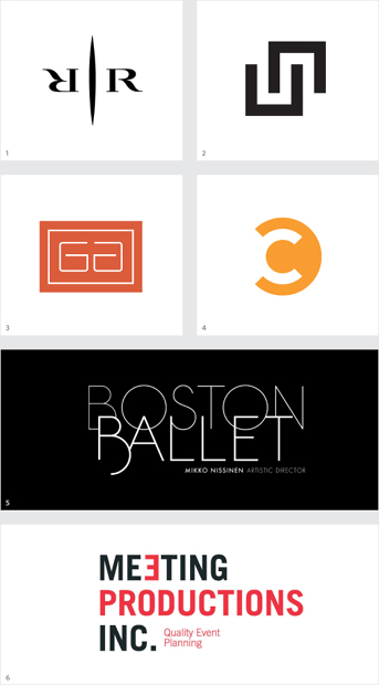
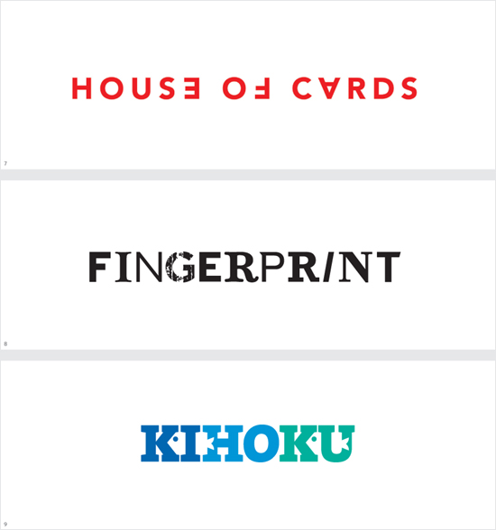
The intentional juxtaposition of two elements—weight, color, typeface, orientation, etc.—can enhance meaning or simply add interest.