14 Shape Patterns
It can be very effective to borrow shapes from a graphic identity to create program elements. Shapes that echo the logo (squares for a squareish logo, circles for a circular logo, etc.) can be used to create pattern or texture. These elements not only are useful in making the look of the program more cohesive, but they also can help make the graphic identity more meaningful and memorable.
More information is conveyed as program designers translate a graphic identity into physical spaces, allowing for layers of meaning to enrich the identity program. Consistent use of these shape elements will remind the viewer of the logo without being redundant.
1. La Fonda del Sol
Mirko Ili![]() Corp
Corp
Mirko Ili![]() , Jee-eun Lee
, Jee-eun Lee
2. Circo by Target
circle k studio
Julie Keenan, Karen North, Nicolas Aparicio, Chris Lehmann
3. Neustar
Siegel+Gale
Sven Seger, Young Kim, Lloyd Blander, Jong Woo Si, Enshalla Anderson
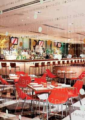
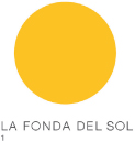
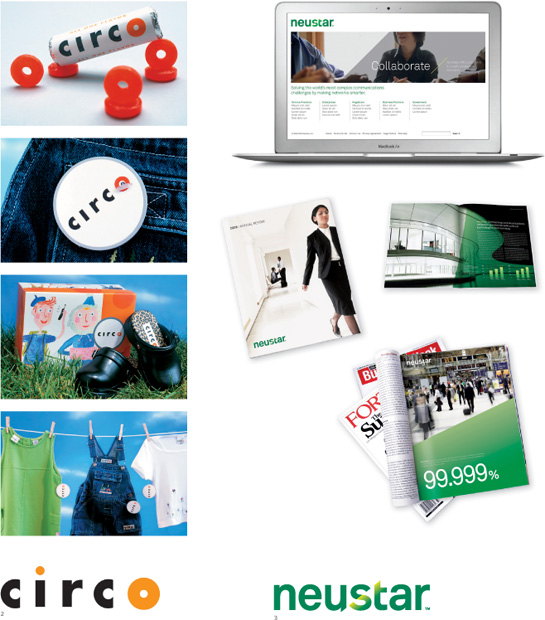
Dominant shapes in the logo can create a visual motif for program elements. For La Fonda del Sol, the round sun logo becomes a letter O in window signage; for Circo, the red letter O becomes a recognizeable graphic element. For Neustar, a simple diagonal creates a recognizable pattern.