VARIATION
31 Logo Flexibility
Inspired by the clever use of variation by media companies such as the music video network MTV, more and more organizations want to change things up with their graphic identities. Logos can be flexible as long as the message is consistent—and consistently recognizable to its intended audience.
Information drives the built-in flexibility within the Language Institute of Central Oregon mark, which uses different colors and icons to signify the organization’s different divisions. With the Ringling College of Art and Design, on the other hand, the variations provide little more than decorative interest. In both cases, the ability to change things up provides one of the more distinguishing characteristics of the marks. If more signals were used to vary these marks, however, would you know where to look?
A wide spectrum of attributes spans the chasm between boredom and chaos. In one direction is restraint, structure, rhythm, pattern, and comfort; in the other, highlights, cleverness, creativity, surprise, and capriciousness. Somewhere in the middle is where you might find “good design.” Don’t underestimate the risks at either extreme.
1. Ringling College of Art and Design
samatamason
Kevin Krueger, Dave Mason, Chris Roeleveld
2. Kapulica Studio
Bunch
3. Language Institute of Central Oregon
Sublime Creative Agency
Aileen Walker, William Hastings
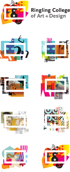
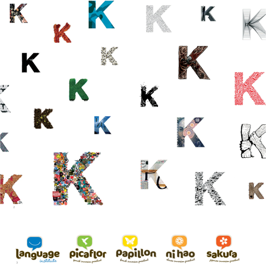
What is consistent about each of these marks? What varies? How is the variation used? Why is it there? Flexibility can breathe life into a graphic identity.