COLOR
4 Color Choices
We could dedicate an entire book to the subject of color—and plenty of people have. As a designer, there’s a lot to learn about using color, from the psychology to the science. When developing a graphic identity, however, perhaps the single most important thing to know about color is at what point in the process to make decisions about it.
Color brings such an immediate emotional quality to a mark—it can tempt designers into jumping ahead and designing with a particular color in mind. Resist this temptation. Complete your initial design for each new mark without regard to the color(s) it will eventually take on. Because most graphic identities face color limitations depending on the application, you’ll need to ensure that a mark will work in several different colors. And because colors are often influenced by trends, what feels contemporary today may look dated tomorrow.
That said, a color treatment can make or break a graphic identity. Color choices that are too dated, illegible, unsophisticated, etc., can drag down even the most wonderfully drawn mark.
Once you’re ready to consider color for a mark, start with the natural dimensions of color: hue (red vs. blue), saturation (bright blue vs. blue gray), and brightness (light blue vs. dark blue). Revisit the color wheel and think about how complementary colors with the same values play visual tricks. Consider additive color (where every color together makes black) or subtractive color (where every color together makes white). Understand the context of color—how a light shape on a dark field looks smaller than a dark shape on a light field.
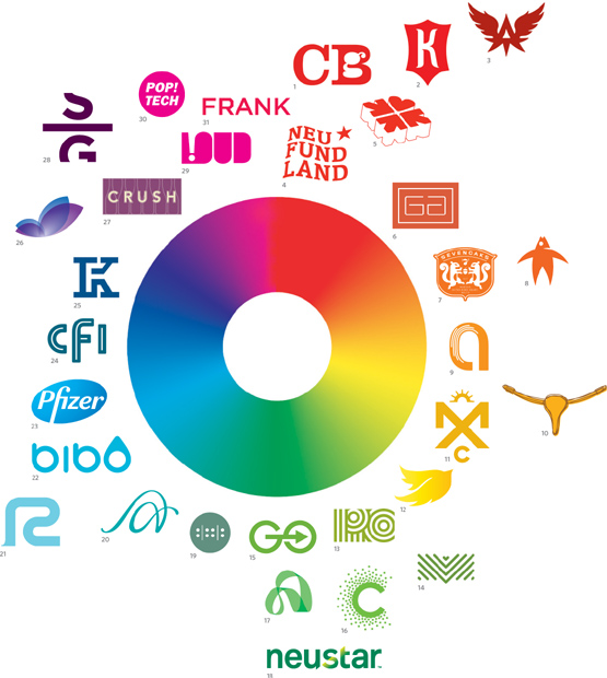
1. CgB
Carol García del Busto
2. Kink
MINE™
Christopher Simmons, Tim Belonax
3. Americas Team
CAPSULE
Brian Adducci
4. NEUFUNDLAND
Simon & Goetz Design GmbH & Co. KG
DörteFischer, Julia Brett, Heiko Winter
5. Avenue for the Arts
David R. Schofield
6. Garza Architects
Murillo Design, Inc.
Rolando G. Murillo
7. Seven Oaks
Cue, Inc.
Alan Colvin
8. Red Star Fish Bar
Idea 21 Design
Tom Berno, Jeff Davis
9. Abaltat
DETAIL. DESIGN STUDIO
10. Yellow Bike Project Austin
Idea 21 Design
Tom Berno, Jeff Davis
11. Morningside Athletic Club
Cue, Inc.
Alan Colvin
12. Icarus Digital
Organic Grid
Michael McDonald
13. Renaissance Capital
Langton Cherubino Group
Jim Keller, Janet Giampietro, David Langton
14. Mill Valley Film Festival
MINE™
Christopher Simmons, Tim Belonax
15. GO
Fitzgerald+CO/Deep Design
Heath Beeferman, Matt Blackburn, Greg Feist
16. Convergence
MINE™
Christopher Simmons, Tim Belonax
17. ArtServe
Square One Design
Mike Gorman, Lindsay Jones
18. Neustar
Siegel+Gale
Sven Seger, Young Kim, Lloyd Blander, Jong Woo Si, Enshalla Anderson
19. Warehouse 242
Eye Design Studio
Gage Mitchell, Chris Bradle, Steve Whitby
20. Aquarius Advisors
John Langdon Design
21. Radlyn
Cue, Inc.
Alan Colvin
22. Bibo
Ó!
Einar Gylfason
23. Pfizer
Siegel+Gale
Howard Belk, Sven Seger, Young Kim, Johnny Lim, Monica Chai, Quae Luong, David McCanless
24. California Film Institute
MINE™
Christopher Simmons, Tim Belonax
25. Fujiken Setsu
Christopher Dina
Christopher Dina, Yukari Dina, Katsumasa Sekine
26. Vocii
Tandemodus
Kelly Komp, Andy Eltzroth, Charee Klimek, Classic Color, Bill Borque
27. Crush Wine Bar
Idea 21
Tom Berno, Jeff Davis
28. Shop Gopher
Jan Sabach Design
29. LOUD Foundation
Seven25. Design & Typography
Isabelle Swiderski
30. PopTech!
C2
Erik Cox and John Bielenberg
31. Frank at the AGO
Hahn Smith Design
Nigel Smith, Alison Hahn, Richard Marazzi, Fred Tan, Emily Fung
Color choices can’t be made entirely objectively, but most of the time (we hope) you’ll make color choices for reasons that add up to more than a gut reaction.