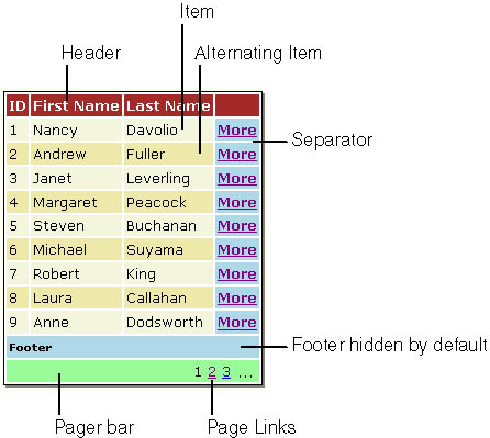
Constituent Items of DataGrid
The user interface of a DataGrid control comprises several types of items. These item types are grouped in the ListItemType enumeration. Each item plays a clear role and has a precise location in the hierarchy of the control’s user interface, as Figure 2-1 shows.
A DataGrid control is formed by using any combination of eight different items. Each item maps to a template style property of the DataGrid control, but remember from Chapter 1 that templates for DataGrid differ from those of DataList because they apply to the columns rather than to the control. Table 2-1 describes the graphical items that form an ASP.NET DataGrid control.
Figure 2-1. The layout of a DataGrid control.
| Item type | Description |
|---|---|
| Header | The grid’s header. This item cannot be data bound. The HeaderStyle property lets you control the look and feel of the header. |
| Item | A normal data bound row displayed in the grid. The ItemStyle property lets you control the look and feel of the row. |
| Separator | An item used to separate rows. This item type is not data bound. |
| AlternatingItem | A data bound row in an odd-numbered position. This item type is useful when you want to use different styles for alternating rows. The AlternatingItemStyle property lets you control the look and feel of the row. |
| Footer | The grid’s footer. This item type cannot be bound to a data source. The FooterStyle property lets you control the look and feel of the footer. |
| EditItem | The grid item currently in edit mode. This item type can be data bound. The EditItemStyle property lets you control the look and feel of the edited item. |
| Pager | The pager bar item you can place at the bottom of the grid to enable scrolling between pages. This item type cannot be data bound. The PagerStyle property lets you control the look and feel of the pager bar. |
| SelectedItem | The grid item currently selected. This item type can be data bound. The SelectedItemStyle property lets you control the look and feel of the selected item. |
Each time an item in Table 2-1 is about to be created, an ItemCreated event is fired. By handling this event, you can customize the way in which the item—for example, a column caption or the pager bar—is rendered. Note that the ItemCreated event is not raised for each column but only once when the DataGrid control has finished creating the whole item. For example, the footer and header events are raised only when the header and the footer for each column have been created. Later in this chapter, you’ll learn to use the ItemCreated event.