
Chapter 13: Conclusion
In this book, we’ve covered some of the finer points and broad strokes of CSS. In some ways, we’ve only scratched the surface.
With the CSS Working Group’s switch to modularized specifications and shorter browser release cycles, new CSS features are created and implemented much more quickly. Attempting to keep up and stay ahead of the curve can leave your head spinning. Indeed, browsers support CSS features and properties such as generated content and scroll anchoring, which I haven’t covered in this book.
So what’s coming next? Quite a bit! One caveat: progress on features that seem to be on a fast track can stall over time. Browser vendors shift development priorities and sometimes entire rendering engines based on developer demand, performance, security, and business concerns. In rare cases—such as support for SVG fonts—vendors may remove support altogether.
The following list of upcoming features isn’t comprehensive. It’s more of a look at a few specifications and implementations in progress.
Nested Grids with subgrid
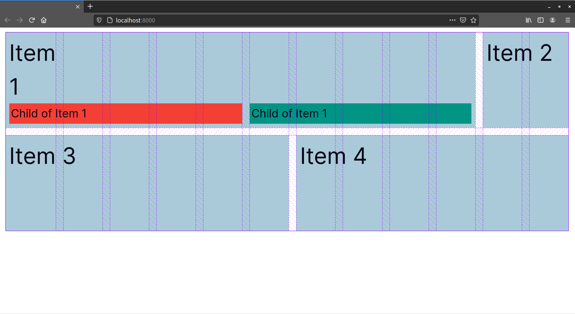
Applying display: grid to an element creates a grid formatting context, and turns its immediate child elements into grid items. Children of grid items, however, don’t participate in the grid formatting context. Instead, they behave according to the rules of normal flow, as pictured below.

As the image above illustrates, neither child of Item 1 participates in the grid formatting context of its “grandparent” element. By specifying a subgrid, however, we can force our grandchild elements to line up with the grid tracks established by the grandparent element.
First, let’s look at the markup for the layout shown in the image above:
<div class="grid">
    <div class="grid-item-1">
        Item 1
        <div class="subgrid-item">Child of Item 1</div>
        <div class="subgrid-item">Child of Item 1</div>
    </div>
    <div class="grid-item-2">Item 2</div>
    <div class="grid-item-3">Item 3</div>
    <div class="grid-item-4">Item 4</div>
</div>
The markup is straightforward. Our grid container has four child elements, and its first child has two children of its own.
Here’s the CSS. I’ve removed non-essential declarations such as background colors:
.grid {
    gap: 2rem;
    display: grid;
    grid-template-columns: repeat(12, 1fr);
    grid-template-rows: repeat(2, 1fr);
}
/*Spans 10 columns */
.grid-item-1 {
    grid-column: 1 / 11;
}
 /* Spans two columns */
.grid-item-2 {
    grid-column: 11 / 13;
}
/* Spans six columns each */
.grid-item-3 {
    grid-column: 1 / 7;
}
.grid-item-4 {
    grid-column: 7 / 13;
}
.subgrid-item {
    font-size: .5em;
    padding: .5rem;
}
We haven’t yet defined a subgrid for this layout. Adding a subgrid requires adding two declarations to a grid item:
display: grid(ordisplay: inherit), which creates a grid formatting context for children of the grid itemgrid-template-columns: subgridorgrid-template-rows: subgrid
Let’s add a column subgrid for .grid-item-1. We’ll also make each child element take up five columns:
.grid-item-1 {
    grid-column: 1 / 11;

    /* Adopts the adopts the parent's grid tracks */
    display: grid;
    grid-template-columns: subgrid;
}
.subgrid-item:first-child {
    grid-column: 1 / 6;
}
.subgrid-item:last-child {
    grid-column: 6 / 11;
}
Elements within the subgrid align with the grid tracks of the parent grid container, as pictured below.
The child elements of Item 1 now align with the grid tracks of div.grid, minus any padding applied to .grid-item-1.
You may also have noticed from the screenshots that the Item 1 text wraps in our subgrid. Although that text isn’t an element, it participates in the grid formatting context of its parent. As a result, its width is constrained to the width of a single grid track.
Unfortunately, Firefox (versions 71 and above) is the only browser that currently supports subgrid.
Creating Brick-like Layouts with masonry
Firefox is also the only browser that currently supports masonry-style grid layouts. It’s still experimental at this stage. You’ll need to enable it by changing the value of layout.css.grid-template-masonry-value.enabled to true. You can find this option in Firefox’s about:config menu.
Masonry-style layouts, also known as Pinterest-style layouts, until now have required a JavaScript library such as Masonry.js. With the masonry grid template value, creating masonry-style layouts requires much less effort:
.grid {
    display: grid;
    gap: 1rem;

    /* Short hand for grid-template-rows / grid-template-columns */
    grid-template: masonry / repeat(6, 1fr);
}
This creates the layout shown in the image below.

Rather than add strict tracks for rows (when grid-template-rows: masonry) or columns (when grid-template-rows: masonry), masonry creates a tightly packed layout.
Grid items shrink to the dimensions of their content. By default, they’re arranged where there’s available space, which may not match the source order. However, we can change this behavior using the masonry-auto-flow property. For example, adding masonry-auto-flow: next to the grid container forces items to be arranged in order, as pictured below, where masonry-auto-flow: next preserves the order of grid items in a masonry layout.

To experiment with masonry while ensuring backward compatibility, separate your grid-template-rows and grid-template-columns values. Remember: if a browser can’t parse a declaration, that declaration gets discarded. Using grid-template for both values would make the entire rule fail. Instead, set grid-template-rows or grid-template-columns to masonry, and use the other property to define grid tracks:
.grid {
    display: grid;
    gap: 1rem;
    grid-template-columns: repeat(6, 1fr);
    grid-template-rows: masonry;
}
In browsers that don’t yet support the masonry value, the CSS above creates a six-column grid layout. For 12 grid items, you’d see two rows.
Container Queries
Almost as soon as media queries landed in browsers, developers began asking for a way to change the layout of components based on the width of their container, instead of the browser viewport. A few developers have used JavaScript to create responsive containers and element queries that have a similar effect, but browser implementations have never gone beyond the specification phase.
In March of 2021, however, Chrome announced some movement in this space. Google released Chrome Canary with an experimental container queries implementation, based on a draft specification for single-axis containment.
Work on the container queries feature is now part of the CSS Containment specification. We may soon be able to create adaptable layouts using an @container rule with a syntax that’s similar to @media:
.simple-input {
    contain: layout inline-size; /* Creates a containment context for the inline axis */
}
.simple-input input,
.simple-input button {
    display: block;
    font: inherit;
    padding: 2px;
}
@container (min-width: 40rem) {
    .simple-input {
        display: flex;
        gap: 1rem;
    }
}
To experiment with container queries today, install Chrome or Chromium. Enable the feature by typing chrome://flags/#enable-container-queries in the address bar, and selecting Enabled from the Enable CSS Container Queries menu.
Both David A. Herron’s “Container Queries: a Quick Start Guide” and the Mozilla Developer Network’s “CSS Container Queries” are fantastic introductions to container queries. CodePen also has a growing collection of container query demos worth exploring. If poring over technical details is your thing, read Miriam Suzanne’s Container Query Proposal & Explainer.
How to Follow Changes and Additions to CSS
Keeping track of all this can be overwhelming. Just when you think you’re up to date on everything, you find a new spec that you didn’t know existed, or an existing spec changes in a significant way. Because specifications and implementations are often in flux, keeping up with changes to CSS can be tough. But it is possible.
The World Wide Web Consortium manages a list of current specifications and their status. One of the best ways to become a CSS expert is to carefully read specifications. Specifications explain how features are supposed to work, and can help you recognize browser bugs, or understand what may be going wrong in your CSS.
If you’d like to track the development and discussion of CSS specifications, try the CSS Working Group’s GitHub repository. It contains current drafts of specifications, and a list of issues that developers, browser vendors, and specification editors are working through. The CSS Working Group also has a Twitter account if you’d just like to keep up with developments without getting into the proverbial weeds.
Tracking Browser Support
The Can I use site is the leader in the browser support tracking space. It tracks support for a range of CSS, HTML, SVG and JavaScript features in every major browser across several versions. Can I use shares documentation with the Mozilla Developer Network, another fantastic resource for tracking features as they land.
Chrome Platform Status tracks features as they appear in Google Chrome. Because they both use Chromium, Microsoft Edge hews closely to the feature set and release cycle of Google’s Chrome. If Chrome supports a feature, there’s a good chance Edge does as well. Other Chromium-based browsers, such as Samsung Internet, have a longer release cycle. Samsung includes the version of Chrome on which the current release is based as part of its release notes.
Apple is notoriously secret about its products. Safari, the web browser for macOS and iOS, is no exception. Safari is, however, based on WebKit, an open-source web browser engine. WebKit Feature Status is a great way to keep up with what’s coming to Safari and other WebKit-based browsers.
If you prefer to weigh in on what features browsers should support, you can also follow and comment on issue tickets in the bug trackers of WebKit, Firefox, and Chromium. Developer interest can help vendors prioritize feature development.
Documentation and Tutorials
The Mozilla Developer Network is an amazing resource for web development more generally. Its CSS Reference is perhaps the best on the Web. Almost every property is documented, and each property’s page includes examples of use, details whether it’s experimental or production-ready, and links to the relevant specification.
For general CSS tricks, tips, and techniques, CSS-Tricks is an excellent resource. The site includes tutorials on CSS and other front-end development topics.
Stephanie Eckles’ Modern CSS Solutions is perfect for experienced developers who are still trying to learn the CSS landscape. Its companion site SmollCSS includes snippets.
Newsletters are also a great way to keep track of new CSS features. Rachel Andrew keeps track of layout specifications and implementations in her long-running weekly CSS Layout News. Her newsletter also contains useful pointers to CSS and design-focused resources.
SitePoint.com, too, has a treasure trove of CSS-related material. Its HTML and CSS channel has lots of CSS tutorials, including topics such as Grid, CSS optimization, authoring tools, and progressive enhancement. If you need help, you can always ask a question in the SitePoint Forums.
And that’s how this book ends. Of course, just reading this book isn’t sufficient for becoming a true CSS master. The best way to achieve mastery is by putting knowledge into practice. My hope is that you’ve gained a better understanding of a range of CSS topics, including specificity, layout, and project architecture. These topics provide a solid foundation for your journey toward CSS mastery.