
Creating a great photograph takes more than just the right settings on your camera. To take your photography to the next level, you need to gain an understanding of how the elements within the frame come together to create a compositionally pleasing image. Composition is the culmination of light, shape, and, to borrow a word from the iconic photographer Jay Maisel, gesture. Composition is a way for you to pull your viewing audience into your image and guide them through the scene. Let’s examine a few methods you can use to add interest to your photos by utilizing some common compositional elements.
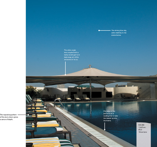
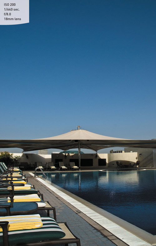
I call this my “brochure picture” because it reminds me of something you might see in a travel magazine. When my buddy Jeff Kelby and I ventured up to this rooftop pool, the site of the huge umbrella, along with the blue water and sky, immediately struck me. But it wasn’t until I walked around to the corner of the pool that I was able to find the angle that pulled all of the elements together into a balanced composition.
Wandering through the ruins of Angkor Wat, you see dozens of these lion and serpent statues. After photographing several of them, I started looking for a more interesting way to shoot them. I started circling around the area, moving farther and farther from them until I passed behind these trees. When I got between these two, I looked back at the statues and took note of the sloping trunks and how they were forming a curved frame for my subjects to appear in. Sometimes you just have to keep checking all the angles instead of shooting the obvious.

Long focal lengths and large apertures will allow you to isolate your subject from the chaos that surrounds it. I utilize the Av mode for the majority of my shooting. I also like to use a longer focal length lens to shrink the depth of field to a very narrow area (Figure 9.1).
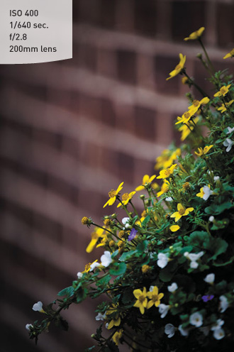
The blurred background and foreground force the viewer’s eye toward the sharper, in-focus areas, which gives greater emphasis to the subject.
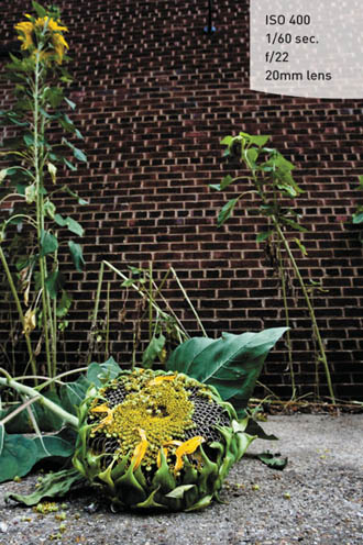
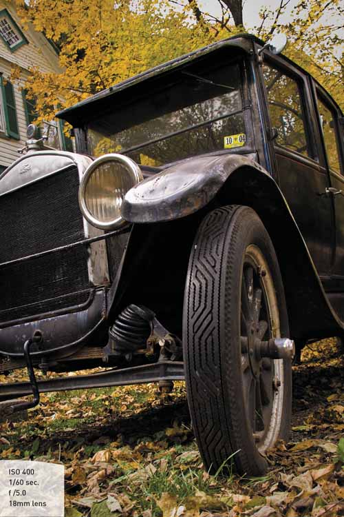
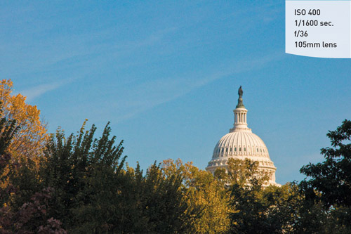
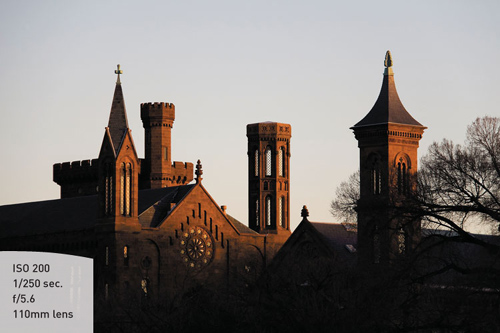
Occasionally a greater depth of field is required to maintain a sharp focus across a greater distance. This might be due to the sheer depth of your subject, where you have objects that are near the camera but sharpness is desired at a greater distance as well (Figure 9.2).
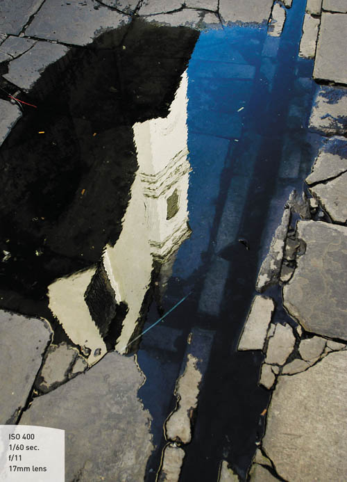
Or perhaps you are photographing a reflection in a puddle. With a narrow depth of field, you could only get the reflected object or the puddle in focus. By making the aperture smaller, you will be able to maintain acceptable sharpness in both areas (Figure 9.3).
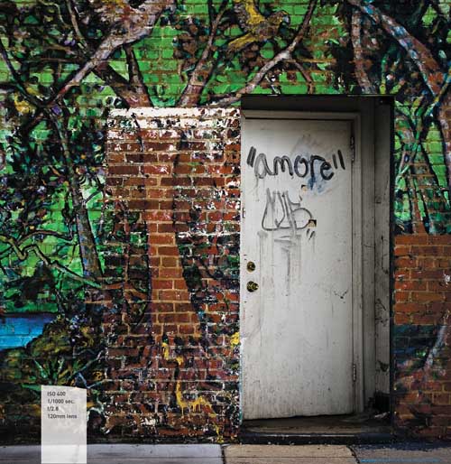
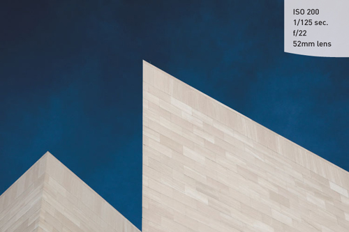
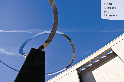
Having strong angular lines in your image can add to the composition, especially when they are juxtaposed to each other (Figure 9.4). This can create a tension that is different from the standard horizontal and vertical lines that we are so accustomed to seeing in photos.
There are times when you can accentuate the angles in your images by tilting the camera, thus adding an unfamiliar angle to the subject, which draws the viewer’s attention (Figure 9.5).
Sometimes the easiest way to influence your photographs is to simply change your perspective. Instead of always shooting from a standing position, try moving your camera to a place where you normally would not see your subject. Try getting down on your knees or even lying on the ground. This low angle can completely change how you view your subject and create a new interest in common subjects (Figure 9.6).
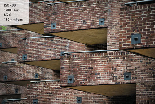
Rhythm and balance can be added to your images by finding the patterns in everyday life and concentrating on the elements that rely on geometric influences. Try to find the balance and patterns that often go unnoticed (Figure 9.7).
Color works well as a tool for composition when you have very saturated colors to work with. Some of the best colors are those within the primary palette. Reds, greens, and blues, along with their complementary colors (cyan, magenta, and yellow), can all be used to create visual tension (Figure 9.8). This tension between bright colors will add visual excitement, drama, and complexity to your images when combined with other compositional elements.

You can also use a color as a theme for your photography. One of the shots that I am known for is something that I call “The Blue Sky Shot.” If I am out shooting when the skies are blue, I can almost guarantee that I will try to use the sky as part of a background for some element of my image (Figure 9.9). The blue sky can act as a color contrast to my subject, giving a pleasing contrast, visual interest, and isolation to my subject.
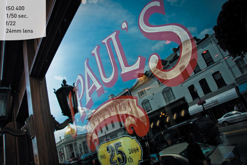
We just saw that you can use color as a strong compositional tool. One of the most effective uses of color is to combine two contrasting colors that make the eye move back and forth across the image (Figure 9.10). There is no exact combination that will work best, but consider using dark and light colors, like red and yellow or blue and yellow, to provide the strongest contrasts.

You can also introduce contrast through different geometric shapes that battle (in a good way) for the attention of the viewer. You can combine circles and triangles, ovals and rectangles, curvy and straight, hard and soft, dark and light, and so many more (Figure 9.11). You aren’t limited to just one contrasting element either. Combining more than one element of contrast will add even more interest. Look for these contrasting combinations whenever you are out shooting, and then use them to shake up your compositions.
One way to pull a viewer into your image is to incorporate leading lines. These are elements that come from the edge of the frame and then lead into the image toward the main subject (Figure 9.12). This can be the result of vanishing perspective lines, an element such as a river, or some other feature used to move from the outer edge in to the heart of the image.
Generally speaking, splitting the frame right down the middle is not necessarily your best option. While it may seem more balanced, it can actually be pretty boring. Generally speaking, you should utilize the rule of thirds when deciding how to divide your frame (Figure 9.13).
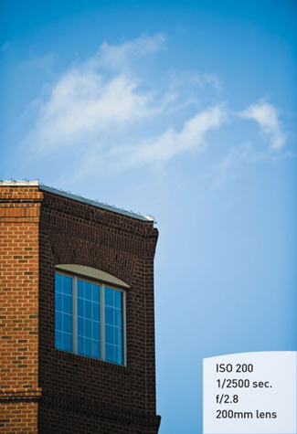
With horizons, a low horizon will give a sense of stability to the image. Typically, this is done when the sky is more appealing than the landscape below. When the emphasis is to be placed on the landscape, the horizon line should be moved upward in the frame, leaving the bottom two thirds to the subject below (Figure 9.14).
The outer edge of your photograph acts as a frame to hold all of the visual elements of the photograph. One way to add emphasis to your subject is through the use of internal frames (Figure 9.15). Depending on how the frame is used, it can create the illusion of a third dimension to your image, giving it a feeling of depth.

Apply the shooting techniques and tools that you have learned in the previous chapters to these assignments, and you’ll improve your ability to incorporate good composition into your photos. Make sure you experiment with all the different elements of composition and see how you can combine them to add interest to your images.
Take your camera for a walk around your neighborhood and look for patterns and angles. Don’t worry so much about getting great shots as much as developing an eye for details.
Here’s a great exercise that was given to me by my friend Vincent Versace: shoot the alphabet. This will be a little more difficult but with practice you will start to see beyond the obvious. Don’t just find letters in street signs and the like. Instead, find objects that aren’t really letters but have the shape of the letters.
Circles, squares, and triangles. Spend a few sessions concentrating on shooting simple geometric shapes.
Depth of field plays an important role in defining your images and establishing depth and dimension. Practice shooting wide open, using your largest aperture for the narrowest depth of field. Then find a scene that would benefit from extended depth of field, using very small apertures to give sharpness throughout the scene.