“Why do two colors, put one next to the other, sing?”
–Pablo Picasso
“All colors are the friends of their neighbors and the lovers of their opposites. “
–Marc Chagall
CHAPTER 1
COLOR THEORY
Color theory was one of my favorite courses in college. I was fascinated to learn that there are theories behind creating compositional balance in art works. Much of how I use color in my images comes from the principles I first learned in that course. The funny thing is, the course wasn’t even required for my major—it was a theory course designed for painting majors.
While entire books (and college courses) have been dedicated to the study and application of color theories, this book focuses on what I have found through my experience as a photographer to be the most fundamental, interesting, and most applicable concepts within this broad topic. The bulk of color theory has to do with the mixing of pigments, which doesn’t concern photographers. Instead of reinventing the (color) wheel, I am going to narrow in on the aspects of color theory that pertain directly to photographers.
AN OVERVIEW OF COLOR THEORY
The human eye, although vastly more powerful than any camera lens, is still quite limited in its ability to perceive color. The range of colors our eyes can see is referred to as the visible spectrum. The visible specturm begins with white light, which is broken down into a mixture of red, green, and blue color wavelengths.
ADDITIVE AND SUBTRACTIVE COLOR
Color interactions fall under two categories: colored pigments and colored light. The mixing of colored pigment falls under the subtractive color model, seen in Figure 1.1. In this model, magenta, yellow, and cyan overlap to create red, green, and blue, which in turn overlap to create black. This is the model that printers refer to. The additive model (Figure 1.2) shows what happens when colored light interacts. Red, green, and blue overlap to create cyan, magenta, and yellow, which combine to make white, or colorless light. This, being a book about colored light, is where we will spend much of our time.
Though there are some similarities between the two models (blue and yellow make green), there are some major differences. For example, in the additive color model, green and red light mix to make yellow light (Figure 1.3); in the subtractive color model, green and red paint create a brown color when mixed.
When our eyes are perceiving the color of an object, such as the color of a flower, a car, or even the blue sky, what we are actually seeing are unabsorbed color wavelengths. For example, when we’re looking at something that we perceive as red, such as an apple, the apple skin looks red because the green and blue wavelengths of white light are being absorbed, leaving only the red wavelengths to reflect back to our eyes.

Figure 1.1 The CMY (cyan, magenta, yellow) color model, also known as the subtractive color model, is commonly used by visual artists. It demonstrates what happens when you overlap colored pigment.

Figure 1.2 The RGB (red, green, blue), or additive color model, demonstrates what happens when colored light of different wavelengths overlaps.
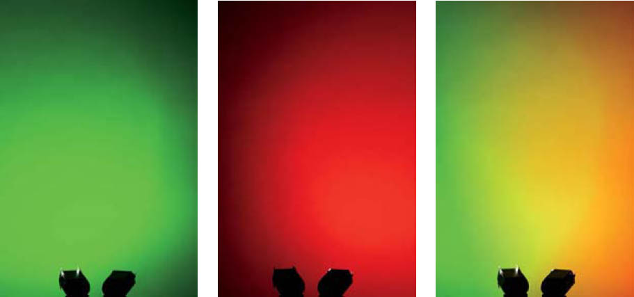
Figure 1.3 While red and green pigment combine to make a muddy brown color, when you overlap red and green light, you get yellow light.
That said, when our eyes perceive a colored surface, both the additive and subtractive properties will be in effect. For example, consider the white vase in Figure 1.4. The images on the left were shot on a white background, while the images on the right were shot in front of a red backdrop. The red light on the white backdrop and the red light on the red backdrop yield similar results. Now look at the green scenarios. Green light shining on the red background makes the the background appear black because red surfaces absorb green wavelengths.

Figure 1.4 Red and green light overlap to create yellow light, but when green light hits a red surface, the surface appears black.
The bottom row of images shows what happens when red and green light overlap: we get yellow light against the white surface, but the red background still appears red. Once again, the green light is absorbed, per the subtractive law, leaving only red light to illuminate the background. These laws will come into play when you’re determining how to create desirable color interactions in your images—or eliminate undesirable ones.
RYB COLOR WHEEL
The CMY color model is a more up-to-date theory of color than the older model, known as the RYB color wheel. However, the RYB color wheel is still commonly used by painters and interior decorators (Figure 1.5). It’s a fantastic resource for understanding relationships between colors.
Before we begin, know that the “rules” of color theory describe how color is rendered, not how it should be rendered. How you end up lighting an image depends on what you’re trying to accomplish with the shot. For instance, when lighting a person, I think that green light looks fantastic on dark skin, but can look sickly on fair skin. You will find your preferences the more you shoot.
MONOCHROMATIC COLOR SCHEMES
The term monochromatic is often used to describe black-and-white images. However, it can also refer to the use of a single color, or various shades of a single color, in an image, such as the use of orange in Figure 1.6. Monochromatic color studies make for fun photography experiments. Look up “Pantone Photography” on the internet to see endless examples of monochromatic color schemes.

Figure 1.5 The RYB (red, yellow, blue) color wheel is an outdated model of color interaction, though still commonly used by visual artists.

Figure 1.6 Monochromatic doesn’t mean black and white; it can refer to an image comprised of a single color.
COMPLEMENTARY COLORS
Complementary colors sit opposite each other on a color wheel. To identify a color’s complement, first determine which color model you’re using. In the RYB model, for example, the complement of red is green (Figure 1.7). In the RGB model (Figure 1.8), red’s complement is cyan. Because these colors are the farthest from each other on the color wheel (meaning you can’t have a more contrasting pairing), when the colors are placed side by side the result is eye-grabbing (Figure 1.9). Look what happens when you make a grid out of the complementary pairing of red and green (Figure 1.10). The image appears to vibrate!

Figure 1.7 Complementary colors on the RYB color wheel (subtractive colors).
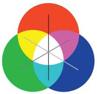
Figure 1.8 Complementary colors in the RGB color model (additive colors).

Figure 1.9 Orange and blue are complementary to each other, and can be used proportionally to achieve balance in an image.

Figure 1.10 When complementary colors red and green are next to each other in a grid, they appear to vibrate.
ANALOGOUS COLORS
Analogous colors are the three colors that sit next to each other on the color wheel, such as orange, red-orange, and yellow-orange (Figure 1.11). For all intents and purposes, in photographic use, analogous colors are pretty much the same as monochromatic color examples, since analogous colors are basically just three shades of the same color. In Figure 1.12, you can see how the various shades of orange combine to create a look similar to Figure 1.5.
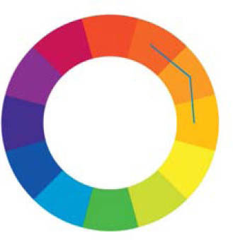
Figure 1.11 Analogous colors are three colors that sit next to each other on the color wheel.

Figure 1.12 Images using analogous colors look quite similar to those using a monochromatic color scheme because they are comprised of colors that are closely related.
SPLIT COMPLEMENTARY COLORS
The idea behind split complementary color schemes (Figure 1.13) is similar to the idea behind complementary colors. Split complementary color schemes consist of a color (e.g., blue) and, rather than the color’s complement (e.g., orange), the two colors neighboring the complement (e.g., red-orange and yellow-orange) (Figure 1.14).

Figure 1.13 Split Complementary color schemes consist of a color and the two neighboring colors of the first color’s complement.

Figure 1.14 Orange is the complementary color to blue, so a split complementary color scheme including blue would also include red-orange and yellow-orange.
TRIADIC COLORS
A color triad is comprised of three equidistant colors on the color wheel, such as red, yellow, and blue; or purple, orange, and green (Figure 1.15). Using the three colors of a triad makes for a harmonious composition (Figure 1.16).

Figure 1.15 Color triads are comprised of three equidistant colors on the color wheel.

Figure 1.16 This image shows a red, yellow, and blue triadic relationship.
TETRADIC COLORS
If you use the four colors at each point of a rectangle on the color wheel, you have a tetradic color scheme (Figure 1.17). Red, orange, blue, and green is an example of a color tetrad (Figure 1.18).

Figure 1.17 If you make a rectangle on a color wheel connecting four colors, you have a tetradic color palette.
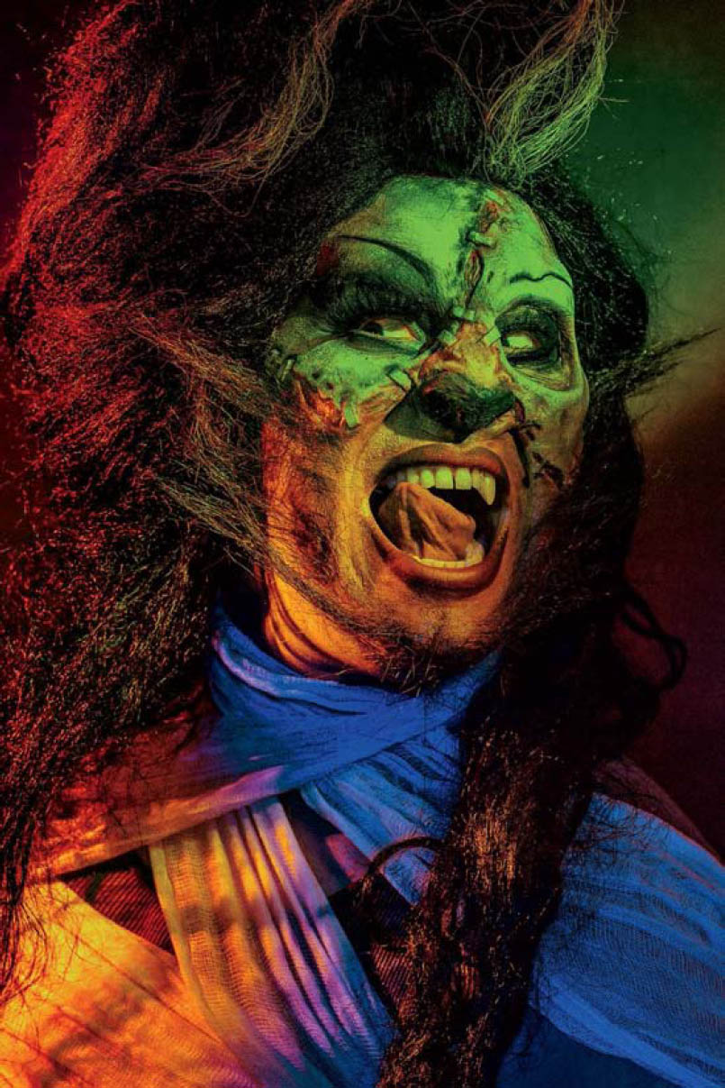
Figure 1.18 Red, orange, blue, and green is an example of a color tetrad.
GOETHE’S NUMERICAL SYSTEM
Johann Wolfgang von Goethe was a scientist (among many other things) who was immensely involved in color theory. He took it on himself to devise a system for creating harmonious color schemes. He ascribed numerical values to colors, with brighter colors, like yellow, getting a higher value, and darker colors, like purple, getting a lower value. Here are the values he came up with:
Red – 6
Orange – 8
Yellow – 9
Green – 6
Blue – 4
Violet – 3
Thus, in order to achieve balance in a composition of purple (3) and yellow (9), the ratio would need to be three parts purple to one part yellow. Orange and blue are less intense colors, so balance is achieved at a 2:1 ratio of orange to blue. Red and green represent equal values (Figure 1.19). A more complex example, such as a composition consisting of yellow, red, and violet, would need three parts purple, one and a half parts red, and one part yellow to be balanced according to the Goethe system (Figure 1.20).

Figure 1.19 According to Goethe’s numerical system, to achieve balance between a darker color, like purple, and a lighter color, like yellow, you need three parts purple to one part yellow.
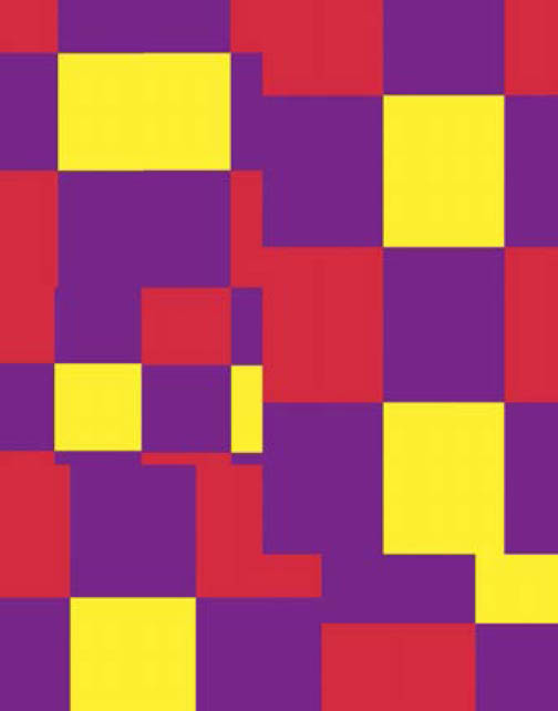
Figure 1.20 To achieve balance in a composition of purple (3), red (6), and yellow (9), you need three parts purple, one and a half parts red, and one part yellow.
USING COLOR INTENTIONALLY
Now that we have a grasp on color theory, we need to consider the meanings associated with different colors. This includes cultural and historic relationships that we humans have with certain colors. Sight and color recognition is as fundamental to the human experience as any other sense. Recognizing what a color indicates is an innate sense in humans and animals. It’s a means of survival, just like hearing or sensitivity to heat. It’s how we determine whether something is edible or poisonous, friend or foe. Take yellow and black stripes for example. If caution isn’t your first instinct or thoughts of bee stings don’t fill your mind, you’re an anomaly. Warm colors, such as red, yellow, and orange are more intense and tend to stimulate appetite or feelings of power, passion, happiness, warmth and stimulation, which is why these are so often used purposefully in branding for restaurants and sports teams. Cooler colors like blue, green, and purple tend to draw up more calming or somber emotions such as safety, reflection, royalty, or sadness (for example, the work from Picasso’s Blue Period).

Figure 1.21 Red is a color that invokes passion.
Since colors have such a fundamental meaning to us—meanings that are manifested in nature and used in universal signage—it’s only logical that we learn how to leverage it in our photos, specifically in how we light. For example, by adding a splash of red to a portrait, we are adding an indicator that this person is passionate, or maybe they have a wild side or a hot temper (Figure 1.21).

Figure 1.22 The blue color cast on the subject adds a feeling of melancholy or reflection to the image.
Contrarily, if you were to flood a scene with blue light, the subject may seem to be lost in reflection, or mourning (Figure 1.22). Photographers can use color as an additional layer of control in portraying our subject—not unlike introducing shutter drag to indicate movement or using a low camera angle in a portrait to convey a subject’s power. We get to play God, in a sense, by coloring our subject in a way that evokes a particular reaction in viewers when they are looking at the final image.
While viewers will ultimately come to their own interpretations of a subject in an image, we can set them off on a specific path by the way in which we use color. Not only do warm colors and cool colors have their own, separate innate meanings based on our emotional and cultural backgrounds, but the combinations of different color types can affect the viewer’s experience of the photograph, as well. For example, if an image is predominantly cool with the presence of warm colors, the cooler colors will seem to recede, adding more emphasis to the warm ones. In Figure 1.23, the red becomes all the more prominent when emphasized against the dark blue scene. The sliver of red conveys the presence of an open door—perhaps to a source of truth or enlightenment. Brighter colors have more power than darker ones, so you need less of these tones within an image to achieve “balance.”

Figure 1.23 The strip of red light becomes all the more emphasized when set against dark blue.
ORANGE YOU GLAD I ADDED BLUE?
Now that you have a bit of basic color theory under your belt, you can add this knowledge to your arsenal of photographic expertise. Color is simply another photographic tool at your disposal, just like a lens or light modifier. The better you understand color theory, the more pertinent information you can call to mind when composing an image.
Complementary colors are just what I had in mind when I met to shoot with the fiery-haired Elinor. I was in London a while back to teach a Studio Anywhere workshop. I made sure to leave an extra day for test-shooting with a model. I met Elinor at her apartment and located a small swatch of white wall, which was all I needed for the session (Figure 1.24). I set up my softbox and began to dial in my settings.

Figure 1.24 The setup. All I needed was a neutral-colored wall.

Figure 1.25 The softbox created flattering light, but I still felt like the image was lacking something.

Figure 1.26 When I want a soft fill light, I use the RoundFlash modifier, made by Neewer. It’s designed to fit over a flash on the camera’s hot shoe.

Figure 1.27 When I add the Cactus V6 transmitter (which is needed to trigger additional off-camera flashes), it puts the flash too high to fit in the opening.

Figure 1.28 As a workaround, I rotate the RoundFlash and secure the flash to hang below the camera and lens.
Though the softbox created flattering, soft light, I felt the image could use something extra (Figure 1.25).
Shadows in an image are perfect placeholders for other light—namely colored light. When I knew that I would be photographing Elinor and her fiery red hair, based on color theory and a bit of experience, I knew that a shade of blue would be the prefect accent color to use.
My go-to modifier for soft, even frontal light is a ring light. Ring lights are usually costly and cumbersome, especially since they need to be mounted to a stand, leaving you at a fixed distance from the subject. I did some shopping around, and I found a portable, collapsible ring light, called RoundFlash, made by Neewer. It’s designed to fit over your camera and flash, assuming it’s a normal-sized flash sitting on a hot shoe (Figure 1.26). However, since I need my Cactus V6 transmitter to trigger additional off-camera flashes, I couldn’t use the ring light as it was designed; it made the flash sit too high to fit the space designated for the flash head (Figure 1.27), so I used a small workaround. By placing the flash in upside down, I could rotate the modifier and let the flash hang below my camera and lens (Figure 1.28).
When using a mobile ring flash as a fill light, keep in mind that if you move toward or away from your subject as you shoot, the intensity of the fill light will fluctuate. My go-to portrait lens is a 85mm lens, which isn’t macro—meaning I can’t get closer than about 3–4 feet from my subject. I am typically 5–10 feet from the subject, which allows composition that includes the subject from the knees up. As a rule, I start at a neutral point, with all my flashes set to the same output. I generally need the fill light’s power setting to be three to four times as bright as the main light (assuming the main light is also diffused) (Figure 1.29). This is because I am farther away from the subject than my main light, and because medium- to dark-colored gels absorb a decent amount of light (generally a couple of stops, give or take).
In Figure 1.30, you can see the RAW file has some nice, soft, blue shadows. The goal now is to flesh out all the colors in Adobe Lightroom. As you likely know, when you shoot a RAW image, it’s up to you to grade the file, since the tones and colors of an image straight out of the camera look rather flat. However, drawing out the colors isn’t as simple as cranking up the vibrance or saturation sliders. There are three panels in Lightroom that I utilize to maximize colors in a file: the tone curve, the dehaze slider, and the camera calibration panel.
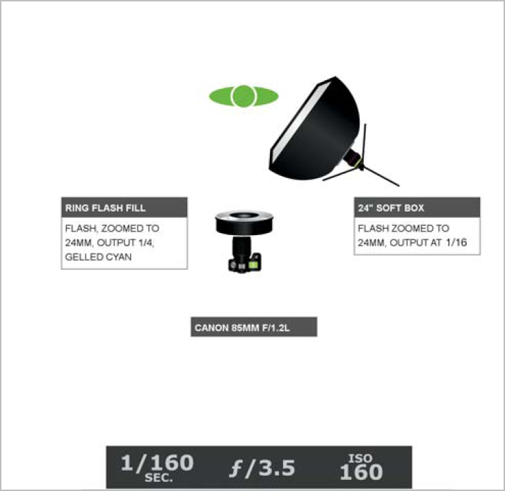
Figure 1.29 The lighting diagram. My fill light is powered four times higher as my main light since I am farther away and the gel absorbs a great deal of light.

Figure 1.30 The RAW file. Though the blue light is present in the shadows, it will need to be fleshed out in post-processing.
THE TONE CURVE
Note: To be clear, I use Adobe Lightroom Classic in my workflow, but throughout the book I’ll refer to it simply as Lightroom.
The tone curve is one of the most powerful panels in the develop module of Lightroom. Often I find that a tone curve adjustment is the only adjustment I need to make to a RAW file. In Figure 1.31, you can see that there are four areas to a curve: shadows, darks, lights, and highlights. The tone curve panel has a slider for each area (Figure 1.32). The problem with using the sliders to make adjustments is that you can’t adjust the individual color channels.
I began by toggling the icon (circled in red) in the bottom-right of the panel to switch into manual mode, where you can adjust individual color channels (Figure 1.33). I make an adjustment point by clicking on the center of the curve and pulling up, which increases the universal brightness of the image. If I were to make a point to the left of the center and pull down, the “lights” section of the curve would be bumped up, which would create more contrast (Figure 1.34). If I were to pull up on that point, the dark areas would open up, resulting in less contrast (Figure 1.35).

Figure 1.31 The four areas on a tone curve are shadows, darks, lights, and highlights.

Figure 1.32 The tone curve panel has a slider for the shadows, darks, lights, and highlights. We will need to work in manual mode in order to adjust the individual color channel curves in this panel.

Figure 1.33 Toggle the icon at the bottom-right of the panel to switch into manual mode. Make adjustments to the image by clicking on the curve and pulling up or down.

Figure 1.34 If I make a second adjustment point to the left of the first adjustment point and pull down, the dark areas get darker and the light areas get brighter, meaning more contrast.

Figure 1.35 If I instead pull up on the shadow point, the dark areas get lighter, meaning less contrast.
Once I start working my way through the red, green, and blue curves, I use my knowledge of color theory to manipulate the tones in my image. For example, if I were to make a central adjustment point to the red channel, which controls red and cyan in an image, and pull up, red would be added to the whole image (Figure 1.36). If I were to pull down on that point, cyan would be added to the whole image (Figure 1.37). The green channel affects greens and magentas, while the blue channel controls blue and yellow hues.

Figure 1.36 When working in the red channel, if I made a central adjustment and pull up, red would be added to the whole image.

Figure 1.37 When working in the red channel, if I made a central adjustment and pull down, cyan would be added to the whole image.
Using color theory and the areas of a tone curve, I can quickly figure out how to add colorful accents to the various areas of my image. In Figure 1.38, I made a series of adjustments in the blue channel. I lowered the darks to retain the natural red of the model’s hair; raised the lights to add blue to her skin; and lowered the highlights to add yellow to the highlights, The image on the right of Figure 1.39 shows what I was able to accomplish by only using the tone curves.

Figure 1.38 Knowing how the curves work allows me to bring out certain colors in the various areas of an image.

Figure 1.39 The only adjustments I made to the image on the right were curve adjustments.
DEHAZE
The Dehaze slider in Lightroom (Figure 1.40) was designed to remove (or add) haze from a file. It is an extremely powerful tool. A small tweak can greatly increase the contrast and color in a file. How much dehaze to use will vary from file to file. For example, if you’re adjusting the Dehaze slider on a non-hazy image, you won’t need as much Dehaze as you would if your subject was backlit. I think of the Dehaze slider in terms of salt in a dish—a little goes a long way.

Figure 1.40 The Dehaze slider is designed to remove haze from an image, which in turn boosts the colors and contrast in the file.
CAMERA CALIBRATION PANEL
The camera calibration panel is my other go-to spot for fleshing out color in a file (Figure 1.41). It’s the best tool for changing color intensity and hue—even better than the HSL (hue, saturation, luminance) panel.
Let’s take Elinor’s hair, for example. If I adjust her hair using the targeted action tool in the HSL panel (the small icon in the upper-left corner of the panel), her skin (being a similar color to her hair) will also be affected (Figure 1.42). It takes many specific adjustments to alter the colors in a file, which can result in unnatural-looking transitions between colors in the final image (Figure 1.43).
The camera calibration panel is designed to match the colors in an image (on your computer screen) to how they looked on the screen of the specific camera you were shooting with. It’s one of my go-to spots for color grading an image because it creates smooth transitions from one color to another. Instead of making adjustments to the hue, saturation, and luminance of each individual color in the HSL panels, I can adjust large regions of color (Figure 1.44).

Figure 1.41 The camera calibration panel is a powerful tool for changing color intensity and hue.

Figure 1.42 Though the targeted action tool is good for isolating and adjusting a specific color, it can be problematic when it alters aspects of the image that you don’t want to change.

Figure 1.43 Using the HSL panel to color grade an image can require making many adjustments, which can lead to unnatural-looking transitions between colors.

Figure 1.44 The camera calibration panel is a powerful tool for changing large areas of color.
In Figure 1.45, you can see how a combination of adjustments to the tone curves, the Dehaze slider, and the camera calibration panel creates a vibrant image with a smooth transition between colors.

Figure 1.45 The final image. The colors are brighter and bolder, and the transition between colors is smooth.