Chapter 4. Visualizing Data Differently
If you choose to just use tables, bar charts, and line charts, you will be able to fulfill most data communication needs. However, by using only these basic forms of communicating with data, you may restrict your analysis and risk boring your audience.
Using alternate chart types can help you find different messages in the data. Using two measures on a chart instead of one can show relationships you would not see otherwise. Comparing one metric directly to another means that you don’t have to look at two separate charts and form the analysis in your head. And showing the individual data points, instead of aggregating values to show a summary metric, can uncover new trends in the data.
This chapter looks at some alternate charts and ways to use them
Chart Types - Scatterplots
I’m going to have to mention this at the outset… I love scatterplots. There, I’ve said it. Of course I’ll give you an unbiased opinion of them, but I will also share why I think they are so powerful. I love scatterplots because of how flexible they are: they can cover a number of different use cases. Many people also find them easy to interpret. The combination of multiple metrics is useful for analysis. Finally, scatterplots allow you to combine hundreds, if not thousands, of data points on a single chart, which can uncover stories in the data that might be lost if you filtered the data to fit on a single page. (Color can help here, highlighting the key data points.)
With so many options, let’s ensure you can understand the fundamental building blocks of scatterplots.
How to Read Scatterplots
You can add a lot of detail to a scatterplot, but that doesn’t mean you should. Too much detail can make the chart very difficult to read.
We’ll begin by looking at a simple scatterplot from our bike shop, Allchains, comparing the sales value to profit for each of our bike types (Figure 4-1).

Figure 4-1. - Scatterplot
Let’s explore the different elements of a scatterplot: multiple axes, plots, color, and shapes. There are lots of choices to be made within each one.:
Multiple axes
Scatterplots have two axes, rather than the singular axis we have seen on charts thus far (Figure 4-2). This is useful when you want to directly compare two metrics.

Figure 4-2. - Multiple Axes in a Scatterplot
The axes create a 2-D position against which you can compare the data point . By plotting multiple points, you will be able to find and analyze patterns between them. Also, the measure forming the x-axis should be the independent variable: the measure that is not reliant or driven by the y-axis. The y-axis’s measure is therefore described as the dependent variable. In Figure 4-2 the sales value is plotted on the x-axis, since without any sales, no profit could be generated: profit is dependent on sales.
The patterns created by these plots are classed as correlation patterns (Figure 4-3). You may have heard of the “false cause fallacy,”1 or “correlation doesn’t equal causation.” It means that just because you find a strong correlation between two factors in your data, you can’t assume that one factor is causing the other. In this example, Allchains sells more bike helmets on sunny days. Can we assume that sunny days cause more sales of bike gear? Not necessarily. Personally, I ride my bike a lot more on sunnier days than on rainy ones-- and most of those sunny days occur in summer. If more helmets are sold on sunny days, it’s probably due to overall warmer seasonal weather of summer, not the sunshine itself. After all, winter days can be sunny and icy at the same time-- but I’m not going riding on those days!

Figure 4-3. - Correlation not equaling causation
Correlations can be grouped into numerous types; the main terms you will come across are positive and negative correlations and strong and weak correlations. In a positive correlation, as the measure forming the x-axis increases, so will the y-axis (Figure 4-4). We can demonstrate these with a trend line on our scatterplot. In Figure 4-4 I’ve used orange to make the trend line really pop.
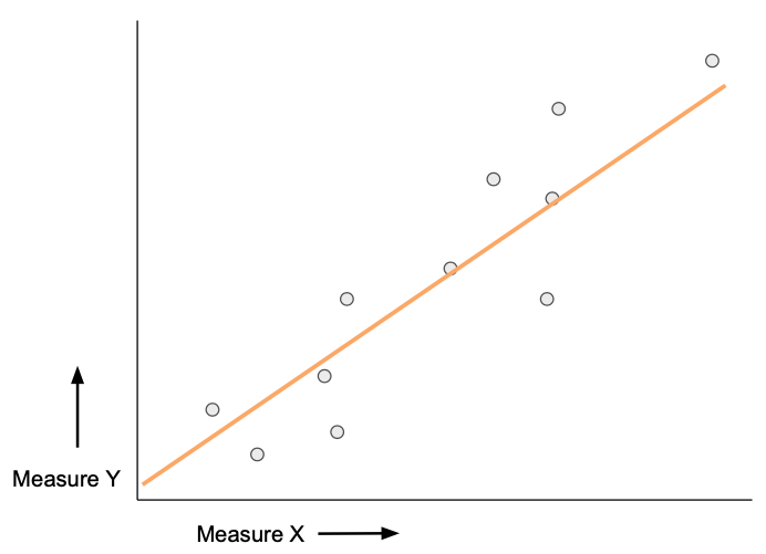
Figure 4-4. - Scatterplot with a positive correlation
If the dependent variable reduces as the independent variable increases, you have a negative correlation (Figure 4-5). For example, if X is the number of times Allchains provides maintenance services to bikes, Y shows a reduction in the number of mechanical breakdowns for our customers in the following year.
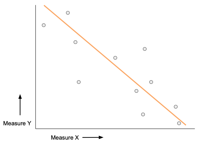
Figure 4-5. - Scatterplot with a negative correlation
However, just being aware of the direction of the correlation isn’t enough. How much attention you should pay to the relationship you have found depends on the strength of the relationship between the variables. A strong correlation means the data points are tightly packed around the trend line (Figure 4-6). The less distance between the data points and the line, the stronger the relationship is.
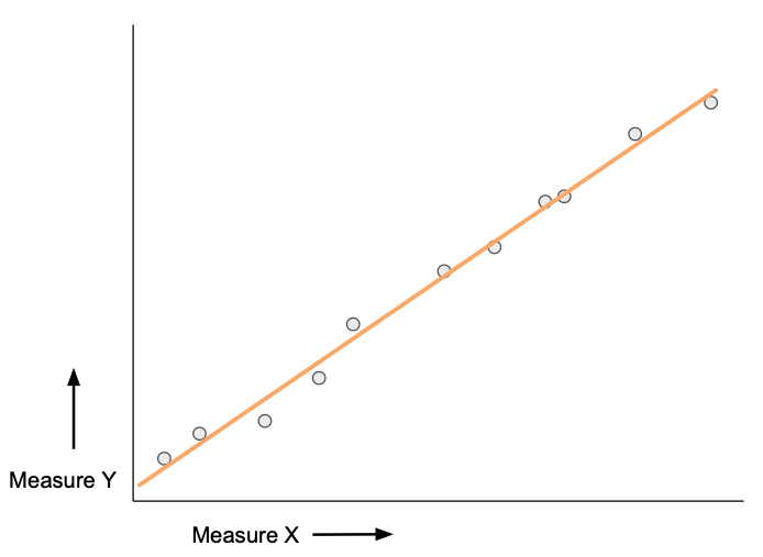
Figure 4-6. - Scatterplot with a strong correlation
The further the data points are from the trend line, the weaker the relationship is (Figure 4-7).

Figure 4-7. - Scatterplot with a weak correlation
Not every scatterplot will show a correlation. If there is no relationship between the measure on the x-axis and the measure on the y-axis, the scatterplot has no correlation. That might look something like Figure 4-8.
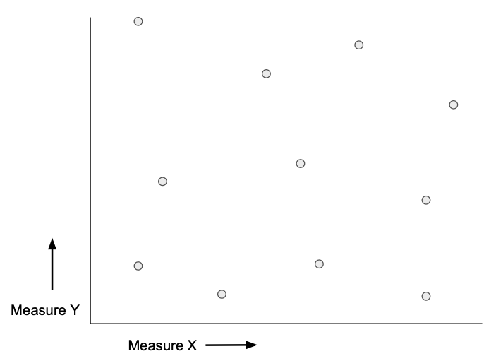
Figure 4-8. - Scatterplot with no correlation
Whether you actually draw the trend line or not, showing the patterns in scatterplots can be easier than explaining the relationship through words or other chart choices. Once you see the pattern in the data, it also becomes easier to spot the outliers, the data points that don’t fit the pattern you’ve established. Investigating outliers can reveal issues in your organization that wouldn’t be apparent otherwise.
Plots
The superstars of the scatterplot are the actual data points. A plot, or a point on the scatterplot, represents two data points, one from the measure forming the x-axis and one from the y-axis (x, y).
When you have too few data points, as in Figure 4-1, it can be hard to draw anything useful from the chart. The converse is over-plotting: where there are so many data points it’s difficult to see what the chart is showing. Figure 4-9 is an example: it shows sales value and profit data from about 800 bike sales.

Figure 4-9. - An example of over-plotting on a Scatterplot
Can you identify 800 distinct plots here? I can’t. Many of the plots are right on top of each other. This technique helps where there are only a few plots overlapping each other. In Figure 4-9, though, the darkly shaded area is an amorphous mass of indistinguishable plots. This chart is not completely useless, however, since it shows the outliers.
If the question you are trying to answer requires individual data points, like analysing all students in a school, you can adjust the chart style to help. By increasing the transparency of the plots, you can see where the overlapping points exist more clearly. In Figure 4-10 I’ve reduced the same plots to 30% of their original opacity.
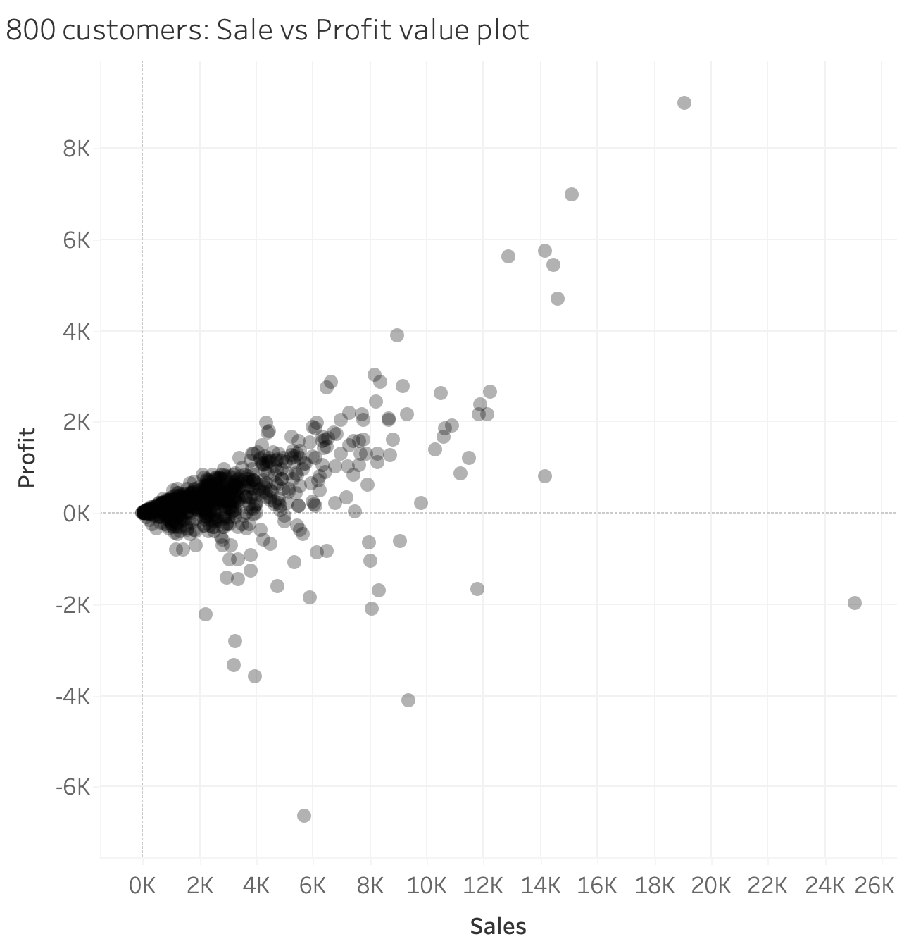
Figure 4-10. - Increasing the transparency of the plots
Another technique to break up the amorphous blob is to add borders to the plots, to show the number of data points at least on the surface. In Figure 4-11 I have used a light grey border to make the individual points ‘pop’ off the page when they overlap.

Figure 4-11. - Increased transparency with borders
Sometimes it’s difficult to get everything you need into a single, static chart. We’ll explore this in Chapter 7 when we look at using multiple charts to show the different aspects of the data rather than trying to squeeze all of them onto just one.
Color
One thing you may have noticed about our scatterplots so far is that it is difficult to see which point relates to what categorical value. The plots are often categorical values, like the headers on bar charts. Figure 4-12 adds color and a color legend (the small reference on the side of the chart that explains what each color represents).

Figure 4-12. - Coloured Scatterplot
Be careful not to overuse color on scatterplots: your audience probably won’t remember what each of 20 different colors represents, and forcing them to look back and forth to the legend too much adds more cognitive effort to understand your communication. As discussed in Chapter 1, one of our focuses is to reduce the cognitive effort it takes to understand the message you are sharing.
Most cultures already associate many different meanings with colors, and you can use this to your advantage. If you use colors in ways that are already linked to familiar concepts , the audience will need to refer to the legend a lot less. If, for example, you are visualizing the sales of fruits and vegetables for a grocery store, using the hues related to the different foods-- such as red for strawberries and yellow for bananas-- will make it easier to read. Using red for bananas and yellow for strawberries, on the other hand, would add to the cognitive load. Similarly, you might use black and red to indicate profit and loss, since ‘in the red’ is a common idiom for loss-making companies and ‘in the black’ describes profitable ones. Wherever you can use the consumer’s awareness of such factors, do so: it reduces the cognitive load. The term for this is using your audience’s psychological schema.2
In Figure 4-12 I’ve intentionally used colors that look like mud for mountain bikes, stone for gravel bikes, and grey for road bikes. Using individual colors like this to represent categories is known as a categorical color palette.
If your plots represent an ordinal data field, you may wish to use a sequential color palette. This uses grades of shading of a single color, from light to dark, to represent a sequence of values (such as low to high or early to late). With 16 data points in Figure 4-13, it would be difficult to see whether later quarters have had higher sales and profits than earlier quarters. With a sequential color palette to indicate when in the year the sale occurred, it is at least possible to draw some conclusions from this chart. In this case, plots of higher sales and profits are all darker blues, showing they happened more recently.

Figure 4-13. - Sequentially coloured scatterplot
Another palette type you can use is a diverging color palette, which uses two different colors to represent values that cross above or below a certain threshold, such as zero or a target. One color would represent under-performance and another color could represent over-performance.
Finally, you can use color to make certain points stand out among all the others. In Figure 4-14, I have highlighted my own purchases at Allchains amid those of hundreds of other customers.

Figure 4-14. - Color used to highlight
This is a simple technique that shares the message without losing the context of all other customers’ behaviour. We’ll cover more about color in Chapter 7.
shapes
The plots on your scatterplot don’t have to be circles. You can use different shapes to represent different categories, as shown in Figure 4-15.
Shape scatterplots are particularly useful for ensuring accessibility. You don’t always know if all of your consumers can distinguish colors easily. What’s commonly called color blindness is an inability to differentiate part of the color spectrum, and it can manifest differently in many different visual disabilities.
There are tradeoffs here: shape is a pre-attentive attribute, just as color is, but color triggers pre-attentive responses more strongly. Interpreting shapes takes more cognitive work. To make this easier, you might use representative shapes where possible, or pair shapes with color. Shapes will be discussed further in Chapter 5: Visual Elements.

Figure 4-15. - Shape scatterplot
How to Optimize Scatterplots
Scatterplots are a good chart option whenever you are comparing two measures, especially when one measure has (or might have) an impact on the other. Think of the sales and profit measures used throughout this chapter. As sales increase, you’d expect profits to increase, right? But that might not be the case! What if sales increase as our company lowers prices to undercut the competition? Or the cost of each sale might rise, forcing the company to spend more than normal to keep up with production volumes through extra sales.
The scatterplot may not always be able to tell you why something is happening, but it will nudge you in the right direction and make you ask the right questions.
There are a few variants of scatterplots that we did not cover above that can prove very useful in certain situations:
Small multiple scatterplots
As seen above, using trend lines in scatterplots can be a strong technique to communicate the relationship between two metrics. However, too many plots on a single scatterplot can hide significant or changing trends . One workaround is to break the single scatterplot into many scatterplots. You can shrink the charts and change the formatting to convey the message on a single page or screen.
The term small multiples refers to the trellis-like pattern of charts that are created when each chart is subdivided by different categories. Small multiples can be formed from most forms of charts, but I find scatterplots particularly effective. In Figure 4-16, I have broken up a scatterplot by year (vertically) and quarter (horizontally) to compare quarterly trends clearly against each other. I also made a number of formatting alterations to make the trend the clearest part of the chart. Highlighting the trend in color against a strong x- and y-axis makes the trends quickly comparable. The plots have had their transparency increased to still be visible but fade into the background.

Figure 4-16. - Small Multiple Scatterplots
In Figure 4-16, you can quickly see the negative correlation between sales and profit in Q1 2017: it is the only trend line that tracks downwards as sales increases. The trend lines demonstrate the most profit for sales occurred in Q1 2020 and this message is clearly shown by the small multiple scatterplot.
This technique is particularly useful when sharing static versions of the chart. However, even if you make an interactive version of your scatterplot that includes filtering to create each individual small multiple in turn, you may still want to consider using the small multiple option. The trellis shape of small multiples allow you to compare trends horizontally, in this case quarter-on-quarter, and the same quarter in a different year.
Quadrant charts
Just like the small multiple scatterplot makes trends more apparent, a quadrant chart also simplifies the interpretation of the data in the scatterplot. Quadrant charts effectively dissect the scatterplot with reference lines linked to the axes (See Figure 4-18). This clarity makes it much easier to determine next steps. Take the scatterplot in Figure 4-17: with a weak correlation, how do you interpret the message in this chart? The x-axis shows sales, the y-axis represents profit, and each plot is a different category of each Bike Type.
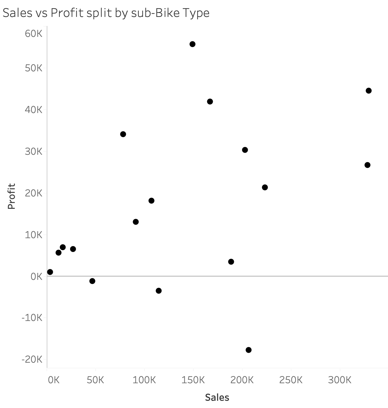
Figure 4-17. - Scatterplot to form Quadrant chart
It’s difficult to see much in this scatterplot, as there is very little grouping in the data. Grouping is another pre-attentive attribute that helps your audience understand the messages in scatterplots. You can add an average line of the mean for each metric for easier analysis. Figure 4-18 shows how using two average lines can divide the plots.

Figure 4-18. - Quadrant chart
The quadrant chart’s sections can now be easily described, allowing the reader to see what decisions might be made about each point.
For example, the plots in the High Sales, High Profit section are very important for the store: they are generating high cash flow while still making money for the stores.
The Low Sales, High Profit section represents an opportunity for the business, by allowing us to understand why we’ve been able to generate such high value from such a meagre amount of sales. If the company was able to sell more, would the profit increase in equal proportion or would the sale price have to fall, eating into those profit margins, to sell more?
The High Sales, Low Profit section poses an interesting challenge: these bike types are selling well, yet the company can’t seem to generate profit from them. This is a drain on resources. Should Allchains stop selling bikes in these categories and focus on other types?
The Low Sales, Low Profit section should be monitored, to determine if there is any chance for growth or whether it’s time to stop selling these items.
Quadrant charts are useful for showing the data points clearly manner whilst also simplifying the analysis. They are particularly useful for audiences who are not used to using scatterplots to interpret data.
When to Avoid Scatterplots
There are times when scatterplots make the message harder to understand. You might see these used often, but I recommend staying away if it would require too many colors or if you need to add a third measure. Let me show you why.
Too many colors
In the words of my colleague Luke Stoughton, using too many colors on a scatterplot can look like you’ve “squashed a unicorn”. It’s hard to disagree with him when I’ve seen too many charts that look like Figure 4-19.
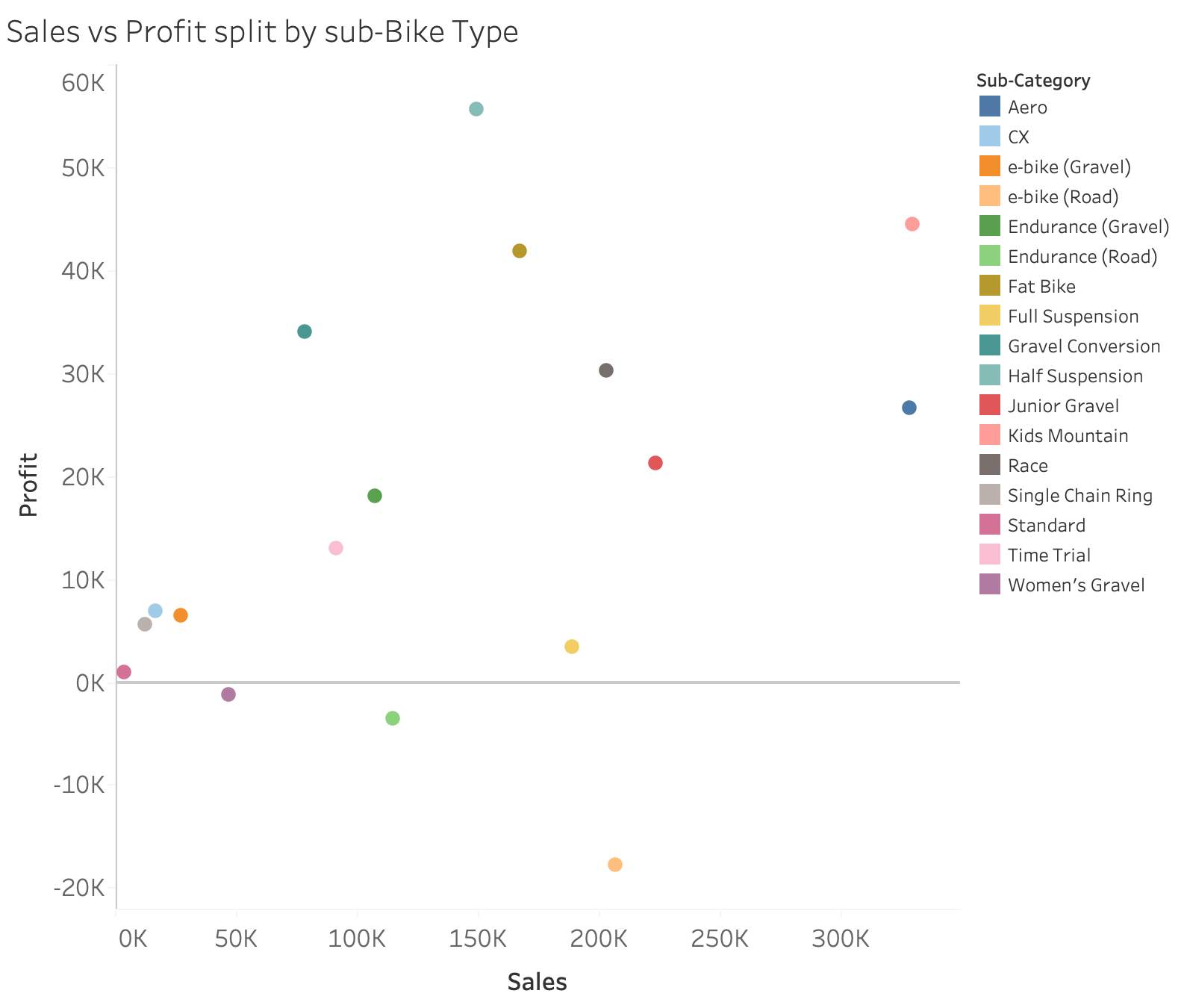
Figure 4-19. - Scatterplot with too many colors
A potential alternative is interactive charting. With interactive charting the user can instead hover over each plot to see what it represents-- so you don’t need the splatter of unicorn colors, as. (The challenges of interactivity are discussed more deeply in Chapter 8.) To mitigate this issue, it is much easier to highlight just a single plot, or at worst a few key points to highlight as shown in Figure 4-14.
Nondifferentiable color palettes
Scatterplots are so effective at showing two measures that you might be tempted to add a third, to demonstrate an additional relationship in the data. Figure 4-20 adds a new dimension, average discount, to the plots used as the base chart for the Quadrant chart in Figure 4-17.

Figure 4-20. - Scatterplot with sequential color palette
No, it’s not your eyes-- it’s just tough to distinguish the difference between the average discounts shown by the blue gradient in the sequential color palette. You can probably spot the highest average discount, but trying to separate the lower third of the points is very difficult. This chart would be much better if the discount was added as a set of bands, to allow the user to draw clearer distinctions between the different levels of discount (Figure 4-21).
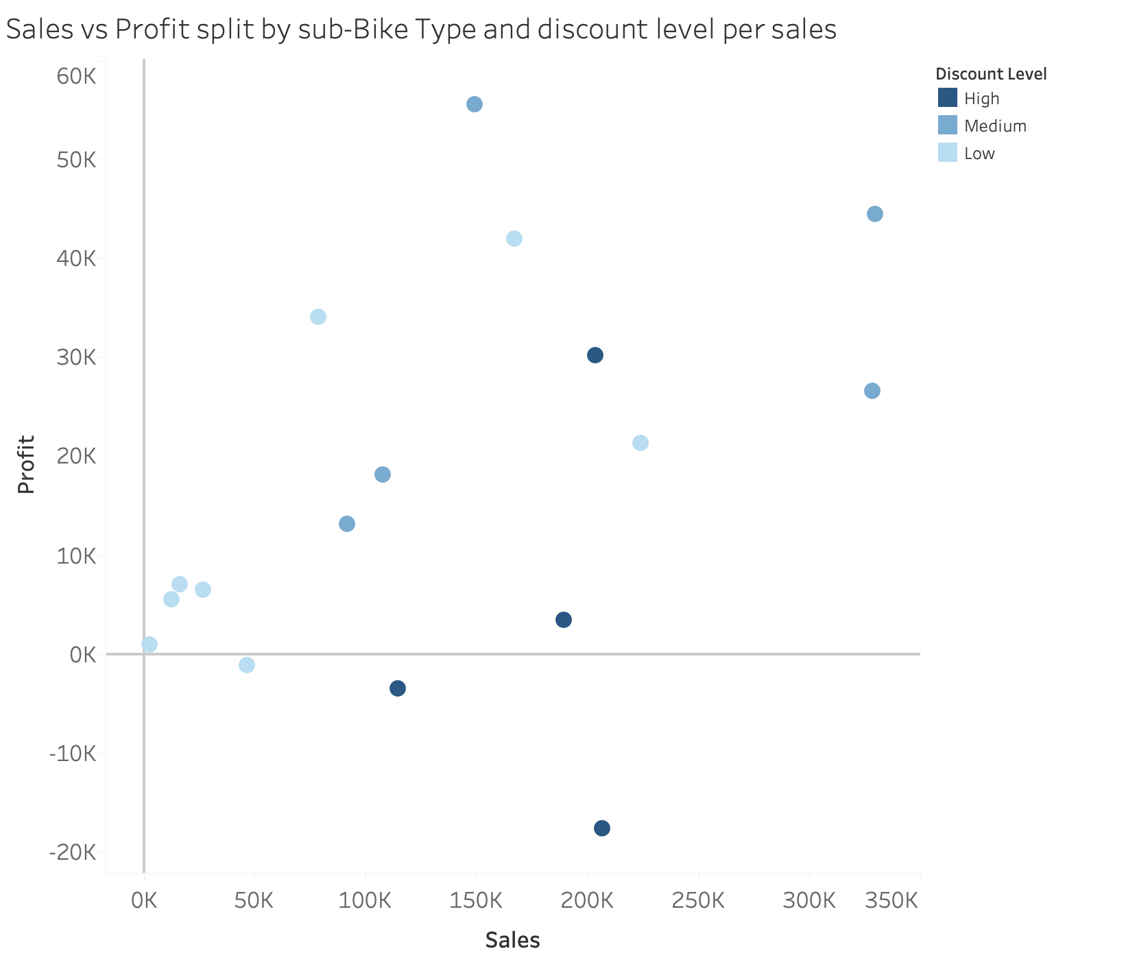
Figure 4-21. - Scatterplot with Banded Color
When users only have to pick out a few shades of the same color, it is much easier for them to form a relationship between color and meaning. In addition, to clarify the relationship between the two metrics shown as the axes of the scatterplot, each axis should be the same length. Any distortion of their length can change how the relationships and correlations are perceived.
Again, don’t to squeeze too much into a single chart. If you find yourself struggling to see the colors clearly, try creating a separate chart instead, or consider using interactive charting.
Chart Types - Maps
Maps grab readers’ attention. Children are taught how to read maps from an early age, so they’re usually a familiar form of data communication, which can make absorbing the message much simpler. This section will look at a few key aspects of visualizing data with maps, including how to determine whether a map is your best option.
How to Read Maps
If you really think about it, maps are a form of scatterplot. Think of longitude and latitude as the x- and y- axes of a map.
Understanding this allows us to take advantage of a pre-attentive attribute we looked at Chapter 1: grouping. A cluster of points on a map, such as incidences of natural events like meteor strikes, can show areas of activity; the absence of points then show a lack of the same activity. If your data shows human activity, though, you will frequently find data points clustering in population-dense areas, like major cities, as Figure 4-22 shows. This is where clustering can actually obscure the stories in your data .

Figure 4-22. - Symbol Map showing sales by city from our bike stores across the United States
The map in Figure 4-22 is a type of map called a symbol map: a symbol (in this case, a circle) is placed on the map to represent the data point for that location.
Size and shape
Data is visualized in a symbol map by sizing the shape to represent the values of the measure; the larger the shape, the higher the value. This makes it very easy to see the largest values, but the lowest values, being small, often fade into the background. If you need to identify low values (such as markets with underperforming sales), this can be a problem. Symbol maps are great when you need to show the reader the range of values quickly, but since readers can’t measure the precise size of the shape, they aren’t good for showing exact differences.
Here’s another potential problem with symbol maps. The clusters in the top right corner of the map in Figure 4-22, makes it look like sales are especially high in the Northeastern US areas whereas that is where many of the major cities are much closer together than .
Symbol maps can use any shape to represent the data point. With circles, the centre of the shape often represents the location of the data point. However, Google’s inverted drip shape (discussed more in Chapter 5 with Figure 5.21) uses the point at the bottom of the shape to indicate a precise location. Make sure the shape you choose demonstrates the location clearly.
Choropleth maps and color
You can also use color on a symbol map, but I recommend giving it a different meaning from the shape. Using two forms of pre-attentive attributes for the same information, such as both color and size for the same aggregation of the same measure, is called double encoding. It can hide other stories within the data by overexaggerating the main message, and is best avoided.
Sequential or diverging palettes are frequently used with maps to show how a range of values corresponds with the shape of a geographical element. These maps are called choropleth maps. Figure 4-23 uses the similar data as Figure 4-22 this time at state level rather than city level, but the resulting effect is very different. In this map (Figure 4-23), color is used to show greater values as being more intensely coloured. However, like the symbol map, trying to distinguish between anything but the highest and lowest values in a choropleth map is particularly challenging.

Figure 4-23. - Choropleth Map
How to Optimize Maps
As you saw with shapes, with choropleth maps, variation in the size of the mark can affect how your message is perceived. Small locations, like the states in Figure 4-23, are hard to see; large areas are likely to draw your audience’s attention even if they are not the intended focus.
You might have noticed one consistent factor of the maps that I have used so far is the minimal background. Removing as much unnecessary detail as possible allows the data to stand out from the map’s background. When using a map to visualize data, you need to remember this is the primary purpose of the map rather than adding detailed backgrounds. It’s important to strike a balance between the detail in the background and the data being visualized. If you strike the correct balance, your audience will get a clear view of the data points as well as a clear view on the geographical context of where those data points are. Roads, rivers or borders may need to be added or removed based on the purpose of the visualization using the map.
Symbol maps prove to be a useful technique where small geographical areas provide some of the highest values. In contrast, if a choropleth map is used to show this data, it is unlikely that the highest values will stand out due to taking up such a small amount of the screen space. Take this example of the ranking of each state based on the number of bike saddles sold in each state to the east of the Mississippi (Figure 4-24).

Figure 4-24. - Bike accessory sales shown by a choropleth map
Clearly you can see that Rhode Island (RI) is the top seller of saddles. What, you mean you can’t? You’re not alone as I think most people would struggle to draw that conclusion from the map due to the small size of Rhode Island. Your eyes are likely drawn to the larger states as they are bigger blocks of the same color. Visualizing the same data as a symbol map instead makes even the smallest state stand out (Figure 4-26)

Figure 4-25. - Better Symbol Map
Symbols can still overlap each other. The symbols in Figure 4-26 have to remain rather small so they don’t overlap each other and hide any smaller symbols behind. This is where Tile maps become useful. The offer equal space for each entity, in this case state, but tries to allocate the tile to a similar location on the map as would be found on a regular map. Figure 4-26a shows the profit of each state for Allchains bike stores in those states.

Figure 4-26. a - Tile Map of profit by state
Choropleth maps can be more useful than symbol maps when you want to visualize data that crosses a threshold like zero, or a target. Being able to see those above and below the threshold is likely to be the key aspect of the visualization. The shapes of a shape map are sized on a linear scale and thus when data goes past a tipping point, like zero, it becomes difficult to make that linear scale make sense to show the message in your data clearly. Take for example, profit generated from our states where our Allchains stores exist. There are three ways to visualize profit and loss in the size of symbols but none of them are that effective (Figure 4-27):
-
Small symbols representing the most negative values, large symbols representing the most positive values
-
Large symbols representing the most negative values, small symbols representing the most positive values
-
Large symbols representing the most negative values tapering to small as the values cross the zero point and then become larger as they become larger positive values

Figure 4-27. - The effect of a scale crossing zero
The top option in Figure 4-27 would potentially hide the largest negative values. This means the items making the largest loss wouldn’t be visible on the map. The most profitable items would dominate the map, so this is a great choice if you are trying to show a positive spin on the numbers, but it wouldn’t be a clear representation of the data. If you reverse the sizing from largest to smallest as the values go from the largest negative number to the largest positive, you paint the opposite impression on your view. Neither is useful for the reader to see both the biggest winners and losers to make a balanced judgement. The final option creates that balance but completely ignores the reader’s interpretation of whether something is a positive or negative number unless used with color to show whether the value is positive or negative. If this technique is used, it is another example of double encoding the value which I would avoid if possible. Therefore, it’s just easier to divert away from showing values crossing through zero or a target as a shape.
Using a choropleth chart is much more effective at achieving this right balance between highlighting both the largest positive and negative values. Figure 4-28 shows the effect of the negative values being shown in a separate color to the positive values. This type of colouring is known as a diverging color palette.

Figure 4-28. - Choropleth map using a diverging color scale to represent state profit
The darker the intensity of the colors, the more intense the profit or loss it each state has. In Figure 4-28, no states have losses to the same extent as others have profits. Your eyes can easily find the highest profits (in black), or the largest losses (in red), on the same chart. You could use the same technique if you were showing the range of values either side of a target. One color would represent under-performance and another color could represent over-performance. In Figure 4-28, you may have noticed that I intentionally used colors that are normally referred to in accounting terminology for whether a company is profitable or not. Being ‘in the red’ is a phrase that describes loss-making companies or being ‘in the black’ for profitable ones. Wherever you can use the consumer’s awareness of such factors, reduces the cognitive load to interpret the chart. The term for this is using your audience’s psychological schema.3
Mapping challenges go beyond just a simple shape versus choropleth design decision, however. As data sets grow ever bigger from more internet connected devices and trackers, a common mapping challenge is to visualize many thousands of data points on the same map. Let’s look at some taxi journey data in New York City where there are nearly 800,000 data points on the same map. If we were trying to work out where our Bike Store might be located where we know lots of people are using transport to start a journey from and offer an alternative transport option. The map in Figure 4-29 doesn’t provide any additional insights beyond the shape of Manhattan. There are so many data points, that even if each circle is shrunk to a dot, the cluster of data points form an amorphous mass.

Figure 4-29. - Map of hundreds of thousands of taxi journey start points in Manhattan
There are two main alternatives to symbol or choropleth maps that can assist us in solving the dilemma of overplotting. The first is a density map that takes into account the plots close to or on top of each other. Color is used to show the density of the number of plots in the same space. The higher the number of plots, the lighter and brighter the color. As you can see in Figure 4-30, the density map shows a higher level of activity in the middle of Manhattan. This data story was also in Figure 4-29 but due to the style of map chosen, it was impossible to see it. Lower values of plots are almost blurred out entirely like we can see on the Northern tip of the island.

Figure 4-30. - Density map using the same data as Figure 4-29
An alternative to a density map that shows the story in the data but doesn’t blur out the lower values is a Hex Bin Map. This style of map counts the number of points found in a certain area. Those areas are often shown as a hexagon as they tessellate closely together, like bees honeycomb. Color is often used to show the range of values captured in each area with darker colors representing the highest values. From the density map, the store looks like it should lie somewhere between 30th and 54th Street. The same Manhattan taxi journey data is shown as a Hex Bin Map in Figure 4-31.
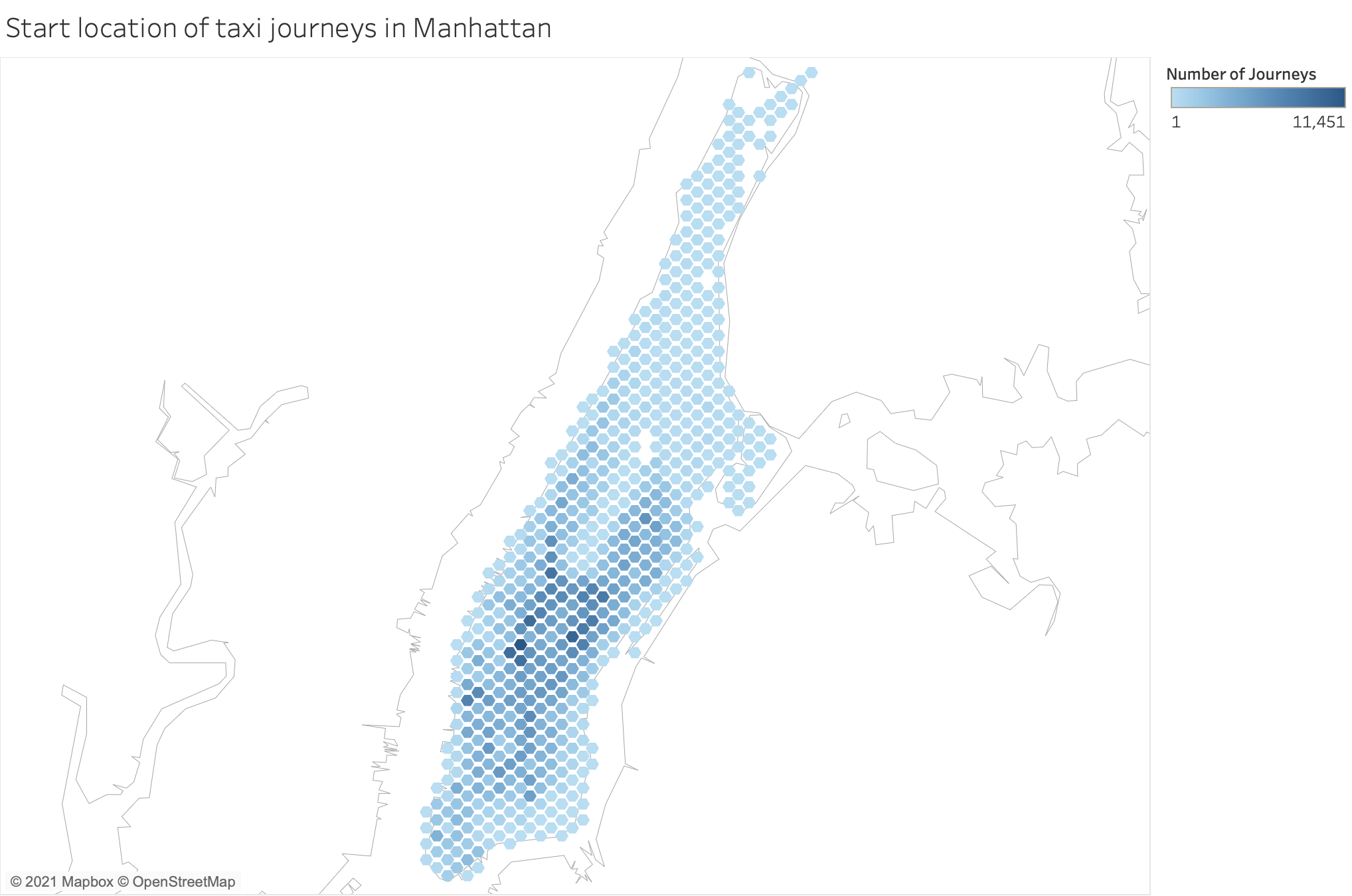
Figure 4-31. - Hex Bin map using the same data as Figure 4-29
There are lots of different map styles to choose from but depending on what message you are conveying, how much data you have and the scale of the geographical areas, some styles are more useful than others. With the hex bin map, it’s a little easier to more precisely identify where the bike store location should be than with the density map.
When You Might Not Use Maps
In this section on maps, we’ve highlighted a number of times that you should shy away from certain styles of maps, but there are a couple of key situations where just relying on a map is not the right situation.
One common situation is that just because you have geographic references in your data doesn’t mean that you need to use a map to show the data points. Let us go back to the Allchain’s Accessories sales shown in Figure 4-26 for a data set that demonstrates this point. In the original map, only one sales ranking can be shown at any time. But what if the data contained multiple ranks for different products? The original data set has three different values for each state showing how each ranks in terms of three different products. Would three maps be the best way to show this data? Certainly not, as this would take a lot of space on the screen unless you want to make each state minute. It would also place a significant challenge to remember each rank of each state to compare the variances. Instead, you could use a parallel coordinates plot to show the change in ranking between the different measures (Figure 4-32)

Figure 4-32. - A parallel coordinates chart as an alternative to a map
With parallel coordinate charts, the rank of a categorical member, in this case state, determines where the mark is made against a vertical axis. The left-to-right flow of the chart can show change in rank over time, or as in this case, the changing rank between different products. If the change is show overtime, the chart type is called a bump chart. In this example, I’ve added a highlight to show that Rhode Island is ranked first in two categories of accessories but not for Pedals. The line connecting the circles representing each state can show change between the different categories. A steep gradient rise or fall is a strong indication of change in the rank between measures, drawing your attention more easily to the change than a change in saturation on a map ever would.
Another situation where using a map should be questioned is where you have multiple measures or categories being shown on the same map. Often I see creators trying to squeeze too much on to a single chart and maps are not excluded from this. Figure 4-33 demonstrates how difficult it is to put multiple measures on a map.

Figure 4-33. - Map showing multiple measures
This map isn’t impossible to read but it isn’t easier either. By including two metrics, you need to use two different mark types on the map. In this case profit is being used as the choropleth map, with the shapes being sized by total sales. The message in the visualization is not clear and ultimately that is what we are looking to achieve. As already covered, a scatterplot is a great method to communicate two different measures when split up by a category, in this case state (see Figure 4-34).

Figure 4-34. - Scatterplot showing Sales compared to Profit for each state
Occasionally, multiple categories might need to be shown as well as multiple measures. I’ve seen a number of instances where maps are used with different chart types layered on top of the base map. This poses even more challenge to interpret than just a simple measure like sales, as shown in Figure 4-33. Figure 4-35 might seem extreme due to having two very different chart types used together, but I’ve come across many similar examples where information is trying to be communicated.

Figure 4-35. - Pie chart and choropleth map
In chapter 7, I will demonstrate how it is much easier to create multiple charts rather than attempt to encode too much differing information into one chart.
Maps will always grab your attention so are an attractive option to communicate any data with a geographical element. However, it’s important to take care to not just default to using a map in any situation but still consider other chart types that can portray your message more clearly.
Chart Types - Part-To-Whole
When visualizing a total value, the most frequent question you are likely to be asked is how that value is broken down. The breakdown of the value will be a categorical data field which can be a challenge to visualize, especially in a static form. There are multiple part-to-whole charts to choose from but this section will look at a couple of the most common you will come across, the pie chart and treemap.
Like many of the chart types we are delving into further, a bar chart is another potential alternative but when striving to capture the audience’s attention, alternative chart types can help. The benefit of pie charts and tree maps are that they offer visual alternatives which can grab the reader’s attention and thus encourage them to consume the message conveyed by the chart.
How to Read
In many school mathematics syllabuses, pie charts are covered very early on. Therefore, it is likely that you will have come across them before. Pie charts are commonly used in the media to represent proportions as a way to grab the reader’s attention for the article. However, let’s cover the basic components of a pie chart and how to read them so we know what options we have to play with.
Sections
The circle of the pie chart represents the total of the measure being analyzed. The individual contribution to the overall measure is demonstrated by the coloured-in section of the circle. In Figure 4-36, Category ‘X’ makes up a quarter of the overall amount and therefore, a quarter of the circle is coloured with the color representing category X. All of the other categories have been combined together to form the ‘Everything Else’ group in Figure 4-36. The largest section should start at the top of the circle and rotates clockwise unless the other section is the grouping of all other categorical variables.
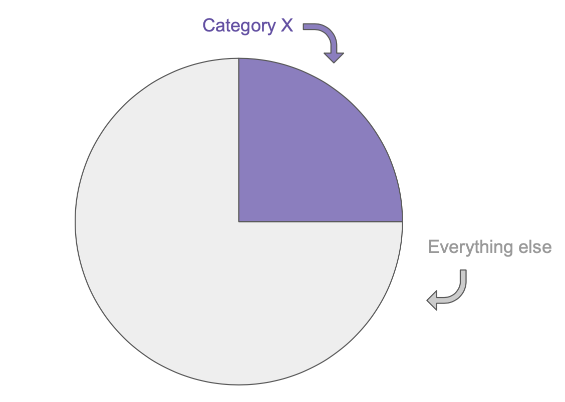
Figure 4-36. - Basic Pie chart sections
If an additional category is to be shown on the pie chart, it will follow on from the end of the initial section, again in a clockwise direction. In Figure 4-37, Category Y has been used to demonstrate this. As Category Y makes up an eighth of the overall total, the coloured-in section covers 12.5% of the circle. The highlighted categories should be shown in the highest to lowest value order so it makes interpreting the pie chart easier for the consumer of the chart.

Figure 4-37. - Basic Pie chart with additional category
Angles
Understanding angles is everything when interpreting a pie chart and you’ll notice how they don’t appear in the list of pre-attentive attributes. Size does appear in that list and that is what we are comparing between the different sections of the pie chart. Humans aren’t great at assessing angles precisely but that doesn’t make pie charts completely horrendous at communicating data. As we are taught to interpret pie charts and read analogue clock faces from an early age, I’ve found people can instinctively determine section size where it is a quarter, half or three quarters of the circle. By starting that section at the top point of the circle, it makes it easier still to recognize, like we can see in Figure 4-38.

Figure 4-38. - Reading Pie chart angles
When those sections start away from the top of the circle and are offset by another category, it becomes much harder for people to quickly interpret the data point being shown. For example, in Figure 4-39 Category X is the same sized segment as per before but now is not in the same position. If I hadn’t have told you it is the same size, would you have been sure?

Figure 4-39. - Offset sections making pie charts harder to read
When there are multiple sections in a pie chart it is a challenge to determine which ones are similar sizes and what those sizes represent. Labels can help but I will cover those shortly.
Alternative pie charts
In many news media articles and pieces containing data visualization, the traditional pie chart has been replaced by a version of the pie chart called a donut chart. The chart is named as such due to the middle of the pie missing and thus is shaped like a donut (Figure 4-40).

Figure 4-40. - Donut chart
White space is important when designing communications and the donut pie chart variant allows the user to have more white space on the page. White space allows the consumer to see a cleaner view and makes the visualization pop off the page a little more. However, with the middle section missing in the donut pie chart, it can be slightly harder to determine what the angle of the section is and therefore, what value is represented by the section.
Instead of using angle to represent the value, area can be used instead. A treemap uses rectangular area to demonstrate the values being visualized. In Figure 4-41, a treemap shows the same values as the first pie chart in this section (Figure 4-36).

Figure 4-41. - Basic Treemap
There is debate and research over what is easier to interpret but personally I find square area easier to interpret than the angles or circular sections of pie charts. Robert Kosara found that square pie charts were the clearest to interpret in one study.4
Labels
One element that is more frequently shown on a pie chart than others we have featured so far is labels. The labels can show the name of the category, the value and/or the percentage of total represented by the section.
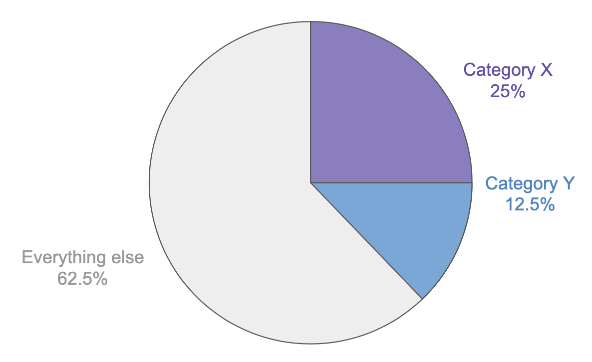
Figure 4-42. - Pie Chart with labels
Although the labels can help the user be more precise with the values being shown, care should be taken over whether the chart is becoming the secondary element to the label that a consumer of the information is looking at. The use of labels is one area where a donut chart can benefit especially where one section is being highlighted. The blank middle of the donut can be used to show the value and any other information you’d like to share about that section like the value of that section as shown in Figure 4-43. You can be quite innovative with the blank space of a donut pie chart by adding small percentage change indicators or even sparklines (covered in Chapter 3) to give the reader additional contextual information for the value being shown.

Figure 4-43. - Donut chart with labels
The labels in a treemap can be placed over the top of the sections representing each categorical member (Figure 4-44). If the area of the section of the treemap is so small then that section probably doesn’t warrant the attention the label would draw to that area of the chart.

Figure 4-44. - Treemap with multiple sections and labels
When to Use
Any form of pie chart only works well when there are very few categorical variables. Often, I will only use a pie chart when demonstrating two categories. When visualizing the sales of the Road Bike Type, I’ve chosen to group the other Bike Types’ sales to simplify the view for the reader (Figure 4-45).
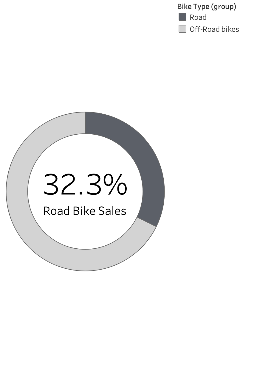
Figure 4-45. - Simple donut chart example
The message is much clearer than would be otherwise if each Bike Type was shown in turn, even if the label is left clearly displayed (Figure 4-46). Having the other sections detracts from the focused message of the percentage of the Road Bike sales.
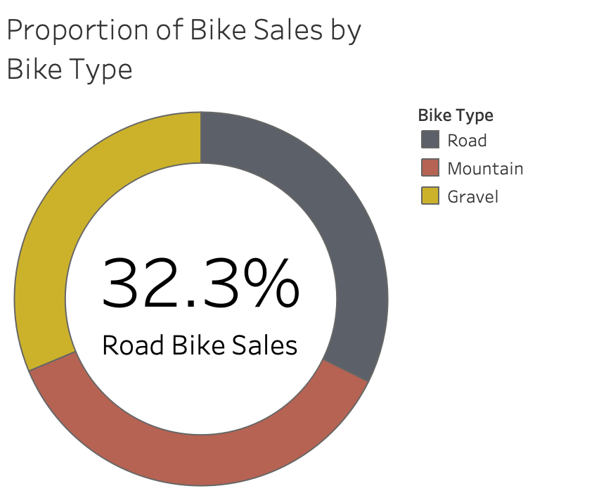
Figure 4-46. - Donut Chart with multiple segments
When using multiple segments, I find it much clearer to use a Treemap as there is often more space for labels and is an easier comparison to make between the different sections if the values are similar as they are in Figure 4-47.

Figure 4-47. - Basic Treemap with multiple segments
I’ve also found Treemaps particularly useful when showing long-tailed distributions of data. Long-tailed distributions are where you have a lot of different members of a category providing small contributions. For example, if you sold a large number of products, it can still be useful to compare the value of sales from each of the different products. In Figure 4-48, all of the manufacturers sold through the Bike Store over time have been added to the view. As you can see this has created a lot of subdivisions of the Bike Type segments but conclusions can still be drawn. For example, the top 5 manufacturers of Gravel bikes can be seen to make up about half the sales of Gravel bikes.

Figure 4-48. - Treemap showing long tail distribution
Most tools used to build treemaps will present the largest value in the top left of the treemap or segment so it is easier to rank the sales visually and see how many values it takes to make up significant proportions of the overall or segment value. The business intelligence tools you use to build these charts will automatically determine how to orientate the sections within the treemap.
When You Might Not Use Part-To-Whole Charts
There are a number of occasions where you should avoid using part-to-whole charts. The first and most important one being where the chart doesn’t visualize the total amount of the value. In Figure 4-49, the Gravel Bike Type has been removed. Depending on how the chart is titled, it might make you believe there are only two Bike Types contributing to the stores’ sales.

Figure 4-49. - Pie chart not showing the total sales
Survey results are often shown in organizations using pie charts. Many surveys allow the respondents to answer with multiple choices or answers to different questions and this makes the data very difficult to represent in a pie chart without it being misleading or not adding up to 100%. One situation where you can’t visualize the total amount in a pie chart or treemap, even if you include all the potential categories, is if you might have any members of the category you are showing in the pie chart that have negative values. There is no clear way to visualize the negative contribution as a proportion of an area.
Another situation where part-to-whole charts should be avoided is when demonstrating change over time. If you want to show how the proportions of bike sales change by type overtime, you might be tempted to replicate a pie chart per year if you are already showing the data in that manner for a single year. In Figure 4-50, due to the changing proportions of each Bike Type, it is challenging to see the change in proportion of sales over time using pie charts.

Figure 4-50. - Pie charts demonstrating change over time
Using pie charts to show change over time can also hide the absolute change in the overall amount the pie chart represents. It takes a lot of labelling to make pie charts communicate this information clearly.
A much clearer way to communicate the numbers would be to use a line chart to show the change in percentage of total sales each Bike Type achieved each year. Figure 4-51 shows exactly this relationship but it’s much easier to see the changing patterns across the years than it was in the pie charts. You’ll notice that the Mountain Bike Type didn’t have a consistent starting point for the angle. While it’s difficult to track it’s relative change year-on-year in the pie chart, it is easy to see in the line chart.
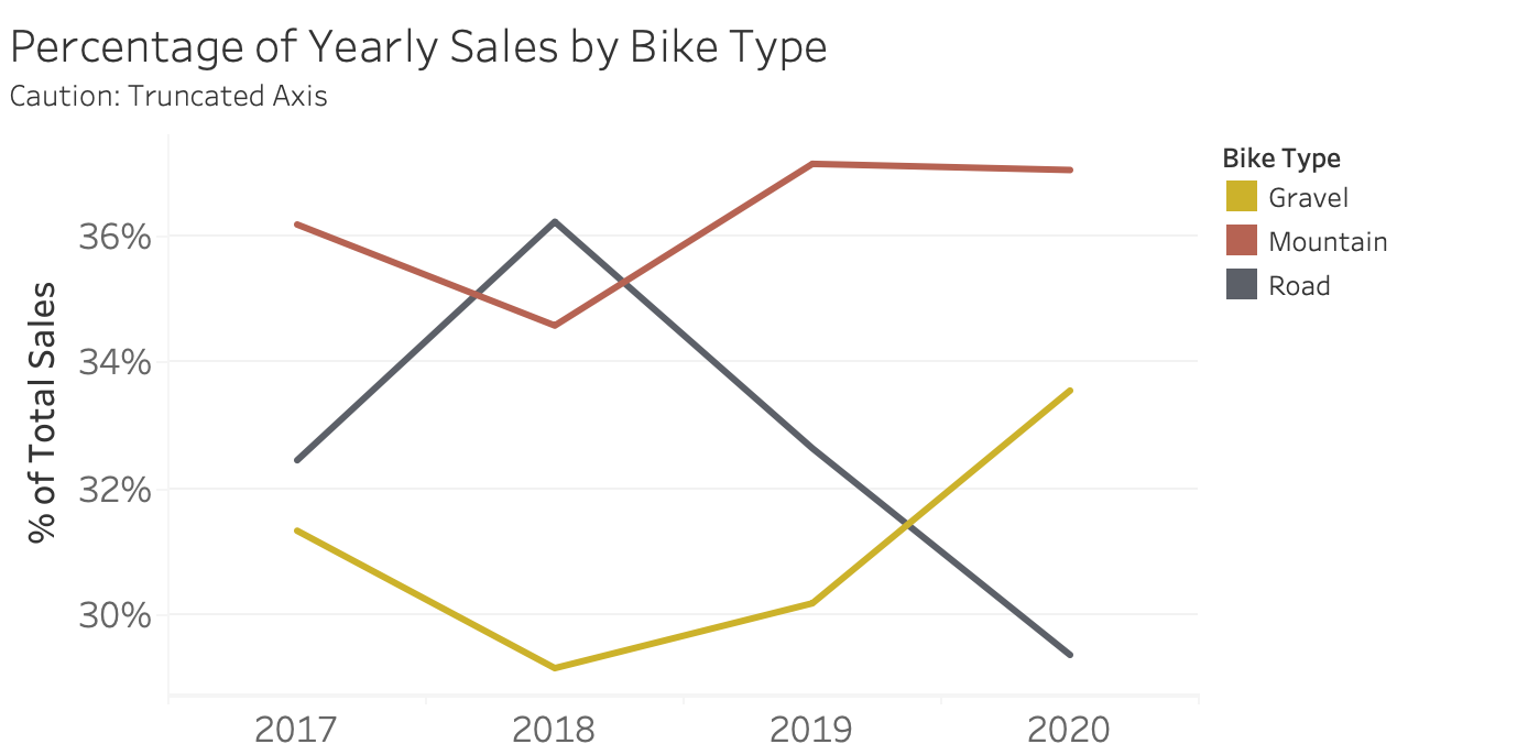
Figure 4-51. - Percentage of Yearly Sales Line chart
You may notice that I have truncated the y-axis by removing the zero point of the axis. Whilst I argued this shouldn’t happen for any mark type that uses height or length to indicate the value, as I’m showing a trend through lines, I have removed it here.
Another occasion where you should avoid using a pie chart is when you have too many categorical variables, which makes any pie chart difficult to read. The same detail that is found in the treemap in Figure 4-48, is actually unreadable when in a pie chart form as seen in Figure 4-52.

Figure 4-52. - Pie chart with too many segments
Instead, the treemap allows for much easier analysis.
Part-to-whole charts are an important tool in your visual communication repertoire but should be used with caution as they can be challenging to interpret in the wrong situations compared to a number of charts we’ve looked at so far. There are alternate chart types like waffle chart or square pie charts that can be used more effectively here but are less common. You should not use part-to-whole charts to show any measure that may go beyond 100% like progress towards, and hopefully beyond, a sales target.
Summary
Understanding how to use tables, bars and line charts are key skills to communicating with data but the charts covered in this chapter are not far behind in terms of their importance to your ability to communicate. Like language, the more words you know, the more options you will have when you are making your point.
Scatterplots alone are a very effective way to visualize two measures at the same time. Dealing with lots of data points can be intimidating but in a scatterplot they can actually become much easier to interpret. By adding trend lines, the message within the data can be shared very easily and won’t take a statistics degree to understand the key metrics that describe the relationships.
Maps are another brilliant method to attract users to your work. The levels of inherent knowledge people have about countries and cities don’t have to become separate data points that muddy the data you are sharing. Anything that minimises the amount of interpretation of data points for a user is useful and a map can add much more than just layering on more data points.
Visualizing part-to-whole relationships is a common task when working with data and there are challenges posed by both Pie charts and Treemaps. However, compared to stacked bar charts or other methods, Pies and Treemaps can be used more clearly. All options for these charts are less useful when too many variables are shown on any single chart. Using an ‘other’ group to collate the minority segments is a useful work around.
As people have become more accustomed to seeing data visualisations in their everyday lives, it’s become increasingly difficult to create visualizations that are memorable and stand out from the crowd. As covered in Chapter 1, a key part of communication is gaining the attention of the consumer so they receive the message you are communicating. In the case of data visualization, different chart types are created to convey the intended message.
Whilst less common charts do gain the attention of the audience due to their unique aesthetics, they are also more challenging to interpret due to the reader’s lack of familiarity with them and the charts’ use of less effective pre-attentive attributes.
The eye-catching nature of alternate charts to what has been covered so far is the primary reason to use them. As mentioned in the introduction to this section, being memorable is a significant battle when data visualisations become more commonplace. Take Figure 4-53 as an example, the visualization is an alternate way to show a company’s Income Statement inspired by my colleague Joe Kernaghan. The chart shows how different profit types are formed from Tesla’s 2020 financial statements.
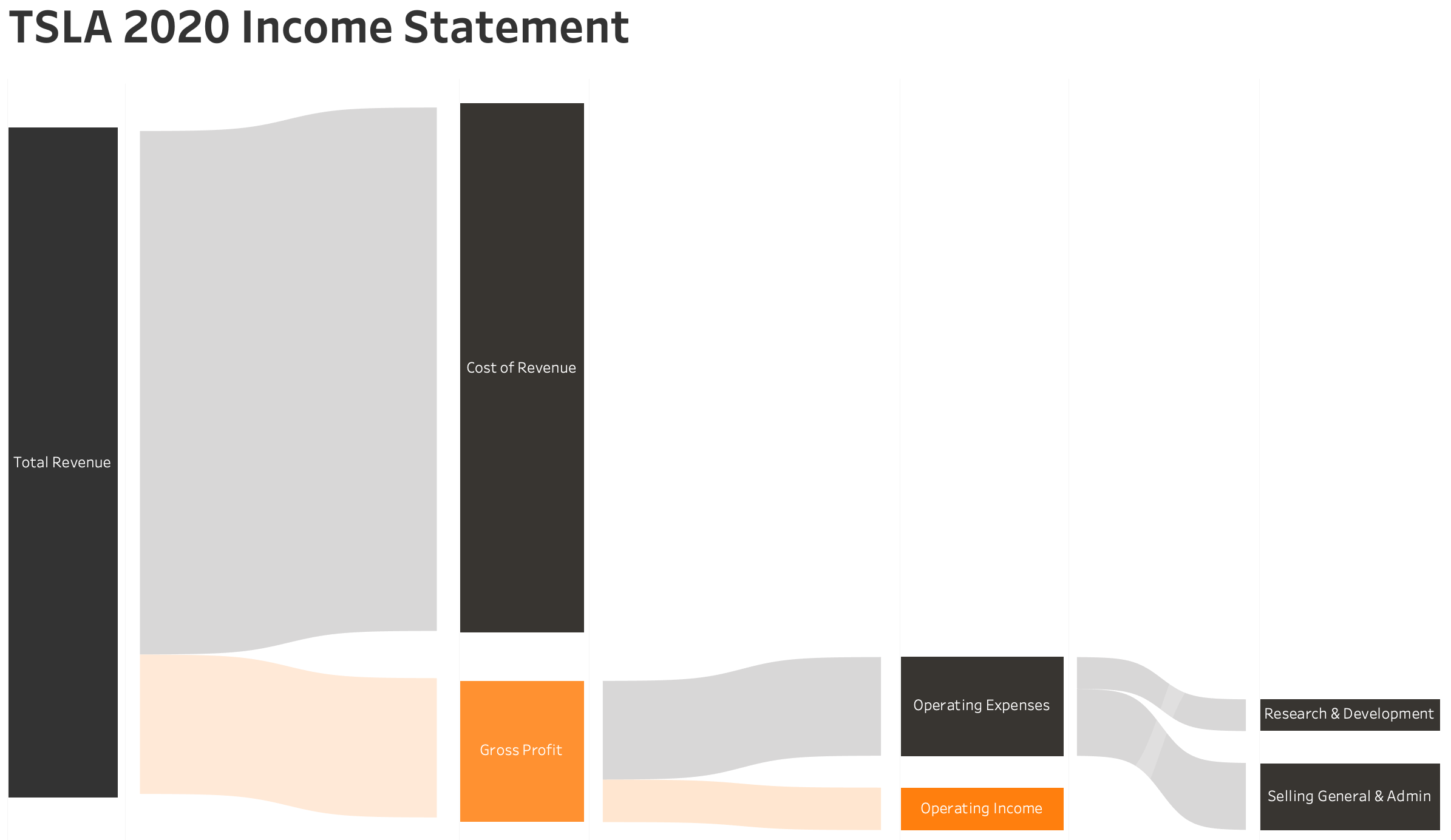
Figure 4-53. - TSLA 2020 Income Statement Sankey5
The chart doesn’t offer precise information but does show how the different amounts fit together and are split apart to form the Gross and Operating Profit. As a way of grabbing people’s attention and educating them on what goes into forming the Profit values, it works well as a chart.
Ultimately, by going beyond using basic bar charts, you’ll make active choices about why you are communicating the way you are and ultimately that makes better visualisations than you otherwise would.
1 For more information on this see: https://en.wikipedia.org/wiki/Correlation_does_not_imply_causation
2 Sleeper, Ryan. 2018. Practical Tableau. Sebastopol, CA: O’Reilly, p.495.
3 Sleeper, Ryan. 2018. Practical Tableau. Sebastopol, CA: O’Reilly, p.495.
4 https://eagereyes.org/blog/2016/a-reanalysis-of-a-study-about-square-pie-charts-from-2009
5 Based on a template from the Flerlage Twins: https://www.flerlagetwins.com/2019/04/more-sankey-templates.html