![]()
Line Charts with D3
In this chapter, you are going to create a line chart with ticks and labels. You will find out how to add Scalable Vector Graphics (SVG) elements to a document, and by manipulating these elements, how you can create any kind of visualization. Such flexibility enables you to build any type of chart, building it up brick by brick.
You’ll begin by looking at how to build the basic elements of a line chart using the D3 commands introduced in the previous chapter. In particular, you’ll be analyzing the concepts of scales, domains, and ranges, which you’ll be encountering frequently. These constitute a typical aspect of the D3 library, in terms of how it manages sets of values.
Once you understand how to manage values in their domains, scales, and intervals, you’ll be ready to move on to the realization of the chart components, such as axes, axis labels, the title, and the grid. These components form the basis upon which you’ll be drawing the line chart. Unlike in jqPlot, these components are not readily available but must be developed gradually. This will result in additional work, but it will also enable you to create special features. Your D3 charts will be able to respond to particular needs, or at least, they will have a totally original look. By way of example, you’ll see how to add arrows to the axes.
Another peculiarity of the D3 library is the use of functions that read data contained in a file. You’ll see how these functions work and how to exploit them for your needs.
Once you have the basic knowledge necessary to implement a line chart, you’ll see how to implement a multiseries line chart. You’ll also read about how to implement a legend and how to associate it with the chart.
Finally, to conclude, you’ll analyze a particular case of line chart: the difference line chart. This will help you understand clip area paths—what they are and what their uses are.
Developing a Line Chart with D3
You’ll begin to finally implement your chart using the D3 library. In this and in the following sections, you’ll discover a different approach toward chart implementation compared to the one adopted with libraries such as jqPlot and Highcharts. Here the implementation is at a lower level and the code is much longer and more complex; however, nothing beyond your reach.
Now, step by step, or better, brick by brick, you’ll discover how to produce a line chart and the elements that compose it.
Starting with the First Bricks
The first “brick” to start is to include the D3 library in your web page (for further information, see Appendix A):
<script src="../src/d3.v3.min.js"></script>
Or if you prefer to use a content delivery network (CDN) service:
<script src="http://d3js.org/d3.v3.min.js"></script>
The next “brick” consists of the input data array in Listing 3-1. This array contains the y values of the data series.
Listing 3-1. Ch3_01.html
var data = [100, 110, 140, 130, 80, 75, 120, 130, 100];
Listing 3-2 you define a set of variables related to the size of the visualization where you’re drawing the chart. The w and h variables are the width and height of the chart; the margins are used to create room at the edges of the chart.
Listing 3-2. Ch3_01.html
w = 400;
h = 300;
margin_x = 32;
margin_y = 20;
Because you’re working on a graph based on an x-axis and y-axis, in D3 it is necessary to define a scale, a domain, and a range of values for each of these two axes. Let’s first clarify these concepts and learn how they are managed in D3.
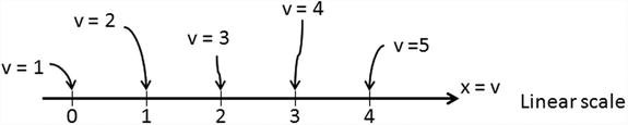
You have already had to deal with scales, even though you might not realize it. The linear scale is more natural to understand, although in some examples, you have used a logarithmic scale (see the Sidebar “LOG SCALE” below)
LOG SCALE
The log scale uses intervals corresponding to orders of magnitude (generally ten) rather than a standard linear scale. This allows you to represent a large range of values (v) on an axis.
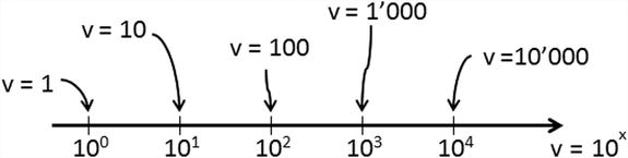
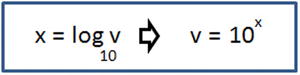
The logarithm is another way of writing exponentials, and you can use it to separate the exponent (x) and place it on an axis.
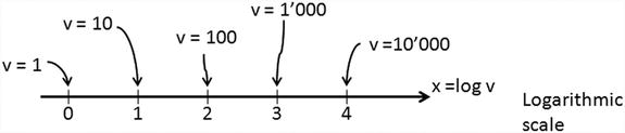
For example, an increase of one point on a log scale corresponds to an increase of 10 times that value. Similarly, an increase of two points corresponds to an increase of 100 times that value. And so on.
A scale is simply a function that converts a value in a certain interval, called a domain, into another value belonging to another interval, called a range. But what does all this mean exactly? How does this help you?
Actually, this can serve you every time you want to affect the conversion of a value between two variables belonging to different intervals, but keeping its “meaning” with respect to the current interval. This relates to the concept of normalization.
Suppose that you want to convert a value from an instrument, such as the voltage reported by a multimeter. You know that the voltage value would read between 0 and 5 volts, which is the range of values, also known as the domain.
You want to convert the voltage measured on a scale of red. Using Red-Green-Blue (RGB) codes, this value will be between 0 and 255. You have now defined another color range, which is the range.
Now suppose the voltage on the multimeter reads 2.7 volts, and the color scale shown in red corresponds to 138 (actually 137.7). You have just applied a linear scale for the conversion of values. Figure 3-1 shows the conversion of the voltage value into the corresponding R value on the RGB scale. This conversion operates within a linear scale, since the values are converted linearly.
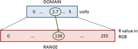
Figure 3-1. The conversion from the voltage to the R value is managed by the D3 library
But of what use is all of this? First, conversions between different intervals are not so uncommon when you aim to visualize data in a chart, and second, such conversions are managed completely by the D3 library. You do not need to do any calculations; you just need to define the domains, the range, and the scale to apply.
Translating this example into D3 code, you can write:
var scale = d3.scale.linear(),
             .domain([0,5]),
             .range([0,255]);
console.log(Math.round(scale(2.7)));      //it returns 138 on FireBug console
Inside the Code
You can define the scale, the domain, and the range; therefore, you can continue to implement the line chart by adding Listing 3-3 to your code.
Listing 3-3. Ch3_01.html
y = d3.scale.linear().domain([0, d3.max(data)]).range([0 + margin_y, h - margin_y]);
x = d3.scale.linear().domain([0, data.length]).range([0 + margin_x, w - margin_x]);
Because the input data array is one-dimensional and contains the values that you want to represent on the y-axis, you can extend the domain from 0 to the maximum value of the array. You don’t need to use a for loop to find this value. D3 provides a specific function called max(date), where the argument passed is the array in which you want to find the maximum.
Now is the time to begin adding SVG elements. The first element to add is the <svg> element that represents the root of all the other elements you’re going to add. The function of the <svg> tag is somewhat similar to that of the canvas in jQuery and jqPlot. As such, you need to specify the canvas size with w and h. Inside the <svg> element, you append a <g> element so that all the elements added to it internally will be grouped together.
Subsequently, apply a transformation to this group <g> of elements. In this case, the transformation consists of a translation of the coordinate grid, moving it down by h pixels, as shown in Listing 3-4.
Listing 3-4. Ch3_01.html
var svg = d3.select("body")
    .append("svg:svg")
    .attr("width", w)
    .attr("height", h);

var g = svg.append("svg:g")
    .attr("transform", "translate(0," + h + ")");
Another fundamental thing you need in order to create a line chart is the path element. This path is filled with the data using the d attribute.
The manual entry of all these values is too arduous and in this regard D3 provides you with a function that does it for you: d3.svg.line. So, in Listing 3-5, you declare a variable called line in which every data is converted into a point (x,y).
Listing 3-5. Ch3_01.html
var line = d3.svg.line()
    .x(function(d,i) { return x(i); })
    .y(function(d) { return -1 * y(d); });
As you’ll see in all the cases where you need to make a scan of an array (a for loop), in D3 such a scan is handled differently through the use of the parameters d and i. The index of the current item of the array is indicated with i, whereas the current item is indicated with d. Recall that you translated the y-axis down with a transformation. You need to keep that mind; if you want to draw a line correctly, you must use the negative values of y. This is why you multiply the d values by -1.
The next step is to assign a line to a path element (see Listing 3-6).
Listing 3-6. Ch3_01.html
g.append("svg:path").attr("d", line(data));
If you stopped here and launch the web browser on the page, you would get the image shown in Figure 3-2.
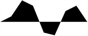
Figure 3-2. The default behavior of an SVG path element is to draw filled areas
This seems to be wrong somehow, but you must consider that in the creation of images with SVG, the role managed by CSS styles is preponderant. In fact, you can simply add the CSS classes in Listing 3-7 to have the line of data.
Listing 3-7. Ch3_01.html
<style>
path {
    stroke: steelblue;
    stroke-width: 3;
    fill: none;
}

line {
    stroke: black;
}
</style>
Thus, with the CSS style classes suitably defined, you’ll get a line as shown in Figure 3-3.
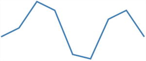
Figure 3-3. The SVG path element draws a line if the CSS style classes are suitably defined
But you are still far from having a line chart. You must add the two axes. To draw these two objects, you use simple SVG lines, as shown in Listing 3-8.
Listing 3-8. Ch3_01.html
// draw the x axis
g.append("svg:line")
    .attr("x1", x(0))
    .attr("y1", -y(0))
    .attr("x2", x(w))
    .attr("y2", -y(0))

// draw the y axis
g.append("svg:line")
    .attr("x1", x(0))
    .attr("y1", -y(0))
    .attr("x2", x(0))
    .attr("y2", -y(d3.max(data))-10)
Now is the time to add labels. For this purpose there is a D3 function that greatly simplifies the job: ticks(). This function is applied to a D3 scale such as x or y, and returns rounded numbers to use as ticks. You need to use the function text(String) to obtain the string value of the current d (see Listing 3-9).
Listing 3-9. ch3_01.html
//draw the xLabels
g.selectAll(".xLabel")
    .data(x.ticks(5))
    .enter().append("svg:text")
    .attr("class", "xLabel")
    .text(String)
    .attr("x", function(d) { return x(d) })
    .attr("y", 0)
    .attr("text-anchor", "middle");

// draw the yLabels
g.selectAll(".yLabel")
    .data(y.ticks(5))
    .enter().append("svg:text")
    .attr("class", "yLabel")
    .text(String)
    .attr("x", 25)
    .attr("y", function(d) { return -y(d) })
    .attr("text-anchor", "end");
To align the labels, you need to specify the attribute text-anchor. Its possible values are middle, start, and end, depending on whether you want the labels aligned in the center, to the left, or to the right, respectively.
Here, you use the D3 function attr() to specify the attribute, but it is possible to specify it in the CSS style as well, as shown in Listing 3-10.
Listing 3-10. ch3_01.html
.xLabel {
    text-anchor: middle;
}

.yLabel {
    text-anchor: end;
}
In fact, writing these lines is pretty much the same thing. Usually, however, you’ll prefer to set these values in the CSS style when you plan to change them—they are understood as parameters. Instead, in this case, or if you want them to be a fixed property of an object, it is preferable to insert them using the attr() function.
Now you can add the ticks to the axes. This is obtained by drawing a short line for each tick. What you did for tick labels you now do for ticks, as shown in Listing 3-11.
Listing 3-11. ch3_01.html
//draw the x ticks
g.selectAll(".xTicks")
    .data(x.ticks(5))
    .enter().append("svg:line")
    .attr("class", "xTicks")
    .attr("x1", function(d) { return x(d); })
    .attr("y1", -y(0))
    .attr("x2", function(d) { return x(d); })
    .attr("y2", -y(0)-5)

// draw the y ticks
g.selectAll(".yTicks")
    .data(y.ticks(5))
    .enter().append("svg:line")
    .attr("class", "yTicks")
    .attr("y1", function(d) { return -y(d); })
    .attr("x1", x(0)+5)
    .attr("y2", function(d) { return -y(d); })
    .attr("x2", x(0))
Figure 3-4 shows the line chart at this stage.

Figure 3-4. Adding the two axes and the labels on them, you finally get a simple line chart
As you can see, you already have a line chart. Perhaps by adding a grid, as shown in Listing 3-12, you can make things look better.
Listing 3-12. Ch3_01.html
//draw the x grid
g.selectAll(".xGrids")
    .data(x.ticks(5))
    .enter().append("svg:line")
    .attr("class", "xGrids")
    .attr("x1", function(d) { return x(d); })
    .attr("y1", -y(0))
    .attr("x2", function(d) { return x(d); })
    .attr("y2", -y(d3.max(data))-10);
// draw the y grid
g.selectAll(".yGrids")
    .data(y.ticks(5))
    .enter().append("svg:line")
    .attr("class", "yGrids")
    .attr("y1", function(d) { return -y(d); })
    .attr("x1", x(w))
    .attr("y2", function(d) { return -y(d); })
    .attr("x2", x(0));
You can make a few small additions to the CSS style (see Listing 3-13) in order to get a light gray grid as the background of the line chart. Moreover, you can define the text style as it seems more appropriate, for example by selecting Verdana for the font, with size 9.
Listing 3-13. Ch3_01.html
<style>
path {
    stroke: steelblue;
    stroke-width: 3;
    fill: none;
}
line {
    stroke: black;
}
.xGrids {
    stroke: lightgray;
}
.yGrids {
    stroke: lightgray;
}
text {
    font-family: Verdana;
    font-size: 9pt;
}
</style>
The line chart is now drawn with a light gray grid, as shown in Figure 3-5.

Figure 3-5. A line chart with a grid covering the blue lines
Look carefully at the Figure 3-5. The gray lines of the grid are drawn above the blue line representing the data. In other words, to be more explicit, you must be careful about the order in which you draw the SVG elements. In fact it is convenient to first draw the axes and the grid and then eventually to move on to the representation of the input data. Thus, you need to put all items that you want to draw in the right order, as shown in Listing 3-14.
Listing 3-14. ch3_01.html
<script>
var data = [100,110,140,130,80,75,120,130,100];
w = 400;
h = 300;
margin_x = 32;
margin_y = 20;
y = d3.scale.linear().domain([0, d3.max(data)]).range([0 + margin_y, h - margin_y]);
x = d3.scale.linear().domain([0, data.length]).range([0 + margin_x, w - margin_x]);
var svg = d3.select("body")
    .append("svg:svg")
    .attr("width", w)
    .attr("height", h);

var g = svg.append("svg:g")
    .attr("transform", "translate(0," + h + ")");

var line = d3.svg.line()
    .x(function(d,i) { return x(i); })
    .y(function(d) { return -y(d); });

// draw the y axis
g.append("svg:line")
    .attr("x1", x(0))
    .attr("y1", -y(0))
    .attr("x2", x(w))
    .attr("y2", -y(0));

// draw the x axis
g.append("svg:line")
    .attr("x1", x(0))
    .attr("y1", -y(0))
    .attr("x2", x(0))
    .attr("y2", -y(d3.max(data))-10);

//draw the xLabels
g.selectAll(".xLabel")
    .data(x.ticks(5))
    .enter().append("svg:text")
    .attr("class", "xLabel")
    .text(String)
    .attr("x", function(d) { return x(d) })
    .attr("y", 0)
    .attr("text-anchor", "middle");

// draw the yLabels
g.selectAll(".yLabel")
    .data(y.ticks(5))
    .enter().append("svg:text")
    .attr("class", "yLabel")
    .text(String)
    .attr("x", 25)
    .attr("y", function(d) { return -y(d) })
    .attr("text-anchor", "end");

//draw the x ticks
g.selectAll(".xTicks")
    .data(x.ticks(5))
    .enter().append("svg:line")
    .attr("class", "xTicks")
    .attr("x1", function(d) { return x(d); })
    .attr("y1", -y(0))
    .attr("x2", function(d) { return x(d); })
    .attr("y2", -y(0)-5);

// draw the y ticks
g.selectAll(".yTicks")
    .data(y.ticks(5))
    .enter().append("svg:line")
    .attr("class", "yTicks")
    .attr("y1", function(d) { return -1 * y(d); })
    .attr("x1", x(0)+5)
    .attr("y2", function(d) { return -1 * y(d); })
    .attr("x2", x(0));

//draw the x grid
g.selectAll(".xGrids")
    .data(x.ticks(5))
    .enter().append("svg:line")
    .attr("class", "xGrids")
    .attr("x1", function(d) { return x(d); })
    .attr("y1", -y(0))
    .attr("x2", function(d) { return x(d); })
    .attr("y2", -y(d3.max(data))-10);

// draw the y grid
g.selectAll(".yGrids")
    .data(y.ticks(5))
    .enter().append("svg:line")
    .attr("class", "yGrids")
    .attr("y1", function(d) { return -1 * y(d); })
    .attr("x1", x(w))
    .attr("y2", function(d) { return -y(d); })
    .attr("x2", x(0));

// draw the x axis
g.append("svg:line")
    .attr("x1", x(0))
    .attr("y1", -y(0))
    .attr("x2", x(w))
    .attr("y2", -y(0));

// draw the y axis
g.append("svg:line")
    .attr("x1", x(0))
    .attr("y1", -y(0))
    .attr("x2", x(0))
    .attr("y2", -y(d3.max(data))+10);

// draw the line of data points
g.append("svg:path").attr("d", line(data));
</script>
Figure 3-6 shows the line chart with the elements drawn in the correct sequence. In fact, the blue line representing the input data is now on the foreground covering the grid and not vice versa.
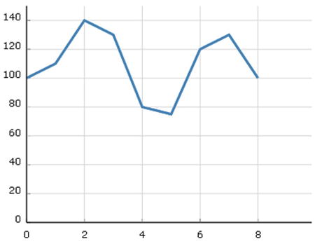
Figure 3-6. A line chart with a grid drawn correctly
So far, you have used an input data array containing only the values of y. In general, you’ll want to represent points that have x and y values assigned to them. Therefore, you’ll extend the previous case by using the input data array in Listing 3-15.
Listing 3-15. Ch3_02.html
var data = [{x: 0, y: 100}, {x: 10, y: 110}, {x: 20, y: 140},
            {x: 30, y: 130}, {x: 40, y: 80}, {x: 50, y: 75},
            {x: 60, y: 120}, {x: 70, y: 130}, {x: 80, y: 100}];
You can now see how the data is represented by dots containing both the values of x and y. When you use a sequence of data, you’ll often need to immediately identify the maximum values of both x and y (and sometimes the minimum values too). In the previous case, you used the d3.max and d3.min functions, but these operate only on arrays, not on objects. The input data array you inserted is an array of objects. How do you solve this? There are several approaches. Perhaps the most direct way is to affect a scan of the data and find the maximum values for both x and y. In Listing 3-16, you define two variables that will contain the two maximums. Then scanning the values of x and y of each object at a time, you compare the current value of x and y with the values of xMax and yMax, in order to see which value is larger. The greater of the two will become the new maximum.
Listing 3-16. Ch3_02.html
var xMax = 0, yMax = 0;
data.forEach(function(d) {
    if(d.x > xMax)
       xMax =  d.x;
    if(d.y > yMax)
       yMax =  d.y;
});
Several useful D3 functions work on arrays, so why not create two arrays directly from the input array of objects—one containing the values of x and the other containing the values of y? You can use these two arrays whenever necessary, instead of using the array of objects, which is far more complex (see Listing 3-17).
Listing 3-17. Ch3_02.html
var ax = [];
var ay = [];
data.forEach(function(d,i){
     ax[i] = d.x;
     ay[i] = d.y;
})
var xMax = d3.max(ax);
var yMax = d3.max(ay);
This time you assign both x and y to the line of data points, as shown in Listing 3-18. This operation is very simple even when you’re working with an array of objects.
Listing 3-18. Ch3_02.html
var line = d3.svg.line()
    .x(function(d) { return x(d.x); })
    .y(function(d) { return -y(d.y); })
As for the rest of the code, there is not much to be changed—only a few corrections to the values of x and y bounds, as shown in Listing 3-19.
Listing 3-19. Ch3_02.html
y = d3.scale.linear().domain([0, yMax]).range([0 + margin_y, h - margin_y]);
x = d3.scale.linear().domain([0, xMax]).range([0 + margin_x, w - margin_x]);
...
// draw the y axis
g.append("svg:line")
    .attr("x1", x(0))
    .attr("y1", -y(0))
    .attr("x2", x(0))
    .attr("y2", -y(yMax)-20)
...
//draw the x grid
g.selectAll(".xGrids")
    .data(x.ticks(5))
    .enter().append("svg:line")
    .attr("class", "xGrids")
    .attr("x1", function(d) { return x(d); })
    .attr("y1", -y(0))
    .attr("x2", function(d) { return x(d); })
    .attr("y2", -y(yMax)-10)

// draw the y grid
g.selectAll(".yGrids")
    .data(y.ticks(5))
    .enter().append("svg:line")
    .attr("class", "yGrids")
    .attr("y1", function(d) { return -1 * y(d); })
    .attr("x1", x(xMax)+20)
    .attr("y2", function(d) { return -1 * y(d); })
    .attr("x2", x(0))
Figure 3-7 shows the outcome resulting from the changes made to handle the y values introduced by the input data array.
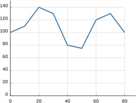
Figure 3-7. A line chart with a grid and axis labels that take into account the y values entered with the input array
Controlling the Axes’ Range
In the line chart you just drew in the code, the data line will always be at the top of the chart. If your data oscillates at very high levels, with the scale of y starting at 0, you risk having a flattened trend line. It is also not optimal when the upper limit of the y-axis is the maximum value of y. Here, you’ll add a check on the range of the axes. For this purpose in Listing 3-20, you define four variables that specify the lower and upper limits of the x- and y-axes.
Listing 3-20. Ch3_03.html
var xLowLim = 0;
var xUpLim = d3.max(ax);
var yUpLim = 1.2 * d3.max(ay);
var yLowLim = 0.8 * d3.min(ay);
You consequently replace all the limit references with these variables. Note that the code becomes somewhat more readable. Specifying these four limits in a direct manner enables you to modify them easily as the need arises. In this case, only the range covered by the experimental data on y, plus a margin of 20%, is represented, as shown in Listing 3-21.
Listing 3-21. ch3_03.html
y = d3.scale.linear().domain([yLowLim, yUpLim]).range([0 + margin_y, h - margin_y]);
x = d3.scale.linear().domain([xLowLim, xUpLim]).range([0 + margin_x, w - margin_x]);

...

//draw the x ticks
g.selectAll(".xTicks")
    .data(x.ticks(5))
    .enter().append("svg:line")
    .attr("class", "xTicks")
    .attr("x1", function(d) { return x(d); })
    .attr("y1", -y(yLowLim))
    .attr("x2", function(d) { return x(d); })
    .attr("y2", -y(yLowLim)-5)

// draw the y ticks
g.selectAll(".yTicks")
    .data(y.ticks(5))
    .enter().append("svg:line")
    .attr("class", "yTicks")
    .attr("y1", function(d) { return -y(d); })
    .attr("x1", x(xLowLim))
    .attr("y2", function(d) { return -y(d); })
    .attr("x2", x(xLowLim)+5)

//draw the x grid
g.selectAll(".xGrids")
    .data(x.ticks(5))
    .enter().append("svg:line")
    .attr("class", "xGrids")
    .attr("x1", function(d) { return x(d); })
    .attr("y1", -y(yLowLim))
    .attr("x2", function(d) { return x(d); })
    .attr("y2", -y(yUpLim))

// draw the y grid
g.selectAll(".yGrids")
    .data(y.ticks(5))
    .enter().append("svg:line")
    .attr("class", "yGrids")
    .attr("y1", function(d) { return -y(d); })
    .attr("x1", x(xUpLim)+20)
    .attr("y2", function(d) { return -y(d); })
    .attr("x2", x(xLowLim))

// draw the x axis
g.append("svg:line")
    .attr("x1", x(xLowLim))
    .attr("y1", -y(yLowLim))
    .attr("x2", 1.2*x(xUpLim))
    .attr("y2", -y(yLowLim))

// draw the y axis
g.append("svg:line")
    .attr("x1", x(xLowLim))
    .attr("y1", -y(yLowLim))
    .attr("x2", x(xLowLim))
    .attr("y2", -1.2*y(yUpLim))
Figure 3-8 shows the new line chart with the y-axis range between 60 and 160, which displays the line better.
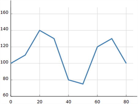
Figure 3-8. A line chart with y-axis range focused around the y values
In order to better understand the graphical versatility of D3, especially in the implementation of new features, you’ll learn to add arrows to the x- and y-axes. To do this, you must add the two paths in Listing 3-22, as they will draw the arrows at the ends of both axes.
Listing 3-22. Ch3_04.html
g.append("svg:path")
      .attr("class", "axisArrow")
      .attr("d", function() {
        var x1 = x(xUpLim)+23, x2 = x(xUpLim)+30;
        var y2 = -y(yLowLim),y1 = y2-3, y3 = y2+3
        return 'M'+x1+','+y1+','+x2+','+y2+','+x1+','+y3;
});

g.append("svg:path")
      .attr("class", "axisArrow")
      .attr("d", function() {
        var y1 = -y(yUpLim)-13, y2 = -y(yUpLim)-20;
        var x2 = x(xLowLim),x1 = x2-3, x3 = x2+3
        return 'M'+x1+','+y1+','+x2+','+y2+','+x3+','+y1;
});
In the CCS style, you add the axisArrow class, as shown in Listing 3-23. You can also choose to enable the fill attribute to obtain a filled arrow.
Listing 3-23. Ch3_04.html
.axisArrow {
    stroke: black;
    stroke-width: 1;
    /*fill: black; */
}
Figure 3-9 shows the results, with and without filling.
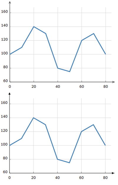
Figure 3-9. Two different ways to represent the arrows on the axes
Adding a Title and Axis Labels
In this section, you’ll add a title to the chart. It is quite a simple thing to do, and you will use the SVG element called text with appropriate changes to the style, as shown in Listing 3-24. This code will place the title in the center, on top.
Listing 3-24. Ch3_05.html
g.append("svg:text")
        .attr("x", (w / 2))
        .attr("y", -h + margin_y )
        .attr("text-anchor", "middle")
        .style("font-size", "22px")
        .text("My first D3 line chart");
Figure 3-10 shows the title added to the top of the line chart.
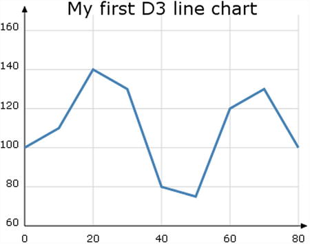
Figure 3-10. A line chart with a title
Following a similar procedure, you can add labels to the axes as well (see Listing 3-25).
Listing 3-25. Ch3_05.html
g.append("svg:text")
        .attr("x", 25)
        .attr("y", -h + margin_y)
        .attr("text-anchor", "end")
        .style("font-size", "11px")
        .text("[#]");

g.append("svg:text")
        .attr("x", w - 40)
        .attr("y", -8 )
        .attr("text-anchor", "end")
        .style("font-size", "11px")
        .text("time [s]");
Figure 3-11 shows the two new axis labels put beside their corresponding axes.
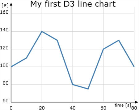
Figure 3-11. A more complete line chart with title and axes labels
Now that you have learned how to make a line chart, you’re ready to try some more complex charts. Generally, the data you want to display in a chart are not present in the web page, but rather in external files. You’ll integrate the following session on how to read data from external files with what you have learned so far.
Drawing a Line Chart from Data in a CSV File
When designing a chart, you typically refer to data of varied formats. This data often come from several different sources. In the most common case, you have applications on the server (which your web page is addressed to) that extract data from a database or by instrumentation, or you might even have data files collected in these servers. The example here uses a comma-separated value (CSV) file residing on the server as a source of data. This CSV file contains the data and could be loaded directly on the server or, as is more often the case, could be generated by other applications.
It is no coincidence that D3 has been prepared to deal with this type of file. For this purpose, D3 provides the function d3.csv(). You’ll learn more about this topic with an example.
Reading and Parsing Data
First of all, you need to define the size of the “canvas,” or better, the size and margins of the area where you want to draw the chart. This time, you define four margins. This will give you more control over the drawing area (see Listing 3-26).
Listing 3-26. Ch3_06a.html
<!DOCTYPE html>
<meta charset="utf-8">
<style>
</style>
<body>
<script src="http://d3js.org/d3.v3.js"></script>
<script>
var margin = {top: 70, right: 20, bottom: 30, left: 50},
    w = 400 - margin.left - margin.right,
    h = 400 - margin.top - margin.bottom;
Now you deal with the data; write the data in Listing 3-27 with a text editor into a file and save it as data_01.csv.
Listing 3-27. data_01.csv
date,attendee
12-Feb-12,80
27-Feb-12,56
02-Mar-12,42
14-Mar-12,63
30-Mar-12,64
07-Apr-12,72
18-Apr-12,65
02-May-12,80
19-May-12,76
28-May-12,66
03-Jun-12,64
18-Jun-12,53
29-Jun-12,59
This data contain two sets of values separated by a comma (recall that CSV stands for comma-separated values). The first is in date format and lists the days on which there was a particular event, such as a conference or a meeting. The second column lists the number of attendees. Note that the dates are not enclosed in any quote marks.
In a manner similar to jqPlot, D3 has a number of tools that the control time formats. In fact, to handle dates contained in the CSV file, you must specify a parser, as shown in Listing 3-28.
Listing 3-28. Ch3_06a.html
var parseDate = d3.time.format("%d-%b-%y").parse;
Here you need to specify the format contained in the CSV file: %d indicates the number format of the days, %b indicates the month reported with the first three characters, and %y indicates the year reported with the last two digits. You can specify the x and y values, assigning them with a scale and a range, as shown in Listing 3-29.
Listing 3-29. ch3_06a.html
var x = d3.time.scale().range([0, w]);
var y = d3.scale.linear().range([h, 0]);
Now that you have dealt with the correct processing of input data, you can begin to create the graphical components.
Implementing Axes and the Grid
You’ll begin by learning how to graphically realize the two Cartesian axes. In this example, shown in Listing 3-30, you follow the most appropriate way to specify the x-axis and y-axis through the function d3.svg.axis().
Listing 3-30. ch3_06a.html
var xAxis = d3.svg.axis()
    .scale(x)
    .orient("bottom")
    .ticks(5);

var yAxis = d3.svg.axis()
    .scale(y)
    .orient("left")
    .ticks(5);
This allows you to focus on the data, while all the axes-related concerns (ticks, labels, and so on) are automatically handled by the axis components. Thus, after you create xAxis and yAxis, you assign the scale of x and y to them and set the orientation. Is it simple? Yes; this time you don’t have to specify all that tedious stuff about axes—their limits, where to put ticks and labels, and so on. Unlike the previous example, all this is automatically done with very few rows. I chose to introduce this concept now, because in the previous example, I wanted to emphasize the fact that every item you design is a brick that you can manage with D3, regardless of whether this process is then automated within the D3 library.
Now you can add the SVG elements to the page, as shown in Listing 3-31.
Listing 3-31. ch3_06a.html
var svg = d3.select("body").append("svg")
    .attr("width", w + margin.left + margin.right)
    .attr("height", h + margin.top + margin.bottom)
    .append("g")
    .attr("transform", "translate(" + margin.left + "," + margin.top + ")");

  svg.append("g")
      .attr("class", "x axis")
      .attr("transform", "translate(0," + h + ")")
      .call(xAxis);

  svg.append("g")
      .attr("class", "y axis")
      .call(yAxis);
Notice how the x-axis is subjected to translation. In fact, in the absence of specifications, the x-axis would be drawn at the top of the drawing area. Moreover, you also need to add to the CSS style. See Listing 3-32.
Listing 3-32. Ch3_06a.html
<style>
body {
  font: 10px verdana;
}
.axis path,
.axis line {
  fill: none;
  stroke: #333;
}
</style>
Figure 3-12 shows the result.
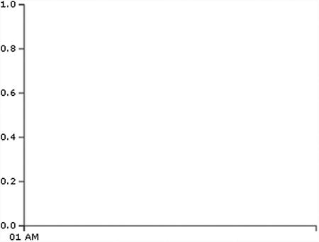
Figure 3-12. An empty chart ready to be filled with data
Using FireBug, you can see the structure of the SVG elements as you have just defined them (see Figure 3-13).
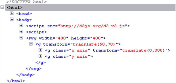
Figure 3-13. FireBug shows the structure of the SVG elements created dynamically to display the axes
You can see that all the elements are automatically grouped within the group <g> tag. This gives you more control to apply possible transformations to the separate elements.
You can also add a grid if you want. You build the grid the same way you built the axes. In fact, in the same manner, you define two grid variables—xGrid and yGrid—using the axis() function in Listing 3-33.
Listing 3-33. Ch3_06a.html
var yAxis = d3.svg.axis()
  ...
var xGrid = d3.svg.axis()
    .scale(x)
    .orient("bottom")
    .ticks(5)
    .tickSize(-h, 0, 0)
    .tickFormat("");

var yGrid = d3.svg.axis()
    .scale(y)
    .orient("left")
    .ticks(5)
    .tickSize(-w, 0, 0)
    .tickFormat("");
And in the bottom of the JavaScript code, you add the two new SVG elements to the others, as shown in Listing 3-34.
Listing 3-34. ch3_06a.html
svg.append("g")
    .attr("class", "y axis")
    .call(yAxis)

svg.append("g")
    .attr("class", "grid")
    .attr("transform", "translate(0," + h + ")")
    .call(xGrid);

svg.append("g")
    .attr("class", "grid")
    .call(yGrid);
Both elements are named with the same class name: grid. Thus, you can style them as a single element (see Listing 3-35).
Listing 3-35. Ch3_06a.html
<style>
...
.grid .tick {
    stroke: lightgrey;
    opacity: 0.7;
}
.grid path {
    stroke-width: 0;
}
</style>
Figure 3-14 shows the horizontal grid lines you have just defined as SVG elements.

Figure 3-14. Beginning to draw the horizontal grid lines
Your chart is now ready to display the data from the CSV file.
Drawing Data with the csv() Function
It’s now time to display the data in the chart, and you can do so with the D3 function d3.csv(), as shown in Listing 3-36.
Listing 3-36. ch3_06a.html
d3.csv("data_01.csv", function(error, data) {
// Here we will put all the SVG elements affected by the data
// on the file!!!
});
The first argument is the name of the CSV file; the second argument is a function where all the data within the file is handled. All the D3 functions that are in some way influenced by these values must be placed in this function. For example, you use svg.append() to create new SVG elements, but many of these functions need to know the x and y values of data. So you’ll need to put them inside the csv() function as a second argument.
All the data in the CSV file is collected in an object called data. The different fields of the CSV file are recognized through their headers. The first thing you’ll add is an iterative function where the data object is read item by item. Here, date values are parsed. You must ensure that all attendee values are read as numeric (this can be done by assigning each value to itself with a plus sign before it). See Listing 3-37.
Listing 3-37. Ch3_06a.html
d3.csv("data_01.csv", function(error, data) {
    data.forEach(function(d) {
       d.date = parseDate(d.date);
       d.attendee = +d.attendee;
    });
});
Only now is it possible to define the domain on x and y in Listing 3-38, because only now do you know the values of this data.
Listing 3-38. Ch3_06a.html
d3.csv("data_01.csv", function(error, data) {
    data.forEach(function(d) {
    ...
    });

    x.domain(d3.extent(data, function(d) { return d.date; }));
    y.domain(d3.extent(data, function(d) { return d.attendee; }));
});
Once data from the file is read and collected, it constitutes a set of points (x, y) that must be connected by a line. You’ll use the SVG element path to build this line, as shown in Listing 3-39. As you saw previously, the function d3.svg.line() makes the work easier.
Listing 3-39. Ch3_06a.html
d3.csv("data_01.csv", function(error, data) {
    data.forEach(function(d) {
    ...
    });
...
var line = d3.svg.line()
    .x(function(d) { return x(d.date); })
    .y(function(d) { return y(d.attendee); });
});
You can also add the two axes labels and a title to the chart. This is a good example of how to build <g> groups manually. Previously the group and all the elements inside were created by functions; now you need to do this explicitly. If you wanted to add the two axis labels to one group and the title to another, you’d need to specify two different variables: labels and title (see Listing 3-40).
In each case you create an SVG element <g> with the append() method, and define the group with a class name. Subsequently, you assign the SVG elements to the two groups, using append() on these variables.
Listing 3-40. ch3_06a.html
d3.csv("data_01.csv", function(error, data) {
    data.forEach(function(d) {
    ...
    });
...
    var labels = svg.append("g")
       .attr("class", "labels")

    labels.append("text")
       .attr("transform", "translate(0," + h + ")")
       .attr("x", (w-margin.right))
       .attr("dx", "-1.0em")
       .attr("dy", "2.0em")
       .text("[Months]");
    labels.append("text")
       .attr("transform", "rotate(-90)")
       .attr("y", -40)
       .attr("dy", ".71em")
       .style("text-anchor", "end")
       .text("Attendees");

    var title = svg.append("g")
       .attr("class", "title");

    title.append("text")
       .attr("x", (w / 2))
       .attr("y", -30 )
       .attr("text-anchor", "middle")
       .style("font-size", "22px")
       .text("A D3 line chart from CSV file");
});
Finally, you can add the path element, which draws the line representing the data values (see Listing 3-41).
Listing 3-41. Ch3_06a.html
d3.csv("data_01.csv", function(error, data) {
    data.forEach(function(d) {
    ...
    });
...

    svg.append("path")
       .datum(data)
       .attr("class", "line")
       .attr("d", line);
});
Even for this new SVG element, you must not forget to add its CSS style settings, as shown in Listing 3-42.
Listing 3-42. Ch3_06a.html
<style>
...
.line {
    fill: none;
    stroke: steelblue;
    stroke-width: 1.5px;
}
</style>
Figure 3-15 shows the nice line chart reporting all the data in the CSV file.
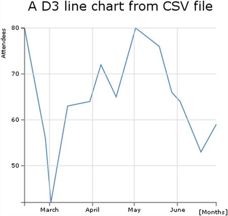
Figure 3-15. A complete line chart with all of its main components
As you have seen for the line chart of jqPlot, even here it is possible to make further additions. For example, you could put data marker on the line.
Inside the d3.csv() function at the end of all the added SVG elements, you can add markers (see Listing 3-43). Remember that these elements depend on the data, so they must be inserted inside the csv() function.
Listing 3-43. Ch3_06b.html
d3.csv("data_01.csv", function(error, data) {
    data.forEach(function(d) {
    ...
    });
...

    svg.selectAll(".dot")
       .data(data)
       .enter().append("circle")
       .attr("class", "dot")
       .attr("r", 3.5)
       .attr("cx", function(d) { return x(d.date); })
       .attr("cy", function(d) { return y(d.attendee); });
});
In the style part of the file, you add the CSS style definition of the .dot class in Listing 3-44.
Listing 3-44. Ch3_06b.html
.dot {
    stroke: steelblue;
    fill: lightblue;
}
Figure 3-16 shows a line chart with small circles as markers; this result is very similar to the one obtained with the jqPlot library.
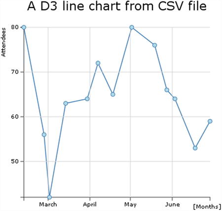
Figure 3-16. A complete line chart with markers
These markers have a circle shape, but it is possible to give them many other shapes and colors. For example, you can use markers with a square shape (see Listing 3-45).
Listing 3-45. Ch3_06c.html
<style>
.dot {
    stroke: darkred;
    fill: red;
}
</style>
...
svg.selectAll(".dot")
    .data(data)
    .enter().append("rect")
    .attr("class", "dot")
    .attr("width", 7)
    .attr("height", 7)
    .attr("x", function(d) { return x(d.date)-3.5; })
    .attr("y", function(d) { return y(d.attendee)-3.5; });
Figure 3-17 shows the same line chart, but this time it uses small red squares for markers.

Figure 3-17. One of the many marker options
You could also use markers in the form of a yellow rhombus, often referred to as diamonds (see Listing 3-46).
Listing 3-46. Ch3_06d.html
<style>
.dot {
    stroke: orange;
    fill: yellow;
}
</style>
...
svg.selectAll(".dot")
    .data(data)
    .enter().append("rect")
    .attr("class", "dot")
    .attr("transform", function(d) {
       var str = "rotate(45," + x(d.date) + "," + y(d.attendee) + ")";
       return str;
    })
    .attr("width", 7)
    .attr("height", 7)
    .attr("x", function(d) { return x(d.date)-3.5; })
    .attr("y", function(d) { return y(d.attendee)-3.5; });
Figure 3-18 shows markers in the form of a yellow rhombus.
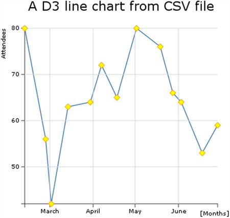
Figure 3-18. Another marker option
In this section, you put point markers aside and return to the basic line chart. Another interesting feature you can add to your chart is to fill in the area below the line. Do you remember the d3.svg.line() function? Well, here you are using the d3.svg.area() function. Just as you have a line object in D3, you have an area object as well. Therefore, to define an area object, you can add the rows in bold in Listing 3-47 to the code, in the section just below the definition of the line object.
Listing 3-47. Ch3_07.html
var line = d3.svg.line()
    .x(function(d) { return x(d.date); })
    .y(function(d) { return y(d.attendee); });

var area = d3.svg.area()
    .x(function(d) { return x(d.date); })
    .y0(h)
    .y1(function(d) { return y(d.attendee); });

var labels = svg.append("g")
...
As you can see, to define an area you need to specify the three functions that delimit the edges: x, y0, and y1. In this case, y0 is constant, corresponding to the bottom of the drawing area (the x-axis). You now need to create the corresponding element in SVG, which is represented by a path element, as shown in Listing 3-48.
Listing 3-48. Ch3_07.html
d3.csv("data_01.csv", function(error, data) {

  data.forEach(function(d) {
    d.date = parseDate(d.date);
    d.attendee = +d.attendee;
  });

...
svg.append("path")
    .datum(data)
    .attr("class", "line")
    .attr("d", line);

svg.append("path")
    .datum(data)
    .attr("class", "area")
    .attr("d", area);
});
As shown in Listing 3-49, you need to specify the color setting in the corresponding CSS style class.
Listing 3-49. Ch3_07.html
.area {
    fill: lightblue;
}
Figure 3-19 shows an area chart derived from the line chart.
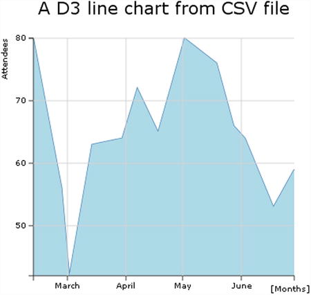
Figure 3-19. An area chart
Now that you’re familiar with the creation of the basic components of a line chart using SVG elements, the next step is to start dealing with multiple data series: multiseries line charts. The most important element covered in this section is the legend. You’ll learn to create one by exploiting the basic graphical elements that SVG provides.
Working with Multiple Series of Data
So far, you’ve been working with a single series of data. It is now time to move on to multiseries. In the previous example, you used a CSV file as a source of data. Now, you’ll look at another D3 function: d3.tsv(). It performs the same task as csv(), but operates on tab-separated value (TSV) files.
Copy Listing 3-50 into your text editor and save it as data_02.tsv (see the following note).
![]() Note The values in a TSV file are tab-separated, so when you write or copy Listing 3-50, remember to check that there is only one tab character between each value.
Note The values in a TSV file are tab-separated, so when you write or copy Listing 3-50, remember to check that there is only one tab character between each value.
Listing 3-50. data_02.tsv
Date         europa    asia    america
12-Feb-12    52        40      65
27-Feb-12    56        35      70
02-Mar-12    51        45      62
14-Mar-12    63        44      82
30-Mar-12    64        54      85
07-Apr-12    70        34      72
18-Apr-12    65        36      69
02-May-12    56        40      71
19-May-12    71        55      75
28-May-12    45        32      68
03-Jun-12    64        44      75
18-Jun-12    53        36      78
29-Jun-12    59        42      79
Listing 3-50 has four columns, where the first column is a date and the other three are values from different continents. The first column contains the x values; the others are the corresponding y values of the three series.
Start writing the code in Listing 3-51; there isn’t any explanation, because this code is virtually identical to the previous example.
Listing 3-51. Ch3_08a.html
<!DOCTYPE html>
<html>
<head>
<meta charset="utf-8">
<script src="http://d3js.org/d3.v3.js"></script>
<style>
body {
    font: 10px verdana;
}
.axis path,
.axis line {
    fill: none;
    stroke: #333;
}

.grid .tick {
    stroke: lightgrey;
    opacity: 0.7;
}
.grid path {
    stroke-width: 0;
}

.line {
    fill: none;
    stroke: steelblue;
    stroke-width: 1.5px;
}
</style>
</head>
<body>
<script type="text/javascript">
var margin = {top: 70, right: 20, bottom: 30, left: 50},
    w = 400 - margin.left - margin.right,
    h = 400 - margin.top - margin.bottom;
var parseDate = d3.time.format("%d-%b-%y").parse;
var x = d3.time.scale().range([0, w]);
var y = d3.scale.linear().range([h, 0]);

var xAxis = d3.svg.axis()
    .scale(x)
    .orient("bottom")
    .ticks(5);

var yAxis = d3.svg.axis()
    .scale(y)
    .orient("left")
    .ticks(5);

var xGrid = d3.svg.axis()
    .scale(x)
    .orient("bottom")
    .ticks(5)
    .tickSize(-h, 0, 0)
    .tickFormat("");

var yGrid = d3.svg.axis()
    .scale(y)
    .orient("left")
    .ticks(5)
    .tickSize(-w, 0, 0)
    .tickFormat("");

var svg = d3.select("body").append("svg")
    .attr("width", w + margin.left + margin.right)
    .attr("height", h + margin.top + margin.bottom)
    .append("g")
    .attr("transform", "translate(" + margin.left + "," + margin.top + ")");

var line = d3.svg.line()
    .x(function(d) { return x(d.date); })
    .y(function(d) { return y(d.attendee); });

// Here we add the d3.tsv function
// start of the part of code to include in the d3.tsv() function
d3.tsv("data_02.tsv", function(error, data) {

    svg.append("g")
       .attr("class", "x axis")
       .attr("transform", "translate(0," + h + ")")
       .call(xAxis);

    svg.append("g")
       .attr("class", "y axis")
       .call(yAxis);

    svg.append("g")
       .attr("class", "grid")
       .attr("transform", "translate(0," + h + ")")
       .call(xGrid);

    svg.append("g")
       .attr("class", "grid")
       .call(yGrid);
});
//end of the part of code to include in the d3.tsv() function

var labels = svg.append("g")
    .attr("class","labels");

labels.append("text")
    .attr("transform", "translate(0," + h + ")")
    .attr("x", (w-margin.right))
    .attr("dx", "-1.0em")
    .attr("dy", "2.0em")
    .text("[Months]");
labels.append("text")
    .attr("transform", "rotate(-90)")
    .attr("y", -40)
    .attr("dy", ".71em")
    .style("text-anchor", "end")
    .text("Attendees");

var title = svg.append("g")
    .attr("class", "title");

title.append("text")
    .attr("x", (w / 2))
    .attr("y", -30 )
    .attr("text-anchor", "middle")
    .style("font-size", "22px")
    .text("A multiseries line chart");
</script>
</body>
</html>
When you deal with multiseries data in a single chart, you need to be able to identify the data quickly and as a result you need to use different colors. D3 provides some functions generating an already defined sequence of colors. For example, there is the category10() function, which provides a sequence of 10 different colors. You can create a color set for the multiseries line chart just by writing the line in Listing 3-52.
Listing 3-52. Ch3_08a.html
...
var x = d3.time.scale().range([0, w]);
var y = d3.scale.linear().range([h, 0]);
var color = d3.scale.category10();
var xAxis = d3.svg.axis()
...
You now need to read the data in the TSV file. As in the previous example, just after the call of the d3.tsv() function, you add a parser, as shown in Listing 3-53. Since you have to do with date values on the x-axis, you have to parse this type of value. You’ll use the parseDate() function.
Listing 3-53. Ch3_08a.html
d3.tsv("data_02.tsv", function(error, data) {
    data.forEach(function(d) {
       d.date = parseDate(d.date);
    });
...
});
You’ve defined a color set, using the category10() function in a chain with a scale() function. This means that D3 handles color sequence as a scale. You need to create a domain, as shown in Listing 3-54 (in this case it will be composed of discrete values, not continuous values such as those for x or y). This domain consists of the headers in the TSV file. In this example, you have three continents. Consequently, you’ll have a domain of three values and a color sequence of three colors.
Listing 3-54. Ch3_08a.html
d3.tsv("data_02.tsv", function(error, data) {
    data.forEach(function(d) {
       d.date = parseDate(d.date);
    });
    color.domain(d3.keys(data[0]).filter(function(key) {
       return key !== "date";
    }));
...
});
In Listing 3-53, you can see that data[0] is passed as an argument to the d3.keys() function. data[0] is the object corresponding to the first row of the TSV file:
Object {date=Date {Sun Feb 12 2012 00:00:00 GMT+0100},
europa="52", asia="40", america="65"}.
The d3.keys() function extracts the name of the values from inside an object, the same name which we find as a header in the TSV file. So using d3.keys(data[0]), you get the array of strings:
["date","europa","asia","america"]
You are interested only in the last three values, so you need to filter this array in order to exclude the key "date". You can do so with the filter() function. Finally, you’ll assign the three continents to the domain of colors.
["europa","asia","america"]
The command in Listing 3-55 reorganizes all the data in an array of structured objects. This is done by the function map() with an inner function, which maps the values following a defined structure.
Listing 3-55. Ch3_08a.html
d3.tsv("data_02.tsv", function(error, data) {
...
    color.domain(d3.keys(data[0]).filter(function(key) {
       return key !== "date";
    }));

    var continents = color.domain().map(function(name) {
       return {
          name: name,
          values: data.map(function(d) {
             return {date: d.date, attendee: +d[name]};
          })
       };
    });
...
});
So this is the array of three objects called continents.
[ Object { name="europa", values=[13]},
  Object { name="asia", values=[13]},
  Object { name="america", values=[13]} ]
Every object has a continent name and a values array of 13 objects:
[ Object { date=Date, attendee=52 },
  Object { date=Date, attendee=56 },
  Object { date=Date, attendee=51 },
  ...]
You have the data structured in a way that allows for subsequent handling. In fact, when you need to specify the y domain of the chart, you can find the maximum and minimum of all values (not of each single one) in the series with a double iteration (see Listing 3-56). With function(c), you make an iteration of all the continents and with function(v), you make an iteration of all values inside them. In the end, d3.min and d3.max will extract only one value.
Listing 3-56. Ch3_08a.html
d3.tsv("data_02.tsv", function(error, data) {
...
    var continents = color.domain().map(function(name) {
    ...
   });

    x.domain(d3.extent(data, function(d) { return d.date; }));
    y.domain([
       d3.min(continents, function(c) {
          return d3.min(c.values, function(v) { return v.attendee; });
       }),
       d3.max(continents, function(c) {
           return d3.max(c.values, function(v) { return v.attendee; });
       })
    ]);
...
});
Thanks to the new data structure, you can add an SVG element <g> for each continent containing a line path, as shown in Listing 3-57.
Listing 3-57. Ch3_08a.html
d3.tsv("data_02.tsv", function(error, data) {
...

    svg.append("g")
       .attr("class", "grid")
       .call(yGrid);

    var continent = svg.selectAll(".continent")
       .data(continents)
       .enter().append("g")
       .attr("class", "continent");

    continent.append("path")
       .attr("class", "line")
       .attr("d", function(d) { return line(d.values); })
       .style("stroke", function(d) { return color(d.name); });
});
The resulting multiseries line chart is shown in Figure 3-20.
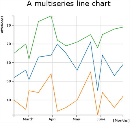
Figure 3-20. A multiseries line chart
Legend
When you are dealing with multiseries charts, the next logical step is to add a legend in order to categorize the series with colors and labels. Since a legend is a graphical object like any other, you need to add the SVG elements that allow you to draw it on the chart (see Listing 3-58).
Listing 3-58. Ch3_08a.html
d3.tsv("data_02.tsv", function(error, data) {
...
    continent.append("path")
       .attr("class", "line")
       .attr("d", function(d) { return line(d.values); })
       .style("stroke", function(d) { return color(d.name); });

    var legend = svg.selectAll(".legend")
       .data(color.domain().slice().reverse())
       .enter().append("g")
       .attr("class", "legend")
       .attr("transform", function(d, i) { return "translate(0," + i * 20 + ")"; });

    legend.append("rect")
       .attr("x", w - 18)
       .attr("y", 4)
       .attr("width", 10)
       .attr("height", 10)
       .style("fill", color);

    legend.append("text")
       .attr("x", w - 24)
       .attr("y", 9)
       .attr("dy", ".35em")
       .style("text-anchor", "end")
       .text(function(d) { return d; });
});
The resulting multiseries line chart is shown in Figure 3-21, with a legend.
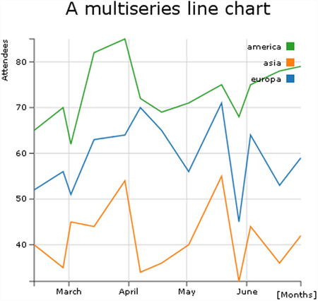
Figure 3-21. A multiseries line chart with a legend
In a line chart, you usually have the data points connected by sequence, one by one, in a straight line. Sometimes, you can see some line chart representation with all the points joined into a curved line. In fact, the effect was obtained via an interpolation. The D3 library covers interpolations of data points in a more correct way from a mathematical point of view. You, therefore, need to delve a little deeper into this concept.
When you have a set of values and want to represent them using a line chart, you essentially want to know the trend that these values suggest. From this trend, you can evaluate which values may be obtained at intermediate points between a data point and the next. Well, with such an estimate you are actually affecting an interpolation. Depending on the trend and the degree of accuracy you want to achieve, you can use various mathematical methods that regulate the shape of the curve that will connect the data points.
The most commonly used method is the spline. (If you want to deepen your knowledge of the topic, visit http://paulbourke.net/miscellaneous/interpolation/.) Table 3-1 lists the various types of interpolation that the D3 library makes available.
Table 3-1. The options for interpolating lines available within the D3 library
|
Options |
Description |
|---|---|
|
basis |
A B-spline, with control point duplication on the ends. |
|
basis-open |
An open B-spline; may not intersect the start or end. |
|
basis-closed |
A closed B-spline, as in a loop. |
|
bundle |
Equivalent to basis, except the tension parameter is used to straighten the spline. |
|
cardinal |
A Cardinal spline, with control point duplication on the ends. |
|
cardinal-open |
An open Cardinal spline; may not intersect the start or end, but will intersect other control points. |
|
cardinal-closed |
A closed Cardinal spline, as in a loop. |
|
Linear |
Piecewise linear segments, as in a polyline. |
|
linear-closed |
Close the linear segments to form a polygon. |
|
monotone |
Cubic interpolation that preserves a monotone effect in y. |
|
step-before |
Alternate between vertical and horizontal segments, as in a step function. |
|
step-after |
Alternate between horizontal and vertical segments, as in a step function. |
You find these options by visiting https://github.com/mbostock/d3/wiki/SVG-Shapes#wiki-line_interpolate.
Now that you understand better what an interpolation is, you can see a practical case. In the previous example, you had three series represented by differently colored lines and made up of segments connecting the data points (x,y). But it is possible to draw corresponding interpolating lines instead.
As shown in Listing 3-59, you just add the interpolate() method to the d3.svg.line to get the desired effect.
Listing 3-59. Ch3_08b.html
var line = d3.svg.line()
    .interpolate("basis")
    .x(function(d) { return x(d.date); })
    .y(function(d) { return y(d.attendee); });
Figure 3-22 shows the interpolating lines applied to the three series in the chart. The straight lines connecting the data points have been replaced by curves.
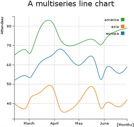
Figure 3-22. A smooth multiseries line chart
This kind of chart portrays the area between two series. In the range where the first series is greater than the second series, the area has one color, where it is less the area has a different color. A good example of this kind of chart compares the trend of income and expense across time. When the income is greater than the expenses, the area will be green (usually the green color stands for OK), whereas when it is less, the area is red (meaning BAD). Write the values in Listing 3-60 in a TSV (or CSV) file and name it data_03.tsv (see the note).
![]() Note The values in a TSV file are tab-separated, so when you write or copy Listing 3-60, remember to check that there is only one tab character between each value.
Note The values in a TSV file are tab-separated, so when you write or copy Listing 3-60, remember to check that there is only one tab character between each value.
Listing 3-60. data_03.tsv
Date         income    expense
12-Feb-12    52        40
27-Feb-12    56        35
02-Mar-12    31        45
14-Mar-12    33        44
30-Mar-12    44        54
07-Apr-12    50        34
18-Apr-12    65        36
02-May-12    56        40
19-May-12    41        56
28-May-12    45        32
03-Jun-12    54        44
18-Jun-12    43        46
29-Jun-12    39        52
Start writing the code in Listing 3-61; explanations aren’t included this time, as the example is virtually identical to the previous one.
Listing 3-61. Ch3_09.html
<!DOCTYPE html>
<html>
<head>
<meta charset="utf-8">
<script src="http://d3js.org/d3.v3.js">></script>
<style>
body {
  font: 10px verdana;
}
.axis path,
.axis line {
  fill: none;
  stroke: #333;
}
.grid .tick {
    stroke: lightgrey;
    opacity: 0.7;
}
.grid path {
    stroke-width: 0;
}
</style>
</head>
<body>
<script type="text/javascript">

var margin = {top: 70, right: 20, bottom: 30, left: 50},
    w = 400 - margin.left - margin.right,
    h = 400 - margin.top - margin.bottom;

var parseDate = d3.time.format("%d-%b-%y").parse;
var x = d3.time.scale().range([0, w]);
var y = d3.scale.linear().range([h, 0]);

var xAxis = d3.svg.axis()
    .scale(x)
    .orient("bottom")
    .ticks(5);

var yAxis = d3.svg.axis()
    .scale(y)
    .orient("left")
    .ticks(5);

var xGrid = d3.svg.axis()
    .scale(x)
    .orient("bottom")
    .ticks(5)
    .tickSize(-h, 0, 0)
    .tickFormat("");

var yGrid = d3.svg.axis()
    .scale(y)
    .orient("left")
    .ticks(5)
    .tickSize(-w, 0, 0)
    .tickFormat("");

var svg = d3.select("body").append("svg")
    .attr("width", w + margin.left + margin.right)
    .attr("height", h + margin.top + margin.bottom)
    .append("g")
    .attr("transform", "translate(" + margin.left + "," + margin.top + ")");

// Here we add the d3.tsv function
// start of the part of code to include in the d3.tsv() function
d3.tsv("data_03.tsv", function(error, data) {

    svg.append("g")
       .attr("class", "x axis")
       .attr("transform", "translate(0," + h + ")")
       .call(xAxis);

    svg.append("g")
       .attr("class", "y axis")
       .call(yAxis);

    svg.append("g")
       .attr("class", "grid")
       .attr("transform", "translate(0," + h + ")")
       .call(xGrid);

    svg.append("g")
       .attr("class", "grid")
       .call(yGrid);

});
//end of the part of code to include in the d3.tsv() function

var labels = svg.append("g")
    .attr("class", "labels");

labels.append("text")
    .attr("transform", "translate(0," + h + ")")
    .attr("x", (w-margin.right))
    .attr("dx", "-1.0em")
    .attr("dy", "2.0em")
    .text("[Months]");
labels.append("text")
    .attr("transform", "rotate(-90)")
    .attr("y", -40)
    .attr("dy", ".71em")
    .style("text-anchor", "end")
    .text("Millions ($)");

var title = svg.append("g")
    .attr("class", "title");

title.append("text")
    .attr("x", (w / 2))
    .attr("y", -30 )
    .attr("text-anchor", "middle")
    .style("font-size", "22px")
    .text("A difference chart");
</script>
</body>
</html>
First you read the TSV file to check whether the income and expense values are positive. Then you parse all the date values (see Listing 3-62).
Listing 3-62. Ch3_09.html
d3.tsv("data_03.tsv", function(error, data) {

    data.forEach(function(d) {
       d.date = parseDate(d.date);
       d.income = +d.income;
       d.expense = +d.expense;
    });
    ...
});
Here, unlike the example shown earlier (the multiseries line chart), there is no need to restructure the data, so you can create a domain on x and y, as shown in Listing 3-63. The maximum and minimum are obtained by comparing income and expense values with Math.max and Math.min at every step, and then finding the values affecting the iteration at each step with d3.min and d3.max.
Listing 3-63. Ch3_09.html
d3.tsv("data_03.tsv", function(error, data) {
    data.forEach(function(d) {
    ...
    });

    x.domain(d3.extent(data, function(d) { return d.date; }));
    y.domain([
       d3.min(data, function(d) {return Math.min(d.income, d.expense); }),
       d3.max(data, function(d) {return Math.max(d.income, d.expense); })
    ]);
    ...
});
Before adding SVG elements, you need to define some CSS classes. You’ll use the color red when expenses are greater than income, and green otherwise. You need to define these colors, as shown in Listing 3-64.
Listing 3-64. Ch3_09.html
<style>
...
.area.above {
    fill: darkred;
}

.area.below {
    fill: lightgreen;
}

.line {
    fill: none;
    stroke: #000;
    stroke-width: 1.5px;
}
</style>
Since you need to represent lines and areas, you define them by using the interpolation between data points (see Listing 3-65).
Listing 3-65. Ch3_09.html
d3.tsv("data_03.tsv", function(error, data) {
    ...

    svg.append("g")
       .attr("class", "grid")
       .call(yGrid);

    var line = d3.svg.area()
       .interpolate("basis")
       .x(function(d) { return x(d.date); })
       .y(function(d) { return y(d["income"]); });

    var area = d3.svg.area()
       .interpolate("basis")
       .x(function(d) { return x(d.date); })
       .y1(function(d) { return y(d["income"]); });

});
As you can see, you are actually defining only the line of income points; there is no reference to expense values. But you are interested in the area between the two lines of income and expenditure, so when you define the path element, in order to draw this area, you can put the expense values as a border, with a generic function iterating the d values (see Listing 3-66).
Listing 3-66. Ch3_09.html
d3.tsv("data_03.tsv", function(error, data) {
    ...

    var area = d3.svg.area()
       .interpolate("basis")
       .x(function(d) { return x(d.date); })
       .y1(function(d) { return y(d["income"]); });

    svg.datum(data);

    svg.append("path")
       .attr("class", "area below")
       .attr("d", area.y0(function(d) { return y(d.expense); }));

    svg.append("path")
       .attr("class", "line")
       .attr("d", line);

});
If you load the web page now, you should get the desired area (see Figure 3-23).
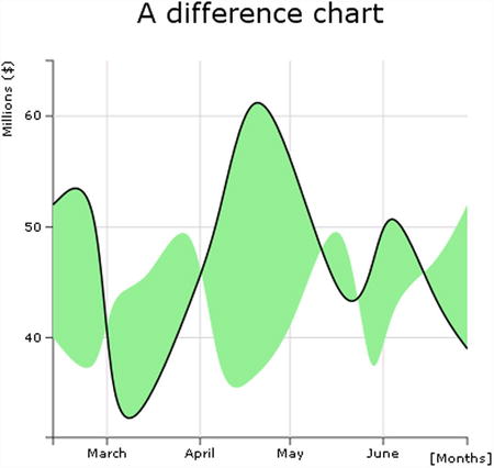
Figure 3-23. An initial representation of the area between both trends
But all the areas are green. Instead, you want some of these areas to be red. You need to select the areas enclosed by the income and expense lines, where the income line is above the expense line, and exclude the areas that do not correspond to this scheme. When you deal with areas, portions of which must be added or subtracted, it is necessary to introduce the clip path SVG element.
Clip paths are SVG elements that can be attached to previously drawn figures with a path element. The clip path describes a “window” area, which shows only in the area defined by the path. The other areas of the figure remain hidden.
Take a look at Figure 3-24. You can see that the line of income is black and thick. All green areas (light gray in the printed book version) above this line should be hidden by a clip path. But what clip path do you need? You need the clip path described by the path that delimits the lower area above the income line.
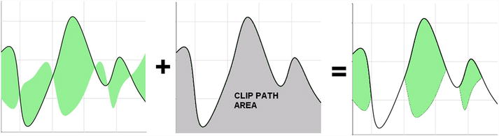
Figure 3-24. Selection of the positive area with a clip path area
You need to make some changes to the code, as shown in Listing 3-67.
Listing 3-67. ch3_09.html
d3.tsv("data_03.tsv", function(error, data) {
    ...

    svg.datum(data);

    svg.append("clipPath")
      .attr("id", "clip-below")
      .append("path")
      .attr("d", area.y0(h));

    svg.append("path")
       .attr("class", "area below")
       .attr("clip-path", "url(#clip-below)")
       .attr("d", area.y0(function(d) { return y(d.expense); }));

    svg.append("path")
       .attr("class", "line")
       .attr("d", line);

});
Now you need to do to same thing for the red areas (dark gray in the printed book version). Always starting from the area enclosed between the income and expense lines, you must eliminate the areas below the income line. So, as shown in Figure 3-25, you can use the clip path that describes the area above the income line as the window area.
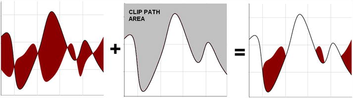
Figure 3-25. Selection of the negative area with a clip path area
Translating this into code, you need to add another clipPath to the code, as shown in Listing 3-68.
Listing 3-68. Ch3_09.html
d3.tsv("data_03.tsv", function(error, data) {
    ...

    svg.append("path")
       .attr("class", "area below")
       .attr("clip-path", "url(#clip-below)")
       .attr("d", area.y0(function(d) { return y(d.expense); }));

    svg.append("clipPath")
       .attr("id", "clip-above")
       .append("path")
       .attr("d", area.y0(0));

    svg.append("path")
       .attr("class", "area above")
       .attr("clip-path", "url(#clip-above)")
       .attr("d", area.y0(function(d) { return y(d.expense); }));

    svg.append("path")
       .attr("class", "line")
       .attr("d", line);

});
In the end, both areas are drawn simultaneously, and you get the desired chart (see Figure 3-26).
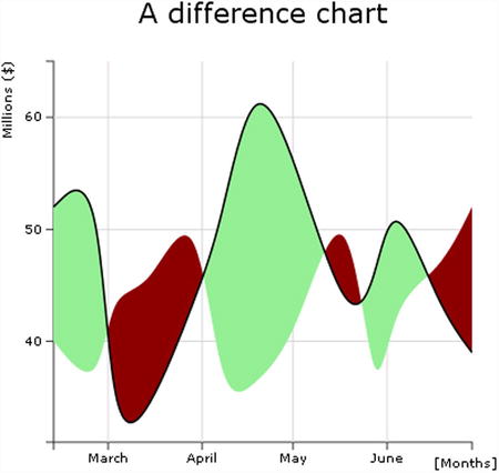
Figure 3-26. The final representation of the difference area chart
Summary
This chapter shows how to build the basic elements of a line chart, including axes, axis labels, titles, and grids. In particular you have read about the concepts of scales, domains, and ranges.
You then learned how to read data from external files, particularly CSV and TSV files. Furthermore, in starting to work with multiple series of data, you learned how to realize multiseries line charts, including learning about all the elements needed to complete them, such as legends.
Finally, you learned how to create a particular type of line chart: the difference line chart. This has helped you to understand clip area paths.
In the next chapter, you’ll deal with bar charts. Exploiting all you’ve learned so far about D3, you’ll see how it is possible to realize all the graphic components needed to build a bar chart, using only SVG elements. More specifically, you’ll see how, using the same techniques, to implement all the possible types of multiseries bar charts, from stacked to grouped bars, both horizontally and vertically orientated.