
![]()
Bar Charts with D3
In this chapter, you will see how, using the D3 library, you can build the most commonly used type of chart: the bar chart. As a first example, you will start from a simple bar chart to practice the implementation of all the components using scalar vector graphic (SVG) elements.
Drawing a Bar Chart
In this regard, as an example to work with we choose to represent the income of some countries by vertical bars, so that we may compare them. As category labels, you will use the names of the countries themselves. Here, as you did for line charts, you decide to use an external file, such as a comma-separated values (CSV) file, which contains all the data. Your web page will then read the data contained within the file using the d3.csv() function. Therefore, write the data from Listing 4-1 in a file and save it as data_04.csv.
Listing 4-1. data_04.csv
country,income
France,14
Russia,22
Japan,13
South Korea,34
Argentina,28
Listing 4-2 shows a blank web page as a starting point for the development of your bar chart. You must remember to include the D3 library in the web page (see Appendix A for further information). If you prefer to use a content delivery network (CDN) service, you can replace the reference with this:
<script src="http://d3js.org/d3.v3.min.js"></script>
Listing 4-2. Ch4_01.html
<!DOCTYPE html>
<html>
<head>
<meta charset="utf-8">
<script src="../src/d3.v3.js"></script>
</head>
<body>
<script type="text/javascript">
// add the D3 code here
</script>
</body>
</html>
First, it is good practice to define the size of the drawing area on which you wish to represent your bar chart. The dimensions are specified by the w and h (width and height) variables, but you must also take the space for margins into account. These margin values must be subtracted from w and h, suitably restricting the area to be allocated to your chart (see Listing 4-3).
Listing 4-3. Ch4_01.html
<script type="text/javascript">
var margin = {top: 70, right: 20, bottom: 30, left: 40},
    w = 500 - margin.left - margin.right,
    h = 350 - margin.top - margin.bottom;
var color = d3.scale.category10();
</script>
Moreover, if you look at the data in the CSV file (see Listing 4-1), you will find a series of five countries with their relative values. If you want to have a color for identifying each country, it is necessary to define a color scale, and this, as you have already seen, could be done with the category10() function.
The next step is to define a scale on the x axis and y axis. You do not have numeric values on the x axis but string values identifying the country of origin. Thus, for this type of value, you have to define an ordinal scale as shown in Listing 4-4. In fact, the function rangeRoundBands divides the range passed as argument into discrete bands, which is just what you need in a bar chart. For the y axis, since it represents a variable in numerical values, you simply choose a linear scale.
Listing 4-4. Ch4_01.html
<script type="text/javascript">
...
var color = d3.scale.category10();
var x = d3.scale.ordinal()
    .rangeRoundBands([0, w], .1);
var y = d3.scale.linear()
    .range([h, 0]);
<script type="text/javascript">
Now you need to assign the two scales to the corresponding axes, using the d3.svg.axis() function. When you are dealing with bar charts, it is not uncommon that the values reported on the y axis are not the nominal values, but their percentage of the total value. So, you can define a percentage format through d3.format(), and then you assign it to tick labels on the y axis through the tickFormat() function (see Listing 4-5).
Listing 4-5. Ch4_01.html
<script type="text/javascript">
...
var y = d3.scale.linear()
    .range([h, 0]);

var formatPercent = d3.format(".0%");
var xAxis = d3.svg.axis()
    .scale(x)
    .orient("bottom");
var yAxis = d3.svg.axis()
    .scale(y)
    .orient("left")
    .tickFormat(formatPercent);
<script type="text/javascript">
Finally, it is time to start creating SVG elements in your web page. Start with the root as shown in Listing 4-6.
Listing 4-6. Ch4_01.html
<script type="text/javascript">
...
var yAxis = d3.svg.axis()
    .scale(y)
    .orient("left")
    .tickFormat(formatPercent);

var svg = d3.select("body").append("svg")
    .attr("width", w + margin.left + margin.right)
    .attr("height", h + margin.top + margin.bottom)
    .append("g")
    .attr("transform", "translate(" + margin.left + ", " + margin.top + ")");
<script type="text/javascript">
And now, to access the values contained in the CSV file, you have to use the d3.csv() function, as you have done already, passing the file name as first argument and the iterative function on the data contained within as the second argument (see Listing 4-7).
Listing 4-7. Ch4_01.html
<script type="text/javascript">
...
var svg = d3.select("body").append("svg")
    .attr("width", w + margin.left + margin.right)
    .attr("height", h + margin.top + margin.bottom)
    .append("g")
    .attr("transform", "translate(" + margin.left + ", " + margin.top + ")");

d3.csv("data_04.csv", function(error, data) {
    var sum = 0;
    data.forEach(function(d) {
       d.income = +d.income;
       sum += d.income;
    });
//insert here all the svg elements depending on data in the file
});
<script type="text/javascript">
During the scan of the values stored in the file through the forEach() loop, you ensure that all values of income will be read as numeric values and not as a string: this is possible by assigning every value to itself with a plus sign before it.
values = +values
And in the meantime, you also carry out the sum of all income values. This sum is necessary for you to compute the percentages. In fact, as shown in Listing 4-8, while you are defining the domains for both the axes, the “single income”/sum ratio is assigned to the y axis, thus obtaining a domain of percentages.
Listing 4-8. Ch4_01.html
...
d3.csv("data_04.csv", function(error, data) {
    data.forEach(function(d) {
    ...
    });

    x.domain(data.map(function(d) { return d.country; }));
    y.domain([0, d3.max(data, function(d) { return d.income/sum; })]);

});
After setting the values on both axes, you can draw them adding the corresponding SVG elements in Listing 4-9.
Listing 4-9. Ch4_01.html
d3.csv("data_04.csv", function(error, data) {
...
    y.domain([0, d3.max(data, function(d) { return d.income/sum; })]);

    svg.append("g")
       .attr("class", "x axis")
       .attr("transform", "translate(0, " + h + ")")
       .call(xAxis);

    svg.append("g")
       .attr("class", "y axis")
       .call(yAxis);
});
Usually, for bar charts, the grid is required only on one axis: the one on which the numeric values are shown. Since you are working with a vertical bar chart, you draw grid lines only on the y axis (see Listing 4-10). On the other hand, grid lines are not necessary on the x axis, because you already have a kind of classification in areas of discrete values, often referred to as categories. (Even if you had continuous values to represent on the x axis, however, for the bar chart to make sense, their range on the x axis should be divided into intervals or bins. The frequency of these values at each interval is represented by the height of the bar on the y axis, and the result is a histogram.)
Listing 4-10. Ch4_01.html
...
var yAxis = d3.svg.axis()
    .scale(y)
    .orient("left")
    .tickFormat(formatPercent);

var yGrid = d3.svg.axis()
    .scale(y)
    .orient("left")
    .ticks(5)
    .tickSize(-w, 0, 0)
    .tickFormat("");

var svg = d3.select("body").append("svg")
    .attr("width", w + margin.left + margin.right)
    .attr("height", h + margin.top + margin.bottom)
    .append("g")
    .attr("transform", "translate(" + margin.left + ", " + margin.top + ")");

d3.csv("data_04.csv", function(error, data) {
    ...
    svg.append("g")
       .attr("class", "y axis")
       .call(yAxis);

    svg.append("g")
       .attr("class", "grid")
       .call(yGrid);
});
Since the grid lies only on the y axis, the same thing applies for the corresponding axis label. In order to separate the components of the chart between them in some way, it is good practice to define a variable for each SVG element <g> which identifies a chart component, generally with the same name you use to identify the class of the component. Thus, just as you define a labels variable, you also define a title variable. And so on, for all the other components that you intend to add.
Unlike jqPlot, it is not necessary to include a specific plug-in to rotate the axis label; rather, use one of the possible transformations which SVG provides you with, more specifically a rotation. The only thing you need to do is to pass the angle (in degrees) at which you want to rotate the SVG element. The rotation is clockwise if the passed value is positive. If, as in your case, you want to align the axis label to the y axis, then you will need to rotate it 90 degrees counterclockwise: so specify rotate(–90) as a transformation (see Listing 4-11). Regarding the title element, you place it at the top of your chart, in a central position.
Listing 4-11. Ch4_01.html
d3.csv("data_04.csv", function(error, data) {
    ...

    svg.append("g")
       .attr("class", "grid")
       .call(yGrid);

    var labels = svg.append("g")
        .attr("class", "labels");

    labels.append("text")
          .attr("transform", "rotate(–90)")
          .attr("y", 6)
          .attr("dy", ".71em")
          .style("text-anchor", "end")
          .text("Income [%]");

    var title = svg.append("g")
        .attr("class", "title");

    title.append("text")
         .attr("x", (w / 2))
         .attr("y", -30 ).attr("text-anchor", "middle")
        .style("font-size", "22px")
        .text("My first bar chart");

});
Once you have defined all of the SVG components, you must not forget to specify the attributes of the CSS classes in Listing 4-12.
Listing 4-12. Ch4_01.html
<style>
body {
    font: 14px sans-serif;
}

.axis path,
.axis line {
    fill: none;
    stroke: #000;
    shape-rendering: crispEdges;
}
.grid .tick {
    stroke: lightgrey;
    opacity: 0.7;
}
.grid path {
    stroke-width: 0;
}

.x.axis path {
    display: none;
}
</style>
At the end, add the SVG elements which make up your bars. Since you want to draw a bar for each set of data, here you have to take advantage of the iterative function(error,data) function within the d3.csv() function. As shown in Listing 4-13, you therefore add the data(data) and enter() functions within the function chain. Moreover, defining the function(d) within each attr() function, you can assign data values iteratively, one after the other, to the corresponding attribute. In this way, you can assign a different value (one for each row in the CSV file) to the attributes x, y, height, and fill, which affect the position, color, and size of each bar. With this mechanism each .bar element will reflect the data contained in one of the rows in the CSV file.
Listing 4-13. Ch4_01.html
d3.csv("data_04.csv", function(error, data) {
    ...

    title.append("text")
         .attr("x", (w / 2))
         .attr("y", -30 )
         .attr("text-anchor", "middle")
         .style("font-size", "22px")
         .text("My first bar chart");
    svg.selectAll(".bar")
      .data(data)
      .enter().append("rect")
      .attr("class", "bar")
      .attr("x", function(d) { return x(d.country); })
      .attr("width", x.rangeBand())
      .attr("y", function(d) { return y(d.income/sum); })
      .attr("height", function(d) { return h - y(d.income/sum); })
      .attr("fill", function(d) { return color(d.country); });
});
At the end, all your efforts will be rewarded with the beautiful bar chart shown in Figure 4-1.
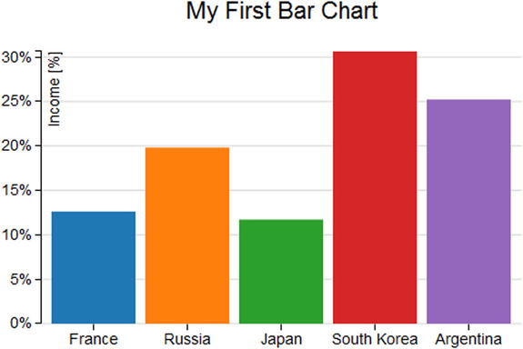
Figure 4-1. A simple bar chart
You have introduced the bar chart with the simplest case where you had a number of groups represented per country and a corresponding value (income). Very often, you need to represent data which are a bit more complex, for example, data in which you want to divide the total income sector by sector. In this case, you will have the income for each country divided into various portions, each of which represents the income of a sector of production. For our example, we will use a CSV file in a way that is very similar to that used in the previous example (see Listing 4-1), but with multiple values for each country, so that you may work with multiseries bar charts. Therefore, write the data in Listing 4-14 with a text editor and save it as data_05.csv.
Listing 4-14. data_05.csv
Country,Electronics,Software,Mechanics
Germany,12,14,18
Italy,8,12,10
Spain,6,4,5
France,10,14,9
UK,7,11,9
Looking at the content of the file, you may notice that the columns are now four. The first column still contains the names of the nations, but now the incomes are three, each corresponding to a different sector of production: electronics, software, and mechanics. These titles are listed in the headers.
Start with the code of the previous example, making some changes and deleting some rows, until you get the code shown in Listing 4-15. The pieces of code in bold are the ones that need to be changed (the title and the CSV file)m while those that are not present must be deleted. Those of you who are starting directly from this section can easily copy the contents shown in Listing 4-15.
Listing 4-15. Ch4_02.html
<!DOCTYPE html>
<html>
<head>
<meta charset="utf-8">
<script src="http://d3js.org/d3.v3.js"></script>
<style>
body {
     font: 14px sans-serif;
}
.axis path,
.axis line {
    fill: none;
    stroke: #000;
    shape-rendering: crispEdges;
}
.x.axis path {
     display: none;
}
</style>
</head>
<body>
<script type="text/javascript">
var color = d3.scale.category10();

var margin = {top: 70, right: 20, bottom: 30, left: 40},
    w = 500 - margin.left - margin.right,
    h = 350 - margin.top - margin.bottom;

var x = d3.scale.ordinal()
    .rangeRoundBands([0, w], .1);

var y = d3.scale.linear()
    .range([h, 0]);

var formatPercent = d3.format(".0%");

var xAxis = d3.svg.axis()
    .scale(x)
    .orient("bottom");

var yAxis = d3.svg.axis()
    .scale(y)
    .orient("left")
    .tickFormat(formatPercent);

var yGrid = d3.svg.axis()
    .scale(y)
    .orient("left")
    .ticks(5)
    .tickSize(-w, 0, 0)
    .tickFormat("");

var svg = d3.select("body").append("svg")
    .attr("width", w + margin.left + margin.right)
    .attr("height", h + margin.top + margin.bottom)
    .append("g")
    .attr("transform", "translate(" + margin.left + ", " + margin.top + ")");

d3.csv("data_05.csv", function(error, data) {

    svg.append("g")
       .attr("class", "x axis")
       .attr("transform", "translate(0, " + h + ")")
       .call(xAxis);

    svg.append("g")
       .attr("class", "y axis")
       .call(yAxis);

    svg.append("g")
       .attr("class", "grid")
       .call(yGrid);
});
var labels = svg.append("g")
    .attr("class", "labels");

labels.append("text")
      .attr("transform", "rotate(–90)")
      .attr("x", 50)
      .attr("y", -20)
      .attr("dy", ".71em")
      .style("text-anchor", "end")
      .text("Income [%]");

var title = svg.append("g")
    .attr("class", "title")

title.append("text")
     .attr("x", (w / 2))
     .attr("y", -30 )
     .attr("text-anchor", "middle")
     .style("font-size", "22px")
    .text("A stacked bar chart");
</script>
</body>
</html>
Now think of the colors and the domain you want to set. In the previous case, you drew each bar (country) with a different color. In fact, you could even give all the bars of the same color. Your approach was an optional choice, mainly due to aesthetic factors. In this case, however, using a set of different colors is necessary to distinguish the various portions that compose each bar. Thus, you will have a series of identical colors for each bar, where each color will correspond to a sector of production. A small tip: when you need a legend to identify various representations of data, you need to use a sequence of colors, and vice versa. You define the domain of colors relying on the headers of the file and deleting the first item, “Country,” through a filter (see Listing 4-16).
Listing 4-16. Ch4_02.html
d3.csv("data_05.csv", function(error, data) {

    color.domain(d3.keys(data[0]).filter(function(key) {
    return key !== "Country"; }));

    svg.append("g")
       .attr("class", "x axis")
       .attr("transform", "translate(0, " + h + ")")
       .call(xAxis);

...
On the y axis you must not plot the values of the income, but their percentage of the total. In order to do this, you need to know the sum of all values of income, so with an iteration of all the data read from the file, you may obtain the sum. Again, in order to make it clear to D3 that the values in the three columns (Electronics, Mechanics, and Software) are numeric values, you must specify them explicitly in the iteration in this way:
values = +values;
In Listing 4-17, you see how the forEach() function iterates the values of the file and, at the same time, calculates the sum you need to obtain your percentages.
Listing 4-17. Ch4_02.html
d3.csv("data_05.csv", function(error, data) {

    color.domain(d3.keys(data[0]).filter(function(key) {
    return key !== "Country"; }));
    var sum = 0;

      data.forEach(function(d){
      d.Electronics = +d.Electronics;
      d.Mechanics = +d.Mechanics;
      d.Software = +d.Software;
      sum = sum +d.Electronics +d.Mechanics +d.Software;
    });

    svg.append("g")
       .attr("class", "x axis")
       .attr("transform", "translate(0, " + h + ")")
       .call(xAxis);

...
Now you need to create a data structure which can serve your purpose. Build an array of objects for each bar in which each object corresponds to one of the portions in which the total income is divided. Name this array "countries" and create it through an iterative function (see Listing 4-18).
Listing 4-18. Ch4_02.html
d3.csv("data_05.csv", function(error, data) {
    ...
    data.forEach(function(d){
       d.Electronics = +d.Electronics;
       d.Mechanics = +d.Mechanics;
       d.Software = +d.Software;
       sum = sum +d.Electronics +d.Mechanics +d.Software;
    });

    data.forEach(function(d) {
      var y0 = 0;
      d.countries = color.domain().map(function(name) {
      return {name: name, y0: y0/sum, y1: (y0 += +d[name])/sum }; });
      d.total = d.countries[d.countries.length - 1].y1;
    });

    svg.append("g")
       .attr("class", "x axis")
       .attr("transform", "translate(0, " + h + ")")
       .call(xAxis);

...
Using the Firebug console (see the section “Firebug and DevTool” in Chapter 1), you can directly see the internal structure of this array. Thus, add (temporarily) the call to the console to the code passing the countries array as an argument, as shown in Listing 4-19.
Listing 4-19. Ch4_02.html
data.forEach(function(d) {
    var y0 = 0;
    d.countries = color.domain().map(function(name) {
    return {name: name, y0: y0/sum, y1: (y0 += +d[name])/sum }; });
    d.total = d.countries[d.countries.length - 1].y1;
console.log(d.countries);
});
Figure 4-2 shows the internal structure of the countries array along with all its content how it is displayed by the Firebug console.
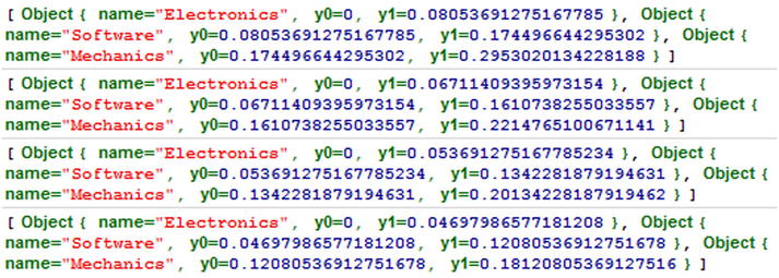
Figure 4-2. The Firebug console shows the content and the structure of the countries array
If you analyze in detail the first element of the array:
[Object {name="Electronics", y0=0, y1=0.08053691275167785},
 Object {name="Software", y0=0.08053691275167785, y1=0.174496644295302},
 Object {name="Mechanics", y0=0.174496644295302, y1=0.2953020134228188}]
You may notice that each element of the array is, in turn, an array containing three objects. These three objects represent the three categories (the three series of the multiseries bar chart) into which you want to split the data. The values of y0 and y1 are the percentages of the beginning and the end of each portion in the bar, respectively.
After you have arranged all the data you need, you can include it in the domain of x and y, as shown in Listing 4-20.
Listing 4-20. Ch4_02.html
d3.csv("data_05.csv", function(error, data) {
   ...
   data.forEach(function(d) {
   ...
   console.log(d.countries);
   });

    x.domain(data.map(function(d) { return d.Country; }));
    y.domain([0, d3.max(data, function(d) { return d.total; })]);

    svg.append("g")
       .attr("class", "x axis")
       .attr("transform", "translate(0, " + h + ")")
       .call(xAxis);

...
And then, in Listing 4-21 you start to define the rect elements which will constitute the bars of your chart.
Listing 4-21. Ch4_02.html
d3.csv("data_05.csv", function(error, data) {
    ...
    svg.append("g")
       .attr("class", "grid")
       .call(yGrid);

    var country = svg.selectAll(".country")
        .data(data)
        .enter().append("g")
        .attr("class", "country")
        .attr("transform", function(d) {
        return "translate(" + x(d.Country) + ",0)"; });

    country.selectAll("rect")
          .data(function(d) { return d.countries; })
          .enter().append("rect")
          .attr("width", x.rangeBand())
          .attr("y", function(d) { return y(d.y1); })
          .attr("height", function(d) { return (y(d.y0) - y(d.y1)); })
          .style("fill", function(d) { return color(d.name); });
});
You have seen the internal structure of the array with the library, and since D3 always starts with basic graphics, the most complex part lies in translating the data structure into a hierarchical structure of SVG elements. The <g> tag comes to your aid to build proper hierarchical groupings. In this regard, you have to define an element <g> for each country. First, you need to use the data read from the CSV file iteratively. This can be done by passing the data array (the original data array, not the countries array you have just defined) as argument to the data() function. When all this is done, you have five new group items <g>, as five are the countries which are listed in the CSV file and five are also the bars which will be drawn. The position on the x axis of each bar should also be managed. You do not need to do any calculations to pass the right x values to translate(x,0) function. In fact, as shown in Figure 4-3, these values are automatically generated by D3, exploiting the fact that you have defined an ordinal scale on the x axis.

Figure 4-3. Firebug shows the different translation values on the x axis that are automatically generated by the D3 library
Within each of the group elements <g>, you must now create the <rect> elements, which will generate the colored rectangles for each portion. Furthermore, it will be necessary to ensure that the correct values are assigned to the y and height attributes, in order to properly place the rectangles one above the other, avoiding them from overlapping, and thus to obtain a single stacked bar for each country.
This time, it is the countries array which will be used, passing it as an argument to the data() function. Since it is necessary to make a further iteration for each element <g> that you have created, you will pass the iterative function(d) to the data() function as an argument. In this way, you create an iteration in another iteration: the first scans the values in data (countries); the second, inner one scans the values in the countries array (sectors of production). Thus, you assign the final percentages (y1) to the y attributes, and you assign the difference between the initial and final percentage (y0–y1) to the height attributes. The values y0 and y1 have been calculated previously when you have defined the objects contained within the countries array one by one (see Figure 4-4).
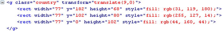
Figure 4-4. Firebug shows the different height values attributed to each rect element
At the, end you can admire your stacked bar chart in Figure 4-5.
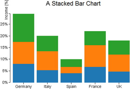
Figure 4-5. A stacked bar chart
Looking at your stacked bar chart, you immediately notice that something is missing. How do you recognize the sector of production, and what are their reference colors? Why not add a legend?
As you did for the other chart components, you may prefer to define a legend variable for this new component. Once you have created the group element <g>, an iteration is required also for the legend (see Listing 4-22). The iteration has to be done on the sectors of production. For each item, you need to acquire the name of the sector and the corresponding color. For this purpose, this time you will exploit the color domain which you have defined earlier: for the text element, you will use the headers in the CSV file, whereas for the color you directly assign the value of the domain.
Listing 4-22. Ch4_02.html
d3.csv("data_05.csv", function(error, data) {
    ...
    country.selectAll("rect")
           .data(function(d) { return d.countries; })
           .enter().append("rect")
           .attr("width", x.rangeBand())
           .attr("y", function(d) { return y(d.y1); })
           .attr("height", function(d) { return (y(d.y0) - y(d.y1)); })
           .style("fill", function(d) { return color(d.name); });
    var legend = svg.selectAll(".legend")
        .data(color.domain().slice().reverse())
        .enter().append("g")
        .attr("class", "legend")
        .attr("transform", function(d, i) {
        return "translate(0, " + i * 20 + ")"; });

    legend.append("rect")
          .attr("x", w - 18)
          .attr("y", 4)
          .attr("width", 10)
          .attr("height", 10)
          .style("fill", color);

    legend.append("text")
          .attr("x", w - 24)
          .attr("y", 9)
          .attr("dy", ".35em")
          .style("text-anchor", "end")
          .text(function(d) { return d; });
});
Just to complete the topic of stack bar charts, using the D3 library it is possible to represent the bars in descending order, by adding the single line in Listing 4-23. Although you do not really need this feature in your case, it could be useful in certain other particular cases.
Listing 4-23. Ch4_02.html
d3.csv("data_05.csv", function(error, data) {
    ...
    data.forEach(function(d) {
        ...
        console.log(d.countries);
    });
    data.sort(function(a, b) { return b.total - a.total; });

    x.domain(data.map(function(d) { return d.Country; }));
    ...
});
Figure 4-6 shows your stacked bars represented along the x axis in descending order.
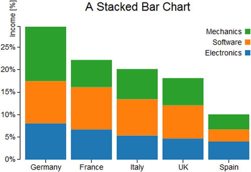
Figure 4-6. A sorted stacked bar chart with a legend
A Normalized Stacked Bar Chart
In this section, you will see how to convert the preceding chart in a normalized chart. By “normalized,” we mean that the range of values to be displayed in the chart is converted into another target range, which often goes from 0 to 1, or 0 to 100 if you are talking about percentages (a very similar concept was treated in relation to the “Ranges, Domains, and Scales” section in Chapter 2). Therefore, if you want to compare different series covering ranges of values that are very different from each other, you need to carry out a normalization, reporting all of these intervals in percentage values between 0 and 100 (or between 0 and 1). In fact, having to compare multiple series of data, we are often interested in their relative characteristics. In our example, for instance, you might be interested in how the mechanical sector affects the economic income of a nation (normalization), and also in comparing how this influence differs from country to country (comparison between normalized values). So, in order to respond to such a demand, you can represent your stacked chart in a normalized format.
You have already reported the percentage values on the y axis; however, the percentages of each sector of production were calculated with respect to the total amount of the income of all countries. This time, the percentages will be calculated with respect to the income of each country. Thus, in this case you do not care how each individual portion partakes (in percentage) of the global income (referring to all five countries), but you care only about the percentage of income which each single sector produces in the respective country. In this case, therefore, each country will be represented by a bar at 100%. Now, there is no information about which country produces more income than others, but you are interested only in the information internal to each individual country.
All of this reasoning is important for you to understand that, although starting from the same data, you will need to choose a different type of chart depending on what you want to focus the attention of those who would be looking at the chart.
For this example, you are going to use the same file data_05.csv (refer to Listing 4-14); as we have just said, the incoming information is the same, but it is its interpretation which is different. In order to normalize the previous stacked bar chart, you need to effect some changes to the code. Start by extending the left and the right margins by just a few pixels as shown in Listing 4-24.
Listing 4-24. Ch4_03.html
var margin = {top: 70, right: 70, bottom: 30, left: 50},
    w = 500 - margin.left - margin.right,
    h = 350 - margin.top - margin.bottom;
In Listing 4-25, inside the d3.csv() function you must eliminate the iterations for calculating the sum of the total income, which is no longer needed. Instead, you add a new iteration which takes the percentages referred to each country into account. Then, you must eliminate the definition of the y domain, leaving only the x domain.
Listing 4-25. Ch4_03.html
d3.csv("data_05.csv", function(error, data) {
    color.domain(d3.keys(data[0]).filter(function(key) {
    return key !== "Country"; }));

      data.forEach(function(d) {
      var y0 = 0;
      d.countries = color.domain().map(function(name) {
      return {name: name, y0: y0, y1: y0 += +d[name]}; });
      d.countries.forEach(function(d) { d.y0 /= y0; d.y1 /= y0; });
    });

    x.domain(data.map(function(d) { return d.Country; }));

    var country = svg.selectAll(".country")
...
With this new type of chart, the y label would be covered by the bars. You must therefore delete or comment out the rotate() function in order to make it visible again as shown in Listing 4-26.
Listing 4-26. Ch4_03.html
labels.append("text")
    //.attr("transform", "rotate(–90)")
      .attr("x", 50)
      .attr("y", -20)
      .attr("dy", ".71em")
      .style("text-anchor", "end")
      .text("Income [%]");
While you’re at it, why not take the opportunity to change the title to your chart? Thus, modify the title as shown in Listing 4-27.
Listing 4-27. Ch4_03.html
title.append("text")
     .attr("x", (w / 2))
     .attr("y", -30 )
     .attr("text-anchor", "middle")
     .style("font-size", "22px")
    .text("A normalized stacked bar chart");
Even the legend is no longer required. In fact, you will replace it with another type of graphic representation which has very similar functions. Thus, you can delete the lines which define the legend in Listing 4-28 from the code.
Listing 4-28. Ch4_03.html
var legend = svg.selectAll(".legend")
    .data(color.domain().slice().reverse())
    .enter().append("g")
    .attr("class", "legend")
    .attr("transform", function(d, i) {
        return "translate(0, " + i * 20 + ")"; });

  legend.append("rect")
        .attr("x", w - 18)
        .attr("y", 4)
        .attr("width", 10)
        .attr("height", 10)
        .style("fill", color);

  legend.append("text")
        .attr("x", w - 24)
        .attr("y", 9)
        .attr("dy", ".35em")
        .style("text-anchor", "end")
        .text(function(d) { return d; });
Now that you have removed the legend and made the right changes, if you load the web page you get the normalized stacked bar chart in Figure 4-7.
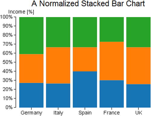
Figure 4-7. A normalized stacked bar chart
Without the legend, you must once again know, in some way, what the colors in the bars refer to; you are going to label the last bar on the right with labels reporting the names of the groups.
Start by adding a new style class in Listing 4-29.
Listing 4-29. ch4_03.html
<style>
...
.x.axis path {
    display: none;
}
.legend line {
    stroke: #000;
    shape-rendering: crispEdges;
}
</style>
Hence, in place of the code that you have just removed, as shown in Listing 4-28, you add the code in Listing 4-30.
Listing 4-30. ch4_03.html
country.selectAll("rect")
       .data(function(d) { return d.countries; })
       .enter().append("rect")
       .attr("width", x.rangeBand())
       .attr("y", function(d) { return y(d.y1); })
       .attr("height", function(d) { return (y(d.y0) - y(d.y1)); })
       .style("fill", function(d) { return color(d.name); });

var legend = svg.select(".country:last-child")
    .data(data);

legend.selectAll(".legend")
      .data(function(d) { return d.countries; })
          .enter().append("g")
          .attr("class", "legend")
          .attr("transform", function(d) {
        return "translate(" + x.rangeBand()*0.9 + ", " +
        y((d.y0 + d.y1) / 2) + ")";
});

legend.selectAll(".legend")
      .append("line")
      .attr("x2", 10);

legend.selectAll(".legend")
      .append("text")
      .attr("x", 13)
      .attr("dy", ".35em")
      .text(function(d) { return d.name; });
});
As you add the labels to the last bar, the SVG elements which define them must belong to the group corresponding to the last country. So, you use the .country: last-child selector to get the last element of the selection containing all the bars. So, the new chart will look like Figure 4-8.
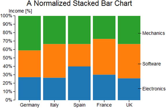
Figure 4-8. A normalized stacked bar chart with labels as legend
Always using the same data contained in data_05.csv, you can obtain another representation: a grouped bar chart. This representation is most appropriate when you want to focus on the individual income for each sector of production. In this case, you do not care in what measure the sectors partake of the total income. Thus, the percentages disappear and are replaced by y values written in the CSV file.
Listing 4-31 shows the part of code that is almost comparable to that present in other previous examples, so we will not discuss it in detail. In fact, you will use it as a starting point upon which to add other code snippets.
Listing 4-31. Ch4_04.html
<!DOCTYPE html>
<html>
<head>
<meta charset="utf-8">
<script src="../src/d3.v3.js"></script>
<style>
body {
    font: 14px sans-serif;
}
.axis path,
.axis line {
    fill: none;
    stroke: #000;
shape-rendering: crispEdges;
}
.x.axis path {
    display: none;
}
</style>
</head>
<body>
<script type="text/javascript">
var color = d3.scale.category10();

var margin = {top: 70, right: 70, bottom: 30, left: 50},
    w = 500 - margin.left - margin.right,
    h = 350 - margin.top - margin.bottom;

var yGrid = d3.svg.axis()
    .scale(y)
    .orient("left")
    .ticks(5)
    .tickSize(-w, 0, 0)
    .tickFormat("")

var svg = d3.select("body").append("svg")
    .attr("width", w + margin.left + margin.right)
    .attr("height", h + margin.top + margin.bottom)
    .append("g")
    .attr("transform", "translate(" + margin.left + ", " + margin.top + ")");

d3.csv("data_05.csv", function(error, data) {

    svg.append("g")
       .attr("class", "x axis")
       .attr("transform", "translate(0, " + h + ")")
       .call(xAxis);

    svg.append("g")
       .attr("class", "y axis")
       .call(yAxis)

    svg.append("g")
       .attr("class", "grid")
       .call(yGrid);
});
</script>
</body>
</html>
For this specific purpose, you need to define two different variables on the x axis: x0 and x1, both following an ordinal scale as shown in Listing 4-32. The x0 identifies the ordinal scale of all the groups of bars, representing a country, while x1 is the ordinal scale of each single bar within each group, representing a sector of production.
Listing 4-32. Ch4_04.html
var margin = {top: 70, right: 70, bottom: 30, left: 50},
    w = 500 - margin.left - margin.right,
    h = 350 - margin.top - margin.bottom;

var x0 = d3.scale.ordinal()
    .rangeRoundBands([0, w], .1);
var x1 = d3.scale.ordinal();
var y = d3.scale.linear()
    .range([h, 0]);

...
Consequently, in the definition of the axes, you assign the x0 to the x axis, and the y to the y axis (see Listing 4-33). Instead, the variable x1 will be used later only as a reference for the representation of the individual bar.
Listing 4-33. Ch4_04.html
...
var y = d3.scale.linear()
    .range([h, 0]);

var xAxis = d3.svg.axis()
    .scale(x0)
    .orient("bottom");

var yAxis = d3.svg.axis()
    .scale(y)
    .orient("left");
...
Inside the d3.csv() function, you extract all the names of the sectors of production with the keys() function and exclude the “country” header by filtering it out from the array with the filter() function as shown in Listing 4-34. Here, too, you build an array of objects for each country, but the structure is slightly different. The new array looks like this:
[Object {name="Electronics", value=12},
 Object {name="Software", value=14},
 Object {name="Mechanics", value=18}]
Listing 4-34. Ch4_04.html
...
d3.csv("data_05.csv", function(error, data) {
  var sectorNames = d3.keys(data[0]).filter(function(key) {
    return key !== "Country"; });
  data.forEach(function(d) {
    d.countries = sectorNames.map(function(name) {
          return {name: name, value: +d[name]
    };
  });
  ...
});
Once you define the data structure, you can define the new domains as shown in Listing 4-35.
Listing 4-35. Ch4_04.html
d3.csv("data_05.csv", function(error, data) {
    ...
    data.forEach(function(d) {
    ...
});

x0.domain(data.map(function(d) { return d.Country; }));
x1.domain(sectorNames).rangeRoundBands([0, x0.rangeBand()]);
y.domain([0, d3.max(data, function(d) {
    return d3.max(d.countries, function(d) { return d.value; });
})]);

svg.append("g")
   .attr("class", "x axis")
   .attr("transform", "translate(0, " + h + ")")
   .call(xAxis);
...
As mentioned before, with x0 you specify the ordinal domain with the names of each country. Instead, in x1 the names of the various sectors make up the domain. Finally, in y the domain is defined by numerical values. Update the values passed in the iterations with the new domains (see Listing 4-36).
Listing 4-36. Ch4_04.html
d3.csv("data_05.csv", function(error, data) {
    ...
    svg.append("g")
       .attr("class", "grid")
       .call(yGrid);
    var country = svg.selectAll(".country")
        .data(data)
        .enter().append("g")
        .attr("class", "country")
        .attr("transform", function(d) {
return "translate(" + x0(d.Country) + ",0)";
        });
    country.selectAll("rect")
          .data(function(d) { return d.countries; })
          .enter().append("rect")
          .attr("width", x1.rangeBand())
          .attr("x", function(d) { return x1(d.name); })
          .attr("y", function(d) { return y(d.value); })
          .attr("height", function(d) { return h - y(d.value); })
          .style("fill", function(d) { return color(d.name); });
});
Then, externally to the csv() function you can define the SVG element which will represent the axis label on the y axis, as shown in Listing 4-37. It does not need to be defined within the csv() function, since it is independent from the data contained in the CSV file.
Listing 4-37. Ch4_04.html
d3.csv("data_05.csv", function(error, data) {
    ...
});

var labels = svg.append("g")
    .attr("class", "labels")

labels.append("text")
          .attr("transform", "rotate(–90)")
          .attr("y", 5)
          .attr("dy", ".71em")
          .style("text-anchor", "end")
          .text("Income");
</script>
One last thing... you need to add an appropriate title to the chart as shown in Listing 4-38.
Listing 4-38. Ch4_04.html
labels.append("text")
    ...
    .text("Income");

var title = svg.append("g")
    .attr("class", "title")

title.append("text")
    .attr("x", (w / 2))
    .attr("y", -30 )
    .attr("text-anchor", "middle")
    .style("font-size", "22px")
    .text("A grouped bar chart");
</script>
And Figure 4-9 is the result.

Figure 4-9. A grouped bar chart
In the previous case, with the normalized bar chart, you looked at an alternative way to represent a legend. You have built this legend by putting some labels which report the series name on the last bar (refer to Figure 4-8). Actually you made use of point labels. These labels can contain any text and are directly connected to a single value in the chart. At this point, introduce point labels. You will place them at the top of each bar, showing the numerical value expressed by that bar. This greatly increases the readability of each type of chart.
As you have done for any other chart component, having defined the PointLabels variable, you use it in order to assign the chain of functions applied to the corresponding selection. Also, for this type of component, which has specific values for individual data, you make use of an iteration for the data contained in the CSV file. The data on which you want to iterate are the same data you used for the bars. You therefore pass the same iterative function(d) to the data() function as argument (see Listing 4-39). In order to draw the data on top of the bars, you will apply a translate() transformation for each PointLabel.
Listing 4-39. Ch4_04.html
d3.csv("data_05.csv", function(error, data) {
    ...
    country.selectAll("rect")
    ...
      .attr("height", function(d) { return h - y(d.value); })
      .style("fill", function(d) { return color(d.name); });

    var pointlabels = country.selectAll(".pointlabels")
        .data(function(d) { return d.countries; })
        .enter().append("g")
        .attr("class", "pointlabels")
        .attr("transform", function(d) {
          return "translate(" + x1(d.name) + ", " + y(d.value) + ")";
        })
        .append("text")
        .attr("dy", "-0.3em")
        .attr("x", x1.rangeBand()/2)
        .attr("text-anchor", "middle")
        .text(function(d) { return d.value; });
...
});
And finally, there is nothing left to do but to add a legend, grouped in the classic format, to the chart (see Listing 4-40).
Listing 4-40. ch4_04.html
d3.csv("data_05.csv", function(error, data) {
    ...
    pointlabels.append("text")
    ...
       .text(function(d) { return d.value; });

    var legend = svg.selectAll(".legend")
        .data(color.domain().slice().reverse())
        .enter().append("g")
        .attr("class", "legend")
        .attr("transform", function(d, i) {
            return "translate(0, " + i * 20 + ")";
        });

    legend.append("rect")
          .attr("x", w - 18)
          .attr("y", 4)
          .attr("width", 10)
          .attr("height", 10)
          .style("fill", color);

    legend.append("text")
          .attr("x", w - 24)
          .attr("y", 9)
          .attr("dy", ".35em")
          .style("text-anchor", "end")
          .text(function(d) { return d; });
});
Figure 4-10 shows the new chart with point labels and a segments legend.
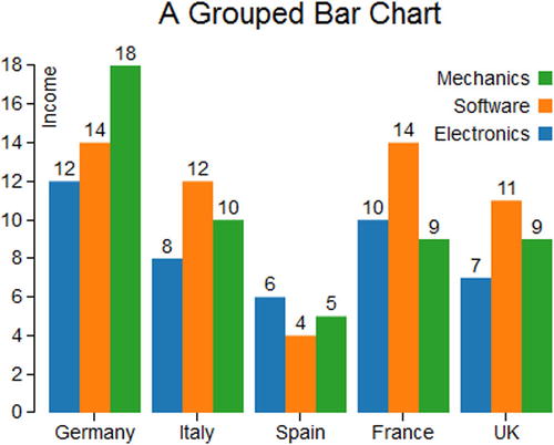
Figure 4-10. A grouped bar chart reporting the values above each bar
Horizontal Bar Chart with Negative Values
So far you have used only positive values, but what if you have both positive and negative values? How can you represent them in a bar chart? Take, for example, this sequence of values containing both positive and negative values (see Listing 4-41).
Listing 4-41. Ch4_05.html
var data = [4, 3, 1, -7, -10, -7, 1, 5, 7, -3, -5, -12, -7, -11, 3, 7, 8, -1];
Before analyzing the data to be displayed, start adding margins to your charts as shown in Listing 4-42.
Listing 4-42. Ch4_05.html
var data = [4, 3, 1, -7, -10, -7, 1, 5, 7, -3, -5, -12, -7, -11, 3, 7, 8, -1];

var margin = {top: 30, right: 10, bottom: 10, left: 30},
    w = 700 - margin.left - margin.right,
    h = 400 - margin.top - margin.bottom;
In this particular case, you will make use of horizontal bars where the values in the input array will be represented on the x axis, with the value 0 in the middle. In order to achieve this, it is first necessary to find the maximum value in absolute terms (both negative and positive). You then create the x variable on a linear scale, while the y variable is assigned to an ordinal scale containing the sequence in which data are placed in the input array (see Listing 4-43).
Listing 4-43. Ch4_05.html
...
var margin = {top: 30, right: 10, bottom: 10, left: 30},
    w = 700 - margin.left - margin.right,
    h = 400 - margin.top - margin.bottom;

var xMax = Math.max(-d3.min(data), d3.max(data));

var x = d3.scale.linear()
    .domain([-xMax, xMax])
    .range([0, w])
    .nice();

var y = d3.scale.ordinal()
    .domain(d3.range(data.length))
    .rangeRoundBands([0, h], .2);
In Listing 4-44, you assign the two scales to the corresponding x axis and y axis. This time, the x axis will be drawn in the upper part of the chart while the y axis will be oriented downwards (the y values are growing downwards).
Listing 4-44. Ch4_05.html
var y = d3.scale.ordinal()
    .domain(d3.range(data.length))
    .rangeRoundBands([0, h], .2);

  var xAxis = d3.svg.axis()
    .scale(x)
    .orient("top");

var yAxis = d3.svg.axis()
    .scale(y)
    .orient("left");
At this point, there is nothing left to do but to begin to implement the drawing area. Create the root <svg> element, assigning the margins that have been previously defined. Then, you define the x axis and y axis (see Listing 4-45).
Listing 4-45. Ch4_05.html
var yAxis = d3.svg.axis()
    .scale(y)
    .orient("left")

var svg = d3.select("body").append("svg")
    .attr("width", w + margin.left + margin.right)
    .attr("height", h + margin.top + margin.bottom)
    .append("g")
    .attr("transform", "translate(" + margin.left + ", " + margin.top + ")");

svg.append("g")
  .attr("class", "x axis")
   .call(xAxis);
  svg.append("g")
  .attr("class", "y axis")
  .attr("transform", "translate("+x(0)+",0)")
  .call(yAxis);
Finally, you need to insert a <rect> element for each bar to be represented, being careful to divide the bars into two distinct groups: negative bars and positive bars (see Listing 4-46). These two categories must be distinguished in order to set their attributes separately, with a CSS style class (e.g., color).
Listing 4-46. Ch4_05.html
svg.append("g")
   .attr("class", "y axis")
   .attr("transform", "translate("+x(0)+",0)")
   .call(yAxis);

svg.selectAll(".bar")
  .data(data)
  .enter().append("rect")
  .attr("class", function(d) {
          return d <0 ? "bar negative" : "bar positive";
  })
  .attr("x", function(d) { return x(Math.min(0, d)); })
  .attr("y", function(d, i) { return y(i); })
  .attr("width", function(d) { return Math.abs(x(d) - x(0)); })
  .attr("height", y.rangeBand());
In fact, if you analyze the structure with Firebug in Figure 4-11, you will see that the iteration has created two different types of bars within the same group, recognizable by the characterization of the class name “bar positive” and “bar negative.” Through these two different names, you apply two different CSS styles in order to distinguish the bars with negative values from those with positive values.
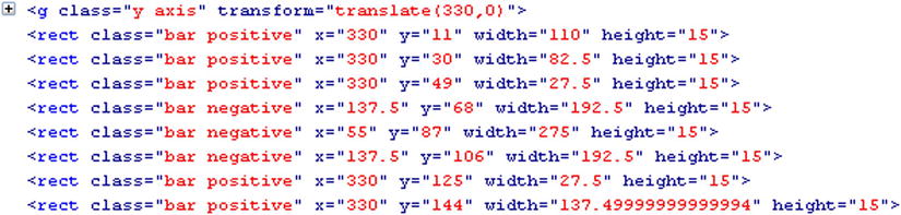
Figure 4-11. Firebug shows how it is possible to distinguish the positive from the negative bars, indicating the distinction in the class of each rect element
According to what we have just said, you set the style class attributes for negative and positive bars as in Listing 4-47.
Listing 4-47. Ch4_05.html
<style>
.bar.positive {
    fill: red;
    stroke: darkred;
}
.bar.negative {
    fill: lightblue;
    stroke: blue;
}
.axis path,
.axis line {
    fill: none;
    stroke: #000;
  }
body {
  font: 14px sans-serif;
}
</style>
At the end, you get the chart in Figure 4-12 with red bars for positive values and blue bars for negative values.
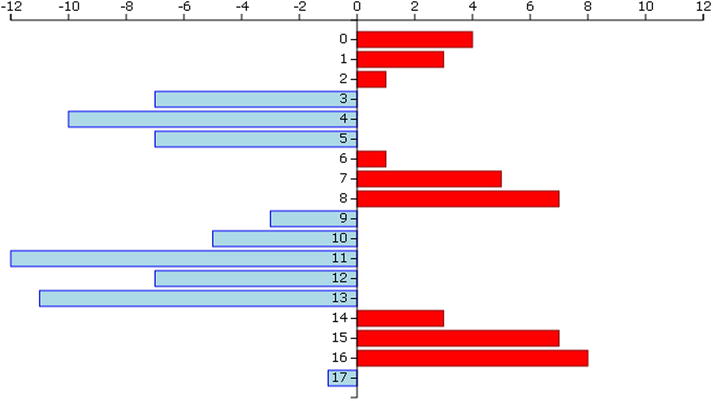
Figure 4-12. A horizontal bar chart
Summary
In this chapter, you have covered almost all of the fundamental aspects related to the implementation of a bar chart, the same type of chart which was developed in the first section of the book using the jqPlot library. Here, you made use of the D3 library. Thus, you saw how you can realize a simple bar chart element by element; then you moved on to the various cases of stacked bar charts and grouped bar charts, to finally look at a most peculiar case: a horizontal bar chart which portrays negative values.
In the next chapter, you will continue with the same approach: you will learn how to implement pie charts in a way similar to that used when working with jqPlot, but this time you will be using the D3 library.