
![]()
Scatterplot and Bubble Charts with D3
In this chapter, you will learn about scatterplot charts. Whenever you have a set of data pairs [x, y] and you want to analyze their distribution in the xy plane, you will refer to this type of chart. Thus, you will see first how to make this type of chart using the D3 library. In the first example, you will begin reading a TSV (tab-separated values) file containing more than one series of data, and through them, you will see how to achieve a scatterplot.
Once the scatterplot is completed, you will see how to represent the data points using markers with particular shapes, either choosing them from a predefined set or by creating original.
This class of charts is very important. It is a fundamental tool for analyzing data distributions; in fact, from these diagrams you can find particular trends (trendlines) and groupings (clusters). In this chapter, two simple examples will show you how you can represent trendlines and clusters.
Moreover, you will see how to add the highlighting functionality to your charts by the event handling and how the D3 library manages it.
Finally, the chapter will close with a final example in which you will need to represent data with three parameters [x, y, z]. Therefore, properly modifying the scatterplot, you will discover how you can get a bubble chart, which is a scatterplot modified to be able to represent an additional parameter.
Thanks to the D3 library, there is no limit to the graphic representations which you can generate, combining graphical elements as if they were bricks. The creation of scatterplots is no exception.
You begin with a collection of data (see Listing 7-1), this time in a tabulated form (therefore a TSV file) which you will copy and save as a file named data_09.tsv. (See the following Note.)
![]() Note Notice that the values in a TSV file are TAB separated, so when you write or copy Listing 7-1, remember to check that there is only a TAB character between each value.
Note Notice that the values in a TSV file are TAB separated, so when you write or copy Listing 7-1, remember to check that there is only a TAB character between each value.
Listing 7-1. data_09.tsv
time  intensity group
10    171.11    Exp1
14    180.31    Exp1
17    178.32    Exp1
42    173.22    Exp3
30    145.22    Exp2
30    155.68    Exp3
23    200.56    Exp2
15    192.33    Exp1
24    173.22    Exp2
20    203.78    Exp2
18    187.88    Exp1
45    180.00    Exp3
27    181.33    Exp2
16    198.03    Exp1
47    179.11    Exp3
27    175.33    Exp2
28    162.55    Exp2
24    208.97    Exp1
23    200.47    Exp1
43    165.08    Exp3
27    168.77    Exp2
23    193.55    Exp2
19    188.04    Exp1
40    170.36    Exp3
21    184.98    Exp2
15    197.33    Exp1
50    188.45    Exp3
23    207.33    Exp1
28    158.60    Exp2
29    151.31    Exp2
26    172.01    Exp2
23    191.33    Exp1
25    226.11    Exp1
60    198.33    Exp3
Suppose that the data contained in the file belong to three different experiments (labeled as Exp1, Exp2, and Exp3), each applied to a different object (for example, three luminescent substances), in which you want to measure how their emission intensity varies over time. The readings are done repeatedly and at different times. Your aim will be to represent these values in the xy plane in order to analyze their distribution and eventual properties.
Observing the data, you can see that they are composed of three columns: time, intensity, and group membership. This is a typical data structure which can be displayed in the form of a scatterplot. You will put the time scale on the x axis, put the intensity values on the y axis, and finally identify groups by the shape or by the color of the markers which will mark the position of the point in the scatterplot.
As it has become customary, you begin by writing the code in Listing 7-2. This code represents your starting code, and since it is common to almost all charts you have seen in the previous example, it does not require further explanation.
Listing 7-2. Ch7_01.html
<!DOCTYPE html>
<html>
<head>
<meta charset="utf-8">
<script src="http://d3js.org/d3.v3.js"></script>
<style>
body {
    font: 16px sans-serif;
}
.axis path,
.axis line {
    fill: none;
    stroke: #000;
    shape-rendering: crispEdges;
}
</style>
</head>
<body>
<script type="text/javascript">
var margin = {top: 70, right: 20, bottom: 40, left: 40},
    w = 500 - margin.left - margin.right,
    h = 400 - margin.top - margin.bottom;

var color = d3.scale.category10();

var x = d3.scale.linear()
    .range([0, w]);

var y = d3.scale.linear()
    .range([h, 0]);

var xAxis = d3.svg.axis()
    .scale(x)
    .orient("bottom");

var yAxis = d3.svg.axis()
    .scale(y)
    .orient("left");

var svg = d3.select("body").append("svg")
    .attr("width", w + margin.left + margin.right)
    .attr("height", h + margin.top + margin.bottom)
    .append("g")
    .attr("transform", "translate(" + margin.left+ "," +margin.top+ ")");

var title = d3.select("svg").append("g")
    .attr("transform", "translate(" + margin.left+ "," +margin.top+ ")")
    .attr("class","title");

title.append("text")
    .attr("x", (w / 2))
    .attr("y", –30 )
    .attr("text-anchor", "middle")
    .style("font-size", "22px")
    .text("My Scatterplot");
</script>
</body>
</html>
In Listing 7-3, you read the tabulated data from the TSV file with the d3.tsv() function, making sure that the numerical values will be read as such. Here, even if you have times on the first column, these do not require parsing since they are seconds and can thus be considered on a linear scale.
Listing 7-3. Ch7_01.html
...
var svg = d3.select("body").append("svg")
    .attr("width", w + margin.left + margin.right)
    .attr("height", h + margin.top + margin.bottom)
    .append("g")
    .attr("transform", "translate(" + margin.left+ "," +margin.top+ ")");

d3.tsv("data_09.tsv", function(error, data) {
    data.forEach(function(d) {
       d.time = +d.time;
       d.intensity = +d.intensity;
    });
});

var title = d3.select("svg").append("g")
    .attr("transform", "translate(" + margin.left+ "," +margin.top+ ")")
    .attr("class","title");
...
Also with regard to the domains, the assignment is very simple, as shown in Listing 7-4. Furthermore, you will use the nice() function, which rounds off the values of the domain.
Listing 7-4. Ch7_01.html
d3.tsv("data_09.tsv", function(error, data) {
    data.forEach(function(d) {
       d.time = +d.time;
       d.intensity = +d.intensity;
    });

    x.domain(d3.extent(data, function(d) { return d.time; })).nice();
    y.domain(d3.extent(data, function(d) { return d.intensity; })).nice();
});
You add also the axis label, bringing “Time [s]” on the x axis and “Intensity” on the y axis, as shown in Listing 7-5.
Listing 7-5. Ch7_01.html
d3.tsv("data_09.tsv", function(error, data) {
    ...
     x.domain(d3.extent(data, function(d) { return d.time; })).nice();
     y.domain(d3.extent(data, function(d) { return d.intensity; })).nice();

    svg.append("g")
       .attr("class", "x axis")
       .attr("transform", "translate(0," + h + ")")
       .call(xAxis);

    svg.append("text")
       .attr("class", "label")
       .attr("x", w)
       .attr("y", h + margin.bottom - 5)
       .style("text-anchor", "end")
       .text("Time [s]");

    svg.append("g")
       .attr("class", "y axis")
       .call(yAxis);

    svg.append("text")
       .attr("class", "label")
       .attr("transform", "rotate(–90)")
       .attr("y", 6)
       .attr("dy", ".71em")
       .style("text-anchor", "end")
       .text("Intensity");
});
Finally, you have to draw the markers directly on the graph. These can be represented by the SVG element <circle>. The data points to be represented on the ` will therefore be of small dots of radius 3.5 pixels (see Listing 7-6). To define their representation of different groups, the markers are drawn in different colors.
Listing 7-6. Ch7_01.html
d3.tsv("data_09.tsv", function(error, data) {
    ...
    svg.append("text")
      .attr("class", "label")
      .attr("transform", "rotate(-90)")
      .attr("y", 6)
      .attr("dy", ".71em")
      .style("text-anchor", "end")
      .text("Intensity");

    svg.selectAll(".dot")
       .data(data)
       .enter().append("circle")
       .attr("class", "dot")
       .attr("r", 3.5)
       .attr("cx", function(d) { return x(d.time); })
       .attr("cy", function(d) { return y(d.intensity); })
       .style("fill", function(d) { return color(d.group); });
});
Now you have so many colored markers on the scatterplot, but no reference to their color and the group to which they belong. Therefore, it is necessary to add a legend showing the names of the various groups associated with the different colors (see Listing 7-7).
Listing 7-7. Ch7_01.html
d3.tsv("data_09.tsv", function(error, data) {
    ...
    svg.selectAll(".dot")
       .data(data)
       .enter().append("circle")
       .attr("class", "dot")
       .attr("r", 3.5)
       .attr("cx", function(d) { return x(d.time); })
       .attr("cy", function(d) { return y(d.intensity); })
       .style("fill", function(d) { return color(d.group); });

    var legend = svg.selectAll(".legend")
       .data(color.domain())
       .enter().append("g")
       .attr("class", "legend")
       .attr("transform", function(d, i) {
          return "translate(0," + (i * 20) + ")"; });

    legend.append("rect")
       .attr("x", w - 18)
       .attr("width", 18)
       .attr("height", 18)
       .style("fill", color);

    legend.append("text")
       .attr("x", w - 24)
       .attr("y", 9)
       .attr("dy", ".35em")
       .style("text-anchor", "end")
       .text(function(d) { return d; });
});
After all the work is complete, you get the scatterplot shown in Figure 7-1.
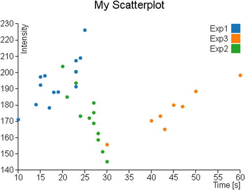
Figure 7-1. A scatterplot showing the data distribution
Markers and Symbols
When you want to represent a scatterplot, an aspect not to be underestimated is the shape of the marker with which you want to represent the data points. Not surprisingly, the D3 library provides you with a number of methods that manage the marker representation by symbols. In this chapter, you will learn about this topic since it is well suited to this kind of chart (scatterplots), but does not alter its application to other types of chart (e.g., line charts).
Using Symbols as Markers
D3 library provides a set of symbols that can be used directly as a marker. In Table 7-1, you can see a list reporting various predefined symbols.
Table 7-1. Predefined Symbols in D3 Library
|
Symbol |
Description |
|---|---|
|
Circle |
A circle |
|
Cross |
A Greek cross (or plus sign) |
|
Diamond |
A rhombus |
|
Square |
An axis-aligned square |
|
Triangle-down |
A downward-pointing equilateral triangle |
|
Triangle-up |
An upward-pointing equilateral triangle |
Continuing with the previous example, you replace the dots in the scatterplot chart with different symbols used as markers. These symbols will vary depending on the series of membership of the data (Exp1, Exp2, or Exp3). So this time, to characterize the series to which data belong, it will be both the color and the shape of the marker.
First, you need to assign each series to a symbol within the groupMarker object, as shown in Listing 7-8.
Listing 7-8. Ch7_01b.html
var margin = {top: 70, right: 20, bottom: 40, left: 40},
    w = 500 - margin.left - margin.right,
    h = 400 - margin.top - margin.bottom;

var groupMarker = {
    Exp1: "cross",
    Exp2: "diamond",
    Exp3: "triangle-down"
};

var color = d3.scale.category10();
Then, you delete from the code the lines concerning the representation of the dots (see Listing 7-9). These lines will be replaced with others generating the markers (see Listing 7-10).
Listing 7-9. Ch7_01b.html
svg.selectAll(".dot")
      .data(data)
      .enter().append("circle")
      .attr("class", "dot")
      .attr("r", 3.5)
      .attr("cx", function(d) { return x(d.time); })
      .attr("cy", function(d) { return y(d.intensity); })
      .style("fill", function(d) { return color(d.group); });
Actually, you are going to generate symbols that are nothing more than the predefined SVG paths. You may guess this from the fact that in Listing 7-10 the addition of the symbols is performed through the use of the append("path") function. Concerning instead the generation of the symbol as such, the D3 library provides a specific function: d3.svg.symbol(). The symbol to be displayed is passed as argument through the type() function, for example if you want to use the symbols to cross utilize type("cross").
In this case, however, the symbols to be represented are three and they depend on the series of each point. So, you have to implement an iteration on all data by function (d) applied to groupMarker, which will return the string corresponding to the “cross”, “diamond”, and “triangle-down” symbols.
Finally, being constituted by a SVG path, the symbol can also be changed by adjusting the Cascading Style Sheets (CSS) styles. In this example, you can choose to represent only the outlines of the symbols by setting the fill attribute to white.
Listing 7-10. Ch7_01b.html
d3.tsv("data_09.tsv", function(error, data) {
    ...
    svg.append("text")
      .attr("class", "label")
      .attr("transform", "rotate(-90)")
      .attr("y", 6)
      .attr("dy", ".71em")
      .style("text-anchor", "end")
      .text("Intensity");

    svg.selectAll("path")
       .data(data)
       .enter().append("path")
       .attr("transform", function(d) {
          return "translate(" + x(d.time) + "," + y(d.intensity) + ")";
       })
       .attr("d", d3.svg.symbol().type( function(d) {
          return groupMarker[d.group];
       }))
       .style("fill", "white")
       .style("stroke", function(d) { return color(d.group); })
       .style("stroke-width", "1.5px");

    var legend = svg.selectAll(".legend")
...
});
Figure 7-2 shows the scatterplot using various symbols in place of dots.
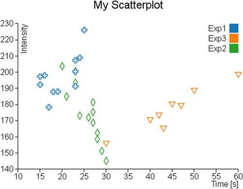
Figure 7-2. In a scatterplot, the series could be represented by different symbols
Using Customized Markers
You have just seen that the markers with the D3 library are nothing more than SVG paths. You could use this to your advantage by customizing your chart with the creation of other symbols that will be added to those already defined.
On the Internet, you can find a huge number of SVG symbols; once you have decided what symbol to use, you get its path in order to add it in your web page. More enterprising readers can also decide to edit SVG symbols with a SVG editor. I suggest you to use the Inkscape editor (see Figure 7-3); you can download it from its official site: http://inkscape.org. Or, more simply, you can start from an already designed SVG symbol and then modify it according to your taste. To do this, I recommend using the SVG Tryit page at this link: www.w3schools.com/svg/tryit.asp?filename=trysvg_path (see Figure 7-4).
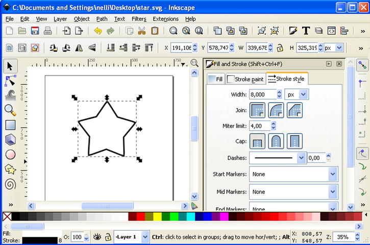
Figure 7-3. Inkscape: a good SVG editor for generating symbols
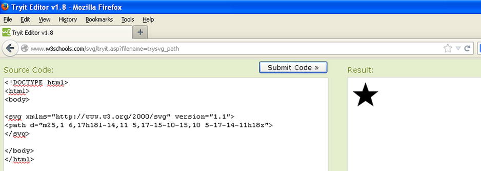
Figure 7-4. Tryit is a useful tool to preview SVG symbols in real time inserting the path
Therefore, choose three new symbols (e.g., a crescent moon, a star, and the Mars symbol) that go to replace the default ones. You extract their path and then insert into the definition of a new object, which you call markers, as shown in Listing 7-11.
Listing 7-11. Ch7_01c.html
var margin = {top: 70, right: 20, bottom: 40, left: 40},
    w = 500 - margin.left - margin.right,
    h = 400 - margin.top - margin.bottom;

var markers = {
    mars: "m15,7 a 7,7 0 1,0 2,2 z l 1,1 7-7m-7,0 h 7 v 7",
    moon: "m15,3 a 8.5,8.5 0 1,0 0,13 a 6.5,6.5 0 0,1 0,-13",
    star: "m11,1 3,9h9l-7,5.5 2.5,8.5-7.5-5-7.5,5 2.5-8.5-7-6.5h9z"
};

var groupMarker = {
    ...
Now you have to update the associations between symbols and groups that you defined within the groupMarker variable, as shown in Listing 7-12.
Listing 7-12. Ch7_01c.html
var groupMarker = {
    Exp1: markers.star,
    Exp2: markers.moon,
    Exp3: markers.mars
};
The last thing you can do is to change the definition of the path when you are creating the SVG elements (see Listing 7-13).
Listing 7-13. Ch7_01c.html
svg.selectAll("path")
    .data(data)
    .enter().append("path")
    .attr("transform", function(d) {
       return "translate(" + x(d.time) + "," + y(d.intensity) + ")";
    })
    .attr("d", function(d) { return groupMarker[d.group]; })
    .style("fill", "white")
    .style("stroke", function(d) { return color(d.group); })
    .style("stroke-width", "1.5px");
At the end, you obtain a scatterplot reporting the symbols that you have personally created or downloaded from the Internet (see Figure 7-5).
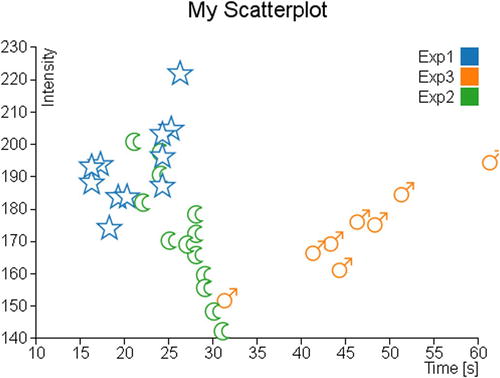
Figure 7-5. A scatterplot with a customized set of markers
Adding More Functionalities
Now that you have learned how to represent a distribution of data using scatterplots, it is time to introduce the trendline and clusters. Very often, analyzing in detail some sets of points in the data distribution, you can see that they follow a particular trend or tend to congregate in clusters. Therefore, it will be very useful to highlight this graphically. In this section, you will see a first example of how to calculate and represent linear trendlines. Then, you will see a second example which will illustrate a possibility of how to highlight some clusters present in the xy plane.
Trendlines
For reasons of simplicity, you will calculate the trendline of a set of points (a series) following a linear trend. To do this, you use the method of least squares. This method ensures that you find, given a set of data, the line that best fits the trend of the points, as much as possible by minimizing the error (the sum of the squares of the errors).
![]() Note For further information, I suggest you visit the Wolfram MathWorld article at http://mathworld.wolfram.com/LeastSquaresFitting.html.
Note For further information, I suggest you visit the Wolfram MathWorld article at http://mathworld.wolfram.com/LeastSquaresFitting.html.
For this example, you will continue working with the code of the scatterplot, but excluding all the changes made with the insertion of symbols. To avoid unnecessary mistakes and more repetition, Listing 7-14 shows the code you need to use as the starting point for this example.
Listing 7-14. Ch7_02.html
<!DOCTYPE html>
<html>
<head>
<meta charset="utf-8">
<script src="http://d3js.org/d3.v3.js"></script>
<style>
body {
    font: 16px sans-serif;
}
.axis path, .axis line {
    fill: none;
    stroke: #000;
    shape-rendering: crispEdges;
}
</style>
</head>
<body>
<script type="text/javascript">
var margin = {top: 70, right: 20, bottom: 40, left: 40},
    w = 500 - margin.left - margin.right,
    h = 400 - margin.top - margin.bottom;
var color = d3.scale.category10();
var x = d3.scale.linear()
    .range([0, w]);
var y = d3.scale.linear()
    .range([h, 0]);
var xAxis = d3.svg.axis()
    .scale(x)
    .orient("bottom");
var yAxis = d3.svg.axis()
    .scale(y)
    .orient("left");
var svg = d3.select("body").append("svg")
    .attr("width", w + margin.left + margin.right)
    .attr("height", h + margin.top + margin.bottom)
    .append("g")
    .attr("transform", "translate(" +margin.left+ "," +margin.top+ ")");
d3.tsv("data_09.tsv", function(error, data) {
    data.forEach(function(d) {
       d.time = +d.time;
       d.intensity = +d.intensity;
    });
    x.domain(d3.extent(data, function(d) { return d.time; })).nice();
    y.domain(d3.extent(data, function(d) { return d.intensity; })).nice();
    svg.append("g")
       .attr("class", "x axis")
       .attr("transform", "translate(0," + h + ")")
       .call(xAxis);
    svg.append("text")
       .attr("class", "label")
       .attr("x", w)
       .attr("y", h + margin.bottom - 5)
       .style("text-anchor", "end")
       .text("Time [s]");
    svg.append("g")
       .attr("class", "y axis")
       .call(yAxis);
    svg.append("text")
       .attr("class", "label")
       .attr("transform", "rotate(-90)")
       .attr("y", 6)
       .attr("dy", ".71em")
       .style("text-anchor", "end")
       .text("Intensity");
    svg.selectAll(".dot")
       .data(data)
       .enter().append("circle")
       .attr("class", "dot")
       .attr("r", 3.5)
       .attr("cx", function(d) { return x(d.time); })
       .attr("cy", function(d) { return y(d.intensity); })
       .style("fill", function(d) { return color(d.group); });
    var legend = svg.selectAll(".legend")
       .data(color.domain())
       .enter().append("g")
       .attr("class", "legend")
       .attr("transform", function(d, i) {
          return "translate(0," + (i * 20) + ")";
       });
    legend.append("rect")
       .attr("x", w - 18)
       .attr("width", 18)
       .attr("height", 18)
       .style("fill", color);
    legend.append("text")
       .attr("x", w - 24)
       .attr("y", 9)
       .attr("dy", ".35em")
       .style("text-anchor", "end")
       .text(function(d) { return d; });
});
var title = d3.select("svg").append("g")
    .attr("transform", "translate(" + margin.left + "," + margin.top + ")")
    .attr("class","title");
title.append("text")
    .attr("x", (w / 2))
    .attr("y", -30)
    .attr("text-anchor", "middle")
    .style("font-size", "22px")
    .text("My Scatterplot");
</script>
</body></html>
First, you define all the variables that will serve for the method of least squares within the tsv() function, as shown in Listing 7-15. For each variable you define an array of size 3, since there are three series to be represented in your chart.
Listing 7-15. Ch7_02.html
d3.tsv("data_09.tsv", function(error, data) {

    sumx = [0,0,0];
    sumy = [0,0,0];
    sumxy = [0,0,0];
    sumx2 = [0,0,0];
    n = [0,0,0];
    a = [0,0,0];
    b = [0,0,0];
    y1 = [0,0,0];
    y2 = [0,0,0];
    x1 = [9999,9999,9999];
    x2 = [0,0,0];
    colors = ["","",""];

    data.forEach(function(d) {
    ...
});
Now you exploit the iteration of data performed during the parsing of data, to calculate simultaneously all the summations necessary for the method of least squares (see Listing 7-16). Moreover, it is convenient for the representation of a straight line to determine the maximum and minimum x values in each series.
Listing 7-16. Ch7_02.html
d3.tsv("data_09.tsv", function(error, data) {
    ...
    data.forEach(function(d) {
       d.time = +d.time;
       d.intensity = +d.intensity;
       for(var i = 0; i < 3; i=i+1)
       {
          if(d.group == "Exp"+(i+1)){
             colors[i] = color(d.group);
             sumx[i] = sumx[i] + d.time;
             sumy[i] = sumy[i] + d.intensity;
             sumxy[i] = sumxy[i] + (d.time * d.intensity);
             sumx2[i] = sumx2[i] + (d.time * d.time);
             n[i] = n[i] +1;
             if(d.time < x1[i])
               x1[i] = d.time;
             if(d.time > x2[i])
               x2[i] = d.time;
           }
       }
    });

    x.domain(d3.extent(data, function(d) { return d.time; })).nice();
    ...
});
Once you have calculated all the summations, it is time to make the calculation of the least squares in Listing 7-17. Since the series are three, you will repeat the calculation for three times within a for() loop. Furthermore, within each loop you directly insert the creation of the SVG element for drawing the line corresponding to the result of each calculation.
Listing 7-17. Ch7_02.html
d3.tsv("data_09.tsv", function(error, data) {
    ...
    x.domain(d3.extent(data, function(d) { return d.time; })).nice();
    y.domain(d3.extent(data, function(d) { return d.intensity; })).nice();

    for(var i = 0; i < 3; i = i + 1){
       b[i] = (sumxy[i] - sumx[i] * sumy[i] / n[i]) /
           (sumx2[i] - sumx[i] * sumx[i] / n[i]);
       a[i] = sumy[i] / n[i] - b[i] * sumx[i] / n[i];
       y1[i] = b[i] * x1[i] + a[i];
       y2[i] = b[i] * x2[i] + a[i];
       svg.append("svg:line")
          .attr("class","trendline")
          .attr("x1", x(x1[i]))
          .attr("y1", y(y1[i]))
          .attr("x2", x(x2[i]))
          .attr("y2", y(y2[i]))
          .style("stroke", colors[i])
          .style("stroke-width", 4);
    }
Now that you have completed the whole, you can see the representation of the three trendlines within the scatterplot, as shown in Figure 7-6.
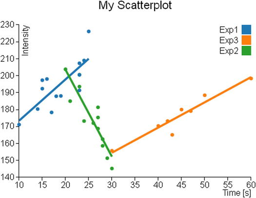
Figure 7-6. Each group shows its trendline
Clusters
When you work with the scatterplot, you may need to perform a clustering analysis. On the Internet, there are many analysis methods and algorithms that allow you to perform various operations of identification and research of clusters.
The cluster analysis is a classification technique that has the aim to identify data groups (clusters precisely) within a distribution of data (in this case, the scatterplot on the xy plane). The assignment of the various data points to these clusters is not defined a priori, but it is the task of cluster analysis to determine the criteria for selection and grouping. These clusters should be differentiated as much as possible, and in this case, as the grouping criterion, the cluster analysis will be based on the exaxt distances between the various data points and a point representative of the cluster called centroid (see Figure 7-7).
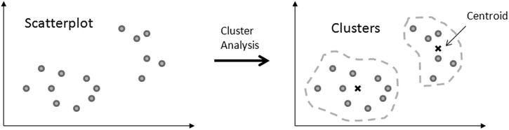
Figure 7-7. The cluster analysis groups a set of data points around a centroid for each cluster
Thus, the aim of this analysis is primarily to identify possible similarities within a data distribution, and in this regard there is nothing more appropriate of a scatterplot chart in which you can highlight these similarities through the different colors of the different points depending on the cluster membership.
In this section, you will see how to implement a cluster analysis algorithm and then how it is possible to integrate it into a scatterplot.
Given the complexity of the cluster analysis, this chapter will not go into this topic in detail. You are interested only in highlighting the various points of the scatterplot in a different way from that of the series to which they belong (Exp1, Exp2, and Exp3). In this example, you want to color the data points depending on the cluster to which they belong. In order to do this, you will use a simple case of cluster analysis: the K-means algorithm. You define first the number of clusters into which you want to divide all the data, and then for each cluster, a representative point (centroid) is chosen. The distance between each data point and the three centroids is considered as a criterion for membership.
There are some examples available on the Internet in which the K-means method is applied, and it is totally implemented in JavaScript; among them I choose one developed by Heather Arthur (https://github.com/harthur/clusterfck), but you can replace it with any other.
For the example in question, I have taken the liberty to modify the code to make it as easy as possible. Starting from the data points contained within the TSV file, and representing them in a scatterplot, you are practically analyzing how these points are distributed in space xy. Now you are interested to recognize in this distribution, for example, three different clusters.
To do so you will apply the following algorithm:
- Make a random choice of three data points as cluster centroids.
- Iterate over all the data points in the file, assigning each of them to the cluster that has the closest centroid. At the end, you have all the data points divided into three clusters.
- Within each cluster, a new centroid is calculated, which this time will not correspond to any given point but will be the “midpoint” interposed between all points in the cluster.
- Recalculate steps 2 and 3 until the new centroids correspond to the previous ones (that is, the coordinates of the centroids in the xy plane remain unchanged).
Once the algorithm is completed, you will have the points in the scatterplot with three different colors corresponding to three different clusters.
Please note that in this algorithm there is no optimization, and thus the result will always be different every time you upload the page in your browser. In fact, what you get every time is a possible solution, not the “best solution.”
Now to keep some of modularity, you will write the code of the analysis of clusters in an external file which you will call kmeans.js.
First, you will implement the randomCentroids() function, which will choose k points (in this example, k = 3) among those contained in the file (here passed within the points array) to assign them as centroids of the k clusters (see Listing 7-18). This function corresponds to the point 1 of the algorithm.
Listing 7-18. kmeans.js
function randomCentroids(points, k) {
    var centroids = points.slice(0);
    centroids.sort(function() {
       return (Math.round(Math.random()) - 0.5);
    });
    return centroids.slice(0, k);
}:
Now you have to assign all the points contained in the file to the three different clusters. To do this, you need to calculate the distance between each data point and the centroid in question, and thus you need to implement a specific function that calculates the distance between two points. In Listing 7-19, it is defined the distance() function, which returns the distance between v1 and v2 generic points.
Listing 7-19. kmeans.js
function distance(v1, v2) {
      var total = 0;
      for (var i = 0; i < v1.length; i++) {
         total += Math.pow((v2[i] - v1[i]), 2);
      }
      return Math.sqrt(total);
};
Now that you know how to calculate the distance between two points, you can implement a function that is able to decide which is the cluster assignment of each data point, calculating its distance with all centroids and choosing the smaller one. Thus, you can add the closestCentroid() function to the code, as shown in Listing 7-20.
Listing 7-20. kmeans.js
function closestCentroid(point, centroids) {
    var min = Infinity;
    var index = 0;
    for (var i = 0; i < centroids.length; i++) {
       var dist = distance(point, centroids[i]);
       if (dist < min) {
          min = dist;
          index = i;
       }
    }
    return index;
}:
Now you can write the function that expresses the algorithm first exposed in its entirety. This function requires two arguments, the input data points (points) and the number of clusters into which they will be divided (k) (see Listing 7-21). Within it, you then choose the centroids using the newly implemented randomCentroids() function (point 1 of the algorithm).
Listing 7-21. kmeans.js
function kmeans(points, k) {
    var centroids = randomCentroids(points, k);
};
Once you have chosen the three centroids, you can assign all data points (contained in the points array) to the three clusters, defining the assignment array as shown in Listing 7-22 (point 2 of the algorithm). This array has the same length of the points array and is constructed in such a way that the order of its elements corresponds to the order of data points. Every element contains the number of the cluster to which they belong. If, for example, in the third element of the assignment array you have a value of 2, then it will mean that the third data point belongs to the third cluster (clusters are 0, 1, and 2).
Listing 7-22. kmeans.js
function kmeans(points, k) {
    var centroids = randomCentroids(points, k);
    var assignment = new Array(points.length);
    var clusters = new Array(k);
    var movement = true;
    while (movement) {
      for (var i = 0; i < points.length; i++) {
         assignment[i] = closestCentroid(points[i], centroids);
      }
      movement = false;
    }
    return clusters;
};
Finally, by selecting a cluster at a time, you will recalculate the centroids and with these repeat the whole process until you get always the same values. First, as you can see in Listing 7-23, you make an iteration through the iterator j to analyze a cluster at a time. Inside of it, based on the contents of the assignment array, you fill the assigned array with all data points belonging to the cluster. These values serve you for the calculation of the new centroid defined in the newCentroid variable. To determine its new coordinates [x, y], you sum all x and y values, respectively, of all points of the cluster. These amounts are then divided by the number of points, so the x and y values of the new centroid are nothing more than the averages of all the coordinates.
To do all this, you need to implement a double iteration (two for() loops) with the g and i iterators. The iteration on g allows you to work on a coordinate at a time (first x, then y, and so on), while the iteration on i allows you to sum point after point in order to make the summation.
If the new centroids differ from the previous ones, then the assignment of the various data points to clusters repeats again, and the cycle begins again (steps 3 and 4 of the algorithm).
Listing 7-23. kmeans.js
function kmeans(points, k) {
    ...
    while (movement) {
      for (var i = 0; i < points.length; i++) {
         assignment[i] = closestCentroid(points[i], centroids);
      }
      movement = false;
      for (var j = 0; j < k; j++) {
         var assigned = [];
         for (var i = 0; i < assignment.length; i++) {
            if (assignment[i] == j) {
               assigned.push(points[i]);
            }
         }
         if (!assigned.length) {
            continue;
         }
         var centroid = centroids[j];
         var newCentroid = new Array(centroid.length);
         for (var g = 0; g < centroid.length; g++) {
            var sum = 0;
            for (var i = 0; i < assigned.length; i++) {
               sum += assigned[i][g];
            }
            newCentroid[g] = sum / assigned.length;
            if (newCentroid[g] != centroid[g]) {
               movement = true;
            }
         }
         centroids[j] = newCentroid;
         clusters[j] = assigned;
       }
    }
    return clusters;
};
Applying the Cluster Analysis to the Scatterplot
Having concluded the JavaScript code for the clustering analysis, it is time to come back to the web page. As you did for the example of the trendlines, you will use the code of the scatterplot as shown in Listing 7-24. This is the starting point on which you make the various changes and additions needed to integrate the cluster analysis.
Listing 7-24. Ch7_03.html
<!DOCTYPE html>
<html>
<head>
<meta charset="utf-8">
<script src="http://d3js.org/d3.v3.js"></script>
<style>
body {
    font: 16px sans-serif;
}
.axis path, .axis line {
    fill: none;
    stroke: #000;
    shape-rendering: crispEdges;
}
</style>
</head>
<body>
<script type="text/javascript">
var margin = {top: 70, right: 20, bottom: 40, left: 40},
    w = 500 - margin.left - margin.right,
    h = 400 - margin.top - margin.bottom;
var color = d3.scale.category10();
var x = d3.scale.linear()
    .range([0, w]);
var y = d3.scale.linear()
    .range([h, 0]);
var xAxis = d3.svg.axis()
    .scale(x)
    .orient("bottom");
var yAxis = d3.svg.axis()
    .scale(y)
    .orient("left");
var svg = d3.select("body").append("svg")
    .attr("width", w + margin.left + margin.right)
    .attr("height", h + margin.top + margin.bottom)
    .append("g")
    .attr("transform", "translate(" +margin.left+ "," +margin.top+ ")");
d3.tsv("data_09.tsv", function(error, data) {
    data.forEach(function(d) {
       d.time = +d.time;
       d.intensity = +d.intensity;
    });
    x.domain(d3.extent(data, function(d) { return d.time; })).nice();
    y.domain(d3.extent(data, function(d) { return d.intensity; })).nice();
    svg.append("g")
       .attr("class", "x axis")
       .attr("transform", "translate(0," + h + ")")
       .call(xAxis);
    svg.append("text")
       .attr("class", "label")
       .attr("x", w)
       .attr("y", h + margin.bottom - 5)
       .style("text-anchor", "end")
       .text("Time [s]");
    svg.append("g")
       .attr("class", "y axis")
       .call(yAxis);
    svg.append("text")
       .attr("class", "label")
       .attr("transform", "rotate(–90)")
       .attr("y", 6)
       .attr("dy", ".71em")
       .style("text-anchor", "end")
       .text("Intensity");
    var legend = svg.selectAll(".legend")
       .data(color.domain())
       .enter().append("g")
       .attr("class", "legend")
       .attr("transform", function(d, i) {
          return "translate(0," + (i * 20) + ")";
       });
    legend.append("rect")
       .attr("x", w - 18)
       .attr("width", 18)
       .attr("height", 18)
       .style("fill", color);
    legend.append("text")
       .attr("x", w - 24)
       .attr("y", 9)
       .attr("dy", ".35em")
       .style("text-anchor", "end")
       .text(function(d) { return d; });
});
var title = d3.select("svg").append("g")
    .attr("transform", "translate(" + margin.left + "," + margin.top + ")")
    .attr("class","title");
title.append("text")
    .attr("x", (w / 2))
    .attr("y", -30)
    .attr("text-anchor", "middle")
    .style("font-size", "22px")
    .text("My Scatterplot");
</script>
</body>
</html>
First, you need to include the file kmeans.js you have just created in order to use the functions defined within (see Listing 7-25).
Listing 7-25. Ch7_03.html
...
<meta charset="utf-8">
<script src="http://d3js.org/d3.v3.js"></script>
<script src="./kmeans.js"></script>
<style>
body {
    ...
Prepare an array which will hold the data to be analyzed and call it myPoints. Once this is done, you can finally add the call to the kmean() function, as shown in Listing 7-26.
Listing 7-26. Ch7_03.html
d3.tsv("data_09.tsv", function(error, data) {
    var myPoints = [];
    data.forEach(function(d) {
       d.time = +d.time;
       d.intensity = +d.intensity;
       myPoints.push([d.time, d.intensity]);
    });
    var clusters = kmeans(myPoints, 3);
    x.domain(d3.extent(data, function(d) { return d.time; })).nice();
    y.domain(d3.extent(data, function(d) { return d.intensity; })).nice();
    ...
};
Finally, you modify the definition of the circle SVG elements so that these are represented in the basis of the results returned by the kmeans() function, as shown in Listing 7-27.
Listing 7-27. Ch7_03.html
d3.tsv("data_09.tsv", function(error, data) {
    ...
    svg.append("text")
      .attr("class", "label")
      .attr("transform", "rotate(–90)")
      .attr("y", 6)
      .attr("dy", ".71em")
      .style("text-anchor", "end")
      .text("Intensity");

    for(var i = 0; i < 3; i = i + 1){
       svg.selectAll(".dot" + i)
          .data(clusters[i])
          .enter().append("circle")
          .attr("class", "dot")
          .attr("r", 5)
          .attr("cx", function(d) { return x(d[0]); })
          .attr("cy", function(d) { return y(d[1]); })
          .style("fill", function(d) { return color(i); });
    }

    var legend = svg.selectAll(".legend")
       .data(color.domain())
       .enter().append("g")
    ...
};
In Figure 7-8, you can see the representation of one of the possible results which could be obtained after a clustering analysis.

Figure 7-8. The scatterplot shows one possible solution of the clustering analysis applied to the data in the TSV file
Highlighting Data Points
Another functionality that you have not yet covered with the library D3, but you have seen with the jqPlot library (see Chapter 10) is highlighting and the events related to it. The D3 library even allows you to add this functionality to your charts and handle events in a way that is very similar to that seen with the jqPlot library.
The D3 library provides a particular function to activate or remove event listeners: the on() function. This function is applied directly to a selection by chaining method and generally requires two arguments: the type and the listener.
selection.on(type, listener);
The first argument is the type of event that you want to activate, and it is expressed as a string containing the event name (such as mouseover, submit, etc.). The second argument is typically made up of a function which acts as a listener and makes an operation when the event is triggered.
Based on all this, if you want to add the highlighting functionality, you need to manage two particular events: one is when the user hovers the mouse over a data point by highlighting it, and the other is when the user moves out the mouse from above the data point, restoring it to its normal state. These two events are defined in the D3 library as mouseover and mouseout. Now you have to join these events to two different actions. With mouseover, you will enlarge the volume of data points and you will increase the vividness of its color to further constrast it with the others. Instead, you will do the complete opposite with mouseout, restoring the color and size of the original data points.
Listing 7-28 shows the highlight functionality applied to the scatterplot code.
Listing 7-28. Ch7_04.html
<!DOCTYPE html>
<html>
<head>
<meta charset="utf-8">
<script src="http://d3js.org/d3.v3.js"></script>
<style>
body {
    font: 16px sans-serif;
}
.axis path, .axis line {
    fill: none;
    stroke: #000;
    shape-rendering: crispEdges;
}
</style>
</head>
<body>
<script type="text/javascript">
var margin = {top: 70, right: 20, bottom: 40, left: 40},
    w = 500 - margin.left - margin.right,
    h = 400 - margin.top - margin.bottom;
var color = d3.scale.category10();
var x = d3.scale.linear()
    .range([0, w]);
var y = d3.scale.linear()
    .range([h, 0]);
var xAxis = d3.svg.axis()
    .scale(x)
    .orient("bottom");
var yAxis = d3.svg.axis()
    .scale(y)
    .orient("left");
var svg = d3.select("body").append("svg")
    .attr("width", w + margin.left + margin.right)
    .attr("height", h + margin.top + margin.bottom)
    .append("g")
    .attr("transform", "translate(" +margin.left+ "," +margin.top+ ")");
d3.tsv("data_09.tsv", function(error, data) {
    data.forEach(function(d) {
       d.time = +d.time;
       d.intensity = +d.intensity;
    });
    x.domain(d3.extent(data, function(d) { return d.time; })).nice();
    y.domain(d3.extent(data, function(d) { return d.intensity; })).nice();
    svg.append("g")
       .attr("class", "x axis")
       .attr("transform", "translate(0," + h + ")")
       .call(xAxis);
    svg.append("text")
       .attr("class", "label")
       .attr("x", w)
       .attr("y", h + margin.bottom - 5)
       .style("text-anchor", "end")
       .text("Time [s]");
    svg.append("g")
       .attr("class", "y axis")
       .call(yAxis);
    svg.append("text")
       .attr("class", "label")
       .attr("transform", "rotate(–90)")
       .attr("y", 6)
       .attr("dy", ".71em")
       .style("text-anchor", "end")
       .text("Intensity");

    var dots = svg.selectAll(".dot")
      .data(data)
      .enter().append("circle")
      .attr("class", "dot")
      .attr("r", 5)
      .attr("cx", function(d) { return x(d.time); })
      .attr("cy", function(d) { return y(d.intensity); })
      .style("fill", function(d) { return color(d.group); })
      .on("mouseover", function() { d3.select(this)
         .style("opacity",1.0)
         .attr("r", 15);
       })
       .on("mouseout", function() { d3.select(this)
          .style("opacity",0.6)
          .attr("r", 5);
       }) ;

    var legend = svg.selectAll(".legend")
       .data(color.domain())
       .enter().append("g")
       .attr("class", "legend")
       .attr("transform", function(d, i) {
          return "translate(0," + (i * 20) + ")";
       });
    legend.append("rect")
       .attr("x", w - 18)
       .attr("width", 18)
       .attr("height", 18)
       .style("fill", color);
    legend.append("text")
       .attr("x", w - 24)
       .attr("y", 9)
       .attr("dy", ".35em")
       .style("text-anchor", "end")
       .text(function(d) { return d; });
});
var title = d3.select("svg").append("g")
    .attr("transform", "translate(" + margin.left + "," + margin.top + ")")
    .attr("class","title");
title.append("text")
    .attr("x", (w / 2))
    .attr("y", –30)
    .attr("text-anchor", "middle")
    .style("font-size", "22px")
    .text("My Scatterplot");
</script>
</body>
</html>
Before loading the web page to see the result, you need to dull all the colors of the data points by setting the opacity attribute in the CSS styles, as shown in Listing 7-29.
Listing 7-29. Ch7_04.html
<style>
body {
    font: 16px sans-serif;
}
.axis path,
.axis line {
    fill: none;
    stroke: #000;
    shape-rendering: crispEdges;
}
.dot {
    stroke: #000;
    opacity: 0.6;
}
</style>
Figure 7-9 shows one of many data points in the bubble chart in two different states. On the left you can see the data point in its normal state, while on the right it is highlighted.
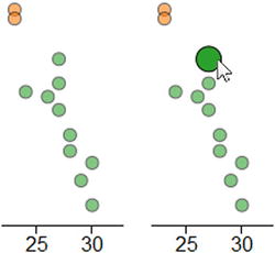
Figure 7-9. A bubble assumes two states: normal on the left and highlighted when moused over on the right
Bubble Chart
It is very easy to build a bubble chart by effecting only a few changes to the previous scatterplot example. First of all, you need to add a new column to your data. In this case (see Listing 7-30), you add bandwidth values as the last column to the data_09.tsv and you save it as data_10.tsv.
Listing 7-30. data_10.tsv
time  intensity group   bandwidth
10    171.11    Exp1    20
14    180.31    Exp1    30
17    178.32    Exp1    10
42    173.22    Exp3    40
30    145.22    Exp2    35
30    155.68    Exp3    80
23    200.56    Exp2    10
15    192.33    Exp1    30
24    173.22    Exp2    10
20    203.78    Exp2    20
18    187.88    Exp1    60
45    180.00    Exp3    10
27    181.33    Exp2    40
16    198.03    Exp1    30
47    179.11    Exp3    20
27    175.33    Exp2    30
28    162.55    Exp2    10
24    208.97    Exp1    10
23    200.47    Exp1    10
43    165.08    Exp3    10
27    168.77    Exp2    20
23    193.55    Exp2    50
19    188.04    Exp1    10
40    170.36    Exp3    40
21    184.98    Exp2    20
15    197.33    Exp1    30
50    188.45    Exp3    10
23    207.33    Exp1    10
28    158.60    Exp2    10
29    151.31    Exp2    30
26    172.01    Exp2    20
23    191.33    Exp1    10
25    226.11    Exp1    10
60    198.33    Exp3    10
Now you have a third parameter in the list of data corresponding to the new column bandwidth. This value is expressed by a number, and in order to read it as such you need to add the bandwidth variable to the parsing of data, as shown in Listing 7-31. You must not forget to replace the name of the TSV file with data_10.tsv in the tsv() function.
Listing 7-31. Ch7_05.html
d3.tsv("data_10.tsv", function(error, data) {
    var myPoints = [];
    data.forEach(function(d) {
       d.time = +d.time;
       d.intensity = +d.intensity;
       d.bandwidth = +d.bandwidth;
       myPoints.push([d.time, d.intensity]);
    });
    ...
});
Now you can turn all the dots into circular areas just by increasing their radius, since they are already set as SVG element <circle> as shown in Listing 7-32. The radii of these circles must be proportional to the bandwidth value, which therefore can be directly assigned to the r attribute. The 0.4 value is a correction factor which fits the bandwidth values to be very well represented in the bubble chart (in other cases, you will need to use other values as a factor).
Listing 7-32. Ch7_05.html
d3.tsv("data_10.tsv", function(error, data) {
    ...
  svg.append("text")
      .attr("class", "label")
      .attr("transform", "rotate(–90)")
      .attr("y", 6)
      .attr("dy", ".71em")
      .style("text-anchor", "end")
      .text("Intensity");

    svg.selectAll(".dot")
       .data(data)
       .enter().append("circle")
       .attr("class", "dot")
       .attr("r", function(d) { return d.bandwidth * 0.4 })
       .attr("cx", function(d) { return x(d.time); })
       .attr("cy", function(d) { return y(d.intensity); })
       .style("fill", function(d) { return color(d.group); })
       .on("mouseover", function() { d3.select(this)
          .style("opacity",1.0)
          .attr("r", function(d) { return d.bandwidth * 0.5 });
       })
       .on("mouseout", function() { d3.select(this)
          .style("opacity",0.6)
          .attr("r", function(d) { return d.bandwidth * 0.4 });
       });

var legend = svg.selectAll(".legend")
    ...
});
Last but not least, you need to update the title of the new chart as shown in Listing 7-33.
Listing 7-33. Ch7_05.html
title.append("text")
    .attr("x", (w / 2))
    .attr("y", –30 )
    .attr("text-anchor", "middle")
    .style("font-size", "22px")
    .text("My Bubble Chart");
And Figure 7-10 will be the result.
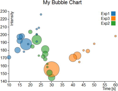
Figure 7-10. A bubble chart
Summary
In this chapter, you briefly saw how to generate bubble charts and scatterplots with the D3 library. Even here, you carried out the same type of charts which you saw in the second part of the book with the jqPlot library. Thus, you can get an idea of these two different libraries and of the respective approaches in the implementation of the same type of charts.
In the next chapter, you will implement a type of chart with which you still have not dealt with in the book: radar charts. This example of representation is not feasible with jqPlot, but it is possible to implement it thanks to D3 graphic elements. Thus, the next chapter will be a good example of how to use the potentialities of the D3 library to develop other types of charts which differ from those most commonly encountered.