![]()
This chapter covers a type of chart that you have not yet read about: the radar chart. First you will get to know what it is, including its basic features, and how to create one using the SVG elements provided by the D3 library.
You’ll start by reading a small handful of representative data from a CSV file. Then, making reference to the data, you’ll see how it is possible to implement all the components of a radar chart, step by step. In the second part of the chapter, you’ll use the same code to read data from more complex file, in which both the number of series and the amount of data to be processed are greater. This approach is a fairly common practice when you need to represent a new type of chart from scratch. You begin by working with a simple but complete example, and then, once you’ve implemented the basic example, you’ll extend it with more complex and real data.
Radar Chart
Radar charts are also known as web or spider charts, for the typical web structure they assume (see Figure 8-1). They are two-dimensional charts that enable you to represent three or more quantitative variables. They consist of a sequence of spokes, all having the same angle, with each spoke representing one of the variables. A point is represented on every spoke and the point’s distance from the center is proportional to the magnitude of the given variable. Then a line connects the point reported on each spoke, thus giving the plot a web-like appearance. Without this connecting line, the chart would look more like a scanning radar.
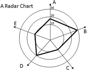
Figure 8-1. A radar chart looks like a spider web
Copy the following data and save it in a file as data_11.csv (see Listing 8-1).
Listing 8-1. data_11.csv
section,set1,set2,
A,1,6,
B,2,7,
C,3,8,
D,4,9,
E,5,8,
F,4,7,
G,3,6,
H,2,5,
In Listing 8-2, you define the drawing area and the margins. You then create a color sequence with the category10() function.
Listing 8-2. Ch8_01.html
var margin = {top: 70, right: 20, bottom: 40, left: 40},
    w = 500 - margin.left - margin.right,
    h = 400 - margin.top - margin.bottom;

var color = d3.scale.category20();
In the drawing area you just defined, you also have to define a specific area that can accommodate a circular shape, which in this case is the radar chart. Once you have defined this area, you define the radius like a Cartesian axis. In fact, each spoke on a radar chart is considered an axis upon which you place a variable. You therefore define a linear scale on the radius, as shown in Listing 8-3.
Listing 8-3. ch8_01.html
var circleConstraint = d3.min([h, w]);
var radius = d3.scale.linear()
    .range([0, (circleConstraint / 2)]);
You need to find the center of the drawing area. This is the center of the radar chart, and the point from which all the spokes radiate (see Listing 8-4).
Listing 8-4. Ch8_01.html
var centerXPos = w / 2 + margin.left;
var centerYPos = h / 2 + margin.top;
Begin to draw the root element <svg>, as shown in Listing 8-5.
Listing 8-5. Ch8_01.html
var svg = d3.select("body").append("svg")
    .attr("width", w + margin.left + margin.right)
    .attr("height", h + margin.top + margin.bottom)
    .append("g")
    .attr("transform", "translate(" + centerXPos + ", " + centerYPos + ")");
Now, as shown in Listing 8-6, you read the contents of the file with the d3.csv() function. You need to verify that the read values set1 and set2 are interpreted as numeric values. You also want to know which is the maximum value among all these, in order to define a scale that extends according to its value.
Listing 8-6. ch8_01.html
d3.csv("data_11.csv", function(error, data) {
    var maxValue =0;
    data.forEach(function(d) {
       d.set1 = +d.set1;
       d.set2 = +d.set2;
       if(d.set1 > maxValue)
          maxValue = d.set1;
       if(d.set2 > maxValue)
          maxValue = d.set2;
    });
});
Once you know the maximum value of the input data, you set the full scale value equal to this maximum value multiplied by one and a half. In this case, instead of using the automatic generation of ticks on the axes, you have to define them manually. In fact, these ticks have a spherical shape and consequently, quite particular features. This example divides the range of the radius axis into five ticks. Once the values of the ticks are defined, you can assign a domain to the radius axis (see Listing 8-7).
Listing 8-7. Ch8_01.html
d3.csv("data_11.csv", function(error, data) {
    ...
    data.forEach(function(d) {
    ...
    });

    var topValue =1.5 * maxValue;
    var ticks = [];
    for(i =0; i <5;i += 1){
      ticks[i] = topValue * i / 5;
    }
  radius.domain([0,topValue]);
});
Now that you have all of the numerical values, we can embed some <svg> elements in order to design a radar grid that will vary in shape and value depending on the data entered (see Listing 8-8).
Listing 8-8. Ch8_01.html
d3.csv("data_11.csv", function(error, data) {
    ...
    radius.domain([0, topValue]);
    var circleAxes = svg.selectAll(".circle-ticks")
      .data(ticks)
      .enter().append("g")
      .attr("class", "circle-ticks");

    circleAxes.append("svg:circle")
      .attr("r", function(d) {return radius(d);})
      .attr("class", "circle")
      .style("stroke", "#CCC")
      .style("fill", "none");

    circleAxes.append("svg:text")
      .attr("text-anchor", "middle")
      .attr("dy", function(d) {return radius(d)})
      .text(String);
});
You have created a structure of five <g> tags named circle-ticks, as you can see in Figure 8-2, each containing a <circle> element (which draws the grid) and a <text> element (which shows the corresponding numeric value).
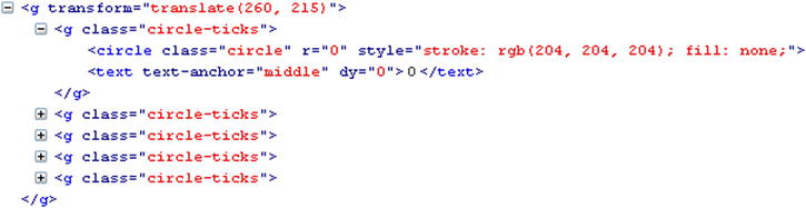
Figure 8-2. FireBug shows how the circle-ticks are structured
All of this code generates the circular grid shown in Figure 8-3.
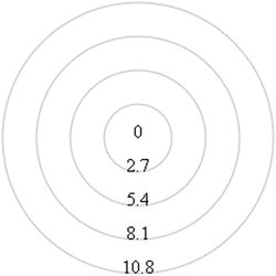
Figure 8-3. The circular grid of a radar chart
As you can see, the values reported on the tick will vary depending on the maximum value contained in the data.
Now is the time to draw the spokes, as many rays as there are lines in the data_11.csv file. Each of these lines corresponds to a variable, the name of which is entered in the first column of the file (see Listing 8-9).
Listing 8-9. Ch8_01.html
d3.csv("data_11.csv", function(error, data) {
    ...
    circleAxes.append("svg:text")
       .attr("text-anchor", "middle")
       .attr("dy", function(d) {return radius(d)})
       .text(String);

    lineAxes = svg.selectAll('.line-ticks')
      .data(data)
      .enter().append('svg:g')
      .attr("transform", function (d, i) {
          return "rotate(" + ((i / data.length * 360) - 90) +
          ")translate(" + radius(topValue) + ")";
      })
      .attr("class", "line-ticks");

    lineAxes.append('svg:line')
       .attr("x2", -1 * radius(topValue))
      .style("stroke", "#CCC")
      .style("fill", "none");

    lineAxes.append('svg:text')
       .text(function(d) { return d.section; })
      .attr("text-anchor", "middle")
      .attr("transform", function (d, i) {
          return "rotate("+(90 - (i * 360 / data.length)) + ")";
      });
});
You now have spokes represented in the chart, as shown in Figure 8-4.
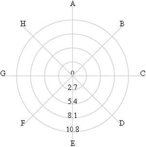
Figure 8-4. The radial axes of a radar chart
Adding Data to the Radar Chart
It is now time to consider the numeric columns in the file. Each column can be considered a series and each series must be assigned a color. You can define the series by taking the headers from the file and removing the first column. Then you can create the domain of colors according to the sequence of the series and then define the lines that draw them (see Listing 8-10).
Listing 8-10. Ch8_01.html
d3.csv("data_11.csv", function(error, data) {
    ...
    lineAxes.append('svg:text')
       .text(function(d) { return d.section; })
       .attr("text-anchor", "middle")
       .attr("transform", function (d, i) {
          return "rotate("+(90-(i*360/data.length))+")";
       });

    var series = d3.keys(data[0])
      .filter(function(key) { return key !== "section"; })
      .filter(function(key) { return key !== ""; });

    color.domain(series);

    var lines = color.domain().map(function(name){
      return (data.concat(data[0])).map(function(d){
          return +d[name];
      });
    });
});
This is the content of the series arrays:
["set1", "set2"]
And this is the content of the lines arrays:
[[1,2,3,...],[6,7,8,...]]
These lines will help you create the corresponding path elements and enable you to draw the trend of the series on the radar chart. Each series will pass through the values assumed in the various spokes (see Listing 8-11).
Listing 8-11. Ch8_01.html
d3.csv("data_11.csv", function(error, data) {
    ...
    var lines = color.domain().map(function(name){
       return (data.concat(data[0])).map(function(d){
          return +d[name];
       });
    });

    var sets = svg.selectAll(".series")
        .data(series)
        .enter().append("g")
        .attr("class", "series");

    sets.append('svg:path')
        .data(lines)
        .attr("class", "line")
        .attr("d", d3.svg.line.radial()
        .radius(function (d) {
          return radius(d);
        })
        .angle(function (d, i) {
          if (i == data.length) {
              i =0;
          } //close the line
          return (i / data.length) * 2 * Math.PI;
        }))
        .data(series)
        .style("stroke-width", 3)
        .style("fill", "none")
        .style("stroke", function(d,i){
          return color(i);
        });
});
You can also add a legend showing the names of the series (which are, actually, the headers of the columns) and a title placed on top in the drawing area, as shown in Listing 8-12.
Listing 8-12. Ch8_01.html
d3.csv("data_11.csv", function(error, data) {
    ...
       .data(series)
       .style("stroke-width", 3)
       .style("fill", "none")
       .style("stroke", function(d,i){
          return color(i);
       });

    var legend = svg.selectAll(".legend")
      .data(series)
      .enter().append("g")
      .attr("class", "legend")
      .attr("transform", function(d, i) {
          return "translate(0," + i * 20 + ")";
      });

  legend.append("rect")
    .attr("x", w/2 -18)
    .attr("y", h/2 - 60)
    .attr("width", 18)
    .attr("height", 18)
    .style("fill", function(d,i){ return color(i);});

    legend.append("text")
    .attr("x", w/2 -24)
    .attr("y", h/2 - 60)
    .attr("dy","1.2em")
    .style("text-anchor", "end")
    .text(function(d) { return d; });

});
var title = d3.select("svg").append("g")
  .attr("transform", "translate(" +margin.left+ "," +margin.top+ ")")
  .attr("class","title");

title.append("text")
  .attr("x", (w / 2))
  .attr("y", -30 )
  .attr("text-anchor", "middle")
  .style("font-size", "22px")
  .text("My Radar Chart");
Last but not least, you can add a CSS style class to rule the text style, as shown in Listing 8-13.
Listing 8-13. Ch8_01.html
<style>
body {
  font: 16px sans-serif;
}
</style>
Figure 8-5 shows the resulting radar chart.
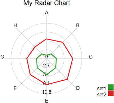
Figure 8-5. A radar chart with two series
Improving Your Radar Chart
If you followed along in the previous example, you should not have any problem adding more columns and rows to the radar chart. Open the last input data file, called data_11.csv, and add two more columns and rows. Save the file as data_12.csv, as shown in Listing 8-14.
Listing 8-14. data_12.csv
section,set1,set2,set3,set4,
A,1,6,2,10,
B,2,7,2,14,
C,3,8,1,10,
D,4,9,4,1,
E,5,8,7,2,
F,4,7,11,1,
G,3,6,14,2,
H,2,5,2,1,
I,3,4,5,2,
L,1,5,1,2,
You now have to replace the call to the data11.csv file with the data12.csv file in the d3.csv() function, as shown in Listing 8-15.
Listing 8-15. Ch8_02.html
d3.csv("data_12.csv", function(error, data) {
...});
Figure 8-6 shows the result.
Figure 8-6. A radar chart with four series
Wow, it works! Ready to add yet another feature? So far, you’ve traced a line that runs through the various spokes to return circularly to the starting point; the trend now describes a specific area. You’ll often be more interested in the areas of a radar chart that are delimited by the different lines than in the lines themselves. If you want to make this small conversion to your radar chart in order to show the areas, you need to add just one more path, as shown in Listing 8-16. This path is virtually identical to the one already present, only instead of drawing the line representing the series, this new path colors the area enclosed inside. In this example, you’ll use the colors of the corresponding lines, but adding a bit of transparency, so as not to cover the underlying series.
Listing 8-16. Ch8_02.html
d3.csv("data_12.csv", function(error, data) {
    ...
    var sets = svg.selectAll(".series")
        .data(series)
        .enter().append("g")
        .attr("class", "series");

    sets.append('svg:path')
        .data(lines)
        .attr("class", "line")
        .attr("d", d3.svg.line.radial()
        .radius(function (d) {
            return radius(d);
        })
        .angle(function (d, i) {
            if (i == data.length) {
                i =0;
            }
            return (i / data.length) * 2 * Math.PI;
        }))
        .data(series)
        .style("stroke-width", 3)
        .style("opacity", 0.4)
        .style("fill", function(d,i){
            return color(i);
        })
        .style("stroke", function(d,i){
            return color(i);
        });

    sets.append('svg:path')
        .data(lines)
        .attr("class", "line")
        .attr("d", d3.svg.line.radial()
        ...
});
As you can see in Figure 8-7, you now have a radar chart with semi-transparent areas.
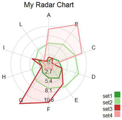
Figure 8-7. A radar chart with color filled areas
Summary
This chapter explained how to implement radar charts. This type of chart is not so common but it is especially useful to highlight the potential of the D3 library. It shows an example that helps you to understand how you can develop other charts that differ from the most commonly encountered types.
The next chapter concludes the book by considering two different cases. These cases are intended to propose, in a simplified way, the classic situations that developers have to face when they deal with real data. In the first example, you’ll see how, using D3, it is possible to represent data that are generated or acquired in real time. You’ll create a chart that’s constantly being updated, always showing the current situation. In the second example, you’ll use the D3 library to read the data contained in a database.