![]()
Adding Controls to Charts
Sometimes, it can be useful to change settings directly from the browser at runtime and then replot the chart with these new settings. A typical way of doing this is to add active controls. These controls make the chart interactive, allowing the user to make choices in real time, such as deciding how the chart should be represented. By inserting controls, you give the user the ability to control the values of the chart’s attributes.
In this chapter, you will look at introducing controls within your web page. You will also consider the factors that lead to the choice of one type of control over another. A series of examples featuring three of the most commonly used controls, will take you deeper into this topic.
Adding Controls
One way to group controls is according to their functionality. Some controls (e.g., buttons, menus) work as switches (command controls) with which the user can trigger a particular event or launch a command. Other controls (e.g., check boxes, radio buttons, combo boxes, sliders) are bound to a specific value or property. With this type of control, the user makes a choice or enters values through a text field (text area). Still other controls (e.g., scrollbars) have a navigation function and are especially suitable in situations in which it is necessary to move an object, such as a selected item in a list or a large image enclosed in a frame or in the web page.
Here, you will be investigating those controls that are linked to values and that let the user interact with a chart by making choices. These controls should, in some way, graphically represent the values that a particular property can assume (the same values that you would usually assign to some variables within your JavaScript code, limited to those that you want to make available to the user). Your choice of control will depend on the property to set and the values that it can assume:
- To enable the user to make a single selection from a set of values (e.g., one of three possible colors), the choice of mutually exclusive radio buttons as controls is optimal (see Figure 10-1a).
- To let the user select which series should be visible in a chart, you will need to use check boxes (see Figure 10-1b).
- To allow the user to choose within a range of values for a particular attribute (e.g., changing the color of an object through adjustment of the red-green-blue (RGB) values that define the color), a slider is generally the best choice (see Figure 10-1c) (in this case, you would use three sliders as controls, corresponding to the colors red, green, and blue).
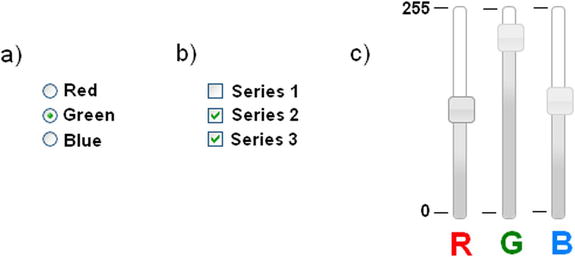
Figure 10-1. Three of the most commonly used controls: (a) radio buttons, (b) check boxes, (c) sliders
The list of possible controls does not end there. But, an understanding of the mechanisms that underlie these controls enables a chart developer to handle the vast majority of cases, including those that are the most complex.
In the following examples, you will discover how to apply these three controls to your chart.
Using Radio Buttons
To illustrate the use of controls, let us first look at radio buttons. Radio buttons are a set of small buttons grouped in list form (see Figure 10-1a). They are generally represented as small, empty circles, with text to the side. As previously stated, this type of control is linked to a certain value or property. The particularity of radio buttons is that their values are mutually exclusive; therefore, the user can choose only one of them.
By way of illustration, let us take a simple multiseries line chart, in which, instead of displaying all the series, you want to allow the user to decide which series will be shown. To make a selection, the user will click one of the radio buttons, filling the circle with a dot. The series corresponding to that control will then be drawn on the chart.
Adding Radio Button Controls
First, you need to write the HTML page importing all the necessary libraries (see Listing 10-1).
Listing 10-1. ch10_01.html
<HTML>
<HEAD>
<TITLE>Series selections with controls</TITLE>
<meta charset="utf-8">
<script src="http://code.jquery.com/jquery-1.9.1.min.js"></script>
<script src="http://d3js.org/d3.v3.min.js"></script>
<script src="./multiseries.js"></script>
<link rel="stylesheet" href="./multiseries.css"/>
<script>
$(document).ready(function(){

   //add your code here

});
</script>
</HEAD>
<BODY>
<div id="myChart"></div>
   <!-- add the table with the controls here -->
</BODY>
</HTML>
Or, if you prefer to use the content delivery network (CDN) service, you use the following code:
<script src="../src/js/jquery-1.9.1.js"></script>
<script src="../src/d3.v3.js"></script>
You start with a line chart in which you will be representing three sets of values. The chart that you’re going to take as a point of reference is a multiseries line chart that you implemented in Chapter 3 (see Listing 3-51).
For convenience, here is the chart again (see Figure 10-2) and the code (see Listing 10-2) that generates it, on which you will work.
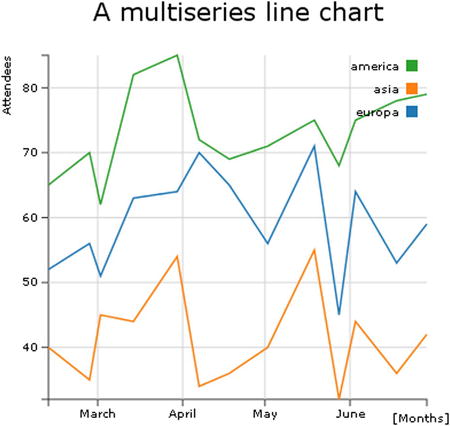
Figure 10-2. The multiseries line chart with a legend implemented in Chapter 3
Listing 10-2. Ch3_08a.html
<!DOCTYPE html>
<html>
<head>
<meta charset="utf-8">
<script src="http://d3js.org/d3.v3.min.js"></script>
<style>
body {
  font: 10px verdana;
}
.axis path,
.axis line {
  fill: none;
  stroke: #333;
}

.grid .tick {
    stroke: lightgrey;
    opacity: 0.7;
}
.grid path {
    stroke-width: 0;
}

.line {
  fill: none;
  stroke: steelblue;
  stroke-width: 1.5px;
}
</style>
</head>
<body>
<script type="text/javascript">
var margin = {top: 70, right: 20, bottom: 30, left: 50},
    w = 400 - margin.left - margin.right,
    h = 400 - margin.top - margin.bottom;
var parseDate = d3.time.format("%d-%b-%y").parse;
var x = d3.time.scale().range([0, w]);
var y = d3.scale.linear().range([h, 0]);

var color = d3.scale.category10();

var xAxis = d3.svg.axis()
    .scale(x)
    .orient("bottom")
    .ticks(5);

var yAxis = d3.svg.axis()
    .scale(y)
    .orient("left")
    .ticks(5);

var xGrid = d3.svg.axis()
    .scale(x)
    .orient("bottom")
    .ticks(5)
    .tickSize(-h, 0, 0)
    .tickFormat("")

var yGrid = d3.svg.axis()
    .scale(y)
    .orient("left")
    .ticks(5)
    .tickSize(-w, 0, 0)
    .tickFormat("")

var svg = d3.select("body").append("svg")
    .attr("width", w + margin.left + margin.right)
    .attr("height", h + margin.top + margin.bottom)
    .append("g")
    .attr("transform", "translate(" + margin.left + ", " + margin.top + ")");

var line = d3.svg.line()
    .x(function(d) { return x(d.date); })
    .y(function(d) { return y(d.attendee); });

d3.tsv("data_02.tsv", function(error, data) {

  data.forEach(function(d) {
    d.date = parseDate(d.date);
  });

  color.domain(d3.keys(data[0]).filter(function(key) {
    return key !== "date";
  }));

  var continents = color.domain().map(function(name) {
    return {
      name: name,
      values: data.map(function(d) {
          return {date: d.date, attendee: +d[name]};
      })
    };
  });

  x.domain(d3.extent(data, function(d) { return d.date; }));
  y.domain([
    d3.min(continents, function(c) {
       return d3.min(c.values, function(v) { return v.attendee; });
    }),
    d3.max(continents, function(c) {
       return d3.max(c.values, function(v) { return v.attendee; });
    })
  ]);

  svg.append("g")
      .attr("class", "x axis")
      .attr("transform", "translate(0, " + h + ")")
      .call(xAxis);

  svg.append("g")
      .attr("class", "y axis")
      .call(yAxis)

  svg.append("g")
      .attr("class", "grid")
      .attr("transform", "translate(0, " + h + ")")
      .call(xGrid)

  svg.append("g")
      .attr("class", "grid")
      .call(yGrid);

  var continent = svg.selectAll(".continent")
      .data(continents)
      .enter().append("g")
      .attr("class", "continent");

   continent.append("path")
      .attr("class", "line")
      .attr("d", function(d) { return line(d.values); })
      .style("stroke", function(d) { return color(d.name); });

var legend = svg.selectAll(".legend")
      .data(color.domain().slice().reverse())
      .enter().append("g")
      .attr("class", "legend")
      .attr("transform", function(d, i) { return "translate(0, " + i * 20 + ")"; });

  legend.append("rect")
      .attr("x", w - 18)
      .attr("y", 4)
      .attr("width", 10)
      .attr("height", 10)
      .style("fill", color);

  legend.append("text")
      .attr("x", w - 24)
      .attr("y", 9)
      .attr("dy", ".35em")
      .style("text-anchor", "end")
      .text(function(d) { return d; });
});

var labels = svg.append("g")
       .attr("class", "labels")

  labels.append("text")
      .attr("transform", "translate(0, " + h + ")")
      .attr("x", (w-margin.right))
      .attr("dx", "-1.0em")
      .attr("dy", "2.0em")
      .text("[Months]");
  labels.append("text")
      .attr("transform", "rotate(-90)")
      .attr("y", -40)
      .attr("dy", ".71em")
      .style("text-anchor", "end")
      .text("Attendees");

  var title = svg.append("g")
         .attr("class", "title")

  title.append("text")
      .attr("x", (w / 2))
      .attr("y", -30 )
      .attr("text-anchor", "middle")
      .style("font-size", "22px")
      .text("A multiseries line chart");
</script>
</body>
</html>
This chart does nothing more than display the data stored in an external TSV file (see Listing 10-3).
Listing 10-3. data2.tsv
date         europe  asia    america
12-Feb-12    52      40      65
27-Feb-12    56      35      70
02-Mar-12    51      45      62
14-Mar-12    63      44      82
30-Mar-12    64      54      85
07-Apr-12    70      34      72
18-Apr-12    65      36      69
02-May-12    56      40      71
19-May-12    71      55      75
28-May-12    45      32      68
03-Jun-12    64      44      75
18-Jun-12    53      36      78
29-Jun-12    59      42      79
But, instead of displaying all three series with lines of different colors, as seen previously, you provide the user the opportunity to display only one series at a time. Once the chart is loaded in the browser, the user will be able to select any one of the three series and switch between them, without having to load a new page.
Given that the examples are becoming increasingly complex, a good practice is to modularize the code as much as possible. Enclose all code relating exclusively to the display of the chart in an external js file. Let’s call this file multiseries.js. This JS file will then be included in the HTML page.
<script src="./multiseries.js"></script>
You begin by enclosing all the code of the Listing 10-2 inside a function, called draw_multiseries()(see Listing 10-4). The parts of the code that have been added to the original example, are shown in bold.
Listing 10-4. Multiseries.js
function draw_multiseries(s,w,h,series){

var margin = {top: 70, right: 20, bottom: 30, left: 50},
    w = w - margin.left - margin.right,
    h = h - margin.top - margin.bottom;
var parseDate = d3.time.format("%d-%b-%y").parse;
var x = d3.time.scale().range([0, w]);
var y = d3.scale.linear().range([h, 0]);

var color = d3.scale.category10();

var xAxis = d3.svg.axis()
    .scale(x)
    .orient("bottom")
    .ticks(5);

var yAxis = d3.svg.axis()
    .scale(y)
    .orient("left")
    .ticks(5);

var xGrid = d3.svg.axis()
    .scale(x)
    .orient("bottom")
    .ticks(5)
    .tickSize(-h, 0, 0)
    .tickFormat("");

var yGrid = d3.svg.axis()
    .scale(y)
    .orient("left")
    .ticks(5)
    .tickSize(-w, 0, 0)
    .tickFormat("");

var svg = d3.select(s).append("svg")
    .attr("width", w + margin.left + margin.right)
    .attr("height", h + margin.top + margin.bottom)
    .append("g")
    .attr("transform", "translate(" + margin.left + ", " + margin.top + ")");

var line = d3.svg.line()
    .x(function(d) { return x(d.date); })
    .y(function(d) { return y(d.attendee); });

d3.tsv("data_02.tsv", function(error, data) {

    data.forEach(function(d) {
       d.date = parseDate(d.date);
    });

    color.domain(d3.keys(data[0]).filter(function(key) {
       return key !== "date";
    }));

    var continents = color.domain().map(function(name) {
       return {
          name: name,
          values: data.map(function(d) {
             return {date: d.date, attendee: +d[name]};
          })
       };
    });

    x.domain(d3.extent(data, function(d) { return d.date; }));
    y.domain([
       d3.min(continents, function(c) {
          return d3.min(c.values, function(v) { return v.attendee; });
       }),
       d3.max(continents, function(c) {
          return d3.max(c.values, function(v) { return v.attendee; });
       })
    ]);

    if( typeof series === 'number'){
       if (series < 3) {
         continents = [continents[series]];
      }
    }
    else if(typeof series === 'object'){
       var tmp = [];
       if(series[2])
          tmp.push(continents[2]);
       if(series[1])
          tmp.push(continents[1]);
       if(series[0])
          tmp.push(continents[0]);
       continents = tmp;
    }

    svg.append("g")
       .attr("class", "x axis")
       .attr("transform", "translate(0, " + h + ")")
       .call(xAxis);

    svg.append("g")
       .attr("class", "y axis")
       .call(yAxis);

    svg.append("g")
       .attr("class", "grid")
       .attr("transform", "translate(0, " + h + ")")
       .call(xGrid);

    svg.append("g")
      .attr("class", "grid")
      .call(yGrid);

    var continent = svg.selectAll(".continent")
       .data(continents)
       .enter().append("g")
       .attr("class", "continent");

    continent.append("path")
       .attr("class", "line")
       .attr("d", function(d) { return line(d.values); })
       .style("stroke", function(d) { return color(d.name); });

var legend = svg.selectAll(".legend")
       .data(color.domain().slice().reverse())
       .enter().append("g")
       .attr("class", "legend")
       .attr("transform", function(d, i) { return "translate(0, " + i * 20 + ")"; });

    Legend.append("rect")
       .attr("x", w - 18)
       .attr("y", 4)
       .attr("width", 10)
       .attr("height", 10)
       .style("fill", color);

    legend.append("text")
       .attr("x", w - 24)
       .attr("y", 9)
       .attr("dy", ".35em")
       .style("text-anchor", "end")
       .text(function(d) { return d; });
});

var labels = svg.append("g")
       .attr("class", "labels");

    labels.append("text")
       .attr("transform", "translate(0, " + h + ")")
       .attr("x", (w-margin.right))
       .attr("dx", "-1.0em")
       .attr("dy", "2.0em")
       .text("[Months]");
    labels.append("text")
       .attr("transform", "rotate(-90)")
       .attr("y", -40)
       .attr("dy", ".71em")
       .style("text-anchor", "end")
       .text("Attendees");

var title = svg.append("g")
       .attr("class", "title");

    title.append("text")
       .attr("x", (w / 2))
       .attr("y", -30 )
       .attr("text-anchor", "middle")
      .style("font-size", "22px")
      .text("A multiseries line chart");
} //end of the function
The function you just defined, accepts four parameters. The first parameter, tag, indicates from which tag in the HTML page the chart will begin to be drawn. The second and third parameters, w and h (width and height) are the dimensions of the canvas on which you’re going to draw the chart. The last parameter, series, is a value that you will use to communicate to the function which series will be shown on the chart.
Having specified the code by supplying a function with parameters, you can draw the chart externally adjusting its properties each time without having to hack the code. For example, a simple property could be to decide whether or not to display a series in a multiseries chart.
The user will be selecting an option from a set of possible choices; the radio buttons is the best choice of control for this purpose. Therefore, let us assign one series to each radio button. As you can see in Listing 10-5, all the controls (buttons) are contained in an inner list within a table. Each button is specified by an <input> element in which the four series are also specified as values.
Listing 10-5. ch10_01.html
<table>
<tr>
  <td>
    <div>
       <ul>
           <li><input name="dataSeries" value="0" type="radio" checked />Europe</li>
           <li><input name="dataSeries" value="1" type="radio" />Asia</li>
           <li><input name="dataSeries" value="2" type="radio" />America</li>
           <li><input name="dataSeries" value="3" type="radio" />All</li>
      </ul>
    </div>
  </td>
</tr>
</table>
However, setting the controls definition in an HTML page is not enough; you must also create functions that relate the radio buttons to the D3 chart. Depending on which radio button is in the checked state, a different set from the data set will be loaded in the chart.
In selecting a different radio button, the user changes the checked attribute from 'false' to 'true'. The status change of a radio button involves the activation of the change() function, which detects this event. This function assigns a value to the series variable, indicating which series will be displayed in the chart (a value of 3 indicates that all series should be displayed) and finally forces the replot of the chart. The new data are thus represented in the chart, without having to reload the page (see Listing 10-6).
Listing 10-6. ch10_01.html
$(document).ready(function(){
    var series = 3;
    d3.select("#myChart").selectAll("svg").remove();
    draw_multiseries("#myChart",400,400,series);

    $("input[type=radio][name=dataSeries]").attr("checked", false);
    $("input[type=radio][name=dataSeries][value=3]").attr("checked", true);

    $("input[type=radio][name=dataSeries]").change(function(){
       series = parseInt($(this).val());
       d3.select("#myChart").selectAll("svg").remove();
       draw_multiseries("#myChart",400,400,series);
    });
});
To customize the elements within the table of controls, you can add a little bit of Cascading Style Sheets (CSS) style, as demonstrated in Listing 10-7.
Listing 10-7. ch10_01.html
<HTML>
<HEAD>
    <TITLE>Series selections with controls</TITLE>
<meta charset="utf-8">
<script src="http://code.jquery.com/jquery-1.9.1.min.js"></script>
<script src="http://d3js.org/d3.v3.min.js"></script>
<script src="./multiseries.js"></script>
<link rel="stylesheet" href="./multiseries.css"/>
<style>
li {
    font-family: "Verdana";
    font-size: 16px;
    font-weight: bold;
    text-shadow: 1px 2px 2px #555555;
    margin: 3px;
    list-style: none;
}
</style>
 <script>
$(document).ready(function(){
...
If you load this web page in the browser, you obtain the chart in Figure 10-3.
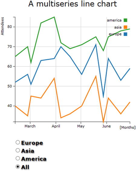
Figure 10-3. With radio buttons it is possible to select only one series of data
Now, the user can choose which series will be shown in the chart. Having selected the radio button as a control, the chart will display only one set of data at a time.
Using Sliders
In the previous example the user first set the series to display by checking one of the radio buttons. This time, selecting one of the series, you will keep unchanged all the other series, but you can modify the color of the selected series. In order to do this, you will insert a set of three sliders. In this scenario, the user selects a series in a predefined color, then he or she can modify this color by adjusting the three RGB values that compose it. Now, you have a selection, followed by a fine adjustment.
When you are required to change the value of an attribute by scrolling through contiguous values in a given range, sliders are the kind of control needed. In this case, three sliders are necessary, one for each color (red, green, blue), so that the user can adjust the RGB values to obtain the desired color.
Using the previous example (see Listings 10-3 and 10-4), first you choose the jQuery Interface library (jQuery UI) to obtain the sliders.
This library provides a whole range of tools, such as widgets, themes, effects, and interactions that enrich web pages, turning them into highly interactive web applications. For our purposes, widgets are of particular interest. These small graphic applications can prove a valuable tool that, when added to your web pages, makes your charts even more interactive. Widgets facilitate interaction with the program beneath the web page and very often are real mini-applications. In their simplest forms, widgets appear as tables, accordions, combo boxes, or even buttons.
Thus, before adding the sliders to the web page, you must import all the necessary files that are part of this library:
<script src="http://code.jquery.com/jquery-1.9.1.min.js"></script>
<link rel="stylesheet" href="http://code.jquery.com/ui/1.10.3/themes/smoothness/jquery-ui.css"/>
<script src="http://code.jquery.com/ui/1.10.3/jquery-ui.min.js"></script>
<script src="../src/js/jquery-1.9.1.js"></script>
<link rel="stylesheet" href="../src/css/smoothness/jquery-ui-1.10.3.custom.min.css"/>
<script src="../src/js/jquery-ui-1.10.3.custom.min.js"></script>
![]() Note If you are working in the workspace made available with the source code that accompanies this book (see Appendix A), you may access the libraries already contained in the workspace by using the following references:
Note If you are working in the workspace made available with the source code that accompanies this book (see Appendix A), you may access the libraries already contained in the workspace by using the following references:
Once you have imported all the files, you can start inserting the three sliders in the HTML table. As you can see in Listing 10-8, you eliminate the second column, containing the radio buttons, replacing it with a set of <div> elements (if you are starting directly from here, you can copy the entire listing instead of just the text in bold). The jQuery UI will convert them into sliders (see Chapter 2).
Listing 10-8. ch10_02.html
<table>
<tr>
  <td>
    <div>
       <ul>
          <li><input name="dataSeries" value="0" type="radio" checked />Europe</li>
          <li><input name="dataSeries" value="1" type="radio" />Asia</li>
          <li><input name="dataSeries" value="2" type="radio" />America</li>
      </ul>
    </div>
  </td>
  <td>
    <div id="red">
      <div id="slider-text">
        <div id="0">0</div>
        <div id="1">255</div>
      </div>
    </div>
    <div id="green">
      <div id="slider-text">
         <div id="0">0</div>
         <div id="1">255</div>
      </div>
    </div>
    <div id="blue">
      <div id="slider-text">
         <div id="0">0</div>
         <div id="1">255</div>
      </div>
    </div>
  </td>
</tr>
</table>
Furthermore, you have also added two numerical values to each slider with the slider-text id. These values are nothing more than labels that are used to display the minimum and maximum for the range of values (0–255) covered by the three sliders. This methodology can be very useful when you have to represent a scale for each slide in the web page.
Let us now add all the CSS style directives to make sure these new controls can be displayed correctly in the context of the existing page (see Listing 10-9).
Listing 10-9. ch10_02.html
<style>
...
#red, #green, #blue {
    float: left;
    margin: 15px;
    left: 50px;
}
#red .ui-slider-range {
    background: #ef2929;
}
#red .ui-slider-handle {
    border-color: #ef2929;
}
#green .ui-slider-range {
    background: #8ae234;
}
#green .ui-slider-handle {
    border-color: #8ae234;
}
#blue .ui-slider-range {
    background: #729fcf;
}
#blue .ui-slider-handle {
    border-color: #729fcf;
}
#slider-text div {
    font-family: "Verdana";
    font-size: 10px;
    position: relative;
    left: 17px;
}
</style>
With regard to the section of code in JavaScript, you keep only the part that manages the radio buttons for the selection of the desired series, integrating it with a new section of code that handles the RGB values, adjusted through the three sliders, as shown in Listing 10-10. The three RGB values are then converted to hexadecimal numbers through an appropriate function and combined to form the HTML color code, expressed by a pound sign (#), followed by six hexadecimal characters ('rrggbb'), where each pair represents a value from 0 to 255, translated into hexadecimal format.
Listing 10-10. ch10_02.html
$(document).ready(function(){

var colors = ["#ffc87c", "#ffeba8", "#f3b080"];
var series = 0;
d3.select("#myChart").selectAll("svg").remove();
draw_multiseries("#myChart",400,400,series,colors);

$("input[type=radio][name=dataSeries]").attr("checked", false);
$("input[type=radio][name=dataSeries][value=0]").attr("checked", true);

$("input[type=radio][name=dataSeries]").change(function(){
    series = parseInt($(this).val());
    d3.select("#myChart").selectAll("svg").remove();
    draw_multiseries("#myChart",400,400,series,colors);
});

function hexFromRGB(r, g, b) {
    var hex = [
       r.toString( 16 ),
       g.toString( 16 ),
       b.toString( 16 )
    ];
    $.each( hex, function( nr, val ) {
       if ( val.length === 1 ) {
           hex[ nr ] = "0" + val;
       }
    });
    return hex.join( "" ).toUpperCase();
};

$( "#red, #green, #blue" ).slider({
    orientation: "vertical",
    range: "min",
    max: 255,
    change: refreshPlot
});

$( "#red" ).slider( "value", 75 );
$( "#green" ).slider( "value", 178 );
$( "#blue" ).slider( "value", 197 );

function refreshPlot() {
    var r = $( "#red" ).slider( "value" );
    var g = $( "#green" ).slider( "value" );
    var b = $( "#blue" ).slider( "value" );
    var col = hexFromRGB(r, g, b);
    d3.select("#myChart").selectAll("svg").remove();
    colors[series] = "#"+col;
    draw_multiseries("#myChart",400,400,series,colors);
}
    $("[id=0]").css('top','90px'),
    $("[id=1]").css('top','-20px'),
});
For this specific example, you need an additional argument to be passed to the draw_multiseries() function, that is, the current color indicated by the three RGB sliders. In this regard, I prefer to pass as a fifth argument the entire colors array composed of three colors related to the three series. In this way you update the values of the three colors outside the function every time you go to change the position of one of the sliders and let the draw_multiseries() function have only the task of displaying the chart.
So you have to make some changes in the draw_multiseries() function in multiseries.js (see Listing 10-11), then save it as multiseries2.js. Do not forget to include this new file in place of the previous one in the HTML page.
<script src="./multiseries2.js"></script>
Listing 10-11. Multiseries2.js
function draw_multiseries(s,w,h,series,colors){

    ...
    //var color = d3.scale.category10();
    ...
    if( typeof series === 'number'){
       if (series < 3) {
         //continents = [continents[series]];
      }
    }
    ...
};
In Figure 10-4 the user can decide which series to display and change it by modifying the RBG values through three sliders.
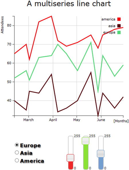
Figure 10-4. A chart with three slider widgets added to adjust the RGB levels
Using Check Boxes
In the previous examples, the user could choose only one among the number of series that could be displayed. However, typically the user will want to be able to decide which series should be displayed and which should not, choosing, for instance, to display two or more sets at the same time. This entails dealing with multiple choices within the same group. To enable the user to make this kind of choice, you have to opt for check boxes.
Generally, check boxes are grouped in a list, represented by empty boxes (see Figure 10-1). Unlike radio buttons, these controls are not mutually exclusive, but rather multiple choice. Thus, you can select all, some, or none of the values that they represent (whereas with radio buttons an item has to be selected).
Similar to radio buttons, there is a check box for each series, and if a check box is checked, the corresponding series is shown in the chart. Yet, unlike radio buttons, check boxes are independent of each other: their state (checked or unchecked) does not affect the status of the others.
Often, when you have a list of check boxes, it can be very useful to add two buttons with the “CheckAll/UncheckAll” functionality, thereby allowing the choice of selecting/deselecting all the check boxes with one click.
Let’s delete the table containing the previous controls (radio buttons, sliders) and substitute it with a new one containing check boxes, as shown in Listing 10-12 (if you are starting directly from here, you can copy the entire listing without considering the previous controls). Moreover, in addition to the four controls for as many series, you can add a button at the end to manage the feature “CheckAll/UncheckAll”.
Listing 10-12. ch10_03.html
<table>
<tr>
   <td>
      <div>
        <ul>
          <li><input name="0" type="checkbox" checked />Europe</li>
          <li><input name="1" type="checkbox" checked />Asia</li>
          <li><input name="2" type="checkbox" checked />America</li>
          <li><input type="button" name="checkall" value="Uncheck All"></li>
        </ul>
      </div>
    </td>
</tr>
</table>
As with radio buttons, you have to add jQuery methods to bind the events that have occurred with these controls. First, you define the status of each check box. Normally, they should all be checked. Then, you define five jQuery methods, enabling or disabling the series to be represented, and then force the replot.
From the code, you must delete all the rows that handled the previous controls and in their place, write the methods in Listing 10-13.
Listing 10-13. ch10_03.html
$(document).ready(function(){

var series = [true,true,true];
d3.select("#myChart").selectAll("svg").remove();
draw_multiseries("#myChart",400,400,series);

$("input[type=checkbox][name=0]").change(function(){
    if(this.checked){
       series[0] = true;
    }else{
       series[0] = false;
    }
    d3.select("#myChart").selectAll("svg").remove();
    draw_multiseries("#myChart",400,400,series);
});

$("input[type=checkbox][name=1]").change(function(){
    if(this.checked){
       series[1] = true;
    }else{
       series[1] = false;
    }
    d3.select("#myChart").selectAll("svg").remove();
    draw_multiseries("#myChart",400,400,series);
});

$("input[type=checkbox][name=2]").change(function(){
    if(this.checked){
        series[2] = true;
    }else{
        series[2] = false;
    }
    d3.select("#myChart").selectAll("svg").remove();
    draw_multiseries("#myChart",400,400,series);
});

$("input[type=button][name=checkall]").click(function(){
    if(this.value == "Check All"){
        series = [true,true,true];
        $("input[type=checkbox][name=0]").prop("checked", true);
        $("input[type=checkbox][name=1]").prop("checked", true);
        $("input[type=checkbox][name=2]").prop("checked", true);
        d3.select("#myChart").selectAll("svg").remove();
        draw_multiseries("#myChart",400,400,series);
        this.value = "Uncheck All";
    }else{
        series = [false,false,false];
        $("input[type=checkbox][name=0]").prop("checked", false);
        $("input[type=checkbox][name=1]").prop("checked", false);
        $("input[type=checkbox][name=2]").prop("checked", false);
        d3.select("#myChart").selectAll("svg").remove();
        draw_multiseries("#myChart",400,400,series);
        this.value = "Check All";
    }
});

});
In this example we do not need to pass a property, perhaps the color of the previous example. Then you can go back to using the original function draw_multiseries (the one with four parameters).
<script src="./multiseries.js"></script>
As shown in Figure 10-5, the user can now select the series he or she wants to see displayed in the chart.
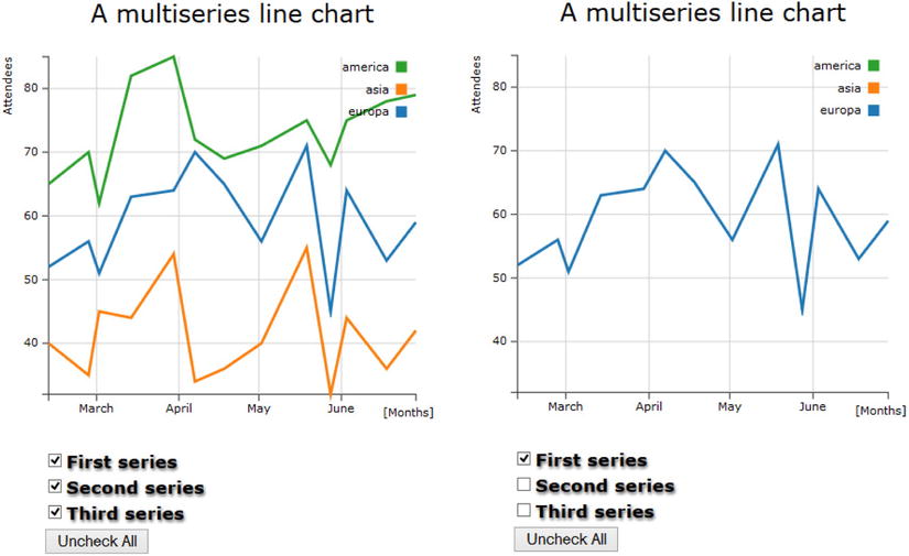
Figure 10-5. A custom legend with check boxes and a button
If you click the button labeled “Uncheck all”, all the check boxes will be unchecked, and the corresponding series will be hidden in the plot. Subsequently, the button will show the label “Check All.” When clicking it this time, all the check boxes will be checked, and the corresponding series will be shown in the chart.
Summary
In this chapter, you have seen how to use various controls, such as radio buttons, sliders, and check boxes, to increase the interactivity of a chart. With the introduction of controls, we, as programmers, are no longer the only ones to have direct control of the values of the properties of the chart; through such controls the user is also able to make the appropriate choices.
In addition, you learned how to integrate jQuery UI widgets with the D3 library, using these widgets as controls.
In the next chapter, you will complete this integration by using jQuery UI widgets as containers for your charts. This combination greatly expands the possibilities for development and representation of charts using the D3 library.