Embedding D3 Charts in jQuery Widgets
In this chapter, you’ll exploit the capability to represent the charts within some specific containers, often referred to as widgets, such as tabbed panels and accordions, provided by some libraries, including jQuery UI. This enables you to exploit the great potential of the jQuery UI widgets to further improve the way in which your charts are represented.
The advantages of combining jQuery UI and D3 libraries are various: you can display more charts occupying the same space in the web page, and at the same time keep the context of the page clean and tidy. Another advantage is that jQuery UI widgets can be resized, and even users can resize a D3 chart.
In this chapter, you’ll explore three simple cases where the benefits just mentioned will be made evident.
jQuery UI: Widgets
Along with the D3 library, there is another library that can help you integrate your web page with interactive and graphic objects: the jQuery UI. This library provides an entire range of tools, such as widgets, themes, effects, and interactions, which enrich web pages, turning them into highly interactive web applications. For our purposes, widgets are of particular interest. These small graphic applications can prove a valuable tool that, when added to your web pages, make your charts even more interactive. Widgets facilitate interaction of the program beneath the web page and very often are real mini-applications. In their simplest forms, widgets appear as tables, accordions, combo boxes, or even buttons.
As with the D3 library, you will need to include the plug-in file in the web page if you want to integrate its widgets. In the examples that we will see in this chapter, we will use the jQuery UI version 1.10.3. You must also include the CSS file representing the theme. This can be done through the Google Hosted Libraries service:
<link rel="stylesheet" href="http://ajax.googleapis.com/ajax/libs/jqueryui/1.10.3/themes/smoothness/jquery-ui.css"/>
<script src="http://ajax.googleapis.com/ajax/libs/jquery/1.9.1/jquery.min.js">
</script>
<script src="http://ajax.googleapis.com/ajax/libs/jqueryui/1.10.3/jquery-ui.min.js">
</script>
You can also download from the official CDN jQuery site:
<link rel="stylesheet" href="http://code.jquery.com/ui/1.10.3/themes/smoothness/jquery-ui.css"/>
<script src="http://code.jquery.com/jquery-1.9.1.min.js"></script>
<script src="http://code.jquery.com/ui/1.10.3/jquery-ui.min.js"></script>
If you prefer to download the libraries locally or to use the workspace in the source code accompanying this book (see Appendix A), you can refer to the libraries as follows:
<link rel="stylesheet" href="../src/css/smoothness/jquery-ui-1.10.3.custom.min.css"/>
<script src="../src/js/jquery-1.9.1.js"></script>
<script src="../src/js/jquery-ui-1.10.3.custom.min.js"></script>
 Note The theme for the jQuery UI widgets used in this book is smoothness. The list of available themes is vast and covers many combinations of colors and shapes. This well-stocked list is available on ThemeRoller (http://jqueryui.com/themeroller). ThemeRoller is a page on the official jQuery web site that allows you to preview widgets and to then download your favorite theme from those available.
On visiting the official jQuery UI web site (http://jqueryui.com/), you will notice that the widgets provided by this library are numerous. Here, I will discuss only the most common examples, especially those that are most likely to be integrated into a page containing charts.
As you will see throughout this book, some of these widgets will be used as containers, exploiting their particular capabilities, such as resizing and encapsulation, including these:
- Accordions
- Tabs
Other widgets will be used to replace the simple controls that HTML offers, as the former are much more advanced and rich in functionality, including the following:
- Buttons
- Combo boxes
- Menus
- Sliders
Still other widgets will also perform the function of indicators. With these, you will see how to integrate a particular widget class:
- Progress bars
Accordion
An accordion widget is a set of collapsible panels that enable the web page to show a large amount of information in a compact space panels (for more information, please refer to http://jqueryui.com/accordion/).
The jQuery UI accordion allows you to organize related content into distinct sections, called panels, with any one panel visible at a time. Each panel can hold a thematic area or, as you will see in later chapters, different types of charts. The content is revealed by clicking the tab for each panel, allowing the user to move from one panel to another without changing the page. The panels of the accordion expand and contract, according to the choice of the user, such that only one panel shows its content at any given time.
The HTML structure you need to write to obtain an accordion widget in the page is composed of an outer <div> tag containing all the panels. Each panel in turn is specified by a heading placed between two <h3> tags and a <div></div> pair, with the content inbetween. Listing 11-1 represents a simple accordion with four panels.
Listing 11-1. Ch11_01a.html
<div id="accordion">
    <h3>First header</h3>
    <div>First content panel</div>
    <h3>Second header</h3>
    <div>Second content panel</div>
    <h3>Third header</h3>
    <div>Third content panel</div>
    <h3>Fourth header</h3>
    <div>Fourth content panel</div>
</div>
In JavaScript code, you need to add the snippet in Listing 11-2 to obtain an accordion widget.
Listing 11-2. Ch11_01a.html
$(function() {
    $( "#accordion" ).accordion();
});
Figure 11-1 illustrates our accordion.
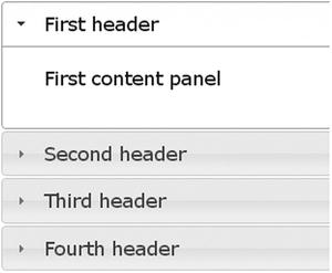
Figure 11-1. An accordion consists of collapsible panels suitable for containing information in a limited amount of space
But, that is not enough. It would be better if you could control the style of the accordion. This can be accomplished by adding the code given in Listing 11-3.
Listing 11-3. Ch11_01a.html
<style type="text/css">
    .ui-accordion {
        width: 690px;
        margin: 2em auto;
    }
    .ui-accordion-header {
        font-size: 15px;
        font-weight: bold;
    }
    .ui-accordion-content {
        font-size: 12px;
    }
</style>
The result is shown in Figure 11-2.
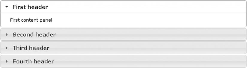
Figure 11-2. By modifying the CSS style properties, you can change the accordion’s appearance as you like
Tab
A widget that is very similar to the accordion in its functionality is the panel with tabs. Here, each panel is unique, but there are several tabs at the top, identified by different headings. Nonetheless, this widget affords the possibility to show a large amount of information in a limited space, and the user can choose to view the content of only one tab at a time. More significant is the loss of the vertical expansion of panels (for more information, please refer to http://jqueryui.com/tabs/).
The HTML structure you need to write to obtain a tab widget in the web page is slightly more complex than the previous one. The headings are given in an unordered list <ul>, in which each item <li> must be referenced to an anchor tag <a>. The contents of every tab are enclosed in a <div></div> pair, with an id attribute corresponding to the references in the anchor tags (see Listing 11-4).
Listing 11-4. Ch11_01b.html
<div id="tabs">
  <ul>
    <li><a href="#tabs-1">First header</a></li>
    <li><a href="#tabs-2">Second header</a></li>
    <li><a href="#tabs-3">Third header</a></li>
    <li><a href="#tabs-4">Fourth header</a></li>
  </ul>
  <div id="tabs-1">
    <p>First tab panel</p>
  </div>
  <div id="tabs-2">
    <p>Second tab panel</p>
  </div>
   <div id="tabs-3">
    <p>Third tab panel</p>
  </div>
  <div id="tabs-4">
    <p>Fourth tab panel</p>
  </div>
</div>
In JavaScript code, you need to specify the tab widget, as shown in Listing 11-5.
Listing 11-5. Ch11_01b.html
$(function() {
    $( "#tabs" ).tabs();
});
The CSS style classes must also be defined, as shown in Listing 11-6.
Listing 11-6. Ch11_01b.html
<style type="text/css">
    .ui-tabs {
      width: 690px;
      margin: 2em auto;
    }
    .ui-tabs-header {
      font-size: 15px;
      font-weight: bold;
    }
    .ui-tabs-panel {
      font-size: 12px;
    }
</style>
When the procedure is complete, you will get the widgets illustrated in Figure 11-3.
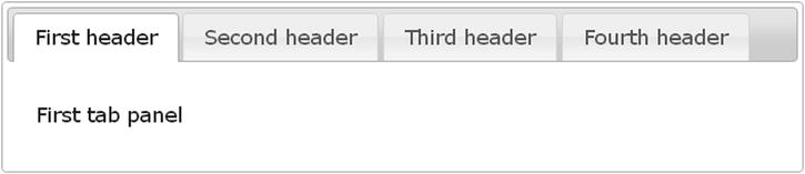
Figure 11-3. The tab widget consists of multiple panels that occupy the same area
D3 Charts on Tabs
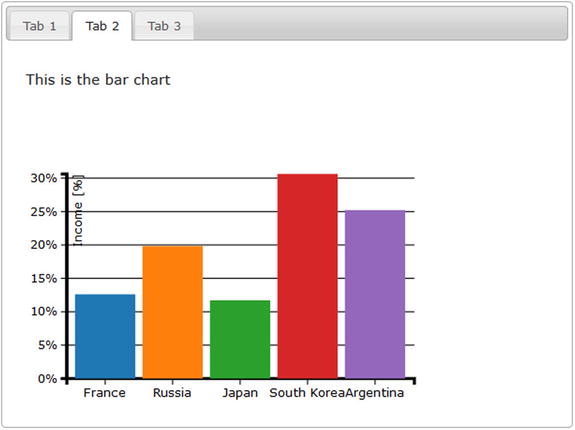
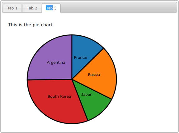
The first widget you’re going to use as a container is the tab. Inserting charts inside tabs allows you to display different charts on the same page within a limited area. In this example, you’ll place three different D3 charts within three tabs, called Tab 1, Tab 2, and Tab 3. In the first tab you’ll place a multiseries line chart, in the second tab you’ll place a bar chart, and in the last tab a pie chart. You won’t be analyzing these charts in detail, because they are exactly the same kind of charts used in previous chapters. Each type of chart will be enclosed in its corresponding JS file and expressed as a function (see Listings 11-7 through 11-9).
Listing 11-7. linechart.js
function draw_linechart(s,w,h){
margin_x = 32;
margin_y = 20;

var data = [{x:0,y:100},{x:10,y:110},{x:20,y:140},
                   {x:30,y:130},{x:40,y:80},{x:50,y:75},
                   {x:60,y:120},{x:70,y:130},{x:80,y:100}];

var ax = [];
var ay = [];
data.forEach(function(d,i){
    ax[i] = d.x;
    ay[i] = d.y;
})
var xMax = d3.max(ax);
var yMax = d3.max(ay);
var xLowLim = 0;
var xUpLim = d3.max(ax);
var yUpLim = 1.2 * d3.max(ay);
var yLowLim = 0.8 * d3.min(ay);

var line = d3.svg.line()
    .x(function(d) { return x(d.x); })
    .y(function(d) { return -y(d.y); })

y = d3.scale.linear().domain([yLowLim, yUpLim]).range([0 + margin_y, h - margin_y]);
x = d3.scale.linear().domain([xLowLim, xUpLim]).range([0 + margin_x, w - margin_x]);

var svg = d3.select(s)
    .append("svg:svg")
    .attr("width", w)
    .attr("height", h)

var g = svg.append("svg:g")
    .attr("transform", "translate(0, " + h + ")");

// draw the xLabels
g.selectAll(".xLabel")
    .data(x.ticks(5))
    .enter().append("svg:text")
    .attr("class", "xLabel")
    .text(String)
    .attr("x", function(d) { return x(d) })
    .attr("y", 0)
    .attr("text-anchor", "middle");

// draw the yLabels
g.selectAll(".yLabel")
    .data(y.ticks(5))
    .enter().append("svg:text")
    .attr("class", "yLabel")
    .text(String)
    .attr("x", 25)
    .attr("y", function(d) { return -y(d) })
    .attr("text-anchor", "end");

// draw the x ticks
g.selectAll(".xTicks")
    .data(x.ticks(5))
    .enter().append("svg:line")
    .attr("class", "xTicks")
    .attr("x1", function(d) { return x(d); })
    .attr("y1", -y(yLowLim))
    .attr("x2", function(d) { return x(d); })
    .attr("y2", -y(yLowLim)-5)

// draw the y ticks
g.selectAll(".yTicks")
    .data(y.ticks(5))
    .enter().append("svg:line")
    .attr("class", "yTicks")
    .attr("y1", function(d) { return -y(d); })
    .attr("x1", x(xLowLim))
    .attr("y2", function(d) { return -y(d); })
    .attr("x2", x(xLowLim)+5)

// draw the x grid
g.selectAll(".xGrids")
    .data(x.ticks(5))
    .enter().append("svg:line")
    .attr("class", "xGrids")
    .attr("x1", function(d) { return x(d); })
    .attr("y1", -y(yLowLim))
    .attr("x2", function(d) { return x(d); })
    .attr("y2", -y(yUpLim))

// draw the y grid
g.selectAll(".yGrids")
    .data(y.ticks(5))
    .enter().append("svg:line")
    .attr("class", "yGrids")
    .attr("y1", function(d) { return -y(d); })
    .attr("x1", x(xUpLim)+20)
    .attr("y2", function(d) { return -y(d); })
    .attr("x2", x(xLowLim))

// draw the x axis
g.append("svg:line")
    .attr("x1", x(xLowLim))
    .attr("y1", -y(yLowLim))
    .attr("x2", 1.2*x(xUpLim))
    .attr("y2", -y(yLowLim))

// draw the y axis
g.append("svg:line")
    .attr("x1", x(xLowLim))
    .attr("y1", -y(yLowLim))
    .attr("x2", x(xLowLim))
    .attr("y2", -1.2*y(yUpLim))

g.append("svg:path")
      .attr("class", "axisArrow")
      .attr("d", function() {
        var x1 = x(xUpLim)+23, x2 = x(xUpLim)+30;
        var y2 = -y(yLowLim), y1 = y2-3, y3 = y2+3
        return 'M'+x1+','+y1+','+x2+','+y2+','+x1+','+y3;
});

g.append("svg:path")
      .attr("class", "axisArrow")
      .attr("d", function() {
        var y1 = -y(yUpLim)-13, y2 = -y(yUpLim)-20;
        var x2 = x(xLowLim), x1 = x2-3, x3 = x2+3
        return 'M'+x1+','+y1+','+x2+','+y2+','+x3+','+y1;
});

// draw the line of data points
g.append("svg:path").attr("d", line(data));

};
function draw_barchart(s,w,h){

var margin = {top: 70, right: 20, bottom: 30, left: 40},
    w = w - margin.left - margin.right,
    h = h - margin.top - margin.bottom;

var color = d3.scale.category10();

var x = d3.scale.ordinal()
    .rangeRoundBands([0, w], .1);
var y = d3.scale.linear()
    .range([h, 0]);

var formatPercent = d3.format(".0%");

var xAxis = d3.svg.axis()
    .scale(x)
    .orient("bottom");

var yAxis = d3.svg.axis()
    .scale(y)
    .orient("left")
    //.tickFormat(formatPercent);
    .tickFormat(d3.format(".0%"));

var yGrid = d3.svg.axis()
    .scale(y)
    .orient("left")
    .ticks(5)
    .tickSize(-w, 0, 0)
    .tickFormat("")

var svg = d3.select(s).append("svg")
    .attr("width", w + margin.left + margin.right)
    .attr("height", h + margin.top + margin.bottom)
    .append("g")
    .attr("transform", "translate(" + margin.left + "," + margin.top + ")");

d3.csv("data_04.csv", function(error, data) {

  var sum = 0;
  data.forEach(function(d) {
    d.income = +d.income;
    sum += d.income;
  });

  x.domain(data.map(function(d) { return d.country; }));
  y.domain([0, d3.max(data, function(d) { return d.income/sum; })]);

  svg.append("g")
      .attr("class", "x axis")
      .attr("transform", "translate(0," + h + ")")
      .call(xAxis);

  svg.append("g")
      .attr("class", "y axis")
      .call(yAxis)

  svg.append("g")
      .attr("class", "grid")
      .call(yGrid);

var labels = svg.append("g")
       .attr("class", "labels")

  labels.append("text")
      .attr("transform", "rotate(-90)")
      .attr("y", 6)
      .attr("dy", ".71em")
      .style("text-anchor", "end")
      .text("Income [%]");

  svg.selectAll(".bar")
      .data(data)
      .enter().append("rect")
      .attr("class", "bar")
      .attr("x", function(d) { return x(d.country); })
      .attr("width", x.rangeBand())
      .attr("y", function(d) { return y(d.income/sum); })
      .attr("height", function(d) { return h - y(d.income/sum); })
      .attr("fill", function(d) { return color(d.country); });

});

};
Listing 11-9. piechart.js
function draw_piechart(s,w,h){

var margin = {top: 10, right: 10, bottom: 10, left: 10},
    w = w - margin.left - margin.right,
    h = h - margin.top - margin.bottom;

var color = d3.scale.category10();

var radius = Math.min(w, h) / 2;

var arc = d3.svg.arc()
    .outerRadius(radius)
    .innerRadius(0);

var pie = d3.layout.pie()
    .sort(null)
    .value(function(d) { return d.income; });

var svg = d3.select(s).append("svg")
    .attr("width", w + margin.left + margin.right)
    .attr("height", h + margin.top + margin.bottom)
    .append("g")
    .attr("transform", "translate(" +(w/2+margin.left)+
                   "," +(h/2+margin.top)+ ")");

d3.csv("data_04.csv", function(error, data) {

  data.forEach(function(d) {
    d.income = +d.income;
  });

var g = svg.selectAll(".arc")
      .data(pie(data))
      .enter().append("g")
      .attr("class", "arc");

  g.append("path")
      .attr("d", arc)
      .style("fill", function(d) { return color(d.data.country); });

  g.append("text")
      .attr("transform", function(d) {
              return "translate(" + arc.centroid(d) + ")"; })
      .style("text-anchor", "middle")
      .text(function(d) { return d.data.country; });

});

};
With the introduction of so many graphic elements on the web page, the use of Cascading Style Sheets (CSS) styles becomes increasingly important. You need to define some settings in order to modify the tabs’ appearance so that they will fit to your needs. Add the style settings in Listing 11-10.
Listing 11-10. Ch11-02.html
<style>
.ui-tabs {
    width: 690px;
    margin: 2em auto;
}
.ui-tabs-nav {
    font-size: 12px;
}
.ui-tabs-panel {
    font-size: 14px;
}
.jqplot-target {
    font-size: 18px;
}
ol.description {
    list-style-position: inside;
    font-size: 15px;
    margin: 1.5em auto;
    padding: 0 15px;
    width: 600px;
}
</style>
As you did previously for the JavaScript code, do the same for the CSS. Define separately Cascading Style Sheets (CSS) styles of the multiseries line chart by enclosing them in an external file called linechart.css (see Listing 11-11).
Listing 11-11. Linechart.css
path {
    stroke: black;
    stroke-width: 3;
    fill: none;
}
line {
    stroke: black;
}
.xGrids {
    stroke: lightgray;
}
.yGrids {
    stroke: lightgray;
}
text {
    font-family: Verdana;
    font-size: 9pt;
}
.axisArrow {
    stroke: black;
    stroke-width: 1;
    fill: black;
}
Now it is time to add the jQueryUI tabs() function at the end of the $(document).ready() function, as shown in Listing 11-12.
Listing 11-12. ch11_02.html
$(document).ready(function(){

  $("#tabs").tabs();

    draw_linechart("#tabs-1",400,300);
    draw_barchart("#tabs-2",400,300);
    draw_piechart("#tabs-3",400,300);

});
Selecting a tab will replot the content of the chart within it. Now, in the <body> part of the web page, you need to add the <div> elements that the jQuery UI library will convert into tabs. The way to do that is to specify a <div> element with tabs as id. Inside it, you define a list of three items, each representing a tab. After the list, you must define another three subdivisions of tabs: three additional <div> elements called tabs-1, tabs-2, and tabs-3. You are going to put these into your charts: chart1, chart2, and chart3 (see Listing 11-13).
Listing 11-13. ch11_02.html
<div id="tabs">
    <ul>
      <li><a href="#tabs-1">Tab 1</a></li>
      <li><a href="#tabs-2">Tab 2</a></li>
      <li><a href="#tabs-3">Tab 3</a></li>
    </ul>
    <div id="tabs-1">
      <p>This is the line chart</p>
    </div>
    <div id="tabs-2">
      <p>This is the bar chart</p>
    </div>
    <div id="tabs-3">
      <p>This is the pie chart</p>
    </div>
</div>
Figure 11-4 shows the final result.

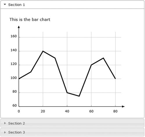
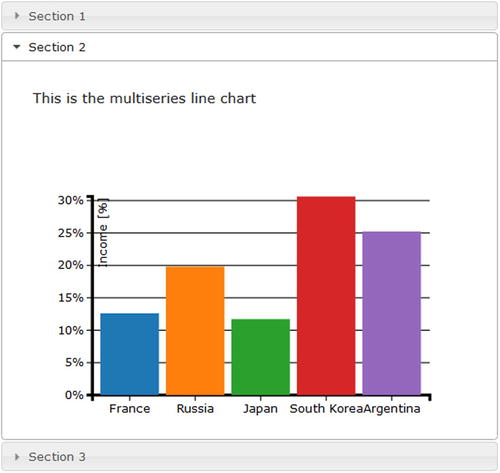
D3 Charts on Accordions
Another commonly used type of jQuery UI container is the accordion. This time you’ll put the previous three charts into accordions. The list of plug-ins to include with the web page remains the same as in the previous example. You need to make some changes in the CSS styles; there are specific CSS classes for accordions, and their attributes need to be specified. They are shown in Listing 11-14.
Listing 11-14. ch11_03.html
<style type="text/css">
.ui-accordion {
    width: 690px;
    margin: 2em auto;
}
.ui-accordion-header {
    font-size: 12px;
}
.ui-accordion-content {
    font-size: 14px;
}
.jqplot-target {
    font-size: 18px;
}
ol.description {
    list-style-position: inside;
    font-size: 15px;
    margin: 1.5em auto;
    padding: 0 15px;
    width: 600px;
}
.section {
      width: 400px;
      height: 200px;
      margin-top: 20px;
      margin-left: 20px;
}
</style>
As you did in the previous example, you must create the jQueryUi widget. You can do this by calling the accordion() function as shown in Listing 11-15:
Listing 11-15. ch11_03.html
$(document).ready(function(){

    $("#accordion").accordion();
    draw_linechart("#chart1",400,300);
    draw_barchart("#chart2",400,300);
    draw_piechart("#chart3",400,300);

});
As you can see, the way in which you define the accordions is very similar to the way you define the tabs. In the same way, you now define the <div> elements that will be converted into accordion tabs in the HTML code (see Listing 11-16).
Listing 11-16. ch11_03.html
<div id="accordion" style="margin-top:50px">
<h3><a href="#">Section 1</a></h3>
<div>
<p>This is the bar chart</p>
<div id="chart1"></div>
</div>
<h3><a href="#">Section 2</a></h3>
<div>
<p>This is the multiseries line chart</p>
<div class="section" id="chart2"></div>
</div>
<h3><a href="#">Section 3</a></h3>
<div>
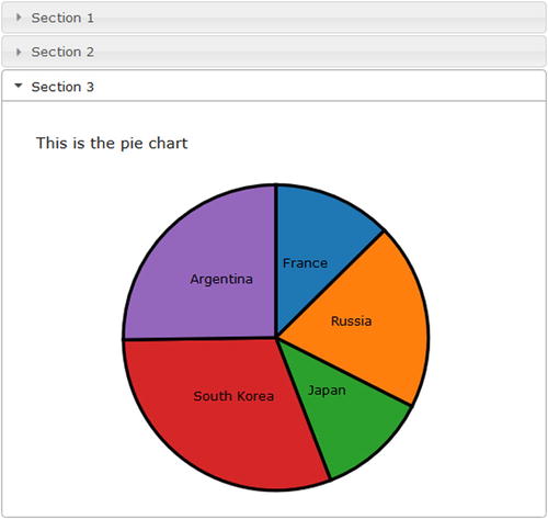
<p>This is the pie chart</p>
<div class="section" id="chart3"></div>
</div>
</div>
As you can see in Figure 11-5, the result is similar to the previous one, but this time the different charts are replaced by sliding the accordion tab vertically.
By default, you have to click the accordion headers to activate the associated panel. But you can change this behavior, setting the event that will activate the section contained in each single panel. For example, you can set the mouseover as the activating event. To do this, you need to pass the event as an argument to the accordion() function.
$("#accordion").accordion({ event: "mouseover" });
If you change the code, you will see each section expanding whenever you mouseover the corresponding accordion header.
Resizable and Draggable Charts
Two other features that you can widely exploit in your charts enable users to resize and drag the container area. A resizable frame within a web page allows you to arbitrarily change its size and the size of the objects it contains. This feature could be combined with the ability to drag elements within the page, which would enable them to occupy different positions relative to the original.
In addition to giving fluidity to the layout of the page, this feature can sometimes be useful when you want the user to interactively manage spaces occupied by different frames on the page (see Figure 11-6).
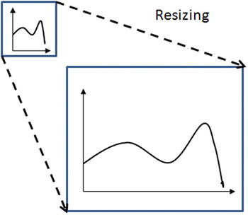
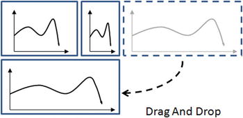
Figure 11-6. Enclosing the charts in jQueryUI containers enables you to resize and move them around the page
In this section, you’ll see two examples. In the first example, you will focus on the resizing applied to a line chart. You’ll see how easy it is to resize a chart contained within a container. In the second example, you’ll further develop the example by adding two more line charts. Once the draggable property is enabled for all three charts, you will see how you can change their positions to your liking, or even exchange them.
A Resizable Line Chart
In this example you’ll use a simple line chart. Thus, you’ll need to include only the CSS and the draw_linechart() function contained in the file linechart.js (see Listings 11-7 and 11-11).
<link rel="stylesheet" href="./linechart.css" />
<script src="./linechart.js"></script>
Instead, add the CSS style relating to the jQuery UI container directly to your HTML page (see Listing 11-17).
Listing 11-17. ch11_04.html
<style type="text/css">
.chart-container {
    border: 1px solid darkblue;
    padding: 30px 0px 30px 30px;
    width: 900px;
    height: 400px;
}
#chart1 {
    width: 96%;
    height: 96%;
}
</style>
To the <body> part of the web page, you now add the <div> element, which will be the container enclosing the line chart(see Listing 11-18).
Listing 11-18. ch11_04.html
<div id="resizable" class="chart-container">
      <div id="chart1"></div>
</div>
Now, after you have defined the chart-container as container, you can handle it with two jQuery methods—the resizable() function adds the resizable functionality and the bind() function binds the event of resizing to the replotting of the chart (see Listing 11-19).
Listing 11-19. ch11_04.html
$(document).ready(function(){

  $('div.chart-container').resizable({delay:20});
  $('div.chart-container').bind('resize', function(event, ui) {
      d3.select("#chart1").selectAll("svg").remove();
      draw_linechart("#chart1", ui.size.width, ui.size.height);
  });
  draw_linechart("#chart1",400,300);
});
The result is a resizable chart, shown in Figure 11-7, with a small grey triangle in the bottom-right corner. By clicking on it, the user can resize the container and consequently the D3 chart.
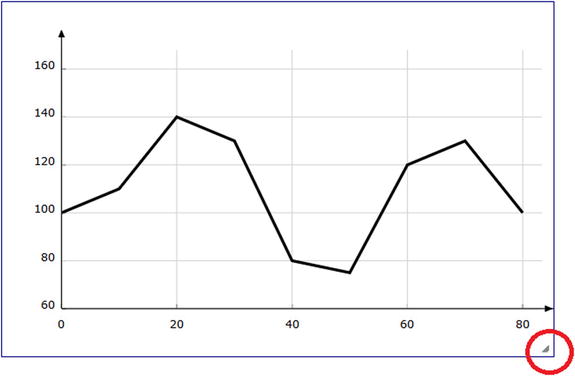
Figure 11-7. A resizable line chart
Three Draggable Line Charts
Starting from the previous example, you will add two more line charts by placing them in two independent containers. The goal here—in addition to making all three containers resizable—is to make the containers draggable. The final result is a web page with three line charts, the position of which can be changed by dragging them, even exchanging their positions.
Start by making some small additions to the previous example. In Listing 11-20, you add the other two containers (chart-container2 and chart-container3) with the new line charts inside, naming them chart2 and chart3, respectively.
Listing 11-20. ch11_04b.html
<BODY>
<div class="chart-container">
    <div id="chart1"></div>
</div>
<div class="chart-container2">
    <div id="chart2"></div>
</div>
<div class="chart-container3">
    <div id="chart3"></div>
</div>
</BODY>
Now that you have created three different containers, each of them may hold one of the three chart seen in the previous examples. Now you’ll activate the draggable feature for the three containers. Doing this is really quite simple; you need to add the function to the three jQuery selections applied to each container, as shown in Listing 11-21. Moreover, you’ll add the resizing feature for the two new containers the same way as was done for the first container.
Listing 11-21. ch11_04b.html
$(document).ready(function(){

    $('div.chart-container').draggable({
       cursor: 'move'
    });
    $('div.chart-container2').draggable({
       cursor: 'move'
    });
    $('div.chart-container3').draggable({
       cursor: 'move'
    });

    $('div.chart-container').resizable({delay:20});
    $('div.chart-container').bind('resize', function(event, ui) {
       d3.select("#chart1").selectAll("svg").remove();
       draw_linechart("#chart1", ui.size.width, ui.size.height);
    });

    $('div.chart-container2').resizable({delay:20});
    $('div.chart-container2').bind('resize', function(event, ui) {
      d3.select("#chart2").selectAll("svg").remove();
      draw_piechart("#chart2", ui.size.width, ui.size.height);
    });
    $('div.chart-container3').resizable({delay:20});
    $('div.chart-container3').bind('resize', function(event, ui) {
       d3.select("#chart3").selectAll("svg").remove();
       draw_barchart("#chart3", ui.size.width, ui.size.height);
    });

    draw_linechart("#chart1",300,200);
    draw_piechart("#chart2",200,200);
    draw_barchart("#chart3",500,200);

});
Nothing remains but to add CSS styles, thus defining the initial position and size of each container, as shown in Listing 11-22.
Listing 11-22. ch11_04b.html
<style type="text/css">
.chart-container {
    border: 1px solid darkblue;
    padding: 30px 0px 30px 30px;
    width: 300px;
    height: 200px;
    position: relative;
    float: left;
}
.chart-container2 {
    border: 1px solid darkblue;
    padding: 30px 0px 30px 30px;
    width: 200px;
    height: 200px;
    position: relative;
    float: left;
    margin-left: 20px;
}
.chart-container3 {
    border: 1px solid darkblue;
    padding: 30px 0px 30px 30px;
    width: 500px;
    height: 200px;
    position: relative;
    float: left;
    margin-left: 20px;
}
#chart1 {
    width: 96%;
    height: 96%;
}
#chart2 {
    width: 96%;
    height: 96%;
}
#chart3 {
    width: 96%;
    height: 96%;
}
</style>
In Figure 11-8, you can see the page layout when the page is initially loaded. Figure 11-9 shows a situation in which the user has changed the position and the size of the third chart to align it below the other two.
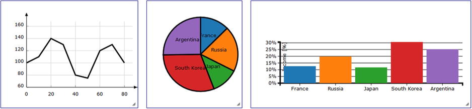
Figure 11-8. The web page shows the three line charts enclosed in three different containers
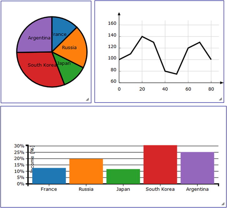
Figure 11-9. By dragging and resizing the containers, the original layout can be changed
Summary
In this chapter you have seen how to exploit the potential of widgets that the jQuery UI library makes available to you, widgets that help you improve the way your charts are represented. You have seen how to enclose more charts inside containers, such as accordions and tabs, so that you can view them one by one, even when they occupy the same area. You have also seen how to resize these containers, extending such capability to the charts developed with the jqPlot library.
In the next chapter and final chapter, you will see how you can handle structured data using the JSON format. You will see how it is “natural” working with highly structured data to get data visualizations that may be really challenging using other JavaScript libraries and other programming languages.