Chapter 4 Window Basics
In this chapter, we’ll first look at the main elements of a window before describing the window classes that are most commonly used in applications. These elements will almost certainly be familiar from other programming you’ve done or from applications you’ve used. Despite the differences between systems, the available controls are surprisingly similar in functionality, with wxWidgets handling nearly all of the differences. Remaining differences are usually handled using optional platform-specific window styles.
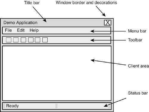
Naturally, you know what a window is, but for a full understanding of how to use the wxWidgets API, it’s good to have a grasp of the window model that wxWidgets uses. This differs in small respects from the window model used on each individual platform. Figure 4-1 shows the basic elements of a window.
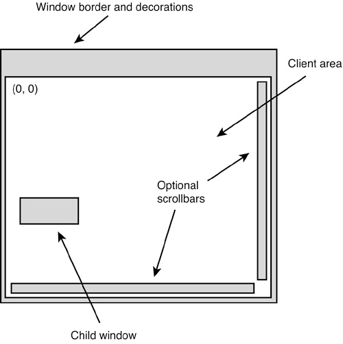
A window is any rectangular area with a common set of properties: it can be resized, it can paint itself, it can be shown and hidden, and so on. It may contain other windows (such as a frame with menu bar, toolbar, and status bar), or no child windows (such as a static text control). Normally, a window that you see on the screen in a wxWidgets application has a corresponding object of the wxWindow class or derived class, but this is not always the case: for example, the drop-down list in a native wxComboBox is not usually modeled with a separate wxWindow.
When we refer to the size of a window, we normally include the outer dimensions, including decorations such as the border and title bar. When we refer to the size of the client area of a window, we mean the area inside the window that can be drawn upon or into which child windows may be placed. A frame’s client area excludes any space taken by the menu bar, status bar, and toolbar.
Most windows are capable of showing scrollbars, managed by the window rather than added explicitly by the application. The client area is then reduced by the space used by the scrollbars. For optimization, only windows that have the wxHSCROLL and wxVSCROLL style are guaranteed to own their own scrollbars. More information on scrolling can be found later in this chapter when we discuss wxScrolledWindow.
A window can have a wxCaret (for displaying the current text position) and a wxCursor (for displaying the current mouse position). When the mouse enters a window, wxWidgets automatically displays the cursor that has been set for the window. When a window receives the focus, the caret (if any) will be shown at its current position, or at the mouse position if the focus was a result of a mouse button click.
Windows are broadly divided into top-level windows (wxFrame, wxDialog, wxPopup) and other windows. Only top-level windows may be created with a NULL parent, and only top-level windows have delayed destruction (they are not deleted until idle time, when all other events have been processed). Except for pop-up windows, top-level windows can have decorations such as title bars and close buttons and can normally be dragged around the screen and resized, if the application allows it.
The coordinate system always has (0, 0) at the top-left corner, and window dimensions are in pixels. The origin and scale can be changed for a device context that is used to paint on the window. For more on device contexts, see Chapter 5, “Drawing and Printing.”
When a window needs to be painted, it receives two events, wxEVT_ERASE_BACKGROUND to paint the background, and wxEVT_PAINT to paint the foreground. Ready-to-use classes such as wxButton paint themselves, but to create your own special window class, you will need to handle these events. You can optimize painting by getting the update region (the part that needs refreshing) from the window.
Every window has background and foreground color settings that can be used to determine the background color and (less commonly) foreground color. The default background erase handler uses the window’s background color, or if none has been set, the appropriate color or texture for the current color scheme or theme. A window also has a font setting, which may or may not be used depending on the kind of window.
On Mac OS X, a window has the concept of window variant, whereby it can be shown in a selection of sizes: wxWINDOW_VARIANT_NORMAL (the default), wxWINDOW_VARIANT_SMALL, wxWINDOW_VARIANT_MINI, or wxWINDOW_VARIANT_LARGE. Changing to a smaller variant is useful when you have a lot of information to convey and limited space, but it should be used in moderation. Some applications use the small variant throughout.
When a window is resized, either by the application or by the user, it receives a wxEVT_SIZE event. If the window has children, they will need to be positioned and sized appropriately, and the recommended way is to use sizers, as discussed in Chapter 7, “Window Layout Using Sizers.” Most stock windows have a notion of a default size and position if you pass them wxDefaultSize or wxDefaultPosition (or -1 as an individual size or position value). To this end, each control implements DoGetBestSize, which returns a reasonable default size based on the control content, current font, and other factors.
Any window can receive input from the mouse at any time, unless another window has temporarily captured the mouse or the window is disabled. Only the window with the current focus can receive keyboard input. An application can set the window focus itself; wxWidgets also sets the focus to a window when the user clicks on it. The wxEVT_SET_FOCUS event is sent to a window that is receiving the focus; wxEVT_KILL_FOCUS is sent when the focus is moving to a different window. See Chapter 6, “Handling Input,” for more details on handling input.
All windows are (unless otherwise specified) recipients of idle events (wxEVT_IDLE), which are sent when all other events have been processed, specified with the EVT_IDLE(func) macro. For more information, see “Idle Time Processing” in Chapter 17, “Writing Multithreaded Applications.”
A special kind of idle time processing is user interface updating, in which all windows can specify a function that updates the window’s state. This function is called periodically in idle time. In the descriptions of events that follow, EVT_UPDATE_UI(id, func) is usually omitted for brevity. User interface updating is covered in Chapter 9, “Creating Custom Dialogs.”
In general, windows are created on the heap with new, but see Chapter 15, “Memory Management, Debugging, and Error Checking,” for details and exceptions. Most window classes allow creation either in one or two steps. wxButton has typical constructor signatures:
wxButton();
wxButton(wxWindow* parent,
wxWindowID id,
const wxString& label = wxEmptyString,
const wxPoint& pos = wxDefaultPosition,
const wxSize& size = wxDefaultSize,
long style = 0,
const wxValidator& validator = wxDefaultValidator,
const wxString& name = wxT("button"));
The following example of one-step construction takes advantage of all the constructor’s default values:
wxButton* button = new wxButton(parent, wxID_OK);
Unless the window is a frame or dialog, you must pass a non-NULL parent window to the constructor. This will automatically add the child window to the parent, and when the parent is destroyed, the children will also be destroyed. As we’ve seen previously, you pass a standard or user-defined identifier to the window for the purposes of uniquely identifying it. You can also pass wxID_ANY, and wxWidgets will generate a suitable identifier (a negative value, to differentiate it from user-defined or standard identifiers). You can pass a position and size to the window, a validator, if appropriate (see Chapter 9), a style (see the following), and a string name. You can pass an arbitrary string to the name parameter, or ignore it; it is rarely used now but was introduced to allow window customization under Xt and Motif, which require controls to be identified by name.
With two-step construction, you use the default constructor and then call Create, which has the same signature as the full constructor. For example, to create a button in two steps:
wxButton* button = new wxButton;
button->Create(parent, wxID_OK);
Only when you call Create is the underlying window created, and a wxEVT_CREATE event sent to the window in case it needs to do further processing at this point.
Why would you want to use two-step construction? One reason is that you may want to delay full creation of the window until it’s really required. Another is to set some properties of the window before Create is called, especially if those properties are used within the Create call. For example, you may want to set the wxWS_EX_VALIDATE_RECURSIVELY extra style (which must be set with SetExtraStyle). In the case of a dialog, this style is used from within its Create function when initial validation takes place, so if you need it, it’s important to set it before the dialog is created.
When you create a wxWindow, or any non-top-level derived window class, it is always in a visible state—so if the parent is visible at the time of creation, the window will also be visible. You can then use Show(false) to hide it if required. This is different from wxDialog and wxFrame, which are initially created in a hidden state to enable the application to lay out the controls without initial flicker, before showing with Show or (for modal dialogs) ShowModal.
Windows are deleted by calling Destroy (for top-level windows) or delete (for child windows), and the wxEVT_DESTROY event is sent just before the actual window is destroyed. In fact, child windows are deleted automatically, so it is rare to delete them explicitly.
A window has a style and an extra style. Window styles are a concise way to specify alternative behavior and appearances for windows when they are created. The symbols are defined in such as way that they can be combined in a “bit-list” using the C++ bitwise-or operator. For example:
wxCAPTION ¦ wxMINIMIZE_BOX ¦ wxMAXIMIZE_BOX ¦ wxTHICK_FRAME
The wxWindow class has a basic set of styles, such as border styles, and each derived class may add further styles. The “extra” style accommodates values that cannot fit into the style value.
The rest of this chapter provides you with enough detailed information about the most commonly used window classes for you to apply them to your own applications. However, if you are reading this book for the first time, you may want to skip ahead to Chapter 5 and browse the window descriptions later.
Here’s a summary of the classes we cover, to help you navigate this chapter. For other window classes, see Chapter 12, “Advanced Window Classes,” and Appendix E, “Third-Party Tools for wxWidgets.”
These base classes implement functionality for derived concrete classes.
wxWindow. The base class for all windows.
wxControl. The base class for controls, such as wxButton.
wxControlWithItems. The base class for multi-item controls.
Top-level windows usually exist independently on the desktop.
wxFrame. A resizable window containing other windows.
wxMDIParentFrame. A frame that manages other frames.
wxMDIChildFrame. A frame managed by a parent frame.
wxDialog. A resizable window for presenting choices.
wxPopupWindow. A transient window with minimal decoration.
Container windows manage child windows.
wxPanel. A window for laying out controls.
wxNotebook. A window for switching pages using tabs.
wxScrolledWindow. A window that scrolls children and graphics.
wxSplitterWindow. A window that manages two child windows.
These controls can be edited by the user.
wxButton. A push-button control with a text label.
wxBitmapButton. A push-button control with a bitmap label.
wxChoice. A drop-down list of choices.
wxComboBox. An editable field with a list of choices.
wxCheckBox. A control representing a check box, on or off.
wxListBox. A list of selectable string items.
wxRadioBox. A grid of radio buttons.
wxRadioButton. A control resembling a radio button, on or off.
wxScrollBar. A scrollbar control.
wxSpinButton. Arrows for incrementing/decrementing values.
wxSpinCtrl. A text field and spin button for editing integers.
wxSlider. A control for changing a value within a given range.
wxTextCtrl. A single- or multiple-line text entry field.
wxToggleButton. A button that can be toggled on and off.
These controls present information and cannot be edited by the user.
wxGauge. A control showing a quantity.
wxStaticText. A control that shows a text label.
wxStaticBitmap. A control that shows a bitmap label.
wxStaticLine. A control displaying a line.
wxStaticBox. A control displaying a box around other controls.
Menus are transient windows containing lists of commands.
wxMenu. A menu that can be used as a popup or in a menu bar.
It’s worth mentioning base classes that you may or may not be able use directly but that implement a lot of functionality for derived classes. Use the API reference for these (and other) base classes as well as the reference for the derived classes to get a full understanding of what’s available.
wxWindow is both an important base class and a concrete window class that you can instantiate. However, it’s more likely that you will derive classes from it (or use pre-existing derived classes) than use it on its own.
As we’ve seen, a wxWindow may be created either in one step, using a non-default constructor, or two steps, using the default constructor followed by Create. For one-step construction, you use this constructor:
wxWindow(wxWindow* parent,
wxWindowID id,
const wxPoint& pos = wxDefaultPosition,
const wxSize& size = wxDefaultSize,
long style = 0,
const wxString& name = wxT("panel"));
For example:
wxWindow* win = new wxWindow(parent, wxID_ANY,
wxPoint(100, 100), wxSize(200, 200));
Each window class may add to the basic styles defined for wxWindow, listed in Table 4-1. Not all native controls support all border styles, and if no border is specified, a default style appropriate to that class will be used. For example, on Windows, most wxControl-derived classes use wxSUNKEN_BORDER by default, which will be interpreted as the border style for the current theme. An application may suppress the default border by using a style such as wxNO_BORDER.
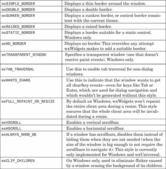
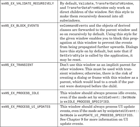
Table 4-2 lists extra styles that cannot be accommodated in the regular style and that are set using wxWindow::SetExtraStyle.
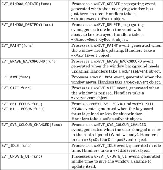
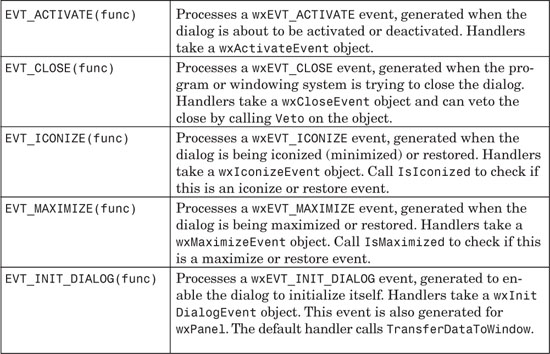
wxWindow and all its derived classes generate the events listed in Table 4-3. Events generated by mouse, keyboard, or joystick input are covered in Chapter 6.
Because wxWindow is the base class for all other window classes, it has the largest number of member functions. We can’t describe them all here in detail, so instead we present a summary of some of the most important functions. Browsing them should give you a good idea of the general capabilities of windows, and you can refer to the reference manual for details of parameters and usage.
CaptureMouse captures all mouse input, and ReleaseMouse releases the capture. This is useful in a drawing program, for example, so that moving to the edge of the canvas scrolls it rather than causing another window to be activated. Use the static function GetCapture to retrieve the window with the current capture (if it’s within the current application), and HasCapture to determine if this window is capturing input.
Centre (Center), CentreOnParent (CenterOnParent), and CentreOnScreen (CenterOnScreen) center the window relative to the screen or the parent window.
ClearBackground clears the window by filling it with the current background color.
ClientToScreen and ScreenToClient convert between coordinates relative to the top-left corner of this window, and coordinates relative to the top-left corner of the screen.
Close generates a wxCloseEvent whose handler usually tries to close the window. Although the default close event handler will destroy the window, calling Close may not actually close the window if a close event handler has been provided that doesn’t destroy the window.
ConvertDialogToPixels and ConvertPixelsToDialog convert between dialog and pixel units, which is useful when basing size or position on font size in order to give more portable results.
Destroy destroys the window safely. Use this function instead of the delete operator because different window classes can be destroyed differently. Frames and dialogs are not destroyed immediately when this function is called but are added to a list of windows to be deleted on idle time, when all pending events have been processed. This prevents problems with events being sent to non-existent windows.
Enable enables or disables the window and its children for input. Some controls display themselves in a different color when disabled. Disable can be used instead of passing false to Enable.
FindFocus is a static function that can be used to find the window that currently has the keyboard focus.
FindWindow can be used with an identifier or a name to find a window in this window’s hierarchy. It can return a descendant or the parent window itself. If you know the type of the window, you can use wxDynamicCast to safely cast to the correct type, returning either a pointer to that type or NULL:
Fit resizes the window to fit its children. This should be used with sizer-based layout. FitInside is similar, but it uses the virtual size (useful when the window has scrollbars and contains further windows).
Freeze and Thaw are hints to wxWidgets that display updates between these two function calls should be optimized. For example, you could use this when adding a lot of lines to a text control separately. Implemented for wxTextCtrl on GTK+, and all windows on Windows and Mac OS X.
GetAcceleratorTable and SetAcceleratorTable get and set the accelerator table for this window.
GetBackgroundColour and SetBackgroundColour are accessors for the window background color, used by the default wxEVT_ERASE_BACKGROUND event. After setting the color, you will need to call Refresh or ClearBackground to show the window with the new color. SetOwnBackgroundColour is the same as SetBackgroundColour but the color is not inherited by the window’s children.
GetBackgroundStyle and SetBackgroundStyle are accessors for the window background style. By default, the background style is wxBG_STYLE_SYSTEM, which tells wxWidgets to draw the window background with whatever style is appropriate, whether a texture drawn according to the current theme (for example, wxDialog), or a solid color (for example, wxListBox). If you set the style to wxBG_STYLE_COLOUR, wxWidgets will use a solid color for this window. If you set it to wxBG_STYLE_CUSTOM, wxWidgets will suppress the default background drawing, and the application can paint it from its erase or paint event handler. If you want to draw your own textured background, then setting the style to wxBG_STYLE_CUSTOM is recommended for flicker-free refreshes.
GetBestSize returns the minimal size for the window in pixels (as implemented for each window by DoGetBestSize). This is a hint to the sizer system not to resize the window so small that it cannot be viewed or used properly. For example, for a static control, it will be the minimum size such that the control label is not truncated. For windows containing subwindows (typically wxPanel), the size returned by this function will be the same as the size the window would have had after calling Fit.
GetCaret and SetCaret are accessors for the wxCaret object associated with the window.
GetClientSize and SetClientSize are accessors for the size of the client area in pixels. The client area is the region within any borders and window decorations, inside which you can draw or place child windows.
GetCursor and SetCursor are accessors for the cursor associated with the window.
GetDefaultItem returns a pointer to the child button that is the default for this window, or NULL. The default button is the one activated by pressing the Enter key. Use wxButton::SetDefault to set the default button.
GetDropTarget and SetDropTarget are accessors for the wxDropTarget object which handles dropped data objects for this window. Drag and drop is covered in Chapter 11, “Clipboard and Drag and Drop.”
GetEventHandler and SetEventHandler are accessors for the first event handler for the window. By default, the event handler is the window itself, but you can interpose a different event handler. You can also use PushEventHandler and PopEventHandler to set up a handler chain, with different handlers dealing with different events. wxWidgets will search along the chain for handlers that match incoming events (see Chapter 3, “Event Handling”).
GetExtraStyle and SetExtraStyle are accessors for the “extra” style bits. Extra styles normally start with wxWS_EX_.
GetFont and SetFont are accessors for the font associated with this window. SetOwnFont is the same as SetFont, except that the font is not inherited by the window’s children.
GetForegroundColour and SetForegroundColour are accessors for the window foreground color, whose meaning differs according to the type of window. SetOwnForegroundColour is the same as SetForegroundColour but the color is not inherited by the window’s children.
GetHelpText and SetHelpText are accessors for the context-sensitive help string associated with the window. The text is actually stored by the current wxHelpProvider implementation, and not in the window.
GetId and SetId are accessors for the window identifier.
GetLabel returns the label associated with the window. The interpretation of this value depends on the particular window class.
GetName and SetName are accessors for the window name, which does not have to be unique. The window name has no special significance to wxWidgets, except under Motif where it is the resource name for the window.
GetParent returns a pointer to the parent window.
GetPosition returns the position of the top-left corner of the window in pixels, relative to its parent.
GetRect returns a wxRect object (see Chapter 13, “Data Structure Classes”) representing the size and position of the window in pixels.
GetSize and SetSize retrieve and set the outer window dimensions in pixels.
GetSizer and SetSizer are accessors for the top-level sizer used for arranging child windows on this window.
GetTextExtent gets the dimensions of the string in pixels, as it would be drawn on the window with the currently selected font.
GetToolTip and SetToolTip are accessors for the window tooltip object.
GetUpdateRegion returns the portion of the window that currently needs refreshing (since the last paint event was handled).
GetValidator and SetValidator are accessors for the optional wxValidator object associated with the window, to handle transfer and validation of data. See Chapter 9 for more about validators.
GetVirtualSize returns the virtual size of the window in pixels, as determined by setting the scrollbar dimensions.
GetWindowStyle and SetWindowStyle are accessors for the window style.
InitDialog sends a wxEVT_INIT_DIALOG event to initiate transfer of data to the window.
IsEnabled indicates whether the window is enabled or disabled.
IsExposed indicates whether a point or a part of the rectangle is in the update region.
IsShown indicates whether the window is shown.
IsTopLevel indicates whether the window is top-level (a wxFrame or a wxDialog).
Layout invokes the sizer-based layout system if there is a sizer associated with the window. See Chapter 7 for more about sizers.
Lower sends a window to the bottom of the window hierarchy, while Raise raises the window above all other windows. This works for top-level windows and child windows.
MakeModal disables all the other top-level windows in the application so that the user can only interact with this window.
Move moves the window to a new position.
MoveAfterInTabOrder moves the tab order of this window to a position just after the window passed as argument, and MoveBeforeInTabOrder is the same but moves the tab order in front of the window argument.
PushEventHandler pushes an event handler onto the event stack for this window, and PopEventHandler removes and returns the top-most event handler on the event handler stack. RemoveEventHandler finds a handler in the event handler stack and removes it.
PopupMenu shows a menu at the specified position.
Refresh and RefreshRect causes a paint event (and optionally an erase event) to be sent to the window.
SetFocus gives the window the current keyboard focus.
SetScrollbar sets the properties for a built-in scrollbar.
SetSizeHints allows specification of the minimum and maximum window sizes, and window size increments, in pixels. This is applicable to top-level windows only.
Show shows or hides the window; Hide is equivalent to passing false to Show.
TransferDataFromWindow and TransferDataToWindow transfer data from and to the window. By default, these call validator functions, but they can be overridden by the application.
Update immediately repaints the invalidated area of the window.
UpdateWindowUI sends wxUpdateUIEvents to the window to give the window (and application) a chance to update window elements, such as toolbars as menu items.
Validate validates the current values of the child controls using their validators.
wxControl derives from wxWindow and is the abstract base class for controls: windows that display items of data and usually respond to mouse clicks or keyboard input by sending command events.
wxControlWithItems is an abstract base class for some wxWidgets controls that contain several items, such as wxListBox, wxCheckListBox, wxChoice, and wxComboBox. The use of this intermediate class ensures that a consistent API is used across several controls that have similar functionality.
The items in a wxControlWithItems have string labels and, optionally, client data associated with them. Client data comes in two different flavors: either simple untyped (void*) pointers, which are stored by the control but not used in any way by it, or typed pointers (wxClientData*). These typed pointers are owned by the control, meaning that the typed client data will be deleted when an item is deleted or when the entire control is cleared (for example, when it is destroyed). All items in the same control must have client data of the same type: either all typed or all untyped (if it has any at all). The client data type is determined by the first call to Append, SetClientData, or SetClientObject. To work with typed client data, you should derive a class from wxClientData containing the data you want to store, and pass it to Append or SetClientObject.
Append adds a single item or an array of items to the control. When adding a single item, you can also associate typed or untyped data with the item by passing a second argument. For example:
wxArrayString strArr;
strArr.Add(wxT("First string"));
strArr.Add(wxT("Second string"));
controlA->Append(strArr);
controlA->Append(wxT("Third string"));
controlB->Append(wxT("First string"), (void *) myPtr);
controlC->Append(wxT("First string"), new MyTypedData(1));
Clear clears all items from the controls (deleting all typed client data).
Delete removes an item (and its typed client data) using a zero-based position.
FindString returns the zero-based index to the item matching a string, or wxNOT_FOUND if no item was found.
GetClientData and GetClientObject return a pointer to the client data associated with the specified item (if any). SetClientData and SetClientObject can be used to set the data for a specified item.
GetCount returns the number of items in the control.
GetSelection returns the index of the selected item, or wxNOT_FOUND if none was selected. SetSelection sets the index of the selected item.
GetString returns the item label at the given position; SetString sets an item’s label.
GetStringSelection returns the label of the selected item or an empty string if no item is selected; SetStringSelection sets the selection. To avoid an assertion, first check that the string is available in the control using FindString.
Insert inserts an item (with or without client data) at a specified position in the control.
IsEmpty returns true if the control has no items, and false otherwise.
Top-level windows are placed directly on the desktop and are not contained within other windows. They can be moved around the screen, and resized if the application permits it. There are three basic kinds of top-level window: wxFrame and wxDialog, both derived from an abstract base class called wxTopLevelWindow, and wxPopupWindow, which has less functionality and is derived directly from wxWindow. A dialog can be either modal or modeless, whereas a frame is almost always modeless. Modal means that flow through the application effectively halts until the user dismisses the dialog. This is very handy for getting a response before continuing, but it’s always good to see whether an alternative user interface can be used (for example, a font control on the toolbar rather than in a properties window) to keep the interaction more fluid.
Top-level windows normally have a title bar and can have decorations for closing, minimizing, or restoring the window. A frame often has a menu bar, toolbar, and status bar, but a dialog generally does not. On Mac OS X, a frame’s menu bar is not shown at the top of the frame, but at the top of the screen.
Don’t confuse this usage of “top-level window” with the window returned by wxApp::GetTopWindow, by which wxWidgets or your application can get hold of the “main window,” most often the first frame or dialog you create.
If needed, you can access all current top-level windows using the global variable wxTopLevelWindows, which is a wxWindowList.
wxFrame is a popular choice for the main application window. Figure 4-2 shows the elements that compose a frame. A frame may optionally have a title bar (with decorations such as a button for closing the window), a wxMenuBar, a wxToolBar, and a wxStatusBar. The area that is left for child windows is called the client area, and it is up to the application to arrange the children’s size and position if there is more than one child. You should use sizers for this purpose, described in Chapter 7, or perhaps a splitter window (covered later in this chapter) if you need a couple of child windows.
Because some platforms do not allow direct painting on a frame, and to support keyboard navigation between child controls, you should create an intermediate wxPanel (see later).
A frame can have more than one toolbar, but it will only do sizing and positioning for one toolbar. You must implement explicit layout for multiple toolbars.
It is highly likely that you will derive a new class from wxFrame rather than using it directly, so that you can handle events such as wxEVT_CLOSE (see the following) and command events. Often you will create child windows and a menu bar within your frame constructor.
You can assign an icon to the frame to be shown by the system, such as on the taskbar or in the file manager. On Windows, it’s best to use a compound icon at 16×16 and 32×32 pixels and perhaps several color depths. On Linux, the same icons as for Windows usually suffices. On Mac OS X, you’ll need a variety of icons in different colors and depths. For more details on icons and icon bundles, see Chapter 10, “Programming with Images.”
wxFrame has the following constructor in addition to the default constructor:
wxFrame(wxWindow* parent, wxWindowID id, const wxString& title,
const wxPoint& pos = wxDefaultPosition,
const wxSize& size = wxDefaultSize,
long style = wxDEFAULT_FRAME_STYLE,
const wxString& name = wxT("frame"));
For example:
wxFrame* frame = new wxFrame(NULL, ID_MYFRAME,
wxT("Hello wxWidgets"), wxDefaultPosition,
wxSize(500, 300));
frame->Show(true);
Note that the frame won’t be shown until Show(true) is called, to give the application the chance to do child window layout invisibly.
You don’t have to pass a parent window to the new frame, but if you do, the new window will be displayed on top of the parent window if the wxFRAME_FLOAT_ON_PARENT style is specified.
To destroy a frame, do not use delete, but instead use Destroy or Close to tell wxWidgets to clean up the frame in idle time when all its events have been processed. When you call Close, you send a wxEVT_CLOSE event to the window. The default handler for this event calls Destroy. When a frame is deleted, its children are automatically deleted, as long as they are not themselves top-level windows.
When the last top-level window has been destroyed, the application exits (although you can change this behavior by calling wxApp::SetExitOnFrame Delete). Your main window’s wxEVT_CLOSE handler may need to destroy other top-level windows that might be open—for example, a Find dialog—otherwise the application will not close when the main window is closed.
A frame does not have the equivalent of wxDialog::ShowModal to enter an event loop and disable other top-level windows. However, you can get similar behavior by creating a wxWindowDisabler object when you require other top-level windows to be disabled. Or, you can use a wxModalEventLoop object, passing the frame pointer, calling Run to start a local event loop and calling Exit (usually from an event handler) to quit the loop.
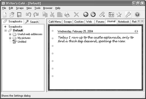
Figure 4-3 shows the frame of a consumer application running on Windows. The frame has a title bar at the top, a menu bar, a colorful toolbar, a splitter window in the frame’s client area, and a status bar at the bottom, giving help on toolbar buttons and menu items as the user drags the mouse over them.
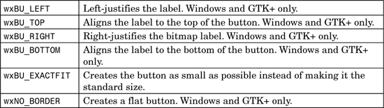
wxFrame can have the window styles listed in Table 4-4, in addition to those described for wxWindow.
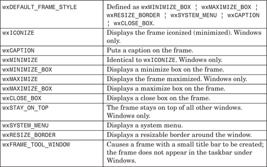
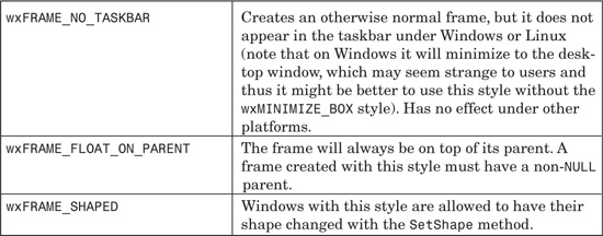
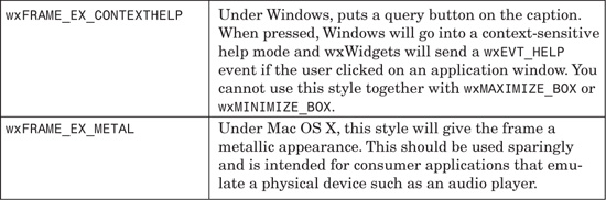
Table 4-5 shows the extra styles that couldn’t be accommodated in the regular style and that are set using wxWindow::SetExtraStyle.
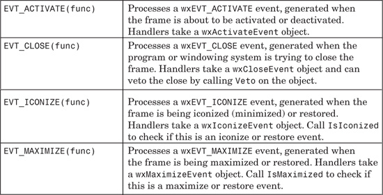
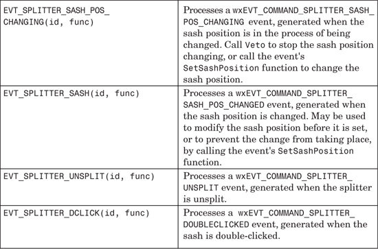
wxFrame and its derived classes generate the events listed in Table 4-6, in addition to those mentioned for wxWindow.
These are the major wxFrame functions. Because wxFrame derives from wxTopLevelWindow and wxWindow, please also refer also to the member functions for these classes.
CreateStatusBar creates one or more status fields at the bottom of the frame. Use SetStatusText to set the text for a particular field, and SetStatusWidths to customize the widths of the fields (see also wxStatusBar later in this chapter). For example:
frame->CreateStatusBar(2, wxST_SIZEGRIP);
int widths[3] = { 100, 100, -1 };
frame->SetStatusWidths(3, widths);
frame->SetStatusText(wxT("Ready"), 0);
CreateToolBar creates a toolbar under the menu bar and associates it with the frame. Alternatively, you can create a toolbar by using the wxToolBar constructor, but to allow it to be managed by the frame, you need to call wxFrame::SetToolBar.
GetMenuBar and SetMenuBar are accessors for the frame’s wxMenuBar. There is only one menu bar per frame. You can replace an existing one with a new menu bar, and the old menu bar will be deleted.
GetTitle and SetTitle are accessors for the title that appears on the frame’s title bar.
Iconize iconizes or restores the frame. You can test the frame’s iconic state by calling IsIconized.
Maximize resizes the frame to fit the desktop, or restores it to the previous state if it is currently maximized. Call IsMaximized to test whether the frame is maximized.
SetIcon sets the icon displayed when the frame is minimized. It’s also used for other purposes by the window manager, such as displaying the program’s icon in Windows Explorer or on the taskbar. You can also use SetIcons to set an icon bundle (multiple icons with a variety of resolutions and depths).
SetShape sets a region specifying the shape of the frame on some platforms (currently Windows, Mac OS X, and GTK+, and X11 if the appropriate X11 extension is available).
ShowFullScreen hides as many decorations as possible and shows the client window at the maximum size of the display. It can also restore the frame to its former size and state. Use IsFullScreen to determine whether the frame is currently being shown full-screen.
If you want to write a more unusual-looking consumer application, such as a clock or media player, you can set a non-rectangular region for the frame, and only that region will be displayed. In Figure 4-4, the frame has no decorations (such as caption, border, or menu bar), and its paint handler is displaying a penguin bitmap. There is a region associated with the frame that acts as a mask that lets only the penguin show through.
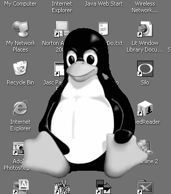
The principles are demonstrated by the code in samples/shaped, although it uses a different image from the one shown here. When the frame is created, a bitmap is loaded, and a region is created out of it. On GTK+, setting the window shape must be delayed until the window creation event is sent, so you will need a __WXGTK__ test in your code. The following code demonstrates the required event table, frame constructor, and window creation event handler:
BEGIN_EVENT_TABLE(ShapedFrame, wxFrame)
EVT_MOTION(ShapedFrame::OnMouseMove)
EVT_PAINT(ShapedFrame::OnPaint)
#ifdef __WXGTK__
EVT_WINDOW_CREATE(ShapedFrame::OnWindowCreate)
#endif
END_EVENT_TABLE()
ShapedFrame::ShapedFrame()
: wxFrame((wxFrame *)NULL, wxID_ANY, wxEmptyString,
wxDefaultPosition, wxSize(250, 300),
¦ wxFRAME_SHAPED
¦ wxSIMPLE_BORDER
¦ wxFRAME_NO_TASKBAR
¦ wxSTAY_ON_TOP
)
{
m_hasShape = false;
m_bmp = wxBitmap(wxT("penguin.png"), wxBITMAP_TYPE_PNG);
SetSize(wxSize(m_bmp.GetWidth(), m_bmp.GetHeight()));
#ifndef __WXGTK__
// On wxGTK we can’t do this yet because the window hasn’t
// been created yet so we wait until the EVT_WINDOW_CREATE
// event happens. On wxMSW and wxMac the window has been created
// at this point so we go ahead and set the shape now.
SetWindowShape();
#endif
}
// Used on GTK+ only
void ShapedFrame::OnWindowCreate(wxWindowCreateEvent& WXUNUSED(evt))
{
SetWindowShape();
}
To set the shape, we create a region from the bitmap and the color to be used as the transparent color, and call SetShape.
void ShapedFrame::SetWindowShape()
{
wxRegion region(m_bmp, *wxWHITE);
m_hasShape = SetShape(region);
}
In order to allow the window to be moved around the screen, there is a mouse handler that explicitly moves the window.
void ShapedFrame::OnMouseMove(wxMouseEvent& evt)
{
wxPoint pt = evt.GetPosition();
if (evt.Dragging() && evt.LeftIsDown())
{
wxPoint pos = ClientToScreen(pt);
Move(wxPoint(pos.x - m_delta.x, pos.y - m_delta.y));
}
}
The paint handler is very simple, but of course in a real application, you will have other windows or graphics displayed inside the frame.
void ShapedFrame::OnPaint(wxPaintEvent& evt)
{
wxPaintDC dc(this);
dc.DrawBitmap(m_bmp, 0, 0, true);
}
For more details, see samples/shaped in the wxWidgets distribution.
This frame class, derived from wxFrame, is part of wxWidgets’ Multiple Document Interface (MDI) support, whereby a parent frame manages zero or more wxMDIChildFrame windows. How it does so depends on platform; the main visual differences are illustrated in Figure 4-6. On Windows, the child windows are clipped to the boundary of the main window. These windows can be tiled, overlapped, or maximized within the main frame so that only one shows at a time, and a Window menu (automatically added by wxWidgets) is available for controlling the child windows. The MDI style has the advantage of keeping a desktop relatively uncluttered, grouping together all the windows in the application. Also, because the main frame’s menu bar is replaced by the active child frame’s menu bar, the clutter of multiple menu bars is also reduced.
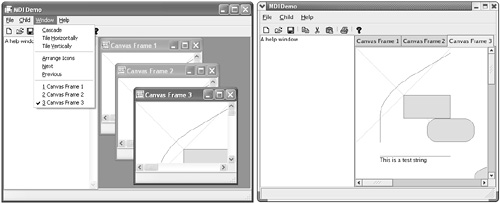
Under GTK+, wxWidgets emulates the MDI style using tabbed windows; only one window is shown at a time, but the user can switch between windows quickly using the tabs. On Mac OS, wxMDIParentFrame and wxMDIChildFrame windows look like normal frames, reflecting the fact that documents always open in a new window on Mac OS.
On platforms where MDI children are contained within the parent, a wxMDIParentFrame arranges its children on a wxMDIClientWindow, which can coexist with other windows in the frame. In Figure 4-6, the parent frame’s size event handler sets the sizes and positions of a text control and the client window. For details, see samples/mdi in your wxWidgets distribution.
Each child frame can have its own menu bar, in addition to the parent frame’s menu bar. When a child frame is activated, its menu bar is shown. When there are no child frames, the parent frame’s menu bar is shown. You need to construct your child frame menu bar carefully to include the same commands as the parent’s menu bar, adding others that are specific to the child. The parent frame and child frames can have their own toolbars and status bars, but they are not swapped like menu bars.
wxMDIParentFrame has the same constructor as wxFrame.
wxMDIParentFrame can have the window styles listed in Table 4-7, in addition to those described for wxFrame.
These are the major wxMDIParentFrame functions, in addition to those defined for wxFrame.
ActivateNext and ActivatePrevious activate the next or previous child frame.
Cascade and Tile provide two methods to arrange the child frames: overlapping and tiling them, respectively. ArrangeIcons lays out any minimized frames within the client window. These three functions only apply on Windows.
GetActiveChild provides the application with a pointer to the currently active child (if any).
GetClientWindow returns a pointer to the client window (a container for the child frames). You can provide a different client window from the default by overriding OnCreateClient and returning an instance of your own wxMDIClientWindow-derived class, but you must then use two-step parent frame construction.
wxMDIChildFrame should always be created as a child of a wxMDIParentFrame window. As explained in the previous section, its appearance depends on the platform and will either be free-floating or constrained to the boundary of its parent.
Its constructor is the same as a regular frame; despite the fact that its true parent is a wxMDIClientWindow, you should pass the frame parent to the constructor.
For example:
#include "wx/mdi.h"
wxMDIParentFrame* parentFrame = new wxMDIParentFrame(
NULL, ID_MYFRAME, wxT("Hello wxWidgets"));
wxMDIChildFrame* childFrame = new wxMDIChildFrame(
parentFrame, ID_MYCHILD, wxT("Child 1"));
childFrame->Show(true);
parentFrame->Show(true);
wxMDIChildFrame takes the same styles as wxFrame, although depending on platform, not all of them will take effect.
These are the major wxMDIChildFrame functions. See also the base class, wxFrame.
Activate activates this frame, bringing it to the front and displaying its menu bar.
Maximize resizes the frame to fit the parent (Windows only).
Restore sets the frame to the size it was before it was maximized (Windows only).
A dialog is a top-level window used for presenting information, options, or selections. It can optionally have a title bar with decorations such as the close window button and minimize button, and as with wxFrame, you can assign an icon to the dialog to be shown in the taskbar or equivalent. A dialog can contain any combination of non-top level windows and control—for example, a wxNotebook with OK and Cancel buttons underneath. As its name suggests, you use this class to initiate a dialog with a user, presenting specific information and choices, compared with the frame’s usual role as the main window of an application.
There are two kinds of dialog—modal and modeless. A modal dialog blocks program flow and user input on other windows until it is dismissed (EndModal is called), whereas a modeless dialog behaves more like a frame in that program flow continues, and input in other windows is still possible. To show a modal dialog, you should use the ShowModal method, whereas to show a dialog modelessly, you simply use Show, as with frames.
Note that the modal dialog is one of the very few examples of wxWindow-derived objects that may be created on the stack and not on the heap. In other words, you can use the heap method as follows:
void AskUser()
{
MyAskDialog *dlg = new MyAskDialog(...);
if ( dlg->ShowModal() == wxID_OK )
...
//else: dialog was cancelled or some another button pressed
dlg->Destroy();
}
You can also achieve the same result by using the stack:
void AskUser()
{
MyAskDialog dlg(...);
if ( dlg.ShowModal() == wxID_OK )
...
// no need to call Destroy() here
}
Normally you will derive a new class from wxDialog rather than using it directly so that you can handle events such as wxEVT_CLOSE (see the following) and command events. Often you will create your dialog’s controls within the constructor.
Just as with wxFrame, wxWidgets will resize a single child window to fill the dialog, but for more than one child, the application is responsible for sizing and positioning the controls using sizers (see Chapter 7).
When you call Show, wxWidgets calls InitDialog to send a wxInitDialog Event to the dialog, transferring data to the dialog via validators or other means.
wxDialog has the following constructor in addition to the default constructor:
wxDialog(wxWindow* parent, wxWindowID id, const wxString& title,
const wxPoint& pos = wxDefaultPosition,
const wxSize& size = wxDefaultSize,
long style = wxDEFAULT_DIALOG_STYLE,
const wxString& name = wxT("dialog"));
For example:
wxDialog* dialog = new wxDialog(NULL, ID_MYDIALOG,
wxT("Hello wxWidgets"), wxDefaultPosition,
wxSize(500, 300));
dialog->Show(true);
The dialog won’t be shown until Show(true) or ShowModal is called to give the application the chance to do child window layout invisibly.
By default, a dialog created with a NULL parent window will be given the application’s top-level window as parent. Use the wxDIALOG_NO_PARENT style to prevent this from happening and create an orphan dialog. This is not recommended for modal dialogs.
As with wxFrame, do not use delete to destroy a dialog, but instead use Destroy or Close to delay deletion until all the object’s events have been processed. When you call Close, the default wxEVT_CLOSE handler for this function usually calls Destroy.
Note that before a modal dialog is destroyed, an event handler should have called EndModal, passing the identifier of the command that closed it (for example, wxID_OK or wxID_CANCEL). This will exit the dialog’s event loop so that the dialog object can be destroyed by the code that called ShowModal. The identifier passed to EndModal will be returned by ShowModal. To clarify, the OnCancel function in the following example will be called while ShowModal is in its event loop:
// Event handler for wxID_CANCEL
void MyDialog::OnCancel(wxCommandEvent& event)
{
EndModal(wxID_CANCEL);
}
// Show a dialog
void ShowDialog()
{
// Show the dialog
MyDialog dialog;
// OnCancel or other function is called from within ShowModal
if (dialog.ShowModal() == wxID_CANCEL)
{
...
}
}
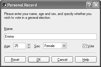
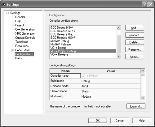
Figure 4-7 shows a typical simple dialog, which we’ll create in Chapter 9. Dialogs can, of course, get more complicated, such as the settings dialog shown in Figure 4-8. This one has a splitter window, a tree control to navigate between multiple panels, and a grid control acting as a property editor.
wxDialog can have the window styles listed in Table 4-8 in addition to those described for wxWindow.
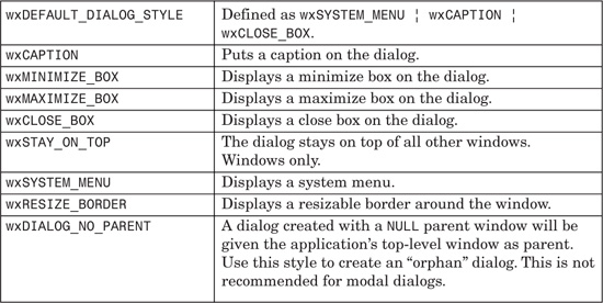
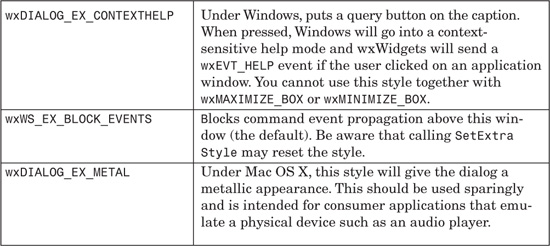
Table 4-9 describes extra styles that couldn’t be accommodated in the regular style, and so are set using wxWindow::SetExtraStyle. Although wxWS_EX_BLOCK_EVENTS is valid for all windows, we repeat it here because it is set by default.
These are the major wxDialog functions. Please refer also to the member functions for wxWindow and wxTopLevelWindow, from which wxDialog is derived.
GetTitle and SetTitle are accessors for the title that appears on the dialog’s title bar.
Iconize iconizes or restores the dialog. You can test the dialog’s iconic state by calling IsIconized.
Maximize maximizes the dialog (makes it as large as the desktop) or restores it to the previous state. Call IsMaximized to test whether the dialog is maximized. Windows only.
SetIcon sets the icon displayed when the dialog is minimized. It’s also used for other purposes by the window manager, such as displaying the program’s icon in Windows Explorer or on the taskbar. You can also use SetIcons to set an icon bundle (multiple icons with a variety of resolutions and depths).
ShowModal is used when showing a modal dialog. It returns the value of the identifier passed to EndModal—normally this is the identifier of the control that the user clicked on to dismiss the dialog. By default (implemented in the dialog’s wxEVT_CLOSE handler), closing the dialog sends a simulated wxID_CANCEL to the dialog. The default handler for wxID_CANCEL calls EndModal with wxID_CANCEL. Therefore, if you provide a button with the identifier wxID_CANCEL, the logic for canceling the dialog is handled for you, unless you need extra functionality.
SetLeftMenu and SetRightMenu are only available on Microsoft Smartphone, and they set the commands allocated to the left and right menu buttons. They take a command identifier, such as wxID_OK, a label, and an optional pointer to a wxMenu to show.
Pop-up windows are not implemented on all platforms (in particular, they are missing from Mac OS X), and so we will only briefly mention them.
wxPopupWindow is a top-level window that normally has minimal decoration and is used to implement windows that are shown briefly, such as a menu or a tooltip. Create it by passing a parent window and optional style to the constructor (defaulting to wxNO_BORDER). Move it into position with Position, which takes a screen position and size and makes sure that the popup is visible on the display.
wxPopupTransientWindow is a special kind of wxPopupWindow that dismisses itself (hides) when it loses the focus or the mouse is clicked outside of the window. It can also be hidden with Dismiss.
Container windows are designed to hold further visual elements, either child windows or graphics drawn on the window.
wxPanel is essentially a wxWindow with some dialog-like properties. This is usually the class to use when you want to arrange controls on a window that’s not a wxDialog, such as a wxFrame. It’s often used for pages of a wxNotebook. wxPanel normally takes the system dialog color.
As with wxDialog, you can use InitDialog to send a wxInitDialogEvent to the panel, transferring data to the panel via validators or other means. wxPanel also handles navigation keys such as the Tab key to provide automatic traversal between controls, if the wxTAB_TRAVERSAL style is provided.
wxPanel has the following constructor in addition to the default constructor:
wxPanel(wxWindow* parent, wxWindowID id,
const wxPoint& pos = wxDefaultPosition,
const wxSize& size = wxDefaultSize,
long style = wxTAB_TRAVERSAL¦wxNO_BORDER,
const wxString& name = wxT("panel"));
For example:
wxPanel* panel = new wxPanel(frame, wxID_ANY,
wxDefaultPosition, wxSize(500, 300));
This class represents a control with several pages, switched by clicking on tabs along an edge of the control. A page is normally a wxPanel or a class derived from it, although you may use other window classes.
Notebook tabs may have images as well as, or instead of, text labels. The images are supplied via a wxImageList (see Chapter 10), and specified by position in the list.
To use a notebook, create a wxNotebook object and call AddPage or InsertPage, passing a window to be used as the page. Do not explicitly destroy the window for a page that is currently managed by wxNotebook; use DeletePage instead, or let the notebook destroy the pages when it is itself destroyed.
Here’s an example of creating a notebook with three panels, and a text label and icon for each tab:
#include "wx/notebook.h"
#include "copy.xpm"
#include "cut.xpm"
#include "paste.xpm"
// Create the notebook
wxImageList* imageList = new wxImageList(16,16,true, 3);
imageList->Add(wxlcon(copy_xpm));
// Create the image list
wxImageList* imageList = new wxImageList(16,16,true, 3);
imageList->Add(wxIcon(cut_xpm));
imageList->Add(wxIcon(paste_xpm));
notebook->SetimageList(imageList);
// Create and add the pages
wxPanel* window1 = new wxPanel(notebook, wxID_ANY);
wxPanel* window2 = new wxPanel(notebook, wxID_ANY);
wxPanel* window3 = new wxPanel(notebook, wxID_ANY);
notebook->AddPage(window1, wxT("Tab one"), true, 0);
notebook->AddPage(window2, wxT("Tab two"), false, 1);
notebook->AddPage(window3, wxT("Tab three"), false, 2);
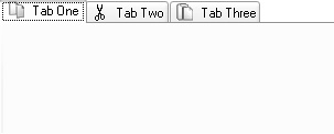
Figure 4-9 shows the result on Windows.
On most platforms, there are scroll buttons to view tabs that cannot all be displayed on the window at once. However, on Mac OS, the tabs do not scroll, so the number you can display is limited by the window and tab label size.
If you use sizers to lay out controls on individual pages, and pass wxDefaultSize to the notebook constructor, wxNotebook will adjust its size to fit the sizes of its pages.
On Windows XP, the default theme paints a gradient on the notebook’s pages. Although this is the expected native behavior, it can slow down performance, and you may prefer a solid background for aesthetic reasons, especially when the notebook is not being used in a dialog. If you want to suppress themed drawing, there are three ways of doing it. You can use the wxNB_NOPAGETHEME style to disable themed drawing for a particular notebook, you can call wxSystemOptions::SetOption to disable it for the whole application, or you can disable it for individual pages by using SetBackgroundColour. To disable themed pages globally, do this:
wxSystemOptions::SetOption(wxT("msw.notebook.themed-background"), 0);
Set the value to 1 to enable it again. To give a single page a solid background that matches the current theme, use
wxColour col = notebook->GetThemeBackgroundColour();
if (col.Ok())
{
page->SetBackgroundColour(col);
}
On platforms other than Windows, or if the application is not using Windows themes, GetThemeBackgroundColour will return an uninitialized color object, and this code will therefore work on all platforms. Please note that this syntax and behavior is subject to change, so refer to the wxNotebook documentation in your wxWidgets distribution for the latest information.
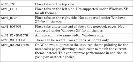
wxNotebook can have the window styles listed in Table 4-11, in addition to those described for wxWindow.
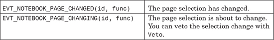
wxNotebook generates wxNotebookEvent propagating events (events that can be handled by the notebook or its ancestors) specified in Table 4-12.
These are the major wxNotebook functions.
AddPage adds a page, and InsertPage inserts a page at the given position. You can use a text label for the tab, or an image (specified by index into an image list), or both. For example:
// Adds an unselected page with a label and an image
// (index 2 in the associated image list).
notebook->AddPage(page, wxT("My tab"), false, 2);
DeletePage removes and destroys the specified page, while RemovePage just removes the page without deleting the page. Call DeleteAllPages to delete all the pages. When the wxNotebook is deleted, it will delete all its pages.
AdvanceSelection cycles through the pages, and SetSelection sets the specified page by zero-based index. Use GetSelection to get the index of the selected page, or wxNOT_FOUND if none was selected.
SetImageList sets a wxImageList to be used by the notebook but does not take ownership of it. Call AssignImageList if you want the notebook to delete the image list when it is destroyed. GetImageList returns the associated image list. An image list stores images to be shown on each page tab, if required. wxImageList is described in Chapter 10.
Use GetPage to return the page window for a given index, and use GetPageCount to return the number of pages in the notebook.
SetPageText and GetPageText are accessors for the label for a given page (by index).
SetPageImage and GetPageImage are accessors for the index of a page’s image index in the notebook’s image list.
wxNotebook is derived from a base class wxBookCtrlBase, which abstracts the concept of a control that manages pages. There are two API-compatible variations of the wxNotebook concept, wxListbook and wxChoicebook, and you can implement your own, such as wxTreebook.
wxListbook uses a wxListCtrl to change pages; the list control displays icons with text labels underneath them, and can be on any of the four sides, defaulting to the left side. This is an attractive alternative to wxNotebook, and it has the advantage of being able to cope with an arbitrary number of pages even on Mac OS X because the list control can scroll.
wxChoicebook uses a choice control (a drop-down list) and is particularly handy for small devices with restricted screen space, such as smartphones. It does not display images, and by default, it will display the choice control at the top.
The include files for these classes are wx/listbook.h and wx/choicebk.h. Event handlers for these two classes take a wxListbookEvent or wxChoicebookEvent argument, respectively, and you can use the event macros EVT_XXX_PAGE_CHANGED(id, func) and EVT_XXX_PAGE_CHANGING(id, func) where XXX is LISTBOOK or CHOICEBOOK.
You can use the same window styles as wxNotebook, or you can use the equivalents, such as wxCHB_TOP or wxLB_TOP instead of wxNB_TOP.
All windows can have scrollbars, but extra code is required to make scrolling work. This gives the flexibility to define appropriate scrolling behaviors for different kinds of windows. wxScrolledWindow implements commonly required scrolling behavior by assuming that scrolling happens in consistent units, not different-sized jumps, and that page size (the amount scrolled when “paging” up, down, left, or right) is represented by the visible portion of the window. It is suited to drawing applications but is not so suitable for a sophisticated editor in which the amount scrolled may vary according to the size of text on a given line. For this, you would derive from wxWindow and implement scrolling yourself. wxGrid is an example of a class that implements its own scrolling, largely because columns and rows can vary in size.
To use a scrolled window, you need to define the number of pixels per logical scroll unit (how much the window is scrolled for a line up or down scroll event) and provide the virtual size in logical units. wxScrolledWindow will then take care of showing the scrollbars with appropriately sized “thumbs” (the parts you can drag) and will show or hide scrollbars as appropriate, according to the actual size of the window.
The following fragment shows how to create a scrolled window:
#include "wx/scrolwin.h"
wxScrolledWindow* scrolledWindow = new wxScrolledWindow(
this, wxID_ANY, wxPoint(0, 0), wxSize(400, 400),
wxVSCROLL¦wxHSCROLL);
// Set up virtual window dimensions. It will be 1000x1000
// and will scroll 10 pixels at a time
int pixelsPerUnixtX = 10;
int pixelsPerUnixtY = 10;
int noUnitsX = 1000;
int noUnitsY = 1000;
scrolledWindow->SetScrollbars(pixelsPerUnitX, pixelsPerUnitY,
noUnitsX, noUnitsY);
A second way to specify the virtual size is to use SetVirtualSize, which takes the virtual size in pixels, plus a call to SetScrollRate to set the horizontal and vertical scrolling increments. A third way is to set a sizer for the window, and the scrolled window will calculate the required scrollbar dimensions from the space taken up by the child windows. You will still need to call SetScrollRate to specify the scrolling increments.
You can provide a paint event handler as normal, but in order to draw the graphics at the appropriate position for the current positions of the scrollbars, call DoPrepareDC before drawing. This sets the device context’s device origin. For example:
void MyScrolledWindow::OnPaint(wxPaintEvent& event)
{
wxPaintDC dc(this);
DoPrepareDC(dc);
dc.SetPen(*wxBLACK_PEN);
dc.DrawLine(0, 0, 100, 100);
}
Alternatively, you can override the OnDraw virtual function; wxScrolledWindow creates a paint device context and calls DoPrepareDC for you before calling your OnDraw function, so the code simplifies to the following:
void MyScrolledWindow::OnDraw(wxDC& dc)
{
dc.SetPen(*wxBLACK_PEN);
dc.DrawLine(0, 0, 100, 100);
}
Note that you will need to call DoPrepareDC if you draw on the window from outside the paint event, such as within a mouse event handler.
You can provide your own DoPrepareDC function. The default function simply shifts the device origin according to the current scroll positions so that subsequent drawing will appear at the right place:
void wxScrolledWindow::DoPrepareDC(wxDC& dc)
{
int ppuX, ppuY, startX, startY;
GetScrollPixelsPerUnit(& ppuX, & ppuY);
GetViewStart(& startX, & startY);
dc.SetDeviceOrigin( - startX * ppuX, - startY * ppuY );
}
For more on painting on a wxScrolledWindow, including using buffered drawing, please see the section on wxPaintDC in Chapter 5, “Drawing and Printing.”
There are no special styles for wxScrolledWindow, but usually you will supply wxVSCROLL¦wxHSCROLL (the default style for wxScrolledWindow). On some platforms, if these styles are not present, no scrollbars will be provided for efficiency reasons.
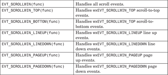
wxScrolledWindow generates wxScrollWinEvent events (see Table 4-13). These events do not propagate up the window parent-child hierarchy, so if you want to intercept these events, you must derive a new class or plug an event handler object into the window object. Normally you will not need to override the existing handlers for these events.
These are the major wxScrolledWindow functions.
CalcScrolledPosition and CalcUnscrolledPosition both take four arguments: two integers for the position input in pixels, and two pointers to integers for the transformed position output, also in pixels. CalcScrolledPosition calculates the device position from the logical position. For example, if the window is scrolled 10 pixels down from the top, the logical first visible position is 0, but the device position is -10. CalcUnscrolledPosition does the inverse, calculating the logical position from the device position.
EnableScrolling enables or disables physical scrolling in horizontal and vertical directions independently. Physical scrolling is the physical transfer of bits up or down the screen when a scroll event occurs. If the application scrolls by a variable amount (for example, if there are different font sizes), then physical scrolling will not work, and you should switch it off. If physical scrolling is disabled, you will have to reposition child windows yourself. Physical scrolling may not be available on all platforms, but it is enabled by default where it is available.
GetScrollPixelsPerUnit returns the horizontal and vertical scroll unit sizes in two pointers to integers. A value of zero indicates that there is no scrolling in that direction.
GetViewStart returns the position of the first visible position on the window, in logical units. Pass two pointers to integers to receive the values. You will need to multiply by the values returned by GetScrollPixelsPerUnit to get pixel values.
GetVirtualSize returns the size in device units (pixels) of the scrollable window area. Pass two pointers to integers to receive the virtual width and height.
DoPrepareDC prepares the device context by setting the device origin according to the current scrollbar positions.
Scroll scrolls a window so that the view is at the given point in scroll units (not pixels), passed as two integers. If either parameter is -1, that position will be unchanged.
SetScrollbars sets the pixels per unit in each direction, the number of units for the virtual window in each direction, the horizontal and vertical position to scroll to (optional), and a boolean to indicate whether the window should be refreshed (false by default).
SetScrollRate sets the horizontal and increment scroll rate (the same as the pixels per unit parameters in SetScrollbars).
SetTargetWindow can be used to scroll a window other than the wxScrolledWindow.
If you want to implement your own scrolling behavior, you can derive a class from wxWindow and use wxWindow::SetScrollbar to set scrollbar properties.
SetScrollbar takes the arguments listed in Table 4-14.
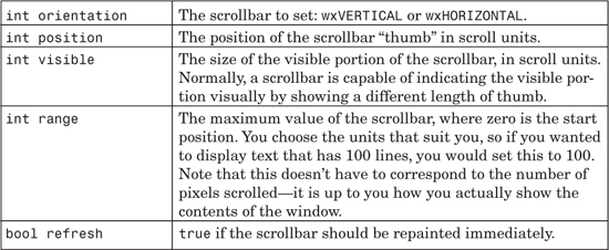
Let’s say you want to display 50 lines of text, using the same font. The window is sized so that you can only see 16 lines at a time.
You would use
SetScrollbar(wxVERTICAL, 0, 16, 50)
Note that with the window at this size, the thumb position can never go above 50 minus 16, or 34.
You can determine how many lines are currently visible by dividing the current view size by the character height in pixels.
When defining your own scrollbar behavior, you will always need to recalculate the scrollbar settings when the window size changes. You could therefore introduce a new function AdjustScrollbars into which you place your scrollbar calculations and SetScrollbar call. AdjustScrollbars can be called initially, and also from your wxSizeEvent handler function.
It’s instructive to look at the implementations of wxScrolledWindow and wxGrid if you’re thinking of implementing your own scrolling behavior.
You may want to look at wxVScrolledWindow in the wxWidgets reference manual; this can be used to build a scrolled window class that can scroll by lines of unequal height in the vertical direction.
This class manages up to two subwindows (use nested splitter windows if you need more splits). The current view can be split into two by the application, for example, from a menu command. It can be unsplit either by the application or via the splitter window user interface by double-clicking on the sash or dragging the sash until one of the panes has zero size (override the latter behavior with SetMinimumPaneSize).
On most platforms, when the sash is dragged, a reverse-video line will be drawn to show where the sash will end up. You can pass wxSP_LIVE_UPDATE to let the sash move in “real time” instead, resizing the child windows. This is the default (and only) mode on Mac OS X.
The following fragment shows how to create a splitter window, creating two subwindows and hiding one of them.
#include "wx/splitter.h"
wxSplitterWindow* splitter = new wxSplitterWindow(this, wxID_ANY,
wxPoint(0, 0), wxSize(400, 400), wxSP_3D);
leftWindow = new MyWindow(splitter);
leftWindow->SetScrollbars(20, 20, 50, 50);
rightWindow = new MyWindow(splitter);
rightWindow->SetScrollbars(20, 20, 50, 50);
rightWindow->Show(false);
splitter->Initialize(leftWindow);
// Unncomment this to prevent unsplitting
// splitter->SetMinimumPaneSize(20);
This fragment shows how the splitter window can be manipulated after creation:
void MyFrame::OnSplitVertical(wxCommandEvent& event)
{
if ( splitter->IsSplit() )
splitter->Unsplit();
leftWindow->Show(true);
rightWindow->Show(true);
splitter->SplitVertically( leftWindow, rightWindow );
}
void MyFrame::OnSplitHorizontal(wxCommandEvent& event)
{
if ( splitter->IsSplit() )
splitter->Unsplit();
leftWindow->Show(true);
rightWindow->Show(true);
splitter->SplitHorizontally( leftWindow, rightWindow );
}
void MyFrame::OnUnsplit(wxCommandEvent& event)
{
if ( splitter->IsSplit() )
splitter->Unsplit();
}
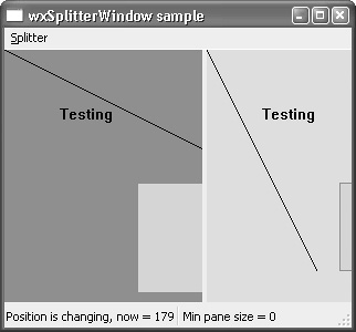
Figure 4-10 shows how the wxWidgets splitter sample looks on Windows without the wxSP_NO_XP_THEME style. If you use this style, the splitter will take on a more traditional look with a sunken border and 3D sash.
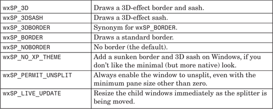
wxSplitterWindow can have the window styles shown in Table 4-15 in addition to those described for wxWindow.
These are the major wxSplitterWindow functions.
GetMinimumPaneSize and SetMinimumPaneSize are accessors for the minimum pane size. The default minimum pane size is zero, which means that either pane can be reduced to zero by dragging the sash, thus removing one of the panes. To prevent this behavior (and veto out-of-range sash dragging), set a minimum size, for example 20 pixels. However, if the wxSP_PERMIT_UNSPLIT style is used when a splitter window is created, the window may be unsplit even if the minimum size is non-zero.
GetSashPosition and SetSashPosition are accessors for the sash position. Passing true to SetSashPosition resizes the pane and redraws the sash and border.
GetSplitMode and SetSplitMode are accessors for the split orientation, which can be wxSPLIT_VERTICAL or wxSPLIT_HORIZONTAL.
GetWindow1 and GetWindow2 get the pointers to the two panes.
Initialize can be called with a pointer to a window if you only want to have one pane initially.
IsSplit tests whether the window is split.
ReplaceWindow replaces one of the windows managed by the wxSplitter Window with another one. Generally, it’s better to use this function instead of calling Unsplit and then resplitting the window.
SetSashGravity takes a floating-point argument, which determines the position of the sash as the window is resized. A value of 0.0 (the default) means that only the bottom or right child window will be resized, and a value of 1.0 means that only the top or left child window will be resized. Values inbetween indicate that the change in size should be distributed between both child windows (a value of 0.5 distributes the size evenly). Use GetSashGravity to return the current setting.
SplitHorizontally and SplitVertically initialize the splitter window with two panes and optionally an initial sash size.
Unsplit removes the specified pane.
UpdateSize causes the splitter to update its sash position immediately (normally, this is done in idle time).
There are subtleties to be aware of when using a splitter window as part of a sizer hierarchy. If you don’t need the sash to be moveable, you can create both child windows with absolute sizes. This will fix the minimum size of both child windows, and the sash will therefore not be free to move. If you need the sash to be moveable, as is normally the case, pass default values to the child windows and specify an initial minimum size in the splitter window constructor. Then add the splitter window to its sizer, passing the wxFIXED_MINSIZE flag to Add, which tells wxWidgets to treat the specified size as the minimum size.
Another issue is that a splitter does not set its sash position (and therefore the sizes of its child windows) until idle time, when it can be sure that sizing has been finalized and the sash position won’t be set prematurely. This can result in a sash that visibly repositions itself just after the window has been shown. To fix this, call wxSplitterWindow::UpdateSize as soon as you have done your layout, for example after a wxSizer::Fit call. The splitter will update its sash and child window sizes immediately.
By default, when the user or application resizes the splitter, only the bottom (or right) window is adjusted to take into account the new size. If you need different behavior, use SetSashGravity as documented in the previous section.
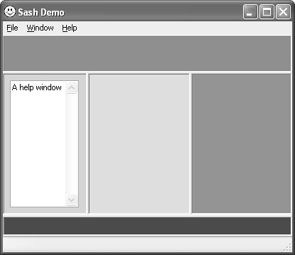
If you have a lot of “split” windows in your application, consider using wxSashWindow. This is a window that allows any of its edges to have a sash (as specified by the application) that can be dragged to resize the window. The actual content window is normally created by the application as a child of wxSashWindow.
When a sash is dragged, it notifies the application with a wxSashEvent so the handler can change the window size accordingly before laying out the windows. Layout is achieved via a class called wxLayoutAlgorithm, which provides LayoutWindow, LayoutFrame, and LayoutMDIFrame methods for arranging the sash windows on different kinds of parent windows.
You can also use the class wxSashLayoutWindow, which responds to events of type wxQueryLayoutInfoEvent to provide orientation and size information to wxLayoutAlgorithm.
Please see the reference manual for further details. wxSashWindow doesn’t permit moving or undocking windows, and it’s likely that these classes will be superceded by a general docking and layout framework in the near future.
Figure 4-11 shows a view of the wxSashWindow sample provided in samples/sashtest.
Non-static controls, such as wxButton and wxListBox, respond to mouse and keyboard input. We’ll describe the basic ones here; more advanced controls are described in Chapter 12. You can also download others (see Appendix E) or create your own.
A wxButton is a control that looks like a physical push button with a text label, and it is one of the most common elements of a user interface. It may be placed on a dialog box or panel, or almost any other window. A command event is generated when the user clicks on the button.
Here’s a simple example of creating a button:
#include "wx/button.h"
wxButton* button = new wxButton(panel, wxID_OK, wxT("OK"),
wxPoint(10, 10), wxDefaultSize);
Figure 4-12 shows how a button with the default size looks on Windows XP.
wxWidgets obtains the default button size by calling the static function wxButton::GetDefaultSize, calculated appropriately for each platform, but you can let wxWidgets size the button to just fit the label by passing the style wxBU_EXACTFIT.

These are the major wxButton functions.
SetLabel and GetLabel are accessors for the button label. You can use an ampersand to indicate that the following letter is a mnemonic on Windows and GTK+.
SetDefault sets this button to be the default button on the parent window, so pressing the Enter key activates this button.
You can use an ampersand in the button label to indicate that the next letter is an underlined mnemonic (or “access key”), so that the user can press that key instead of clicking on the button. The mnemonic only works on Windows and GTK+; on other platforms, the ampersand will simply be stripped from the label and ignored.
On some systems, notably GTK+, standard buttons such as OK and New are displayed with special graphics in line with the native look and feel for that platform. wxWidgets maps some of its standard window identifiers to these stock buttons, but it also permits the application to substitute a custom label should the need arise.
The recommended usage is as follows. When using a stock button identifier, and you want wxWidgets to supply the label, just supply the identifier and not the label (or an empty string for the label). For example:
wxButton* button = new wxButton(this, wxID_OK);
wxWidgets will substitute the correct standard label on all platforms. For example, on Windows and Mac OS X, the string "&OK" will be used. On GTK+, the stock OK button will be used. However, if you supply a label that is different from the stock label, wxWidgets will use that label. For example:
wxButton* button = new wxButton(this, wxID_OK, wxT("&Apply"));
This will result in the “Apply” label being displayed on all platforms, overriding the standard identifier.
You can get the stock button label for a given identifier with wxGetStockLabel (include wx/stockitem.h), passing the identifier, true (if you want menu codes to be included), and an optional accelerator string to append.
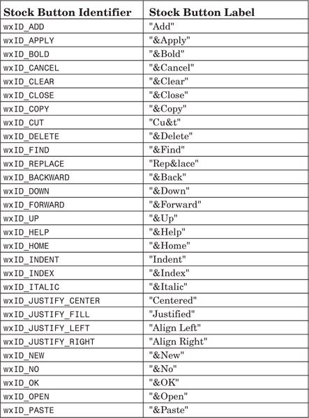
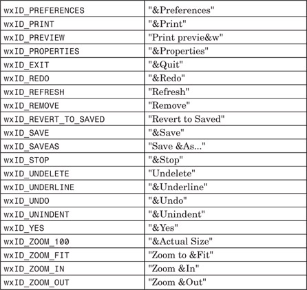
Table 4-19 shows the stock button identifiers and their corresponding labels.
A bitmap button is like a normal text button, but it shows a bitmap instead of text. A command event is generated when the user clicks on the button.
Here’s a simple example of creating a bitmap button:
#include "wx/bmpbuttn.h"
wxBitmap bitmap(wxT("print.xpm"), wxBITMAP_TYPE_XPM);
wxBitmapButton* button = new wxBitmapButton(panel, wxID_OK,
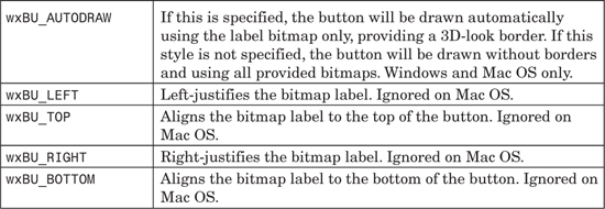
bitmap, wxDefaultPosition, wxDefaultSize, wxBU_AUTODRAW);
Figure 4-13 shows the result under Windows.
A bitmap button can be supplied with a single bitmap (optionally with transparency information), and wxWidgets will draw all button states using this bitmap. If the application needs more control, additional bitmaps for the selected state, unpressed focused state, and grayed-out state may be supplied.
XPM is a good choice of bitmap format for buttons because it supports transparency and can be included into C++ code, but you can load them from other formats too, such as JPEG, PNG, GIF, and BMP.
wxBitmapButton generates wxCommandEvent propagating events, identical to wxButton.
These are the major wxBitmapButton functions.
SetBitmapLabel and GetBitmapLabel are accessors for the main button label bitmap. You can also use SetBitmapFocus, SetBitmapSelected, and SetBitmapDisabled and their corresponding getters for more precise control of the button in different states.
SetDefault sets this button to be the default button on the parent window, so pressing the Enter key will activate the button.
The choice control consists of a read-only text area that reflects the selection of a drop-down list box. The list box is hidden until the user presses a button on the control to reveal the list of strings.
To create a choice control, pass the usual parent window, identifier, position, size, and style parameters, plus an array of strings to populate the list. For example:
#include "wx/choice.h"
wxArrayString strings;
strings.Add(wxT("One"));
strings.Add(wxT("Two"));
strings.Add(wxT("Three"));
wxChoice* choice = new wxChoice(panel, ID_COMBOBOX,
wxDefaultPosition, wxDefaultSize, strings);
On most platforms, the look is similar to wxComboBox (see Figure 4-14), except that the user cannot edit the text. On GTK+, wxChoice is a button with a drop-down menu. You may like to use a read-only wxComboBox to get the benefit of the scrolling drop-down list.

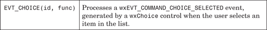
The combo box is a combination of a list box and a single-line text field, and it allows you to set and get the text of the text field independently of the list box. The text field can be read-only, in which case it behaves very much like wxChoice. Normally, the list box is hidden until the user presses a button on the control to reveal the list of strings. This makes for a very compact way of allowing the user to enter text and also to choose from a list of existing options.
To create a combo box, pass the usual parent window, identifier, position, size, and style parameters, plus the initial text and an array of strings to populate the list. For example:
#include "wx/combobox.h"
wxArrayString strings;
strings.Add(wxT("Apple"));
strings.Add(wxT("Orange"));
strings.Add(wxT("Pear"));
strings.Add(wxT("Grapefruit"));
wxComboBox* combo = new wxComboBox(panel, ID_COMBOBOX,
wxT("Apple"), wxDefaultPosition, wxDefaultSize,
strings, wxCB_DROPDOWN);
The result on Windows is shown in Figure 4-14 with the drop-down list activated.
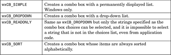
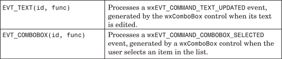
These are the major wxComboBox functions. Please refer also to the wxControlWithItems member functions from earlier in this chapter.
Copy copies the selected text onto the clipboard from the text field. Cut does the same, and it also deletes the selected text. Paste copies text from the clipboard into the text field.
GetInsertionPoint returns the insertion point for the combo box’s text field (a long integer representing the position), and SetInsertionPoint sets it. Use SetInsertionPointEnd to set the insertion point at the end of the text field.
GetLastPosition returns the last position in the text field.
GetValue returns the value of the text field, and SetValue sets it. For a combo box with the wxCB_READONLY style, the string must be in the combo box choices list; otherwise, the call is ignored in release mode, and it displays an alert in debug mode.
SetSelection with two arguments selects the text in the combo box text field between two given positions. Replace replaces the text between two given positions with specified text. Remove removes the text between two given positions.
See also the following functions from wxControlWithItems: Clear, Delete, FindString, GetClientData, GetClientObject, SetClientData, SetClientObject, GetCount, GetSelection, SetSelection, GetString, SetString, GetStringSelection, SetStringSelection, Insert, and IsEmpty.
A check box is a control that normally has two states: on or off. It is represented by a box containing a cross or tick if checked, with a label to the left or right of the check box. Optionally, it can have a third state, called the mixed or undetermined state, which can be used to indicate that the item does not apply (for example, a component in an installer that is always installed and therefore cannot be selected or deselected).
Here’s a simple example of creating a check box:
#include "wx/checkbox.h"
wxCheckBox* checkbox = new wxCheckBox(panel, ID_CHECKBOX,
wxT("&Check me"), wxDefaultPosition, wxDefaultSize);
checkBox->SetValue(true);
Figure 4-15 shows how this looks on Windows.
A check box with the wxCHK_3STATE style looks like Figure 4-16 on Windows.
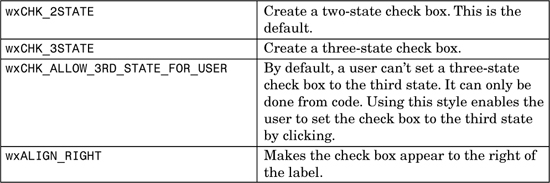
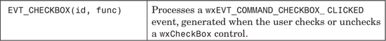
These are the major wxCheckBox functions.
SetLabel and GetLabel are accessors for the check box label. You can use an ampersand to indicate that the following letter is the mnemonic (or “access key”) on Windows and GTK+.
GetValue and SetValue get and set the boolean state. Use Get3StateValue or Set3StateValue to get and set one of wxCHK_UNCHECKED, wxCHK_CHECKED, or wxCHK_UNDETERMINED.
Is3State can be used to determine whether the check box is a three-state check box.
IsChecked returns true if the check box is checked.
A wxListBox is used to select one or more of a list of strings, numbered from zero. The strings are displayed in a scrolling box, with the selected strings marked in reverse video. A list box can be single-selection: if an item is selected, the previous selection is removed. In a multiple-selection list box, clicking an item toggles the item on or off independently of other selections.
Here’s an example of creating a single-selection list box:
#include "wx/listbox.h"
wxArrayString strings;
strings.Add(wxT("First string"));
strings.Add(wxT("Second string"));
strings.Add(wxT("Third string"));
strings.Add(wxT("Fourth string"));
strings.Add(wxT("Fifth string"));
strings.Add(wxT("Sixth string"));
wxListBox* listBox = new wxListBox(panel, ID_LISTBOX,
wxDefaultPosition, wxSize(180, 80), strings, wxLB_SINGLE);
Figure 4-17 shows what this looks like under Windows.
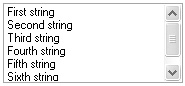
wxCheckListBox is derived from wxListBox and inherits its functionality, but in addition, it can display a check box next to each item label. Include wx/checklst.h to use this class. Figure 4-18 shows a wxCheckListBox on Windows.
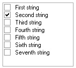
If you have a lot of items to display, consider using wxVListBox. This is a virtual list box that displays data directly from a source that you specify by deriving a new class and implementing the functions OnDrawItem and OnMeasureItem. Its event macros are the same as for wxListBox.
wxHtmlListBox is derived from wxVListBox and offers an easy way to display complex items. wxHtmlListBox obtains HTML fragments from the OnGetItem function, which your derived class must override. Figure 4-19 shows the wxWidgets wxHtmlListBox sample (in samples/htlbox), with custom separators drawn by an overridden OnDrawSeparator function.
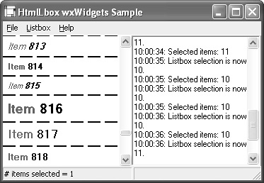
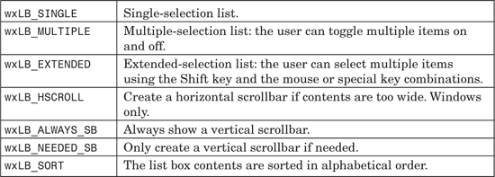
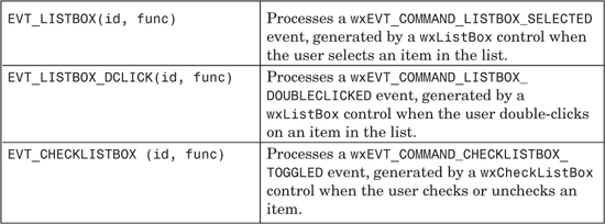
These are the major wxListBox functions.
Deselect deselects an item in the list box.
GetSelections fills a wxArrayInt array with the positions of the currently selected items and returns it.
InsertItems inserts the given number of strings before the specified position. Pass either the number of items, a C++ array of wxStrings, and the insertion position, or a wxArrayString object and the insertion position.
Selected returns true if the given item is selected.
Set clears the list box and adds the given strings to it. Pass either the number of items, a C++ array of wxStrings, and an optional array of void* client data, or a wxArrayString object and an optional array of void* client data.
SetFirstItem sets the specified item to be the first visible item.
SetSelection and SetStringSelection take an integer or string item and an optional boolean for the selection state, defaulting to true.
See also the wxControlWithItems functions: Clear, Delete, FindString, GetClientData, GetClientObject, SetClientData, SetClientObject, GetCount, GetSelection, GetString, SetString, GetStringSelection, Insert, and IsEmpty.
A radio box is used to select an item from a number of mutually exclusive buttons. It is displayed as a vertical column or horizontal row of labeled buttons, within a static box, which may have a label.
The way that the buttons are laid out depends on two constructor parameters: the major dimension, and the orientation style, which can be wxRA_SPECIFY_COLS (the default) or wxRA_SPECIFY_ROWS. The major dimension is the number of rows or columns. For example, eight buttons laid out with a major dimension of two and the wxRA_SPECIFY_COLS style will have two columns and four rows. Changing to wxRA_SPECIFY_ROWS will give the radio box two rows and four columns.
Here’s an example of creating a radio box with three columns:
#include "wx/radiobox.h"
wxArrayString strings;
strings.Add(wxT("&One"));
strings.Add(wxT("&Two"));
strings.Add(wxT("T&hree"));
strings.Add(wxT("&Four "));
strings.Add(wxT("F&ive "));
strings.Add(wxT("&Six "));
wxRadioBox* radioBox = new wxRadioBox(panel, ID_RADIOBOX,
wxT("Radiobox"), wxDefaultPosition, wxDefaultSize,
strings, 3, wxRA_SPECIFY_COLS);
The constructor specifies that the buttons should be laid out in three columns. On Windows, this produces the result shown in Figure 4-20.
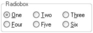
wxRadioBox can have the window styles listed in Table 4-28 in addition to those described for wxWindow. Specifying a different major dimension changes the button ordering.
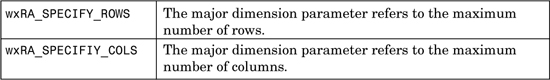
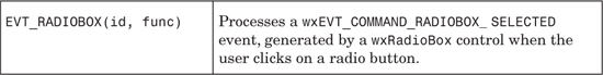
These are the major wxRadioBox functions.
Enable with an index and a boolean enables or disables a specified button.
FindString returns the index of a button matching the given string, or wxNOT_FOUND if no match was found.
GetCount returns the number of buttons in the radio box.
GetString and SetString are accessors for the label of the specified button. GetLabel and SetLabel set the radio box label.
GetSelection returns the zero-based index of the selected radio button. GetStringSelection returns the label of the selected button. SetSelection and SetStringSelection set the selection without generating a command event.
Show shows or hides an individual button or the whole radio box.
A radio button usually denotes one of several mutually exclusive options. It has a text label next to a button, which is normally round in appearance.
It has two states: on or off. You can create a group of mutually exclusive radio buttons by specifying wxRB_GROUP for the first in the group. The group ends when another radio button group is created, or when there are no more controls. You can also create other types of control within a group.
You might use a group of radio buttons instead of a radio box when the layout is slightly more complex: for example, you may have an extra description or other control next to each radio button. Or you may use radio buttons simply to avoid the static box that wxRadioBox provides.
Here’s a simple example of a group of two radio buttons.
#include "wx/radiobut.h"
wxRadioButton* radioButton1 = new wxRadioButton (panel,
ID_RADIOBUTTON1, wxT("&Male"), wxDefaultPosition,
wxDefaultSize, wxRB_GROUP);
radioButton1->SetValue(true);
wxRadioButton* radioButton2 = new wxRadioButton (panel,
ID_RADIOBUTTON2, wxT("&Female"));
// Sizer code to group the buttons horizontally
wxBoxSizer* sizer = new wxBoxSizer(wxHORIZONTAL);
sizer->Add(radioButton1, 0, wxALIGN_CENTER_VERTICAL¦wxALL, 5);
sizer->Add(radioButton2, 0, wxALIGN_CENTER_VERTICAL¦wxALL, 5);
parentSizer->Add(sizer, 0, wxALIGN_CENTER_VERTICAL¦wxALL, 5);
On Windows, this will create the controls shown in Figure 4-21.
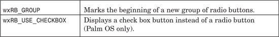
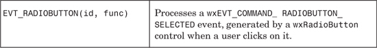
A wxScrollBar is a control that represents a horizontal or vertical scrollbar. It is distinct from the two scrollbars that some windows provide automatically, but the two types of scrollbar share the way events are received. A scrollbar has the following main attributes: range, thumb size, page size, and position.
The range is the total number of units associated with the view represented by the scrollbar. For a table with 15 columns, the range would be 15.
The thumb size is the number of units that are currently visible. For the table example, the window might be sized so that only 5 columns are currently visible, in which case the application would set the thumb size to 5. When the thumb size becomes the same as or greater than the range, the scrollbar will automatically be hidden on most platforms.
The page size is the number of units that the scrollbar should scroll when paging through the data.
The scrollbar position is the current thumb position.
To create a scrollbar control, pass the usual parent window, identifier, position, size, and style parameters. For example:
#include "wx/scrolbar.h"
wxScrollBar* scrollBar = new wxScrollBar(panel, ID_SCROLLBAR,
wxDefaultPosition, wxSize(200, 20), wxSB_HORIZONTAL);
Under Windows, this will look like the control in Figure 4-22.
After creation, call SetScrollbar to set its properties. For more information on using this function, see the description of wxScrolledWindow earlier in this chapter.
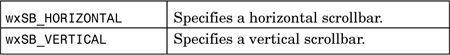
wxScrollBar generates wxScrollEvent propagating events. You can use EVT_COMMAND_SCROLL... macros with window identifiers when intercepting scroll events from controls, or EVT_SCROLL... macros without window identifiers for intercepting scroll events from the receiving window—except for this, the macros behave exactly the same. Use EVT_SCROLL(func) to respond to all scroll events. For a comprehensive list of scroll event macros, please see Table I-1 in Appendix I, “Event Classes and Macros,” and also see the reference manual.
These are the major wxScrollBar functions.
GetRange returns the length of the scrollbar.
GetPageSize returns the number of scroll units that will be scrolled when the user pages up or down. Often it is the same as the thumb size.
GetThumbPosition and SetThumbPosition are accessors for the current position of the scrollbar thumb.
GetThumbLength returns the thumb or “view” size.
SetScrollbar sets the scrollbar properties. It takes the position in scroll units, thumb size, range, page size, and optional boolean to specify whether the control will be refreshed.
wxSpinButton has two small up and down (or left and right) arrow buttons. It is often used next to a text control for incrementing and decrementing a value. Portable programs should try to use wxSpinCtrl instead as wxSpinButton is not implemented for all platforms.
The range supported by this control (and wxSpinCtrl) depends on the platform but is at least -32768 to 32767.
To create a wxSpinButton control, pass the usual parent window, identifier, position, size, and style parameters. For example:
#include "wx/spinbutt.h"
wxSpinButton* spinButton = new wxSpinButton(panel, ID_SPINBUTTON,
wxDefaultPosition, wxDefaultSize, wxSP_VERTICAL);
On Windows, the result is the control shown in Figure 4-23.
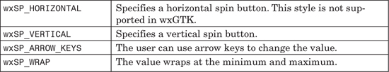
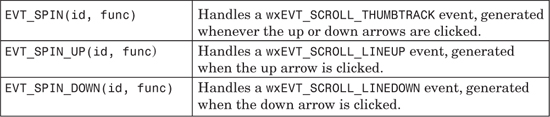
These are the major wxSpinButton functions.
GetMax returns the maximum permissible value.
GetMin returns the minimum permissible value.
GetValue returns the current spin button value, and SetValue sets the current spin value.
SetRange sets the minimum and maximum values.
wxSpinCtrl combines a wxTextCtrl and a wxSpinButton into one control. When you click on the up and down arrow buttons, the value displayed in the text control will be incremented or decremented, and you can also type integers directly into the text control.
To create a wxSpinCtrl control, pass the usual parent window, identifier, position, size, and style parameters. The following code creates a spin control with a range of zero to 100 and an initial value of 5.
#include "wx/spinctrl.h"
wxSpinCtrl* spinCtrl = new wxSpinCtrl(panel, ID_SPINCTRL,
wxT("5"), wxDefaultPosition, wxDefaultSize, wxSP_ARROW_KEYS,
0, 100, 5);
On Windows, this will look like the control in Figure 4-24.
wxSpinCtrl generates wxSpinEvent propagating events as shown in Table 4-36. You can also use EVT_TEXT to intercept text updates with a wxCommandEvent handler.
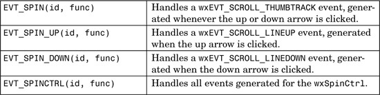
These are the major wxSpinCtrl functions.
GetMax returns the maximum permissible value.
GetMin returns the minimum permissible value.
GetValue returns the current integer spin button value, and SetValue sets the current spin value.
SetRange sets the minimum and maximum values.
A slider is a control with a handle that can be moved back and forth to change the value.
To create a wxSlider control, pass the usual parent window, identifier, position, size, and style parameters. The following code creates a slider control with a range of zero to 40 and an initial position of 16.
#include "wx/slider.h"
wxSlider* slider = new wxSlider(panel, ID_SLIDER, 16, 0, 40,
wxDefaultPosition, wxSize(200, -1),
wxSL_HORIZONTAL¦wxSL_AUTOTICKS¦wxSL_LABELS);
On Windows, this creates the control shown in Figure 4-25.
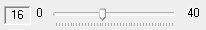
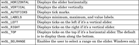
wxSlider generates wxCommandEvent propagating events, as shown in Table 4-38, but if you need finer control, you can use EVT_COMMAND_SCROLL_... with wxScrollEvent handlers; see Table I-1 in Appendix I.
These are the major wxSlider functions.
ClearSel clears the selection for a slider with wxSL_SELRANGE on Windows. ClearTicks clears the ticks on Windows.
GetLineSize and SetLineSize are accessors for the number of units incremented or decremented when the arrow buttons are clicked. GetPageSize and SetPageSize are accessors for the number of units paged when clicking either side of the thumb.
GetMax returns the maximum permissible value.
GetMin returns the minimum permissible value.
GetSelEnd and GetSelStart return the selection end and start points; use SetSelection to set the selection. These functions are only implemented on Windows.
GetThumbLength and SetThumbLength are accessors for the slider thumb size.
GetTickFreq and SetTickFreq are accessors for the tick frequency on Windows. Use SetTick to set a tick position on Windows.
GetValue returns the current slider value, and SetValue sets the slider value.
SetRange sets the minimum and maximum values.
The text control enables text to be displayed and edited, either as a single-line or a multi-line control. Some simple styling and formatting is supported on some platforms (Windows, GTK+, and Mac OS X via setting and getting text attributes using the wxTextAttr class.
To create a text control, pass the usual parent window, identifier, position, size, and style parameters, plus the initial text. For example, to create a multi-line text control:
#include "wx/textctrl.h"
wxTextCtrl* textCtrl = new wxTextCtrl(panel, ID_TEXTCTRL,
wxEmptyString, wxDefaultPosition, wxSize(240, 100),
wxTE_MULTILINE);
On Windows, this will create the control shown in Figure 4-26.
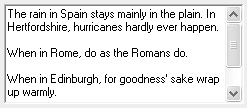
Multi-line text controls always store text as a sequence of lines separated by
characters, using Unix newlines even on non-Unix platforms. As a result, you can ignore the differences between platforms, but at a price: indices such as those returned by GetInsertionPoint or GetSelection cannot be used as indices into the string returned by GetValue as they’re going to be slightly off for platforms using
as the separator as Windows does.
Instead, if you need to obtain a substring between the two indices obtained from the control with the help of the functions mentioned previously, you should use GetRange. The indices themselves can only be passed to other methods, such as SetInsertionPoint or SetSelection. Never use the indices returned by multi-line text controls as indices into the string it contains, but only as arguments to be passed back to other wxTextCtrl methods.
Multi-line text controls support setting styles: you can set colors and fonts for individual characters. Note that under Windows, the wxTE_RICH style is required for style support. To use the styles, you can either call SetDefaultStyle before inserting the text or call SetStyle later to change the style of the text already in the control. The first method is much more efficient.
In either case, if the style doesn’t specify some of the attributes, the values of the default style will be used. If there is no default style, the attributes of the text control itself are used.
In the following code, the second call to SetDefaultStyle doesn’t change the text foreground color (which stays red), while the last one doesn’t change the background color (which stays gray):
text->SetDefaultStyle(wxTextAttr(*wxRED));
text->AppendText(wxT("Red text
"));
text->SetDefaultStyle(wxTextAttr(wxNullColour, *wxLIGHT_GREY));
text->AppendText(wxT("Red on gray text
"));
text->SetDefaultStyle(wxTextAttr(*wxBLUE);
text->AppendText(wxT("Blue on gray text
"));
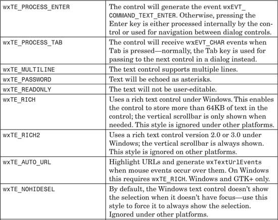
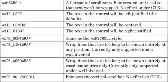
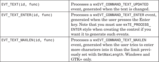
These are the major wxTextCtrl functions.
AppendText appends the given text to the end of the text control, and WriteText writes the text at the current insertion point. SetValue clears and then sets the value, after which IsModified returns false. You can pass strings with newlines for a multi-line text control. Be aware that these functions send text update events.
GetValue returns the entire contents of the control, possibly with newlines for a multi-line control. GetLineText gets just one line from a multi-line control. GetRange gets the text between two positions.
Copy copies the selected text onto the clipboard from the text field. Cut does the same, and it also deletes the selected text. Paste copies text from the clipboard into the text field. You can use CanCopy, CanCut, and CanPaste in UI update event handlers.
Clear clears the text in the control. Note that this will generate a text update event.
DiscardEdits resets the internal “modified” flag as if the current edits had been saved.
EmulateKeyPress inserts the character that would have been inserted if the given key event had occurred in the text control.
GetDefaultStyle and SetDefaultStyle are accessors for the font currently used for new text. GetStyle returns the style at the given position in the text, and SetStyle sets the style for the given range.
GetInsertionPoint and SetInsertionPoint get and set the current insertion point for new text. GetLastPosition returns the last position in the control, and SetInsertionPointEnd sets the insertion point at the end of the text.
GetLineLength returns the length of the specified line in characters.
GetNumberOfLines returns the number of lines of text in the control.
GetStringSelection returns the text currently selected in the control, or an empty string if there is no selection. GetSelection returns the current selection span in two pointers to long integers. SetSelection selects the text range indicated by two long integers representing positions in the text.
IsEditable returns true if the contents may be edited. Call SetEditable to make the control read-only or writeable. IsModified returns true if the user has modified the text. IsMultiline returns true if the control is multi-line.
LoadFile loads text from a file into the control, and SaveFile saves the contents as a file.
PositionToXY converts a pixel position to character position and line number, whereas XYToPosition goes the other way.
Remove removes the text in the given span. Replace replaces the text in the given span.
ShowPosition makes the line containing the given position visible.
Undo undoes the last edit, and Redo redoes the last edit. This may do nothing on some platforms. You can use CanUndo and CanRedo to test whether these operations can be applied to the control’s text (but not whether the platform supports undo/redo).
wxToggleButton is a button that stays pressed when clicked. In other words, it is similar to wxCheckBox in functionality but looks like a wxButton.
Here’s a simple example of creating a toggle button:
#include "wx/tglbtn.h"
wxToggleButton* toggleButton = new wxToggleButton(panel, ID_TOGGLE,
wxT("&Toggle label"), wxDefaultPosition, wxDefaultSize);
toggleButton->SetValue(true);
Figure 4-27 shows how a toggle button looks on Windows in the toggled state.
These are the major wxToggleButton functions.
SetLabel and GetLabel are accessors for the button label. You can use an ampersand to indicate that the following letter is the mnemonic (or “access key”), used on Windows and GTK+.
GetValue and SetValue get and set the boolean state.
Static controls do not take any input and are used to display information or to enhance the application’s aesthetics.
This is a horizontal or vertical bar that shows a quantity (often time) from zero to the specified range. No command events are generated for the gauge. Here’s a simple example of creating a gauge:
#include "wx/gauge.h"
wxGauge* gauge = new wxGauge(panel, ID_GAUGE,
200, wxDefaultPosition, wxDefaultSize, wxGA_HORIZONTAL);
gauge->SetValue(50);
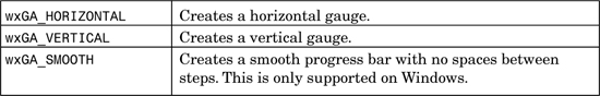
A static text control displays one or more lines of read-only text.
To create a wxStaticText control, pass a parent window, identifier, label, position, size, and style. For example:
#include "wx/stattext.h"
wxStaticText* staticText = new wxStaticText(panel, wxID_STATIC,
wxT("This is my &static label"),
wxDefaultPosition, wxDefaultSize, wxALIGN_LEFT);
Under Windows, this creates the control shown in Figure 4-29.
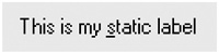
An ampersand in the label (as shown here) indicates to some platforms—currently Windows and GTK+—that the following letter should be underscored and used as a shortcut key for navigating to the next non-static control.
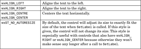
A static bitmap control displays an image.
To create a wxStaticBitmap control, pass a parent window, identifier, bitmap, position, size and style. For example:
#include "wx/statbmp.h"
#include "print.xpm"
wxBitmap bitmap(print_xpm);
wxStaticBitmap* staticBitmap = new wxStaticBitmap(panel, wxID_STATIC,
bitmap);
This produces a simple image on the panel or dialog as shown in Figure 4-30.
This control displays a horizontal or vertical line, to be used as a separator in dialogs.
Here’s an example of creating a wxStaticLine control:
#include "wx/statline.h"
wxStaticLine* staticLine = new wxStaticLine(panel, wxID_STATIC,
wxDefaultPosition, wxSize(150, -1), wxLI_HORIZONTAL);
Figure 4-31 shows what a horizontal static line looks like under Windows.
This control is a rectangle drawn around other controls to denote a logical grouping of items, with an optional text label. At present, the control should not be used as a parent for further controls; the controls that it surrounds are actually siblings of the box and should be created after it but with the same parent as the box. Future versions of wxWidgets may allow contained controls to be either siblings or children.
Here’s an example of creating a wxStaticBox control:
#include "wx/statbox.h"
wxStaticBox* staticBox = new wxStaticBox(panel, wxID_STATIC,
wxT("&Static box"), wxDefaultPosition, wxSize(100, 100));
This will look like the control in Figure 4-32 under Windows.
In this section, we’ll describe programming with wxMenu, a simple way to present commands without taking up a lot of display space. In the next section, we’ll look at how menus are used in menu bars.
A menu is a list of commands that pops up either from a menu bar or on an arbitrary window, often as a “context menu” invoked by clicking the right mouse button (or equivalent). A menu item can be a normal command, or it can have a check or radio button next to the label. A menu item in a disabled state won’t respond to commands. A special kind of menu item can display a visual indication of a further pull-right menu, and this can be nested to an arbitrary level. Another kind of menu item is the separator, which simply displays a line or space to indicate separation between two groups of items.
Figure 4-33 shows a typical menu with normal, check, and radio items and a submenu.
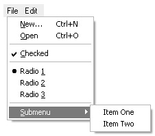
The example shows the use of both mnemonics and shortcuts. A mnemonic is a highlighted key in a label (such as the “N” in “New”) that can be pressed when the menu is shown to execute that command. Specify a mnemonic by preceding the letter with an ampersand (“&”). A shortcut (or accelerator) is a key combination that can be used when the menu is not shown, and it is indicated in a menu item by a key combination following a tab character. For example, the New menu item in the example was created with this code:
menu->Append(wxID_NEW, wxT("&New... Ctrl+N"));
For more on creating accelerators via menu items or by programming with wxAcceleratorTable, please see Chapter 6.
Check and radio items automatically update their state; that is, when the user toggles a check item, it will be shown in the reverse state when the menu is next popped up. Similarly, consecutive radio items form a group and when one item is checked, the other items in the group are unchecked. You can also set these states yourself, for example from a user interface update event handler (see Chapter 9).
You can create a menu and show it at a particular point in a window using wxWindow::PopupMenu, for example:
void wxWindow::OnRightClick(wxMouseEvent& event)
{
if (!m_menu)
{
m_menu = new wxMenu;
m_menu->Append(wxID_OPEN, wxT("&Open"));
m_menu->AppendSeparator();
m_menu->Append(wxID_EXIT, wxT("E&xit"));
}
PopupMenu(m_menu, event.GetPosition());
}
Events are sent to the menu itself before travelling up the hierarchy of windows starting from the window the popup menu was shown on. PopupMenu will cause program flow to “block” at this point, resuming when the user has dismissed the menu. If you want, you can delete and re-create the menu every time it needs to be shown, or you can reuse the same menu.
Where possible, use standard wxWidgets identifiers in menus, such as wxID_OPEN, wxID_ABOUT, wxID_PRINT, and so on. You can find a full list of these in Chapter 3. In particular, wxID_ABOUT, wxID_PREFERENCES and wxID_EXIT are interpreted specially on Mac OS X. When used in a menu bar, these menu items are not shown in the menus to which they are appended, but are shown instead in the standard application menu. Thus wxWidgets adapts your menus automatically to Mac OS X conventions, but beware of side effects such as a Help menu with no menu items, or two separators together.
See samples/menu in the wxWidgets distribution for a test of most menu functionality, and also see samples/ownerdrw for a demonstration of the use of custom fonts and bitmaps in menu items.
There are four different kinds of event associated with wxMenu: wxCommandEvent, wxUpdateUIEvent, wxMenuEvent, and wxContextMenuEvent.
Table 4-45 lists the command events, whose handlers take a wxCommandEvent argument. Use these for processing menu commands, either from a pop-up menu or a menu bar on a frame. These are interchangeable with the equivalent toolbar event macros so that events generated from both menus and toolbar buttons can be processed by the same handler.
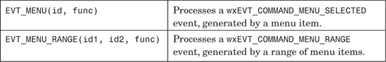
Table 4-46 lists the event macros for update events—events generated by the framework in idle time to give the application a chance to update elements of the UI—for example, enabling or disabling menu items. Although wxUpdateUIEvent applies to all windows, menu event handlers can use them slightly differently than other event handlers: they can call Check and SetText as well as Enable. Check checks or unchecks the menu item, while SetText sets the menu item label, which is useful if the label changes dynamically according to some condition. For example:
BEGIN_EVENT_TABLE(MyFrame, wxFrame)
EVT_UPDATE_UI(ID_TOGGLE_TOOLBAR, MyFrame::OnUpdateToggleToolbar)
END_EVENT_TABLE()
void MyFrame::OnUpdateToggleToolbar(wxUpdateUIEvent& event)
{
event.Enable(true);
event.Check(m_showToolBar);
event.SetText(m_showToolBar ?
wxT("Show &Toolbar (shown)") :
wxT("Show &Toolbar (hidden)"));
}
For more on UI update events, please see Chapter 9.
Table 4-47 lists the other menu-related events. EVT_CONTEXT_MENU handlers take a wxContextMenuEvent, which is derived from wxCommandEvent and therefore propagates up the parent-child window hierarchy. Use this in preference to intercepting a right mouse button click when you want to show a context menu, and call the event object’s GetPosition function to find out where to show the menu.
The remaining macros process wxMenuEvent objects, and these are only sent from a menu bar to its frame. They tell the application when a menu has been opened and closed, and when the user has highlighted a menu item. The default EVT_MENU_HIGHLIGHT handler shows a menu item’s help string in the status bar, but you can provide your own handler to do something different.
These are the major wxMenu functions.
Append adds a menu item: specify an identifier, a label, a help string, and the kind of item (wxITEM_NORMAL, wxITEM_SEPARATOR, wxITEM_CHECK or wxITEM_RADIO). You can also use AppendCheckItem and AppendRadioItem to avoid specifying wxITEM_CHECK or wxITEM_RADIO. For example:
// Append a normal item
menu->Append(wxID_NEW, wxT("&New... Ctrl+N"));
// Append a check item
menu->AppendCheckItem(ID_SHOW_STATUS, wxT("&Show Status"));
// Append a radio item
menu->AppendRadioItem(ID_PAGE_MODE, wxT("&Page Mode"));
Another overload of Append enables you to append a submenu, for example:
// Append a submenu
menu->Append(ID_SUBMENU, wxT("&More options..."), subMenu);
Yet another overload of Append enables you to use a wxMenuItem object directly to append an item, and this is the only way to show bitmaps on menus or to set special fonts. For example:
// Initialization of bitmaps and font not shown
wxBitmap bmpEnabled, bmpDisabled;
wxFont fontLarge;
// Create a menu item
wxMenuItem* pItem = new wxMenuItem(menu, wxID_OPEN, wxT("&Open..."));
// Set bitmaps and font
pItem->SetBitmaps(bmpEnabled, bmpDisabled);
pItem->SetFont(fontLarge);
// Finally append it to the menu
menu->Append(pItem);
Use Insert to insert a menu at a particular position. There are also the functions Prepend, PrependCheckItem, PrependRadioItem, and PrependSeparator for inserting items at the start of the menu.
AppendSeparator adds a separator, and InsertSeparator inserts a separator in a given position. For example:
// Append a separator
menu->AppendSeparator();
Break inserts a break in a menu, causing the next appended item to appear in a new column.
Use Check to toggle a check or radio item on or off, passing the menu item identifier and a boolean value. Use IsChecked to get the checked status.
Delete deletes a menu item specified by identifier or by wxMenuItem pointer. If the item is a menu, the submenu will not be deleted. Use Destroy if you want to remove and delete a submenu. Remove removes the menu item from a menu without deleting the returned wxMenuItem object.
Use Enable to enable or disable a menu item, but rather than doing this explicitly, you may want to use UI update events (see Chapter 9). IsEnabled returns the enabled status.
Use FindItem to find an item by label or identifier. Use FindItemByPosition to find an item by position in the menu.
GetHelpString and SetHelpString are accessors for the help string associated with a menu item. When the menu is part of a menu bar, wxFrame shows this string in the status bar (if available), as the user highlights each menu item.
GetLabel and SetLabel get or set the menu item label, given its identifier.
GetMenuCount returns the number of items in the menu.
GetMenuItems returns a reference to the list of menu items, a wxMenuItemList object.
GetTitle and SetTitle are accessors for the optional title of a menu and are only used for pop-up menus.
UpdateUI sends UI update events to the event handler argument or to the owning window if NULL is passed. This is called just before the menu is popped up, but the application may call it at other times if required.
A control bar provides a convenient way to contain and arrange multiple controls. There are currently three kinds of control bars: wxMenuBar, wxToolBar, and wxStatusBar. wxMenuBar can only belong to a wxFrame. wxToolBar and wxStatusBar are most commonly used with wxFrame, but they can also be children of other windows.
A menu bar contains a series of menus accessible from the top of a frame under the title bar. You can replace a frame’s current menu bar by calling SetMenuBar. To create a menu bar, use the default constructor and append wxMenu objects. For example:
wxMenuBar* menuBar = new wxMenuBar;
wxMenu* fileMenu = new wxMenu;
fileMenu->Append(wxID_OPEN, wxT("&Open..."), wxT("Opens a file"));
fileMenu->AppendSeparator();
fileMenu->Append(wxID_EXIT, wxT("E&xit"), wxT("Quits the program"));
menuBar->Append(fileMenu);
frame->SetMenuBar(menuBar, wxT("&File"));
This code creates a one-menu menu bar, as shown in Figure 4-34.
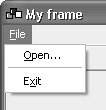
You can append submenus to a wxMenu, and you can create check and radio menu items (refer to the “Menus” section earlier in this chapter). As in the previous example, an ampersand in a label indicates that the following character should be used as a mnemonic (pressing that key when the menu is shown executes the associated command).
If you provide a help string, it will be shown in the frame’s status bar (if any) by virtue of the default EVT_MENU_HIGHLIGHT handler.
wxMenuBar takes the wxMB_DOCKABLE style, used under GTK+ to allow the menu bar to be detached from the frame.
These are the major wxMenuBar functions.
Append adds a menu to the end of the menu bar, which will then own the menu and will destroy it when the menu bar is destroyed (usually by the owning frame). Pass the menu and a label. Insert inserts a menu at the given position.
Enable enables or disables the given menu item, given its identifier. Use IsEnabled to check its enabled status.
Check checks or unchecks a check or radio menu item. Use IsChecked to test its checked status.
EnableTop enables or disables a whole menu, by zero-based position.
FindMenu returns the index of a menu whose label matches the given string, with or without mnemonic characters. It returns wxNOT_FOUND if there was no match.
FindMenuItem returns the index of a menu item given a menu name and a menu item.
FindItem returns the wxMenuItem object given a menu item identifier, and if it is a submenu, its wxMenu pointer will be returned in the second argument.
GetHelpString and SetHelpString are accessors for the help string for a given menu item.
GetLabel and SetLabel are accessors for a menu item’s label.
GetLabelTop and SetLabelTop are accessors for a menu’s label in the menu bar, given the zero-based menu position.
GetMenu returns a pointer to the wxMenu at the given zero-based position.
GetMenuCount returns the number of menus in the menu bar.
Refresh redraws the menu bar.
Remove removes a menu and returns the wxMenu object, which the application is then responsible for deleting.
Replace replaces a menu at the given position with another one. The old menu is returned, and the application is responsible for deleting it.
A toolbar contains a number of buttons and controls. It can be horizontal or vertical, and the buttons can be push, check, or radio buttons. The buttons can show labels as well as bitmaps. If you use wxFrame::CreateToolBar to create the toolbar, or wxFrame::SetToolBar to associate it with a frame, the frame will manage the toolbar, and it will not be counted as part of the client area. If you use it in any other way, then your code will have to manage the toolbar size and position using sizers or some other method.
Here’s an example of creating a toolbar and associating it with a frame:
#include "wx/toolbar.h"
#include "open.xpm"
#include "save.xpm"
wxToolBar* toolBar = new wxToolBar(frame, wxID_ANY,
wxDefaultPosition, wxDefaultSize, wxTB_HORIZONTAL¦wxNO_BORDER);
wxBitmap bmpOpen(open_xpm);
wxBitmap bmpSave(save_xpm);
toolBar->AddTool(wxID_OPEN, bmpOpen, wxT("Open"));
toolBar->AddTool(wxID_SAVE, bmpSave, wxT("Save"));
toolBar->AddSeparator();
wxComboBox* comboBox = new wxComboBox(toolBar, ID_COMBOBOX);
toolBar->AddControl(comboBox);
toolBar->Realize();
frame->SetToolBar(toolBar);
Under Windows, this will create a toolbar, as shown in Figure 4-35.
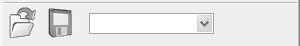
Note the call to Realize, which must be performed after all buttons and controls have been added to the toolbar; otherwise, nothing will appear in the toolbar.
Check out the wxWidgets sample in samples/toolbar for a demonstration of changing orientation, showing labels on buttons, changing the button size, and other aspects of wxToolBar.
Under Windows, wxWidgets will attempt to map colors in the tool bitmaps that are close to “standard” colors to equivalents used by the current theme. In particular, light gray is used to indicate transparency within the bitmap. Table 4-48 lists these colors. In fact, colors in the bitmap only have to be close to the indicated color (each RGB element can be within 10 units of the standard value) for the substitution to take place.
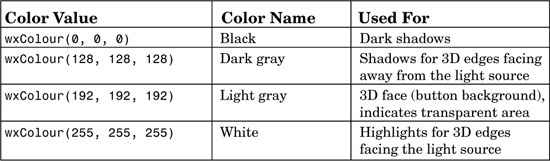
This is fine for 16-color tool bitmaps, but if you use more colors, the mapping can be undesirable because it leads to a grainy effect. In this case, add the following line to your code before the creation of the toolbar to switch off the mapping:
wxSystemOptions::SetOption(wxT("msw.remap"), 0);
You will need to include wx/sysopt.h in your source file.
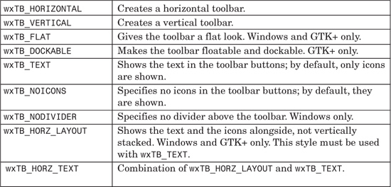
Toolbar event macros are listed in Table 4-50. The toolbar class emits menu commands in the same way that a frame’s menu bar does, so you can use one EVT_MENU or EVT_TOOL macro for both a menu item and a toolbar button. The event handler functions take a wxCommandEvent argument. For most of the event macros, the identifier of the tool is passed, but for EVT_TOOL_ENTER, the toolbar window identifier is passed, and the tool identifier is retrieved from the wxCommandEvent. This is because the identifier may be -1 when the mouse moves off a tool, and -1 is not allowed as an identifier in the event system.
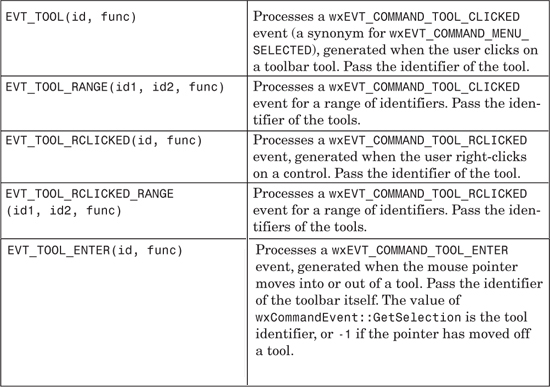
These are the major wxToolBar functions.
AddTool adds a tool: specify the identifier, an optional label, a bitmap, a help string, and the kind of tool (wxITEM_NORMAL, wxITEM_CHECK, or wxITEM_RADIO). Use InsertTool to insert the tool at a particular position. You can also use AddCheckTool and AddRadioTool to avoid specifying wxITEM_CHECK or wxITEM_RADIO. AddSeparator adds a separator, which is a line or a space depending on implementation. Use InsertSeparator to insert a separator in a given position. For example, the following line adds a checkable tool with a caption ("Save"), a bitmap, and a help string ("Toggle button 1"):
toolBar->AddTool(wxID_SAVE, wxT("Save"), bitmap,
wxT("Toggle button 1"), wxITEM_CHECK);
AddControl adds a control, such as a combo box. InsertControl inserts a control at a given position.
DeleteTool deletes a tool specified by identifier. DeleteToolByPos deletes a tool by position. RemoveTool removes a tool from the toolbar but doesn’t delete the wxToolBarTool object, which is returned from the function.
Use EnableTool to enable or disable a tool, but rather than doing this explicitly, you may want to use UI update events (see Chapter 9). GetToolEnabled returns the enabled status.
Use FindById and FindControl to find a tool or control by identifier.
If you need to add bitmaps with a size other than the default 16×15, call SetToolBitmapSize. GetToolBitmapSize returns the current bitmap size. GetToolSize returns the size including decorations around the tool.
GetMargins and SetMargins are accessors for the left/right and top/bottom margins.
GetToolClientData and SetToolClientData can be used to return or associate an arbitrary wxObject for a tool, given the tool identifier.
GetToolLongHelp and SetToolLongHelp are accessors for the long help string associated with a tool. This is a line of help that could be shown in a status bar, for example. GetToolShortHelp and SetToolShortHelp are accessors for the short help string (tooltip) associated with a tool.
GetToolPacking and SetToolPacking are accessors for the tool spacing in the vertical direction if the toolbar is horizontal, and for spacing in the horizontal direction if the toolbar is vertical.
GetToolPosition returns the position in the toolbar given a tool identifier.
GetToolSeparation and SetToolSeparation are accessors for the tool separator size.
GetToolState and SetToolState are accessors for a check or radio tool on/off state.
Realize must always be called after tools have been added.
ToggleTool toggles the given radio or check tool on or off.
A status bar is a narrow window that can be placed along the bottom of a frame to give small amounts of status information. It can contain one or more fields, which can have fixed or variable width. If you use wxFrame::CreateStatusBar to create the status bar, or wxFrame::SetStatusBar to associate it with a frame, the frame will manage the status bar, and it will not be counted as part of the client area. If you use it in any other way, then your code will have to manage the status bar size and position using sizers or some other method.
Here’s an example of creating a status bar with three fields, two that are 60 pixels wide and a third that expands to fill the rest of the status bar.
#include "wx/statusbr.h"
wxStatusBar* statusBar = new wxStatusBar(frame, wxID_ANY,
wxST_SIZEGRIP);
frame->SetStatusBar(statusBar);
int widths[] = { 60, 60, -1 };
statusBar->SetFieldWidths(WXSIZEOF(widths), widths);
statusBar->SetStatusText(wxT("Ready"), 0);
The resulting status bar is shown in Figure 4-36.
If you want, you can create small controls inside status bar fields. You will have to manage their size and position yourself—for example, from within the size event handler of a class derived from wxStatusBar.
Table 4-51 shows the specific window style for wxStatusBar. You can also determine the appearance of the individual field borders using SetStatusStyles.
These are the major wxStatusBar functions.
GetFieldRect returns the size and position of a field’s internal bounding rectangle.
GetFieldsCount returns the number of fields in the status bar. Use SetFieldsCount to set the number of fields.
GetStatusText gets the status text for a field, and SetStatusText sets the text for a field.
PushStatusText saves the current field text in a stack and sets the field text to the string passed as an argument. PopStatusText sets the field text to the top of the stack and pops the stack of saved strings.
SetMinHeight sets the minimal possible height for the status bar.
SetStatusWidths takes the number of fields and an array of integers that represent each field’s width, or a negative number to specify a proportion of the status bar to fill. For example, to create one field of fixed width 100 in the right part of the status bar and two more fields that get 66% and 33% of the remaining space respectively, you should specify an array containing -2, -1, and 100. The negative numbers are used to distinguish absolute pixel values from proportions.
SetStatusStyles takes the number of fields and an array of integer styles that determine the appearance of the fields. Use wxSB_NORMAL for a sunken field with a 3D border, wxSB_FLAT for a flat field with no border, and wxSB_RAISED for a field with a raised 3D border.
This chapter has given you enough information about the capabilities of essential window and control classes to know how to start building useful applications. For more details on these and other window classes, please refer to the reference manual. For further window classes, and how to create your own controls, see Chapter 12. You’ll also find it useful to look at the samples in your wxWidgets distribution, such as samples/widgets, samples/toolbar, samples/text, and samples/listbox.
Next, we’ll look at how how your application can draw on a variety of surfaces, including windows, bitmaps, and the printed page.