Chapter 7 Window Layout Using Sizers
As graphic designers will testify, people are very sensitive to the way that visual objects are arranged. A GUI framework must allow the creation of a visually appealing layout, but unlike with print layout, an application’s windows must often dynamically adapt to changes in size, font preferences, and even language. For platform-independent programming, the layout must also take into account the different sizes of individual controls from one platform to the next. All this means that a näive approach using absolute positions and sizes for controls simply won’t work. This chapter describes wxWidgets’ system of sizers, which gives you all the flexibility you need for even the most complex layouts. If it seems a bit daunting at first, remember that there are tools that will help you create sizer-based layouts—such as DialogBlocks, included on the accompanying CD-ROM—and you will rarely need to create entire layouts by hand.
Before taking the plunge into the world of sizers, let’s review where you might need to program layout behavior and what options you have.
A simple case is where you have a frame with a single window inside the client area. This is so simple that wxWidgets does the layout itself, fitting the child window to the size of the frame client area. For each frame, wxWidgets also manages the menu bar, one toolbar, and one status bar if they have been associated with the frame. If you need two toolbars, then you have to manage at least one of them yourself. If you have more than one child window in the client area, then wxWidgets expects you to manage them explicitly. You can do this with an OnSize event handler and calculate the position and size for each window and then set them. Or, you can use sizers. Similarly, if you create a custom control that consists of several child windows, you need to arrange for the child windows to resize appropriately when the overall control is resized.
Most applications have custom dialogs, sometimes dozens of them. The dialogs may be resizable, in which case the layout should look sensible even when the dialog is much larger than the initial size. The language may be changed, making some elements much larger or smaller than in the default language. If you had to program a hundred resize-friendly dialogs by hand, even with sizers, it would be almost impossibly daunting, so it’s fortunate that editors are available to make this task simple—even a pleasure.
If (and when!) you choose to use sizers, you need to decide how you will create and deploy them. You or your dialog editor can create code in C++ or another language, or you can use XRC files, which are a declarative XML specification of the sizer layout. XRC files can be loaded dynamically or embedded in the executable by compiling them into C++ files with the utility wxrc. Most dialog editors can generate both code and XRC files. Your choice of code or XRC may be a matter of taste; perhaps you prefer to separate the layout from the class, or maybe you prefer the additional flexibility of tweaking the C++ code and the immediacy of having it in the same file as the class.
The next section describes the principles behind sizers, and the following sections describe how to program with individual sizer classes.
The layout algorithm used by sizers in wxWidgets is closely related to layout systems in other GUI toolkits, such as Java’s AWT, the GTK+ toolkit, or the Qt toolkit. It is based upon the idea of individual windows reporting their minimal required size and their ability to be stretched if the size of the parent window has changed. This will most often mean that the programmer does not set the initial size of a dialog; instead, the dialog will be assigned a sizer, which will be queried about the recommended size. This sizer in turn will query its children (which can be windows, empty space, or other sizers) and further descendants. Note that wxSizer does not derive from wxWindow and thus does not interfere with tab ordering and requires very few resources compared to a real window. Sizers form a containment hierarchy parallel to the actual window hierarchy: the sizer hierarchy for a complex dialog may be many deep, but the controls themselves will probably all be siblings with the dialog as their parent.
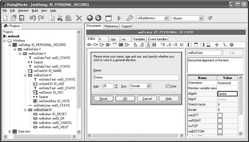
This sizer hierarchy is depicted graphically in wxWidgets dialog editors. Figure 7-1 shows Anthemion Software’s DialogBlocks editing the Personal Record dialog that we will use as an example in Chapter 9, “Creating Custom Dialogs.” A red border in the editor pane surrounds the currently selected element, and its immediate parent is shown with a blue border. The tree you see on the left represents the sizer view of the hierarchy, but all controls are still parented directly on the dialog as far as the window hierarchy is concerned.
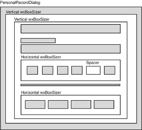
To get a mental picture of how nested sizers work, consider Figure 7-2, a schematic view of the dialog being edited in Figure 7-1. The shaded areas represent actual windows, while the white boxes represent sizers. There are two vertical sizers inside the dialog (to give extra space around the edge of the dialog), and two horizontal sizers within the inner vertical sizer. A spacer is employed inside a horizontal sizer to keep one control away from another group of controls. As you can see, creating a sizer-based layout is really like sorting through a collection of different-sized cardboard boxes, placing smaller boxes in bigger boxes, and adding objects and packing material inside some of them. Of course, the analogy is imperfect because cardboard doesn’t stretch!
There are currently five basic sizer classes available in wxWidgets. Each either represents a specific way to lay out windows or fulfills a special task such as wrapping a static box around another element. These sizers will be discussed in the following sections.
All sizers are containers—that is, they are used to lay out one or more elements, which they contain. No matter how the individual sizers lay out their children, all children have certain features in common.
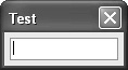
A minimal size: The minimal size of a control is calculated from the control’s notion of its “best size” (supplied by implementing DoGetBestSize for each control). This is the control’s natural size. For example, the best size of a check box comprises the space taken up by the check box graphic and the label. However, if you want the initial window size (as passed to the window’s constructor) to be used as the minimal size instead, you can use the wxFIXED_MINSIZE style when adding the control to a sizer. Note that only some windows can calculate their size (such as a check box), whereas others (such as a list box) don’t have any natural width or height and thus require an explicit size. Some windows can calculate their height, but not their width—for example, a single-line text control. Figure 7-3 shows three controls on their own in a dialog, showing how they expand the dialog to fit their own minimal size.

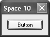
A border: The border is just empty space that is used to separate elements. This border can be all around, or it can be at any combination of sides, such as only above and below the control. The thickness of this border must be set explicitly, typically 5 pixels. Figure 7-4 shows dialogs with only one control (a button) and a border of 0, 5, and 10 pixels around the button, respectively.


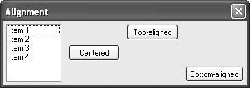
An alignment: An element can be moved to the center of the available space, or to either side of the space. Figure 7-5 shows a horizontal box sizer containing a list box and three buttons. One button is centered, one is aligned at the top, and one is aligned at the bottom. Alignment can be specified in horizontal or vertical orientations, but for most sizers, only one of these will have an effect. For example, in Figure 7-5, we have specified alignment in the vertical orientation, but horizontal alignment isn’t possible because of the way space is distributed among children of the sizer. (To achieve the effect of horizontal alignment, we would need to insert a stretching spacer, which we will look at shortly.)
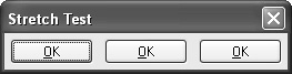
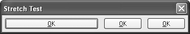
A stretch factor: If a sizer contains more than one child and is offered more space than its children and their borders need, the surplus space needs to be distributed among the children. For this purpose, a stretch factor may be assigned to each child, where the default value of zero indicates that the child will not get more space than its requested minimal size. A value of more than zero is interpreted in relation to the sum of all stretch factors in the children of the respective sizer, so if two children get a stretch factor of 1, they will each get half the extra space, independent of their minimal size. Figure 7-6 shows a dialog with three buttons, at the initial size and after resizing. The first button has a stretch factor of 1 and thus gets stretched, whereas the other two buttons have a stretch factor of zero and keep their initial width.
Note that the term “proportion” is sometimes used instead of stretch factor in the wxWidgets reference manual.
To create a sizer-based layout, create a top-level sizer (any kind of sizer may be used) and associate it with the parent window with wxWindow::SetSizer. Now you can hang your hierarchy of windows and further sizers from the top-level sizer. If you want the top-level window to fit itself around the contents, you call wxSizer::Fit passing the top-level window. If the window should never be resized smaller than the initial size, call wxSizer::SetSizeHints passing the top-level window. This will call wxWindow::SetSizeHints with the appropriate values.
Instead of the three functions described in the previous paragraph, you can simply call the function wxWindow::SetSizerAndFit, which sets the sizer, calls Fit, and also calls SetSizeHints.
If you have a panel inside a frame, you may be wondering which window gets the top-level sizer. Assuming you only have one panel in the frame, the frame already knows how to size the panel to fill the frame’s client area when the frame size is changed. Therefore, you should set the sizer for the panel to manage the panel’s children. If you had more than one panel in the frame, you might set a top-level sizer for the frame, which would manage the frame’s children. However, you would still need a top-level sizer for each child panel that had its own children to lay out.
The following sections describe each kind of sizer and how to use it.
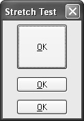
wxBoxSizer can lay out its children either vertically or horizontally, depending on the style passed to its constructor. When using a vertical sizer, each child can be centered, aligned to the right, or aligned to the left. Correspondingly, when using a horizontal sizer, each child can be centered, aligned at the bottom, or aligned at the top. The stretch factor described previously is used for the main orientation, so when using a horizontal box sizer, the stretch factor determines how much the child can be stretched horizontally. Figure 7-7 shows the same dialog as in Figure 7-6, except that the sizer is a vertical box sizer.
You add child elements to a box sizer with Add:
// Add a window
void Add(wxWindow* window, int stretch = 0, int flags = 0,
int border = 0);
// Add a sizer
void Add(wxSizer* window, int stretch = 0, int flags = 0,
int border = 0);
The first parameter is a window or sizer.
The second is the proportion or stretch factor.
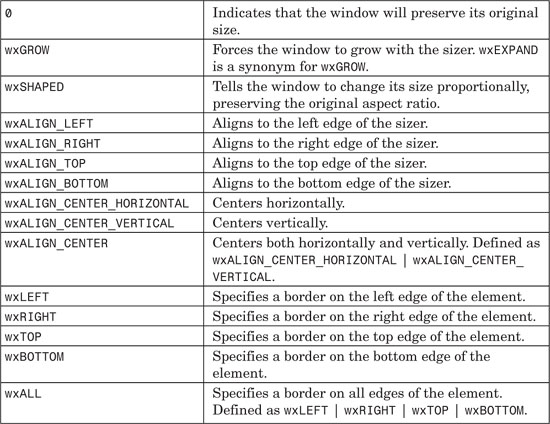
The third parameter is a bit-list specifying alignment behavior and borders. The alignment flags specify what happens when a vertical sizer changes its width, or when a horizontal sizer changes its height. The allowed values for specifying alignment and borders are shown in Table 7-1. The default alignment is wxALIGN_LEFT ¦ wxALIGN_TOP.
The fourth parameter specifies the size of the border (on the edges that have been specified in the flags parameter).
You can also add a spacer. There are three ways to do this:
// Add a spacer (old method)
void Add(int width, int height, int stretch = 0, int flags = 0,
int border = 0);
// Add a fixed-size spacer
void AddSpacer(int size);
// Add a stretching spacer
void AddStretchSpacer(int stretch = 1);
The second method is the equivalent of calling Add(size, size, 0), and the third method is equivalent to calling Add(0, 0, stretch).
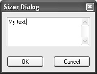
As an example, we will construct a dialog that will contain a text field at the top and two buttons at the bottom. This can be seen at the top level as a column with the text at the top and buttons at the bottom, and at the second level as a row with an OK button to the left and a Cancel button to the right. In many cases, the main window will be resizable by the user, and this change of size will have to be propagated to its children. Here, we want the text area to grow with the dialog, whereas the buttons should have a fixed size. In addition, the buttons will be centered as the width of the dialog changes. Figure 7-8 shows how it will look.
Here’s the code that produces this dialog:
// A dialog with a stretching text control
MyDialog::MyDialog(wxWindow *parent, wxWindowID id,
const wxString &title )
: wxDialog(parent, id, title,
wxDefaultPosition, wxDefaultSize,
wxDEFAULT_DIALOG_STYLE ¦ wxRESIZE_BORDER)
{
wxBoxSizer *topSizer = new wxBoxSizer( wxVERTICAL );
// Create text ctrl with minimal size 100x60
topSizer->Add(
new wxTextCtrl( this, wxID_ANY, "My text.",
wxDefaultPosition, wxSize(100,60), wxTE_MULTILINE),
1, // make vertically stretchable
wxEXPAND¦ // make horizontally stretchable
wxALL, // and make border all around
10 ); // set border width to 10
wxBoxSizer *buttonSizer = new wxBoxSizer( wxHORIZONTAL );
buttonSizer->Add(
new wxButton( this, wxID_OK, "OK" ),
0, // make horizontally unstretchable
wxALL, // make border all around: implicit top alignment
10 ); // set border width to 10
buttonSizer->Add(
new wxButton( this, wxID_CANCEL, "Cancel" ),
0, // make horizontally unstretchable
wxALL, // make border all around (implicit top alignment)
10 ); // set border width to 10
topSizer->Add(
buttonSizer,
0, // make vertically unstretchable
wxALIGN_CENTER ); // no border and centre horizontally
SetSizer( topSizer ); // use the sizer for layout
topSizer->Fit( this ); // fit the dialog to the contents
topSizer->SetSizeHints( this ); // set hints to honor min size
}
wxStaticBoxSizer is a sizer derived from wxBoxSizer that manages a static box around the sizer. Note that this static box has to be created separately. Create wxStaticBoxSizer by passing a pointer to the static box and the orientation (wxHORIZONTAL or wxVERTICAL). The Add function is the same as for wxBoxSizer.
Figure 7-9 shows an example of a dialog with a static box containing a check box control.
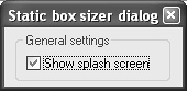
Here’s the corresponding code:
MyDialog::MyDialog(wxWindow *parent, wxWindowID id,
const wxString &title )
: wxDialog(parent, id, title,
wxDefaultPosition, wxDefaultSize,
wxDEFAULT_DIALOG_STYLE ¦ wxRESIZE_BORDER)
{
// Create top-level sizer
wxBoxSizer* topLevel = new wxBoxSizer(wxVERTICAL);
// Create static box and static box sizer
wxStaticBox* staticBox = new wxStaticBox(this,
wxID_ANY, wxT("General settings"));
wxStaticBoxSizer* staticSizer = new wxStaticBoxSizer(staticBox,
wxVERTICAL);
topLevel->Add(staticSizer, 0,
wxALIGN_CENTER_HORIZONTAL¦wxALL, 5);
// Create a check box inside the static box sizer
wxCheckBox* checkBox = new wxCheckBox( this, ID_CHECKBOX,
wxT("&Show splash screen"), wxDefaultPosition, wxDefaultSize);
staticSizer->Add(checkBox, 0, wxALIGN_LEFT ¦wxALL, 5);
SetSizer(topLevel);
topLevel->Fit(this);
topLevel->SetSizeHints(this);
}
wxGridSizer is a sizer that lays out its children in a two-dimensional table with all table fields having the same size; that is, the width of each field is the width of the widest child, and the height of each field is the height of the tallest child. Create a wxGridSizer by passing the number of rows, number of columns, extra vertical gap between children, and extra horizontal gap between children. Add is the same as for wxBoxSizer.
Figure 7-10 shows a grid sizer with three columns and two rows. The extra size of the second button has caused the space occupied by all the buttons to increase because all the cells of a wxGridSizer are the same size.
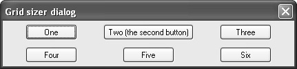
Here’s the code:
MyDialog::MyDialog(wxWindow *parent, wxWindowID id,
const wxString &title )
: wxDialog(parent, id, title,
wxDefaultPosition, wxDefaultSize,
wxDEFAULT_DIALOG_STYLE ¦ wxRESIZE_BORDER)
{
// Create top-level grid sizer
wxGridSizer* gridSizer = new wxGridSizer(2, 3, 0, 0);
SetSizer(gridSizer);
wxButton* button1 = new wxButton(this, ID_BUTTON1, wxT("One"));
gridSizer->Add(button1, 0, wxALIGN_CENTER_HORIZONTAL¦
wxALIGN_CENTER_VERTICAL¦wxALL, 5);
wxButton* button2 = new wxButton(this, ID_BUTTON2, wxT("Two (the second button)"));
gridSizer->Add(button2, 0, wxALIGN_CENTER_HORIZONTAL¦
wxALIGN_CENTER_VERTICAL¦wxALL, 5);
wxButton* button3 = new wxButton(this, ID_BUTTON3, wxT("Three"));
gridSizer->Add(button3, 0, wxALIGN_CENTER_HORIZONTAL¦
wxALIGN_CENTER_VERTICAL¦wxALL, 5);
wxButton* button4 = new wxButton(this, ID_BUTTON4, wxT("Four"));
gridSizer->Add(button4, 0, wxALIGN_CENTER_HORIZONTAL¦
wxALIGN_CENTER_VERTICAL¦wxALL, 5);
wxButton* button5 = new wxButton(this, ID_BUTTON5, wxT("Five"));
gridSizer->Add(button5, 0, wxALIGN_CENTER_HORIZONTAL¦
wxALIGN_CENTER_VERTICAL¦wxALL, 5);
wxButton* button6 = new wxButton(this, ID_BUTTON6, wxT("Six"));
gridSizer->Add(button6, 0, wxALIGN_CENTER_HORIZONTAL¦
wxALIGN_CENTER_VERTICAL¦wxALL, 5);
gridSizer->Fit(this);
gridSizer->SetSizeHints(this);
}
wxFlexGridSizer is a sizer that lays out its children in a two-dimensional table with all table fields in one row having the same height and all fields in one column having the same width. However, unlike wxGridSizer, all rows or all columns are not necessarily the same height or width: this will depend on the size of elements in a row or column. Additionally, columns and rows can be declared to be stretchable, which means that as the sizer is expanded, these columns or rows will be allocated extra space.
Create a wxFlexGridSizer by passing the number of rows, number of columns, extra vertical gap between children, and extra horizontal gap between children. Add is the same as for wxBoxSizer.
Figure 7-11 shows a flex grid sizer at its initial size, where the first column has been made stretchable. It’s essentially the same as the wxGridSizer example, but as you can see, the layout is more compact because the size of the middle column is not reflected in the other columns.
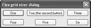
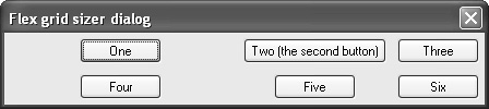
Initially, we don’t see the effect of making the first column stretchable, but if we stretch it horizontally, as in Figure 7-12, we can see this column (containing buttons One and Four) taking up the extra space, with the buttons centered in the column.
Here’s the code that creates the dialogs we’ve shown:
MyDialog::MyDialog(wxWindow *parent, wxWindowID id,
const wxString &title )
: wxDialog(parent, id, title,
wxDefaultPosition, wxDefaultSize,
wxDEFAULT_DIALOG_STYLE ¦ wxRESIZE_BORDER)
{
// Create top-level flex grid sizer
wxFlexGridSizer* flexGridSizer = new wxFlexGridSizer(2, 3, 0, 0);
this->SetSizer(flexGridSizer);
// Make the 1st row growable
flexGridSizer->AddGrowableCol(0);
wxButton* button1 = new wxButton(this, ID_BUTTON1, wxT("One"));
flexGridSizer->Add(button1, 0, wxALIGN_CENTER_HORIZONTAL¦
wxALIGN_CENTER_VERTICAL¦wxALL, 5);
wxButton* button2 = new wxButton(this, ID_BUTTON2, wxT("Two (the second button)"));
flexGridSizer->Add(button2, 0, wxALIGN_CENTER_HORIZONTAL¦
wxALIGN_CENTER_VERTICAL¦wxALL, 5);
wxButton* button3 = new wxButton(this, ID_BUTTON3, wxT("Three"));
flexGridSizer->Add(button3, 0, wxALIGN_CENTER_HORIZONTAL¦
wxALIGN_CENTER_VERTICAL¦wxALL, 5);
wxButton* button4 = new wxButton(this, ID_BUTTON4, wxT("Four"));
flexGridSizer->Add(button4, 0, wxALIGN_CENTER_HORIZONTAL¦
wxALIGN_CENTER_VERTICAL¦wxALL, 5);
wxButton* button5 = new wxButton(this, ID_BUTTON5, wxT("Five"));
flexGridSizer->Add(button5, 0, wxALIGN_CENTER_HORIZONTAL¦
wxALIGN_CENTER_VERTICAL¦wxALL, 5);
wxButton* button6 = new wxButton(this, ID_BUTTON6, wxT("Six"));
flexGridSizer->Add(button6, 0, wxALIGN_CENTER_HORIZONTAL¦
wxALIGN_CENTER_VERTICAL¦wxALL, 5);
flexGridSizer->Fit(this);
flexGridSizer->SetSizeHints(this);
}
This sizer attempts to reconcile the worlds of absolute positioning and sizer-based layout. It can lay out elements in a virtual grid, like a flex grid sizer, but in this case item row and column positions are specified using wxGBPosition, and items can optionally span more than one row and/or column using wxGBSpan.
When creating a wxGridBagSizer, optionally pass sizers for vertical and horizontal gaps between rows and columns (defaulting to zero). Use the Add function to add windows or sizers, passing the position and optional span, plus optional flags and border size as for wxBoxSizer.
Figure 7-13 shows a simple grid bag sizer example with four buttons, one of them spanning two columns (button Two). We also specify that the second row and third column are growable so that when we resize the dialog, we get the effect shown in Figure 7-14.
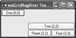
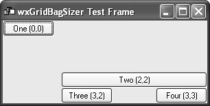
Here’s the code that produces this layout:
MyDialog::MyDialog(wxWindow *parent, wxWindowID id,
const wxString &title )
: wxDialog(parent, id, title,
wxDefaultPosition, wxDefaultSize,
wxDEFAULT_DIALOG_STYLE ¦ wxRESIZE_BORDER)
{
wxGridBagSizer* gridBagSizer = new wxGridBagSizer( );
SetTopSizer(gridBagSizer);
wxButton* b1 = new wxButton(this, wxID_ANY, wxT("One (0,0)"));
gridBagSizer->Add(b1, wxGBPosition(0, 0));
wxButton* b2 = new wxButton(this, wxID_ANY, wxT("Two (2,2)"));
gridBagSizer->Add(b2, wxGBPosition(2, 2), wxGBSpan(1, 2),
wxGROW);
wxButton* b3 = new wxButton(this, wxID_ANY, wxT("Three (3,2)"));
gridBagSizer->Add(b3, wxGBPosition(3, 2));
wxButton* b4 = new wxButton(this, wxID_ANY, wxT("Four (3,3)"));
gridBagSizer->Add(b4, wxGBPosition(3, 3));
gridBagSizer->AddGrowableRow(3);
gridBagSizer->AddGrowableCol(2);
gridBagSizer->Fit(this);
gridBagSizer->SetSizeHints(this);
}
In this section, we’ll discuss some further topics to bear in mind when you’re working with sizers.
Although sizers protect you from changes in basic control size on different platforms and in different languages, you may still have some hard-coded sizes in your dialogs (for example, for list boxes). If you would like these sizes to adjust to the current system font (or font supplied by the application), you can use dialog units instead of pixels. Dialog units are based on average character width and height for a window’s font, and so the actual pixel dimension for a given dialog unit value will vary according to the current font. wxWindow has functions ConvertDialogToPixels and ConvertPixelsToDialog, and a convenience macro wxDLG_UNIT(window, ptOrSz) that can be used with both wxPoint and wxSize objects. So instead of passing a pixel size to your control, use the wxDLG_UNIT macro, for example:
wxListBox* listBox = new wxListBox(parent, wxID_ANY,
wxDefaultPosition, wxDLG_UNIT(parent, wxSize(60, 20)));
Dialog units can be specified in an XRC file by appending “d” to dimension values.
Although dialogs on different platforms are largely similar, sometimes the style guides are incompatible. For example, on Windows and Linux, it’s acceptable to have right-justified or centered OK, Cancel, and Help buttons, in that order. On Mac OS X, the Help should be on the left, and Cancel and OK buttons are right aligned, in that order.
To help with this issue, wxStdDialogButtonSizer is provided. It’s derived from wxBoxSizer, so it can be used in a similar way, but its orientation will depend on platform.
This sizer’s constructor has no arguments. There are two ways of adding buttons: pass the button pointer to AddButton, or (if you’re not using standard identifiers) call SetAffirmativeButton, SetNegativeButton, and SetCancelButton. If using AddButton, you should use identifiers from this list: wxID_OK, wxID_YES, wxID_CANCEL, wxID_NO, wxID_SAVE, wxID_APPLY, wxID_HELP, and wxID_CONTEXT_HELP.
Then, after the buttons have been added, call Realize so that the sizer can add the buttons in the appropriate order with the appropriate spacing (which it can only do when it knows about all the buttons in the sizer). The following code creates a standard button sizer with OK, Cancel, and Help buttons:
wxBoxSizer* topSizer = new wxBoxSizer(wxVERTICAL);
dialog->SetSizer(topSizer);
wxButton* ok = new wxButton(dialog, wxID_OK);
wxButton* cancel = new wxButton(dialog, wxID_CANCEL);
wxButton* help = new wxButton(dialog, wxID_HELP);
wxStdDialogButtonSizer* buttonSizer = new wxStdDialogButtonSizer;
topSizer->Add(buttonSizer, 0, wxEXPAND¦wxALL, 10);
buttonSizer->AddButton(ok);
buttonSizer->AddButton(cancel);
buttonSizer->AddButton(help);
buttonSizer->Realize( );
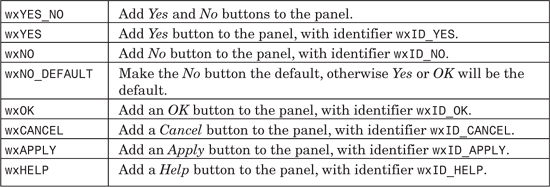
As a convenience, wxDialog::CreateButtonSizer can be used, indirectly creating a wxStdDialogButtonSizer with buttons based on a flag list. If you look at the dialog implementations in src/generic, you will see that CreateButtonSizer is used for many of them. The flags in Table 7-2 can be passed to this function.
Using CreateButtonSizer simplifies the example code shown previously to the following:
wxBoxSizer* topSizer = new wxBoxSizer(wxVERTICAL);
dialog->SetSizer(topSizer);
topSizer->Add(CreateButtonSizer(wxOK¦wxCANCEL¦wxHELP), 0,
wxEXPAND¦wxALL, 10);
There is another way to specify variations in UI on different platforms. XRC allows a platform parameter to be associated with each object; this parameter’s value can be a combination of unix, win, mac, and os2 separated by the pipe character (“¦”). XRC will only create the element if the platform value matches the actual platform the program is running on. DialogBlocks supports this property and can generate conditional C++ code if XRC is not being used.
Alternatively, you can load a different XRC file for each platform, but this is harder to maintain than having the differences contained within a single dialog design.
Sometimes you’d like the layout to change dynamically; for example, clicking on a Details button might expand the dialog and show further controls. You can hide controls contained in sizers the same way you would hide any control, using the wxWindow::Show method. However, wxSizer also offers a separate method, which can tell the sizer not to consider a window in its size calculations. To hide a window using the sizer, pass false to wxSizer::Show. You must then call wxSizer::Layout to force an update.
Sizers takes some getting used to, so don’t worry if you found this chapter a bit heavy going. The best way of getting to grips with them is to play with a dialog editor such as DialogBlocks (included on the CD-ROM), experimenting with different layouts and examining the generated code. You can also look at samples/layout in your wxWidgets distribution. After you’ve tamed them, you’ll find sizers a very powerful tool, and their ability to adapt to different platforms and languages will prove to be a huge productivity benefit.
Next, we’ll look at the standard dialogs provided by wxWidgets.