Chapter 12 Advanced Window Classes
Although this book can’t cover all the classes in wxWidgets in detail, it’s worth looking at a few of the more advanced GUI classes that can contribute to the creation of a more interesting application. This chapter covers the following topics:
wxTreeCtrl; a control that helps you model hierarchical data.
wxListCtrl; a flexible control for showing lists of text labels and icons in several styles.
wxWizard; a special dialog to guide your user through a specific task using a sequence of pages.
wxHtmlWindow; a highly versatile, lightweight HTML control for use in anything from “About” boxes to report windows.
wxGrid; a feature-rich control for displaying tabular data.
wxTaskBarIcon; a quick way for your users to access features in your application from the system tray or equivalent.
Writing your own controls. The necessary steps to build a well-behaved “custom control.”
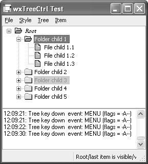
A tree control presents information as a hierarchy, with items that may be expanded or collapsed. Figure 12-1 shows the wxWidgets tree control sample, displaying different font styles and colors. Each item is referenced by the wxTreeItemId type and has text and an optional icon that can be changed dynamically. A tree control can be created in single-selection or multiple-selection mode. To associate data with tree items, derive a class from wxTree ItemData and use wxTreeCtrl::SetItemData and wxTreeCtrl::GetItemData. The tree data will be destroyed when the item or tree is destroyed, so you may want to store only a pointer to the actual data within your tree item data objects.
Because clicks on tree item images can be detected by the application, you can simulate controls within the tree by swapping the images according to the state you want to show for that item. For example, you can easily add simulated check boxes to your tree.
The following fragment shows how to create a tree window with custom tree item data and an image list.
#include "wx/treectrl.h"
// Declare a class to hold tree item data
class MyTreeItemData : public wxTreeItemData
{
public:
MyTreeItemData(const wxString& desc) : m_desc(desc) { }
const wxString& GetDesc( ) const { return m_desc; }
private:
wxString m_desc;
};
// Images for tree items
#include "file.xpm"
#include "folder.xpm"
// Create the tree
wxTreeCtrl* treeCtrl = new wxTreeCtrl(
this, wxID_ANY, wxPoint(0, 0), wxSize(400, 400),
wxTR_HAS_BUTTONS¦wxTR_SINGLE);
wxImageList* imageList = new wxImageList(16, 16);
imageList->Add(wxIcon(folder_xpm);
imageList->Add(wxIcon(file_xpm);
treeCtrl->AssignImageList(imageList);
// Create a root showing the folder icon, and two items showing
// the file icon
wxTreeItemId rootId = treeCtrl->AddRoot(wxT("Root"), 0, 0,
new MyTreeItemData(wxT("Root item")));
wxTreeItemId itemId1 = treeCtrl->AppendItem(rootId,
wxT("File 1"), 1, 1,
new MyTreeItemData(wxT("File item 1")));
wxTreeItemId itemId2 = treeCtrl->AppendItem(rootId,
wxT("File 2"), 1, 1,
new MyTreeItemData(wxT("File item 2")));
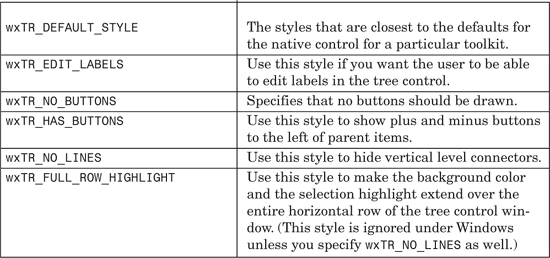
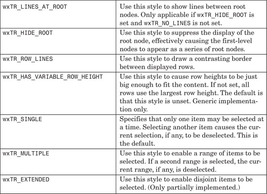
Table 12-1 lists the styles you can pass to the wxTreeCtrl constructor or Create function; also refer to the available styles for wxWindow in Table 4-1.
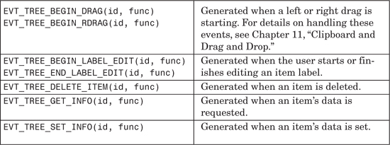
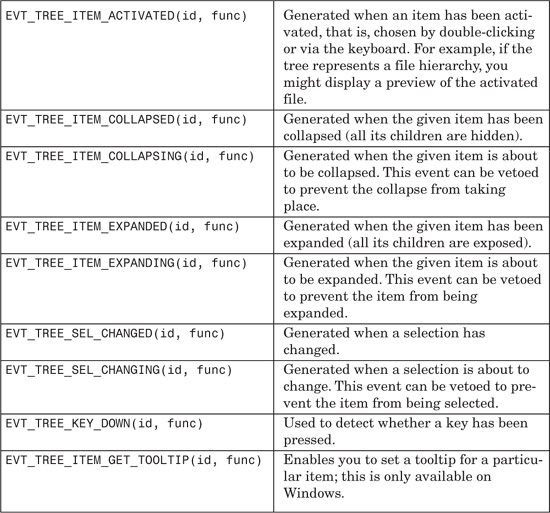
wxTreeCtrl generates wxTreeEvent events, listed in Table 12-2. These events propagate up the window parent-child hierarchy.
These are the important wxTreeCtrl functions.
Use AddRoot to create the first item and then AppendItem, InsertItem, or PrependItem to add subsequent items. Remove an item with Delete, clear all items with DeleteAllItems, or remove all of an item’s immediate descendants with DeleteChildren.
Set an item’s label with SetItemText; you can change the label’s appearance with SetItemTextColour, SetItemBackgroundColour, SetItemBold, and SetItemFont.
If you show images in your tree items, use SetImageList or AssignImage List to associate a wxImageList with the tree control. Each item can show an image for each of the possible item states: wxTreeItemIcon_Normal, wxTreeItemIcon_Selected, wxTreeItemIcon_Expanded, and wxTreeItemIcon_Selected Expanded. Use SetItemImage to pass an index into the tree control’s image list and an optional state. If only the image for the normal state is specified, it will be used for the other states, too.
Scroll an item into view with ScrollTo, or use EnsureVisible if items may need to be expanded to show the desired item. Expand shows the children of an item. Collapse an item that has children with Collapse or CollapseAndReset: the latter also removes the children. This is useful if you’re implementing a tree control with a very large number of items. You may want to add items only when they are visible—that is, when you process an EVT_TREE_ITEM_EXPANDING event. In this case, you will need to use SetItemHasChildren to provide visual feedback that an unexpanded item has children, even when it doesn’t.
You can select or deselect an item with SelectItem. For a single-selection tree, you can get the currently selected item with GetSelection. If there is no selection, it returns an invalid wxTreeItemId, such that a call to wxTree ItemId::IsOk returns false. For a multiple-selection tree, retrieve all the selections with GetSelections by passing a wxArrayTreeItemItemIds reference to the function. Unselect removes the current selection for a single-selection tree, whereas UnselectAll removes all selections from a multiple-selection tree. UnselectItem can be used in a multiple-selection tree to deselect a specific item.
There are several ways to traverse the tree: you can start at the top with GetRootItem and iterate through the children of an item with GetFirstChild and GetNextChild. Find the next and previous siblings of an item with GetNextSibling and GetPrevSibling, determine whether an item has children with ItemHasChildren, and get the parent of an item with GetParent. GetCount returns the total number of items in the tree, and GetChildrenCount counts the number of descendants for the given item.
HitTest is a useful function if you’re implementing drag and drop—it enables you to find the item under the mouse position, together with the part of the item. See the reference manual for the flags returned by HitTest. You can find the bounding rectangle for an item with GetBoundingRect.
For more information on these functions, see the reference manual and the wxTreeCtrl sample in samples/treectrl.
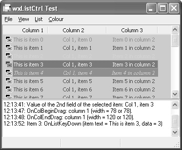
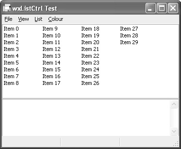
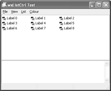
The list control displays items in one of four views: a multi-column list view, a multi-column report view with optional icons, a large icon view, and a small icon view. See Figure 12-2 for examples of these views from the wxListCtrl sample. Each item in a list control is identified by a long integer index representing its zero-based position in the list, which will change as items are added and deleted or as the content is sorted. Unlike the tree control, the default is to allow multiple selections, and single-selection can be specified with a window style. You can supply a sort function if you need the items to be sorted. The report view can display an optional header, whose columns respond to mouse clicks—useful for sorting the contents of the column, for example. The widths of a report view’s columns can be changed either by the application or by dragging on the column dividers.
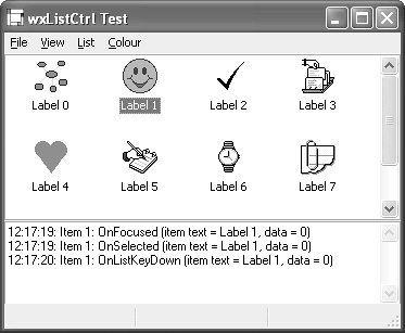
Client data can be associated with items, but it works differently from wxTreeCtrl. Each item has a long integer available for client data, so if you have objects to associate with items, this must be done by the application—for example, with a mapping from long integer to object pointer—and you must free this data yourself.
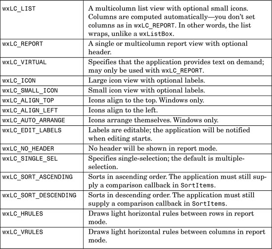
Table 12-3 lists the styles you can pass to the wxListCtrl constructor or Create function. Also refer to the available styles for wxWindow in Table 4-1.
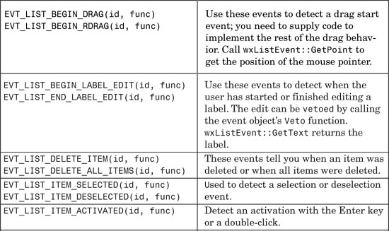
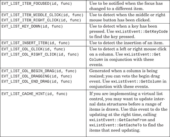
wxListCtrl generates wxListEvent events, described in Table 12-4. These events propagate up the window parent-child hierarchy. Events dealing with a single item return the item index with wxListEvent::GetIndex.
wxListItem is a class you can use to insert an item, set an item’s properties, or retrieve information from an item.
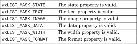
Use SetMask to indicate which properties you want to be taken into account, as described in Table 12-5.
Call SetId to set the zero-based item position, and call SetColumn to set the zero-based column position if the control is in report mode.
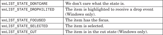
Call SetState to set the item state, as listed in Table 12-6.
Call SetStateMask to indicate which states you are modifying. This method uses the same symbols as for SetState.
Call SetText to set the label or header text, and call SetImage to set the zero-based index into an image list.
Call SetData with a long integer argument to associate data with the item.
For columns only, call SetFormat with wxLIST_FORMAT_LEFT, wxLIST_FORMAT_RIGHT, or wxLIST_FORMAT_CENTRE (identical to wxLIST_FORMAT_CENTER). Also for columns only, call SetColumnWidth to set the column’s width.
Other functions set various additional visual properties: SetAlign, SetBackgroundColour, SetTextColour, and SetFont. These don’t require a mask flag to be specified. All wxListItem functions have equivalent accessors prefixed by Get for retrieving information about an item.
Here’s an example of using wxListItem to select the second item, set its text label, and color it red:
wxListItem item;
item.SetId(1);
item.SetMask(wxLIST_MASK_STATE¦wxLIST_MASK_TEXT);
item.SetStateMask(wxLIST_STATE_SELECTED);
item.SetState(wxLIST_STATE_SELECTED);
item.SetTextColour(*wxRED);
item.SetText(wxT("Red thing"));
listCtrl->SetItem(item);
As an alternative to using wxListItem, you can set and get properties for an item with wxListCtrl convenience functions such as SetItemText, SetItemImage, SetItemState, GetItemText, GetItemImage, GetItemState, and so on as described in the following.
These are the important wxListCtrl functions.
Call Arrange to arrange the items in icon or small icon view, on Windows only.
Use AssignImageList to associate an image list and have wxListCtrl handle its deletion; use SetImageList if you don’t want wxListCtrl to delete it. Pass wxIMAGE_LIST_NORMAL or wxIMAGE_LIST_SMALL to tell wxListCtrl what set of icons this image list will be used for. GetImageList retrieves a pointer to either list.
InsertItem inserts an item at the specified position in the control. You can pass a wxListItem object having set its member variables. Alternatively, you can pass an item index and a string label, or an item index and an image index, or an item index, a label, and an image index. InsertColumn inserts a column in report view.
ClearAll deletes all items and (in report view) columns, and it generates an all-items deletion event. DeleteAllItems deletes all items but not columns and generates an all-items deletion event. DeleteItem deletes a single item and generates an item deletion event. DeleteColumn deletes a column in report view.
Use SetItem to set information about an item: you can pass a wxListItem object as explained previously, or you can pass an index, column, label, and image index. GetItem can be used to get information about the index specified with wxListItem::SetId.
Call SetItemData with an index and a long data value to associate application-defined data with the item. For most platforms, you can store a pointer in this integer value, but on some platforms, a pointer will not fit into an integer. In these cases, you can use a hashmap to map from integer to object pointer, for example. GetItemData retrieves the item for the given index. Note that if the position of an item moves due to sorting, insertion, or removal, the index of the item may change, but its item data will remain the same, so this is a way of identifying an item.
Use SetItemImage to change the image associated with an item; it takes an item index and an index into the image list.
SetItemState sets the state for the given item; you must supply a state mask to specify which state flags are being changed. See the description for wxListItem in the previous section for more details. GetItemState is used to retrieve the state for a given item.
Use SetItemText to set the item’s label and GetItemText to retrieve the label.
SetTextColour sets the text color for all items, and SetBackgroundColour sets the background color for the control. SetItemTextColour and SetItemBackgroundColour set an individual item’s text and background colors, in report view only. The usual getters are available to retrieve text and background colors.
EditLabel starts editing a label and sends a wxEVT_LIST_BEGIN_LABEL_EDIT event. You can get the current text control used for editing with GetEditControl (Windows only).
Use EnsureVisible if you need a particular item to be visible. ScrollList scrolls by a given number of pixels in each orientation (Windows only). Use RefreshItem or RefreshItems to refresh the appearance of an item or a range of items, particularly when using a virtual list control when the underlying data has changed. GetTopItem returns the index of the topmost visible item when in list or report view.
FindItem is a versatile overloaded function that can be used to search for items with a given label, data, or position. GetNextItem is used to search for an item with the given state (for example, to find all selected items). Use HitTest to find an item at a given point. GetItemPosition returns the position of an item in icon or small icon view in client coordinates, and GetItemRect returns an item’s size and position in client coordinates.
You can change the style of a wxListCtrl dynamically, without having to destroy and re-create it: use SetSingleStyle to set a style such as wxLC_REPORT. Pass false to this function to remove the style.
Use SetColumn in report mode to set information about a column, such as header label and width: see wxListItem in the previous section. Use SetColumnWidth to set a column’s width, as a simpler alternative to SetColumn. You can get column information with GetColumn and GetColumnWidth. Get the number of columns with GetColumnCount (report view only).
Get the number of items in a list control with GetItemCount and the number of selected items with GetSelectedItemCount. GetCountPerPage returns the number of items that can fit vertically in the visible area of the control (in list or report view) or the total number of items in the control (icon or small icon view).
Finally, SortItems can be used to sort the items in a list control. Pass the address of a wxListCtrlCompare function that takes two item data values and a further data integer, and returns an integer representing the ordering of the two items. This integer should be zero for identity, negative if the first is less than the second, and positive if the first is greater than the second. For sorting to work, you must associate a long integer value with each item (via wxListItem::SetData, for example). These values will be passed to the comparison function.
The following fragment shows how to create and populate a report list control. The list has three columns and ten items, each with a 16×16 file icon at the start of the row.
#include "wx/listctrl.h"
// Images for report items
#include "file.xpm"
#include "folder.xpm"
// Create a list in report mode
wxListCtrl* listCtrlReport = new wxListCtrl(
this, wxID_ANY, wxDefaultPosition, wxSize(400, 400),
wxLC_REPORT¦wxLC_SINGLE_SEL);
// Assign an image list to the control
wxImageList* imageList = new wxImageList(16, 16);
imageList->Add(wxIcon(folder_xpm));
imageList->Add(wxIcon(file_xpm));
listCtrlReport->AssignImageList(imageList, wxIMAGE_LIST_SMALL);
// Insert three columns
wxListItem itemCol;
itemCol.SetText(wxT("Column 1"));
itemCol.SetImage(-1);
listCtrlReport->InsertColumn(0, itemCol);
listCtrlReport->SetColumnWidth(0, wxLIST_AUTOSIZE );
itemCol.SetText(wxT("Column 2"));
itemCol.SetAlign(wxLIST_FORMAT_CENTRE);
listCtrlReport->InsertColumn(1, itemCol);
listCtrlReport->SetColumnWidth(1, wxLIST_AUTOSIZE );
itemCol.SetText(wxT("Column 3"));
itemCol.SetAlign(wxLIST_FORMAT_RIGHT);
listCtrlReport->InsertColumn(2, itemCol);
listCtrlReport->SetColumnWidth(2, wxLIST_AUTOSIZE );
// Insert ten items
for ( int i = 0; i < 10; i++ )
{
int imageIndex = 0;
wxString buf;
// Insert an item, with a string for column 0,
// and image index 0
buf.Printf(wxT("This is item %d"), i);
listCtrlReport->InsertItem(i, buf, imageIndex);
// The item may change position due to e.g. sorting,
// so store the original index in the item’s data
listCtrlReport->SetItemData(i, i);
// Set a string for column 1
buf.Printf(wxT("Col 1, item %d"), i);
listCtrlReport->SetItem(i, 1, buf);
// Set a string for column 2
buf.Printf(wxT("Item %d in column 2"), i);
listCtrlReport->SetItem(i, 2, buf);
}
Normally, wxListCtrl stores the label, image, and visual attributes for each item. This is fine for a modest amount of data, but if you have thousands of items, you may want to consider implementing a virtual list control. You supply the virtual functions OnGetItemLabel, OnGetItemImage, and OnGetItemAttr for the control to call when it needs the information. You must call SetItemCount to indicate how many items there are in the list control because you won’t be appending any items in the usual way. You can optionally use EVT_LIST_CACHE_HINT to update your internal structures for a given range of items, just before painting is about to happen. Here are trivial examples of the three overridden functions:
wxString MyListCtrl::OnGetItemText(long item, long column) const
{
return wxString::Format(wxT("Column %ld of item %ld"), column, item);
}
int MyListCtrl::OnGetItemImage(long WXUNUSED(item)) const
{
// Return the zeroth image for all items
return 0;
}
wxListItemAttr *MyListCtrl::OnGetItemAttr(long item) const
{
// Use internally stored attributes for every other items
return item % 2 ? NULL : (wxListItemAttr *)&m_attr;
}
To create and populate the virtual list, we don’t append any items; we simply set the item count to a ridiculously large number:
virtualListCtrl = new MyListCtrl(parent, wxID_ANY,
wxDefaultPosition, wxDefaultSize, wxLC_REPORT¦wxLC_VIRTUAL);
virtualListCtrl->SetImageList(imageListSmall, wxIMAGE_LIST_SMALL);
virtualListCtrl->InsertColumn(0, wxT("First Column"));
virtualListCtrl->InsertColumn(1, wxT("Second Column"));
virtualListCtrl->SetColumnWidth(0, 150);
virtualListCtrl->SetColumnWidth(1, 150);
virtualListCtrl->SetItemCount(1000000);
When the underlying data changes in the control, set the item count if it has changed and call wxListCtrl::RefreshItem or wxListCtrl::RefreshItems.
For a full sample, please see samples/listctrl.
The wizard is a great way to break a complex set of choices and settings down into a sequence of simple dialogs. It can be presented to novice users to help them get started with a particular feature in an application, such as gathering information for a new project, exporting data, and so on. Often the settings presented in a wizard can be altered elsewhere in the application’s user interface, but presenting them in a wizard focuses the user on the essentials for getting a specific task completed.
A wizard comprises a series of dialog-like pages set inside a window that normally has an image on the left (the same for all pages, or different for each page), and a row of buttons along the bottom for navigating between pages and getting help. As the user progresses through the wizard, the old page is hidden and a new one is shown. The path through a wizard can be determined by choices the user makes, so not all available pages are necessarily shown each time a wizard is presented.
When the standard wizard buttons are pressed, events are sent to the pages (and to the wxWizard object). You can catch events either in the page class or in a class derived from wxWizard.
To show a wizard, create an instance of wxWizard (or a derived class) and create the pages as children of the wizard. You can use wxWizardPageSimple (or a derived class) and chain the pages together with wxWizardPageSimple::Chain. Or, if you need to determine the path through the wizard dynamically according to user selections, you can derive from wxWizardPage and override GetPrev and GetNext. Add each page to the sizer returned by GetPageAreaSizer so that the wizard can adapt its size to the largest page.
wxWizard’s only special window style is wxWIZARD_EX_HELPBUTTON, which adds a Help button to the wizard’s row of standard buttons. This is an “extra” style, which must be set with SetExtraStyle before Create is called.
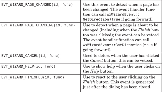
wxWizard generates wxWizardEvent events, which are described in Table 12-7. These events are sent first to the page, and if not processed, to the wizard itself. Except for EVT_WIZARD_FINISHED, event handlers can call wxWizard Event::GetPage to determine the currently active page.
These are the main member functions for wxWizard.
GetPageAreaSizer returns the sizer that manages the page area. Add all pages to this sizer, or one page from which the others can be reached with GetNext, to make the wizard size itself according to the maximum page size. If you don’t do this, you should call FitToPage for the first page before running the wizard, or for all pages if calling wxWizardPage::GetNext might not visit all pages.
GetCurrentPage returns the current active page, or NULL if RunWizard is not executing.
GetPageSize returns the size available for all pages. You can use SetPageSize to set the page size used by all pages, but this is deprecated in favor of adding pages to the sizer returned by GetPageAreaSizer.
Call RunWizard to set the wizard running, passing the first page to be shown. RunWizard returns true if the user successfully finished the wizard, or false if the user cancelled it.
To specify the border around the page area, call SetBorder. The default is zero.
Let’s examine the wxWizard sample from the wxWidgets distribution. It consists of four pages, illustrated in Figure 12-3 (the numbers are for clarity and are not on the actual dialogs).
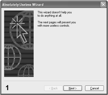
The first page is so simple that it doesn’t have its own derived class—the driving function MyFrame::OnRunWizard simply creates an instance of wxWizardPageSimple and adds a static text control to it, like this:
#include "wx/wizard.h"
wxWizard *wizard = new wxWizard(this, wxID_ANY,
wxT("Absolutely Useless Wizard"),
wxBitmap(wiztest_xpm),
wxDefaultPosition,
wxDEFAULT_DIALOG_STYLE ¦ wxRESIZE_BORDER);
// PAGE 1
wxWizardPageSimple *page1 = new wxWizardPageSimple(wizard);
wxStaticText *text = new wxStaticText(page1, wxID_ANY,
wxT("This wizard doesn’t help you
to do anything at all.
")
wxT("
")
wxT("The next pages will present you
with more useless controls."),
wxPoint(5,5));
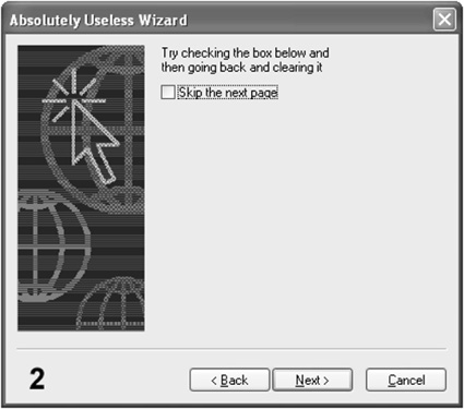
The second page, wxCheckboxPage, is derived from wxWizardPage and implements GetPrev and GetNext. GetPrev always returns the first page, but GetNext can return either the next page or the last page, depending on whether the user checked Skip the Next Page. Here’s the declaration and implementation of wxCheckBoxPage:
// this shows how to dynamically (i.e. during run-time) arrange
// the page order
// PAGE 2
class wxCheckboxPage : public wxWizardPage
{
public:
wxCheckboxPage(wxWizard *parent,
wxWizardPage *prev,
wxWizardPage *next)
: wxWizardPage(parent)
{
m_prev = prev;
m_next = next;
wxBoxSizer *mainSizer = new wxBoxSizer(wxVERTICAL);
mainSizer->Add(
new wxStaticText(this, wxID_ANY, wxT("Try checking the box below and
")
wxT("then going back and clearing it")),
0, // No vertical stretching
wxALL,
5 // Border width
);
m_checkbox = new wxCheckBox(this, wxID_ANY,
wxT("&Skip the next page"));
mainSizer->Add(
m_checkbox,
0, // No vertical stretching
wxALL,
5 // Border width
);
SetSizer(mainSizer);
mainSizer->Fit(this);
}
// implement wxWizardPage functions
virtual wxWizardPage *GetPrev( ) const { return m_prev; }
virtual wxWizardPage *GetNext( ) const
{
return m_checkbox->GetValue( ) ? m_next->GetNext( ) : m_next;
}
private:
wxWizardPage *m_prev,
*m_next;
wxCheckBox *m_checkbox;
};
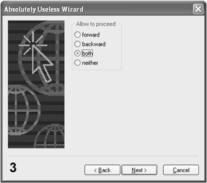
The third page, wxRadioboxPage, intercepts cancel and page changing events. If you try to cancel at this point, you will be asked to confirm the cancel: if you click on No, wxWizardEvent::Veto will be called and the wizard will not be cancelled. OnWizardPageChanging vetoes any attempt to go forwards or backwards that hasn’t first been specified using the radio buttons. In a realistic application, you might use the page changing event to ensure that the user has filled out all mandatory fields in this page before proceeding. Or you may want to prevent the user from going back one page for some reason. This is the code for wxRadioboxPage:
// This is a more complicated example of validity checking:
// using events we may allow the user to return to the previous
// page, but not to proceed. It also demonstrates how to
// intercept a Cancel button press.
// PAGE 3
class wxRadioboxPage : public wxWizardPageSimple
{
public:
// directions in which we allow the user to proceed from this
// page
enum
{
Forward, Backward, Both, Neither
};
wxRadioboxPage(wxWizard *parent) : wxWizardPageSimple(parent)
{
// should correspond to the enum above
static wxString choices[ ] = { wxT("forward"), wxT("backward"), wxT("both"), wxT("neither") };
m_radio = new wxRadioBox(this, wxID_ANY, wxT("Allow to proceed:"),
wxDefaultPosition, wxDefaultSize,
WXSIZEOF(choices), choices,
1, wxRA_SPECIFY_COLS);
m_radio->SetSelection(Both);
wxBoxSizer *mainSizer = new wxBoxSizer(wxVERTICAL);
mainSizer->Add(
m_radio,
0, // No stretching
wxALL,
5 // Border
);
SetSizer(mainSizer);
mainSizer->Fit(this);
}
// wizard event handlers
void OnWizardCancel(wxWizardEvent& event)
{
if ( wxMessageBox(wxT("Do you really want to cancel?"), wxT("Question"),
wxICON_QUESTION ¦ wxYES_NO, this) != wxYES )
{
// not confirmed
event.Veto( );
}
}
void OnWizardPageChanging(wxWizardEvent& event)
{
int sel = m_radio->GetSelection( );
if ( sel == Both )
return;
if ( event.GetDirection( ) && sel == Forward )
return;
if ( !event.GetDirection( ) && sel == Backward )
return;
wxMessageBox(wxT("You can’t go there"), wxT("Not allowed"),
wxICON_WARNING ¦ wxOK, this);
event.Veto( );
}
private:
wxRadioBox *m_radio;
DECLARE_EVENT_TABLE( )
};
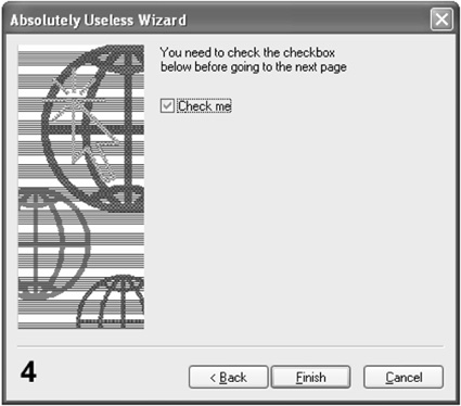
The fourth and last page, wxValidationPage, overrides TransferDataFromWindow to do a validation check on the state of the check box. TransferDataFromWindow is called whenever the Back or Next buttons are clicked, and if the validation or data transfer fails, the page is not changed. As with all dialogs, instead of overriding TransferDataFromWindow, you can use validators for the page controls. This page also demonstrates the use of an image for a particular page, overriding the image passed to the wizard constructor. Here’s the code for wxValidationPage:
// This shows how to simply control the validity of the user input
// by just overriding TransferDataFromWindow( ) - of course, in a
// real program, the check wouldn’t be so trivial and the data
// will be saved somewhere too.
//
// It also shows how to use a different bitmap for one of the pages.
// PAGE 4
class wxValidationPage : public wxWizardPageSimple
{
public:
wxValidationPage(wxWizard *parent) : wxWizardPageSimple(parent)
{
m_bitmap = wxBitmap(wiztest2_xpm);
m_checkbox = new wxCheckBox(this, wxID_ANY,
wxT("&Check me"));
wxBoxSizer *mainSizer = new wxBoxSizer(wxVERTICAL);
mainSizer->Add(
new wxStaticText(this, wxID_ANY,
wxT("You need to check the checkbox
")
wxT("below before going to the next page
")),
0,
wxALL,
5
);
mainSizer->Add(
m_checkbox,
0, // No stretching
wxALL,
5 // Border
);
SetSizer(mainSizer);
mainSizer->Fit(this);
}
virtual bool TransferDataFromWindow( )
{
if ( !m_checkbox->GetValue( ) )
{
wxMessageBox(wxT("Check the checkbox first!"),
wxT("No way"),
wxICON_WARNING ¦ wxOK, this);
return false;
}
return true;
}
private:
wxCheckBox *m_checkbox;
};
The code that puts all the pages together and starts the wizard looks like this:
void MyFrame::OnRunWizard(wxCommandEvent& event)
{
wxWizard *wizard = new wxWizard(this, wxID_ANY,
wxT("Absolutely Useless Wizard"),
wxBitmap(wiztest_xpm),
wxDefaultPosition,
wxDEFAULT_DIALOG_STYLE ¦ wxRESIZE_BORDER);
// a wizard page may be either an object of a predefined class
wxWizardPageSimple *page1 = new wxWizardPageSimple(wizard);
wxStaticText *text = new wxStaticText(page1, wxID_ANY,
wxT("This wizard doesn’t help you
to do anything at all.
")
wxT("
")
wxT("The next pages will present you
with more useless controls."),
wxPoint(5,5)
);
// ... or a derived class
wxRadioboxPage *page3 = new wxRadioboxPage(wizard);
wxValidationPage *page4 = new wxValidationPage(wizard);
// set the page order using a convenience function – could
// also use SetNext/Prev directly as below
wxWizardPageSimple::Chain(page3, page4);
// this page is not a wxWizardPageSimple, so we use SetNext/Prev
// to insert it into the chain of pages
wxCheckboxPage *page2 = new wxCheckboxPage(wizard, page1, page3);
page1->SetNext(page2);
page3->SetPrev(page2);
// allow the wizard to size itself around the pages
wizard->GetPageAreaSizer( )->Add(page1);
if ( wizard->RunWizard(page1) )
{
wxMessageBox(wxT("The wizard successfully completed"),
wxT("That’s all"), wxICON_INFORMATION ¦ wxOK);
}
wizard->Destroy( );
}
When the wizard is finished or canceled, MyFrame intercepts the events and, in this example, reports them on the frame’s status bar. You could equally intercept these events in a class derived from wxWizard.
The full listing of the sample can be found in Appendix J, “Code Listings,” and the code can be found in examples/chap12 on the CD-ROM.
wxHtmlWindow is used by wxWidgets’ built-in help system, and it is also a great control to use in your applications whenever you need to display formatted text and graphics, such as reports. It can display a useful subset of HTML, including tables, but not frames. Features include animated GIFs, highlighted links, fonts, background color, nested lists, centering, right-alignment, horizontal rules, character encoding support, and more. It doesn’t support style sheets, but you can normally achieve the effects you want by writing or generating the appropriate tags. HTML text is selectable and can be copied to the clipboard or returned to the application as plain text.
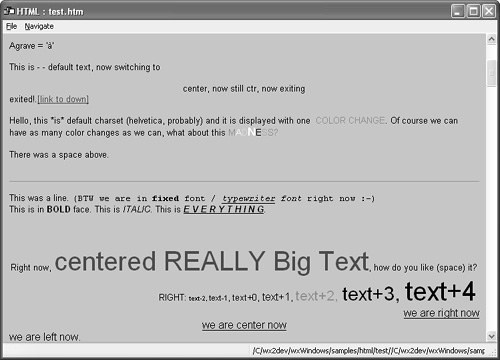
Figure 12-4 shows the wxHtmlWindow demo program that you can compile and run in samples/html/test.
Because wxHtmlWindow is small and fast (unlike a full web browser), you can use it liberally in your application. Figure 12-5 shows an example of wxHtmlWindow in an “About” box.
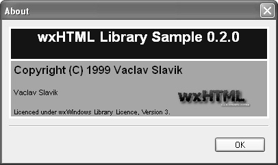
The code to create this dialog is shown in Listing 12-1. In this example, the HTML control is sized to fit the HTML that has been loaded, and then the dialog sizers set the dialog to fit around the wxHtmlWindow.
Listing 12-1 Code to Create an HTML About Box
#include "wx/html/htmlwin.h"
void MyFrame::OnAbout(wxCommandEvent& WXUNUSED(event))
{
wxBoxSizer *topsizer;
wxHtmlWindow *html;
wxDialog dlg(this, wxID_ANY, wxString(_("About")));
topsizer = new wxBoxSizer(wxVERTICAL);
html = new wxHtmlWindow(&dlg, wxID_ANY, wxDefaultPosition,
wxSize(380, 160), wxHW_SCROLLBAR_NEVER);
html->SetBorders(0);
html->LoadPage(wxT("data/about.htm"));
// Fit the HTML window to the size of its contents
html->SetSize(html->GetInternalRepresentation( )->GetWidth( ),
html->GetInternalRepresentation( )->GetHeight( ));
topsizer->Add(html, 1, wxALL, 10);
topsizer->Add(new wxStaticLine(&dlg, wxID_ANY), 0, wxEXPAND ¦ wxLEFT ¦ wxRIGHT, 10);
wxButton *but = new wxButton(&dlg, wxID_OK, _("OK"));
but->SetDefault( );
topsizer->Add(but, 0, wxALL ¦ wxALIGN_RIGHT, 15);
dlg.SetSizer(topsizer);
topsizer->Fit(&dlg);
dlg.ShowModal( );
}
Listing 12-2 shows the HTML that displays as in the sample screenshot.
Listing 12-2 HTML for the About Box Sample
<html>
<body bgcolor="#FFFFFF">
<table cellspacing=3 cellpadding=4 width="100%">
<tr>
<td bgcolor="#101010">
<center>
<font size=+2 color="#FFFFFF"><b><br>wxHTML Library Sample 0.2.0<br></b>
</font>
</center>
</td>
</tr>
<tr>
<td bgcolor="#73A183">
<b><font size=+1>Copyright (C) 1999 Vaclav Slavik</font></b><p>
<font size=-1>
<table cellpadding=0 cellspacing=0 width="100%">
<tr>
<td width="65%">
Vaclav Slavik<p>
</td>
<td valign=top>
<img src="logo.png">
</td>
</tr>
</table>
<font size=1>
Licenced under wxWindows Library Licence, Version 3.
</font>
</font>
</td>
</tr>
</table>
</body>
</html>
See also the wxHtmlListBox class as described in the section “wxListBox and wxCheckListBox” in Chapter 4, “Window Basics.”
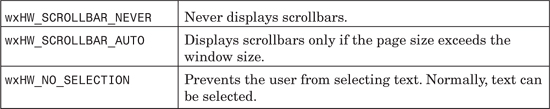
Table 12-8 lists the styles you can pass to the wxHtmlWindow constructor or Create function. Also refer to the available styles for wxWindow in Table 4-1.
These are the main member functions for wxHtmlWindow.
GetInternalRepresentation returns the top-level wxHtmlContainerCell object, whose size you can query with GetWidth and GetHeight to get the overall size of the HTML.
LoadFile loads HTML from a file and displays it. LoadPage takes a location, which may be a URL. Examples of locations include:
http://www.wxwindows.org/front.htm # A URL
file:myapp.zip#zip:html/index.htm # Gets index.htm from myapp.zip
SetPage sets the page using an HTML string rather than a file name or location.
OnCellClicked is called when there was a mouse click inside a cell. It takes a wxHtmlCell pointer, x and y coordinates, and a wxMouseEvent reference. The default behavior is to call OnLinkClicked if the cell contains a hyperlink.
OnLinkClicked takes a wxHtmlLinkInfo reference, and its default behavior is to load the linked page with LoadPage. You can override this behavior, for example to show the application’s home page in the default browser when the user clicks on the link in your “About” box.
You can also override OnOpeningURL, which is called when a URL is being opened, and OnCellMouseHover, called when the mouse moves over an HTML cell.
ReadCustomization and WriteCustomization are used to preserve fonts and borders, and they take a wxConfig* argument and optional path to use in the configuration object.
You can select text with the functions SelectAll, SelectLine, and SelectWord. SelectionToText returns a string with the plain text in the selection. ToText returns the entire page as plain text.
Call SetBorders to set the space around the HTML. SetFonts enables you to set the faces for normal and fixed fonts, and optionally you can pass an array of seven integers specifying the point sizes of the seven font sizes.
AppendToPage can be used to add HTML to the current page and refresh the window.
You can write a custom wxHtmlFilter to read special files, and you can call AddFilter to register it with wxHtmlWindow. For example, you might write a filter to decrypt an encrypted HTML e-book.
GetOpenedAnchor, GetOpenedPage, and GetOpenedPageTitle return information about the currently loaded page.
wxHtmlWindow has a history mechanism, which you can access with HistoryBack, HistoryForward, HistoryCanBack, HistoryCanForward, and HistoryClear.
You can also add windows, including your own custom controls, to an HTML page, as Figure 12-6 shows. This is done by writing a custom “tag handler,” which parses the HTML fragment for a specified tag name and creates and inserts a window.
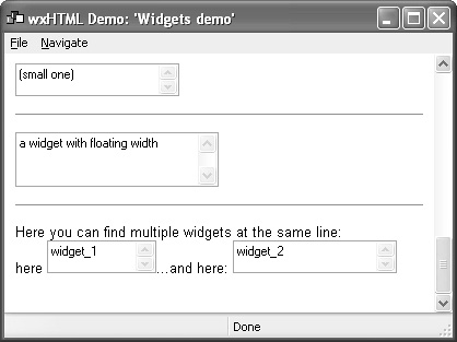
This is part of the HTML page shown in the screenshot:
<mybind name="(small one)" x=150 y=30>
<hr>
<mybind name="a widget with floating width" float=y x="50" y=50>
<hr>
Here you can find multiple widgets at the same line:<br>
here
<mybind name="widget_1" x="100" y=30>
...and here:
<mybind name="widget_2" x="150" y=30>
The code to implement the custom HTML tag mybind looks like this:
#include "wx/html/m_templ.h"
TAG_HANDLER_BEGIN(MYBIND, "MYBIND")
TAG_HANDLER_PROC(tag)
{
wxWindow *wnd;
int ax, ay;
int fl = 0;
tag.ScanParam(wxT("X"), wxT("%i"), &ax);
tag.ScanParam(wxT("Y"), wxT("%i"), &ay);
if (tag.HasParam(wxT("FLOAT"))) fl = ax;
wnd = new wxTextCtrl(m_WParser->GetWindow( ), wxID_ANY, tag.GetParam(wxT("NAME")),
wxPoint(0,0), wxSize(ax, ay), wxTE_MULTILINE);
wnd->Show(true);
m_WParser->GetContainer( )->InsertCell(new wxHtmlWidgetCell(wnd, fl));
return false;
}
TAG_HANDLER_END(MYBIND)
TAGS_MODULE_BEGIN(MyBind)
TAGS_MODULE_ADD(MYBIND)
TAGS_MODULE_END(MyBind)
This technique might be useful if you wanted to create a whole user interface around wxHtmlWindow, possibly using scripts to generate the HTML and respond to input, like a web form. Another example is a registration dialog, with text controls for the user to enter his or her details and a Register button that sends the details to your organization. Or you might want to generate a report with items that can be selected and viewed in more detail by toggling a check box next to each item.
For more details of how to write your own tag handlers, see samples/ html/widget and the wxWidgets reference manual.
It’s likely that if you use wxHtmlWindow extensively within your application, you’ll want to print HTML files, too. wxWidgets provides a class to make this easy, appropriately called wxHtmlEasyPrinting. Create one instance of this class for the lifetime of your application and then call PreviewFile and PrintFile with the name of the local HTML file to print. You can also call PageSetup to show the page setup dialog, and you can retrieve the print and page setup settings using GetPrintData and GetPageSetupData. Customize the header and footer of the printout with SetHeader and SetFooter, which can contain the keywords @PAGENUM@ (the current page) and @PAGESCNT@ (the total number of pages).
This fragment from the sample in samples/html/printing demonstrates the basic principles and shows how to change the font sizes.
#include "wx/html/htmlwin.h"
#include "wx/html/htmprint.h"
MyFrame::MyFrame(const wxString& title,
const wxPoint& pos, const wxSize& size)
: wxFrame((wxFrame *)NULL, wxID_ANY, title, pos, size)
{
...
m_Name = wxT("testfile.htm");
m_Prn = new wxHtmlEasyPrinting(_("Easy Printing Demo"), this);
m_Prn->SetHeader(m_Name + wxT("(@PAGENUM@/@PAGESCNT@)<hr>"),
wxPAGE_ALL);
}
MyFrame::~MyFrame( )
{
delete m_Prn;
}
void MyFrame::OnPageSetup(wxCommandEvent& event)
{
m_Prn->PageSetup( );
}
void MyFrame::OnPrint(wxCommandEvent& event)
{
m_Prn->PrintFile(m_Name);
}
void MyFrame::OnPreview(wxCommandEvent& event)
{
m_Prn->PreviewFile(m_Name);
}
void MyFrame::OnPrintSmall(wxCommandEvent& event)
{
int fontsizes[ ] = { 4, 6, 8, 10, 12, 20, 24 };
m_Prn->SetFonts(wxEmptyString, wxEmptyString, fontsizes);
}
void MyFrame::OnPrintNormal(wxCommandEvent& event)
{
m_Prn->SetFonts(wxEmptyString, wxEmptyString, 0);
}
void MyFrame::OnPrintHuge(wxCommandEvent& event)
{
int fontsizes[ ] = { 20, 26, 28, 30, 32, 40, 44 };
m_Prn->SetFonts(wxEmptyString, wxEmptyString, fontsizes);
}
For examples of all the preceding wxHTML topics, see the samples under samples/html in your wxWidgets distribution.
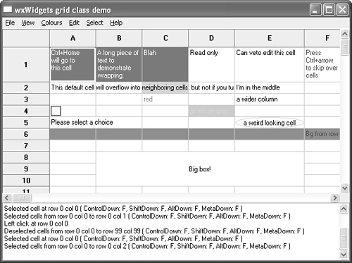
wxGrid is a versatile and somewhat complex class for presenting information in a tabular form. You could make a property sheet out of a grid with name and value columns, create a general-purpose spreadsheet by adding your own formula evaluation code, show a table from a database, or display statistical data generated by your application. In some situations, you might consider wxGrid as an alternative to wxListCtrl in report mode, particularly if you need to display images or arbitrary graphics in cells.
A grid can display optional row and column headers, drawn in a similar way to the headers in a spreadsheet application. The user can drag column and row dividers, select one or more cells, and click a cell to edit it. Each cell in a grid has its own attributes for font, color, and alignment and also may have its own specialized renderer (for drawing the data) and editor (for editing the data). You can write your own renderers and editors: see include/wx/generic/ grid.h and src/generic/grid.cpp in your wxWidgets distribution for guidance. By default, a grid cell will use a simple string renderer and editor. If you have complex requirements for cell formatting, then rather than set attributes for each cell, you can create an “attribute provider” class that dynamically returns attributes for each cell when needed.
You can also create a potentially enormous “virtual” grid where storage is provided by the application, not by wxGrid. To do this, you derive a class from wxGridTableBase and override functions including GetValue, GetNumberRows, and GetNumberCols. These functions will reflect data stored in your application or perhaps in a database. Then plug the table into a grid using SetTable, and the grid will use your data. These more advanced techniques are demonstrated in samples/grid in your wxWidgets distribution, as shown in Figure 12-7.
Listing 12-3 shows an example of creating a simple grid with eight rows and ten columns.
Listing 12-3 Simple Use of wxGrid
#include "wx/grid.h"
// Create a wxGrid object
wxGrid* grid = new wxGrid(frame, wxID_ANY,
wxDefaultPosition, wxSize(400, 300));
// Then we call CreateGrid to set the dimensions of the grid
// (8 rows and 10 columns in this example)
grid->CreateGrid(8, 10);
// We can set the sizes of individual rows and columns
// in pixels
grid->SetRowSize(0, 60);
grid->SetColSize(0, 120 );
// And set grid cell contents as strings
grid->SetCellValue(0, 0, wxT("wxGrid is good"));
// We can specify that some cells are read-only
grid->SetCellValue(0, 3, wxT("This is read-only"));
grid->SetReadOnly(0, 3);
// Colors can be specified for grid cell contents
grid->SetCellValue(3, 3, wxT("green on grey"));
grid->SetCellTextColour(3, 3, *wxGREEN);
grid->SetCellBackgroundColour(3, 3, *wxLIGHT_GREY);
// We can specify that some cells will store numeric
// values rather than strings. Here we set grid column 5
// to hold floating point values displayed with width of 6
// and precision of 2
grid->SetColFormatFloat(5, 6, 2);
grid->SetCellValue(0, 6, wxT("3.1415"));
// Set the grid size to the minimum required to show the content
grid->Fit( );
// Set the parent frame client size to fit the grid
frame->SetClientSize(grid->GetSize( ));
As you have probably gathered by now, wxGrid is not really a single class—it’s a set of interacting classes. Table 12-9 clarifies what’s available and how the classes relate to each other.
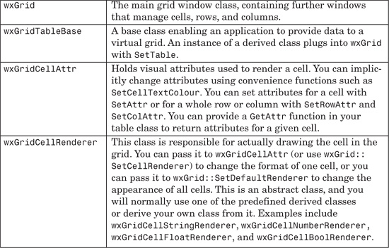
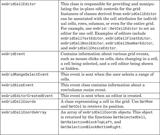
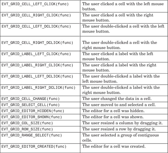
Table 12-10 lists the major grid events you can catch. Note that each EVT_GRID_... macro also has a form EVT_GRID_CMD_... that takes an identifier and can be used by an ancestor of the grid to avoid the need for deriving a new class.
The following is a selection of the most significant wxGrid functions, grouped by functionality. For a complete reference, and for the members of other related classes, please refer to the reference manual.
These functions relate to creation and deletion of the grid and its cells and interaction with the data in its table.
AppendCols and AppendRows append columns and rows, respectively, to the right or bottom of the grid. You can also use InsertCols and InsertRows to insert them at a given position. If you are using a table, you need to override similarly named functions in your table class.
Use GetNumberCols and GetNumberRows to return the number of columns or rows in the grid table associated with the grid.
CreateGrid creates a grid with the specified initial number of rows and columns. Call this directly after the grid constructor. When you use this function, wxGrid will create and manage a simple table of string values for you. All of the grid data will be stored in memory. For applications with more complex data types or relationships, or for dealing with very large datasets, you should derive your own grid table class and pass a table object to the grid with wxGrid::SetTable.
ClearGrid clears all data in the underlying grid table and repaints the grid. The table is not deleted by this function. If you are using a derived table class, then you need to override wxGridTableBase::Clear for this function to have any effect. ClearSelection deselects all cells that are currently selected.
Use DeleteCols and DeleteRows to delete columns and rows, respectively.
GetColLabelValue returns the specified column label. The default grid table class provides column labels of the form A, B…Z, AA, AB…ZZ, AAA… If you are using a custom grid table, you can override wxGridTableBase:: GetColLabelValue to provide your own labels. Similarly, GetRowLabelValue returns the specified row label. The default grid table class provides numeric row labels. If you are using a custom grid table, you can override wxGridTable Base::GetRowLabelValue to provide your own labels. Use SetColLabelValue and SetRowLabelValue to the set the label for a given column or row.
GetCellValue returns the string contained in the cell at the specified location. For simple applications where a grid object automatically uses a default grid table of string values, you use this function together with SetCellValue to access cell values. For more complex applications where you have derived your own grid table class, you only use this function for cells that contain string values.
These functions relate to the way the grid is displayed.
Use BeginBatch and EndBatch to suppress painting between these calls. Painting will only be done when GetBatchCount returns zero.
EnableGridLines turns the drawing of grid lines on or off. Call GridLinesEnabled to determine if they are on or off.
ForceRefresh causes immediate repainting of the grid. Use this instead of the usual wxWindow::Refresh.
Call Fit to fit the grid window to the smallest size required, given the current number of rows and columns.
GetCellAlignment gets the arguments to the horizontal and vertical text alignment values for the grid cell at the specified location. GetColLabel Alignment gets the current column label alignment, and GetRowLabelAlignment gets the current row label alignment. GetDefaultCellAlignment gets the default alignment for a cell. These functions have corresponding setters. Horizontal alignment will be one of wxALIGN_LEFT, wxALIGN_CENTRE (wxALIGN_CENTER), or wxALIGN_RIGHT. Vertical alignment will be one of wxALIGN_TOP, wxALIGN_CENTRE (wxALIGN_CENTER), or wxALIGN_BOTTOM.
GetCellBackgroundColour returns the background color of the cell at the specified location. GetDefaultCellBackgroundColour returns the default background color for the grid. Get the label background color with GetLabel BackgroundColour. These functions have corresponding setters.
GetCellFont gets the font for text in the grid cell at the specified location, and GetDefaultCellFont gets the default font. GetLabelFont gets the font used for row and column labels. These functions have corresponding setters.
GetCellTextColour returns the text color for the grid cell at the specified location. Use GetDefaultCellTextColour to get the default cell text color and GetLabelTextColour to get the label text color. Corresponding setters are provided.
Change and get the color used for grid lines with SetGridLineColour and GetGridLineColour.
SetColAttr and SetRowAttr set the cell attributes for all cells in the given column or row.
To set the format used for a particular column, use SetColFormatBool, SetColFormatNumber, SetColFormatFloat, and SetColFormatCustom.
The following functions use pixel dimensions.
AutoSize automatically sets the height and width of all rows and columns to fit their contents. You can also use AutoSizeColumn, AutoSizeColumns, AutoSizeRow, and AutoSizeRows.
CellToRect returns the rectangle corresponding to the grid cell’s size and position.
Use SetColMinimalWidth and SetRowMinimalHeight to set the column and row minimum dimensions, and retrieve them with GetColMinimalWidth and GetRowMinimalHeight.
Use these functions for getting a variety of dimensions in pixels: GetColLabelSize, GetDefaultColLabelSize, GetDefaultColSize, GetColSize, GetDefaultRowLabelSize, GetRowSize, GetDefaultRowSize, and GetRowLabelSize. There are corresponding setters.
If you need extra space around the grid, call SetMargins.
If you need to find the column or row for a given x or y pixel position, use XToCol and YToRow. To find the column whose right edge is closest to a given x position, use XToEdgeOfCol. To find the row whose bottom edge is close to the given y position, use YToEdgeOfRow.
These functions let you control the grid cursor (current focus position) and selection.
GetGridCursorCol and GetGridCursorRow return the current column and row positions of the cursor. Set the cursor position with SetGridCursor.
You can move the cursor one row or column at a time with MoveCursor Down, MoveCursorLeft, MoveCursorRight, and MoveCursorUp. To do the same thing but to skip to the next non-empty cell in the row or column, use MoveCursor DownBlock, MoveCursorLeftBlock, MoveCursorRightBlock, and MoveCursorUpBlock.
Move a page at a time with MovePageDown and MovePageUp, where a page is determined by the size of the grid window.
GetSelectionMode returns one of wxGrid::wxGridSelectCells (the default mode where individual cells are selected), wxGrid::wxGridSelectRows (selections consist of whole rows), and wxGrid::wxGridSelectColumns (selections consist of whole columns). Set the selection mode with SetSelectionMode.
You can retrieve all selected cells with GetSelectedCells, which returns a wxGridCellCoordsArray object containing the cells GetSelectedCols and GetSelectedRows. Because a user can select several non-contiguous blocks of cells, both GetSelectionBlockTopLeft and GetSelectionBlockBottomRight return a wxGridCellCoordsArray. You can identify the blocks by iterating through these arrays.
Call IsInSelection with with a row and column or wxGridCellCoords object to determine whether the cell is within the selection. IsSelection returns true if there are any selections in the grid.
Select everything in the grid with SelectAll, select a whole column with SelectCol, and select a whole row with SelectRow. You can select a rectangular block with SelectBlock, passing the top-left and bottom-right cell coordinates as either four integers or two wxGridCellCoords objects.
These functions deal with various other types of wxGrid functionality.
GetTable retrieves the table associated with the grid, holding the actual data displayed by the grid. If you use CreateGrid, wxGrid creates a table of string data itself. Alternatively, you can use SetTable to set your own table object.
GetCellEditor and SetCellEditor get and set a pointer to the editor for the cell at the specified location. Call GetDefaultEditor and SetDefaultEditor to get and set the default editor used for all cells.
GetCellRenderer and SetCellRenderer get and set a pointer to the renderer for the grid cell at the specified location. Call GetDefaultRenderer and SetDefaultRenderer to get and set the default renderer used for all cells.
ShowCellEditControl and HideCellEditControl show and hide the edit control for the cell at the current cursor position. This is normally done automatically when the user clicks on a cell to edit it or presses Enter or Escape (or clicks on another window) to finish editing. SaveEditControlValue transfers the value of the in-place edit control to the cell—you may want to call this before closing a grid or retrieving values from a grid to make sure the grid reflects the latest edits.
EnableCellEditControl enables or disables in-place editing of grid cell data. The grid will issue either a wxEVT_GRID_EDITOR_SHOWN or wxEVT_GRID_EDITOR_HIDDEN event when this function is called. Call IsCellEditControl Enabled to determine if the cell can be edited. IsCurrentCellReadOnly returns true if the current cell is read-only.
EnableDragColSize enables or disables column sizing by dragging with the mouse. EnableDragGridSize enables or disables row and column resizing by dragging gridlines with the mouse. EnableDragRowSize enables or disables row sizing by dragging with the mouse.
EnableEditing sets the whole grid as read-only if the argument is false. If the argument is true, the grid is set to the default state where cells may be edited. In the default state, you can set single grid cells and whole rows and columns to be editable or read-only via wxGridCellAttribute::SetReadOnly. For single cells, you can also use the convenience function wxGrid::SetReadOnly. Call IsEditable to determine whether the grid is editable.
You can make a cell read-only with SetReadOnly and retrieve its read-only status with IsReadOnly.
IsVisible returns true if the cell is wholly or partially visible in the grid window. You can make sure a cell is visible by calling MakeCellVisible.
This class installs an icon on the system tray (Windows, Gnome, or KDE) or dock (Mac OS X). Clicking on the icon will pop up a menu that the application supplies, and an optional tooltip can be shown when the mouse hovers over the icon. This technique gives quick access to important application functionality without having to use the regular application user interface. The application can display status information by switching icons, as per the battery and connection indicators in Windows.
Figure 12-8 shows the result of running the wxTaskBarIcon sample on Windows (see samples/taskbar). The wxWidgets icon is installed, and hovering the mouse pointer over the icon shows the tooltip text “wxTaskBarIconSample.” Right-clicking on the icon shows the menu with three options. Selecting Set New Icon sets the icon to a smiley face and also resets the tooltip text to a new string.

The implementation of a wxTaskBarIcon-derived class can be very simple, as Listing 12-4 shows (taken from the wxTaskBarIcon sample). The derived class MyTaskBarIcon overrides CreatePopupMenu and implements event handlers to intercept a left double-click and three menu commands.
Listing 12-4 Deriving from wxTaskBarIcon
class MyTaskBarIcon: public wxTaskBarIcon
{
public:
MyTaskBarIcon( ) {};
void OnLeftButtonDClick(wxTaskBarIconEvent&);
void OnMenuRestore(wxCommandEvent&);
void OnMenuExit(wxCommandEvent&);
void OnMenuSetNewIcon(wxCommandEvent&);
virtual wxMenu *CreatePopupMenu( );
DECLARE_EVENT_TABLE( )
};
enum {
PU_RESTORE = 10001,
PU_NEW_ICON,
PU_EXIT,
};
BEGIN_EVENT_TABLE(MyTaskBarIcon, wxTaskBarIcon)
EVT_MENU(PU_RESTORE, MyTaskBarIcon::OnMenuRestore)
EVT_MENU(PU_EXIT, MyTaskBarIcon::OnMenuExit)
EVT_MENU(PU_NEW_ICON,MyTaskBarIcon::OnMenuSetNewIcon)
EVT_TASKBAR_LEFT_DCLICK (MyTaskBarIcon::OnLeftButtonDClick)
END_EVENT_TABLE( )
void MyTaskBarIcon::OnMenuRestore(wxCommandEvent& )
{
dialog->Show(true);
}
void MyTaskBarIcon::OnMenuExit(wxCommandEvent& )
{
dialog->Close(true);
}
void MyTaskBarIcon::OnMenuSetNewIcon(wxCommandEvent&)
{
wxIcon icon(smile_xpm);
if (!SetIcon(icon, wxT("wxTaskBarIcon Sample - a different icon")))
wxMessageBox(wxT("Could not set new icon."));
}
// Overridables
wxMenu *MyTaskBarIcon::CreatePopupMenu( )
{
wxMenu *menu = new wxMenu;
menu->Append(PU_RESTORE, wxT("&Restore TBTest"));
menu->Append(PU_NEW_ICON,wxT("&Set New Icon"));
menu->Append(PU_EXIT, wxT("E&xit"));
return menu;
}
void MyTaskBarIcon::OnLeftButtonDClick(wxTaskBarIconEvent&)
{
dialog->Show(true);
}
The rest of the code to show a dialog and install the initial icon is equally straightforward, as Listing 12-5 shows.
Listing 12-5 Showing a Taskbar Icon
#include "wx/wx.h"
#include "wx/taskbar.h"
// Define a new application
class MyApp: public wxApp
{
public:
bool OnInit(void);
};
class MyDialog: public wxDialog
{
public:
MyDialog(wxWindow* parent, const wxWindowID id, const wxString& title,
const wxPoint& pos, const wxSize& size, const long windowStyle = wxDEFAULT_DIALOG_STYLE);
~MyDialog( );
void OnOK(wxCommandEvent& event);
void OnExit(wxCommandEvent& event);
void OnCloseWindow(wxCloseEvent& event);
void Init(void);
protected:
MyTaskBarIcon *m_taskBarIcon;
DECLARE_EVENT_TABLE( )
};
#include "../sample.xpm"
#include "smile.xpm"
MyDialog *dialog = NULL;
IMPLEMENT_APP(MyApp)
bool MyApp::OnInit(void)
{
// Create the main frame window
dialog = new MyDialog(NULL, wxID_ANY, wxT("wxTaskBarIcon Test Dialog"), wxDefaultPosition, wxSize(365, 290));
dialog->Show(true);
return true;
}
BEGIN_EVENT_TABLE(MyDialog, wxDialog)
EVT_BUTTON(wxID_OK, MyDialog::OnOK)
EVT_BUTTON(wxID_EXIT, MyDialog::OnExit)
EVT_CLOSE(MyDialog::OnCloseWindow)
END_EVENT_TABLE( )
MyDialog::MyDialog(wxWindow* parent, const wxWindowID id, const wxString& title,
const wxPoint& pos, const wxSize& size, const long windowStyle):
wxDialog(parent, id, title, pos, size, windowStyle)
{
Init( );
}
MyDialog::~MyDialog( )
{
delete m_taskBarIcon;
}
void MyDialog::OnOK(wxCommandEvent& WXUNUSED(event))
{
Show(false);
}
void MyDialog::OnExit(wxCommandEvent& WXUNUSED(event))
{
Close(true);
}
void MyDialog::OnCloseWindow(wxCloseEvent& WXUNUSED(event))
{
Destroy( );
}
void MyDialog::Init(void)
{
(void)new wxStaticText(this, wxID_ANY, wxT("Press ’Hide me’ to hide me, Exit to quit."),
wxPoint(10, 20));
(void)new wxStaticText(this, wxID_ANY, wxT("Double-click on the taskbar icon to show me again."),
wxPoint(10, 40));
(void)new wxButton(this, wxID_EXIT, wxT("Exit"), wxPoint(185, 230), wxSize(80, 25));
(new wxButton(this, wxID_OK, wxT("Hide me"), wxPoint(100, 230), wxSize(80, 25)))->SetDefault( );
Centre(wxBOTH);
m_taskBarIcon = new MyTaskBarIcon( );
if (!m_taskBarIcon->SetIcon(wxIcon(sample_xpm), wxT("wxTaskBarIcon Sample")))
wxMessageBox(wxT("Could not set icon."));
}
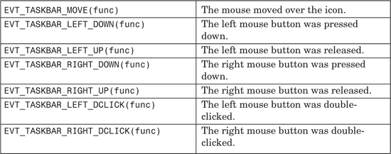
To process events from a taskbar icon, use the event handler macros listed in Table 12-11 to direct input to member functions that take a wxTaskBarIcon Event argument. Note that not all ports are required to send these events, and so you should override CreatePopupMenu if you want to show a popup menu in reaction to a mouse click. Note also that wxTaskBarIconEvent doesn’t pass any mouse status information such as position.
The wxTaskBarIcon API is very simple. These are all the member functions for this class.
CreatePopupMenu is a virtual function that should be overridden by the derived class to return a new wxMenu when called by wxWidgets in response to a wxEVT_TASKBAR_RIGHT_DOWN event (this event is simulated on Mac OS X). wxWidgets will also delete the menu when it is dismissed.
IsIconInstalled returns true if SetIcon was successfully called.
IsOk returns true if the wxTaskBarIcon object initialized successfully.
PopupMenu shows a menu at the current position. It’s not recommended to call this directly; instead, override CreatePopupMenu and let wxWidgets show the menu for you.
RemoveIcon removes the icon previously set with SetIcon.
SetIcon sets an icon (wxIcon) and optional tooltip text. You can call this multiple times.
This section discusses how you can create your own controls in wxWidgets. wxWidgets does not have the concept of a “custom control” in the sense of a binary, drop-in component to which Windows programmers might be accustomed. Third-party controls are usually supplied as source code and follow the same pattern as generic controls within wxWidgets, such as wxCalendarCtrl and wxGrid. We’re using the term “control” loosely here because controls do not have to be derived from wxControl; you might want to use wxScrolledWindow as a base class, for example.
Ten major tasks are involved in writing a new control:
1. Write a class declaration that has a default constructor, a constructor that creates the window, a Create function, and preferably an Init function to do shared initialization.
2. Add a function DoGetBestSize that returns the best minimal size appropriate to this control (based on a label size, for example).
3. Add a new event class for the control to generate, if existing event classes in wxWidgets are inadequate. A new type of push button might just use wxCommandEvent, but more complex controls will need a new event class. Also add event handler macros to use with the event class.
4. Write the code to display the information in the control.
5. Write the code to handle low-level mouse and keyboard events in the control, and generate appropriate high-level command events that the application can handle.
6. Write any default event handlers that the control might have—for example, handling wxID_COPY or wxID_UNDO commands or UI update commands.
7. Optionally, write a validator class that an application can use with the control (to make it easy to transfer data to and from the control) and validate its contents.
8. Optionally, write a resource handler class so that your control can be used with the XRC resource system.
9. Test the control on the platforms you want to support.
10. Write the documentation!
Let’s take the simple example we used in Chapter 3, “Event Handling,” when discussing custom events: wxFontSelectorCtrl, which you can find in examples/chap03 on the CD-ROM. This class shows a font preview on which the user can click to change the font using the standard font selector dialog. Changing the font causes a wxFontSelectorCtrlEvent to be sent, which can be caught by providing an event handler for EVT_FONT_SELECTION_CHANGED(id, func).
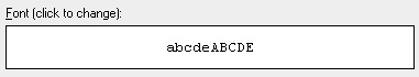
The control is illustrated in Figure 12-9 and is shown with a static text control above it.
The following code is the class declaration for wxFontSelectorCtrl. DoGetBestSize returns a fairly arbitrary size, 200 × 40 pixels, which will be used if no minimum size is passed to the constructor.
/*!
* A control for displaying a font preview.
*/
class wxFontSelectorCtrl: public wxControl
{
DECLARE_DYNAMIC_CLASS(wxFontSelectorCtrl)
DECLARE_EVENT_TABLE( )
public:
// Constructors
wxFontSelectorCtrl( ) { Init( ); }
wxFontSelectorCtrl(wxWindow* parent, wxWindowID id,
const wxPoint& pos = wxDefaultPosition,
const wxSize& size = wxDefaultSize,
long style = wxSUNKEN_BORDER,
const wxValidator& validator = wxDefaultValidator)
{
Init( );
Create(parent, id, pos, size, style, validator);
}
// Creation
bool Create(wxWindow* parent, wxWindowID id,
const wxPoint& pos = wxDefaultPosition,
const wxSize& size = wxDefaultSize,
long style = wxSUNKEN_BORDER,
const wxValidator& validator = wxDefaultValidator);
// Common initialization
void Init( ) { m_sampleText = wxT("abcdeABCDE"); }
// Overrides
wxSize DoGetBestSize( ) const { return wxSize(200, 40); }
// Event handlers
void OnPaint(wxPaintEvent& event);
void OnMouseEvent(wxMouseEvent& event);
// Accessors
void SetFontData(const wxFontData& fontData) { m_fontData = fontData; };
const wxFontData& GetFontData( ) const { return m_fontData; };
wxFontData& GetFontData( ) { return m_fontData; };
void SetSampleText(const wxString& sample);
const wxString& GetSampleText( ) const { return m_sampleText; };
protected:
wxFontData m_fontData;
wxString m_sampleText;
};
To store the font information associated with the control, we are using a wxFontData object, as used by wxFontDialog, so that we can store a color selection along with the font.
The control’s RTTI event table macros and creation code look like this:
BEGIN_EVENT_TABLE(wxFontSelectorCtrl, wxControl)
EVT_PAINT(wxFontSelectorCtrl::OnPaint)
EVT_MOUSE_EVENTS(wxFontSelectorCtrl::OnMouseEvent)
END_EVENT_TABLE( )
IMPLEMENT_DYNAMIC_CLASS(wxFontSelectorCtrl, wxControl)
bool wxFontSelectorCtrl::Create(wxWindow* parent, wxWindowID id,
const wxPoint& pos, const wxSize& size, long style,
const wxValidator& validator)
{
if (!wxControl::Create(parent, id, pos, size, style, validator))
return false;
SetBackgroundColour(wxSystemSettings::GetColour(
wxSYS_COLOUR_WINDOW));
m_fontData.SetInitialFont(GetFont( ));
m_fontData.SetChosenFont(GetFont( ));
m_fontData.SetColour(GetForegroundColour( ));
// Tell the sizers to use the given or best size
SetBestFittingSize(size);
return true;
}
The call to SetBestFittingSize tells the sizer layout algorithm to use either the initial size or the “best” size returned from DoGetBestSize as the minimal control size. The control can stretch to be bigger than this size, according to the flags passed when the control is added to a sizer.
Implementing DoGetBestSize lets wxWidgets know the optimal minimal size of the control. Providing this information means that a control can be created with default size (wxDefaultSize) and it will size itself sensibly. We’ve chosen a somewhat arbitrary but reasonable size of 200 × 40 pixels, which will normally be overridden by application code. A control such as a label or button has a natural default size, but other controls don’t, such as a scrolled window with no child windows. If your control falls into this category, your DoGetBestSize can call wxWindow::DoGetBestSize, or you can omit the function altogether. You will need to rely on the application passing a non-default size to the control’s constructor or the control being sized appropriately by a parent sizer.
If your control can have child windows of arbitrary size, and you want your control to size itself according to these child windows, you can find each child’s size using GetAdjustedBestSize, and you can return a size that fits around these. For example, say we’re implementing a window that contains two child windows, arranged horizontally. We might have this implementation:
wxSize ContainerCtrl::DoGetBestSize( ) const
{
// Get best sizes of subwindows
wxSize size1, size2;
if ( m_windowOne )
size1 = m_windowOne->GetAdjustedBestSize( );
if ( m_windowTwo )
size2 = m_windowTwo->GetAdjustedBestSize( );
// The windows are laid out horizontally. Find
// the total window size.
wxSize bestSize;
bestSize.x = size1.x + size2.x;
bestSize.y = wxMax(size1.y, size2.y);
return bestSize;
}
We covered the topic of creating a new event class (wxFontSelectorCtrlEvent) and event table macro (EVT_FONT_SELECTION_CHANGED) in Chapter 3. An application that uses the font selector control doesn’t have to catch this event at all because data transfer is handled separately. In a more complex control, the event class would have specific functions; we could have provided information about the font in the event class, for example, so that handlers could retrieve the selected font with wxFontSelectorCtrlEvent::GetFont.
Our control has a very simple paint event handler, centering the sample text on the control as follows:
void wxFontSelectorCtrl::OnPaint(wxPaintEvent& event)
{
wxPaintDC dc(this);
wxRect rect = GetClientRect( );
int topMargin = 2;
int leftMargin = 2;
dc.SetFont(m_fontData.GetChosenFont( ));
wxCoord width, height;
dc.GetTextExtent(m_sampleText, & width, & height);
int x = wxMax(leftMargin, ((rect.GetWidth( ) - width) / 2)) ;
int y = wxMax(topMargin, ((rect.GetHeight( ) - height) / 2)) ;
dc.SetBackgroundMode(wxTRANSPARENT);
dc.SetTextForeground(m_fontData.GetColour( ));
dc.DrawText(m_sampleText, x, y);
dc.SetFont(wxNullFont);
}
For drawing standard elements, such as a splitter sash or a border, consider using wxNativeRenderer (please see the reference manual for more details).
Our control detects a left-click and shows a font dialog. If the user confirmed the choice, the font data is retrieved from the font dialog, and an event is sent to the control using ProcessEvent. This event can be processed by a function in a class derived from wxFontSelectorCtrl or a function in the dialog (or other window) containing the control.
void wxFontSelectorCtrl::OnMouseEvent(wxMouseEvent& event)
{
if (event.LeftDown( ))
{
// Get a parent for the font dialog
wxWindow* parent = GetParent( );
while (parent != NULL &&
!parent->IsKindOf(CLASSINFO(wxDialog)) &&
!parent->IsKindOf(CLASSINFO(wxFrame)))
parent = parent->GetParent( );
wxFontDialog dialog(parent, m_fontData);
dialog.SetTitle(_("Please choose a font"));
if (dialog.ShowModal( ) == wxID_OK)
{
m_fontData = dialog.GetFontData( );
m_fontData.SetInitialFont(
dialog.GetFontData( ).GetChosenFont( ));
Refresh( );
wxFontSelectorCtrlEvent event(
wxEVT_COMMAND_FONT_SELECTION_CHANGED, GetId( ));
event.SetEventObject(this);
GetEventHandler( )->ProcessEvent(event);
}
}
}
This class has no keyboard handling, but you could interpret an Enter key press to do the same as left-click. You could also draw a focus rectangle to indicate that the control has the focus, using wxWindow::FindFocus to determine whether this is the focused window. You would need to intercept focus events with EVT_SET_FOCUS and EVT_KILL_FOCUS to refresh the control so that the correct focus graphic is drawn.
If you look at implementations of wxTextCtrl, for example src/msw/textctrl.cpp, you will find that standard identifiers such as wxID_COPY, wxID_PASTE, wxID_UNDO, and wxID_REDO have default command event and UI update event handlers. This means that if your application is set up to direct events to the focused control (see Chapter 20, “Perfecting Your Application”), your standard menu items and toolbar buttons will respond correctly according to the state of the control. Our example control is not complex enough to warrant these handlers, but if you implement undo/redo or clipboard operations, you should provide them. For example:
BEGIN_EVENT_TABLE(wxTextCtrl, wxControl)
...
EVT_MENU(wxID_COPY, wxTextCtrl::OnCopy)
EVT_MENU(wxID_PASTE, wxTextCtrl::OnPaste)
EVT_MENU(wxID_SELECTALL, wxTextCtrl::OnSelectAll)
EVT_UPDATE_UI(wxID_COPY, wxTextCtrl::OnUpdateCopy)
EVT_UPDATE_UI(wxID_PASTE, wxTextCtrl::OnUpdatePaste)
EVT_UPDATE_UI(wxID_SELECTALL, wxTextCtrl::OnUpdateSelectAll)
...
END_EVENT_TABLE( )
void wxTextCtrl::OnCopy(wxCommandEvent& event)
{
Copy( );
}
void wxTextCtrl::OnPaste(wxCommandEvent& event)
{
Paste( );
}
void wxTextCtrl::OnSelectAll(wxCommandEvent& event)
{
SetSelection(-1, -1);
}
void wxTextCtrl::OnUpdateCopy(wxUpdateUIEvent& event)
{
event.Enable( CanCopy( ) );
}
void wxTextCtrl::OnUpdatePaste(wxUpdateUIEvent& event)
{
event.Enable( CanPaste( ) );
}
void wxTextCtrl::OnUpdateSelectAll(wxUpdateUIEvent& event)
{
event.Enable( GetLastPosition( ) > 0 );
}
As we saw in Chapter 9, “Creating Custom Dialogs,” validators are a very convenient way to specify how data is validated and transferred between variables and associated controls. When you write a new control class, you can provide a special validator class to use with it.
wxFontSelectorValidator is a validator you can use with wxFontSelector Ctrl. You can pass font and color pointers or a pointer to a wxFontData object. These variables are usually declared in the dialog class so that they persist and can be retrieved when the dialog has been dismissed. Note that the validator is passed as an object, not using the new operator, and the object is copied by SetValidator before it goes out of scope and is deleted.
For example:
wxFontSelectorCtrl* fontCtrl =
new wxFontSelectorCtrl( this, ID_FONTCTRL,
wxDefaultPosition, wxSize(100, 40), wxSIMPLE_BORDER );
// Either a pointer to a wxFont and optional wxColour...
fontCtrl->SetValidator( wxFontSelectorValidator(& m_font,
& m_fontColor) );
// ...or a pointer to a wxFontData
fontCtrl->SetValidator( wxFontSelectorValidator(& m_fontData) );
The m_font and m_fontColor variables (or m_fontData variable) will reflect any changes to the font preview made by the user. This transfer of data happens when the dialog’s TransferDataFromWindow function is called (which it is by default, from wxWidgets’ standard wxID_OK handler).
You must implement a default constructor, further constructors that take pointers to variables, and a Clone function to duplicate the object. The Validate function should be implemented to check that the data in the control is valid, showing a message and returning false if not. TransferToWindow and TransferFromWindow must be implemented to copy the data to and from the control, respectively.
Here’s the declaration of wxFontSelectorValidator:
/*!
* Validator for wxFontSelectorCtrl
*/
class wxFontSelectorValidator: public wxValidator
{
DECLARE_DYNAMIC_CLASS(wxFontSelectorValidator)
public:
// Constructors
wxFontSelectorValidator(wxFontData *val = NULL);
wxFontSelectorValidator(wxFont *fontVal,
wxColour* colourVal = NULL);
wxFontSelectorValidator(const wxFontSelectorValidator& val);
// Destructor
~wxFontSelectorValidator( );
// Make a clone of this validator
virtual wxObject *Clone( ) const
{ return new wxFontSelectorValidator(*this); }
// Copies val to this object
bool Copy(const wxFontSelectorValidator& val);
// Called when the value in the window must be validated.
// This function can pop up an error message.
virtual bool Validate(wxWindow *parent);
// Called to transfer data to the window
virtual bool TransferToWindow( );
// Called to transfer data to the window
virtual bool TransferFromWindow( );
wxFontData* GetFontData( ) { return m_fontDataValue; }
DECLARE_EVENT_TABLE( )
protected:
wxFontData* m_fontDataValue;
wxFont* m_fontValue;
wxColour* m_colourValue;
// Checks that the validator is set up correctly
bool CheckValidator( ) const;
};
We will leave you to peruse the source in fontctrl.cpp to find out how the class is implemented.
If your class is to be used with XRC files, it is convenient to provide a suitable resource handler to use with the control. This is not illustrated in our example, but refer to the discussion of the XRC system in Chapter 9, and refer also to the existing handlers in the directories include/wx/xrc and src/xrc in your wxWidgets distribution.
After the handler is registered by an application, XRC files containing objects with your control’s properties will be loaded just like any file containing standard wxWidgets controls. Writing the XRC file is another matter, though, because design tools cannot currently be made aware of new resource handlers. However, with DialogBlocks’ simple “custom control definition” facility, you can set up the name and properties for a custom control, and the correct XRC definition will be written, even if it can only display an approximation of the control while editing.
When writing your own control, you need to give wxWidgets a few hints about the control’s appearance. Bear in mind that wxWidgets tries to use the system colors and fonts wherever possible, but also enables an application to customize these attributes where permitted by the native platform. wxWidgets also lets the application and the control choose whether or not child windows inherit their attributes from parents. The system for controlling these attributes is a little involved, but developers won’t have to know about these unless they heavily customize control colors (which is not recommended) or implement their own controls.
If explicitly provided by an application, foreground colors and fonts for a parent window are normally inherited by its children (which may include your custom control). However, this may be overridden—if the application has called SetOwnFont for the parent, the child controls will not inherit the font, and similarly for SetOwnForegroundColour. Also, your control can specify whether it can inherit its parent’s foreground color by returning true from ShouldInheritColours (the default for wxControl, but not for wxWindow). Background colors are not explicitly inherited; preferably, your control should use the same background as the parent by not painting outside the visible part of the control.
In order to implement attribute inheritance, your control should call InheritAttributes from its constructor after window creation. Depending on platform, you can do this when you call wxControl::Create from within your constructor.
Some classes implement the static function GetClassDefaultAttributes, returning a wxVisualAttributes object with background color, foreground color, and font members. It takes a wxWindowVariant argument used only on Mac OS X. This function specifies the default attributes for objects of that class and will be used by functions such as GetBackgroundColour in the absence of specific settings provided by the application. If you don’t want the default values to be returned, you can implement it in your class. You will also need to override the virtual function GetDefaultAttributes, calling GetClassDefaultAttributes, to allow the correct attributes to be returned for a given object. If your control has similar attributes to a standard control, you could use its attributes, for example:
// The static function, for global access
static wxVisualAttributes GetClassDefaultAttributes(
wxWindowVariant variant = wxWINDOW_VARIANT_NORMAL)
{
return wxListBox::GetClassDefaultAttributes(variant);
}
// The virtual function, for object access
virtual wxVisualAttributes GetDefaultAttributes( ) const
{
return GetClassDefaultAttributes(GetWindowVariant( ));
}
The wxVisualAttributes structure is defined as follows:
// struct containing all the visual attributes of a control
struct wxVisualAttributes
{
// the font used for the control’s label or text inside it
wxFont font;
// the foreground color
wxColour colFg;
// the background color; may be wxNullColour if the
// control’s background color is not solid
wxColour colBg;
};
If your control should have a transparent background—for example, if it’s a static control such as a label—then provide the function HasTransparent Background as a hint to wxWidgets (currently on Windows only).
Finally, sometimes your control may need to delay certain operations until the final size or some other property is known. You can use idle time processing for this, as described in “Alternatives to Multithreading” in Chapter 17, “Writing Multithreaded Aplications.”
The example we looked at previously, wxFontSelectorCtrl, was simple enough that we could briefly demonstrate the basics of creating new control, event, and validator classes. However, it’s a bit thin on interesting display and input code. For a more complex example, take a look at wxThumbnailCtrl in examples/chap12/thumbnail on the CD-ROM. This control displays a scrolling page of thumbnails (little images) and can be used in any application that deals with images. (In fact, it’s not limited to images; you can define your own classes derived from wxThumbnailItem to display thumbnails for other file types, or for images within archives, for example.)
Figure 12-10 shows the control being used with a wxGenericDirCtrl inside an image selection dialog (wxThumbnailBrowserDialog). The supplied sample comes with a selection of images in the images subdirectory for demonstration purposes.

The class illustrates the following topics, among others:
Mouse input: Items can be selected with left-click or multiply selected by holding down the Control key.
Keyboard input: The thumbnail grid can be navigated and scrolled with the arrow keys, and items can be selected by holding down the Shift key.
Focus handling: “Set” and “kill” focus events are used to update the currently focused item when the control itself receives or loses the focus.
Optimized drawing: Painting uses wxBufferedPaintDC for flicker-free updates and also checks the update region to eliminate unnecessary drawing.
Scrolling: The control derives from wxScrolledWindow and adjusts its scrollbars according to the number of items in the control.
Custom events: wxThumbnailEvent is generated with several event types including selection, deselection, and right-click.
wxThumbnailCtrl doesn’t load a directory full of images itself; for flexibility, wxThumbnailItem objects are explicitly added, as the following code shows:
// Create a multiple-selection thumbnail control
wxThumbnailCtrl* imageBrowser =
new wxThumbnailCtrl(parent, wxID_ANY,
wxDefaultPosition, wxSize(300, 400),
wxSUNKEN_BORDER¦wxHSCROLL¦wxVSCROLL¦wxTH_TEXT_LABEL¦
wxTH_IMAGE_LABEL¦wxTH_EXTENSION_LABEL¦wxTH_MULTIPLE_SELECT);
// Set a nice big thumbnail size
imageBrowser->SetThumbnailImageSize(wxSize(200, 200));
// Don’t paint while filling the control
imageBrowser->Freeze( );
// Set some bright colors
imageBrowser->SetUnselectedThumbnailBackgroundColour(*wxRED);
imageBrowser->SetSelectedThumbnailBackgroundColour(*wxGREEN);
// Add images from directory ’path’
wxDir dir;
if (dir.Open(path))
{
wxString filename;
bool cont = dir.GetFirst(&filename, wxT("*.*"), wxDIR_FILES);
while ( cont )
{
wxString file = path + wxFILE_SEP_PATH + filename;
if (wxFileExists(file) && DetermineImageType(file) != -1)
{
imageBrowser->Append(new wxImageThumbnailItem(file));
}
cont = dir.GetNext(&filename);
}
}
// Sort by name
imageBrowser->Sort(wxTHUMBNAIL_SORT_NAME_DOWN);
// Tag and select the first thumbnail
imageBrowser->Tag(0);
imageBrowser->Select(0);
// Delete the second thumbnail
imageBrowser->Delete(1);
// Now display the images
imageBrowser->Thaw( );
If you look through the source code in thumbnailctrl.h and thumbnail.cpp, you should get plenty of ideas for implementing your own controls. Feel free to use wxThumbnailCtrl in your own applications, too.
This chapter has covered visual classes that you probably won’t use in your first explorations of wxWidgets, but you’ll almost certainly want to consider them as your applications become more sophisticated. Their source also gives you plenty of tips for learning how to write your own controls, as described in the final part of this chapter.
Refer also to Appendix D, “Other Features in wxWidgets,” for other advanced controls distributed with wxWidgets, and Appendix E, “Third-Party Tools for wxWidgets,” for third-party controls.
Next, we’ll have a look at the data structure classes available in wxWidgets.