
8
Response Surface Methods for Optimization
The first step comes in a burst. Then “bugs,” as such little faults and difficulties are called, show themselves. Months of intense study and labor are required before commercial success.
Thomas Edison (1878)
This chapter provides a broad overview of more advanced techniques for optimization called response surface methods or RSM. (For a much more detailed description of this technique, read RSM Simplified: Optimizing Processes Using Response Surface Methods for Design of Experiments (Productivity Press, 2004).) RSM should be applied only after completing the initial phases of experimentation:
- Fractional two-level designs that screen the vital few from the trivial many factors.
- Full factorials that study the vital few factors in depth and define the region of interest.
The goal of RSM is to generate a map of response, either in the form of contours or as a 3-D rendering. These maps are much like those used by a geologist for topography, but instead of displaying elevation they show your response, such as process yield. Figure 8.1a,b shows examples of response surfaces. The surface on the left exhibits a “simple maximum,” a very desirable outcome because it reveals the peak of response. The surface on the right, called a “saddle,” is much more complex. It exhibits two maximums. You also may encounter other types of surfaces, such as simple minimums or rising ridges.

A two-level design cannot fit the surfaces shown in Figure 8.1a,b, but it can detect the presence of curvature with the addition of “center points.” We will show how to add center points; then, if curvature is significant, how to augment your design into an RSM.
Center Points Detect Curvature in Confetti
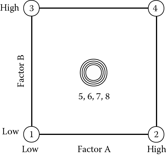
Center points are created by setting all factors at their midpoint. In coded form, center points fall at the all-zero level. An experiment on confetti easily illustrates this concept.
The objective is to cut strips of paper that drop slowly through the air. If the dimensions are optimal, the confetti spins and moves at random angles that please the eye. Table 8.1 shows the factors and levels to be tested. Note the addition of center points (coded as 0). This is a safety measure that plugs the gap between low (–) and high (+) levels.
Two-level factorial with center points for confetti
|
Factor |
Name |
Units |
Low Level (–) |
Center (0) |
High Level (+) |
|
A |
Width |
Inches |
1 |
2 |
3 |
|
B |
Height |
Inches |
3 |
4 |
5 |
For convenience of construction, the confetti specified above is larger and wider than the commercially available variety. The actual design is shown in Table 8.2. We replicated the center point four times to provide more power for the analysis. These points, along with all the others, were performed in random order. The center points act as a barometer of the variability in the system.
Design layout and results for confetti experiment
|
Std |
A: Width (inches) |
B: Length (inches) |
Time (seconds) |
|
1 |
1.00 |
3.00 |
2.5 |
|
2 |
3.00 |
3.00 |
1.9 |
|
3 |
1.00 |
5.00 |
2.8 |
|
4 |
3.00 |
5.00 |
2.0 |
|
5 |
2.00 |
4.00 |
2.8 |
|
6 |
2.00 |
4.00 |
2.7 |
|
7 |
2.00 |
4.00 |
2.6 |
|
8 |
2.00 |
4.00 |
2.7 |
Figure 8.2 shows where the design points are located.
The response is flight time in seconds from a height of five feet. The half-normal plot of effects for this data is shown in Figure 8.3.

Factor A, the width, stands out as a very large effect. On the other end of the effect scale (nearest zero), notice the three triangular symbols. These come from the replicated center points, which contribute three degrees of freedom for estimation of “pure error.” In line with the pure error, you will find the main effect of B (length) and the interaction AB. These two relatively trivial effects, chosen here only to identify them, will be thrown into the residual pool under a new label, “lack of fit,” to differentiate these estimates of error from the “pure error.” (Details on lack of fit can be found below in the boxed text on this topic.) The pure error is included in the residual subtotal in the analysis of variance (ANOVA), shown in Table 8.3, which also exhibits a new row labeled “Curvature.”
ANOVA for confetti experiment (effects B and AB used for lack-of-fit test)
|
Source |
Sum of Squares |
DF |
Mean Square |
F Value |
Prob > F |
|
Model |
0.49 |
1 |
0.49 |
35.00 |
0.0020 |
|
A |
0.49 |
1 |
0.49 |
35.00 |
0.0020 |
|
Curvature |
0.32 |
1 |
0.32 |
22.86 |
0.0050 |
|
Residual |
0.070 |
5 |
0.014 |
||
|
Lack of Fit |
0.050 |
2 |
0.025 |
3.75 |
0.1527 |
|
Pure Error |
0.020 |
3 |
0.0067 |
||
|
Cor Total |
0.88 |
7 |
Apply the usual 0.05 rule to assess the significance of the curvature. In this case, the probability value of 0.005 for curvature falls below the acceptable threshold of 0.05, so it cannot be ignored. That’s bad. It means that the results at the center point were unexpectedly high or low relative to the factorial points around it. In this case, as illustrated by Figure 8.4a,b effect plots of the response versus factors A and B (insignificant at this stage), the center points fall much higher than one would expect from the outer ones.

The relationships obviously are not linear. Notice that the center point responses stay the same in both plots. (Disregard the slope shown for the effect of factor B, which as one can see from the overlapping LSD bars at either end, is not significant.) Because all factors are run at their respective midlevels, we cannot say whether the observed curvature occurs in the A or the B direction, or in both. Statisticians express this confusion as an alias relationship: Curvature = A2 + B2. It will take more experimentation to pin this down. The next step is to augment the existing design by response surface methods (RSM).
Augmenting to a Central Composite Design (CCD)
The remedy for dealing with significant curvature in two-level factorial design is to add more points. By locating the new points along the axes of the factor space, you can create a central composite design (CCD). If constructed properly, the CCD provides a solid foundation for generating a response surface map. Figure 8.5a,b shows the two-factor and three-factor CCDs.
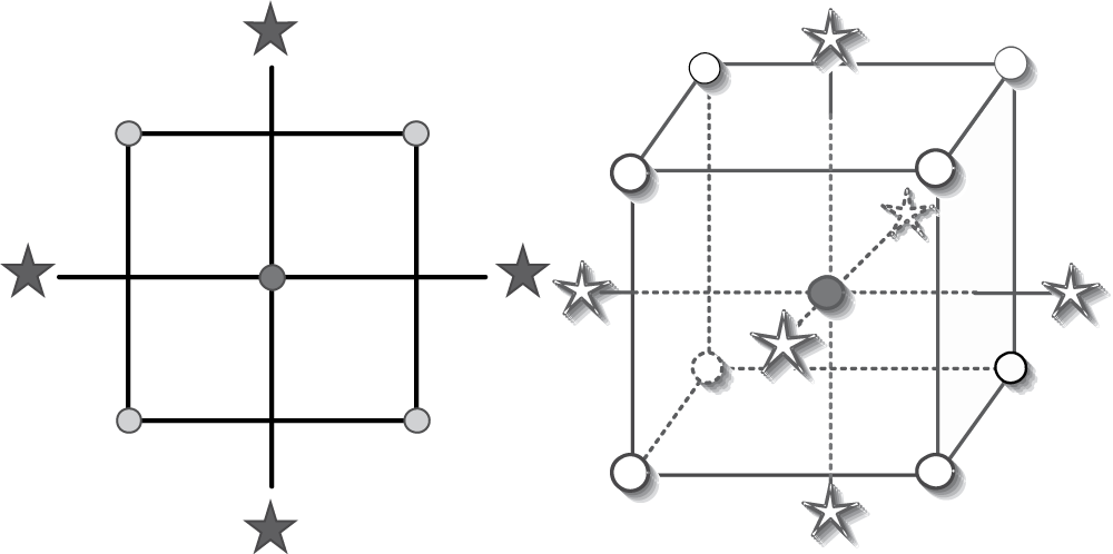
For maximum efficiency, the “axial” (or “star”) points should be located a specific distance outside the original factor range. The ideal location can be found in textbooks or provided by software, but it will be very close to the square root of the number of factors. For example, for the two-factor design used to characterize confetti, the best place to add points is 1.4 coded units from the center. The augmented design is shown in Table 8.4. The new points are designated as block 2. The additional center points provide a link between the blocks and add more power to the estimation of second-order effects needed to characterize curvature.
Central composite design for confetti
|
Std |
Block |
Type |
A: Width (Inches) |
B: Length (Inches) |
Time (Seconds) |
|
1 |
1 |
Factorial |
1.00 |
3.00 |
2.5 |
|
2 |
1 |
Factorial |
3.00 |
3.00 |
1.9 |
|
3 |
1 |
Factorial |
1.00 |
5.00 |
2.8 |
|
4 |
1 |
Factorial |
3.00 |
5.00 |
2.0 |
|
5 |
1 |
Center |
2.00 |
4.00 |
2.8 |
|
6 |
1 |
Center |
2.00 |
4.00 |
2.7 |
|
7 |
1 |
Center |
2.00 |
4.00 |
2.6 |
|
8 |
1 |
Center |
2.00 |
4.00 |
2.7 |
|
9 |
2 |
Axial |
0.60 |
4.00 |
2.5 |
|
10 |
2 |
Axial |
3.40 |
4.00 |
1.8 |
|
11 |
2 |
Axial |
2.00 |
2.60 |
2.6 |
|
12 |
2 |
Axial |
2.00 |
5.40 |
3.0 |
|
13 |
2 |
Center |
2.00 |
4.00 |
2.5 |
|
14 |
2 |
Center |
2.00 |
4.00 |
2.6 |
|
15 |
2 |
Center |
2.00 |
4.00 |
2.6 |
|
16 |
2 |
Center |
2.00 |
4.00 |
2.9 |
The CCD contains five levels of each factor: low axial, low factorial, center, high factorial, and high axial. With this many levels, it generates enough information to fit a second-order polynomial called a quadratic. Standard statistical software can do the actual fitting of the model. The quadratic model for confetti flight time is
Time = 2.68 − 0.30 A + 0.12 B − 0.050 AB − 0.31 A2 + 0.020 B2
This model is expressed in terms of the coded factor levels shown in Table 8.1. The coding eliminates problems caused by varying units of measure, such as inches versus centimeters, which can create problems when comparing coefficients. In this case, the A-squared (A2) term has the largest coefficient, which indicates curvature along this dimension. The ANOVA, shown in Table 8.5, indicates a high degree of significance for this term and the model as a whole. Notice that the AB and B2 terms are insignificant, but we let them be because there is no appreciable benefit to eliminating them from the model; the response surface will not be affected one way or the other (with or without these two terms).
ANOVA for CCD on confetti
|
Source |
Sum of Squares |
DF |
Mean Square |
F Value |
Prob > F |
|
Block |
0.016 |
1 |
0.016 |
||
|
Model |
1.60 |
5 |
0.32 |
15.84 |
0.0003 |
|
A |
0.72 |
1 |
0.72 |
35.47 |
0.0002 |
|
B |
0.12 |
1 |
0.12 |
5.77 |
0.0397 |
|
A 2 |
0.75 |
1 |
0.75 |
37.37 |
0.0002 |
|
B 2 |
0.003 |
1 |
0.003 |
0.15 |
0.7031 |
|
AB |
0.010 |
1 |
0.010 |
0.50 |
0.4991 |
|
Residual |
0.18 |
9 |
0.020 |
||
|
Lack of Fit |
0.071 |
3 |
0.024 |
1.30 |
0.3578 |
|
Pure Error |
0.11 |
6 |
0.018 |
||
|
Cor Total |
1.79 |
15 |
Lack of fit is not significant (because the probability value of 0.3578 exceeds the threshold value of 0.05) and diagnosis of residuals showed no abnormality. Therefore, the model is statistically solid. The resulting contour graph is shown in Figure 8.6.

Each contour represents a combination of input factors that produces a constant response, as shown by the respective labels. The actual runs are shown as dots. (The number 8 by the center point indicates the number of replicates at this set of conditions. In other words, at eight random intervals throughout the experiment, we reproduced confetti with the midpoint dimensions of 2 × 4 inches.) Normally, we would restrict the axes to the factorial range to avoid extrapolation beyond the experimental space, but here we wanted to show the entire design. Notice the darkened areas outside of the actual design space, especially in the corners. These represent areas where predictions will be unreliable due to lack of information. Figure 8.7 shows a 3-D response surface with the ranges reduced to their proper levels. It bisects the center points nicely (those above the surface in black and those below displayed in gray).
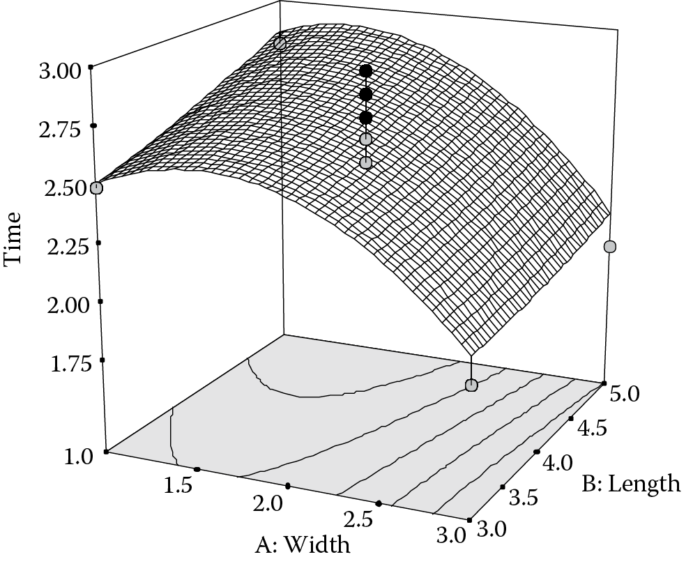
The maximum flight time within this factorial range occurs at a width of 1.44 inches and length of 5 inches. Longer confetti might fly even longer, but this cannot be determined without further experimentation.
Finding Your Sweet Spot for Multiple Responses
Leaders of projects for process improvement, such as Six Sigma Black Belts, quickly learn that they cannot break the “iron triangle” shown in Figure 8.8. The triangle depicts the unavoidable tradeoffs that come with any attempt to make the highest-quality product on schedule at minimal cost.

When pressured by never-ending demands of management, point to this triangle and ask, “Which two of these three things do you want—cheaper, better or faster?” While this response may not be diplomatic, it is very realistic. It may be possible to produce a top-quality product within schedule, but only at high cost. Going for a lowest-cost product in the fastest possible time will invariably cause a decline in quality. And, if quality and cost are tightly guarded, the production timeline will almost certainly be stretched. In other words, you cannot achieve the ideal level at all three objectives simultaneously.
Fortunately, a tool called desirability—when coupled with optimization algorithms—can achieve the best compromise when dealing with multiple demands. The application of desirability (or some other single objective function, such as overall cost) is essential for response surface methods, but is of lesser value for the simpler two-level factorial designs that are the focus of this book. Nevertheless, you may find it helpful for confirming what you ferret out by viewing plots of main effects and any two-factor interactions.
For example, in the popcorn case, it becomes evident that the best compromise for great taste with a minimal number of unpopped kernels (bullets) will be achieved by running the microwave at high power for the shorter time. Figure 8.9 illustrates this most desirable outcome with dots located along the number lines that ramp up (8.9a) for taste (goal: maximize) and down for bullets (goal: minimize).

You can infer from these figures that the desirability scale is very simple. It goes from zero (d = 0) at the least to one at the most (d = 1).
The predicted taste rating of 79 highlighted in Figure 8.9 exceeds the minimum threshold of 65, but it falls short of perfection: a rating of 100. (The smaller numbers (32 – 81) benchmark the experimental range for the taste response.) Similarly, the weight of bullets falls below the maximum threshold of 1 ounce, which is desirable, but it comes up short of perfection—none at all (0 ounces). The overall desirability, symbolized “D,” is computed as
where the lower case ds represent the individual responses for taste (d1), a measure of quality, and bullets (d2), an indicator for the yield of the microwave popcorn process. This is a multiplicative or “geometric” mean rather than the usual additive one. Thus, if any individual response falls out of specification, the overall desirability becomes zero.
In real life, there seems to be an iron-clad rule that tradeoffs must be made. Desirability analysis may find a suitable compromise that keeps things sweet with your process management and product customers, but this will work only if you design a good experiment that produces a statistically valid model within a region that encompasses a desirable combination of the responses of interest. That takes a lot of subject matter knowledge, good design of experiments (DOE), and perhaps a bit of luck.
True Replication versus Repeat Measurement
It often helps to repeat response measurements many times for each run. For example, in the confetti experiment, each strand was dropped 10 times and then averaged. However, this cannot be considered a true replicate because some operations are not repeated, such as the cutting of the paper. In the same vein, when replicating center points, you must repeat all the steps. For example, it would have been easy just to reuse the 2 × 4-inch confetti, but we actually recut to this dimension four times. Therefore, we obtained an accurate estimate of the “pure error” of the confetti production process.
Adding a Center Point Does Not Create a Full Three-Level Design
The two-level design with center point(s) (shown in Figure 8.2) requires all factors to be set at their midlevels around which you run only the combinations of the extreme lows and highs. It differs from a full three-level factorial, which would require nine distinct combinations, including points at the midpoints of the edges. The two-level factorial with center point(s) will reveal curvature in your system, but it does not provide the complete picture that would be obtained by doing a full three-level factorial.
Lack of Fit May Be Fashionable, But It Is Not Desirable for Experimenters
You may have noticed a new line in the ANOVA called lack of fit. This tests whether the model adequately describes the actual response surface. It becomes possible only when you include replicates in your design. The lack-of-fit test compares the error from excess design points (beyond what is needed for the model) with the pure error from the replicates. As a rule of thumb, a probability value of 0.05 or less for the F-value indicates a significant lack of fit—an undesirable result.
Where There’s Smoke, the Probability Is High There’s a Fire
A scientist, engineer, and statistician watched their research lab burn down as a result of combustion of confetti in a paper shredder. They speculated as to the cause.
“It’s an exothermic reaction,” said the scientist.
“That’s obvious,” replied the engineer. “What’s really important is the lack of heat transfer due to inadequate ventilation.”
The two technical professionals then turned to their statistical colleague, who said, “I have no idea what caused the fire, but I can advise that you do some replication. Let’s burn down another lab and see what happens.”
Goldilocks and the Two Bears: A Desirability Fable
Think back to the old story of Goldilocks and the three bears and imagine that the Mama bear has passed away, leaving only Papa Bear and Baby Bear. Everything in the home now comes in two flavors, two sizes, etc.
Now grown a bit from before, Goldilocks comes along and sits in each of the two chairs remaining. One is too small and the other is too large, but on average she finds comfort.
You can see where this is going. It makes no sense to be off equally bad at both ends of a specification and state that everything is all right on an arithmetic average. This really is a fable: Goldilocks needs the missing mother’s chair that would sit just right.