
All modern browsers already support CSS transforms, including mobile browsers. For the first two apps, we'll use four new statements from CSS3 heavily:
transform: Move, rotate, scale, or skew the HTML element usingtranslate[X,Y,Z](v),rotate[X,Y,Z](v),scale[X,Y,Z](v), andskew[X,Y](v), respectively. All these basic transformations have their 3D alternative, such asrotate3d(x, y, z, angle), that you can use to set transformations in all three dimensions with one statement.If you want to perform more transformations on an element, you have to set all of them in a single CSS statement, for example,
transform: rotateY(90deg) translateX(100px);.transform-style: Usingflatorpreserve-3doptions, you can tell the browser whether you want to apply 3D transformations from parent elements to their child. By default, the browser takes all transformations on a per-element basis, which means that if you, for example, rotate the parent element and then rotate its child elements, the browser will perform rotations independently.perspective: Set the perspective depth for this element and all its children as a distance from the element to the viewer. Changing this value doesn't change the size of elements, as we'll see in the second app.transform-origin: This statement is mostly useful for rotation. It lets you set a point around which rotation will be performed. By default, the origin is set to the element's center.
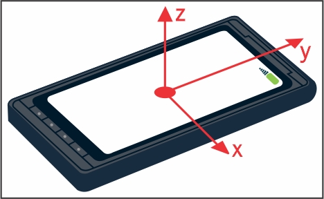
The coordinate system for transformations is very obvious: the x and y axes are like those you're probably used to. The z axis goes in the direction to/from you. The center of coordinates for each element is in its center by default.
It's time to see CSS3 transformations in action. We're going to rotate this HTML snippet:
<body>
  <div id="container">
    <div id="first">Hello</div>
    <div id="second">World!</div>
  </div>
</body>
Apply CSS3 with a few 3D transformations:
/* Center of perspective for this div will be in [250,50]. */
#container { height: 100px; width: 500px;
             perspective: 300px; position: relative; }
#container div { position: absolute; width: 150px; }
#first { transform: rotateY(30deg) translateX(-85px); }
#second { transform: rotateY(-40deg) translateX(85px); }In the browser, we'll see rotated div elements with text like this. Note that the white text is just like any other text on the page. Also, transformed elements are just normal div elements that can be adjusted with CSS to what you desire.
This is an important distinction from WebGL, where everything is drawn right into the canvas using shaders and has absolutely nothing to do with HTML.
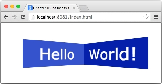
Both div elements, #first and #second, are positioned absolutely. If we didn't translate their position, they would overlay each other, but at the same time, we can't use just inline-block because the rotated div element takes the same space as when it wasn't rotated. Therefore, it would be even harder to make them look like they're joined together.
Let's add one more div element to the #first element:
<div id="container">
  <div id="first"><div id="third">Nested</div>Hello</div>
  <div id="second">World!</div>
</div>
Then, add styles that transform this div element as well:
#third { transform-origin: 0 0;
         transform: rotateY(110deg); }
We want to rotate it around the y axis by 110 degrees, centered to the left edge of its parent (that's the effect of the transform-origin). This should make the mirrored image of the element look like it's joined to the left edge of #first while going slightly to the left and fading away from us. The #third element is aligned to the top-left corner of its parent because it's positioned absolutely.
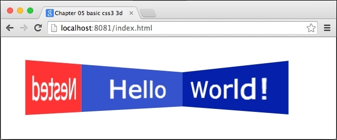
But wait; that's not what we wanted. We can see the back of the #third element, which makes the output look like it's mirrored. That's fine but it seems like it's following the same transformation as #first.
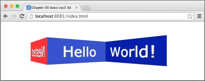
The reason for this behavior is that the browser flattens transformations for child elements. To avoid this, we'll use transform-style: preserve-3d, which we mentioned earlier. Note that preserve-3d applies the parent's transformations only to direct children elements. If children elements have other children elements, then they have to use preserve-3d as well.
So, we can fix this by adding transform-style: preserve-3d to #first:
#first { /* … */ transform-style: preserve-3d; }Now the result looks like we expected:
If you're confused with all these rotations and translations, don't worry. It's hard to imagine rotating objects in 3D, moreover, combining multiple nested objects and rotating each of them relatively.
Your best friend is Developer Tools. Try changing rotations or translations on the fly, change perspective, and see what effect it has. Also, change transform-origin on #third and see what happens.
We'll later set transformations in Dart for both -webkit- prefixed and nonprefixed versions, such as:
element.style.setProperty('transform', 'rotateX...'),
// Mobile browsers supporting only prefixed versions.
element.style.setProperty('-webkit-transform', 'rotateX...'),