
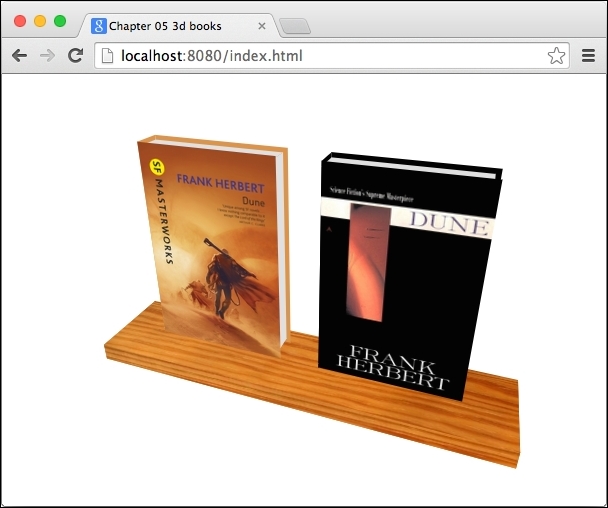
We already saw the basics, and we can start with a more attractive app, for example:
Each book is made out of six div elements and the shelf itself are five div elements (we don't need the back face):
<div id="book-container">
  <div class="book dune-new">
    <div class="front"></div>
    <div class="left"></div>
    <div class="right"></div>
    <div class="back"></div>
    <div class="top"></div>
    <div class="bottom"></div>
  </div>

  <div class="book dune-old"><!-- 6 book's faces again --></div>
  <div class="shelf"><!-- 5 shelf's faces --></div>
</div>
The CSS for this example is not that complicated; there are just a lot of transformations. Feel free to open this example in the browser and check where each div element is positioned:
/* Entire document is using single perspective. */body { perspective: 500px; }

#book-container { transform-style: preserve-3d; text-align:center;
  /* Try manually rotating the scene. */
  /* transform: rotateX(-40deg) rotateY(20deg); */
}

.book { display: inline-block; width: 150px; height: 230px;
        transform-style: preserve-3d; position: relative; }
.book > div { position: absolute; }
.book > .front { transform: translateZ(15px); }
.book > .left { width: 30px; transform-origin: 0 0;
                transform: rotateY(-90deg) translateX(-15px); }
.book > .top { height: 30px; width: 145px;
               transform: rotateX(90deg) translateZ(10px); }
.book > .back { transform: rotateY(180deg) translateZ(15px); }
.book > .right { height: 220px; width: 30px;
     transform: rotateY(90deg) translateZ(130px) translateY(5px);}
.book > .bottom { height: 30px; width: 145px;
                  transform: rotateX(90deg) translateZ(-210px); }
For the sake of simplicity, both books are the same size: 150 px width, 230 px height, and 30 px deep. Let's take a look at some interesting parts:
.book: This wraps all the faces for each book. When we want to position each book on the page, we don't want to move each face separately. Rather, move/rotate the entire container, and all the faces inside will transform relatively to it because ofpreserve-3d. Note that we're settingdisplay: inline-blockand hardcoding the width and height to be sure how much space each book is going to take no matter what the faces inside do..book > div: All faces are positioned absolutely, which means that they will be aligned to the top-left corner of their parent.bookelement..book > .front: This moves the front face 15 px (that's half of the book's depth) along the z axis, because we want to keep the center of the book in its center for all axes. This face has the book's cover image set as itsbackground-image.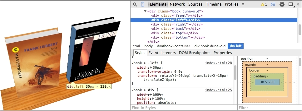
.book > .left: This (highlighted in blue) moves the transform origin to the top-left corner of thedivelement, rotates it by 90 degrees, and moves it 15 px back along the z axis. That's all we need to do for this face because on the x and y axis, it's already where we want it to be thanks totransform-origin: 0 0;.- .
book > .top: This is very similar to.left. We just want to move it a little bit down to make the book look like it's a hardcover. Note that when rotatingdivelements, you also rotate axes, and that's why we're translating along z and not y. #book-container: This wraps the entire bookshelf with books. We want to rotate the entire scene and not just the books; we'll apply transformations to this wrapper using Dart.
Creating a shelf with a wood texture works on exactly the same principle, so we don't need to do it here again.
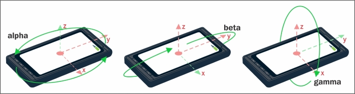
Now, in Dart, we'll listen to the deviceorientation event of the window object, which fires every time the device rotates. In reality, this event will be fired many times per second because the sensors aren't precise and will probably fire events even when your mobile device is lying on the table:
window.addEventListener('deviceorientation',
    (DeviceOrientationEvent e) {
  print(e.alpha);
  print(e.beta);
  print(e.gamma);
});
These are the three angles that we can use to set the rotation on our #book-container element:
This code expects that you're running it on a computer, so you can easily test rotations with Developer Tools:
// web/main.dart
import 'dart:html';
void main() {
HtmlElement container =
document.querySelector('#book-container'),
int initRotationX = null;
int initRotationY = null;
window.addEventListener('deviceorientation',
(DeviceOrientationEvent e) {
// These parameters are expected on a computer.
if (e.beta != null && e.gamma != null) {
// Make the rotation relative to the initial position,
// not [0, 0, 0].
if (initRotationX == null && initRotationY == null) {
initRotationX = e.beta.round();
initRotationY = e.gamma.round();
}
int rotY = (e.gamma.round() - initRotationY);
int rotX = -(e.beta.round() - initRotationX);
// String value for the CSS statement.
var transform = "rotateX(${rotX}deg) rotateY(${rotY}deg)";
container.style.setProperty('transform', transform);
// Mobile browsers support only prefixed versions.
container.style.setProperty('-webkit-transform', transform);
}
});
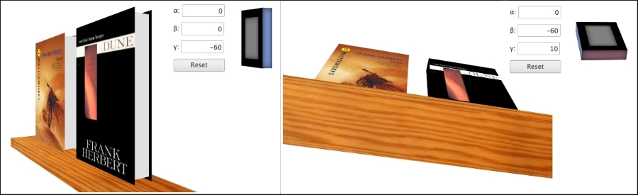
}Now we can open Developer Tools and simulate different rotations. In the Emulation tab, click on Sensors and you should see three input fields, each for one axis.
When you change β (beta) and γ (gamma), the entire scene will rotate.
With quite a short Dart code, we created an app that can react to device rotation and can change CSS styles dynamically from Dart.
As we mentioned earlier, it's okay if you find 3D manipulations complicated and confusing. We encourage you to download the source code for this chapter, play around with CSS transformations, and see what happens.
Obviously, making complicated 3D objects is nearly impossible. There are already tools that make the creation of 3D objects from div elements easier by generating HTML structure and CSS3 for you. You can take a look at one of them, called Tridiv (http://tridiv.com), and note that you can create quite nice stuff with it. But remember, embedding such complicated objects will have significant impact on performance.
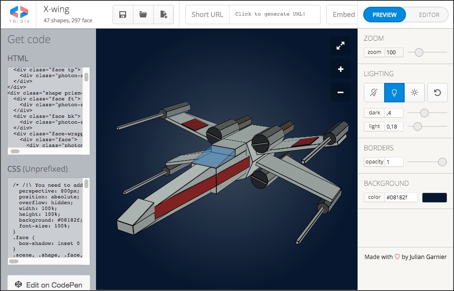
CSS3 transformations, compared to WebGL, are very primitive. There's no built-in lighting renderer, although there's an alternative in JavaScript and CSS3 called Photon (http://photon.attasi.com/), which is good for small projects with a few transformed elements, such as the bookshelf example that we created a moment ago. For larger objects such as the X-Wing from Tridiv, it's quite slow. The same object rendered with WebGL would run smoothly without any problem even on slower computers.
Note
You can read a small comparison of CSS3 transformation and WebGL here: http://blog.teamtreehouse.com/3d-in-the-browser-webgl-versus-css-3d-transforms.
In Chrome and Dartium, you can check whether various rendering techniques are hardware accelerated right in your browser at chrome://gpu/.