Chapter 5. Statistics
Facts are stubborn, but statistics are more pliable.
Mark Twain
Statistics refers to the mathematics and techniques with which we understand data. It is a rich, enormous field, more suited to a shelf (or room) in a library than a chapter in a book, and so our discussion will necessarily not be a deep one. Instead, I’ll try to teach you just enough to be dangerous, and pique your interest just enough that you’ll go off and learn more.
Describing a Single Set of Data
Through a combination of word of mouth and luck, DataSciencester has grown to dozens of members, and the VP of Fundraising asks you for some sort of description of how many friends your members have that he can include in his elevator pitches.
Using techniques from Chapter 1, you are easily able to produce this data. But now you are faced with the problem of how to describe it.
One obvious description of any dataset is simply the data itself:
num_friends=[100,49,41,40,25,# ... and lots more]
For a small enough dataset, this might even be the best description. But for a larger dataset, this is unwieldy and probably opaque. (Imagine staring at a list of 1 million numbers.) For that reason, we use statistics to distill and communicate relevant features of our data.
As a first approach, you put the friend counts into a histogram using Counter and plt.bar (Figure 5-1):
fromcollectionsimportCounterimportmatplotlib.pyplotaspltfriend_counts=Counter(num_friends)xs=range(101)# largest value is 100ys=[friend_counts[x]forxinxs]# height is just # of friendsplt.bar(xs,ys)plt.axis([0,101,0,25])plt.title("Histogram of Friend Counts")plt.xlabel("# of friends")plt.ylabel("# of people")plt.show()

Figure 5-1. A histogram of friend counts
Unfortunately, this chart is still too difficult to slip into conversations. So you start generating some statistics. Probably the simplest statistic is the number of data points:
num_points=len(num_friends)# 204
You’re probably also interested in the largest and smallest values:
largest_value=max(num_friends)# 100smallest_value=min(num_friends)# 1
which are just special cases of wanting to know the values in specific positions:
sorted_values=sorted(num_friends)smallest_value=sorted_values[0]# 1second_smallest_value=sorted_values[1]# 1second_largest_value=sorted_values[-2]# 49
But we’re only getting started.
Central Tendencies
Usually, we’ll want some notion of where our data is centered. Most commonly we’ll use the mean (or average), which is just the sum of the data divided by its count:
defmean(xs:List[float])->float:returnsum(xs)/len(xs)mean(num_friends)# 7.333333
If you have two data points, the mean is simply the point halfway between them. As you add more points, the mean shifts around, but it always depends on the value of every point. For example, if you have 10 data points, and you increase the value of any of them by 1, you increase the mean by 0.1.
We’ll also sometimes be interested in the median, which is the middle-most value (if the number of data points is odd) or the average of the two middle-most values (if the number of data points is even).
For instance, if we have five data points in a sorted vector x, the median is x[5 // 2] or x[2]. If we have six data points, we want the average of x[2] (the third point) and x[3] (the fourth point).
Notice that—unlike the mean—the median doesn’t fully depend on every value in your data. For example, if you make the largest point larger (or the smallest point smaller), the middle points remain unchanged, which means so does the median.
We’ll write different functions for the even and odd cases and combine them:
# The underscores indicate that these are "private" functions, as they're# intended to be called by our median function but not by other people# using our statistics library.def_median_odd(xs:List[float])->float:"""If len(xs) is odd, the median is the middle element"""returnsorted(xs)[len(xs)//2]def_median_even(xs:List[float])->float:"""If len(xs) is even, it's the average of the middle two elements"""sorted_xs=sorted(xs)hi_midpoint=len(xs)//2# e.g. length 4 => hi_midpoint 2return(sorted_xs[hi_midpoint-1]+sorted_xs[hi_midpoint])/2defmedian(v:List[float])->float:"""Finds the 'middle-most' value of v"""return_median_even(v)iflen(v)%2==0else_median_odd(v)assertmedian([1,10,2,9,5])==5assertmedian([1,9,2,10])==(2+9)/2
And now we can compute the median number of friends:
(median(num_friends))# 6
Clearly, the mean is simpler to compute, and it varies smoothly as our data changes. If we have n data points and one of them increases by some small amount e, then necessarily the mean will increase by e / n. (This makes the mean amenable to all sorts of calculus tricks.) In order to find the median, however, we have to sort our data. And changing one of our data points by a small amount e might increase the median by e, by some number less than e, or not at all (depending on the rest of the data).
Note
There are, in fact, nonobvious tricks to efficiently compute medians without sorting the data. However, they are beyond the scope of this book, so we have to sort the data.
At the same time, the mean is very sensitive to outliers in our data. If our friendliest user had 200 friends (instead of 100), then the mean would rise to 7.82, while the median would stay the same. If outliers are likely to be bad data (or otherwise unrepresentative of whatever phenomenon we’re trying to understand), then the mean can sometimes give us a misleading picture. For example, the story is often told that in the mid-1980s, the major at the University of North Carolina with the highest average starting salary was geography, mostly because of NBA star (and outlier) Michael Jordan.
A generalization of the median is the quantile, which represents the value under which a certain percentile of the data lies (the median represents the value under which 50% of the data lies):
defquantile(xs:List[float],p:float)->float:"""Returns the pth-percentile value in x"""p_index=int(p*len(xs))returnsorted(xs)[p_index]assertquantile(num_friends,0.10)==1assertquantile(num_friends,0.25)==3assertquantile(num_friends,0.75)==9assertquantile(num_friends,0.90)==13
Less commonly you might want to look at the mode, or most common value(s):
defmode(x:List[float])->List[float]:"""Returns a list, since there might be more than one mode"""counts=Counter(x)max_count=max(counts.values())return[x_iforx_i,countincounts.items()ifcount==max_count]assertset(mode(num_friends))=={1,6}
But most frequently we’ll just use the mean.
Dispersion
Dispersion refers to measures of how spread out our data is. Typically they’re statistics for which values near zero signify not spread out at all and for which large values (whatever that means) signify very spread out. For instance, a very simple measure is the range, which is just the difference between the largest and smallest elements:
# "range" already means something in Python, so we'll use a different namedefdata_range(xs:List[float])->float:returnmax(xs)-min(xs)assertdata_range(num_friends)==99
The range is zero precisely when the max and min are equal, which can only happen if the elements of x are all the same, which means the data is as undispersed as possible. Conversely, if the range is large, then the max is much larger than the min and the data is more spread out.
Like the median, the range doesn’t really depend on the whole dataset. A dataset whose points are all either 0 or 100 has the same range as a dataset whose values are 0, 100, and lots of 50s. But it seems like the first dataset “should” be more spread out.
A more complex measure of dispersion is the variance, which is computed as:
fromscratch.linear_algebraimportsum_of_squaresdefde_mean(xs:List[float])->List[float]:"""Translate xs by subtracting its mean (so the result has mean 0)"""x_bar=mean(xs)return[x-x_barforxinxs]defvariance(xs:List[float])->float:"""Almost the average squared deviation from the mean"""assertlen(xs)>=2,"variance requires at least two elements"n=len(xs)deviations=de_mean(xs)returnsum_of_squares(deviations)/(n-1)assert81.54<variance(num_friends)<81.55
Note
This looks like it is almost the average squared deviation from the mean, except that we’re dividing by n - 1 instead of n.
In fact, when we’re dealing with a sample from a larger population,
x_bar is only an estimate of the actual mean,
which means that on average (x_i - x_bar) ** 2 is an underestimate of
x_i’s squared deviation from the mean, which is why we divide by n - 1 instead of n. See Wikipedia.
Now, whatever units our data is in (e.g., “friends”), all of our measures of central tendency are in that same unit. The range will similarly be in that same unit. The variance, on the other hand, has units that are the square of the original units (e.g., “friends squared”). As it can be hard to make sense of these, we often look instead at the standard deviation:
importmathdefstandard_deviation(xs:List[float])->float:"""The standard deviation is the square root of the variance"""returnmath.sqrt(variance(xs))assert9.02<standard_deviation(num_friends)<9.04
Both the range and the standard deviation have the same outlier problem that we saw earlier for the mean. Using the same example, if our friendliest user had instead 200 friends, the standard deviation would be 14.89—more than 60% higher!
A more robust alternative computes the difference between the 75th percentile value and the 25th percentile value:
definterquartile_range(xs:List[float])->float:"""Returns the difference between the 75%-ile and the 25%-ile"""returnquantile(xs,0.75)-quantile(xs,0.25)assertinterquartile_range(num_friends)==6
which is quite plainly unaffected by a small number of outliers.
Correlation
DataSciencester’s VP of Growth has a theory that the amount of time people spend on the site is related to the number of friends they have on the site (she’s not a VP for nothing), and she’s asked you to verify this.
After digging through traffic logs, you’ve come up with a list called daily_minutes that shows how many minutes per day each user spends on DataSciencester, and you’ve ordered it so that its elements correspond to the elements of our previous num_friends list. We’d like to investigate the relationship between these two metrics.
We’ll first look at covariance, the paired analogue of variance. Whereas variance measures how a single variable deviates from its mean, covariance measures how two variables vary in tandem from their means:
fromscratch.linear_algebraimportdotdefcovariance(xs:List[float],ys:List[float])->float:assertlen(xs)==len(ys),"xs and ys must have same number of elements"returndot(de_mean(xs),de_mean(ys))/(len(xs)-1)assert22.42<covariance(num_friends,daily_minutes)<22.43assert22.42/60<covariance(num_friends,daily_hours)<22.43/60
Recall that dot sums up the products of corresponding pairs of elements. When corresponding elements of x and y are either both above their means or both below their means, a positive number enters the sum. When one is above its mean and the other below, a negative number enters the sum. Accordingly, a “large” positive covariance means that x tends to be large when y is large and small when y is small. A “large” negative covariance means the opposite—that x tends to be small when y is large and vice versa. A covariance close to zero means that no such relationship exists.
Nonetheless, this number can be hard to interpret, for a couple of reasons:
-
Its units are the product of the inputs’ units (e.g., friend-minutes-per-day), which can be hard to make sense of. (What’s a “friend-minute-per-day”?)
-
If each user had twice as many friends (but the same number of minutes), the covariance would be twice as large. But in a sense, the variables would be just as interrelated. Said differently, it’s hard to say what counts as a “large” covariance.
For this reason, it’s more common to look at the correlation, which divides out the standard deviations of both variables:
defcorrelation(xs:List[float],ys:List[float])->float:"""Measures how much xs and ys vary in tandem about their means"""stdev_x=standard_deviation(xs)stdev_y=standard_deviation(ys)ifstdev_x>0andstdev_y>0:returncovariance(xs,ys)/stdev_x/stdev_yelse:return0# if no variation, correlation is zeroassert0.24<correlation(num_friends,daily_minutes)<0.25assert0.24<correlation(num_friends,daily_hours)<0.25
The correlation is unitless and always lies between –1 (perfect anticorrelation) and 1 (perfect correlation). A number like 0.25 represents a relatively weak positive correlation.
However, one thing we neglected to do was examine our data. Check out Figure 5-2.

Figure 5-2. Correlation with an outlier
The person with 100 friends (who spends only 1 minute per day on the site) is a huge outlier, and correlation can be very sensitive to outliers. What happens if we ignore him?
outlier=num_friends.index(100)# index of outliernum_friends_good=[xfori,xinenumerate(num_friends)ifi!=outlier]daily_minutes_good=[xfori,xinenumerate(daily_minutes)ifi!=outlier]daily_hours_good=[dm/60fordmindaily_minutes_good]assert0.57<correlation(num_friends_good,daily_minutes_good)<0.58assert0.57<correlation(num_friends_good,daily_hours_good)<0.58
Without the outlier, there is a much stronger correlation (Figure 5-3).
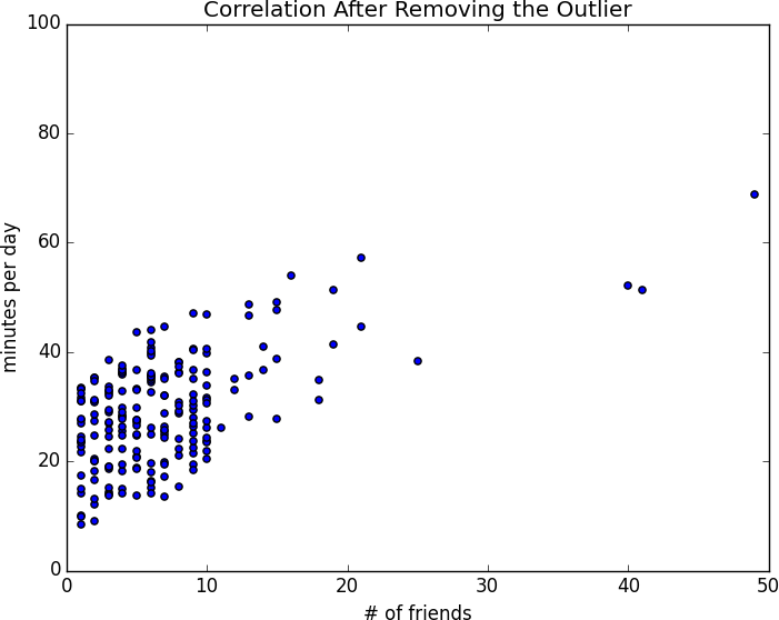
Figure 5-3. Correlation after removing the outlier
You investigate further and discover that the outlier was actually an internal test account that no one ever bothered to remove. So you feel justified in excluding it.
Simpson’s Paradox
One not uncommon surprise when analyzing data is Simpson’s paradox, in which correlations can be misleading when confounding variables are ignored.
For example, imagine that you can identify all of your members as either East Coast data scientists or West Coast data scientists. You decide to examine which coast’s data scientists are friendlier:
| Coast | # of members | Avg. # of friends |
|---|---|---|
West Coast |
101 |
8.2 |
East Coast |
103 |
6.5 |
It certainly looks like the West Coast data scientists are friendlier than the East Coast data scientists. Your coworkers advance all sorts of theories as to why this might be: maybe it’s the sun, or the coffee, or the organic produce, or the laid-back Pacific vibe?
But when playing with the data, you discover something very strange. If you look only at people with PhDs, the East Coast data scientists have more friends on average. And if you look only at people without PhDs, the East Coast data scientists also have more friends on average!
| Coast | Degree | # of members | Avg. # of friends |
|---|---|---|---|
West Coast |
PhD |
35 |
3.1 |
East Coast |
PhD |
70 |
3.2 |
West Coast |
No PhD |
66 |
10.9 |
East Coast |
No PhD |
33 |
13.4 |
Once you account for the users’ degrees, the correlation goes in the opposite direction! Bucketing the data as East Coast/West Coast disguised the fact that the East Coast data scientists skew much more heavily toward PhD types.
This phenomenon crops up in the real world with some regularity. The key issue is that correlation is measuring the relationship between your two variables all else being equal. If your dataclasses are assigned at random, as they might be in a well-designed experiment, “all else being equal” might not be a terrible assumption. But when there is a deeper pattern to class assignments, “all else being equal” can be an awful assumption.
The only real way to avoid this is by knowing your data and by doing what you can to make sure you’ve checked for possible confounding factors. Obviously, this is not always possible. If you didn’t have data on the educational attainment of these 200 data scientists, you might simply conclude that there was something inherently more sociable about the West Coast.
Some Other Correlational Caveats
A correlation of zero indicates that there is no linear relationship between the two variables. However, there may be other sorts of relationships. For example, if:
x=[-2,-1,0,1,2]y=[2,1,0,1,2]
then x and y have zero correlation. But they certainly have a relationship—each element of y equals the absolute value of the corresponding element of x. What they don’t have is a relationship in which knowing how x_i compares to mean(x) gives us information about how y_i compares to mean(y). That is the sort of relationship that correlation looks for.
In addition, correlation tells you nothing about how large the relationship is. The variables:
x=[-2,-1,0,1,2]y=[99.98,99.99,100,100.01,100.02]
are perfectly correlated, but (depending on what you’re measuring) it’s quite possible that this relationship isn’t all that interesting.
Correlation and Causation
You have probably heard at some point that “correlation is not causation,”
most likely from someone looking at data that posed a challenge to parts of his worldview
that he was reluctant to question.
Nonetheless, this is an important point—if x and y are strongly correlated,
that might mean that x causes y,
that y causes x,
that each causes the other,
that some third factor causes both,
or nothing at all.
Consider the relationship between num_friends and daily_minutes. It’s possible that having more friends on the site
causes DataSciencester users to spend more time on the site.
This might be the case if each friend posts a certain amount of content each day,
which means that the more friends you have,
the more time it takes to stay current with their updates.
However, it’s also possible that the more time users spend arguing in the DataSciencester forums, the more they encounter and befriend like-minded people. That is, spending more time on the site causes users to have more friends.
A third possibility is that the users who are most passionate about data science spend more time on the site (because they find it more interesting) and more actively collect data science friends (because they don’t want to associate with anyone else).
One way to feel more confident about causality is by conducting randomized trials. If you can randomly split your users into two groups with similar demographics and give one of the groups a slightly different experience, then you can often feel pretty good that the different experiences are causing the different outcomes.
For instance, if you don’t mind being angrily accused of https://www.nytimes.com/2014/06/30/technology/facebook-tinkers-with-users-emotions-in-news-feed-experiment-stirring-outcry.html?r=0[experimenting on your users], you could randomly choose a subset of your users and show them content from only a fraction of their friends. If this subset subsequently spent less time on the site, this would give you some confidence that having more friends _causes more time to be spent on the site.
For Further Exploration
-
SciPy, pandas, and StatsModels all come with a wide variety of statistical functions.
-
Statistics is important. (Or maybe statistics are important?) If you want to be a better data scientist, it would be a good idea to read a statistics textbook. Many are freely available online, including:
-
Introductory Statistics, by Douglas Shafer and Zhiyi Zhang (Saylor Foundation)
-
OnlineStatBook, by David Lane (Rice University)
-
Introductory Statistics, by OpenStax (OpenStax College)
-