In the previous chapter, we discussed a number of steps involved in preparing the data for analysis. Before analyzing the data, it is imperative to get to know the nature of data we are dealing with. Visualizing the data may give us some useful insights about the nature of data. These insights, such as patterns in the data, distribution of the data, outliers present in the data, etc., can prove to be handy in determining the methodology to be used for analyzing the data. In addition, visualization can be used at the end of analysis to communicate the findings to the party concerned, as conveying the results of analysis through visualization techniques can be more effective than writing pages of textual content explaining the findings. In this chapter, we will learn about some of the basic visualization plots provided by the Matplotlib package of Python and how those plots can be customized to convey the characteristics of different data.
Matplotlib Library
Matplotlib is a plotting library for creating publication-quality plots using the Python programming language. This package provides various types of plots based on the type of information to be conveyed. The plots come with interactive options such as pan, zoom, and subplot configurations. The plots can also be saved in different formats such as PNG, PDF, etc. In addition, the Matplotlib package provides numerous customization options for each type of plot that can be used for effective representation of the information to be conveyed.
Scatter Plot
A scatter plot is a type of plot that uses markers to indicate data points to show the relationship between two variables. The scatter plot can serve many purposes when it comes to data analysis. For example, the plot can reveal patterns and trends in data when the data points are taken as whole, which in turn can help data scientists understand the relationship between two variables and hence enable them to come up with an effective prediction technique. Scatter plots can also be used for identifying clusters in the data. They can also reveal outliers present in the data, which is crucial as outliers tend to drastically affect the performance of prediction systems.
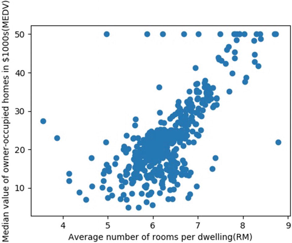
Two columns of data are generally required to create scatter plots, one for each dimension of the plot. Each row of data in the table will correspond to a single data point in the plot. A scatter plot can be created using the scatter function in the Matplotlib library. To demonstrate the usefulness of scatter plots, let’s consider the Boston Housing dataset that can be imported from the Scikit-Learn library. This dataset is actually taken from the StatLib library, which is maintained at Carnegie Mellon University. It consists of 506 samples with 13 different feature attributes such as per capita crime rate by town (CRIM), average number of rooms per dwelling (RM), index of accessibility to radial highways (RAD), etc. In addition, a target attribute MEDV indicates the median value of owner-occupied homes in the thousands.
The following code illustrates the process of creating a Pandas dataframe the Boston housing dataset, which is originally in a dictionary format. For convenience, only the first five rows of the dataframe are displayed in this code using the print command.
The housing dataset is originally in the form of a dictionary, and it is saved to the variable dataset. The 13 feature attributes are assigned to the key data, and the target attribute MEDV is assigned to the key target. The 13 features are then converted to a Pandas dataframe. Now, the scatter plot of the feature variable RM versus the target variable MEDV can be obtained by the following code. From the plot in Figure 6-1, we can see that the price of a house increases with the increase in the number of rooms. In addition to this trend, a few outliers can also be seen in the plot.
plt.scatter(boston_data['RM'],dataset.target)
plt.xlabel("Average number of rooms per dwelling(RM)")
plt.ylabel("Median value of owner-occupied homes in $1000s(MEDV)")
plt.show()
Figure 6-1
Plot of pricing of houses versus average number of rooms per dwelling
Line Plot
A line plot is nothing but a series of data points connected by a line, and it can be used to convey the trend of a variable over a particular time. Line plots are often used for visualizing time-series data to observe the variation of data with respect to time. It can also be used as part of the analysis procedure to check the variation of a variable in an iterative process.
Line plots can be obtained using the plot function in the Matplotlib package. To demonstrate a line plot, let’s consider a time-series dataset consisting of the minimum daily temperature in 0C over 10 years (1981–1990) in the city of Melbourne, Australia. The following code illustrates the process of loading the .csv file containing the dataset, converting it into a dataframe, and plotting the variation in temperature for 1981.
import pandas as pd
import matplotlib.pyplot as plt
import numpy as np
dataset=pd.read_csv('daily-min-temperatures.csv')
df=pd.DataFrame(dataset,columns=['Date','Temp'])
print(df.head())
Output:
Date Temp
0 1981-01-01 20.7
1 1981-01-02 17.9
2 1981-01-03 18.8
3 1981-01-04 14.6
4 1981-01-05 15.8
plt.plot(df['Temp'][0:365])
plt.xlabel("Days in the year")
plt.ylabel("Temperature in degree celcius")
plt.show()
The line plot in Figure 6-2 clearly shows the day-to-day variation of temperature in Melbourne in 1981.
Figure 6-2
Variation in temperature (0C) in Melbourne over the year 1981
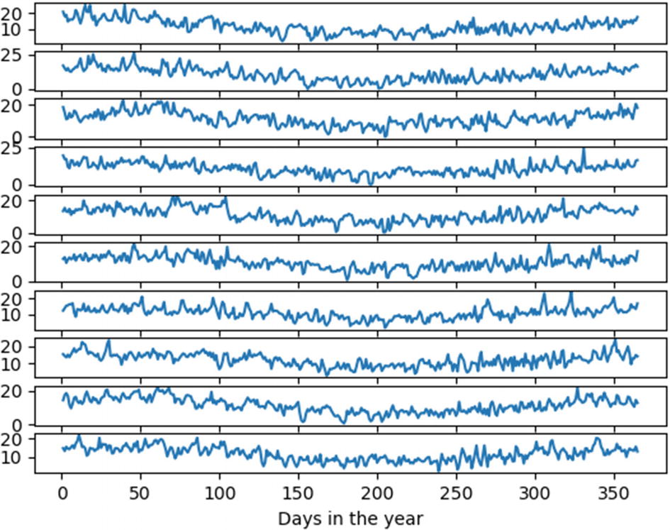
The Matplotlib package also provides the option of subplots wherein a layout of subplots can be created in a single-figure object. In this time-series data example, we can use a simple for loop to extract the data for each of the 10 years and plot it in individual subplots, as illustrated by the following code:
y,k=0,1
x=np.arange(1,366)
for i in range(10):
plt.subplot(10,1,k)
plt.plot(x,df['Temp'][y:y+365])
y=y+365
k=k+1
plt.xlabel("Days in the year")
plt.show()
Figure 6-3 consists of 10 subplots each displaying the variation of temperature over a particular year from 1981 to 1990. Thus, the use of multiple subplots has enabled us to compare the trends in temperature variation in Melbourne over the decade.
Figure 6-3
Temperature variation in Melbourne over 10 years (1981 to 1990)
Histogram
Histogram plots work by splitting the data in a variable into different ranges, called bins; then they count the data points in each bin and plot them as vertical bars. These types of plots can give a good idea about the approximate distribution of numerical data. The width of the bins, i.e., the range of values in each bin, is an important parameter, and the one that best fits the data has to be selected by trying out different values.
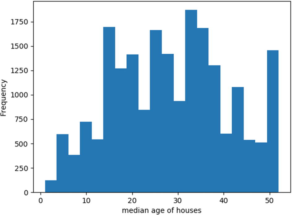
To demonstrate the histogram plot, let’s consider the California housing dataset that is available in the Scikit-Learn library. This dataset, derived from the 1990 U.S. Census, uses one row per census block group. A block group is the smallest geographical unit for which the U.S. Census Bureau publishes sample data (a block group typically has a population of 600 to 3,000 people). The dataset consists of 8 parameters such as median income in block, median house age in block, average number of rooms, etc., and one target attribute, which is the median house value for California districts. There are a total of 20,640 data points (rows) in the data. The following code plots a histogram that shows the distribution of blocks based on the median age of houses within the blocks. Figure 6-4 shows the histogram plot. A lower number normally suggests a newer building.
import matplotlib.pyplot as plt
from sklearn.datasets import fetch_california_housing
MedInc HouseAge AveRooms ... AveOccup Latitude Longitude
0 8.3252 41.0 6.984127 ... 2.555556 37.88 -122.23
1 8.3014 21.0 6.238137 ... 2.109842 37.86 -122.22
2 7.2574 52.0 8.288136 ... 2.802260 37.85 -122.24
3 5.6431 52.0 5.817352 ... 2.547945 37.85 -122.25
4 3.8462 52.0 6.281853 ... 2.181467 37.85 -122.25
plt.hist(df['HouseAge'],bins=20)
plt.xlabel("median age of houses")
plt.ylabel("Frequency")
plt.show()
Figure 6-4
Distribution of blocks based on median age of houses in the blocks
From the histogram plot in Figure 6-4, we can see that most houses in the blocks are distributed in the middle, which indicates that the number of new blocks and very old blocks are lower compared to those with an average age.
Bar Chart
Bar charts are often used by data scientists in their presentations and reports to represent categorical data as horizontal or vertical rectangular bars whose length or height corresponds to the value of the data that they represent. Normally, one of the axes will represent the category of data, while the other axis will represent the corresponding values. Therefore, bar graphs are the ideal choice for comparing different categories of data. Bar charts can also be used for conveying the development of one or multiple variables over a period of time.
Even though bar charts look similar to histogram plots, there are subtle differences between them. For instance, histograms are used to plot the distribution of variables, and bar charts are used to compare variables belonging to different categories. A histogram groups quantitative data into a finite number of bins and plots the distribution of data in those bins, whereas bar charts are used to plot categorical data.
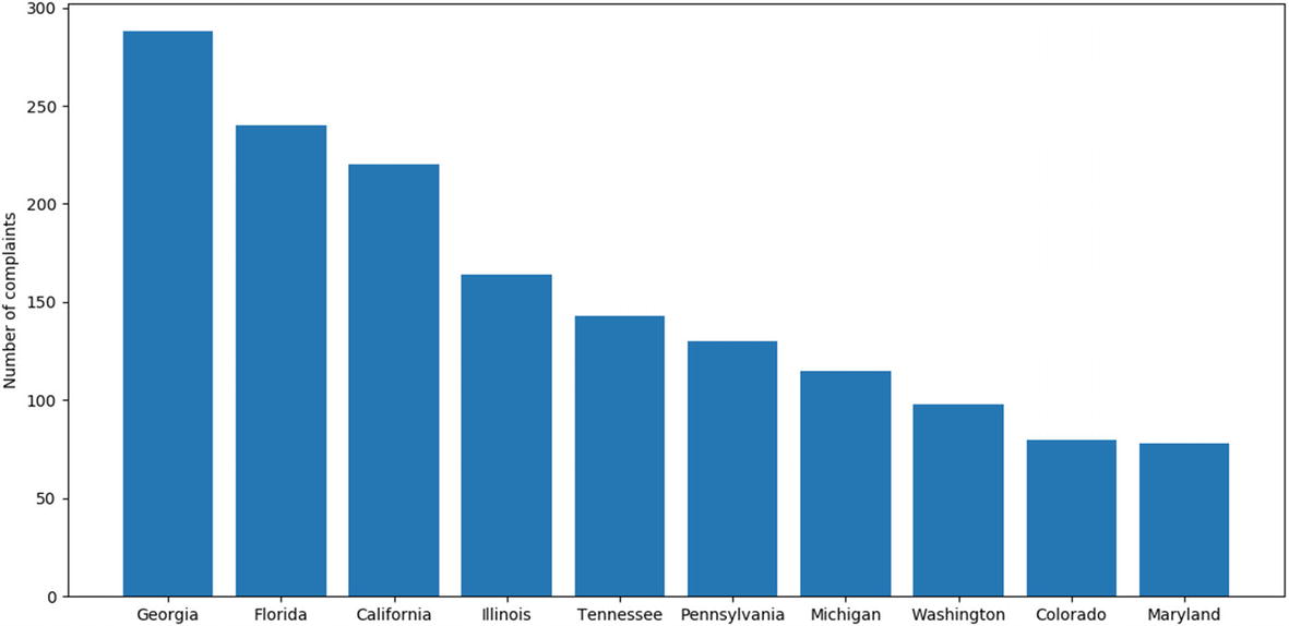
To demonstrate the bar chart, let’s consider the Telecoms Consumer Complaints dataset, which is a collection of complaints received by Comcast, an American global telecommunication company. This company was fined $2.3 million in October 2016 over numerous customer complaints claiming that they have been charged for services they never used. This dataset is a collection of 2,224 such complaints categorized into 11 columns such as customer complaint, date, city, state, ZIP code, status, etc. In the following code, the dataset available as an Excel sheet is first loaded and converted to a dataframe. Then the column containing the states, from which the complaints are received, is selected, and the multiple entries corresponding to the same states are grouped together to a single entry using the function groupby(). The count of the number of times each state is repeated, which in turn corresponds to the number of complaints received from each state, is obtained by using the function size(). The data can then be sorted in descending order of the count values using the function sort_values(). Figure 6-5 shows the plot of top 10 states with the most number of complaints, which gives a clear idea of where more customers have faced grievances. The plot basically gives a comparison of the company’s misgivings in different states based on the number of complaints received from the customers.
Bar plot showing number of complaints received from different states
Pie Chart
Pie charts are generally used to show the distribution of data across different categories as a percentage of the entire data in the form of proportional circular segments. In other words, each circular segment corresponds to a particular category of data. By viewing pie charts, users can quickly grasp the distribution of categorical data by just visualizing the plot rather than seeing the percentage in numbers as in the case of bar plots. Another difference between pie chart and bar charts is that pie charts are used to compare the contribution of each category of data to the whole, whereas bar charts are used to compare the contribution of different categories of data against each other.
To demonstrate a pie chart, let’s consider a dataset containing the details of immigration to Canada from 1980 to 2013. The dataset contains various attributes for immigrants both entering and leaving Canada annually. These attributes include origin/destination name, area name, region name, etc. There are a total of 197 rows of data based on the origin/destination of the immigrants. The following code plots a pie chart that shows the total number of immigrants from 1980 to 2013 categorized by their continent:
3 Latin America and the Caribbean 29832 30395 ... 27173 24950 855141
4 Northern America 1810 1810 ... 7892 8503 246564
5 Oceania 12726 13210 ... 1679 1775 93736
After the dataset is loaded as a Pandas dataframe, the column titles with numbers indicating the year of data are converted to string format. This is done to ensure that the titles are not added when we sum across the rows to compute the total number of immigrants in the next step. This total number of immigrants is saved in an additional column created in the name Total. After computing the total number of immigrants, the data is grouped by the column titled AreaName containing the continent details of the immigrants. By doing this, the number of rows is now reduced to 6 from 197, which indicates that the entire dataset is grouped into 6 continents.
Now the total number of immigrants from the six continents, given in the column titled Total, can be plotted as a pie chart shown in Figure 6-6. Therefore, the pie chart will contain six circular segments corresponding to the six continents. To label these segments in the plot, the continent names present in the column titled AreaName is converted to a list and stored in a variable to be used as labels in the plot function. This code is illustrated here:
Pie chart indicating movement of immigrants belonging to different continents into and out of Canada from 1980 to 2013
Other Plots and Packages
In addition to the fundamental plots that are discussed in this chapter, there are other plots available in the Matplotlib package such as contour plots, stream plots, 3D plots, etc., that can be used based on the nature of data or the requirement for analysis. Other than the Matplotlib package, other packages available provide more sophisticated plots that can be used to enhance the visualization for different categories of data. One such package is the Seaborn library, which can be used for making statistical graphics in Python. The Seaborn library provides more sophisticated plots like the boxplot, heatmap, violin plot, cluster map, etc., that can provide enhanced visualization of data. You are encouraged to explore these other categories of plots and libraries.