
Chapter 4: Technology and Culture
As discussed in Chapters 1 and 2, design is a product of many “layers.” The purpose of a piece of design sets the foundation upon which these layers are built. As illustrated in Chapter 3, the medium with which a particular typeface is created interacts with the alphabet to create letters that have differing qualities. And, as I’ll talk about more in Appendix A, certain philosophies and cultural factors further evoke particular moods in various type styles.
Aside from the medium in which a particular design product is created, the very world within which the designer lives has a tremendous influence on the form that she creates. The most successful designs, those that set trends and eventually stand the test of time, express – and sometimes change – the spirit of their time. The very best designers are either actively aware of this influence or surrender their process to its gentle hand.
The product of this confluence of medium, technology, and culture is what most people recognize as a “style.” It manifests itself as art movements or design trends. To the viewer, it may be all about the “look,” but this “look” is a product of many factors. If a designer were to simply try to copy a “look,” he would likely end up doing little more than creating the veneer to which the Steve Jobs quote in Chapter 1 refers. To really create a design that belongs in its time and place, a designer must yield his process to the influences of his world.
How Trends Are Created
Any significant design trend, or any significant artistic movement, has been a reaction to – and embrace of – technological and cultural forces. Wars, famines, the rise and fall of leaders, demographic trends, inventions, and other world events and innovations all create opportunities for designers to approach the ordinary in an extraordinary way. This is how style is born and how trends are set.
The birth of Impressionism
The artistic movement of Impressionism is no exception to this rule. This groundbreaking style paved the way for modern art and remains the most popular and imitated style in painting.
When many people think of Impressionism, they think of paintings that are colorful but, simply put, blurry. But it wasn’t that the Impressionists had impaired vision or even lacked artistic skill. There were particular technological and cultural factors that inspired the Impressionist movement.
In 1860s Paris, a group of bohemians, later to be known as the Impressionists, gathered at Café Guerbois in Paris. Édouard Manet, Claude Monet, and other soon-to-be-famous artists discussed ideas, art, and politics. France had undergone a series of revolutions over the previous hundred years, and it was just about to experience yet another revolution, as the political influence of the elite classes dwindled and that of the middle class grew.
This growing middle class was increasingly enjoying a biannual art event held in Paris, known simply as the Salon. The Salon was organized and sponsored by the French government’s Academy of Arts, and – because Paris was the center of the art world – this event was the biggest event in art. Jurors chose thousands of paintings to be displayed, and the paintings were crowded onto every inch of the exhibition hall that was available.
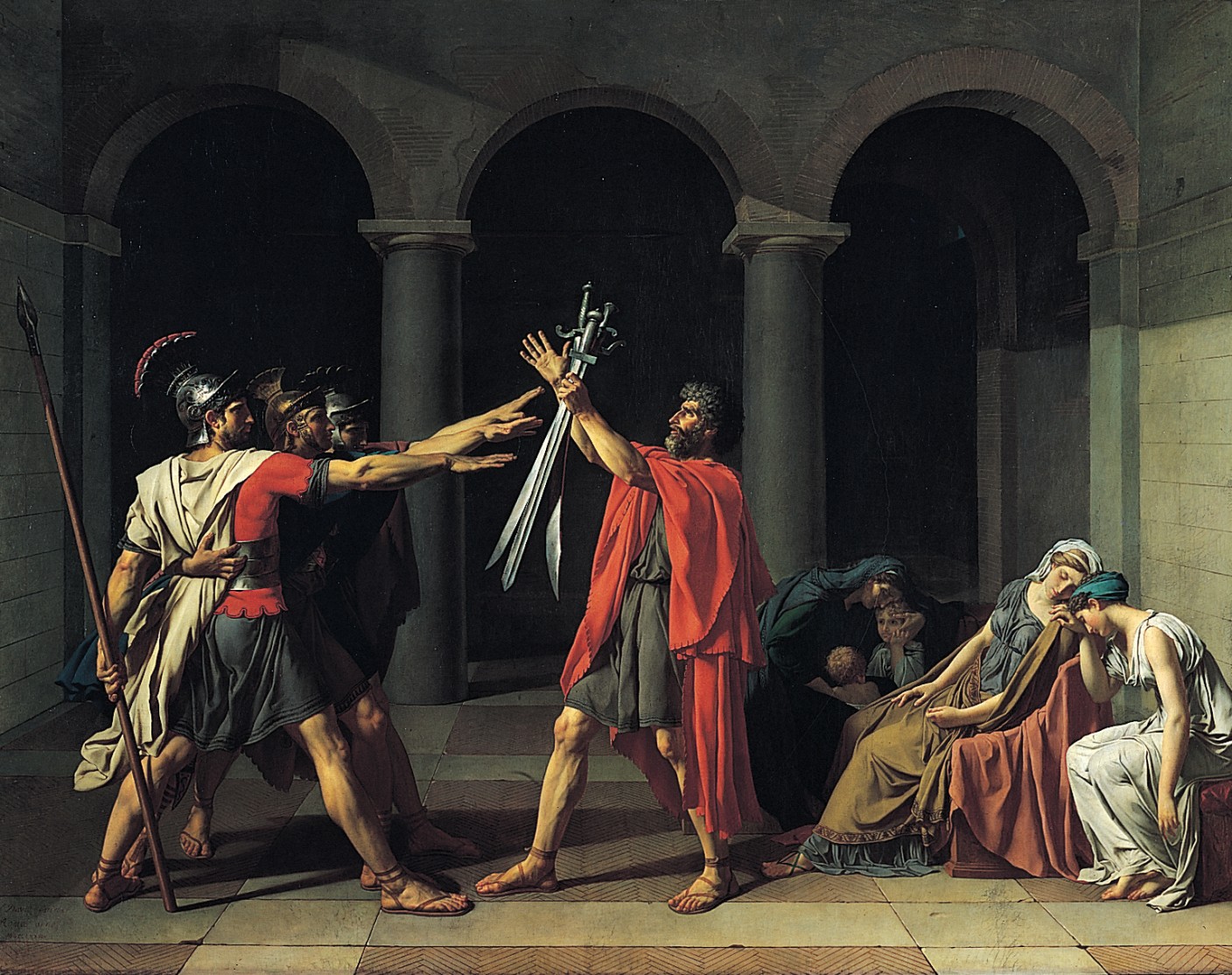
For the previous hundred years or more, paintings in the neoclassical style had prevailed at the Salon. Neoclassical art usually depicted scenes from ancient Greek or Roman history or mythology, painted as realistically as possible. For example, Jacques-Louis David’s The Oath of Horatii (see Figure 4-1) shows the three sons of the Horatii family vowing to defend Rome to the death.
So, in the Parisian art scene, around the time of the birth of Impressionism, there was a very scholarly approach to art: classical themes depicted with perfect perspective and perfect brushwork. The growing middle class was basking in the reflective glory of ancient Greece and Rome, all the while enjoying their newfound capitalist freedom. It was all a little out of place, as this scholarly approach to art was left over from the days when the elite classes ruled Paris. But with the 1863 Salon, this all changed.
Figure 4-1 The Oath of Horatii, by Jacques-Louis David (1784), was a neoclassical painting, representative of the style that was popular during the rise of Impressionism.
Impressionism and the middle class
For some unknown reason, the jury for the 1863 Salon rejected far more paintings than usual. The art community and public were so outraged over these rejections that the French government decided to hold an exhibition of all the rejected works, known as the Salon des Refusés.
Ironically, the very public that came to this exhibition looking for cutting-edge artwork, was shocked at one particular painting. Manet’s painting, Luncheon on the Grass (see Figure 4-2), flew in the face of the sense of propriety that the middle class valued. To at least one art critic, this painting was little more than “a young man’s practical joke.”
The main issue they took with the painting was the presence of the nude in the foreground. This was paradoxical because the Salon was, like any large art exhibit, full of paintings of nudes. But those nudes were likely idealized Roman or Greek goddesses, whereas Manet’s nude was a model in the Paris art scene. Instead of being sprawled out with eyes averted – as she might have been had this been a painting of the Roman goddess Venus – she is seated in an unflattering position and glaring right at the viewer, with no sense of self-consciousness or submissiveness.
Figure 4-2 Édouard Manet’s Luncheon on the Grass (1863), with its everyday subject matter and unrefined brushwork, marked the birth of Impressionism.
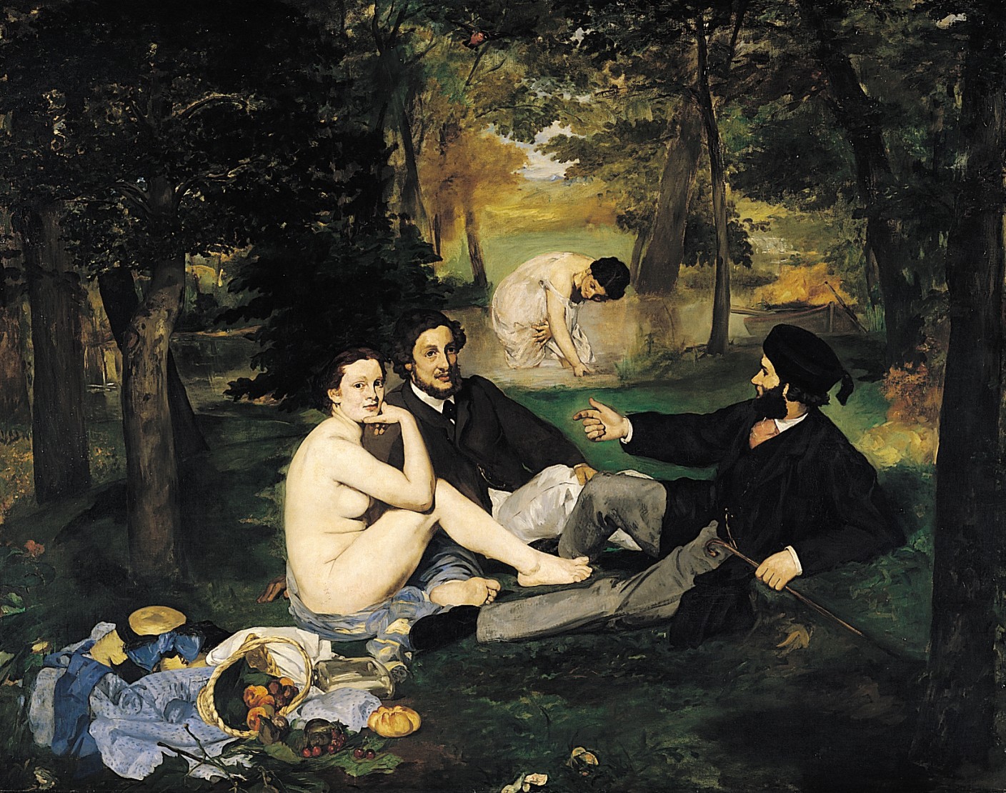
Almost as controversial as the subject matter of this painting was the technique with which it was rendered. The brush strokes are clearly visible, and, in some places, the painting looks like nothing more than a sketch. The sense of perspective is off as well, with the bathing woman in the background looming slightly larger than she should be. The whole scene has a sense of flatness.
Impressionism and photography
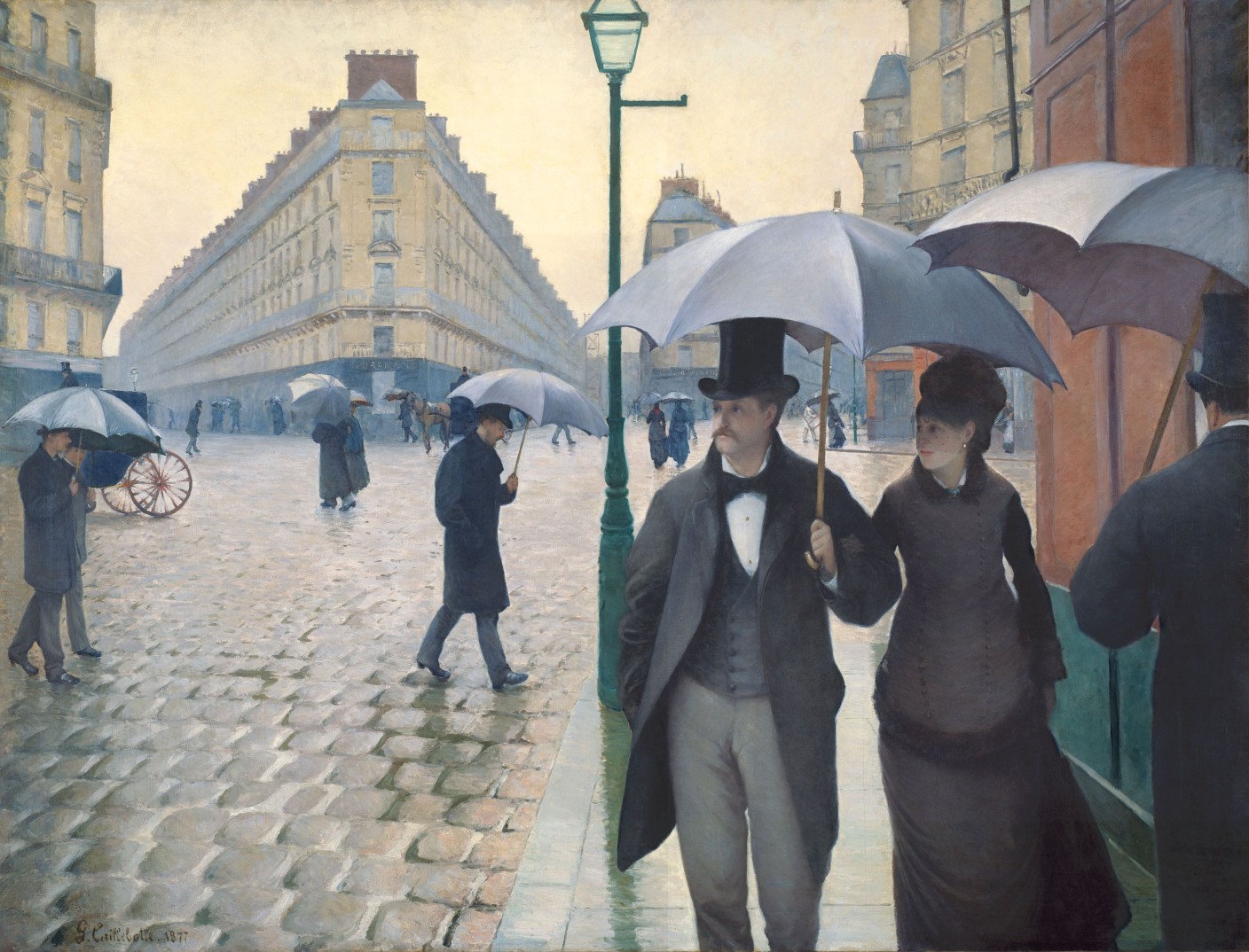
Impressionism developed further as it began to gain acceptance, and this “sloppy” style of painting was both a reaction to, and an inspiration of, the advent of photography, which was gaining popularity as an artistic medium. The “slice of life” subject matter of Impressionism lent itself to the immediacy of photography, resulting in compositions that looked as if they were mere snapshots from a camera, such as in Gustave Caillebotte’s Paris, A Rainy Day (see Figure 4-3). Instead of being carefully arranged within the painting, the people in this piece are caught in motion, entering and exiting the edges of the canvas.
Figure 4-3 The suspended action of Gustave Caillebotte’s Paris, A Rainy Day (1877) makes it look as if it were a photographic snapshot of a Paris street.
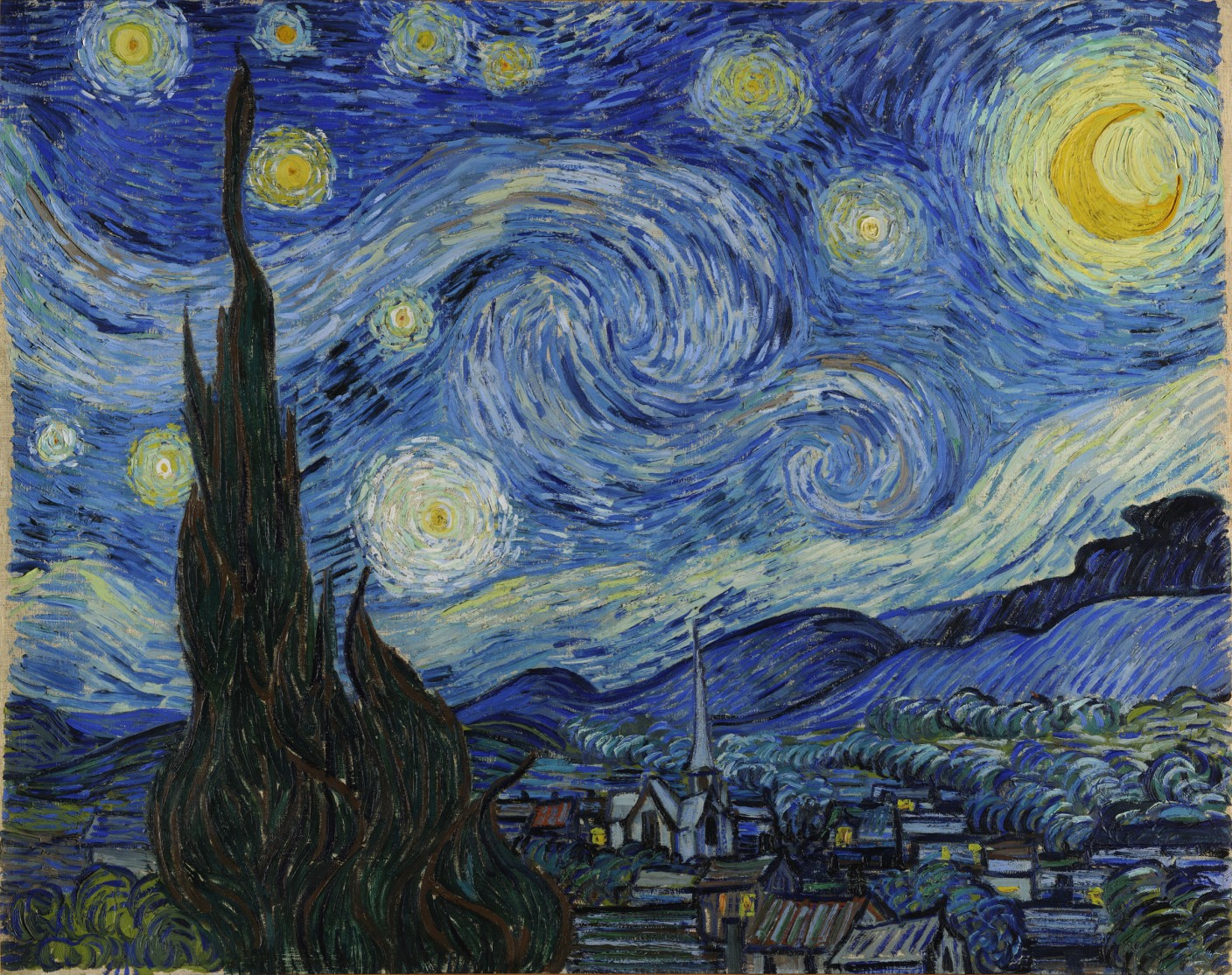
Now that photography could capture life realistically, painters were free (if not pressured) to explore new ways of expressing themselves with paint. By the late 1880s, Impressionism, now very popular and common in the Salon, gave way to Post-Impressionism. The flat compositions and exposed brushwork of Impressionism evolved into more in-depth study of the interaction between individual brush strokes of color and the eyes of the viewer. You probably need only glance at Vincent Van Gogh’s famous Starry Night (see Figure 4-4) to get some idea of what I mean. (I talk more about how the Impressionists and Post-Impressionists explored color in Chapter 9.)
Figure 4-4 The Post-Impressionists further broke down brushwork and color interaction, such as in Vincent Van Gogh’s Starry Night (1889).
Impressionism and modern art
The work of the Impressionists and Post-Impressionists paved the way for modern art. It transformed painting from a method of representation into a method of conceptual and perceptual exploration. Artists continued to find new ways to represent the physical world; make social commentary; and explore the qualities of paint, brush, and canvas.
Art has continued to evolve beyond Impressionism, but go to any art fair today, and you’ll likely see artists of varying degree of skill painting in a style that is visually similar to Impressionism. Some of the paintings may actually be attractive, but none of them has the same cultural import and relevance as the paintings that truly originated from the technological and cultural forces of Paris in the late 19th century.
REMEMBER
In order for a piece of art or design to really be relevant and important, it has to be sensitive to the technological and cultural factors present within the world in which the piece is created. Doing otherwise will result only in the creation of a veneer.
Web 2.0 graphics
Time will tell what art and design produced today will stand the test of time and go down in history as historically significant, but it’s safe to assume that it will be art that is a product of technological and cultural influence. One such artistic style, believe it or not, may well be that associated with the Web 2.0 movement.
The Web 2.0 movement gathered momentum around 2005 and is typically understood to encompass web applications that enable information sharing between multiple users. Services such as Flickr, Blogger, Delicious, and YouTube all benefit from what their users produce. This user-generated content contributes to the overall value of the service. The more photos that are added to the photo-sharing site Flickr, the more it grows into a repository where you can easily find photos on nearly any subject. Many of the photos in this book, for example, are from Flickr.
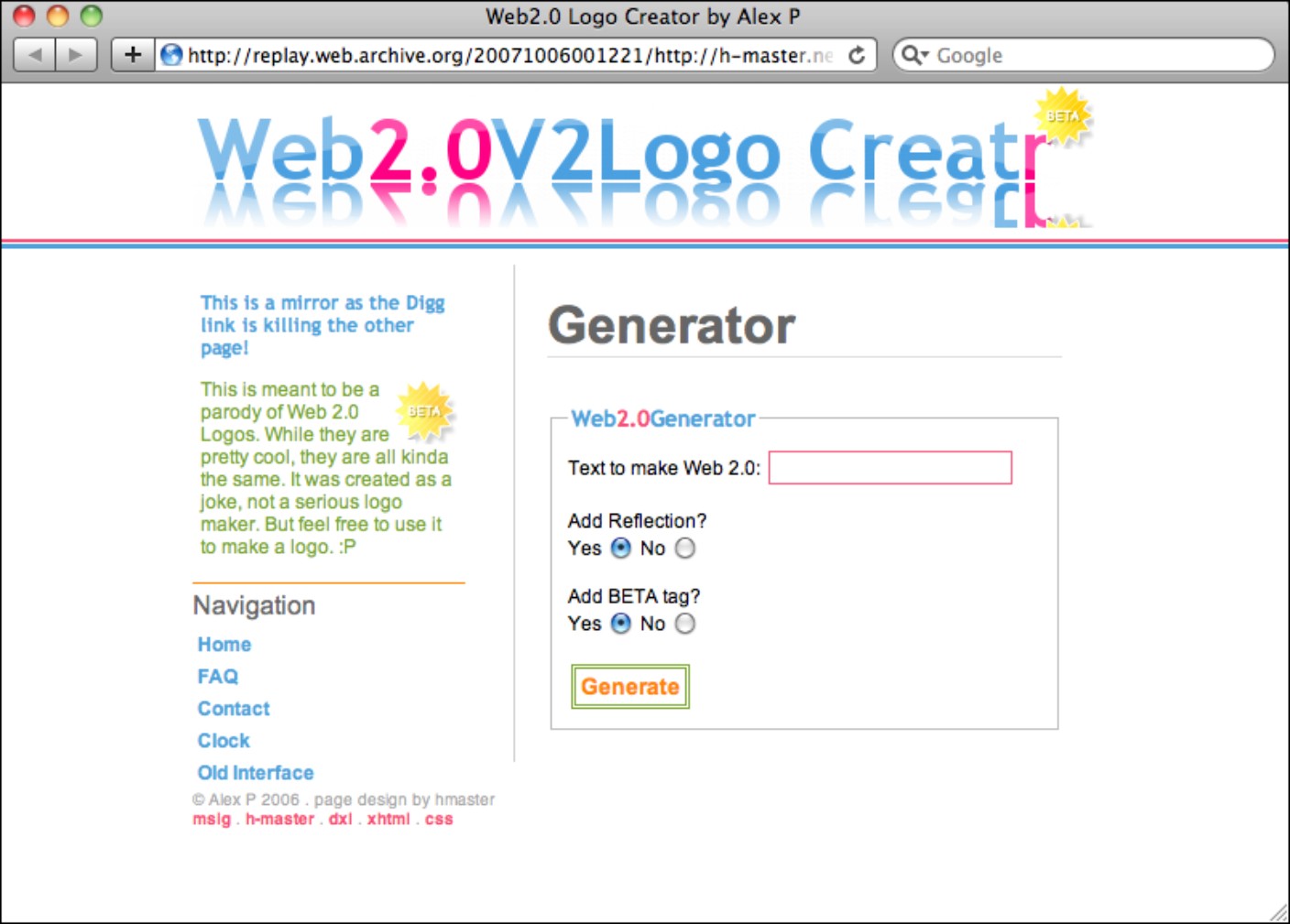
But Web 2.0 sites also are known for their graphic style – lots of gradients, reflective surfaces, and rounded corners. The graphic style of Web 2.0 has been so ubiquitous in the past decade that various sites have popped up – as jokes – for automatically generating Web 2.0 logos and graphics. The Web 2.0 Logo Creator in Figure 4-5 (now defunct) was one such example. It created a logo with gradients in the letters, with an optional reflection of itself underneath.
It’s true, plenty of very laughable Web 2.0–style graphics were created around 2005, but this is mostly because, like the modern-day “Impressionist,” the creators of the graphics were copying the “look” rather than understanding the forces that brought the style into existence.
Figure 4-5 The Web 2.0 style has been so overused that sites like the now-defunct Web 2.0 Logo Creator parodied the style.
Copyright © 2006 Alex P
How Apple started the Web 2.0 style
To understand where the Web 2.0 style comes from, we have to rewind to the Macworld Expo in January 2000, where Steve Jobs introduced Mac OS X and its revolutionary Aqua interface. The crowd oohed and ahhed as he introduced features such as Genie, which “sucked” operating system windows into the Dock – like a genie into a lamp – when he minimized them. But one of the most striking departures of the interface from the status quo was the overall look of the interface. “One of the design goals was when you saw it, you wanted to lick it,” Jobs said.
The most interesting part about Jobs’s comment was that, secondarily, the interface was really inspired by candy. As shown in Figure 4-6, Aqua was designed to complement the colorful translucent hardware Apple produced at the time, such as the Bondi iMac. While designing the iMac, Apple’s design lead, Jonathan Ives, had spent hours in a candy factory searching for inspiration in the lickable translucence of the sweets produced there.
Figure 4-6 Apple’s Aqua interface was inspired by the hardware of its Bondi Blue iMac.
Marcin Wichary (http://www.flickr.com/people/mwichary/)

The desire to have this sort of compelling physical quality in the interface is deeply rooted in the culture for which Mac OS X was being produced. Graphical computer interfaces (GUIs), after all, have always mimicked the physical world through interface metaphors. We drag around “windows” as if they were pieces of paper on our “desktop,” while occasionally dragging a “document,” into the “trash.” Most computer users take these things for granted, but when Xerox first developed the GUI, representing bits of data with representations of physical objects was a groundbreaking concept.
Apple took these interface metaphors to new heights with the Aqua interface (see Figure 4-7). It went beyond representing reality, into representing a fantastical hyper-reality. Check boxes, radio buttons, and other buttons within Aqua glow – like droplets of dew – with a luminescence that you could imagine in your dreams, but that you have never witnessed in reality. Window edges and menu bars are modeled with impossibly gentle smoothness and cast soft shadows underneath them as they float in the virtual space of the desktop.
Figure 4-7 Mac OS X’s Aqua interface represented interface elements in fantastical hyper-reality.
It wasn’t necessarily that nobody had ever before imagined an interface of such lush graphical splendor, but rather that rendering an interface with such detail hadn’t previously been technically feasible. Apple built a technology called Quartz, built upon OpenGL, which – through PDF technology – enabled the rapid display of interface elements that incorporated transparency, path-based shapes, and shadows, while rendering them at device-independent subpixel precision. Aqua’s predecessor, the Platinum interface (see Figure 4-8), relied instead upon QuickDraw, which drew shapes within the interface with raster graphics, represented by solid pixels.
Figure 4-8 The Platinum interface of Mac OS 9 relied upon QuickDraw technology, which made impractical drawing an interface as sophisticated as Aqua.
Apple rode so lightly on the cutting edge that users complained the interface was too cumbersome for the computers of the day. But, eventually, computing power caught up, and now other operating systems represent a similar hyper-reality in their interfaces.
How Aqua influenced the web
Designers have preferred the Macintosh since its release, so they were naturally influenced by this revolutionary Aqua interface. A colleague of mine at the time preferred Microsoft Windows, and he looked over my shoulder and drooled at my Mac’s “inspiring” interface. (He later made the switch to Mac.) But the 2001 commercial release of Mac OS X was a little too early to have meaningful influence on web graphics.
At that time, only 37 percent of Internet users had the capability to display 16 million colors, and – more important – broadband Internet speeds were just beginning to make their way into homes. So, many users were not equipped to even enjoy the amount of color depth such graphics would require, and – with load time of websites being critically important – even if they could, they would have had to wait just a little too long to download them.
In addition to these display restrictions, building such graphics with HTML and CSS was incredibly difficult, if not impossible. Web developers were still dealing with the unpredictable rendering bugs of Internet Explorer 5, and Internet Explorer 6 was just being released. Web designers were mostly restricted to using the square corners that CSS1 yielded (if they were using CSS at all) and solid blocks of color to fill spaces.
But renegade web designers were determined to achieve their visions. In 2003 and 2004, blogs such as A List Apart (www.alistapart.com) shared their elaborate hacks that would create effects such as drop shadows and rounded corners (see www.alistapart.com/articles/cssdropshadows), while remaining cross-browser compatible and minimizing the load time of graphics.
These new techniques still fell slightly short of creating the type of hyper-realism that Aqua depicted. OpenGL simply has some capabilities that go beyond those of CSS. But clearly, designers had been inspired to strive for interfaces and graphics that had a sense of dimension that went beyond the simple capabilities of CSS.
How Aqua met Web 2.0
Finally, designers could create graphics for the web that mimicked reality. Unfortunately, though, many designers worked for large corporations where they didn’t get the opportunity to experiment with new techniques, or had conservative clients who were reluctant to try designs that were anything unlike the rectilinear designs that were commonplace at the time.
Fortunately for some of these designers, the Web 2.0 revolution was coming. Frameworks such as Ruby on Rails and Django, both released in 2005, were making it easier than ever for developers to create web applications that would bring Internet users the social experiences that they craved.
Small teams of young developers flocked to Silicon Valley to start companies and try to secure funding. These teams included designers (myself included) who were eager to try out their new bag of tricks.
These small teams could call all the shots themselves. Some of the developers on these teams had quit their jobs at big companies, while others were straight out of college – or had even dropped out. Still others had fallen victim to the recent economic downturn and couldn’t find jobs anyway. All of them were excited to build things on their own terms.
Silicon Valley in 2006 had the atmosphere of a really geeky frat party – or maybe even 1860s Café Guerbois. Some companies, such as Meetro (a now defunct location-based instant messaging service), were composed of a dozen developers living and working in a three-bedroom apartment in Palo Alto. Developers and designers got together at an all-night “hackathon” called SuperHappyDevHouse, just to talk about ideas and build “mashups.” PBwiki (now PBworks), a hosted wiki provider turned online collaboration tool, was one startup that emerged from such jam sessions. You can see from the August 2006 screenshot of PBwiki’s home page in Figure 4-9 that it used plenty of gradients, three-dimensional elements, and highlights in its design.
This youthful exuberance was evident in the cultures of the companies. Playful alert messages, such as “oops” and “hooray” became commonplace. You can still see this developer-driven attitude in Google’s Gmail (see Figure 4-10). The casual atmosphere, the playful web copy, and company mottos such as Google’s “do no evil” all evinced liberation from the stuffy corporate culture that had previously prevented developers from innovating.
Web 2.0 was all about making the web social, friendly, and humanized. And the type of juicy, friendly-looking graphics that were inspired by the Aqua interface had just the right tone to convey that.
Figure 4-9 Hackathons, where developers collaborate on quick projects, spawned startups such as PBwiki.
Reproduced by permission of PBworks, Inc.
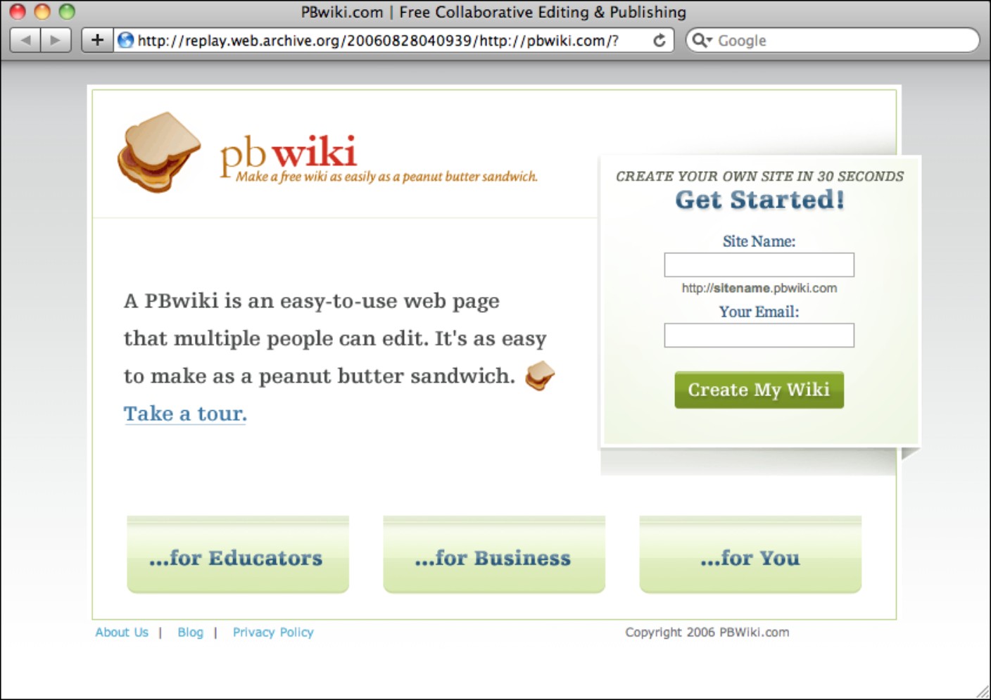
Figure 4-10 The youthful, casual tone of Web 2.0 companies is still apparent, even in messages within Google’s Gmail service.
As with any Silicon Valley boom, few of these startups were successful. But those that were were wildly so. YouTube was acquired by Google for $1.65 billion, Yelp has upended Zagat as the go-to place for restaurant reviews, and Facebook was recently valued at over $50 billion. The winners of the Web 2.0 boom have transformed the way that people interact and have won over even the mainstream.
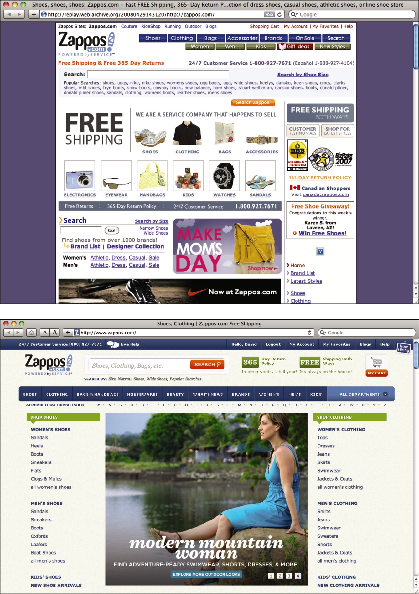
Not every Web 2.0 startup used juicy buttons, gradients, and drop shadows, but the popular aesthetic has lived on and evolved. Those most successful in taking cues from the Web 2.0 style haven’t directly copied it as a visual style, but instead have embraced the ability to create a hyper-real interface, which usually involves some form of gradients, rounded corners, and dimensional characteristics on buttons. Zappos.com (see Figure 4-11) recently abandoned its sharp corners and flat colors for a friendlier and more dimensional graphic style.
Figure 4-11 Zappos.com recently updated its design to one that features more rounded corners, gradients, and other dimensional qualities.
Reproduced by permission of Zappos Retail, Inc.
Form shapes technology, this time
In Chapter 3, I talked a lot about how tools have shaped form over time, but this is one case in which form began to shape the tools. The CSS3 specification has a number of properties that make it easy to create gradients, rounded corners, and drop shadows, directly in CSS, all without having to create a single graphic. It’s even possible to make buttons that closely mimic Aqua buttons (see Figure 4-12) using only CSS3.
Figure 4-12 The stylistic qualities of Web 2.0 have given way to CSS3 support for properties that can be used to create Aqua-like buttons, like this one from www.girliemac.com.
Reproduced by permission of Timomi Imura

SEO Is Design
As I explained in Chapter 2, the bounds of where design ends and other disciplines begin can be quite fuzzy. The growing influence of design has called for designers to have wider and wider skill sets. When designing something that conveys information, such as a blog or other website, or when designing anything, the main thing that the designer is trying to do is communicate information. Because of this central premise around which design is built, it’s critical that a skilled designer for the web understand SEO best practices.
Design – more specifically, the design of typography – has always been about the conveyance of information. Ensuring that the right audience gets that information is part of the responsibilities of the designer.
Information accessibility in design
The early scribes of books worked tirelessly to create beautiful hand lettering that could be read with clarity and reproduced with beauty and efficiency. At that time, very few people could read, much less even get access to a book. Books generally consisted only of religious texts read by the clergy and were extremely expensive and labor intensive to produce. But when Gutenberg invented the printing press, the cost of producing books started to drop. As a result, literacy began to spread.
One pioneer of the spread of literacy was Aldus Manutius, who saw the advent of printing as an opportunity to spread and preserve the wisdom of classic Greek literature. So, Manutius set up his printing house in Venice, Italy, and employed Greek scholars to edit manuscripts and proof prints. He also employed the type designer, Francesco Griffo, whom he commissioned to produce the very first italic typeface (which saved space) and fonts that have inspired some of today’s more popular fonts.
Manutius worked tirelessly to spread Greek literature, and to do so, he needed to innovate a format that would sell well.
What Manutius came up with would later evolve into what we today consider the paperback book. Most books to date had been large, heavy, and bulky, but Manutius created an octavo format that – at only 33⁄4 by 6 inches – could easily be carried around. It was an appealing book format that was at least inexpensive enough to be owned by the elite classes of government and military officials who lived in Venice at the time.
Starting in 1501, Manutius printed octavo books from Virgil, Plato, Aristotle, and others, and was eventually granted a monopoly on Greek publishing by the Venetian government.
It’s probable that Greek literature would not have had the influence on Western culture that it has, were it not for Aldus Manutius’s innovations. By producing a book format that worked for the people whom he wanted to reach, he was able to spread the information that he wanted to spread.
Designing with such utility in mind was at the crux of the modern movement in typography. Jan Tschichold set out to standardize business communications in the modern age for maximum efficiency with his 1928 book, The New Typography. Besides proposing that business communications be printed on standardized paper sizes for easy filing, Tschichold also proposed that business cards be printed with certain portions of information in certain spots, so that they could be filed and sorted according to name, geographic location, or other pieces of information.
This underlying idea of the spread of ideas through printing is still at the backbone of design. When you’re designing something, you’re trying to convey a message. Part of your mission as a designer is to get that message to anyone to whom it applies, especially if someone is actively trying to find your message.
This important principle is often lost with modern designers. Designers and clients often find themselves focusing on the aesthetic and experiential qualities of websites, while ignoring the underlying structure of the information. Ill-advised use of Flash, which locks away information where it can’t be accessed by search engines or accessed through a browser’s Find command, reduces the communicative reach of a website.
I’ve seen some beautiful websites with very interesting information on them. But because they were built in Flash, you can actually copy and paste a string of text from these sites into Google and come up with no results at all. All that great information is locked away inside Flash. Even if Flash were used on these sites in a search-engine-friendly manner, once you got to them, you wouldn’t be able to use the browser’s Find command to scan the information for keywords of interest.
For reasons of search engine friendliness and users being able to use the tool of the browser as intended, it benefits a designer to surrender to whatever limitations may be present in the combination of HTML and CSS. Granted, with the advent of HTML5, these limitations are becoming fewer and fewer, but in any case it’s best to work with HTML.
The reason for this is that, besides the really visible parts of a design – the words and pictures and other content – underneath all that lies the semantic language of HTML, which turns information into a structured hierarchy that powers the web and its amazing information-finding capabilities. A designer should be aware of this information structure, so she can design with SEO best practices in mind and reach the intended audience.
The basics of SEO are stupidly simple. It seems like everyone who works with the web talks about SEO as if they know all of it, but it’s surprising to me sometimes how rarely SEO best practices are actually utilized. Here’s a very basic refresher of why SEO is important, how it works, and what you can do to make sure that you’re doing the best you can.
NOTE
I’ll be talking Google-centrically because Google will likely account for the vast majority of your inbound search traffic. Additionally, if you rank highly on Google, you’ll probably do pretty well on other search engines anyway.
I’ve been writing with SEO in mind – and using best practices as best as I can – on my blog, kadavy.net, for seven years now, and as you can see in Figure 4-13 my search traffic has steadily increased.
Figure 4-13 Writing and designing with SEO in mind has yielded steady growth in search engine traffic for Kadavy.net (data before December 2005 unavailable).

Understanding why SEO is important
SEO is the “location, location, location” of doing business on the web. If you have a bicycle shop on a busy street, you’re going to sell some bikes. It doesn’t matter how high your prices are, or how rude your employees are, you’re going to sell some bikes. Likewise, if you rank highly on Google for “bicycles,” you’re going to sell a lot of bikes, because a lot of people search for “bicycles.” That’s your foot traffic.
I don’t want to make the mistake of assuming that everyone knows just what it means to rank highly on a keyphrase. If you’re selling a product or service, ranking highly on keyphrases related to that product or service is essentially free money. If you rank first on Google for “bicycles” (which is darn near impossible, by the way), you’ll get a huge number of visitors on your site looking for bicycles, and it will cost you nothing. This is called organic traffic, and it’s what SEO builds for you.
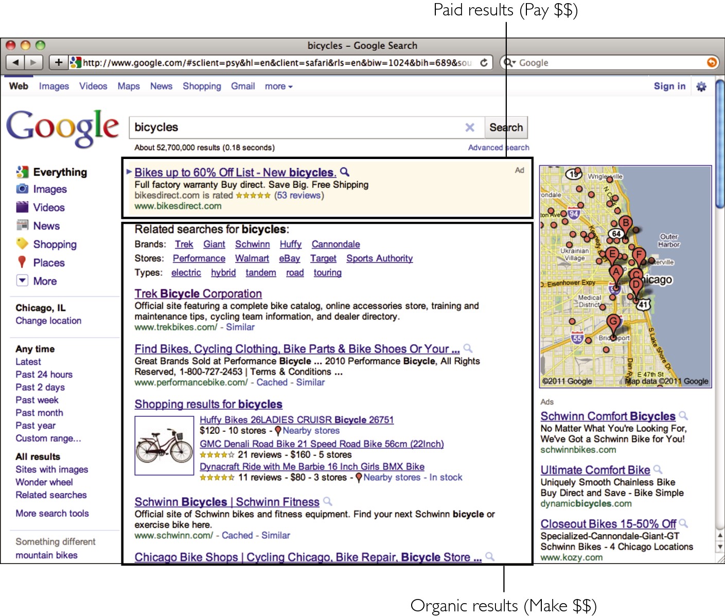
But, as shown in Figure 4-14, some businesses pay big bucks for such traffic by buying Google’s AdWords. In doing so, their sites show up next to Google’s organic search results, and they pay whenever someone clicks through to their site. For the keyword bicycles, those businesses pay an average of 71¢ per click. For the keyphrase Cambria bicycle, they pay an average of $12.55.
Paying for traffic like this can be profitable if the campaigns – and conversion within your site – are managed carefully. But, obviously, free traffic is ideal and translates to big sales. This is why SEO is important.
Figure 4-14 Organic search traffic is ideal because it’s free.
Choosing the right keywords
Before you make sure that you’re using SEO best practices, it’s helpful to have some idea what keywords or keyphrases, you want to rank highly on. But just because you pick a descriptive keyphrase, doesn’t mean people will find you. It has to be a keyphrase that people are actually searching for. My blog gets lots of traffic for the keyphrase lump in mouth because that’s what people search for when they have a mucocele (basically, a clogged salivary gland). Most people don’t search for “mucocele” because they don’t even know what one is – until they get a lump in their mouth and search for it.
Ideally, each page on your site should compete well on a couple keyphrases that are descriptive of the content on your site, that have reasonable search volume, and on which you stand some chance of competing.
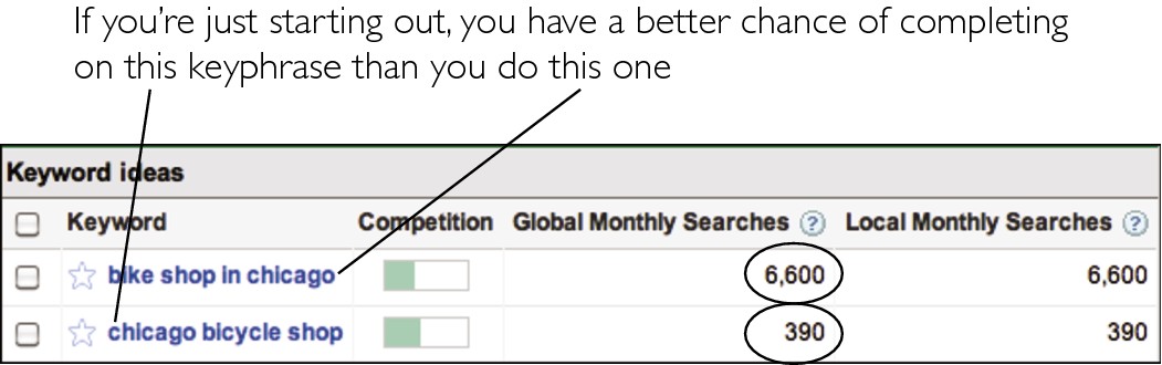
You can find out the volume of keyphrases by using the Google Keyword Tool (http://adwords.google.com/select/KeywordToolExternal). If you’re just starting a site where you sell bicycles, it would be nice to compete well on the keyword bicycles, which has a monthly search volume of over 7 million searches per month – but you don’t stand a chance as a new site. If your site is for a bicycle shop in Chicago, then you’d probably have better luck competing on chicago bicycle shop, which Figure 4-15 shows has a measly 390 searches. Once you dominate that keyphrase, then you can start trying to compete on bike shop in chicago, which has 6,600 searches.
Figure 4-15 If you’re just starting your site, it’s likely easier to rank highly on a low-volume keyphrase than a high-volume keyphrase.
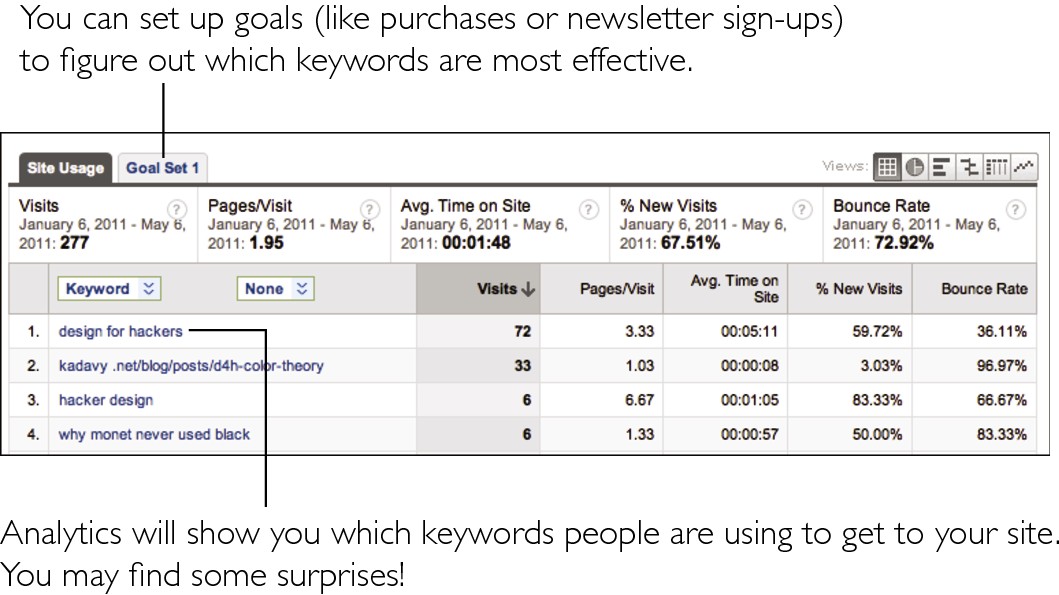
A good place to start to find keyword opportunities from your site is your existing data. If you don’t already have a stats package set up on your site, you should. Google Analytics (http://analytics.google.com) is great, and it’s free. If you happen to already have Google Analytics installed, you can find the keywords that visitors are using to get to your site under Traffic Sources → Keywords, which is shown in Figure 4-16. Here you can see what keywords are bringing in the most traffic, and if you’ve set up e-commerce or marketing (such as lead-generation) goals, you can see what keywords are actually converting into business. You’re likely to find a few keywords you didn’t expect that you happen to rank pretty highly on. It’s a good idea to aim to build upon this success by targeting these keywords further, or targeting related keyphrases. Look for synonyms that you may not already be using (bump/lump, mouth/lip), and update your content accordingly.
Ranking highly for your target keywords
There are endless complex theories on just how a site ranks highly on search engines. Some of those theories have no basis at all. The truth is, nobody except little robots at Google knows just how a site ranks higher than another. What we do know is that the content of a page, how the page is coded, and the authority of other pages that link to a page – especially for the topic in question – are the most powerful dictators of how well a page ranks on search engines.
Figure 4-16 You may find some surprising keywords in your Google Analytics data, which you can use to develop your SEO tactics.
Considering content and coding
The content of a page – meaning the words within that page – has a huge impact on how well a page ranks for given keywords. If your target keywords don’t appear on your page, you’ll have a hard time ranking highly for that keyword. It’s not impossible, but I’ll get to that later. Relevant content has to be within your page – as code (meaning not as an image) – for search engines’ crawlers (the robots that read your pages) to read that content and rank you for the appropriate keywords. This is a strong reason why Flash websites do poorly on search engines, and former print designers that just slice up a design on a WYSIWYG program make poorly performing websites: The real content gets locked away, where crawlers can’t access it.
It’s also essential to use good coding practices in building your pages. There are standards for writing HTML content, and they help rank chunks of content within a page in order of importance. This helps search engines know the difference between the important – and less important – information on a page and, thus, rank that page for various keywords.
Following is a rundown of important content-based factors that dictate how your pages rank on search engines.
URL
Before a search engine’s robot can read the HTML on your page, it will read the URL at which that page resides – and the content of this URL has pretty heavy influence on how that page ranks on search engines. So, if my bike shop is at http://bikeshopinchicago.com, it will rank very highly on bike shop in Chicago. If I have a page for Cambria bicycles, I may want to put it at http://bikeshopinchicago.com/cambria-bicycles. Note that you shouldn’t automatically pick your top keyphrase to be the domain that you purchase, because branding – and planning for the future expansion of your business – are both important. But you should have search engine (and human) friendly URLs that are in plain English instead of http://example.com/?p=34.
Title tag
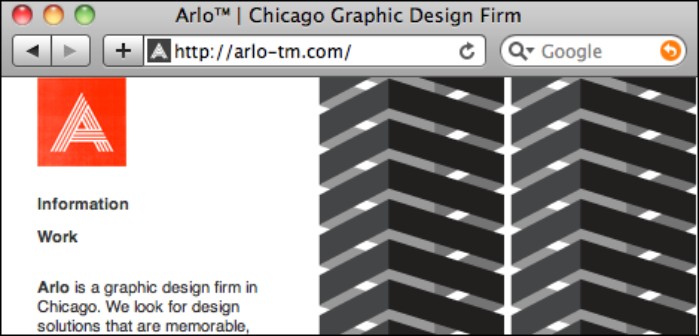
The title tag of a web page is the strongest piece of information indicating what a page is about. Many businesses make the mistake of naming this page “Home Page,” or ignoring it altogether. (This is why, if you search for “Welcome to Adobe GoLive,” you’ll get tons of results.) For any given page on your site, your title tag should contain the exact keyphrases that you want to rank highly on, as shown in Figure 4-17. If it’s the home page, or if your business name contains your target keyphrases, you could then follow that with your site’s name. So, if your business is David’s Bike Shop, your title should be “Bike Shop in Chicago – David’s Bike Shop.”
Figure 4-17 Title tags have a strong influence on what keywords a page ranks highly for.
Reproduced by permission of Arlo, Inc.
Meta tags
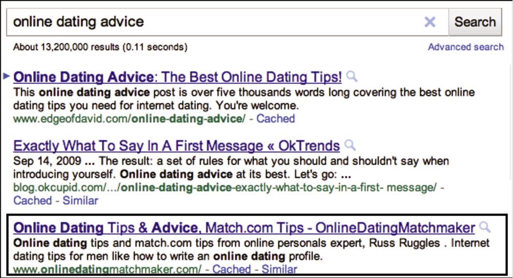
The meta tags also contain some information that search engines give strong authority to when evaluating a page. There are several different meta tags, but the one that you should concern yourself with is the description meta tag. This is a very short (like around 200 characters) description of what the page contains, and search engines use its content not only to evaluate what a page is about, but also to display to users – as in Figure 4-18 – when your page is listed in search results.
Figure 4-18 The descrip-tion meta tag is believed to hold some weight in search engine rankings and sometimes shows up in search results.
Headers
Then there are the headers within your HTML document. These are ranked in order of importance: H1, H2, H3, H4, H5, and H6. There should be only one H1, and it should probably be used for the actual title of your page (which may or may not be the same as your title tag). Some people like to use the H1 for their logos and link to their home pages – it depends on how narrow of a focus your site has. So, if you have a long document, full of text, it’s a good idea to break it up a bit by inserting some useful headers that also happen to contain some of your target keywords.
Content: em, strong, img
Finally, you have the actual content of your page, which is hopefully helpful, interesting, and – incidentally – contains your target keyphrases. In addition to your target keywords, your content will probably bring in visitors on a number of “long tail” keyphrases that just happen to show up naturally within your great content.
Within your content, you’ll hopefully have some images, because they’re useful for users. Much as the URL of your page is important to search engines, the filenames of your images are also important and should be descriptive. So, if you have a JPEG of a mountain bike, your image should be called mountain-bike.jpg, or – even better – include the color and brand: mountain-bike-schwinn-blue.jpg. The alt attribute of your img tag also should be descriptive, so blue schwinn mountain bike would do. Don’t forget, you can end up with a large amount of traffic from Google Image Search, if you use descriptive alt attributes.
The italic and bold HTML tags (em and strong, respectively) also hold higher authority in an HTML document than your plain content (which sits inside of p tags). When you italicize or bold words within your content, it lets search engine crawlers know that those words are important and relevant to the point of the page in question, so it’s a good idea to do a little of this – provided it supports the experience for your human users.
Authority of linking pages
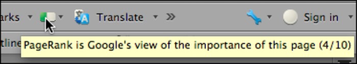
Ranking highly on Google is ultimately all about the authority of your page or site on the keywords in question. This concept of authority also applies generally to your site just being an authoritative site. Google uses a ranking called PageRank to measure how much authority a given page has, on a scale from 1 to 10. There is a complex algorithm behind PageRank that you shouldn’t concern yourself with, but Google does provide a Firefox plug-in called Google Toolbar (shown in Figure 4-19), which shows what the PageRank of a page supposedly is. Seven is considered a very high PageRank. NYT.com has a PageRank of 9. Kadavy.net’s home page is a 4, which is considered decent for a personal blog.
Figure 4-19 Google’s Firefox toolbar displays the PageRank of a given page.
A number of factors go into determining a given page’s PageRank. Although the actual algorithm is an ever-changing secret, here are a few factors that are widely accepted to be a part of the algorithm:
> Age of domain (how long the domain has been registered)
> Authority (or PageRank) of pages that link to the page from other domains
> Date of expiration of the domain (Is the domain expiring soon, or has the owner registered it a couple years into the future? This is in one of Google’s patent filings.)
Content of linking pages and of anchor text of links
To put it very simply, when other pages on a given topic link to your page of a related topic, search engines generally will rank you higher on that topic. If the PageRank of the page linking to your page is particularly high, Google will rank you higher for that.
Also important is the actual anchor text (the content between a tags) of the link that links to your page. So, a link that says “Bike Shop in Chicago” will do more to rank “David’s Bike Shop” higher for searches for “bike shop in Chicago” than if the anchor text says “David’s Bike Shop.”
The a tag also has a couple of attributes, such as the title attribute, which can have descriptive text applied to it. I haven’t seen anything to make me think that using this title attribute helps with SEO, but it certainly wouldn’t hurt. The rel attribute can have a value of nofollow, which tells Google’s crawlers not to follow the link and, therefore, not to give the page any extra authority based upon the link. Most blogs give all links in comments a rel=“nofollow” attribute to discourage SEO-minded spammers from exploiting the comment functionality.
Everything in moderation
So, if you took all this knowledge literally, you might stuff all your pages full of keywords to the point that they didn’t make any sense. You might also contact site owners all over the web, purchasing links, and stuff all your pages full of links – full of your keywords – to other pages. You might even obscure these links by making them the same color as your background or hiding them with CSS.
Using some of these tactics in extreme moderation may even help you a little bit, but anything more than that will be heavily frowned upon by Google. It supposedly takes very sophisticated measures to detect use of these tactics and will downgrade a site for doing so – which is something you do not want to experience (think immediate loss of tons of business). There are tons of shady tactics for getting links. As a general rule of thumb, if it feels like it’s deceiving someone, Google probably has some way to detect it and you can bet they won’t like it.
Getting the content, getting the links
Having a site full of relevant keywords, and being linked to by sites with relevant keywords, is a means to an end, not an end itself. You achieve this by using good coding practices and generating useful and compelling content that others want to link to.
Here are a few legit ways – that Google doesn’t frown upon – to get content and links to your site:
> Have a blog. To rank highly on keywords, it’s pretty much a must to have useful content, rich with your target keywords, that is updated on a regular basis. A blog is the best way to have these attributes. Unfortunately, Google still ranks some pretty awful content really high, so I’d say that having some not-so-well-written content is better than having none at all – but hopefully this will change when they improve or someone gets around to building a better search engine.
> Get into directories. DMOZ is the highest-authority directory, and it’s free – but it’s nearly impossible to get into. There are plenty of paid directories out there, but the only ones I know of that are definitely high-authority are Yahoo! Directory and Business.com. Be wary of other directories or consult a professional. Then, still be wary.
> Write guest posts on other sites. Find a high-authority site that your target audience reads, and pitch a guest post to the author. They’ll get great content, and you’ll get links and exposure to their audience.
> Write link bait. The best way to get lots of links is to write content that other people will link to, share, and talk about. A really thorough, information-rich how-to is a good example, but writing posts that are very controversial works well, too (unfortunately). Such posts then get shared on social news sites such as Reddit, and on Facebook and Twitter. Do lots of research and make some pretty graphs, and your chances of getting lots of links increases again.
> Find your audience. When you’ve written really great, useful, and interesting content, get as many people in your target audience to see it as you can. Submit to a social news site in a category where those people hang out, or buy traffic in your target category on StumbleUpon (pay a very small fee per visit, with a chance of unlimited free traffic). Another good tactic is to find an already popular post on your target topic, find other sites that have linked to it, and pitch to the authors of those sites.
NOTE
There are probably some very reputable SEO firms out there who are great at applying this knowledge, and more, but be wary – because there is so much mystery behind SEO, the field is rife with consultants who overcharge and use tactics that will either work only in the short term or get your site downgraded.
Knowledge Applied
To do work that is appropriate stylistically, you need to understand how technological and cultural factors influence design. Additionally, part of design is conveying information, so be aware of how your intended audience will find your information.
> When the budget or objectives of your project permit (see Chapter 2), pay extra attention to how current technology and culture influence your project.
> Avoid simply copying a graphic style, and try to understand its technological and cultural influences.
> SEO is a part of design. Design with SEO best practices in mind, and build your design around whatever limitations may result.