Chapter 6
The UX of XR
Throughout this chapter we will be looking at techniques and considerations that need to be worked through to create an optimal user experience (UX) within VR, MR, and AR. We will discuss:
APPROACHABLE DESIGN With new technology, many users may feel uncomfortable or even less confident in their initial uses of the technology. It’s important to acknowledge and to design for this and then empower users to try the experience.
SEAMLESS USER FLOW Users have goals, and to help them achieve those goals you need to create a visual that maps out the full flow of the interaction.
KNOW THY AUDIENCE To make the best design decisions, you need to know who you are designing for. This requires user research and data collection to make the most effective design decisions for real users.
MAKING REALITY ACCESSIBLE While you can’t design a unique experience to accommodate the needs of every user, you can allow for things like personalization to enable users to benefit from the many ways XR can make the world around us more accessible every day or even in certain situations.
Approachable design
Creating an XR experience is personal. Unlike playing a game on a computer screen or a TV screen, when you use a HMD (head-mounted display) the screens are attached physically to you and covering your eyes. Having control of someone’s sight is extremely personal. In life, before you enter into someone’s personal space you need to establish a certain amount of trust with them if you want to avoid a strong negative reaction. It likely will take some time before they are willing to let you come within close proximity to establish a physical connection.
The greeting
Consider our greetings to one another. Although it varies in different cultures, in the United States, you extend your hand away from your body offering a handshake to someone you’ve just met. This allows for connection, but at a comfortable distance. As you get to know someone and become more comfortable with them, you might open your arms in greeting and allow them in for a hug. This signifies that it is okay for them to come closer; you have let them in. A hug is very personal, as it is closer and allows for more of a direct connection. Have you ever hugged someone the first time you met? I have. Usually, it is someone who is strongly connected to someone you already know and trust. You feel like you already know them from all you have heard about them, and your hug signifies your acceptance of them as a new friend or member of the family. The most personal greetings are when you allow contact with your face, perhaps for a kiss on the cheek or two—or for those to whom you are most connected, the lips. The closer you are invited into a person’s personal space during a greeting, the more genuine and personal it should feel.
The face is an extraordinarily personal space, one we protect and safeguard. Understanding this aspect of social interaction is important as you set out to create an experience that is in direct contact with the user’s face. Understand that it will need to be introduced to a new user carefully and, for some, incrementally. The greeting needs to be personal and establish trust, as they are going to be allowing the experience into their spaces, trusting you with what their eyes see, what they can hear, how they are feeling, all while coming in close proximity with them (virtually and physically). If at any time during that first introduction they feel too uncomfortable, they will retreat and may hesitate to try to connect with the experience again. Just as in a normal greeting, there are things you can do to help ease any uncertainty by providing them knowledge about the experience and what to expect so that they feel comfortable with that initial hug or kiss.
Our insight into initial greetings and interactions reached a pivotal point during the COVID-19 pandemic, when hugs turned into elbow taps and grandparents used plastic separators to hug their grandchildren. A generation of children have been instructed to not greet others with a physical interaction, and it will be interesting to see how these influences will change greetings as we know them. If anything, it may open people up to be more accepting of virtual greetings and interactions in digital spaces as a result.
When Tim Cook introduced the first Apple Watch in his 2014 keynote, he explained how revolutionary it was by calling it the most personal device the company had ever created. It was the first time Apple released a computer that was so personal that it would be worn on the body. The audience was excited, but would people actually purchase it? A couple of factors helped encourage buyers to take the leap. First, it was an expansion and a companion to familiar and possibly trusted technology: the iPhone. Accessories, such as arm bands to hold an iPhone or iPod while exercising, were already common. This reduced the jump required for potential users to trust something that they wrap around their arm. Wearers of traditional watches were accustomed to consulting them, so trying an Apple Watch may not have felt as monumental. All of these steps built trust, so when users first encountered an Apple Watch, they did not hesitate to wrap one around their wrist and start discovering.
As a designer, what you need to understand is that all the factors just listed are important for the user, whether they’re aware of them or not. It isn’t just the first time someone puts a device on and starts using it that counts; it is the steps and actions that have prepared them for that moment and initial introduction.
Just as none of us had worn an Apple Watch prior to 2014, today many of us may have never worn a head-mounted display, but many of us have worn glasses, either prescription or with UV protection. So, the concept of having something so close to our eyes is familiar. Those glasses have lenses but do not have screens built in. Still, there is some sense of comfort if the head-mounted display looks like the glasses we have worn before. If there is a band that wraps around the whole head and has wires attached to it, that likely reduces the familiarity of the experience. It is harder to relate to.
Observing first-time users of any type of HMD shows clear evidence that there is a sense of discomfort in putting the device on their head. All the interactions I have observed at trade shows, at conferences, and in classroom demos have involved one person explaining and walking though the technology before handing over the device. I have seen those who are the guides try on the headset first to make sure that the menu is correct and everything is reset so that the user can enter the experience at an optimal point. This also allows for the user to see how the device is worn and how to interact with the different parts of it. Even so, a rare few have just put the device on immediately after it was given to them. Many ask one or two questions before they attempt to try it for the first time. It is obvious, even from a distance, who has used some type of XR display and who has not. There is an initial orientation period that you can see in a first-time user who is trying to understand their positioning in the new 3D world they have entered. Repeat users approach this initial step with more confidence and more trust.
Orientation into this new form of reality is essential to establishing trust. The first step is setting up an onboarding tutorial for the user (FIGURE 6.1). Although it is common to have someone with you for your first VR or MR experience, it is much less likely that you will have someone to walk you through a mobile AR experience. Knowing that new users will be navigating their first experiences alone, offering these introductory steps will make a better overall experience, especially for those without a human guide.
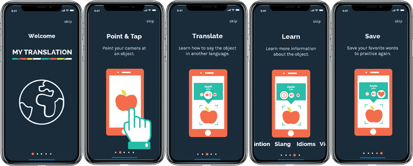
FIGURE 6.1 Onboarding. An introductory set of screens walk the user through the main AR experiences of the app before the experience begins. This step-by-step instruction explains not only how the user can learn a new language, but also helps translate culture through the use of object recognition and machine learning.
Designers: Emma Comtois and Alanna Quinlan
Think of this experience as the equivalent of the guided tutorial a person standing next to you would provide. It should help instruct and guide the user through any necessary setup first, such as creating an account, scanning a room, or finding a plane. Clear, focused instructions with visuals are essential here. We will discuss how to design this further in the next chapter. It is also important to explain and show the main functions of the experience that will help the user achieve their goal. Because there are not yet universal standards for XR, it is safe to assume that you will need to provide these instructions and have them available for your users to access at any time. You don’t need to show every function here; in fact, that would likely be overwhelming, so just focus on essential actions that will help guide the user to get started. This helps the initial interactions feel more approachable as they have some familiarity versus leaving the user feeling completely lost. Lost and insecure are not great first impressions and will likely lead you to lose the user.
Positive user experiences
First impressions matter, and in XR they are essential to creating a positive user experience (UX) for the user. The UX is the design that happens behind all the visuals. The role of the designer is to create an environment where the user understands the space and is able to distinguish the physical and digital worlds. This goal can be achieved using both diegetic and non-diegetic elements. The UX includes many components that work together to help the user achieve their goal. This includes three main components.
Non-diegetic Overlaying an element on top of a virtual environment, making it clear it is not part of the environment itself.
Diegetic The placement of an element to appear inside the virtual environment.
INTERACTION More than just a user and an object, but rather the result and impressions created by the user from interacting with that object, as a result of how it is designed. These impressions are emotional.
CONTEXT The situation where the interaction occurs in collaboration with the user and the object (or service) provides the context.
FUSION The user experience is multifaceted. It is constructed by a combination of all experiences, both the single experiences and also the combination of all those experiences together.
Having a thorough understanding of how to make a good user experience for an interaction outside of XR can help you master the challenge in this space. Many of the same rules and theories apply. Anytime you have a computer and human interaction, there will be a number of considerations that need to be addressed to help the user and make the interaction successful. The foundation for this is the consideration of how interaction, context, and the fusion of experiences all work together to aid the user toward their goal. Working in an immersive, 3D environment adds complexity to creating a good user experience. Some additional elements are unique to this industry and should be considered for an optimal user experience in XR, for example:
Personal space
Agency
Social signifiers
Feedback
Affordances
Interactions
Safety
Guides
Cohesion
It’s worth delving into each of these elements, in addition to the well-known elements of any digital experience.
Personal space
XR is personal. With devices covering our eyes and experiences happening within our homes, the technology is invited into our most personal spaces. As a designer, your role is to acknowledge the need for trust a user has to have to even start an experience. Your users are trusting what they see and feel to you. As such, you don’t want to do anything to break that trust. Before the user begins the experience, they should have an understanding of what they are about to experience. This can be through an onboarding experience as we discussed, a demo, or part of the media that promoted the experience in the first place.
As we explore the full user journey through an experience in this chapter, a big component of that journey is the entry point and how the user connects to the experience. This context is an important step that can and should prepare the user for what will happen next. Even the inclusion of a static image of what the experience will look like or a concise paragraph of text to set up the user’s expectations will improve the experience.
The first few moments of the experience are important as the user is processing a lot of things at one time. To help with this cognitive load, start with a scene or environment that is simple and not too extreme. To further respect the personal space of the users, be thoughtful of how close you place content to them. Imagine a user starting a new experience, perhaps the first time they’ve donned an HMD, and being greeted without warning by things flying towards them. Emotions of anxiety and fear will take over, and the user will likely remove the headset and not want to try it again anytime soon. Being thoughtful of how the positioning of augmented objects can work to further generate trust the user has with the experience, as long as you respect their personal space. You can easily make a user uncomfortable with the proximity and motion of elements around them. To recap, in the initial scene:
Reduce cognitive load by limiting the number of elements
Avoid extremes
Don’t place content too close to user
Avoid fast-moving (potentially alarming) elements
Once the user is engaged, these limits no longer apply strictly, but you should still be deliberate and conscious of intrusions into personal space throughout the experience.
Agency
The user should have some control of their experience, and it should be easy for them to learn how to use that control. Have you ever watched a child have a tantrum? Most of the time, these are caused by the child feeling out of control, and the fight we see is their way of trying to regain some control and feel safe again. Having a sense of control will make a new experience a little less scary and will allow the user to explore more and be more open to the journey. This is called agency.
Agency The ability for a user to control or change something in an experience versus just observing. This ability to choose their own story will have an effect on the full experience.
Agency can be global, meaning the user can impact the entire experience, or local, meaning the user can impact a specific scene or object. Understanding this, it is important to realize that agency is about control, which is really power. The more agency you allow, the more power the user has within the experience. Just like power, having too much agency can be a negative thing. As you are designing your experience, you need to consider how much power you would like your users to have. To do this you need to define the intended relationship between the user and the environment. If you allow too much agency, the user could be lost and overwhelmed to the point that they aren’t able to understand what they are supposed to be doing within an experience. If you limit the agency, the user might feel too constricted and like they are not able to achieve what they are trying to do.
In an educational or training experience, it would make sense to limit the agency to ensure that each user receives the same experience at the end. If you had a pick-your-own-path structure, it would be harder to know what each student learned at the end. However, offering choice within limits can achieve both goals. If students need to cover three topics, for example, you could let the user have some control by selecting which of the three to start with, while knowing that they will still have to complete all three by the end. Allowing for some agency fuels curiosity, which is an important component to keeping users engaged and interested to continue the experience. Games, by nature, benefit from more agency. It is a benefit that each time the user returns to the experience they could explore something in a new or different way than they had before. Every option you provide the user is another path in the user’s journey, however, and will have to be mapped out, designed, and developed. It is worth also considering your budget and timeline as you are also exploring agency.
Reducing agency will create directive experiences, and increasing agency will empower the user’s freedom and sense of control. The goal is to determine what makes sense for each project from a global and local perspective. This is even more important in VR where the experience can often be physically involved.
Social signifiers
If someone has a red flag up on their mailbox, what does that mean? What about lines painted on a street? Knowing that a dashed yellow line in the middle of the road means it is safe to pass someone in that area is a social understanding (FIGURE 6.2). The context of these signifiers is also essential to understanding their meaning. Social signifiers can communicate critical information for the user to understand an experience and can also influence their behavior and actions. Signifiers can be used to help users understand what action should be taken without the need for instruction. If someone raises their hand in the context of a classroom, it is understood that they have a something to contribute. This idea has been converted into the digital environment and through the video conference platform Zoom. A student studying remotely can click the hand icon, and the instructor will see the raised hand graphic on the student’s video thumbnail, mimicking the real-world action of raising of the hand. Just as this action would grab your attention in a classroom, Zoom replicates that action by bringing the student’s video thumbnail to the top of the stack or grid. Without needing an explanation, the first time you see the “raised hand” interaction, it is clear that the student has a question. Utilizing strong signifiers that exist in the physical world in the digital world will make an XR experience feel more approachable and natural to a user.
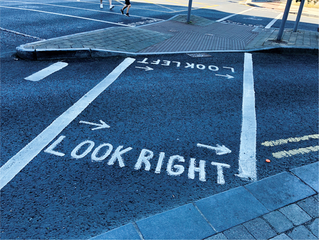
FIGURE 6.2 Social Signifiers. Lines painted on roads hold meaning based on a cultural agreement. This includes crosswalks for pedestrians, as seen here in Limerick, Ireland, with reminders to visitors to look to correct direction before crossing because cars drive on left side of the road.
Social signifiers A visual cue that carries meaning that is based on a social or cultural agreement.
Feedback
In a conversation, it is important to know if the other person has heard you. There are multiple ways to receive feedback from the other person to confirm that the message you sent was received. They might respond verbally or through the use of body language, such as a nod of understanding. Without this response you would be left unsure whether or not you were understood.
The same is true when a human interacts with a computer of any kind: They are is in a conversation with the device or experience. Every time the user communicates something, whether by voice or action, it is important that they receive some type of response so they feel confident that their communication was heard. It is a fundamental part of experience design to build in some type of feedback. If you are shopping online and you add an item to your cart (another great social signifier example, by the way), you need to see something happen to show that you have successful added the item. This could be a visual with the number 1 appearing above the cart icon, an addition to a list of everything in your cart, a window appearing announcing you have successfully added the item to your cart (with options for next possible actions), a sound, or even a haptic vibration (if you are shopping on a mobile device). Receiving any one of these cues gives you confidence that your item was saved so you can either keep shopping or check out. These cues are all examples of feedback.
In XR, the need for this feedback is magnified by the use of real-world experience and environments that you are interacting in. We are used to objects and people providing responses in our physical world, so it is important to replicate them in a digital and immersive world. To do so, keep the feedback natural and timely. Immediate feedback will let the user know if they are interacting with an object or menu correctly. This can also help them gain confidence as a first-time user. We all appreciate some feedback throughout interactions in life, so be sure to build those into your XR experiences as well. We all could hear we are doing a good job more often.
Affordances
Within the first minute of an experience a user should have a good understanding of:
Where they are and how they fit into that space
Why they are there (what is their goal)
How they can interact with the elements within the experience to move toward achieving their goal (perhaps the most important to know)
Think about it, how do you know how to interact with an object? For example, how do you know how to pick up a coffee mug? The shape of the handle is a property of the object that directs you to notice it. Because you use your hands to pick things up, you see the association in shape and size of the handle with that action—all of which tells you to hold that part of the mug to pick it up. This design protects you from holding the part that could be too hot to touch. This understanding to pick up a mug using the handle is called affordance.
Affordance A property or properties of an object that inform a user how they can interact with it to carry out an action.
Designers must consider and leverage affordance to cue users as to how they should interact with an object or experience element, as well as what that object or element should be used for. The beauty of using affordances within XR is that you can design interactions to directly reflect the real physical world and what we already know and understand about physics. As the technology improves, this experience will continue to improve with it. For now, keeping these interactions simple will create the least amount of frustration for the user.
Being directly inspired to use what the user already knows is a massive advantage to this technology. In fact, it is what makes it so exciting and why so many people are constantly working to improve the field. Since the first computers were created, designers have been working to create experiences with a variety of interface metaphors that reflect real-world objects (such as file folders, a trash can, and so forth), but these have all been simplified because they were a 2D experience. Now in XR, those metaphors can be interactive just as they are in the physical world. This is exciting and opens up a lot of possibilities for designers. As such, we are going to explain much more about this important topic in Chapter 7, “The UI of XR,” and Chapter 8, “Human Factors.”
Interactions
Once you understand that you can interact with an object, how do you actually interact with it? There are three types of interactions:
Direct interactions in which you physically touch the object or screen you are using, such as using a touch screen
Indirect interactions in which you use a physical object to control a digital one, such as typing on a keyboard or scrolling with a mouse or trackpad
Semi-direct actions, which are a mix between direct and indirect interactions such as scaling an object by pinching directly on the object and then tapping a button to save the size property
Two of the benefits of interactions within XR are the high proportion of direct interactions and how active and important your hands are to interact with the interface. Gestures, clicks, and drags can all be done with your hands or hand controllers (FIGURE 6.3).
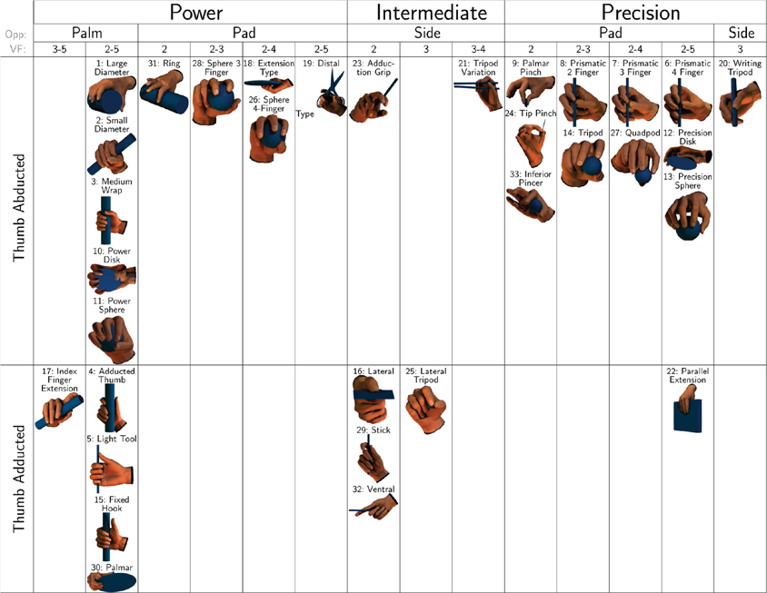
FIGURE 6.3 The GRASP Taxonomy of Human Grasp Types. Hand grasps are classified in columns according to their assignment into the categories: power, intermediate, and precision grasp; and then the opposition type and the VF assignment. The two rows are based on the position of the thumb—which can be in an abducted (thumb flexed) or adducted position.
Chart provided by T. Feix, J. Romero, H. Schmiedmayer, A. M. Dollar, and D. Kragic1
1 Feix, T., Romero, J., Schmiedmayer, H., Dollar, A. M., & Kragic, D. (February, 2016). The GRASP taxonomy of human grasp types. IEEE Transactions on Human-Machine Systems, 46(1), 66–77.
Understanding how we can interact with an object in XR should be easier than using other screens that require the use of a flattened version of an object. Use this to your advantage. We have an established understanding of how objects behave, so use this knowledge to influence the actual interaction. Consider the use of 3D or volumetric representation of objects when it seems appropriate. This way you can really leverage the benefits of this immersive technology.
Planning out interactions to minimize the number of different types of interactions will go a long way to improving the user experience. The fewer kinds of interactions, the easier they will be to remember. The more natural the gestures used by your hands, the easier the learning curve and retention of how to interact throughout the experience.
Safety
It is important to consider what technology you are designing for to make sure to create the best safe experience. There are different considerations that need to be taken into account for VR versus AR and MR. Based on the amount of transparency you have in your screen and your experience, you need to embed different safety precautions.
One great example of this is the Guardian boundary visualization option on the Oculus. The first step is setting up your play space for your experience. Then when you get close to or walk out of bounds the view changes to a mixed reality experience switching to a camera view of the space around you. This step helps you make sure the user can select the space that is available—avoiding furniture and walls for example—before going into a fully virtual experience. Then they can feel comfortable knowing that they will have the visual cue of the camera view switching when the leave that space.
In all XR experiences, even in experiences where there is a transparent view, you should avoid creating a situation where someone would have to walk backwards. This may be an obvious safety concern, but without being able to turn and see what is behind you, or on the ground behind you, this could cause injury. It is also advisable to include some reminders for users to continue to pay attention to their physical environment while using your application. It is important that they continue to be aware of their surroundings.
Guides
When you are visiting a new place for the first time, a tour guide can be helpful to help you find all the must-see places. The same is true when you first explore an XR experience. Use visual cues to help direct the user to discover the space and to show them where they can explore all the must-see places and experiences. Depending on the field of view, it may be hard to see an experience in full, so directors that help guide the user to needed places are an essential visual tool. These can be anything that captures attention, such as arrows, lights, colors, motion, sound, path, lines, or anything else you come up with. There are many useful AR applications that use these guides as the main function of the experience. Navigational AR, for example, is all about creating these visual directors to help find something as you are driving, walking, or even in a grocery store. If you want to make sure that the user finds something, guide them to it (FIGURE 6.4).

FIGURE 6.4 AR Navigation. Turn-by-turn navigation, utilizing augmented reality via a mobile device, to help customers find all the items on their shopping list.
Image provided by: Dent Reality ltd; CEO: Andrew Hart; Product designer: Richard Picot
While exploring deeper into a 3D space, users can easily lose their way or be unsure what they are looking at. Guides can play an important role in keeping the user oriented in these situations, too. In addition, guides can also help the user navigate the digital and physical worlds in more effective ways.
Cohesion
During a new experience, we all receive a sense of comfort from feeling that we gain more understanding with each thing we do. Once you learn how to do something, think about how good it feels the next time you get to use that new skill again. As a designer, you need to take these feelings into account and consider building cohesion and consistency within the experience. This is not only important in the user interface, which will be discussed, but also in the experience as a whole. If you maintain a systematic approach to the design and the interactions within an experience, users will grow increasingly confident with each minute they are immersed. This includes the position of key menu items, but also how you use color, shapes, sizes, type, style of imagery, motion, sound, and the rules of spatial awareness, such as occlusion.
In an augmented experience, having a consistent style for the objects overlaid in a world is a helpful way for the user to easily find and explore the information as they scan a space. To take that to the next step to help you start to broaden your perspective, it helps if objects that look visually cohesive react and relate to the real-world objects in a similar way. For example, if some objects are able to occlude within the space (be hidden under or behind physical objects), then it would make sense to have all objects occlude. Unless, of course, you identify some that will act differently in a systematic way to fulfill a goal within the experience. If you group similar things together and keep a consistent look and feel to all the design elements, the user will have an easier time connecting the parts experience to form a whole.
With so much that can overwhelm a new user, it is important to make the first impression comfortable and approachable. In the same way that it can be challenging for the user to experience too much at one time, it is also hard to design for an entire experience at once. So, next we are going to break it up step-by-step to make it easier to design.
Seamless user flow
The XR experience is a story. If you approach this part of the process as you would tell a story, then it becomes easier and logical to break out each step of the process into a sequence. There is a beginning, a middle, and an end. There will be conflict points, characters, plots, and scenes. As the designer, you get to create this story.
To get started, draw the story out as a chart that shows the movements of the user and how they will engage with your experience, step-by-step. This step-by-step process is important as it breaks this large idea and concept into smaller, more manageable pieces. It can be overwhelming to even get started when you look at the big picture, but if you map out each step, you can just focus on it step-by-step, and then you can zoom out to a 100-foot view and evaluate it from a broader perspective. This chart is called the user flow.
User flow A diagram of the step-by-step journey a user takes through an experience, evaluating and highlighting the display, decisions, and actions that are possible along the way.
The use of the term flow explains how a user can move throughout an entire app experience (FIGURE 6.5). It shows in one visual all the decision points, or agency, the user has; it also shows where all the actions are. For each of these you can then identify all displays or screens that need to be designed. This chart is equally important for you, the designer, who will lay out the interface in the experience and for the developers. You have to design looking forward and backwards, to know where a user has come from, how they can return to where they were, and also how they should move forward towards their goal. By taking the time to create a thorough user flow you can easily see all of these steps in one chart. This is essential to creating a positive user experience in any kind of interaction design, and while there are a lot of similarities to creating this for XR, it does become more complex when you add the addition of space and dimension to the experience.
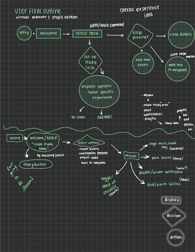
FIGURE 6.5 User Flow Design. User flow sketch for “SimplyStudy,” an AR study experience focusing on the use of spatial UI. Designed for UI Prototype Project. Starts with the entry point and breaks down interactions using shapes to represent the different parts of the flow. Displays are shown within rectangles, decisions within diamonds, and actions within circles.
Designer: Bailey Kretschmer
The first 60 seconds of an experience are critical to the retention of the user. As you start your user flow, consider the entry point where the user will enter the experience. What options will be immediately available to the user? As mentioned earlier, you don’t want to overwhelm the user, so instead of providing a large number of options and customizations, the first priority should be to help them orient into the environment. A user needs to develop a mental model of the experience to understand the space and how they relate to it.
Mental model A map formulated internally to help a person understand the environment they are in and the various relationships between space and any objects, including themselves.
This can be more complex in VR, as the user will be leaving one environment and entering a completely different one. It is important at the start of the scene to allow the user to have a wide angle on the space so they can process the space. Understanding space is absolutely essential in fully immersive setups; however, some orientation will be needed for MR and AR experiences, as well.
MR and AR experiences may require the user to align their digital objects and scenes with their physical ones. This often can require the user to select a vertical or horizontal plane to start their experience or to move around their space to map it out. For someone who has never had to connect their digital and physical worlds, this initial setup will not be intuitive. Providing a visual tool tip or instruction before the user is asked to perform the action will help the user more successfully set up the experience. Assume that the user doesn’t know how to do this, and aim to explain it in a way that includes a visual paired with a description of the action. For example, you can have an illustration of a grid appearing on a surface and an icon of a mobile device moving back and forth supported with the text, “Surface found. Tap to create surface anchor.” The example of this in FIGURE 6.6 uses Adobe Aero on an iOS mobile device.
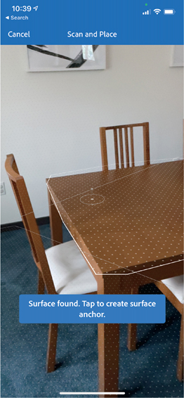
FIGURE 6.6 Selecting a Surface. Screenshot from Adobe Aero showing the process of selecting a surface within your physical space to anchor your 3D content.
You can even go an extra step to include a button that people can click for further information to assist those who are not able to successfully find a surface. This additional guidance will help provide more information for those who need it, while not cluttering up the initial screen.
As mentioned previously, an extremely helpful practice is to include an initial onboarding tutorial, where new users can be guided step-by-step through what they need to do to set up their account, learn how to use the experience, and be introduced the goal of the application. This is something that you can have appear only on the first launch of the application or for a new account signup. A repeat user will not want to go through all those steps every time they launch an app, so be mindful of this in your user flow. This is a great place to have a user create an account, agree to any needed terms and agreements, set up anything that is necessary for the experience to function, and so forth.
Tip
Tell users how much physical space they will need—or any changes in location that are required for the experience—before they launch it, so they are prepared and not surprised.
Once the experience is launched and any initial steps are complete, the next focus should be on clarifying the goal for the user. A goal could be finding a Pokémon, creating art, finding where an ingredient is in the grocery store—whatever the mission of the experience is. With this in mind, it is time to motivate the user to achieve that goal or goals. As you are planning out your user flow, remember to:
INTRODUCE USER AGENCY. What can the user control or customize? How much power should they have based on the goal? Understand that your role as the designer is to still maintain comfort for the user. This requires balancing the amount of power that you give with retaining control of the base line of the experience.
GUIDE THEM TO START INTERACTING. The first step is sometimes the hardest one, so anything you can do to get users over this initial road block is a good idea.
IDENTIFY ANY NEEDED TRANSITIONS BETWEEN SPACES. Where are the main scenes, and how does the user get from one to the next?
ALLOW FOR MISTAKES. How can a user get out of each area and each action? Let them feel that they can perform actions without consequences. Build in an edit, undo.
ALLOW FOR A REFRESH. With new technology, especially using complex 3D imagery that can have large file sizes, there is a chance that the experience will glitch or freeze. Providing an option to refresh or reload more complex parts of the experience will allow the user to have the ability to try to resolve individual issues that may be a result of their device.
PROVIDE AN EXIT. This should be easy to find and easy to perform by the user. Little effort should be needed. This will help them feel comfortable and will instill trust. Each time we enter a new space, the brain tries to understand the full space, including how to get out of the space, just as a backup. If your users do not find an exit or a way out, you will create unneeded anxiety for them. Always build in a way out.
PROVIDE A CLEAR WAY TO SAVE THE EXPERIENCE. The user must be able to save and resume again later, or even launch it where they left off in an alternate location. Knowing that this safety net exists, users will be more willing to try the experience in different physical locations or to come back to play a game from the beginning. Think about how helpful it is when you can pause a video from playing and can return to it later knowing you can resume from where you left off. This is the same idea in XR. Let the user pause and resume later.
As you consider these points and walk through the full experience creating your user flow, understand that it should be a working document. As you work though an idea, it is helpful to then go back over the full experience to see how that idea might shift the overall flow. For example, if you realize that the user needs to be able to search a specific thing at some point in the experience, it might be worthwhile to add a global search feature that users can access at any point during the experience. Make note of the global actions that need to be available at all times, as that will make it easier as you design and develop your navigation items.
Once you have a solid user flow that addresses all the main functions and affordances as planned, double-check to make sure that you can answer the following questions:
What is the goal the user is trying to accomplish? (How do they learn about this goal?)
What information is needed for the user to accomplish this goal? (Where is the information presented to them?)
What pain points, or challenges, can prevent the user from achieving this goal? (What can help them overcome these challenges?)
You and your team can answer these questions, but to get the best insight and feedback it’s wise to ask your users directly about their needs or observe their behaviors as they interact within the experience. User research and usability testing is critical to identify the needs of your users. It should be part of your design process consistently, starting with the user flow, all the way through the launch, updates, and into the full life of the product. This next step is where the user journey truly begins.
Know thy audience
Have you ever been walking along a sidewalk or paved path and saw a footpath shortcut or secondary path veering another direction through the grass? Did it draw you? These desire lines provide powerful user feedback that tell city planners and architects where people would prefer to walk, as opposed to the current path. Paying attention to these signals, what users are requesting, provides rich data for improving the overall user experience. You could just wonder why people can’t follow the simple rule of walking on the sidewalk, but from a UX perspective you should look at it as feedback. Design is an outward practice; rarely do you ever design solely for yourself (with the exception of the occasional passion project, of course). Knowing this, your audience should drive your full design flow. Having the ability to learn what your audience needs and wants takes out the guesswork.
In XR, a main goal should be the comfort of your user. Comfort can take many forms:
Physical comfort
Environmental comfort
Physiological comfort
How will you know what makes someone comfortable or uncomfortable, however, if you don’t ask them or observe them in an environment to see how they react?
While it is unlikely that you can design one experience to fit the needs of every person, you can do a lot to empathize with your users to create the best possible experience for them. The best way to learn about your users is to talk to them. Talk to people who have used XR technology, and talk to people who haven’t. Learn about their hesitations and any barriers. Learn about what they enjoy most about it and what they hope to experience with the technology in the future.
Develop user personas
With so much of the design process focused on a specific target audience, it is important to include that audience as part of the design process as well. They can provide feedback and insights that only a user may consider. To start, identify three to five diverse user personas that you can use to test your user flow. To create these, it is best if you can use real data about actual people that can be collected from interviews, surveys, or analytics. A combination of qualitative and quantitative research should be completed and analyzed. Although we as designers may not be responsible for this process, it is important for us to be a part of the research that is being completed to ensure more well-rounded and encompassing results. From this data, you can start to formulate a few specific personas, each representing a realistic reference as a user. For each persona created, it is helpful to identify their goal as a user, their demographic information, and any additional information that is relevant within the context of the experience (FIGURE 6.7).

FIGURE 6.7 User Persona Template. Create a template to learn more about the humanity behind your users by learning more about their personality and motivations.
User persona A representation of a real user that is intended to represent a key audience to provide reference within the specific context of an experience.
According to usability.gov, “Your personas are only as good as the research behind them.” To ensure that your personas are effective, they should:
Represent the main user groups for the experience
Express the needs and expectations of that group
Share their expectations and how they anticipate they would use the product
Help identify any needed features and functionalities
Represent real people with diverse backgrounds, goals, values, and a range of experience using XR
Represent a diverse group of physical and mental abilities
Walk through with personas
Once you create some user personas, you can take a more specific user journey, walking through your user flow with the goals and needs of one of those personas in mind. Imagine each user persona as they walk through each step of the process, and create user stories for them (FIGURE 6.8). At the outset these stories must:
Identify the type of user
Identify what their goal is
Identify the motivations driving their journey

FIGURE 6.8 User Stories. Comparison of two main kinds of users of the website for the organization HUGs from Cara (Help Understanding Grief), the Griever and the Hugger. The organization has a mission to provide a place for grieving children, families, and friends to find comfort and support.
Designers: Pixels & Print UI/UX Designers; Illustrator: Jiaqi Liu
User stories The narrative of goals, needs, and motivations written from the user’s perspective to evoke empathy.
To do this well, empathize with their needs and values. Consider their feelings and as a result what emotional decisions they might make. A mother shopping for her child will have a different emotional connection to a product than when she is shopping for herself, for example.
Let your research inform the decisions as you walk through the user flow. This promotes human-centered design, where you place the people you are designing for as the focus for the experience. Then, conduct testing to confirm the success of these stories with real users.
In XR especially, adding any sense of humanity into a very computer- and tech-heavy field will make the experience more approachable. Using user research, such as observations, interviews, and evaluations and analytics, to guide your design decisions keeps the experiences human centered. Using the mindset and data of a variety of user personas, journey through the user flow chart and try to achieve their goals. Take notes. Pay special attention to areas that are possible pain points, where you are unable to achieve the goal, or any other challenges that arise.
Afterward, you want to go back through your user flow. Adjust it to help resolve any issues you found on your walk-through or make notes on customizations needed to accommodate the variety of needs of your target audience. This is an important step. As helpful and great as user personas can be, they also can be misleading if you begin to categorize users into a small number of kinds of users. The goal of using these user personas is to walk through the process through the eyes of people different from you. That doesn’t mean that a persona represents all users. It is important to remember that people are unique and each person may have unique challenges that should be part of the design process. We will explore this even further in the next section, so stay tuned, but it is important to understand that as you explore a persona’s user journey think of it as the mind of one user, not all users.
Designers need to have a solid understanding of why they are including an object in a design and why they are placing it in a particular place. Users don’t need to know your reasoning, but they will appreciate how it helps them. In fact, if they don’t even notice some design elements, but instead notice only the feeling of accomplishment from interacting with them, then this is a success. Making research-informed design decisions can help you work toward this success. Listening and watching are incredible design tools, and they are essential to gaining a true understanding of what your users need and want.
Making reality accessible
If you could add into your everyday world one piece of information that you could always have available, what would it be? A closed-captioning experience? A dictionary? A clock? A map? A voice assistant? One of the greatest benefits of augmented and mixed realities is that they open a world of possibilities of supplemental information that can be provided where you need it—in context. The power of this is really a game changer. In a world where we rely on a variety of devices, screens, and speakers for an array of different activities, AR provides an opportunity to align these into one space: the real world.
This topic is so exciting to me that I have spent my tenure researching and designing ways in which immersive technology can make our reality more accessible. There are so many possibilities for how adding a layer of information onto our view can assist people with a variety of needs. I have never been a fan of the term disability, which implies someone can’t do something, but rather a believer that they may just need to do something a different way. This technology can be that way.
There are many ways to approach accessibility in XR. The first is considering who would be excluded from the experience the way it is created. Another is researching how the use of this technology can make other experiences more accessible. Regardless of your approach, it is important that you consider accessibility at the start of the experience and connect it with your user experience planning and research. I have been part of too many conversations and projects where these considerations are an afterthought, where Band-Aids were then applied to try to fix issues, instead of accessibility being an intentional aspect of how the experience works (FIGURE 6.9).

FIGURE 6.9 Augmented Learning. An augmented photo prototype exploring the use of an augmented closed captioning experience for students. This was created to assist students who are hard of hearing, deaf, have a specific learning disability, or are learning in a school outside of their native language.
Designer: Renée Stevens
There are many types of challenges that a variety of users can face in their own unique ways. They range in sensory, motor, and cognitive disabilities or challenges. In her book Mismatch: How Inclusion Shapes Design, Kat Holmes explained the importance of inclusive design and how designers must first consider who we are excluding. If you are designing an experience that requires the use of both hands as the only way to interact within an experience, for example, then you are excluding anyone who has limited arm mobility: those with only one hand, those with limited functions, or those with missing or broken digits.
Throughout life, our abilities change. Holmes identifies a “spectrum of permanent, temporary, and situational mismatches that people experience based on their abilities and disabilities.”2 Someone may have permanent blindness or low vision, or temporarily have low vision because of cataracts or situational factors, such as the sun shining in their eyes or bright light washing out a display. This is an important dynamic that increases the range of users we need to consider providing accommodations for. Over a lifetime a person’s abilities also change. As children we may have more physical abilities, and as we age those change, including deteriorating eyesight. As you focus on your target audience, understand that each has a unique range of abilities. There is no normal, despite what the term disability may imply. Instead, designers should look at this spectrum approach to create inclusive experiences.
2 Holmes, K. (2018). Mismatch: How inclusion shapes design. The MIT Press.
You never know when you might find yourself needing extra assistance. After being hit in a car accident a few years ago, it took me many months to be able to walk up a flight of stairs without being winded. That empathetic experience changed my whole perspective of how the accessibility of buildings can alter so many components of daily life. Take time to see the world from other points of view or, even better, talk and engage with people who have different challenges than your own.
A benefit of XR technology is that it allows for the use of multiple modalities to at the same time. A key part of this is that you are not limiting an experience to just one of the user’s senses; engaging and supporting the experience with touch, sound, and sight will improve the experience for the diverse needs of all users. The overall accessibility benefits that XR provides are:
Focus
Multiple modalities
Personalization
Context
Focus
Could you imagine what it would be like to learn and create or perform in the same space? Many areas of education, training, and medicine are early adaptors of this concept where they can clearly see its benefits. With so many screens grabbing our attention it is hard to stay focused on one area. This can be even harder for those with cognitive processing disorders and learning disabilities. However, learning disabilities don’t end when we leave a classroom, as they extend far into our everyday lives and careers. Having the ability to combine our focus into one area, to both learn and then perform, reduces the cognitive load that is currently needed with multiple windows, devices, and screens. For anyone who faces challenges with ADD and ADHD the ability for focused attention is essential. Combining content into one space can assist in keeping a visual flow in one central location.
Memory is also connected to our ability to focus. It is important to be respectful of the fact that users will have varying lengths of memory, and some will have short memory spans. A common practice in form design for web and mobile is to keep the forms clean to be more efficient with space. However, if the tool tip is in the form field, then it disappears when the user tries to type. This can be even harder when there is a specific format that is required, such as a date. Was it 8/14/20 or 08/04/20 or 08/14/2020? It can be frustrating to the user to not have this example to view at the same time they are entering the information. This may save space, but it is not as accessible to the users.
Focus also relates to our vision and our eye sight. One of the challenges with HMDs is that they can be hard to use for those with corrective lenses, such as glasses. Depending on the device, you may have to remove your prescription glasses to wear an HMD, which would mean leaving your clarity and focus behind. However, several manufactures have been working to overcome this. Magic Leap, as an example, announced a partnership with Frames Direct to produce compatible prescription inserts for HMDs that are anti-reflective, are light managed, and even have eye-tracking features. However, there are other eyesight challenges that can add additional challenges for users. With so many varieties of vision needs—from lazy eye, astigmatism, cataracts, or increased sensitivity to light to eye surgery complications to the low vision that is increasingly common with age—there is not a one-size-fits-all design. Instead, look for ways in which users can customize and personalize their experience to optimize their view. Learn about some of the challenges that your users face so you can use that information as a launch pad to determine settings and options that they user can explore.
Multimodal
There is a difference between requiring two hands to engage with an experience, which is likely to exclude, versus designing it to work in alternative ways such as with two hands, one hand, or with speech. Offering alternatives allows opportunity. As we discussed in Chapter 3, “The Immersive Experience,” providing multiple kinds of information, such as an icon and type or audio and a visual, expands the reach of who can access that information. If a user doesn’t understand the language being used, an icon can help them derive meaning in spite of the language barrier. Providing a combination of audio and visuals in an experience expands the accessibility for anyone with difficulty hearing, deafness, low vision, or blindness.
These efforts often assist the larger audience as well. Those who have a specific learning disability, such as dyslexia, can benefit from the option of more than one delivery mode. Although these are often permanent challenges, it is important to account for temporary and situational elements as Kat Holmes reminds us. Finally, engaging more of the senses makes more of an emotional connection to the information, which will result in more engaged users. The ultimate goal is to make sure that you are not relying on just one sense to deliver the experience. This will create a better user experience overall and make it more accessible too.
Tip
Holding a device up for a long period of time can be fatiguing and can be a challenge to many of users. Consider this as you design your experiences to keep them inclusive.
Personalization
You can’t design a different experience for the needs of every person. However, you can allow opportunities for the user to have control of their experience. To do this effectively, as always, it is important to learn more about the needs of the user. Then you can offer what is most helpful versus allowing the user full agency to control the entire experience; we have discussed how too much control can create confusion. Settings such as volume, brightness, type size, and speech control allow personalization without changing the overall experience. It is important that a user be able to access the options without having to quit or leave an experience. Just as you always have access to a volume and brightness control on a personal computer, it is the expectation that these options will also be available in an XR experience.
With immersive experiences there are additional factors that can affect the comfort level of the user. This includes sitting, standing, flexibility, range of motion, height, and physical environment factors to just name a few. Because the experiences are fully immersive, it means that more of the body is used and can require the need for more customization. The need for these customizations is not new, however. Think of gyms and similar places; people of all different heights and capabilities are able to use the same equipment. The setup allows for each user to select their own weight and adjust the positioning of the equipment. For most equipment there is a primary interaction method, but alternative solutions are possible and often shown in both written and visual format. These solutions can hold valuable information to how product and industrial designers have formulated viable solutions that users are already used to interacting with. That way they don’t feel as new and unknown to a user during their first interactions (FIGURE 6.10).

FIGURE 6.10 Gym Equipment. Variety of gym equipment that can be adjusted to accommodate each user.
Photographer: 4 PM production for Shutterstock
It is important to design with more than one user in mind, and as you walk through your user journeys, consider what customization options would increase the inclusion of users. Just as important, go through the user flow and consider who is being excluded from the experience and what alternative options can be provided to improve their experience.
Context
Understanding the motivation as to why someone wants to interact with a solution or product is invaluable information that can help provide context to the designer. The why is an essential part of any design process, so that part shouldn’t be a surprise. However, providing information in context is a game changer, and you’ll want to harness that potential. In AR, the context is the physical world, and as the physical environment changes so does the experience. So, AR and MR do have more built-in accessibility because users can utilize some of their own adaptations from that space into the experience you have designed.
Consider someone with Autism Spectrum Disorder. Though it varies for each person, one challenge can be social interaction. AR/MR using object recognition, and voice technology all have the ability to determine emotion. In fact, Amazon’s Lab126 and the Alexa voice team have been working on a wearable device to “discern the wearer’s emotional state from the sound of his or her voice,”3 as stated by a Bloomberg report in 2019. This concept allows users assistance in identifying emotions, in context.
3 www.bloomberg.com/news/articles/2019-05-23/amazon-is-working-on-a-wearable-device-that-reads-human-emotions
Another example is in education. There are many different learning styles and learning challenges. However, research shows that hands-on experiences allow for a greater retention of information. Again, more senses are engaged, and the connection becomes more emotional. Think of being able to engage with an object (even a digital one), in the same context that you will one day have to engage similarly in a fully physical experience. This allows you to practice and learn in the same space. An example of this is in surgical residencies where doctors are learning to perform surgeries (FIGURE 6.11).

FIGURE 6.11 3D Medical Models. In an attempt to bring on a specific client in the medical field, this reel was created showcasing various micro-environments, including cellular growth and particle systems. 3D software, such as Cinema 4D (Maxon) and X-Particles (INSYDIUM), was used to artistically direct these little imaginings of a microscopic world. You can view it in motion at www.vimeo.com/522016925.
Designer, editor, and animator: Jared Schafer; Executive director: Brendan Casey
This can apply to design as well, as you consider how you learn computer software. If you watch an in-person tutorial, you often have to look up at a projection screen to follow along step-by-step and try to apply the same thing in your workspace. If you are watching a video tutorial, then you have to continuously switch between windows and views. Imagine if you could get that tutorial overlaid into your workspace so you could see where the tools are and select them to start creating all in the same view. This could help increase the efficiency of how we learn, and for those with specific learning disabilities, that learning in context has the power to be life changing.
UX challenge
As you learn more about your users and their needs, I challenge you to look for who you might be excluding from your experience—from the beginning of the design process. Find willing users who you feel could be most excluded from experiences you are designing and learn from them, as they will have the most valuable insight for how an experience can be improved to be inclusive. Observe and talk with people who have a variety of comfort levels, preferences, abilities, challenges, height, age, identities, socio-economic backgrounds, and experience using XR technology. The best way to create accessible and inclusive environments is to always be willing to learn from a diverse group of users.