Chapter 7
The UI of XR
Throughout this chapter we will be looking at how to design a user interface (UI) for extended reality. Many of the foundational elements of usability for UI design remain, but with immersive interactions there are some new challenges and considerations that deserve extra attention. We will be focusing on those.
THE Z-AXIS Working with depth in UI may be new to you. We will discuss working with the z-axis, working in 3D.
3D INTERFACE METAPHORS To help users navigate a new reality, use interface metaphors that allow them to use their knowledge of interactions in physical space.
TIME AND SPACE When and where you place UI elements can have a major impact on the overall experience. We will consider how to balance 2D and 3D interface elements for the best results.
MICROINTERACTIONS The details of an interaction help inform and guide a user through a full experience. When you design new interface metaphors, which are needed in XR, it is essential to help the users in an effortless and even enjoyable way with microinteractions.
The z-axis
The mind is the interface between ourselves and the world. To design an interface, you first need to understand and contemplate this relationship. Intentionally keeping this in mind is essential to keeping your thought process human-centered. A user interface (UI) is the connection point between two systems; that connection can be between a mind and an environment or even a human and a computer. There are interfaces all around us; some we may be aware of and some we may not. Interfaces connect us to things like laptops, phones, memory cards, vending machines, key fobs, ATMs, and even the chips on credit cards.
Take a few minutes and count how many computers you can find in the room where you are right now. Don’t forget to check places like your bags, wallets, pockets, and walls. As you find each computer, look at the interface or the place where you interact with that computer. This could be a simple button or a complex system made up of buttons, screens, and plugs. Focus on the interfaces that are 3D versus flat (as with a touch screen). Notice physical interface components like light switches, locks, or remote controls. As we start to explore how to design 3D interfaces, it is important to be inspired by the interfaces that are already around us. We will continue to explore this concept in depth in the next section of this chapter. For the moment, however, just pay special attention to all the different kinds of interfaces in your space and how you interact with them every day:
How do you know how to interact with them?
Which ones are the easiest use?
Which ones are the most confusing?
There is a lot to learn from both positive and negative interactions as you explore designing a successful UI.
2D interfaces are actually harder to design for, as many of them are trying to replicate a 3D interaction in a reimagined flat format. In that sense, designing with depth is actually a benefit of the XR medium. Instead of trying to draw a folder that looks like a file folder—but is really a flat icon—you can have a 3D model of a file folder. You can even place the file folder object in the environment where people might expect to see it, such a file cabinet. This is a challenge that is harder to overcome in a flat desktop format.
However, this depth does add more complexity to the interface, which raises some additional considerations. As we start to talk about depth, we need to understand what is meant. When working with a 2D object we deal with the x-axis (left and right) and the y-axis (up and down), as we discussed in Chapter 3, “The Immersive Experience.” With the addition of the z-axis we now have depth, or the ability to move objects forward and back (close and far).
As you explore your world and are considering the design of dimensional interfaces, you want to think of yourself as the user and your eyes as the camera. Knowing that a point of view may vary depending on the experience, if you start with this approach, it will eliminate some of the complexities that may arise based on the kind of interactions you are testing. Consider how you interact with a vending machine, an ATM, or even a household appliance as just a few examples to get you thinking.
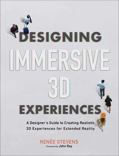
With the x, y, and z axes we can now work with the six degrees of freedom, or 6DoF (FIGURE 7.1). This freedom allows the user to move within the three dimensions as well as change the orientation along each of those axes, which accounts for the six degrees: up/down (+y, –y), left/right (+x, –x), forward/back (+z, –z), and rotation around x, y, and z.

FIGURE 7.1 Six Degrees of Freedom. Illustrating the six degrees in which a user can move freely within 3D space broken down by the x-, y-, and z-axes.
Six degrees of freedom Directions that an object or user is able to move about freely within three-dimensional space, sometimes written as 6DoF. The six degrees are heave, surge, sway, pitch, yaw, and roll.
As an object or user moves linearly along different the axes, these movements are the degrees of translation.
Heaving: Moving up and down along the y-axis
Swaying: Moving left and right along the x-axis
Surging: Moving forward and backward along the z-axis
In comparison, if you turn to change an orientation within the three axes, the degrees of rotation are shown in FIGURE 7.2.
Pitch: Rotating between the x- and y-axis, up and down
Yaw: Rotating between the x- and z-axis, left and right
Roll: Rotating between the z- and y-axis, front to back
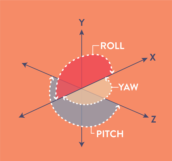
FIGURE 7.2 Pitch, Yaw, and Roll. Showing how objects can rotate within the x-, y-, and z-axes.
The orientation is what adds to the complexity 3D space. As you add the z-axis, you introduce multiple new relationships that you need to design for. This, in combination with the ability to utilize a 360-degree view, creates a dynamic experience for the user.
As you start to design the interface to help a user explore this space, the goal is to make it as approachable as possible. This is where the user experience research that we discussed in the previous chapter becomes essential. You want to make sure your designs are reflecting the needs of the user. The best way to know what the user needs is to ask them—and observe them as they experience your design.
UI and UX are often referred to as a partnership, and while they are very different things, it is very important that they work together. The UI design should reflect data and other information discovered by any UX research and journey mapping. The UI consists of the visual elements that make interacting with an application positive and even enjoyable. It adds appeal. However, in XR you don’t want it to overpower the core experience. Because AR and MR experiences often have a limited field of view, you want to optimize the available space to show as much of the physical world as possible. This requires keeping the interface elements minimal to avoid cluttering the view and overwhelming the viewer. The goal is to find the happy medium between providing convenience and support but not being distracting and overwhelming. This is where the designer comes in.
Because the interactions you are designing for are dependent on technological limitation and allowances, it is important to design specifically for the system on which the experience will be used. At this point, we are not yet able to create a fully responsive or adjustable system that will adapt based on the technology. So, you will need to design the UI for each different system that the experience will be used for. (The exception is mobile devices: Although Android and iOS require different programming languages and AR frameworks, and capabilities will vary, there are enough similarities that you may not need to design a fully different interface for each.)
For HMDs, the field of view (FOV) varies with different models. For example, the HTC Vive has a FOV of 110 degrees; by comparison the Microsoft HoloLens 2 has a FOV of 52 degrees. This difference has a huge impact on how you can use the space. It would be hard to implement the same design into both platforms. Designing for each environment will allow you to design for the specific viewing space available. Even with a variation of 52–110 degrees, you can see how the design will need to be adjusted to create the best user experience.
As the user interface is designed, you need to consider what elements will be in the screen space versus world space. The screen space is the 2D space within the application that is at the same position and orientation as the display (the frame visible to the viewer). This space is determined by the device you use and will vary by product. The world space is the augmented or virtual space that shows the 3D environment surrounding an object or user. This includes objects that are out of the screen space.
Screen space The 2D space defined by the screen or viewable area. This is reliant on the screen size, position, and resolution of the device.
World space The 3D x, y, and z coordinates of any object, defined by the environment.
You may often need to include interface elements in both screen space and world space, but ideally, you want to select a single desired location for the interaction itself. Some elements might be helpful to have in context, such as an interactive button that shows you that the user can rotate a model to see the full representation.
However, things like navigation and other main functions should be static and easy to find. Think about how frustrating it is when you can’t find something in your home. If you lose your phone or your car keys, it is so frustrating, and often the solution is to make sure you always put them back in the same location. This way you know where they are, right? That is the point exactly. You do not want your users to be frustrated trying to search for a menu, it should always be in the same spot so they can trust the experience and confidently explore with ease. Alternatively give them an option for re-orientation of the main menu or elements to come into the direction of the user’s gaze.
UI tips for XR
Keep these points in mind as you make design decisions.
Create a stationary UI in screen space for main navigation items that do not move regardless of what is happening elsewhere on the screen. This will help users feel safe and secure and avoid feeling like they are lost.
For any items that are within the world space, place them in the center third of the viewing area for optimal viewing.
Allow direct manipulation for objects whenever possible, as opposed to indirect (FIGURE 7.3).
Design how each element will appear and then disappear from view.
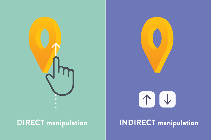
FIGURE 7.3 Direct and Indirect Manipulation. Direct manipulation allows the user to interact with object itself, versus relying on selecting on an icon or button.
Place any UI elements that are spatial at a viewing distance far enough from the user to avoid eye strain from vergence-accommodation conflict, ideally between 1.3–3 meters (4–9 feet). This will be discussed more in Chapter 8, “Human Factors.”
Use solid areas of bright color and pure white sparingly. These will appear even brighter when wearing an HMD and can increase eye fatigue.
Avoid transitions between dark and bright scenes. Instead, you can allow the user to select a day or night mode so the scene lighting will be consistent, which will reduce the amount of adjustments for the eyes.
Let the user have the control to hide or show certain UI elements.
Use minimal text, only what is needed and nothing more.
Use real or perceived affordances to allow users to anticipate the action of an icon. A hamburger icon, for example, is understood to bring out a navigation panel.
Avoid flashing or blinking elements.
Make minimal use of small detailed textures and patterns. These create unnecessary clutter and can cause vibrations and unintentional motion.
Have tools feel available to the user, without being distracting.
3D interface metaphors
As designers, metaphors are one of our most versatile and powerful visual communication tools. This is especially true in motion design where literal interpretations are often seen as cliché and are less successful as a result. Leaning into metaphoric concepts can often help elevate the meaning of the message. Visual metaphors can be seen in many different areas of design, and in the next chapter we will look more at why this change of perception can be effective.
At its core, a metaphor is a way to refer an idea, object, or concept, using a parallel concept as a symbol. This can help reveal similarities between the two or help create a relationship between them. This same idea is true in UI design and can be seen in many forms in our current computer systems. The whole concept of a desktop is a prime example of how interface metaphors are used (FIGURE 7.4). The physical version of a desktop inspired the organization of folders and file structure and even layout of the modern-day computer desktop. If you understand how a folder structure works to organize folders in real, physical life, then you bring with you an understanding of how digital folders and files also work. Instead of having the user learn a whole new system for their digital platform, they can rely on their preexisting knowledge.
Interface metaphor A commonly understood method or language, based on a cultural connection that informs a user how to interact with the user interface.

FIGURE 7.4 Interface Metaphors. These icons represent objects in the physical world. We throw files away in the trash can. We send emails like we send letters in the mail. We store digital files in folders, as we would papers. We add items we want to buy to an online shopping cart. When we are looking for something, we search by clicking on the magnifying glass. We add digital contact information to our address book.
Another great example of this is the trash can concept. When you have finished with a file, you can put it in the trash, just as you do in your physical office. This gives you a location where you can place a file to know that it will be properly deleted, which is the essence of throwing something away. The user has multiple feedback avenues that ensure that the file has been deleted. The first is the visual of the file moving out of one folder and into the trash. Then, when you empty the trash, you hear an audio cue (the sound of crumpling-paper) to reinforce the concept.
One of the greatest strengths of both of these metaphors is that they call upon knowledge users already have. These examples, while great, are 2D concepts that have been used within our flat screens to replicate a 3D action. The exciting part of designing immersive interfaces is that you can be inspired by a 3D action and then create a metaphor, also in 3D.
Even with this exciting concept, as of this writing, XR currently lacks accepted user interface metaphors, meaning that the language of how users interact within this space has not been firmly established. Because the technology is continuing to advance, there isn’t a foundation in this area yet. There are rising trends and research to support certain methods and functions, but they have not been widely or universally adopted, unlike those in desktop computers. To me, this is wildly exciting. Without many guidelines and restrictions, exploration and creativity can help work toward creating strong and successful interactions in this space. Of course, the goal is still the same: create a UI that informs the user how to interact with an object. You still want to use common interaction patterns, such as tapping, dragging, and swiping, so that users don’t have to learn a new set of skills to interact within the experience. Having something familiar will make the whole experience more approachable for the user, which is significant, since many other things will be unfamiliar.
As you design your XR experiences, you can be inspired by your physical environment. Some great possibilities to jump start your thinking:
Shelves
Tabs
Doors
Windows
Books
Libraries
Kitchens
Workshops
Bags or luggage
Clocks
Taking this even further, you can be inspired by the actions you take and the way you interact with objects and elements in your physical space to then re-create them in an immersive way. To get you thinking, here are a few:
Moving
Deleting
Viewing
Searching
Organizing
Creating
Throwing
Picking up
Opening
Closing
Pinching
Tapping
Turning
Speaking
Gesturing
Eye gazing
While there are countless other objects and actions you can add to your own list, remember that the goal is finding relevance to the actions within the experience you are designing. It doesn’t make sense to use a shelf for organization if your experience takes place outdoors; perhaps tree branches might be more relevant instead. Take advantage of what existing knowledge your audience already has. This is another reason your UX process is so essential, as knowing more about your users will allow you to leverage their existing knowledge about interactions. If you have a specific target audience, such as people who golf, as an example, you can leverage what golfers already know about swinging.
How real should you go?
As always, there needs to be a balance between how real versus playful you make these metaphoric interactions. There are different opinions on how close to real life you should make your actions. Remember these are metaphors, not exact replications. As part of this balance, also understand that you need to consider that users interacting in a virtual world may not be very precise with their actions. Design for that. This power of a metaphor works so well, in fact, that it can have an adverse reaction when an object doesn’t work the way the user expects. If a user perceives a 3D object to be just like it is their physical world, they will expect it to act the same in the digital world. If that that isn’t possible, then it will create frustration. When we throw, we usually choose our dominant hand, pull back, and then release in an arc motion. Knowing this, a user would want to be able to:
Select their preferred hand.
Receive some type of feedback that they have the ball successfully in their hand.
See that they can pull back and not lose the ball from their hand (which can be challenging since it would go behind their field of view in the digital space).
See and/or feel that the ball has left their hand as they release.
Receive the visual feedback of seeing the ball flying through the air in the direction they released it.
If the experience cannot replicate these actions in this realistic way, then you need to prepare your user for the differences.
One option is to make the imagery less realistic, which will immediately communicate to the user that it isn’t a real ball, and their expectations will start to adjust at the same time. This concept is demonstrated when you watch a movie. If you see something that is animated, you understand that it didn’t actually happen, so your perception of it is through the lens of fiction. However, if you see actors and actresses, then you are more likely to believe that what you see actually happened. The world of visual effects can challenge that, of course, but the focus here should be on what the mindset of the viewer will be for your experience.
As you work through your concepts, it is important to simultaneously work with or share concepts with your programming team, or do research, to ensure that your designed gestures and interactions are possible on the platform you are designing for. In this field, capabilities are constantly evolving and changing, so you may need to confirm this for each new concept you ideate.
Remember that the interactions themselves can and should vary, so people of different abilities can access the different parts of the interface. As you explore possibilities, keep an open mind and consider how your ideas can be flexible. This is especially true in AR where the location, and in turn the experience, may vary based on user. While initial research about your users can help direct these initial designs, further user research should be conducted to test if these metaphors are understood by the users. Measuring a component’s success metric and ease of use can help you vary elements of your interface. It is important to do this throughout the process, and not just wait until the app has been programmed.
Creating interactive prototypes also allocates space for user feedback early on. This enables you to make adjustments in the design phase before any additional time and energy is spent bringing these ideas into 3D space, and before the programming stage. If you wait until everything has been programmed to get feedback and it is not well received by your users, then you have to go back to the very beginning, which is not an effective use of time or resources.
3D interaction techniques
Research about 3D interaction techniques has been conducted for decades. This provides beneficial guidance. Especially notable is the work of Mark Mine, dating back to 1995, where research was conducted using an immersive simulated program called ISSAC. This early research led him to jobs at NASA, and even Disney as an imagineer, and as the director of the Technology Innovation Group for the Walt Disney Studios. His early research surfaced four main user behaviors that need to be included as part of a 3D interface.
NAVIGATION This includes understanding the location of the user within the overall environment, as well as an understanding of the 3D space, and how to wayfind through it. Essentially, provide the user with a way to understand: What is this space? Where am I in relation to it? How can I move through it?
SELECTION The user needs a way to select objects within the environment. This can be through direct and in-direct interactions.
MANIPULATION Once an object is selected, the user needs a way to modify it from its original state; for example, they might rotate an object to view it in its entirety. A modification could go as far as being able to change the properties of the object: size, texture, transparency, or color.
SYSTEM CONTROL This includes the overall functions and options that an application has. This is the direct way a user can communicate with the application as a whole.
It turns out that the way that a user will interact with 3D interfaces is quite different for VR versus AR. Each has a very different set of needs, so let’s explore these separately.
Virtual reality
Within VR, where we are not able to see anything except what is displayed within the digital environment, the user completely loses the ability to rely on seeing any kind of physical input devices such as a keyboard or a mouse, unless they are replicated in the digital space. They are also unable to see their hands for any gestures or related interactions. Having the ability to use your hands, controllers, and any other gestures becomes harder without having any visual feedback or spatial relationships. New paradigms are needed for this challenge. Here are some examples that can be used:
RAYCASTING METAPHOR Creates a virtual ray into the environment that is defined by the position and orientation of the user’s hand. This feature allows the user to select or manipulate an object while receiving feedback of how it relates to the environment (FIGURE 7.5).
FIGURE 7.5 Raycasting. A photo illustration demonstrating what a raycasting interface looks like: creating a light ray that is intended to help the user properly select a digital object.
VIRTUAL HAND METAPHOR Employs a digital representation of the user’s physical hand within the virtual space to give them clear context, in terms of the location of their hand, to improve interactions. These are usually reliant on the user holding controllers or reliant on outside-in tracking. Ultraleap has proven itself as a leader in the hand-tracking space allowing for unique control using touchless hand tracking within VR and in other immersive and interactive spaces (FIGURE 7.6).

FIGURE 7.6 Ultraleap Hand Tracking. Ultraleap’s world-leading hand tracking enables direct interaction with digital content. The technology captures the subtlety and complexity of natural hand movements by tracking a user’s hand in 3D space. Hand-tracking technology can be used as an alternative for a computer mouse or cursor, but it can also be used to interact with any digital object, hologram, or experience in 3D space.
Image: courtesy of Ultraleap
PORTAL METAPHOR Provides a visual way to transition between spaces using rectilinear shapes such as doors, windows, and display screens. Because users already understand how doors serve as transition points, users can connect these visuals to the action, making the transition more natural (FIGURE 7.7).
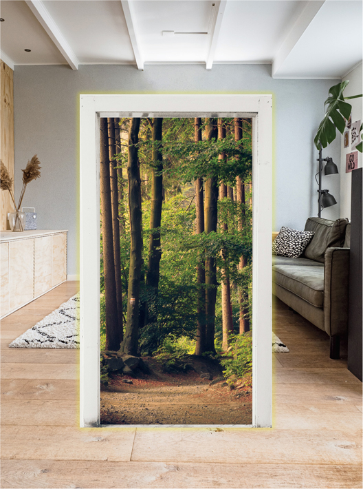
FIGURE 7.7 Portal. Doors and windows, either digital or physical, can be used to help signify to the user the change from one environment to another. This AR portal brings the user from their living room into a digital forest captured in 360-degree video.
Augmented reality
Within the AR space, users are able to see and use their hands, so there isn’t as much need to create visuals to represent hands. However, there are other challenges that need consideration. Users still need to a way to interact with both physical and digital objects. Interactions for mobile AR will be the most familiar, as they use the same touch interfaces that people are used to. The Apple Human Interface Guidelines offer some guidance on best practices for these cases. Some highlights of these include:
TRIGGER SPACE With such a small screen on a mobile device, space is limited, which can make it challenging for the user to be precise with touch points. If digital objects are far away, the touch points will be even smaller. Apple suggests that you include the space around your object in its trigger space. This way, if a gesture is detected near the object, it will select the object itself.
SCALE Do not allow scaling by the user if the object needs to be represented at scale. If the user is using the AR experience to see how a new appliance or furniture will fit within their space, then you wouldn’t want to allow it to change size.
Tip
Remember that scaling is different than moving in z-space. So, if an object can be moved closer to the user this should move the position not the scale,
GESTURES Choose gestures that will not be confused with other very similar ones. As an example, pinching and rotating can be perceived as similar if they both require two fingers. Be sure to use gestures that offer enough difference in the motion to produce more accurate results. Of course, it is best to confirm this during user testing.
INTERACTION Consider other interaction methods beyond gestures. Drag and drop, tap, slide, and pinch and zoom, are all reliant on gestures. You can expand these through the use of voice, tilting of the phone (like a steering wheel mechanism), and proximity. As the user approaches an object it could animate or move as an example. You could also instigate some interactions at the beginning of a session, so they automatically start.
Tip
Some interactions might be more helpful to allow an object to hide; think beyond just allowing to show an object.
As head-mounted displays are expanded for AR, and advancements continue to explore interaction in MR, the need for more interface metaphors will arise. Currently, the technology has been creative in terms of adding touchable trackpads along the sides of glasses, using hand controllers to allow for more precise selections, and using a smartphone to assist as a controller (FIGURE 7.8).

FIGURE 7.8 Hand Controller Concepts. AR/VR sketches of using hand controllers to interact with UI elements.
Designer: Volodymyr Kurbatov
One advantage of using AR or MR is that you are not tethered to an immobile computer system, as you often are in VR. This freedom allows users to move around. This capability also introduces a need for some kind of 3D wayfinding metaphor that is built into any application that promotes movement or is location specific. This would be obvious if you were using an AR map, but this concept would still be needed in any kind of experience where the users are expected to move or explore. Utilizing map metaphors can help a user understand their position within the larger environment of the experience. Including a map, compass, signs, paths, and reference objects or landmarks can help elevate an AR experience, even if it is not a navigation-specific app. Think about playing hide and seek in AR: It would be helpful for a child to know what spaces are allowed, specifically where they can look for their virtual friends who might be hiding. Without this proximity limit and a visual to show that limit to the hiding child, they may play out of bounds. The child needs to know where those bounds are.
Of course, different considerations apply based on the delivery of the final immersive experience, and you should start to see how those differ even from VR to AR. One fun concept that can be explored within any digital environment, however, is how it reacts to any kind of interaction from the user. There is an opportunity in XR to push the reaction behind any action, and depending on the story and tone of your experience, you could make these reactions exaggerated or subtle. Take note of the unique potential within this space to push the boundaries of what can be done in 3D interactions, because there are fewer limits. Imagine how interacting with the UI of a thermometer in a digital environment could cause it to start snowing or melting objects all around you. The possibilities are really limitless.
Time and space
As we explore the best practices of creating a user interface for XR, it is important to point out that the needs of the user will change throughout an experience as they become more versed in using your application. Some controls that are needed at the very start of an experience will not be needed during the entire experience. As people explore and move around their physical or digital environments, they may have a need for different controls and the ability to interact with different elements. As you are designing the UI, have your user flow with you as a guide to note the different needs of the user at each given point during the experience. You only want to have the needed UI elements available for the given moment, based on the time and space of the user in the experience.
The UI needs to be limited to just what is needed and nothing more. This is because space is limited, especially with smaller screens (which is the case with mobile AR), but also because you don’t want to distract and confuse the user. You want to show them only the interface that is needed for the interactions that they can make at that current time and place. With limited space, you will need to prioritize the elements and decide where they are best displayed.
As discussed earlier, you will need to consider what elements will be in the screen space versus world space. The screen space is the 2D space within the application that is at the same position and orientation as the screen. The world space is the augmented or virtual space that shows the 3D environment. This designing of space is really about looking at the relationship of the elements and determining the layering of each object. Within XR you have many options and relationships to consider. If you overlay an element right on top of the world view, this is non-diegetic. This could be a single element or a box with multiple elements; however, this style is typically represented two dimensionally to reinforce that is a separate from the physical space. The opposite of that is diegetic, which as you would expect means that the element is displayed directly within the world space.
Non-diegetic The technique of overlaying an element on top of a virtual environment, making it clear it is not part of the environment itself.
Diegetic The technique of placing an element to appear inside the virtual environment.
Beyond this differentiation, you can also create meta UIs, which are similar to non-diegetic elements, but are often temporary or situational. This could be a notification when the user adds something to a shopping cart for example, or a visual notification that updates the user based on an interaction. These are often 2D to provide a distinction. If the UI is displayed three dimensionally, it would be considered spatial UI. This could be a path to show which way to go or something that adapts to the physical depth and space of the environment. FIGURE 7.9 contrasts the two UI approaches.

FIGURE 7.9 Spatial vs. Meta UI. Turn-by-turn navigation, using augmented reality via a mobile device, to help customers find all the items on their shopping list. The top view shows spatial UI with the design adapting to the physical space. The bottom half of the view is a meta UI window, which shows the map view and shopping list on a 2D window.
Image provided by Dent Reality, Ltd; CEO: Andrew Hart; Product designer: Richard Picot
Meta UI A temporary or situational 2D window that appears on top of a virtual environment.
Spatial UI A temporary or situational 3D element that appears on top of a virtual environment.
As you determine the relationship of these UI elements within the digital and physical space, you then want to make sure that any elements that can move, such as any diegetic objects, follow the same rules and physics specific to that environment. So, for example, if you have images hanging on a wall that remain in place and the user chooses to add an object to that wall, the new object should remain still also, without jumping or resizing or rotating in a way that the others would not. Consider consistent anchor points among all diegetic elements. This way they will all attach to real-world surfaces the same way. Elements can be aligned onto vertical or horizontal planes, so consider designing or limiting how these alignments can be made within a specific experience. For example, a carpet would be allowed to be added to a horizontal plane only. This would also be the case for lamps, boxes, and other physical objects. The only thing that would be allowed to have a vertical plane would be things that can hang on walls or that we are used to seeing in this context such as windows, doors, and walls.
Since we are exploring this relationship of space, it is important to have a good understanding of how your user relates to the 3D interface itself. Consider a theater metaphor: If someone is sitting watching a show, they sit still and don’t move position or viewpoint while objects move around them (generally in front of them, in their field of view). Do you wish to allow the user to move and manipulate the interface to select where the different elements should be? Or perhaps you would prefer the opposite, which is a locomotion metaphor, where the interface remains static, and the user has to move around and through it. Think of a child on a playground, as an example. You may need to explore each possibility depending on the concept of the experience, so keep them in mind.
Microinteractions
Show me, don’t tell me. There is power from seeing something in context to understand how it works. If you understand that, then you also understand the power of AR. Tool tips have become a helpful way for users who need additional instruction to learn more about how to use a digital tool. These started as just text boxes that appeared as you hovered over a tool, but have since grown into short motion clips that demonstrate how the tool works (FIGURE 7.10). This communicates more than just the what, but also the how. This is much more useful to a user as it is faster and can communicate universally. Seeing an animation before the user interacts with an element can effectively communicate the gesture. Seeing a subtle motion as you are about to select something offers you feedback as to what object you are selecting before you commit. Seeing an icon jumping or shaking alerts you to focus on it. These detail-oriented animations are called microinteractions. These are the subtle details you can add to an interface to make it as efficient and friendly as possible.

FIGURE 7.10 Frame-by-Frame Breakdown. A subtle shape change of a circle cursor will help the user understand that they need to scroll upwards, just as the motion of growing taller shows. Although the motion is small, the interaction it communicates is powerful.
Microinteraction The small and subtle details of an interaction with a product or experience.
As broken down by Dan Saffer in the book, Microinteractions, there are four parts of this detail-focused interaction:1
1 Saffer, D. (2014). Microinteractions. O’Reilly Media.
TRIGGER The start of the interaction. These can be started by the user, manually, or they can be automatically initiated if a condition is met. If you flip a light switch, this is the trigger to turn on a light.
RULES Guidelines on what can and should happen in a specific order. When you turn a light on, it will stay on until it is turned off. This is the rule.
FEEDBACK Communication to the user about what is happening. When you see a light come on, this is the feedback that your action, or trigger, of moving the light switch was successful, and now the light is on. This feedback can, and should, be multimodal. Feedback can be provided through visuals, sound, and touch, such as haptic.
LOOPS AND MODES These determine how long the interaction will last and are the final part of the microinteraction. The light will stay on until it is turned off. Turning the light off will close the interaction loop. These can determine whether the action repeats or changes over time as well.
To offer another example, if we apply these steps to interacting with a 3D model in mobile AR, the trigger could be when the object was tapped. When you tap the 3D object, this will trigger an action. The rule will define what action then occurs. Let’s say the rule is that tapping the object will rotate the object. Once the object starts to rotate, this is feedback to the user that the trigger (tap) was successful. The object will continue to rotate until the user taps the object again to stop it. This closes the loop. When the object stops moving, then the full interaction has been completed.
When you add microinteractions to the UI, it is not only helpful, but it also makes the experience appealing. An experience that the user finds enjoyable will encourage them to come back again and repeat it. This attention to detail may seem small, but it will make a big impact on the overall experience. It is a time-efficient way to help guide the users through an interaction, and when navigating a new experience, users will appreciate any help they can get. In some cases, the user might not even realize that they are getting help. Some of the most effective microinteractions may not even be noticeable to some users. Perhaps users notice the absence of that detail more than its presence, and that is a great indicator that it is working as intended. Microinteractions are subtle in nature, which can make them easy to overlook especially if you are not looking for them. They might be:
Bells ringing to show a notification
Volume adjustment bars moving up and down
Sound icons with and without diagonal lines (sound on and off)
An icon scaling up and down
The annoyance of a sound or vibration eventually going off after you hit snooze for your alarm
3D objects deserve 3D microinteractions (FIGURE 7.11). As you are designing your interface and considering how you can add animations and hints to facilitate the interactions for your user, make sure that you are thinking in the same format as your content. If you have a 3D object with a 2D tool tip, you are missing an opportunity for both context and efficiency. Instead, wrapping an arrow around a 3D object to show how you can rotate it offers a faster and more intuitive direction. You can even take one more step by adding slight rotation animation that loops to encourage the user to interact with the element—it is so easy to do, you just showed them how.

FIGURE 7.11 3D Microinteraction. Providing interaction tips in context, and with appropriate motion, makes directions more intuitive. Using 3D microinteractions will limit the need for written-out directions, making the interaction fully visual. In this example the user can see that they can rotate the present object.
With so much complexity in immersive environments and experiences, anything you can do to improve the design and to simplify and assist the user will help make the overall experience better. If you approach your user interactions as a system of smaller microinteractions, you can provide a step-by-step guide through the experience that the user might even find enjoyable. Remember your triggers, rules, feedback, and loops. Look for some of the most complicated features or interactions, and see if you can break them down into smaller more simplified details that can make it easier on the user. The reward will be repeat users and higher engagement rates.
Inspiration is all around you
To repeat the opening statement of this chapter, the mind is the interface between ourselves and the world. Think about way we understand how to interact with the world around us—that is the way we need to think when we design elements that users can interact with in XR. 3D designs deserve 3D interfaces, or at least spatially aware interfaces that acknowledge and respect the time and space that the user is part of. As you design the user interfaces for your XR experiences, find inspiration in the relationships and interactions we have in our physical world.