Chapter 10
Augmented Typography
In this chapter we will be exploring how to optimize your type in augmented experiences. Though many of the topics discussed also apply to virtual reality, the emphasis in this chapter is best practices for AR, because that provides less control of the environment. Here is what we will be covering:
UNDERSTAND LEGIBILITY AND READABILITY Consider the difference between legibility and readability and strategies to help you achieve both with type in your dynamic environments.
CREATE VISUAL CONTRAST Contrast is essential for readability and also accessibility. As you are creating contrast in your design we explore the different kinds of type within AR and considerations for each.
TAKE CONTROL People can interact with an experience within a wide range of environments and scenarios, which means there are a lot of things you cannot control in the design. When it comes to typography, however, there are some essential tips you can follow to embrace the variables to optimize the user experience.
Legibility and readability
With the steadily growing presence of displays in our society, designing for a screen is no longer new. Displays covered in type are around us everywhere—from gas station signage to airport information boards to mobile applications in the palm of our hands. As the use of displays in technology continues to grow and evolve, the way we design type will continue to evolve as well. With the creation of each new screen, each new context, there will be some adjustment that designers need to notice and adjust for (FIGURE 10.1).
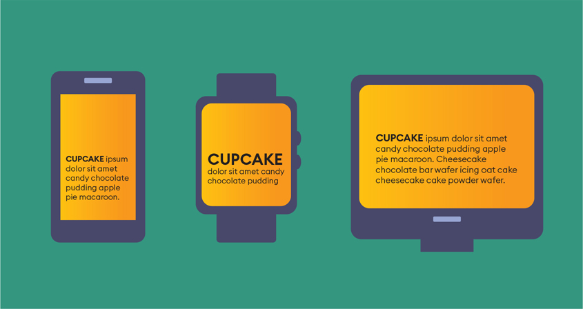
FIGURE 10.1 Type on displays. Presenting text that will appear on a variety of screens creates design challenges.
Evolution
Throughout the evolution of screens, typefaces have been designed to improve the user experience (FIGURE 10.2). In the early 1970s, the screens that displayed type were based on cathode-ray tubes (CRT). As technology has evolved, screens have grown bigger, brighter, and more light weight.
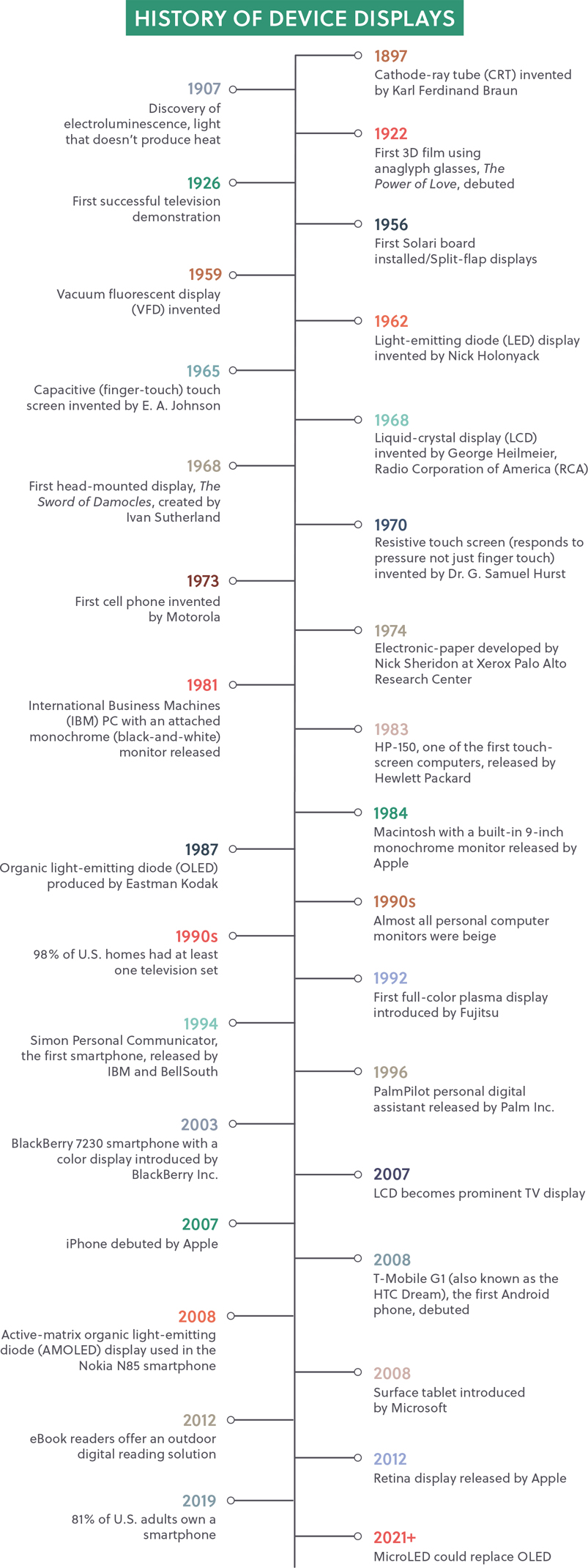
FIGURE 10.2 History of Device Displays. The evolution of displays highlighting pivotal inventions and statistics.
The shapes of the screens have evolved, as well, ironically heading back to where they began. Older CRT screens were curved away from the viewer at the edges, but the advent of liquid-crystal displays (LCD) meant having a flat surface was possible. Flat-screen LCD, and eventually LED (light-emitting diode) displays, became coveted in households around the world.
Fast-forward closer to the present day, and users, especially gamers, are once again back to using curved displays. This time, however, the screen curves in the opposite direction, surrounding the viewer to allow for a more immersive experience.
In the 1980s the first PostScript (vector) type from Adobe produced beautiful results, but only on expensive (at the time) PostScript printers. On the screen, designers saw raster-based bitmap type, which was created with pixels. To imagine what this looks like, think about creating letters by filling in the squares of a graph-paper grid to create the letterforms. These letterforms had to be created for each size of type to display well. This allowed the designer to see the font on the computer screen before printing it. Having the two different formats allowed type designers to optimize for each format, but could cause some unexpected variation in the print output.
Luckily, as screens evolved so did type design, although usually slowly. One advancement for onscreen type was the creation of vector, or outline, type that can scale without the loss of quality or resolution. Even with this, not all type is equal when it comes to digital type, as we will explore in detail in a moment.
For way too long during the early years of web design, there were many limitations on type choices and styling. Many foundational typography rules were unable to be achieved in web format. For example, you could not automatically remove widows and orphans from paragraphs.
The creation of OpenType allowed for cross-platform use (Mac and PC) all in one file. This was the same year that CSS (Cascading Style Sheets) added visual font styling options beyond what had previously been available inside HTML font tags. This allowed for the customization of type on the web. It wasn’t until years later that the World Wide Web Consortium (W3C) adopted a Web Open Font Format as a web standard. (W3C is the organization that maintains international standards for the web.)
This history is important as it carved the path to the current day and the creation of variable fonts (FIGURE 10.3). These efficient files allow for the use of a single font file to change the size and weight of type within the same design. The single file also allows for faster loading times, while keeping the same flexibility of type styling.

FIGURE 10.3 Variable Font. Type showing the weight of the characters gradually increasing.
Variable font A single compressed font that holds multiple variations including weight, width, and slant all in one efficient file.
Back to the basics
Designing typography for ease of reading within XR involves similar considerations as designing for a screen. Like many other facets of designing for XR, however, there are some unique considerations that need to be accounted for.
Just to be clear what we are taking about, typographical marks include:
Letters
Numbers
Punctuation
Dingbats/symbols
Before we go any further discussing typography, we need to first clarify the difference between a typeface and a font. Although the term font is most commonly used, it is important to understand the distinction. Typefaces are families; each of the individual members within those families are the fonts. Well-known typefaces are Helvetica, Times New Roman, Baskerville, and Myriad to name just a few.
Within each of those families are multiple weights, widths, and slants; those are the fonts. Fonts are the smaller unit within a typeface and are the digital files that must be installed and activated on a computer in order to use the typeface. You may have multiple fonts for each typeface family. For example, Adobe includes a wide variety of fonts for the Univers typeface with a broad range of weights (specified by number), widths, and slant of the letters.
Tip
A typeface is what you see, whereas a font is what you use. So anytime you discuss type already in a design—that is the typeface. When you select type on the computer, that is the font.
45 Light Oblique
55 Roman
55 Oblique
65 Bold
65 Bold Oblique
75 Black
75 Black Oblique
85 Extra Black
85 Extra Black Oblique
39 Thin Ultra Condensed
49 Light Ultra Condensed
59 Ultra Condensed
47 Light Condensed
47 Light Condensed Oblique
57 Condensed
57 Condensed Oblique
67 Bold Condensed
67 Bold Condensed Oblique
53 Extended
53 Extended Oblique
63 Bold Extended
63 Bold Extended Oblique
73 Black Extended
73 Black Extended Oblique
93 Extra Black Extended
93 Extra Black Extended Oblique
With this example, Univers is the typeface family and each example listed above is the font.
The first decision you will need to make is what typeface to use for your experience. When you are choosing a typeface, consider the legibility of the type. Based on what we have learned from designing for screens, simple is better. Typefaces that are made from simple shapes translate better into lower resolution displays, such as screens. Avoid overly styled type and ornate variations in stroke weights for this medium.
Legibility How easily distinguishable one letter is from another within a typeface.
Remember that you are designing for pixels—just as when designing a website. Whether you are designing for a handheld experience on a mobile device, a head-mounted display, or even projection mapping, these are all pixel-based media. The screens may be harder to recognize as screens as we start to break out of the typical rectangle frames that we are used to, but the foundation of how they are created is the same. Lean into that so you can rely on what you may already know about choosing a typeface for digital platforms. Here are some guidelines to help you narrow down the options:
Note
If a typeface is categorized as “display,” that does not mean it’s intended for screens. It means it’s intended for headlines.
KEEP IT SIMPLE. Typefaces created from simple shapes work better than overly styled type (FIGURE 10.4).
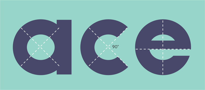
FIGURE 10.4 Geometric Type. Look for letterforms that are created with basic geometric shapes, right angles, and horizontal finishing strokes.
THINK BIG. In print you can have body copy ranging from 8 to 12 points (in print design we measure the size or height of type using points). That is too small for pixel-based type. We will discuss optimal sizes in the next section, “Creating visual contrast.” But starting with what we know about what works well for mobile design or even digital publications, 14 to 16 pixels or larger is optimal size. Anything smaller than that risks not being accessible for users. This takes into account the reading distance, something that is incredibly important for designing for XR. We read books only a few inches away, so the text can be a bit smaller, but when we look at a computer monitor it is often 12 inches away from our eyes, so we need to adjust the sizes accordingly (see Figure 10.9 later in this chapter).
CONSIDER X-HEIGHT. The height of the lowercase letters is called the x-height (FIGURE 10.5). Not all typefaces have the same x-height. Three different typefaces all at the same size can vary in height. Choosing a typeface with a taller x-height means larger proportions, and that can aide in the legibility of the type on a screen. This allows for more open counters, or the inside shapes of the letter, which helps our eye distinguish the letter faster (FIGURE 10.6).

FIGURE 10.5 X-heights. All of these x’s are set at 110 points, but the height of the lowercase x varies based on the style.

FIGURE 10.6 Counters. Look for wide-open spaces inside the shapes of the letters to help with letter recognition.
STAY SANS DETAIL. When working with smaller type especially, sans serif type typically works better on the screen because it lacks the finishing strokes, or serifs, at the bottom of the type. Knowing that the type has to be created using square pixels, you can see why the curves of the serifs are not proportionally reproduced, reducing the legibility. The good news is that typographers create typefaces specifically for screen type, so these are good places to start. Helvetica, Verdana, and Georgia are some classics, but this list continues to grow thanks to the availability of the Web Open Font Format and fonts being designed for both print and web formats (FIGURE 10.7).

FIGURE 10.7 Serif. Type with these finishing strokes—that look like feet on the letters—is serif type.
Beyond using all these different tips to help select a typeface, keep one more consideration in mind: Focus on the experience users will have while reading the type you are designing. As we discussed in detail in Chapter 6, “The UX of XR,” you need to take accessibility into account at every step of your design process.
By identifying who you are designing for and understanding their needs you can then make your design decisions to accommodate their needs. As we dive deeper into the design process and add type within AR and VR, we will uncover and solve some of the unsolved problems. It is helpful to start with the type solutions that are most familiar to a web or mobile experience, and leverage those to help you design the UI of the experience. However, once you start adding the type into the environment, the number of factors that you need to consider increases dramatically.
Type made for XR
Each day more advancements are made in the creation of typefaces and fonts that will help overcome some of the challenges we find specifically in the AR space. For example, product and type designer Niteesh Yadav has used his research findings to help design an AR type family called ARone. The objective of this typeface is to provide a quality reading experience across the variety of AR devices currently available (FIGURE 10.8).
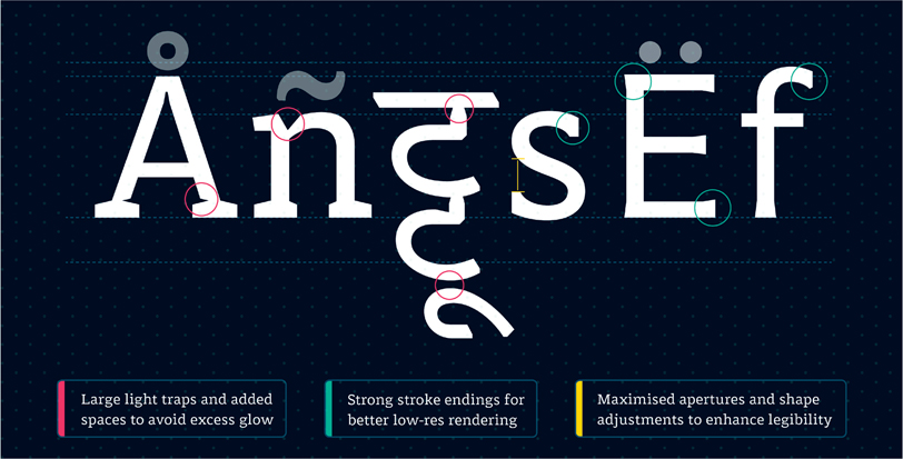
FIGURE 10.8 ARone. ARone type family designed for AR headsets. The family includes multiple weights that work on devices ranging from lo-res to hi-res headsets. The family also includes Latin and Devanagari character sets.
Designer: Niteesh Yadav
This is a common practice; many dominant XR companies have launched their own typefaces to optimize experiences using their products. Magic Leap has their own system typeface called LominoUI. As described in their design guidelines:
It increases readability and allows our users to perform productivity tasks on our device for longer durations comfortably. Lomino also provides a rich typographic palette enabling different levels of hierarchy and expression within the user interface. Spacing is generous, allowing for increased legibility at small sizes. Soft curves and smooth connection are inviting, and terminals are open and extended allowing it to be versatile.1
1 Magic Leap. (2021). Typography. Magic Leap Developer. developer.magicleap.com/en-us/learn/guides/design-typography
Versatility is key with these typefaces, as they have to work under a wide variety of environment and experiences.
Microsoft didn’t create a different typeface for the HoloLens. They use a default typeface for their apps: Segoe UI. This type is described by Microsoft as designed:
to maintain optimal legibility across sizes and pixel densities and offers a clean, light, and open aesthetic that complements the content of the system.2
2 Microsoft. (2020). Typography in Windows Apps. Microsoft Build. docs.microsoft.com/en-us/windows/uwp/design/style/typography
Rather than creating a typeface specifically for their AR technology, Microsoft is using the same typeface as the company uses for other digital platforms.
Type is meant to be read
Before we go any further, it is important to understand the difference between legibility and readability. As we have been discussing, legibility is connected to the typeface design itself. Selecting a typeface that is legible to users means that they can easily distinguish the characters from one another. The designer’s decisions can have a direct impact on how easy it is to read the words; this is readability. For example, if you place black text on a dark gray background, the lack of contrast between the foreground and background colors reduces the readability. However, the typeface is still legible under different conditions, such as with higher contrast. The designer makes the color choices, which have a direct influence to how the user comprehends the letters.
Readability The spacing and arrangement of characters and words in order to make the content flow together to aid reading it.
You can make a number of design choices to improve the readability of type for the user. Many of these remain connected to the foundations of typography, but just need some optimization for XR. Keep these guidelines in mind:
GIVE IT SPACE. Increasing your overall tracking, the space between two or more characters, will help with readability. With many of the displays you often see a bit of a halo effect around the text, so by tracking out your type you can avoid the overlay of the halos and the letters themselves (FIGURE 10.9). This also applies to condensed typefaces: As you move around the type, it can become even more condensed and will lead to overlapping. Make sure to compensate for that by increasing your tracking of the letters or select a less condensed font.

FIGURE 10.9 ARone Halo. An ARone typeface that demonstrates how unusual shapes in letter forms produce better results in the rendering from AR headsets. This typeface includes multiple weights that work on devices ranging from lo- to hi-res headsets.
Designer: Niteesh Yadav
SAY MORE WITH LESS. Reducing the amount of copy, especially paragraphs of type, is a better practice. As much as I love typography, if there is a way to communicate something visually, then you should. You can complement this with tool tips, explainer type, closed captioning, and an audio track. Remember, reading a large amount of type especially in small size, is not going to be a great experience for the viewer. Immersive or augmented type in this space is not a full conversation; leave that for an audio component. Fast type is going to be much more conducive to a positive experience, especially for a new user.
MAKE A CASE. Select a case that works for the content. Uppercase is hard to read in large amounts, but can add hierarchy for headers or shorter phrases you want to stand out. Uppercase text blocks form rectangle shapes, making it harder to read, especially on a display. Uppercase paragraphs lose the readability created when upper- and lowercase combine for faster reading as a result of the organic type shapes.
LIMIT LINE LENGTH To reduce eye strain, keep the length of your lines of type to 50 to 60 characters per line. We lose our place when our eyes have to jump back to the beginning of the next line if it’s too long.
WEIGH IN. Varying your weights of type is a great way to add hierarchy to your designs and can help guide the user’s eye though the page. Just watch for the extreme weights. Light and Extra Bold weights are much less legible than regular, medium, or bold weights.
KEEP IT FLAT. 2D type is easier to read than 3D type. Type that is extruded and volumetric becomes much harder to read. It makes sense if you consider we aren’t as used to reading type in 3D; most of our reading is two dimensional. Logotypes are an exception as they can work as a 3D element in an experience.
As you start to select and design type for an immersive experience, there is one more consideration to make: Is the type there for a functional or stylistic purpose? In VR, type can often be seen as stylistic. This is even more so in game design. Type can be added to the environment to set a mood or tone. Its readability may not be an essential part to understand the experience. For example, in a VR racing game, type seen on the signs as you approach them create the feeling of being on a real street, but what the signs say may not be relevant to the success of the game. In AR and MR, typically the type you see is often a functional and essential aspect of the overall experience. In a navigational AR experience, for example, being able to read the names of streets and other landmarks is a necessity to finding the final destination. Here you want to ensure that the type is crisp and follows a typographic hierarchy that aids the legibility and readability.
Creating visual contrast
Designers are used to considering reading distance when designing. A poster or billboard is expected to be viewed from a further distance than a brochure or postcard. There are different design considerations as a result of the distance between the user and the design element (FIGURE 10.10).

FIGURE 10.10 Viewing Distance. The viewing distance from text to our eyes changes based on the medium.
In XR, you might not choose the typeface based on how far away the user will be when reading the type. Instead, you may want to consider how close the reader can get to the type—and how might it move or change as a result. Within an XR experience there may be type that is:
Placed within the 3D space
Static (such as any type that is part of the UI)
Anchored within the environment
Responsive
In print media, when choosing from the wide range of type options, you can start by selecting from two main text types: display and text type. (There may be other places where type is used, such as for a URL or caption information, which will also be relatively small.)
Display type Type found in large headings and titles; typically 16+ points.
Text type Type found in paragraphs and meant for longer reading; typically 8 to 12 points and sometimes called body text.
With this approach you design for the media, and the text is placed and sized accordingly based on the artboard proportions and size. For example, a business card has a standard size. An experienced designer will consider the user experience during this process, but their focus is the printed page and expected dimensions.
This is not the case for immersive design. You need to design with the user as the central focus and then consider and design the space around them. This should be considered by proximity. Niteesh Yadav’s Master’s thesis and ongoing research on “Type Design Considerations for Augmented Reality” has introduced this concept of creating spatial zones for typographic placement (FIGURE 10.11).3 Though the names for these zones can vary among different manufacturers and researchers in the XR industry, the concept remains consistent. The three zones are, as I prefer to identify them:
3 Yadav, N. (2017). Type design considerations for augmented reality [Master’s thesis, University of Reading, UK]. www.niteeshyadav.com/research
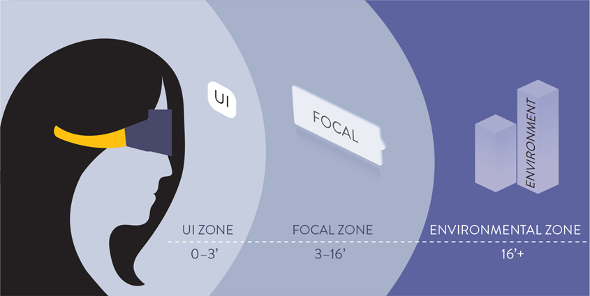
FIGURE 10.11 Spatial Zones. Showing the three main spatial zones in relationship to the user’s display.
UI zone
Focal zone
Environmental zone
UI ZONE The closest text to the user is within this space. This type is anchored to the camera position on a mobile device or HMD making this information constant in placement and view. This content should provide a sense of space within in the experience and aids in creating confidence for the user to understand how to navigate somewhere else in the space or to go back to where they came from. This type can be smaller since it is closer to eye. The reading distance may vary based on the technology; a smartphone that is held up will be farther away from the eye than a head-mounted display (HMD). It is also important to note that different devices will have varying pixel densities that will impact the legibility of the type in close proximity.
At this point you should have a plan for the user’s point of view on the space, so you can place the UI type in a location that will accommodate if they are sitting, standing, or walking/moving. How does the type change or adjust to the different positions of the user? Think of gaze as another variable that can change the content based on where the user is looking. This gaze can move horizontally and vertically from the center gaze point.
FOCAL ZONE The next zone moving farther away from the user is the focal zone. This is an optimal placement for some of the main part of the experience, including any essential type. This is the ideal reading distance for essential type within the experience. This space is within 3 to 16 feet from the user.
ENVIRONMENTAL ZONE The space that reaches farther beyond this scope is the environmental zone. It can be used for positioning, landmarks, and to add any additional environmental context within the experience. Because this is farther away from the user, it is intended to provide directional cues for the user, showing them places that they can explore within the experience, or to provide helpful context to what they are experiencing up close.
In addition to considering these spatial zones you need to consider optimal placement based on gaze. Once again, this is coming from the human-centered approach, so you place content in relationship to the user’s eyes. You need to identify where a vertical gaze is for the user, based on the position of the device. The type that is at the horizon line and 10 to 20 degrees below that point is the optimal placement (FIGURE 10.12). Text that goes above that horizontal line will require the user to move their head upwards to view, and this can cause neck strain. The same happens if the type is too low: 40 to 60 degrees and lower can cause neck strain making it uncomfortable for the user to read the type. This is especially for larger quantities of type or longer passages of type. In both cases, the vertical movement of the user’s head affects the gaze, but it can also shift horizontally—left and right. The main object you want the user to see and interact with should be at center, but understand that all content can’t be squished in the center of the frame. The optimal range for placement of type is 45 degrees left and right of center (FIGURE 10.13). Having the user turn their head too much out of this space can create blurring and distortion of the type.
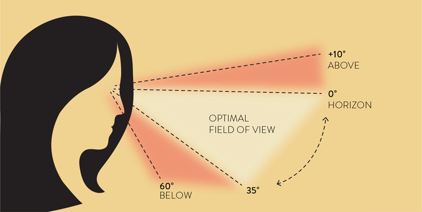
FIGURE 10.12 Gaze Up and Down. The optimal field of view is between 0° and 35°. Areas above and below this space can cause neck and eye strain.
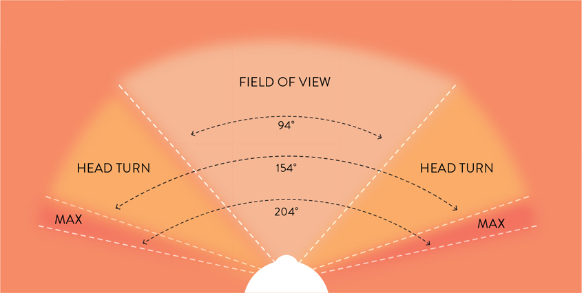
FIGURE 10.13 Gaze Left and Right. As we rotate our heads left and right the optimal field of view is 94°, just a bit more than 45° left and right from center. When the head turns, this field of view can increase to 154° The maximum viewing distance at one time is 204°.
Tip
Keep your type in the center zone of what you are designing to avoid the pixels from blurring on the edge of your peripheral sight. Here are the optimal degrees to remember:
Field of view: 94°
Head turn limit: 154°
Maximum viewing at one time: 204
With a 3D experience, there are important type design considerations for each kind of type relative to the different spatial zones.
IMMERSIVE TYPE This type needs to act like a 3D object, but will most likely be a flat 2D element (for readability). This type is integrated into the 3D environment. As such, it should match the perspective of the planes where it is placed. If you want the type to feel integrated into a space, then it needs to look believable by following the same perspective. This dynamic type will rely on spatial computing to map out the space in advance of the experience or having the user select a vertical or horizontal plane where the type will be placed. Then as the user moves, it will rely on motion tracking to move with the user’s camera or an anchor to hold it in place.
UI TYPE This type remains static in the experience. This should be 2D and remain in one place on the screen, such as the navigation bar or on the top and bottom of the screen. This text is critical for the user experience and often provides identifying information, such as the name of the app or experience. The type can serve as a menu allowing the user to see what other options are available at any given point. UI type must be easy to find, easy to see, and easy to use, because it plays an essential role in the approachability of the experience for a user.
ANCHORED TYPE This type is connected to a specific plane or object within the environment. As the user moves around the environment, the type will remain in the same spot as the object to which it is anchored. For example, in a navigation experience, the tags pinned to the surrounding businesses and landmarks around help the user identify them. These visual tags are anchored to the physical location. So, as the user explores, they will always see the correct name to each building (FIGURE 10.14).

FIGURE 10.14 Anchored Type. Anchored type stays pinned to one specific location or object to identify it, like the business labels in this AR navigation app prototype.
Photographer: NicoElNino for Shutterstock
RESPONSIVE TYPE Just as websites have to create responsive layouts and size ratios for the desktop displays, tablets, and mobile devices, that same concept applies in XR environments. Currently, type in HMDs uses pixel or bitmap type, instead of vector or outline type which would allow it to be scalable. With the dynamic needs of the content and type used in an augmented environment, the design can be seen from far away and also super close, even inside it and all around it. This means that the type needs to be crisp and clear in both near and far viewing distances. Just as in CSS we use the em unit of measurement to scale the type in relation to the width of the screen, there is a benefit for a similar system within AR. Based on user movement and the viewing angle, this approach allows type to automatically adjust for optimal readability.
While we are talking about the responsive needs for type, having type color adjust based on available ambient light would help maintain a higher level of contrast in the type. This technology already exists: You can see it as you watch an iPhone change the screen brightness automatically based on the available light. It is just a matter of connecting the lighting change to trigger a color change in the type. For now, a workaround is placing a contrasting background to separate the type and the environment so you can guarantee enough differentiation between them. Studies have shown that using light type on a darker background works better than the other way around. This is because it provides the most amount of contrast.
Tip
Black-on-white text is not as effective across all devices because you cannot reproduce pure black in a transparent or see-through display, which is used for many AR/MR experiences. Without the pure black there may not be enough contrast between the type and the background for readability.
Take control
You are probably aware by this point that there are a lot of uncontrollable components to working within augmented and mixed realities. One of the most exciting aspects about these technologies is that you can use them in varying environments and scenarios. From a design perspective, however, the lack of control and the unpredictability of environmental factors raise many challenges. Instead of letting the lack of control overwhelm you, I suggest you take control of things where you can. By incorporating some stability and predictability into your experience, you can maintain a sense of control and gain reassurance that users will be able to interact with the type as you designed.
Where type is used
The first way to achieve more control is to consistently place your type in the same location within the experience, from the entry point until the end. After the user sees type repeatedly show up in the same place multiple times, they will start to look to that place for the information when they need it. This can apply to the UI type that helps users figure out how to navigate through an experience, but it can also relate to the immersive type that is part of the 3D space.
For example, in tagAR the name tags always appear above people’s heads (FIGURE 10.15). After you see this happen two or three times, you understand that is where the digital augmented object appears, and then you will look for it in that same location each time after that.

FIGURE 10.15 Tags. An augmented name tag from the mobile application tagAR. These tags always appear directly above each person’s head, making it easier to see their name and make eye contact at the same time.
In a different example, cars with projected GPS directions appearing in the road in front of them use this approach to take advantage of constants within the driving experience. The surrounding scenery might look different at every turn, but the road looks the same. By identifying the element that each person has in common—regardless of where they use the experience—you can discover some predictability to guide your design. You can predict the color of the road and that it will be a solid color background (most of the time), and thus you can select appropriate type for that background and viewing distance. People can view this head-up display only when the car is in motion, so it is safe to assume that they will be seated as well as looking out the front window at the road in front of them. In fact, it helps them stay focused in this spot, versus having to look elsewhere for their directions. Knowing where people are looking while using an experience helps you identify the position where the text should go pretty clearly. Identifying these constants removes some of the unpredictability you may have originally been concerned about.
How type is used
To allow the users to start associating a specific style with a specific function, give a role to each of the type styles within the experience. You can use headers to identify important information, for instance, and body copy to provide tool tips or provide instructions within the experience. Then, when the user sees that same type style again, they will know that it is an instruction because they associate it with the previous prompts they received in the same format. In essence, you will create a stylesheet, just like you would for the web. Creating this and using it consistently across the full design will create a design system. This systematic approach has multiple benefits. It saves time both for the designer and for the user. It does take time to initially set up the styling for each of the needed styles, such as:
Main header (h1)
Secondary header (h2)
Additional headers (max 6)
Body type (p)
But then you can quickly call the right style each time you need to add type to your experience. This will keep a consistent look and feel throughout the experience as well. For the user, this is faster both in the loading of the experience (less code, less time to download and display) and also in the time it takes for them to understand the type styling associations. Other added benefits include accessibility and searchability. Adding these categories of type to your experience will make it easier to navigate and find content.
How to view type
Because people can move through and around an AR experience, a world of possibilities opens for how they can view any given element, including type. Unlike a 3D object, however, type needs to be viewed from the correct angle and perspective for it to be readable. The way to control this viewing angle of text in 3D space is to have it always face the user. The positioning and orientation are relative to the user and their gaze. This added control ensures that people will view the type without any perspective distortion. When users view text in 3D space from extreme angles, the type can get bent and misshapen (FIGURE 10.16). This can create some visually interesting experiences but will dramatically reduce the readability. In addition to having a fixed type orientation, it can also be beneficial to have a fixed scale or size of the type, regardless of the distance. Many AR experiences rely on type to label different elements in the scene. It may seem to make sense to have them scale based on distance from the user. However, think about trying to find something in a store: You can see signs in the distance, but they are harder to read because they are so far away. If the goal is to make the experience better for the user, then it would make sense to improve the overall experience by making it easier to read the text that is far away. Using a consistent type size for these labels in addition to orienting them with the user’s gaze can allow the user to be able to find what they are looking for quickly—even at a distance—or view all their options.
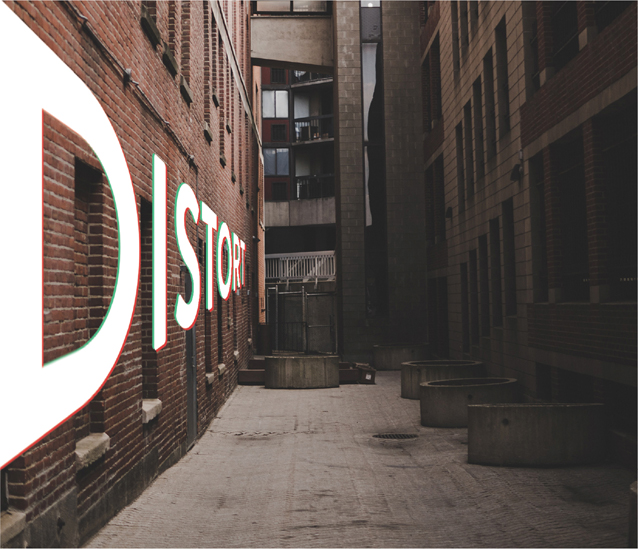
FIGURE 10.16 Perspective Distortion. As type gets warped to fit into a 3D scene, the use of extreme perspectives makes the type more distorted, reducing the readability of the message.
Perspective distortion A warping of the appearance of an object or image often caused by viewing it from an extreme angle or how it is placed into a 3D scene.
Customization
Knowing that people will each have a different experience based on their physical location and environment, you can design for this. Using your user research to identify the most common places people interact with the experience, you can create different experiences for each. When a user first launches the experience, they would have to provide information about their physical environment. Reduce the effort for users (and yourself) by providing a list they can choose from; not only does this make providing the information easier for them, it also is easier to design for. Their answers, which could be as simple as selecting indoors or outdoors, would activate different features or designs based on their choice. Lighting is typically brighter outside than inside, for example, so you could alter the design of your type, and other elements, according to their selection.
Another option could be day or night. This may be something users are already familiar with from their smartphone’s night or dark mode. With this feature, the contrast changes making the phone display easier to read when the environment is bright (black text on white background) or when it is dark (white text on black background). The change alters the luminosity of the screen to customize the experience for the user. A simple concept, as it just reverses the contrast, but it makes a big difference for the user.
Depending on the kind of type, users may want the type to occlude into the space, so it looks like it is fully immersed in the experience, or they may want to be able to have all the type visible. This is another situation where customization allows the user the option to see the information either way. It may be helpful to be able to have any navigation tags visible when making a decision about where to go next. The user would then have the ability to immerse the tags into the physical space where they can still help identify the correct location. Allowing this type customization puts the control in the user’s hands.
By building these customizable options into your AR experience you can allow the user to control their experience: They can adjust as needed to ensure the readability of the type. Empowering the user to customize their own experience brings some control back to the experience. Instead of a one-size-fits-all design solution, you can embrace one of the most attractive reasons to use AR—the experience changes based on your environment. If you take the extra steps to learn what kind of control your users want in the research stage, you can then design multiple solutions that put the control in their hands within parameters that enable you to retain design control. This customization option will also make the experience more accessible.
Remember, accessibility needs can be permanent, temporary, or environmental. People who suffer from migraines or migraine pain caused by bright lights may use these controls to lower their brightness, even during the daytime, allowing them to be able to read the text with fewer side effects, a possible unexpected benefit from providing these options.
Another way to customize an experience to the user’s exact physical space is through spatial computing. As we have talked about in Chapter 3, “Technology Check,” this technology takes a 3D scan of your space to create a digital replica of your physical space. This scan can provide the ability to create a more customized experience for your users. When the application has more knowledge about the space, it can add type to it in a smarter and more informed way. These customizations are also a foreshadowing of the future: a glimpse of where this technology can bring us. Having the ability to create a unique and personalized experience is a huge benefit of choosing to create for XR. Anywhere you can add these customizable details can help both the user and the designer feel more in control, even with all that can’t be controlled.
Minimize
What information is essential to be included in the copy? It is important to look through all the wording you are including in an experience and be as efficient as possible. As we have discussed, reading large amounts of type in XR is not optimal. So, you want to narrow in on just what is needed and avoid anything that is not needed for the experience itself. You can also explore if there are any other ways to express the information instead of in type form.
As much as I love typography, it may not always be the best solution to communicate an idea or action quickly. Using simple icons, arrows, illustrations, photographs, videos, or even a combination of these like a data visualization or an infographic could help eliminate the amount of type needed by communicating the same information in a visual way. For this to work well, you have to put in some work to narrow down what type is needed and how best to use each word effectively. When working with mobile AR especially, screen space is premium real estate. You want to reserve as much space as you can for people to see and interact with the AR experience. Make use of user interactions or UI elements to reveal more information. Ideally, such an element should be viewed at a large enough size to be able to read the text, and the user should have the ability to minimize the element or close it to go back to the full-screen AR experience without interference. You can maximize the space you have by using additional windows, pop-ups, and other UI elements that the user can control.
Design with purpose
The key takeaway to understand leaving this chapter is efficiency. There are many challenges in displaying type in AR—everything from working with lower resolution screens to choosing the best typeface to be viewed up close and far away and everywhere in between. These challenges reveal the need for efficiency of all the type you include within an experience. As you go through your full user journey, check to make sure the type holds purpose everywhere you add it.
As the designer you should be able to clearly identify the purpose of each text element throughout the journey. Then, ask yourself if there is any other way to achieve that purpose. This will keep the type use efficient and will help overcome some of the challenges of augmented typography that currently exist. For example, add some instructional type before an AR experience launches to communicate the requirements and any factors of the user’s environment that can affect their experience. The purpose here is to eliminate the need for these type-based tool tips to appear within the AR experience itself. This is a valid purpose, as it optimizes the user experience for new users and communicates expectations before users exit their comfort zones and launch the AR experience. With a limited field of view and space on the screen, you want to make sure to use each pixel as efficiently as possible by giving each element a purpose.
DESIGN CHALLENGE
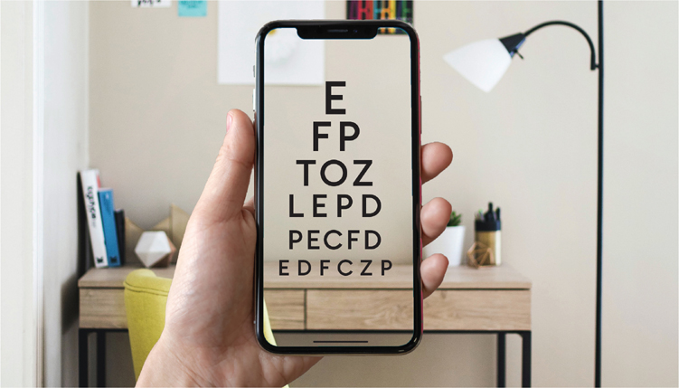
MAKE AN AUGMENTED EYE CHART
The goal of this challenge is to help test your typographic design choices at varying reading distances in augmented reality.
Based on some of the suggestions in this chapter select three typefaces and font weights that you think will be legible in AR.
Using Adobe Illustrator or Photoshop, design an eye chart with different letters in each row. Use these letters in order and add line breaks as shown in the figure.
EFPTOZLPEDPECFDEDFCZP
As you go down each line, reduce the point size as shown.
Save this file as a JPG.
Launch Adobe Dimension. From the basic shape library select a plane.

Using the widget tool on the plane, rotate the plane on the z-axis (blue) to lift the plane up vertically, as you would expect to see a traditional eye chart. Then position the plane on the x-axis (magenta) to lift it up off the ground.
Now you need to add your eye chart to the plane. To do this, move to the right side of the screen and select your Plane layer in the Scene panel. Click the arrow on this layer to view your customization properties. Find the Properties panel, and double-click the base color. Toggle from selecting a color to selecting an image. Here you can upload the JPG you saved earlier.
Adjust the positioning of your plane as needed to make sure you can view the letters correctly.
Now, the fun really begins. You are going to share this to Adobe Aero. While still in Adobe Dimension, choose File > Export > Selected for Aero. Choose Export from the pop-up window, and then save the file in your Creative Cloud Files folder. This should be the default folder that comes up, but if you don’t see it, you can find it in your user files.
Using a mobile device or iPad, launch the Adobe Aero application. When it prompts you to choose an image, choose your eye chart from your Creative Cloud files. Place this on a plane so you can start testing.
Make sure you are clear to move around the image. View the type up close, and step back away from it. How is the readability affected? Take notes.
Based on your findings, choose a different typeface and repeat the process to help identify which typefaces to try out in your next AR project.