Chapter 9
The Uncontrollable Background
In this chapter we will be discussing how the environments, both digital and physical, are dynamic—and therefore unpredictable. How do you design for the unknown? We will be exploring that through:
EXPECTING THE UNEXPECTED You may not be able to control everything, but you can predict certain components. Don’t design for everything, but rather create rules to help your experience adapt with the unpredictabilities.
FIGURE-GROUND When combining digital and physical worlds, it is important to define the relationship between figure and ground to help the mind perceive each element.
LOCATION, LOCATION, LOCATION The best view allows for the most impact. To create a positive, emotional experience, you can set up the scene for the million-dollar view, free of charge.
Expecting the unexpected
There is a lot you cannot control in XR. It can be hard for designers to accept that we don’t have full control of how everything will look. But just as you create responsive designs for interactive experiences, the same idea applies here. The difference is that you have to accept that you cannot control the full experience. In fact, you need to appreciate that there is a beauty to the uniqueness that each user will bring to the experience.
In AR, there is limitless potential for how you can enhance the experiences of our everyday through the addition of a digital overlay. The technology opens a world of possibilities for how you can enhance spaces: everywhere from the driver’s seat of a car to a street to the rooms in your own home. With that great potential comes a great variety, and with great variety comes a wide range of situations and influences that you have to consider. Lighting and background conditions may vary from moment to moment in dynamic AR usage contexts. People walking down a street during the day will have a different experience than those walking down that same street at night. The lighting conditions could change as they walk, too: One moment the sun is shining brightly, and the next a passing cloud blocks some of that light.
How can you visually display information for optimal usability with such a wide range of variables? Well, the short answer is to make your AR experience active and dynamic so it can detect the changing environment and make adjustments in real time. You need to come up with conditionals and rules. But to help you really understand this, we have to dive a bit deeper.
Ambient light
If you want to make a photograph, you are in essence capturing light and the objects the light touches. You can use the available light, or you can add your own custom lighting to the scene. This concept is the same in AR, because you are also reliant on the ambient lighting, which is the available light within a space. These ambient lighting conditions can vary in even a short amount of time. Like a professional photographer, however, you can add supplemental lighting to your digital scene and objects to better control your results.
Ambient light Any available light that is already present in a scene; can include both sunlight and any artificial lights.
When we use the term light in XR, what we are really looking at is illuminance. This is the combination of the brightness of the light source as well as the surface. The degree of reflection and the color of the surface are factors that impact our eye’s perception of the light. In contrast, luminance is the amount of light that comes from, passes through, or reflects off an object. To help you distinguish between the two, think of a lamp on a desk (FIGURE 9.1). The amount of light that shines from the lightbulb is the luminance. However, the amount of light that reaches the table and any other objects below it is the illuminance. Because we are designing for the physical space, it is the illuminance that we want to pay specific attention to. Luminance is measured in the unit called lux. Though you wouldn’t have to memorize exact measurements of luminance, it is helpful to understand how light works within the places that users will be most likely to use your application. Let’s break down the variety and intensity of illuminance in outside and inside conditions.
Illuminance The amount of light that falls onto a surface.
Luminance The amount of light that comes from, passes through, or reflects off an object

FIGURE 9.1 Luminance and Illuminance. The books and table are illuminated by the luminating desk light.
Photographer: alex makarenko for Shutterstock
Outdoor illuminance
TABLE 9.1 illustrates the variety of possible day and night illumination levels, based on research by Engineering ToolBox.
Table 9.1 Illumination based on weather and time of day
CONDITION |
ILLUMINANCE (LUX) |
|---|---|
Bright Sun |
10000 |
Full Daylight |
1000 |
Cloudy |
100 |
Overcast Day |
10 |
Twilight |
1 |
Deep Twilight |
0.1 |
Full Moon |
0.01 |
Quarter Moon |
0.001 |
Starlight |
0.0001 |
Overcast Night |
0.00001 |
Indoor Illuminance
While the outdoor light level can reach up to 10,000 lux on a sunny day, inside light is a different story. Areas closest to a window will likely be your brightest areas, which may reach a maximum of 1000 lux. TABLE 9.2 lists indoor illuminance levels for various locations, based on research by Engineering ToolBox.
Table 9.2 Illumination levels indoors
LOCATION |
ILLUMINATION (LUX) |
|---|---|
Public areas with dark surroundings |
20–50 |
Areas with traffic and corridors (stairways, escalators, elevators, and similar) |
100 |
Warehouses, homes, theaters, storage facilities, loading bays |
150 |
Coffee break room, technical facilities, waiting rooms |
200 |
Offices (varies depending on kind of work performed) |
100–500 |
Classrooms |
300 |
Libraries, show rooms, laboratories, check-out areas, kitchens, auditoriums |
500 |
Supermarkets |
750 |
Drawing studios, workshops, detail-focused offices |
1000 |
Near a window (bright day) |
1000 |
With the variety of available light, you can see how the range you have to design for is quite broad. Having the ability to narrow down where most users will engage in an experience is a great first step. That way you can narrow to an approximate illuminance range that can serve as a baseline to test with. However, you should still test your experience through a variety of lighting conditions to see how the experience changes. If you know that your experience doesn’t work as well in dimmer conditions and communicate this to your user before they begin, you might save them a lot of frustration.
This is also where you can design for conditionals. Many programming languages allow for true or false check-ins. For example:
if daytime=true, then...
This conditional instructs the computer to determine if it is daytime and then would specify what kind of settings or actions to make depending on the result. Although you may not be responsible for doing the actual coding, you can think about possible rules that you want to design for: When it is daytime, the experience should look like version A; when it is nighttime, the experience should look like version B. You may not be able to control every aspect of the experience, but you can design rules and guidelines that dynamically adjust based on certain variables.
Blending
Because you are designing for a range of light that is dynamic, you may want to look at ways to ensure the best experience for most cases. One effective way is to use blending modes to influence how your design elements interact with their surroundings (FIGURE 9.2). Graphic design software, such as Adobe Photoshop, uses blending modes to control how the images and objects on two different layers (such as your foreground AR elements and the user’s background environment) react to and affect one another. Depending on the mode you select, the relationship between the upper (foreground) and lower (background) layers will change.

FIGURE 9.2 Blending Modes. Black boxes are used to separate the white type from the background image. Each of these black boxes is labelled with the blending mode used. You can see how each blends with the background.
Blending mode The method of combining layers in an image-editing application; determines how a specific object or layer will react to any objects or layers underneath it.
Here is a look at the most commonly used blending modes:
NORMAL Opaque pixels cover the pixels directly below them without any alteration. Changing the opacity of the upper layer to reveal the pixels below will make it appear more transparent.
MULTIPLY A darkening blending mode. This multiplies the luminosity of the background color with the foreground’s blending color. The resulting color is always a darker color. Objects that are white will disappear. If you have any elements that are white, you don’t want to use Multiply as they won’t be visible at all.
COLOR BURN A darkening blending mode. Color Burn gives a darker result than Multiply by increasing the contrast creating highly saturated midtones and decreased highlights.
COLOR DODGE A lightening blending mode. This is a brightening effect that decreases the contrast between the background and the blend colors, resulting in saturated midtones and blown-out highlights.
SCREEN A lightening blending mode. The resulting color is always a brighter color. If you have any elements that are black, you don’t want to use Screen as they won’t be visible at all.
OVERLAY A contrast blending mode. It’s a combination of Multiply and Screen and allows the background layer to always be visible. Dark colors will shift the midtones to be darker colors; light tones will shift the midtones to brighter colors. Overlay is a great solution for all the unexpected environments in XR as it allows a full range of contrast in dark and lighting settings.
SOFT LIGHT A contrast blending mode. This mode is very similar to Overlay, but uses more subtle contrast. It will apply either a darkening or lightening effect depending on the luminance values.
Applying a blending mode to some of your digital elements may help the visibility of your content stay as dynamic as the space around it. However, you want to be sure to choose the best mode for your content and the colors you are using. This could be a good option to explore, but just know that the color vibrance of elements will be reduced because blending modes, as the name suggests, blend the foreground and background elements a bit in an XR environment. This will change your digital elements to be somewhat transparent. You will find that the elements won’t be as saturated as a result. However, the benefit of this is that elements the user can see through will be less of an obstruction; users will be able to view what is behind them more easily. That could be helpful, especially in experiences with a limited field of view.
Agency
Part of the reason that there are so many unexpected elements in AR/MR is that the user has more agency. If you recall, agency is how much control the user has within an interactive experience. In this case, the user’s eyes are the main camera, and as such they have full control of what they see and when. But perhaps the most challenging thing is that they also decide where they look. In essence, they become the cinematographer of the experience that you design. But they may not know the first thing about how to produce an effective cinematic sequence. They have full control but, quite possibly, no idea what to do with it. Through a successful UI and adaptable experience design, you can assist them to have the best possible experience even with limited understanding.
Here are some ways to ensure contrast between the digital elements you create even in unexpected conditions in the location your user may choose:
Use blending modes.
Apply a gradient overlay under your object.
Add a shadow under your object.
Use a solid background to separate the object from the background, such as a window, flag, or callout box.
Use a partially transparent shape or element to separate the object from the background.
Use lighting estimation technology to adjust the design for the lighting condition (more on this in Chapter 11, “Color for XR”).
Preview and test your design over a variety of backgrounds throughout the design process (even just with video).
Create different designs for different variables (think dark mode/light mode).
This relationship between your main foreground element and the background elements can take different forms, and luckily, you can rely on the core concepts of visual perception to handle them.
Figure-ground
When you listen to music, what makes a song is not just the notes themselves but also—and perhaps even more importantly—the spaces between the notes that create the rhythm and pace. Music is reliant on both of these elements to create a song. This is also true for what we see. What we see and focus on is reliant on the relationship it has with the environment around it. This gestalt principle of perception is called the figure-ground relationship. One element will fade to the back as the “ground”—this is the background. Another object will stand out in front, the figure. This is also known as positive-negative space.
Figure-ground A visual relationship in which elements are perceived as either the foreground or background.
Note
Gestalt principles are outlined in Chapter 8, “Human Factors.”
The positive shape is the figure, and the negative shape is the ground.
You can see a positive shape only in contrast to the negative shape.
The relationship they have to one another is as important as the shapes themselves.
In traditional design, you can control this relationship. You know that as you create an element you can decide how the background will interact with it. In XR, we have learned that you can’t control every part of the experience, especially in AR and MR. However, there is still a lot you can work out as you establish this dynamic relationship.
We’ll look at types of figure-ground relationships and then techniques you can use in designing them, specifically with an unknown background.
Types of figure-ground relationships
The relationship of the figure to the background can be stable or unstable. Consider how a subtle change to the design of the UI navigation element in FIGURE 9.3 also changes how we perceive the rectangles in relation to the type. In the left example, we see the outline and the type at the same visual level. It is hard to distinguish one as the figure over the other. When the rectangles switch from an outline to a gray fill, the relationship stabilizes. On the right, we can clearly identify the gray as the background and the text as the figure.
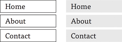
FIGURE 9.3 Figure-Ground Navigation. The navigation design on the left has an unstable relationship, because the outlines and the text make the distinction between figure and background ambiguous. The navigation on the right stabilizes this relationship by making it clear that the gray rectangles are the background, and as a result the text comes forward as the figure.
Stable
The clearest figure-ground balance is when the relationship is stable. This means that there is no confusion between which object is the main focus in the foreground and what falls back to be the background. The stability of this figure-ground relationship is that the elements each stay consistent in their roles and they don’t switch. When the user can clearly differentiate the main element, such as a 3D element or even an UI element integrated into their physical space, then they can focus more clearly, which will minimize their confusion. To make the figure standout, you can consider its styling: colors, size, brightness, contrast, and placement.
Depending on the audience and goal of your experience, you may want the elements to feel very real or clearly digital. If you are incorporating any historical or factual elements into the experience, you likely want more of a realistic feel. An interactive storybook experience for children, however, may be able to get away with a more imaginative representation. Defining a stable figure-ground relationship does not always have to rely on making the figure look different from the real world. The stability isn’t just that the experience feels real or clearly augmented, but rather that you can distinguish the object from its surroundings.
Unstable
Alternatively, this relationship between the figure and the ground can be ambiguous, where elements can reverse to be either the figure or the ground. This can also be called reversible. Although this unstable relationship may sound like a negative thing, it can be a very powerful design relationship—especially to create an optical illusion or the ability to show two images in one. The classic example of this is the face-or-vase illusion, also known as the Rubin vase. Try looking at FIGURE 9.4. Do you see a vase or two faces? Keep looking, and the image reverses with what you saw originally receding to the background of a different visual solution. In this example, you can see the faces as the figure and the black as the ground, or you can reverse that to see the vase as the figure and the white as the ground.

FIGURE 9.4 Reversible Figure-Ground. Based on the concept of the Rubin vase, the relationship of the figure and ground in this image is reversible. If the black shape is perceived as the figure, then the white background falls to the ground. However, if the white becomes the figure, then the black falls to the ground and you identify the two face profiles looking at one another.
This unstable relationship is often used in illustrations, logo, and branding design, and it can be very effective way to communicate more than one message within one space. However, limit the use of reversible figure-ground elements in XR space when you are trying to clearly portray information. In games and other edutainment experiences, it could work effectively. Think of the hierarchy of needs of the user, as discussed earlier. If a user doesn’t find the experience usable, then they are not likely to continue using it. If a reversible figure-ground relationship makes it hard to distinguish between important content and other augmented objects, a user may determine it unusable.
This unstable figure-ground generally relies on the viewer seeing more than one solution in the same area—but with XR you could push this to explore how position and orientation could create an ambiguous relationship. For example, a printed hologram changes as you move your head from one position to another, so digital holograms could function in that same way. You could use this option to vary an experience for repeat users in a game or for those using location and space to explore immersively.
Break it up
AR and MR create some specific challenges of creating a relationship between the known figure and the unknown background. Here are some ideas to consider:
Plan from the ideation stage, and sketch transparently (as discussed in Chapter 5, “Creating the Prototype”). This allows you to consider the background as a variable in your design equation from the beginning.
Consider the horizon line: Elements on the lower half of a composition, or below the horizon line, are often perceived as the figure. Elements in the upper section of a composition, or above the horizon line, are more likely perceived as a ground.
Consider shape and location: Figures typically have a more defined shape with a clear location in space, while grounds have a less clear shape and location in space.
Use occlusion so that the figure feels immersed into the space with the ground continuing behind it.
Use lighting estimation to automatically detect the lighting in the physical space to replicate on your digital objects. This can also help create shadows to further separate elements (we’ll get into more on this in Chapter 11).
Make connections
The relationship between the figure and the ground is important in any type of design, but when it comes to merging physical and digital spaces in XR, the need to define this relationship brings it to the next dimension. Two ways to help strengthen the figure-ground relationship are the use of anchors and tracking.
Anchors
Because the user will be the one who will be relying on the figure-ground relationship, why not give them the ability to create it? Allowing the user to create anchors in their scene is a great option to connect your 3D objects (the figure) to the environment (the ground). For example, in AR, you could allow the user to select where to place a figure and, in response, define the ground as everything else around it. This selection happens through the creation of anchors.
You can offer several types of anchors:
PLANE ANCHORS Here the user can select a flat surface, such as floor, table, or wall. The surface can be vertical or horizontal, but you may want to limit the user to pick only one or the other based on the aspect ratio and orientation of your digital objects. If you have an object that was created to sit on a table, then you may want to allow only horizontal plane anchors. If you are creating a virtual gallery, it would make sense to limit the experience to use only vertical plane anchors. Once the plane is selected, the scene will display from that anchor point. For example, the Ikea Place app allows the user to see furniture in their space before they buy it. The user selects the plane where the piece will be and sees the result instantly.
FACE ANCHORS Using the front-facing, depth-enabled cameras on smartphones to scan facial features, the user can select face anchors. These allow dynamic, real-time rendering based on the motion of the face, paying specific attention to the location of the placed anchors. For example, Memojis on Apple devices (or Bitmojis or AR Emoji on some Android phones) allow the user to customize their appearance with an image and then apply that image mesh to the motion of their face (FIGURE 9.5). Spark AR and Lens Studio by Snap are other examples that allows designers to create face-tracking experiences.
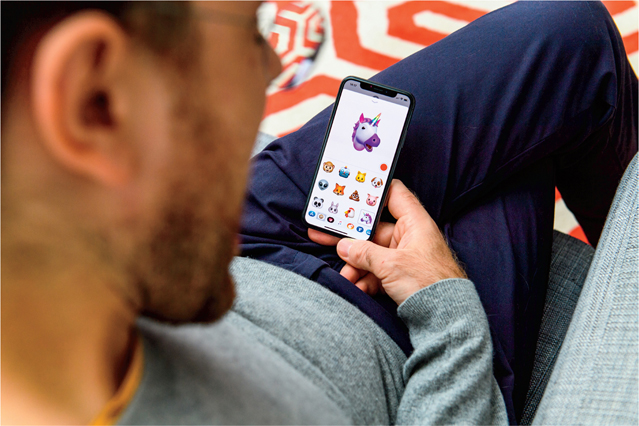
FIGURE 9.5 Memoji. Face tracking experience using the AR Memoji app on Apple iPhone, replaces your face with the face of a character (here a unicorn), imitating your every facial expression.
Photographer: Hadrian for Shutterstock
IMAGE ANCHORS Users can capture a static target image in their physical space to activate an AR experience, such as a video or animation. When in a browser or application experience, the camera in the user’s mobile device captures the target image to launch the action. For example, with the Living Wine Labels app, users can scan the label on a bottle of 19 Crimes wine with their smartphone camera to bring the label’s character to life and hear their backstory of crime, rebellion, or injustice (FIGURE 9.6).
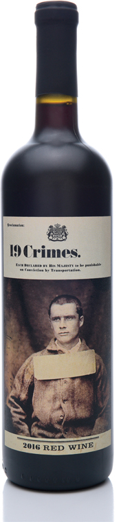
FIGURE 9.6 19 Crimes Red Wine. Baileys of Glenrowan Wines of South Eastern Australia an AR experience with every bottle. If you download the Living Wine Labels mobile app, select the 19 Crimes experience, and then point your smartphone at this wine label, you can watch the convict come to life to tell their tale (right).
Photographer: Steve Cukrov for Shutterstock
3D ANCHORS These allow the user to anchor their experience to a 3D object in their physical space. This is a two step-process. First, they must scan the object, and then they must import it into an authoring program to edit and customize it. For example, lightform projection mapping allows the user to scan an object and then project the experience to display on that object only. Or, the user can display an interactive light projection of content around a physical object, such as the mug on the table (FIGURE 9.7).
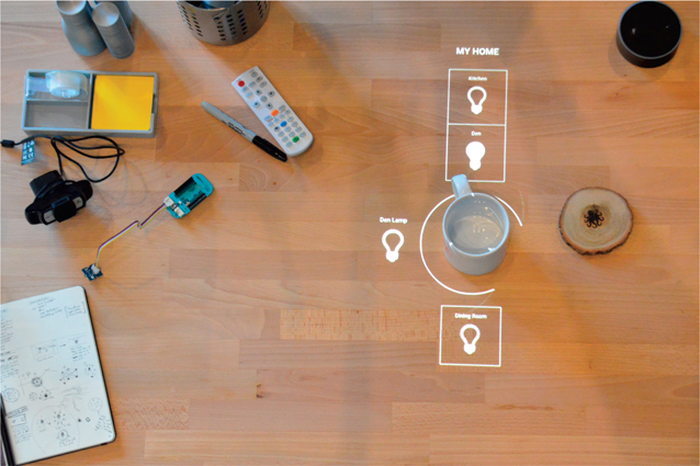
FIGURE 9.7 Interactive Light Concept. Vision work, by argodesign, uses a physical 3D object, such as the mug shown here, as an interface to adjust the lighting around the space.
Image provided by argodesign; Founding partners: Mark Rolston, Jared Ficklin; Creative technologist: Jarrett Webb
Anchors can often be saved so that users can pick up where they left off between sessions with an application. Different authoring tools can be used to create each of these different anchoring techniques.
Tracking
The more information the application and computer running your XR experience have about the environment surrounding the objects in the experience, the more realistic interactions can be. To gather information about the environment, computers use a process called world tracking to scan, analyze, recognize, categorize, and organize the space.
Tracking The process that monitors the position and orientation of the device or its sensors as well as the objects and space around it.
For an experience using a plane anchor, the computer (in this case a smartphone) would use tracking, likely via ray-casting technology, to find flat surfaces as the user scans the room with their phone. Then the camera sends the position and size data to the application so all the elements can align and combine the digital and physical environments. This alignment helps create a strong figure-ground relationship, where the physical world becomes the background to the digital 3D figure.
Location, location, location
When you make a reservation for a hotel room, there may be an option to pay extra for a room with a view, such as an ocean view, city view, or garden view. You may even select the hotel based on a location known to offer million-dollar views. When going to the theater, you pay extra for prime seats with the best view of the stage, typically in the center and the front rows. In XR, you get to make the whole experience the best seats in the house. The best part is that the user can decide what makes the best view for them and then engage in the experience from there.
This location is really all about the position of the viewer in relation to the focal point of a scene. Think about how amazing it is to see something up close, such as an animal or even a sporting event. Being close to the action changes the viewer into an active participant versus a passive observer. With XR, you can be front, center, and immersed in the action. Let’s look at how to create the best view.
Layout and composition
Just as you would do for any other design, you want to start off creating your XR environment using the basic building blocks of the scene. Using basic primitives you can block out a simple idea of what a space will look like. Just as in your sketch stage, during the creation of the layout you are looking at the overall idea and should not get hung up on the details yet. At this current stage, it is about the relationship of objects and the balance of all the components versus the actual elements themselves. This means you will be working with a bunch of gray shapes on a grid to determine where everything will go and how that impacts other elements as well. While you are at this starting stage, you can consider how to add visual impact by looking at the view of the scene itself, including the perspective and focal length. These changes are faster initially and great for exploration until you get more into the details, which take more time. Because you are designing for 3D, be sure to map out where elements will be in relation to the x-, y-, and z-axes.
Perspective
As you design each individual experience there will be a list of constraints and a list of opportunities. This can be due to technology, access, or even limitations created by the physical location. As you are creating the experience, list the constraints first. Having these written out can ignite ideas that will turn into opportunities. For example, if the user is tethered to a traditional computer in a VR experience, then they can’t move around freely. But knowing that someone will be staying within a certain space does allow you the opportunity to use that space to the fullest extent. You can consider the floor material, kind of chair (if needed), or what smells and sounds you can use to enhance the experience for the user. These are opportunities that don’t exist if someone is untethered using an HMD or mobile device with the freedom to go wherever they choose.
With XR, people have the ability to experience places and things that they would have otherwise thought impossible: going back to a time in history, visiting a place that has since been destroyed, seeing what it would be like to fly like a bird, or seeing and feeling what an experience may be like to another person. Using a change of perspective, you can make the seemingly impossible seem very possible. Just as a cinematographer would do, you can compose your shots to be dynamic and offer a unique perspective. Yes, you can show an experience at eye level as we would normally experience it, but you can also show a viewpoint that we wouldn’t normally be able to see to add more energy. This could range from a bird’s-eye view to an ant’s-eye view. Show the unusual and unexpected perspectives. Surprise the viewer.
Focal lengths
To create the best view of the experience, you will need to consider the angle of the view. Remember that the user’s eyes are the main camera of the scene, but you still have to determine what that view will look like. Just as you would choose the right lens for a photograph, you also need to choose the right lens to capture your digital scene. Lenses are broken down by focal length. The focal length of a lens is calculated by measuring the distance from the point where the image is created (thanks to the unification of light rays) to the digital sensor. When thinking about lens focal length, you need to consider the angle of view (wide or narrow) and the magnification (high or low).
Focal length The measure of the optical distance between the unification of light rays on an object to the sensor of a camera.
The lens focal length determines how much of the scene will be captured: This is the angle of view.
The lens focal length determines how large elements will be: This is the magnification.
The longer the focal length, the narrower the angle of view and the higher the magnification.
The shorter the focal length, the wider the angle of view and the lower the magnification.
While there are a number of focal lengths available—especially in computer software where you can type in any number you want—we will examine the three main lengths by category.
Standard 50–60mm: This lens gives the equivalent field of view to normal human vision. This focal length has the least amount of distortion.
Wide 14–35mm: This wide-angle lens allows you to fit in more of the scene with its extreme angles. This wide view does create heavy lens distortion around the edges.
Telephoto 70–200mm: This lens compresses the space and flattens the composition, removing depth and lens distortion.
Motion parallax
When you stare out the window of a fast-moving car, you may notice that elements close to the car, like street signs at the edge of the road, seem to fly by as you try to look at them. However, if you look at a farm way off in the distance, the farm appears to move by slowly. This visual phenomenon is called parallax and relates specifically to a change in position.
Parallax Visual depth cue in which objects that are closer appear of be moving much faster than those that are far away, even if they are traveling at the same speed.
When the viewer changes position, it is called motion parallax. Parallax is a strong visual depth cue in which objects that are closer to your field of view will appear to move more quickly than objects that are father away. Simulating this effect in a digital environment will help enhance the realism as the objects will behave in the familiar way.
Realism
Look at the physical world for inspiration. Because we are constantly surrounded by a variety of textures and materials in real life, similar textures create a sense of realism and depth in a digital environment. Collect references as you navigate and explore through spaces that inspire you, and then use them as you design. Visiting an old factory, you might find a beautiful juxtaposition between wood and metal, and that combination could be the backbone of your design. Turning the pages of a home furnishing catalog provides rich inspiration for combinations of colors, textures, and shapes. If you would like your experience to feel realistic, then you should incorporate realism into it.
Getting emotional
With the combination of the perspective, focal length, materials, textures, and composition, you will also create a mood evoking an emotion. While you can’t design an emotion, all the different variables that you combine together will leave an impact on the user. This impact is how the user feels. This is not something you can control, but certainly is something you can influence. The emotional design behind the experience focuses on how people will feel during the experience, instead of how they will interact with it. How do you want people to feel at the end? Is that different from how you want them to feel in the beginning and at the middle?
In NOIRFLUX’s Sperry Glacier JournoWall experience, the user sees an image of Alaska’s Sperry Glacier from the year 1913 across an entire wall (FIGURE 9.8). As they move, their hand gestures and their body’s presence reveal an image layered beneath it: the same glacier from the year 2008. While the concept was designed in a visual and interactive way, the emotional component comes alive within the user themselves. Once the user realizes that they are literally melting the glacier themselves, it becomes personal. They can see the impact they have on global warming by causing the glacier to melt, directly, with their actions. Although the actual experience was designed, the response from each person who interacts with it, is not. That is an unpredictable, but a beautiful result of how the experience can impact the user on an emotional level.
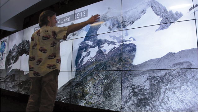
FIGURE 9.8 Sperry Glacier. For the Sperry Glacier JournoWall experience, NOIRFLUX overlaid a 1913 large-format US Geologic Survey photograph of Alaska’s Sperry Glacier atop a 2008 image of the same site. As visitors move and gesture in the space before the 1913 image, their silhouettes reveal the 2008 state of the glacier—making an emotional connection between the dramatic change in the ice-cover and their lives.
Designer: Lorne Covington; Developer: NOIRFLUX
Emotional connection
This emotional reaction has been broken down into three levels by Don Norman, in his book titled Emotional Design:1
1 Norman, D. A. (2004). Emotional design: Why we love (or hate) everyday things. Basic Books.
Visceral: This refers to the emotional reactions we are born with. These instinctual reactions from a first impression connect to our past.
Behavioral: This is the subconscious evaluation of how something helps us achieve a goal. This is essentially how we make our experiences happen. It can include all the challenges and triumphs. We can question an experience by saying, “not sure if this is going to work,” for example. This connects with the present.
Reflective: This is the response after the experience. We will judge the overall experience to determine if we will continue using it or not. This connects to our future.
Emotion adds value. If you have only an understanding of something, that doesn’t use the full potential of the emotional connection and understanding. People can understand what is happening around them, but then they also use their intuition to deepen their understanding and connection of what is happening around them. As a result, they form a response. This response can be negative or positive; either will impact their future decisions.
Interestingly enough, there are 10 main positive emotions identified by Dr. Barbara Fredrickson in the book, Positivity.2 They are:
2 Fredrickson, B. (2009). Positivity. Harmony.
Joy
Gratitude
Serenity
Interest
Hope
Pride
Amusement
Inspiration
Awe
Love
However, there is a unexpected ending, adding an eleventh positive emotion: the element of surprise. Although love is listed last on this list, it really encompasses all the other positive emotions. When you really love something you experience, you experience a hormonal response that reduces stress and, overall, makes you feel good.
When I becomes we
The only thing better than experiencing something wonderful is sharing it with someone. It is important to note that these experiences can be created for multiple users at the same time. The technology has allowed for XR to become social. So, instead of just experiencing spaces on your own, you can explore them with others (FIGURE 9.9). This can be with people in the room or environment, but also from across the world. Using VRChat, you can meet people in a virtual environment from anywhere to connect. Virtual memes are used to represent each user as you chat. Apple’s ARKit 2 release unleashed the power to experience the same AR experiences with others in the same room. One person could be on one side of a table and see the same 3D dynamic objects as the person on the other side, and all in the correct perspective. This means you can play a game with someone else, without any cleanup afterward.

FIGURE 9.9 Collaborative XR. Designers use augmented reality brainstorming about a mobile app interface wireframe. Using AR to brainstorm allows everyone on the team to see the same digital content in the same space, instead of looking at their own individual screens.
Designer: weedezign for Shutterstock
When multiple users become part of the experience, it changes the perception of the interaction. When a single user is in the driver seat, you know that you caused each change you see, but when there are others in the same experience, then each action is questioned—who did that? The more users you have, the more unexpected changes can occur. Perspective becomes relative to each user. Their own dynamic location is like the room with a view, without the added charge.
Control is overrated
As designers (and humans) we strive for control. We like to have some kind of an idea about what will happen next, but the truth is we can’t control the future. We don’t actually know what is going to happen next—just like we can’t control and design every part of an interactive experience, thanks to the uncontrollable background of AR. The beauty of giving the user control is that they will make the experience even better with what they add to it. There are things you can do as a designer to help ensure that the experience is usable, and you even can write some of the rules for the user on what to do in certain situations. You can make sure to establish visual relationships that add contrast and distinguish between the digital and physical worlds. But ultimately, you need to embrace that you simply cannot design every part of the experience and plan on the unexpected to happen. When you do, it means that you have created a space for the user to connect with the experience on a personal and emotional level. They can take an active role in the experience, because it becomes theirs. That adds a touch of magic to it all.
DESIGN CHALLENGE
3D ICON
To help you explore the figure-ground relationship in 3D, this challenge pushes you to think about how to incorporate the three figure-ground relationships discussed in this chapter. At the same time, you can expand your 3D modeling skills.
Pick a flat 2D icon.
Sketch this icon in 3D with a stable figure-ground relationship.
Make this digital using your preferred 3D modeling software and technique.
Sketch the icon using a reversible figure-ground relationship.
Make this digital using your preferred 3D modeling software and technique.
Sketch the icon using an ambiguous figure-ground relationship.
Make this digital using your preferred 3D modeling software and technique.
Compare and contrast: Which design do you feel is most successful? Why?