
Chapter Nine. Tabs
Tabs neatly organize content into a set of logical sections, and save space in a layout by showing only one section at a time. The tab metaphor is instantly recognizable and intuitive because it mimics the appearance and behavior of models in the physical world, like tabbed manila file folders, or the tabbed sections of an address book.
There are numerous ways to use tabs in a website or application interface, including:
• Presenting a compact content module, like a set of most-emailed/popular/discussed stories on a news site or a set of features that cycle like a slideshow
• Acting as the local navigation or primary view switcher where each tab swaps out large portions of a page, like edit and preview modes in a publishing application
• Visually grouping a set of form elements associated with a radio-button element, like the checkout payment example in Chapter 2 on the x-ray perspective
The primary function of a tab set is to selectively hide and show content visually; it’s important to ensure that each block of content is hidden in a way that is still accessible to screen readers. To further improve accessibility, it’s essential to implement ARIA attributes, and add scripting to ensure that screen-reader users can both navigate and select tabs with the keyboard.
In this chapter, we’ll show you how to build a set of tabs so the content is organized and usable in the basic experience, and how to transform the foundation markup into accessible tabs that that will be satisfying and usable for everyone.
X-ray perspective
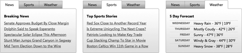
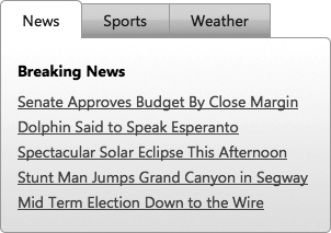
Let’s say we’re building a news site with a small block of featured content embedded in the home page that displays tabbed sections for breaking news stories, top sports stories, and the five-day weather forecast.
Figure 9-1 Target news design for the enhanced experience
There are two ways we could write the foundation markup for a tab widget that would make sense semantically:
• Code the three tab sections as sequential blocks, each with a heading immediately followed by its content, and style the headings as tabs
• Create an unordered list of anchor links that map to related blocks of content; when a user clicks a link, the page scrolls to a specific content block
Either markup choice is valid and usable in the basic experience. In the case of our news example, the individual blocks of content include descriptive headers, which we could use as a heading in the tab in the enhanced experience. This approach can work quite well, and is very simple to implement.
But the text in those headers is a little long for the available space dedicated to tabs in our compact feature block. And on a mobile device, the stacked content blocks could run long and push down on the page, meaning the second and third blocks won’t be immediately visible and available to those users.
Using a list of anchor links for the tabs offers us the option to use abbreviated names for the three tab sections, and also serves as a compact jump navigation, displaying all options at the very top of the page. Anchor links also provide an added benefit: they let users bookmark a specific content block in the basic experience because the anchor’s href value, or hash, is automatically added to the browser’s address bar (e.g., index.htm#sports)—a feature that isn’t possible with static heading tagsd. Finally, an anchor link and its associated content don’t have to be listed sequentially in the markup; we can tie them together with HTML semantics by matching each link’s href value (href="#sports") and an ID set on the specific content block (div id="sports"). For these reasons—compactness, easy jump navigation, bookmarking, and flexibility to structure the page as we like—we’ll use anchor links for our tabs.
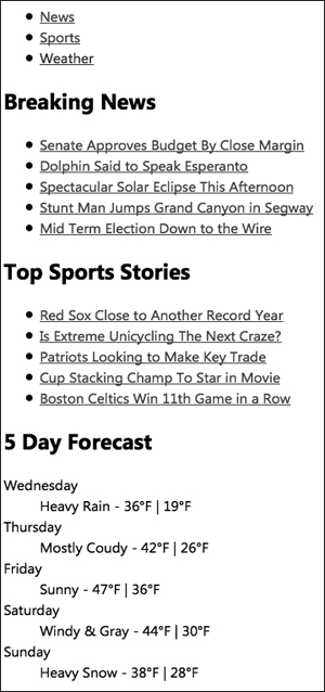
With this markup structure in place, the basic experience is clearly organized and usable in the absence of CSS or JavaScript. This foundation markup structure is also inherently accessible by keyboard and should work with any screen reader, because it uses semantic HTML.
Figure 9-2 Tab content in the basic experience
For browsers capable of rendering the enhanced experience, we’ll layer additional styles and behavior to transform this structured content into a tab widget, and add ARIA attributes and keyboard behavior to ensure accessibility for screen readers.
The ARIA specification provides a detailed set of attributes to properly describe the roles and states of the components in a tab widget for screen readers; our enhancement script will apply these to the enhanced markup. ARIA also recommends specific interaction behaviors for keyboard navigation in tab components: specifically, it recommends that the individual links in the tab strip (News, Sports, Weather) behave as a single UI control. When a tab strip receives focus, the arrow keys should toggle back and forth among the tabs. When the user focuses on a tab, pressing the Tab key should jump focus away from the tab strip to the next focusable element on the page—this could be content within the currently open tab if there is a focusable link or form element; or an element outside the tab widget if not. This behavior will need to be scripted, because the Tab key would normally move focus through each link in the tab strip, and the arrow keys would natively scroll the browser window.
We’ll also have to make a decision about how to address the URL hash in the enhanced experience. As we mentioned, in the basic experience, bookmarking and Back button support is natively built into the internal anchor links (i.e., those that reference content within the same page)—when the user clicks an anchor link, the page URL (index.htm) is automatically updated with the “hash” with the anchor’s target (index.htm#sports), which can then be bookmarked. Clicking the Back button will return the page to its previous hash and scroll location.
If the tab widget controls a very large portion of the page, users may consider the tab a page-level navigation element, and could expect to bookmark specific tab views or step them by using the Back button. To enable this, additional JavaScript logic must be added to programmatically update the URL hash when a user clicks a tab link and also look for presence of (and changes to) the hash in the URL to show the appropriate tab content to match the current hash value.
In the case of our particular target design, however, the tabbed component is a very small widget embedded in a larger page. It would likely be confusing and inconvenient for interactions within it to influence the browser history and Back button behavior—for example, if a user tabs to the Sports and then the Weather tab sections, they would need to click the Back button three times to go the previous page (index.htm #weather > index.htm #sports > index.htm > previous page). For this reason, we don’t want to update the URL hash each time a user clicks on a tab. JavaScript can be used to suppress the anchors’ default behavior of updating the hash in URL for small tab widgets like this.
We’ll first cover how to create a simple news tab widget—from constructing its foundation markup to adding enhancements—then provide an overview of how to extend a tabs widget to include bookmark and history tracking (Back button) support.
Creating the tabs
To build our news tabs widget, we’ll start by writing well-structured foundation markup that starts with a list of anchor links and organizes the content as clearly as possible, and then apply style and script enhancements for capable browsers.
Foundation markup and style
We’ll mark up the tabs as a set of anchor links in an unordered list; each link points to a specific content block by referencing its ID. In the basic experience, clicking a link will scroll to the associated content block and update the URL with the appropriate hash (e.g., index.htm#news):
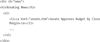
Below the list, each block of tab content is coded as a div with a unique ID that’s associated with an anchor link above:
In the first two tabs, News and Sports, we’ll use an h2 heading for the title, followed by an unordered list with story links. In the basic experience, the links will display in a bulleted format that’s easy to read:
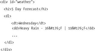
The Weather content block will also start with an h2 for the title, and then use a definition list (dl) to present each day of the week and its associated forecast. In the basic experience, most browsers will render this markup by default with a clear distinction between the day of the week (dt) and forecast (dd):
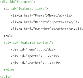
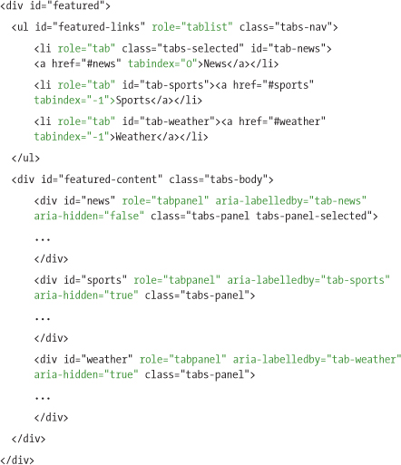
A container div with an ID of featured is wrapped around the entire tab structure (list of links and content blocks) to describe the content’s purpose. The unordered list inside is assigned the ID of featured-links and all of the content blocks—for news, sports, and weather—are grouped into a container div with the ID featured-content. Though we’ll use these containers primarily in the enhanced experience to style the tab components, they also help to group and organize content in the basic experience:
We don’t need much CSS to style the basic experience, because we’re using very descriptive markup like headings, lists, and anchor links that will format the content in a clear and usable way. To keep things simple, we’ll add a single rule to the basic style sheet to set our base font preferences, and we’ll leave the remaining styles up to browser defaults:
body { font-family: "Segoe UI", Arial, sans-serif; }
We now have the foundation markup and safe styles applied to create our basic experience (as seen in Figure 9-2).
Enhanced markup and style
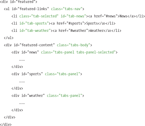
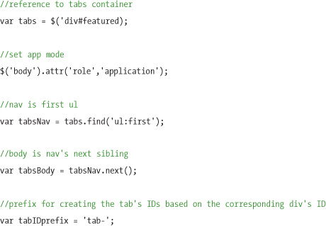
When the tab enhancement script runs, it will add a number of classes and IDs to the markup to apply the tab widget styles and scripting behavior.
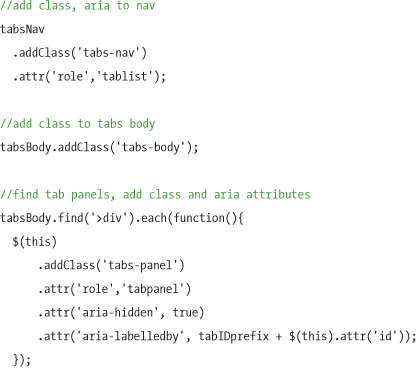
We’ll assign the class tabs-nav to the unordered list of anchor links, and assign a script-generated ID to each list item that is built by taking the anchor ID and prefixing it with "tab-". We’ll also assign the class tab-selected to the currently selected tab, and later apply style rules to make it appear highlighted and visually connected to the tab’s content container.
We’ll add the class tabs-body to the outer tab content container, and assign each tab content div within it a class of tab-panel. The currently selected tab panel is also assigned a class of tabs-panel-selected, which will be used to toggle the visibility of the tab content:
For accessibility support in the enhanced experience, we’ll add several ARIA and tabindex attributes. We’ll start by applying the ARIA role of application to the body element to instruct the screen reader to recognize this as an application-style widget, not as standard web content:
<body role="application">
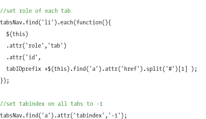
We’ll assign the role of tablist to the anchor links, and the role of tab to each list item, to inform screen-reader users that these links make up the clickable tab strip. Each content div gets the ARIA role="tabpanel" to indicate that it’s a content block for a tab, and the aria-labelledby attribute to associate it with its tab’s id. An additional aria-hidden attribute set to false indicates the currently visible tab panel; we’ll set a true value for all others. And we’ll apply a tabindex attribute to each of the tabs, with a value of 0 for the active tab, and -1 to the others:
With the tabindex attributes applied to the anchor links in this way, we can override their native behavior as individual focusable elements, and instead treat them as a single component with one element that can receive focus. As focus shifts between the tabs, we’ll use JavaScript to move the value tabindex="0" (focusable) to only the currently selected tab, and tabindex="-1" to the others. Changing this value dynamically ensures that each time the component receives Tab focus in the page, the focus returns to the active tab. This technique is known as the roving tab index technique.
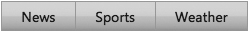
With the markup complete, we can move on to styling the tabs to match our target design. In the enhanced style sheet, we’ll start by styling the unordered list for the tab strip by shifting it down by one pixel to overlap the panels, removing the bullets, floating the list items so they sit side by side, and styling the link with a background image and border:
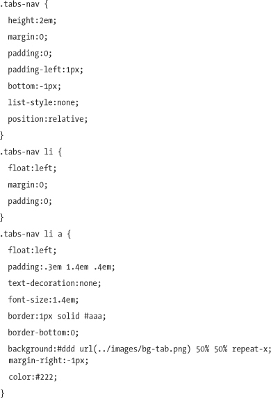
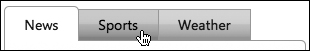
Figure 9-3 Tab strip styles applied to the list of links
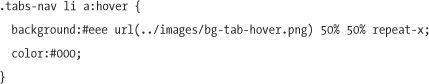
Next, we’ll write a few CSS rules to change the appearance of the tabs’ hover state:
Then we’ll apply the styles for the selected state. The selected tab has a bottom white border to visually connect it with the tab panel and rounded top corners. We’ll also add the CSS3 border-radius property to round the top two corners of the selected tab (don’t worry, browsers that don’t support this property will simply show squared corners). By default, border-radius applies to all four corners of an object; to round a specific corner, each corner needs three properties set to accommodate the various browser implementations—for example, to round just the upper right corner, we need to set the standard border-top-right-radius property, and two browser-specific -moz and -webkit versions of this property:
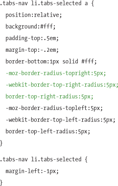
Figure 9-4 Tab interaction states (left to right): selected, hover, and default
The container that groups the tab content panels (tabs-body) is set to a fixed width and given a border and background image to add a bit of definition and texture, and all corners are rounded except the top left (which we keep squared off to connect it to the tab above it). Each tab content div (tabs-panel) is set to display:none to hide it by default. When a tab is selected, the script will add the tabs-panel-selected class to the associated tab content panel, which sets it to display: block and makes it visible:
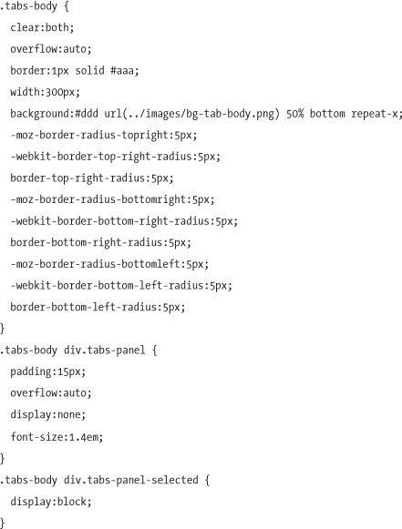
Figure 9-5 Completed tab styles for the enhanced experience
Tabs script
With the markup roughed out and styles in place, we can now write the enhancement script that transforms the foundation markup into the tabs widget for browsers that pass the capabilities test.
First, we’ll define variables for referencing the important elements in the tabs control, including the outer container, list of anchor links, and container for the tab content. The ID prefix (tabs-) that will be used to generate unique IDs and the ARIA application mode are all defined here, up front:
Next, all classes, IDs and ARIA and tabindex attributes are added to the foundation markup to match our enhanced markup.
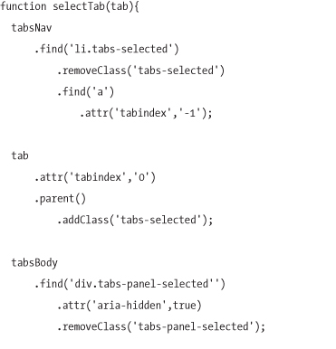
When the user selects a tab, classes are added and removed to highlight the correct tab with the selected state, adjust the tabindex values for the tabs, set focus on the selected tab, and show the associated tab content block. We’ll need a generic, reusable way to select tabs programmatically, because they can be chosen in a number of ways—with mouse clicks, keyboard events, and when the page first loads:
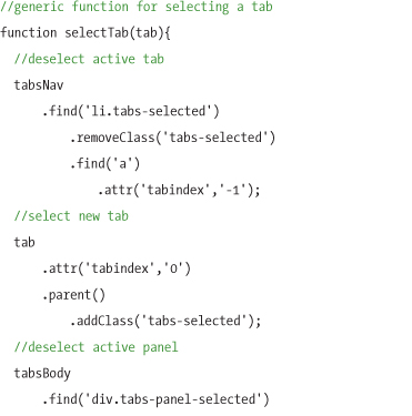
With this in place, we can call the selectTab function with the tab anchor element we want to select as an argument. Now we’re ready to apply the mouse, keyboard, and other events to tie it all together.
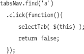
First, we’ll apply events to the tab links. When the user clicks a tab with a mouse, we’ll pass that tab to the generic selectTab function. When binding this event, we’ll return false to prevent the native anchor link behavior (i.e., updating the URL hash, and jumping focus away from the tab link into the content block) from happening:
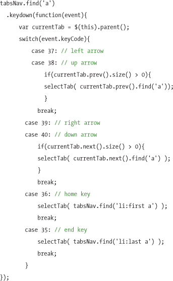
The next point of interaction to consider is the keyboard. We’ll track any keydown events that fire when a tab is focused, and map specific keys to shift focus to another tab—the Left Arrow and Up Arrow keys will select the previous tab, while Right Arrow and Down Arrow select the next tab. The Home and End keys select the first and last tabs, respectively. We’ll associate keyboard events by binding logic to specific key codes (for example, 36 is the Home key):
Finally, we’ll open the first tab panel at page load. We’ll do this by passing a reference to the first tab to our selectTab function:
selectTab( tabsNav.find('a:first') );
Taking the tabs further
This chapter has described the steps involved in creating a simple tabs component, but there are additional ways in which the tabs could be modified or extended, depending on the needs of your implementation. These include bookmark and history tracking support, creating an auto-rotating effect, referencing external tab content, and displaying tabs as an accordion widget.
Bookmarking and history (Back button) tracking
When a tab strip is used in the enhanced experience to control larger portions of the screen, users may expect it to act as a navigation component, where the browser’s Back button will traverse through each tab click and return them to the previous tab. The ability to bookmark and restore a specific tab view, often referred to as deep linking, is a complementary feature that is usually included when supporting history and Back button support.
Supporting bookmarks and deep linking
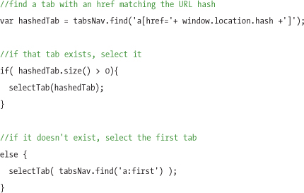
In order to implement deep linking in a tab widget, we’ll need to check the URL hash at page load; if it corresponds with the ID of one of our tabs, the script will automatically select and show that tab.
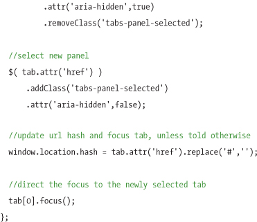
The URL hash value can be captured in a variable using the JavaScript property, window.location.hash, which we’ll use to look for a tab with an href attribute matching that hash’s value. If a tab exists, then we can pass it to our selectTab function. If no match is found—either because there is no URL hash present, or there’s a hash but it doesn’t match any of our tabs—we’ll select the first tab in the list as a fallback:
Now our tabs support the ability to load the correct tab when a hash is specified. Of course, this will only be useful if our tabs update the hash when they are selected. To do that, we’ll add a line to the end of our selectTab function that updates the URL hash with the tab anchor element’s href (which corresponds to the id of its tab panel):
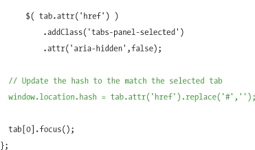
By adding this line of code just before directing focus to the tab, we can make sure that after the hash is updated, focus returns to the tab itself (which is necessary for giving context to keyboard events).
Now our tabs report their state to the URL hash, allowing any tab to be bookmarked or emailed. But by implementing this feature, we’ve introduced some new problems: first, the browser now scrolls to the tab panel whenever the user clicks a tab, and second, we’ve broken the Back button—it won’t navigate users to a previously selected tab!
To fix the scrolling problem, we recommend using JavaScript to modify the id attributes of each of the tab panels so that they no longer correspond with the tab anchor’s href values. This way, when the URL hash changes, there will no longer be an element on the page with an ID matching that hash, and the browser won’t scroll. Of course, when these IDs are modified, the tabs script will also need to be modified to look for those new IDs when a tab is clicked. This could be handled by making a simple adjustment to the selectTab function, setting it to look for a tab panel that has an id equal to the hash value plus whatever predefined prefix you decide.
Fixing the back button however, requires some additional work.
Supporting the Back button
Currently, each time the user selects a tab, the URL changes and the browser stores that change in its history menu. Despite that, the Back button won’t lead users back to the last page they visited, or even the last tab. In fact, it seems to do nothing at all, because the browser doesn’t automatically refresh to the state associated with the last hash.
When creating components that manipulate the URL hash, we recommend building in logic to update the component whenever the hash changes, whether it’s changed with the browser’s Back button, Forward button, or history menu. Here are some scenarios where it makes sense to track state in the URL hash:
• When the tabs contain a large portion of the page content (because the user may expect that each tab is actually a new page)
• When it would be common for users to save (or bookmark) links to a particular tab state
Supporting components that update when the hash changes should be straightforward, but unfortunately, it isn’t, because of spotty browser support. As of this writing, only Internet Explorer 8 and Firefox 3.6 support the HTML5 hashchange event, which is a clean and reliable way to detect when the URL hash changes; in all other browsers, there’s no native support for this event, and therefore no way to know when the hash has changed.
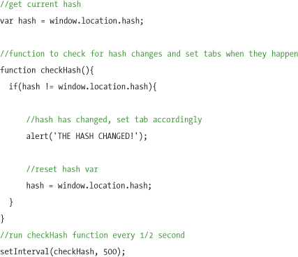
To support other browsers, we can emulate the native hashchange event by setting a JavaScript function that checks the URL hash on a time interval and compares it to the value last time it checked. If the value is different, the hash has changed, and the script can call a function to update our tabs based on the new hash:
In Internet Explorer versions 7 and earlier, when a user presses the Back button, the browser will always report to JavaScript the original URL hash value it had at page load, despite the fact that it visibly changes in the address bar, so the hash value is unreliable in these popular browsers. In order to support the Back button in these versions of IE, developers usually inject an iframe into the page and use its src attribute to track hash changes, since the iframe’s hash changes reliably when the Back/Forward buttons are clicked.
The actual scripting involved to achieve this way-behind-the-scenes method of supporting the Back button is beyond the scope of this chapter, but several JavaScript libraries exist that serve this purpose. One such library is called jQuery History (available at www.mikage.to/jquery/jquery_history.html). This plugin is fairly simple to use and provides support for both the Back button and bookmarking in a convenient package that handles all the various browser quirks and bugs. The script included with this book incorporates this plugin as an option. We’ll cover how to use it in “Using the tabs script” later in this chapter.
Auto-rotating tabs
Another feature commonly seen on the web is auto-rotating tabs, where each panel displays for a length of time before shuffling to the next tab panel. This popular feature is used on the home pages of news websites that rotate through a set of top stories for the day.
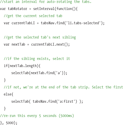
The tabs in this chapter could be extended to implement auto-rotate with a minimal amount of work. The script would simply select the initial tab, and then set an interval loop that shuffles to the next tab after five seconds or so, depending on the length of the tab content.
Using jQuery, that loop could look something like this:
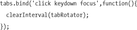
This feature could be annoying to users if there’s no way to stop rotating the tabs. Stopping the auto-rotation is as simple as clearing the interval that was set, with the statement clearInterval(tabRotator). We recommend running this code as soon as the user clicks, focuses, or presses a key anywhere within the tabs control, such as the following example:
The plugin included with this chapter includes this feature as an option. For details, be sure to check out “Using the tabs script” below.
Referencing external tab content
Our example news tab widget could be extended to use Ajax to fetch external content for the panels. This is particularly useful when converting a website’s top navigation into a tabs component that allows users to peruse the content of each section without requiring them to refresh the entire page. (This would be a good example of where supporting history tracking might make a lot of sense).
The markup for an Ajax-populated tab widget could be similar to the foundation markup discussed earlier in this chapter, except that the links within the unordered list would each reference external pages, rather than local content anchors (with the caveat that we would generally recommend that the content for at least the active tab be delivered with the page along with those links, so users in the basic experience can access it). When a tab is clicked, the script formulates an Ajax request based on the link’s href attribute to pull the external content into a tab panel.
For a great example of a jQuery plugin that already supports this behavior, we highly recommend the jQuery UI tabs component. In addition to Ajax support, jQuery UI tabs include the ability to collapse tab panels, and can be styled with the ThemeRoller tool. You can download the tabs plugin at jQueryUI.com/download.
Displaying tabs as an accordion
Due to their differing visual layouts, it may not be obvious that tabs and accordion controls have much in common, but they’re nearly identical in behavior. Both allow for toggling the display of content panes, and allow only one pane to be viewed at a time.
Technically, the markup behind each control could be quite similar as well, but the source order may vary depending on the implementation. For example, while the foundation markup presented in this chapter included an unordered list of tabs, followed by all of the tab panels, an accordion’s source order might alternate between headers and blocks of content, reflecting the order in which they’re presented visually. Source order aside, the accordion’s HTML attributes could be identical to the tabs described in this chapter, including the ARIA roles and states. In fact, because the accordion is so similar to tabs, the ARIA spec doesn’t even include a role for it; using the tabs role(s) is actually the recommended W3C approach for implementing an accordion.
For a good example of an accordion control that follows the principles in this chapter, visit http://test.cita.uiuc.edu/aria/tabpanel/tabpanel2.php.
Using the tabs script
The tabs demo and code that accompanies this book (available at www.filamentgroup.com/dwpe) includes a reusable, easy-to-use plugin, jQuery.tabs.js, that packages the script outlined in this chapter for use in your projects.
To use this script in your page, download and reference the files listed in the tabs demo page, and simply call the tabs method on the parent container for the tab content. For example, using the foundation markup provided in this chapter, you could simply call the tabs method on the div with an ID of featured:
$('#featured).tabs();
The tab content markup needs to follow the same structure of the example in this chapter: a parent tab container that holds an unordered list of anchor links followed by a wrapper div that contains the set of corresponding tab content panels.
The tabs plugin also has two configurable options for supporting bookmark-able tab URLs and the Back button. To use these features, you’ll need to include a reference to the jQuery History plugin script. See the history tab example page to see how to properly reference all the necessary script files.
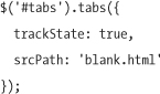
In our tabs plugin, state-tracking features are disabled by default, but you can enable them with the trackState option, which accepts a true/false value:

With state-tracking enabled, you’ll also need to provide a URL to the blank page on your server to be used in history tracking (learn more about this in the jQuery History plugin documentation). The srcPath option defaults to jQuery.history.blank.html and can be overridden with a path to a blank filename of your choice:
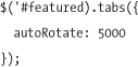
Our tabs plugin also supports auto-rotation, which is disabled by default, but can be activated by setting the autoRotate option to a desired interval in milliseconds:
* * *
Now that you understand how to create a fully functional and accessible tabs component, you can see just how to structure the content and include key ARIA attributes and keyboard navigation behavior that make it truly usable to everyone. Tab components can be used for small and large content blocks, so considering user expectations of bookmark support and Back button behavior can dramatically improve the user experience. The core techniques and principles we discussed in this chapter for tracking hash states and preserving Back button support are applicable to a wide range of interactive and Ajax-powered widgets.